

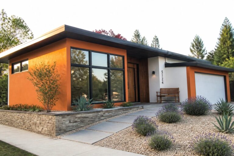
When I look at houses with bold orange exteriors, the white trim usually catches my eye right away because it sharpens the edges around windows and doors.
That kind of contrast helps the facade read clearly from the street, especially on days when the light is flat.
I have noticed it works better on some homes than others.
Checking how the colors sit against the roof and any stone accents matters more than the paint swatch suggests at first.
A few of these combinations might be worth trying on a small part of my own trim to see how they hold up over a season.
Black Trim Against Bright Orange Walls
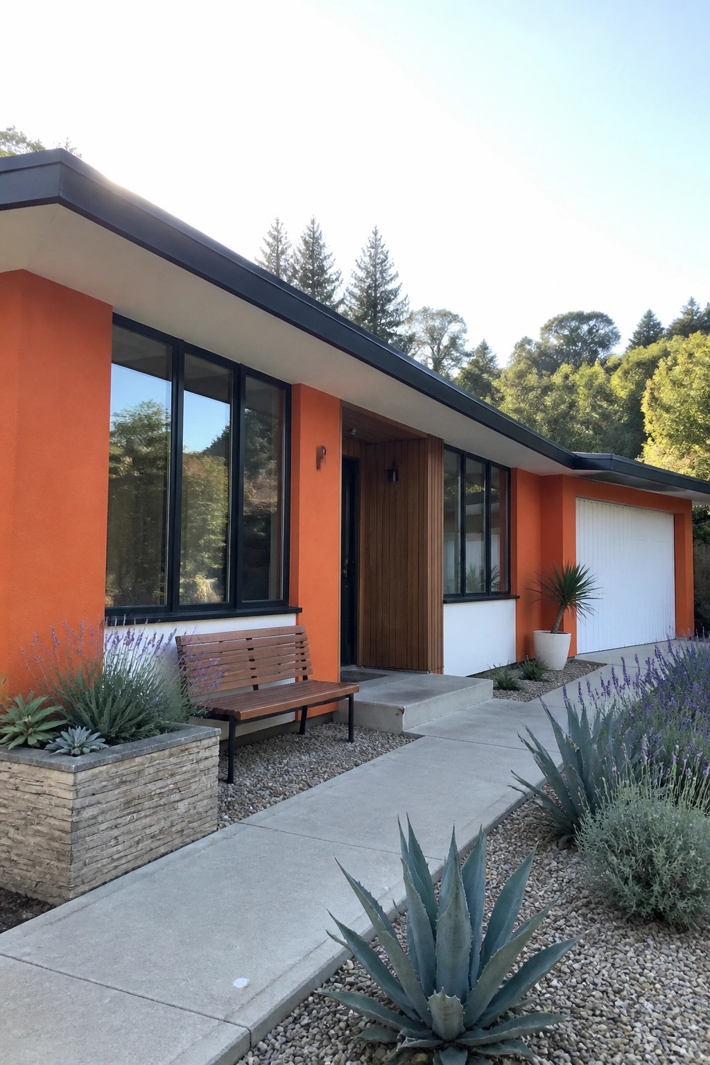
Black trim gives bright orange exteriors a sharp, modern look that feels intentional rather than overwhelming. The dark frames around windows and along the roofline create clear lines that stop the color from feeling too flat or bold on its own.
This works best on simpler house shapes where the trim can stand out without competing details. Keep the black true and matte so it contrasts cleanly with both the orange and any white sections, and test a small patch first to see how it reads in your light.
High-Contrast Black Trim On Orange And White Homes
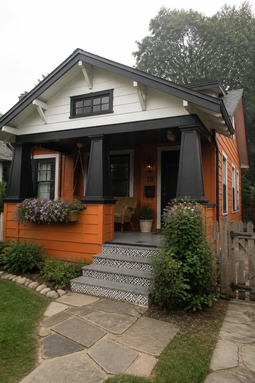
One way to make bright orange siding feel balanced instead of overwhelming is to pair it with strong black trim. The dark color outlines the porch, windows, and roof edges so the orange and white sections read as clean blocks of color rather than one solid bright surface.
This works best on smaller homes or cottages where the contrast helps the house feel grounded. Keep the trim consistent on the main structural lines and let the orange stay the dominant wall color so the look stays simple rather than busy.
White Trim On Bright Orange Siding
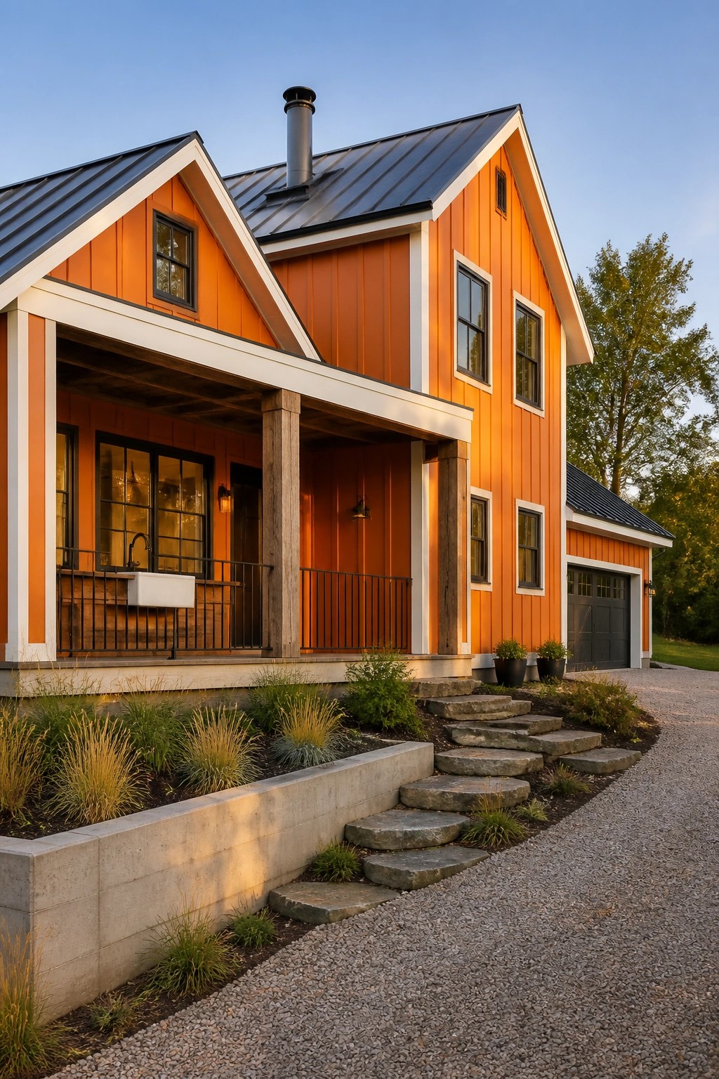
White trim stands out sharply against bright orange siding and gives the whole exterior a clean, defined look. The contrast keeps the color from feeling flat while still letting the orange stay the main feature.
This approach works well on houses with straightforward rooflines and few small details. Use wider trim boards around windows and corners, and consider a dark roof if you want the contrast to read even stronger from the street.
White Trim Against Bright Orange Brick
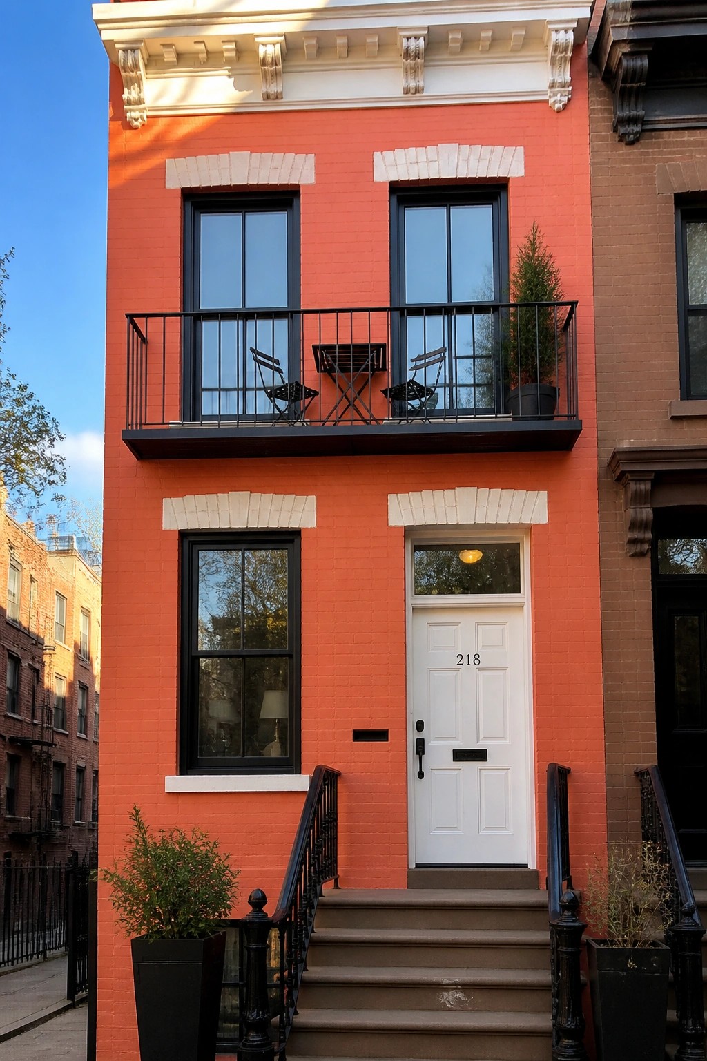
White trim and a white door give this orange brick house a sharp, clean look that stands out without extra decoration. The contrast makes the entrance easy to read and keeps the whole facade from feeling flat or heavy.
This approach works best on narrow city homes or row houses where the front is simple. Use bright white on the door and window frames, then let the brick color carry the rest of the look.
Orange Shutters Against White Walls
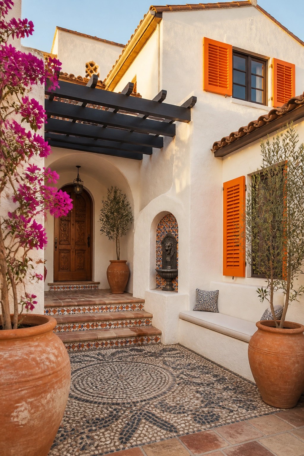
Bright orange shutters give a white stucco house real presence. The color stands out sharply without any extra trim or decoration, and it works especially well when the rest of the exterior stays simple.
This look fits homes with a Mediterranean or Spanish style. Use it on the main windows and keep other accents minimal so the orange stays the main feature. Make sure the shade is vivid enough to read clearly from the street.
High-Contrast Trim On Bright Orange Homes
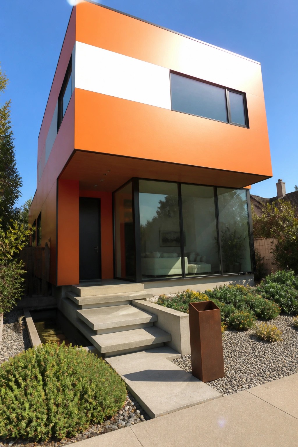
Bright orange works best when it has something to push against. The white horizontal band across the middle and the dark frames around every window keep the color from looking flat or too heavy. That simple contrast gives the whole front a clean, modern shape without needing extra decoration.
This approach suits boxy contemporary homes where the goal is to make the color the main feature. Use the white band to break up large wall areas and let the dark trim define the windows and doors. It keeps the look sharp even on sunny days when the orange might otherwise wash out.
Bright Orange Trim Against White Siding
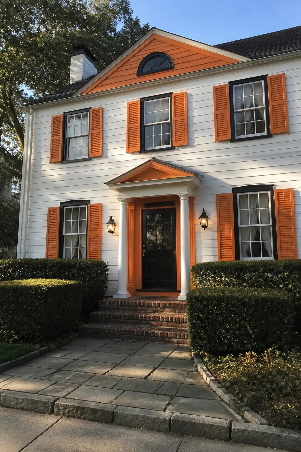
Bright orange trim and shutters give a white house a sharp, clean look that still feels classic. The color choice stands out without overpowering the simple lines of the facade.
This approach suits older or traditional homes where you want the windows and entry to read clearly from the street. Keep the main door and window frames dark so the orange does not compete too much with other details.
High Contrast Trim Makes Orange Siding Stand Out
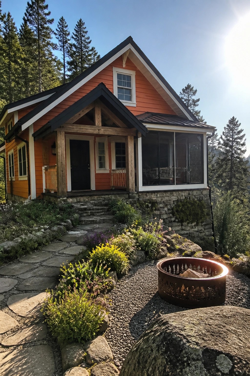
Bright orange houses can look too bold on their own, but adding white trim around the windows, eaves, and doors changes that. The white creates clear lines that keep the color from feeling flat or overwhelming. Darker accents on the roof and porch posts add another layer that helps the orange read as warm rather than loud.
This approach works best on smaller homes or cottages with straightforward shapes. Keep the trim crisp and fairly wide so it frames the siding without competing with it. Too much extra detail on the facade can weaken the effect.
Bright Orange Siding Works Best With White Trim
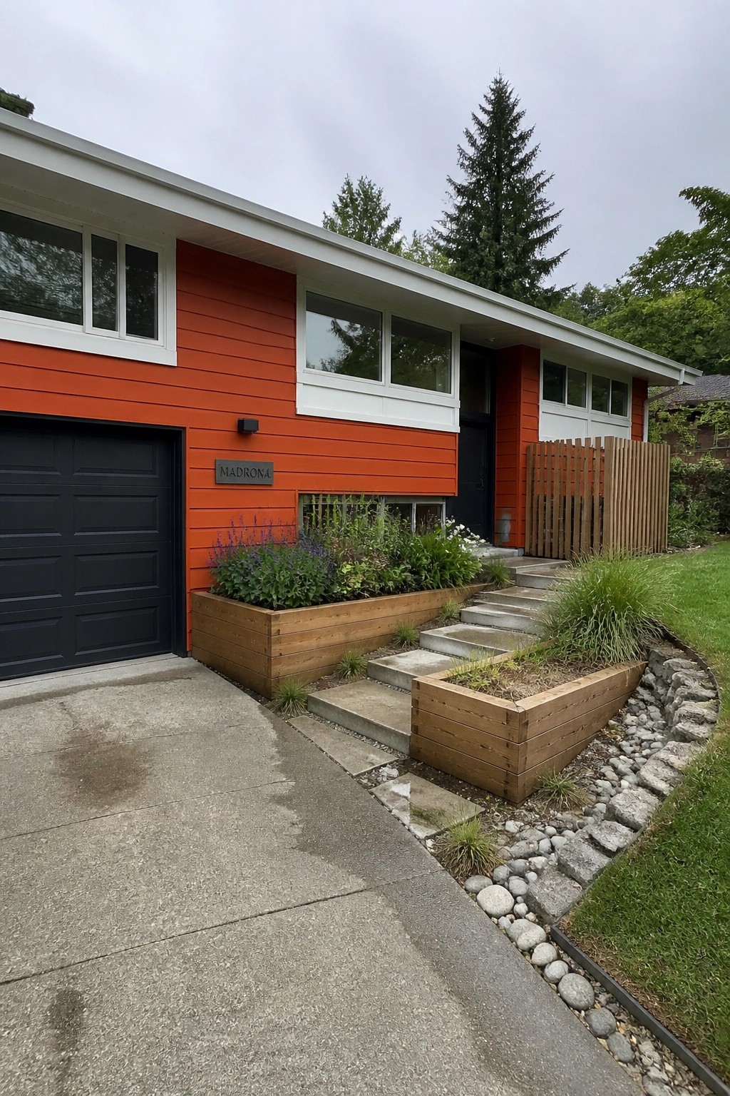
Bright orange siding stands out more when you keep the trim clean and white. The sharp edges around the windows and roofline give the color room to breathe without looking heavy. A dark door or garage door adds another layer of contrast that keeps the whole front from feeling flat.
This approach suits mid-century or modern homes that already have simple lines. It works especially well on houses with multiple window sizes, since the white frames tie everything together. Just make sure the orange is a true saturated shade rather than a muted one, or the contrast will fall flat.
High-Contrast Trim Brings Out Orange And White
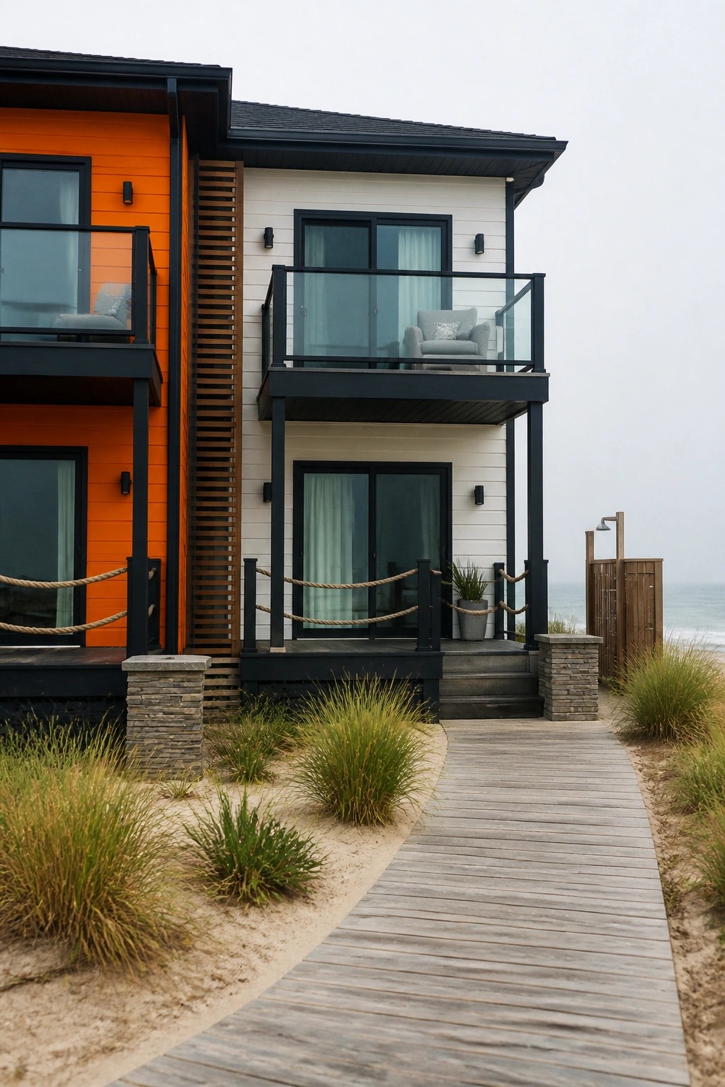
Black trim works especially well with bright orange siding because it gives the color something sharp to push against. The white sections stay calm next to it, so the orange does not feel too heavy or too loud on the front of the house.
This look suits homes with clean lines and flat surfaces. Keep the dark trim on windows, railings, and posts so the contrast stays consistent instead of breaking up across different finishes.
Bright Orange Trim on White Siding
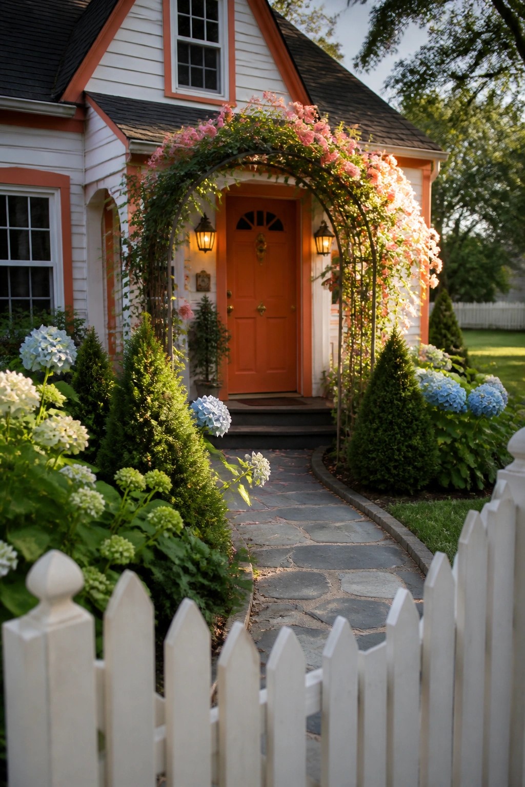
Orange trim stands out clearly against white siding and makes the whole front feel more defined. The color choice draws attention to the door and window frames without needing extra details or patterns.
This approach works well on smaller homes or cottages where you want the entry to read first. Keep the orange limited to trim, doors, and a few accents so it stays sharp rather than overwhelming the rest of the facade.
Dark Trim Sharpens Orange Exteriors
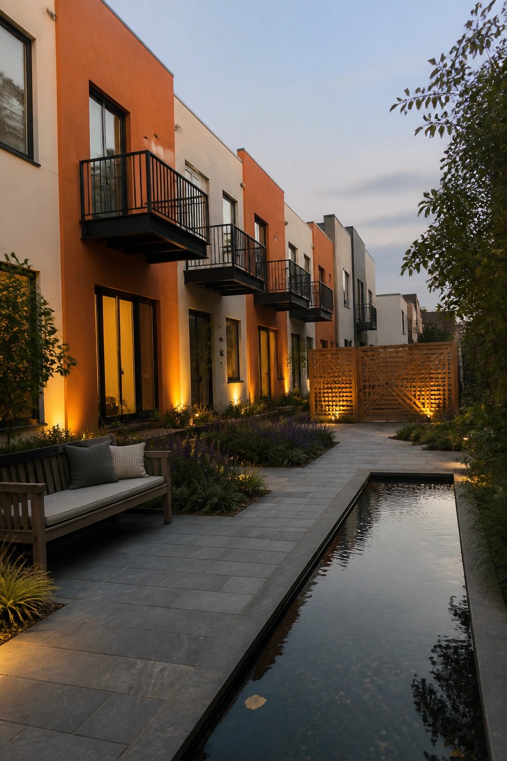
Bright orange siding stands out more when it meets black trim around windows, doors, and balconies. The dark frames give the color clear edges and stop it from looking flat against lighter walls. This approach works especially well on modern townhomes where the goal is clean lines rather than soft blending.
Use it on homes with simple shapes and few details. Keep the rest of the palette limited to white or light gray so the orange and black stay the focus. Avoid adding too many other colors or the contrast loses its impact.
White Trim Against Bright Orange Siding
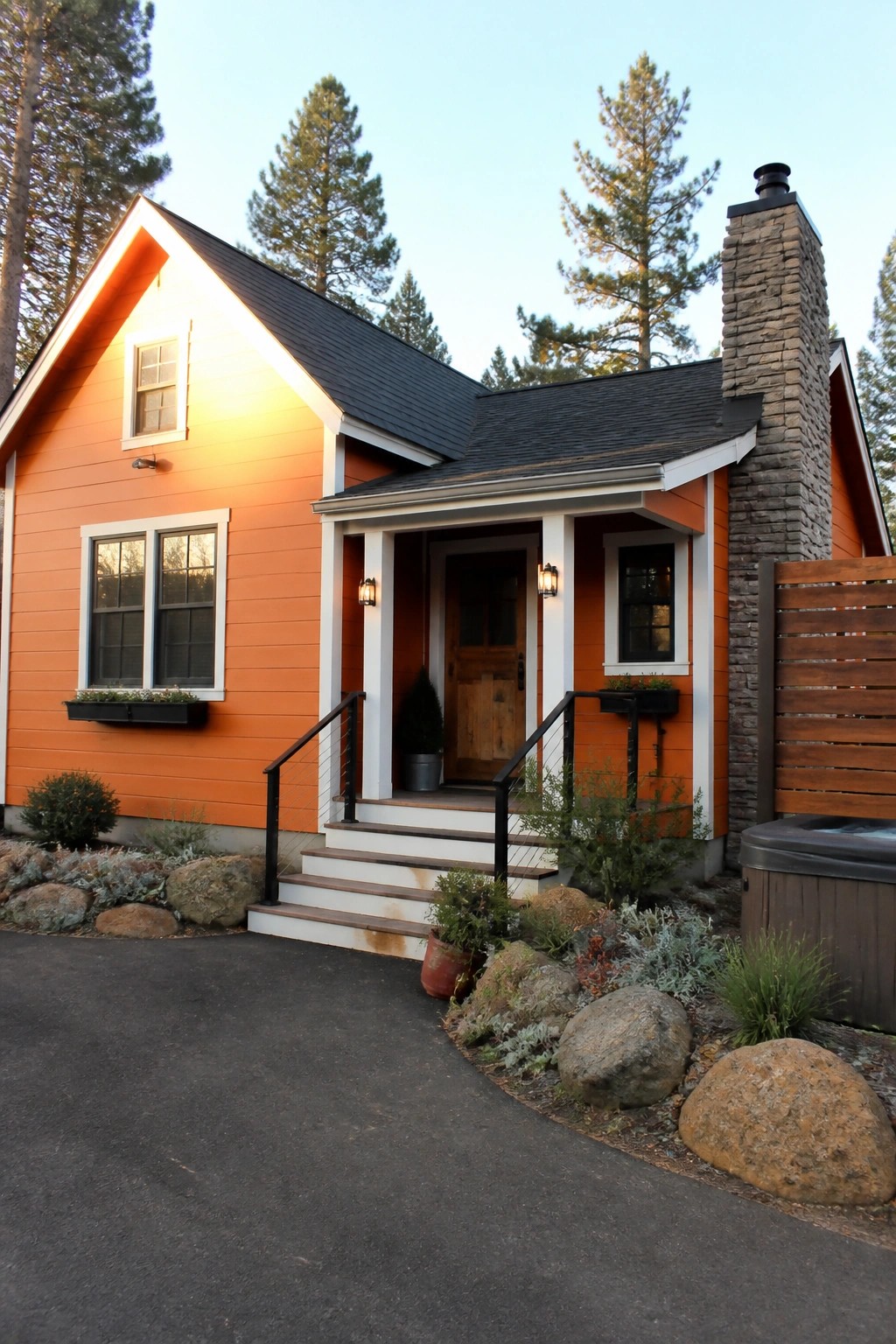
White trim gives orange siding a sharper, cleaner look. The contrast makes the color feel more deliberate instead of overwhelming, and it helps the house read as a whole rather than just a block of bright paint.
This approach works best on smaller homes or those with simple rooflines. Use a true white on the trim and keep the number of accent materials low so the contrast stays strong.
High-Contrast Trim On Orange Siding
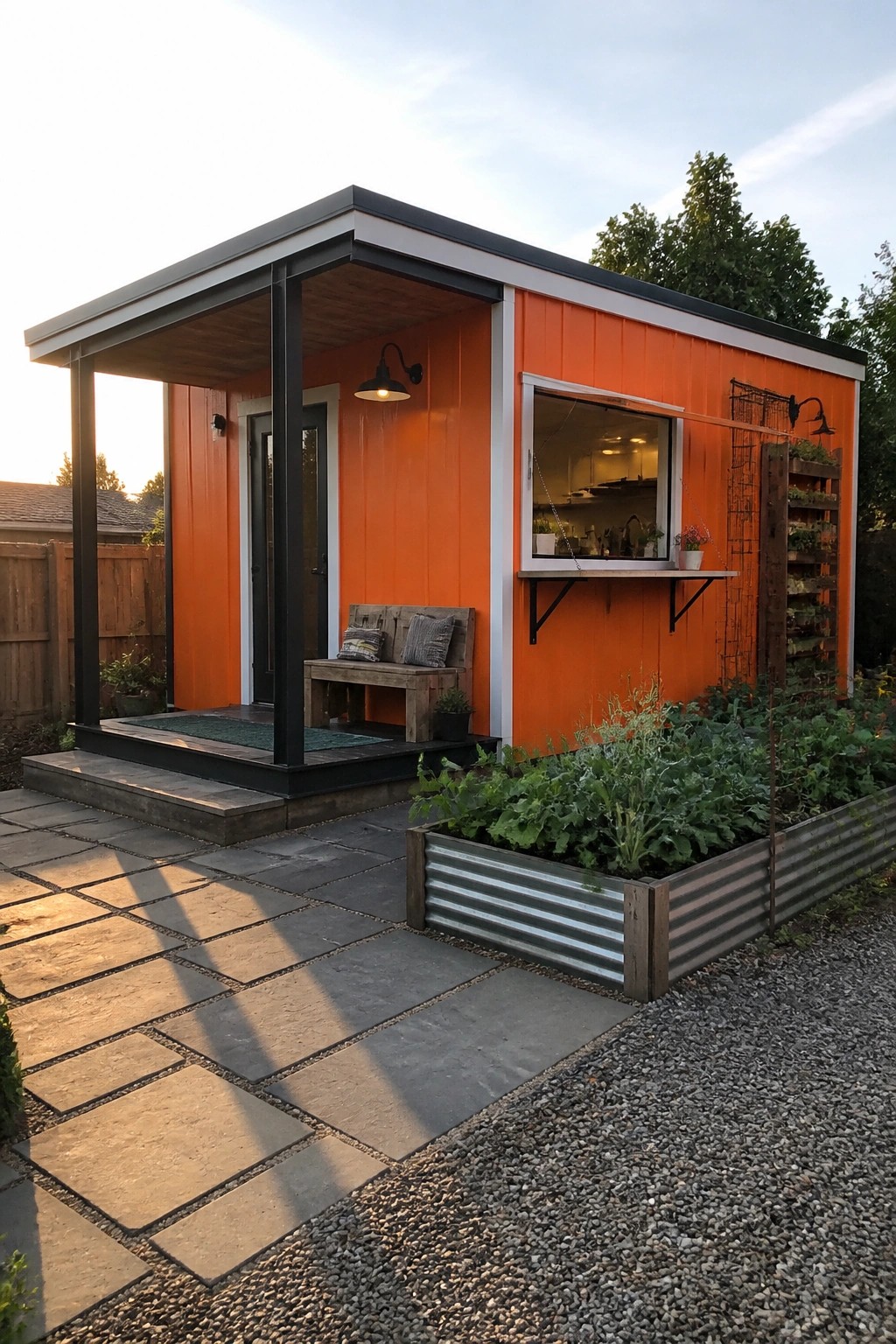
One way to make bright orange siding feel more intentional is to frame it with strong black and white trim. The dark trim around doors and windows, plus the white roofline detail, gives the color clear edges and keeps it from looking washed out in daylight.
This works best on smaller buildings or backyard structures where you want the color to read as a deliberate choice rather than an afterthought. Stick with simple trim colors and let the orange carry the look.
Bold Trim Color Emphasizes The Architecture
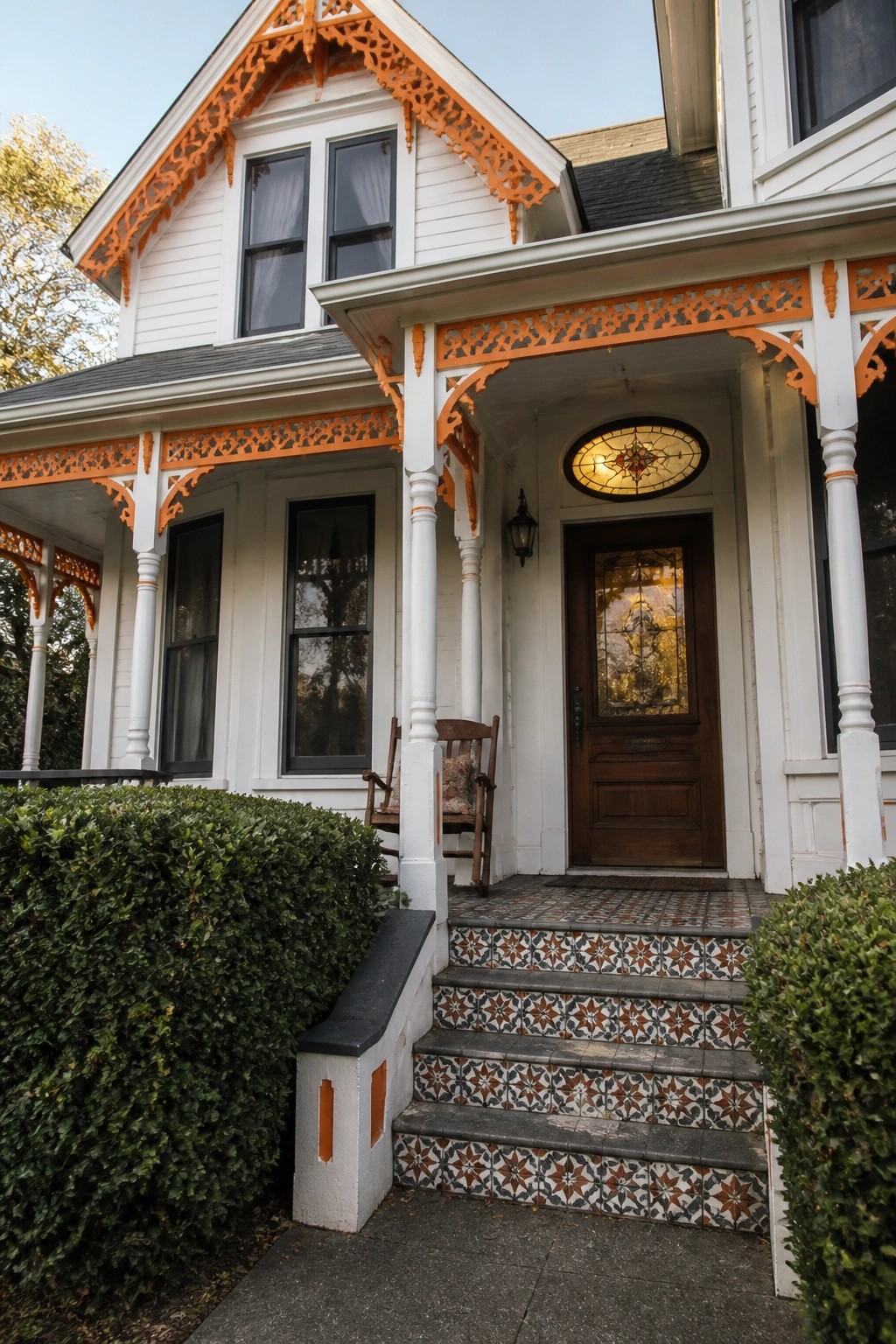
Painting the trim a bright contrasting color is one of the simplest ways to make the details on an older house read clearly. The orange here picks up every scroll and cutout along the eaves and porch without adding any new pieces.
This approach suits homes that already have plenty of trim to show off. Keep the siding light and limit the accent color to the trim only so the contrast stays clean and the whole facade does not feel busy.
Black Trim Makes Orange Siding Stand Out
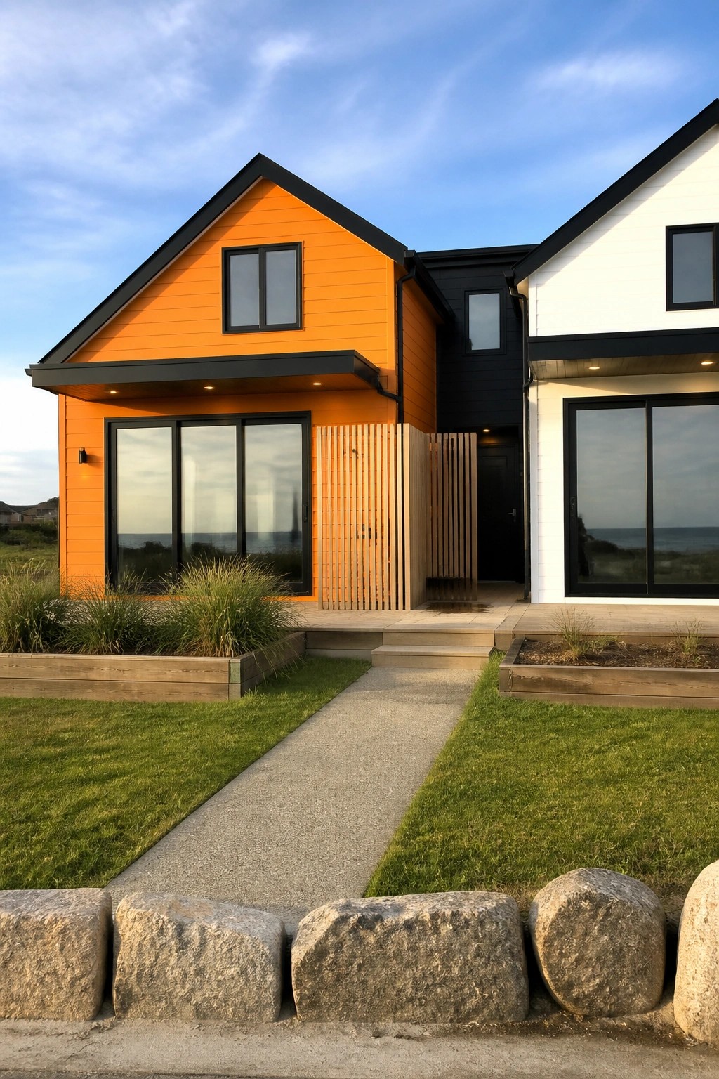
Bright orange siding needs clear edges to keep from looking flat or washed out. Black trim around the windows and rooflines does that job well, giving the color shape and making the whole front feel more structured.
This works best on homes with simple shapes and bigger windows. Keep the rest of the palette limited so the orange stays the focus without competing with too many other tones.
Bright Orange Accents With Black Trim
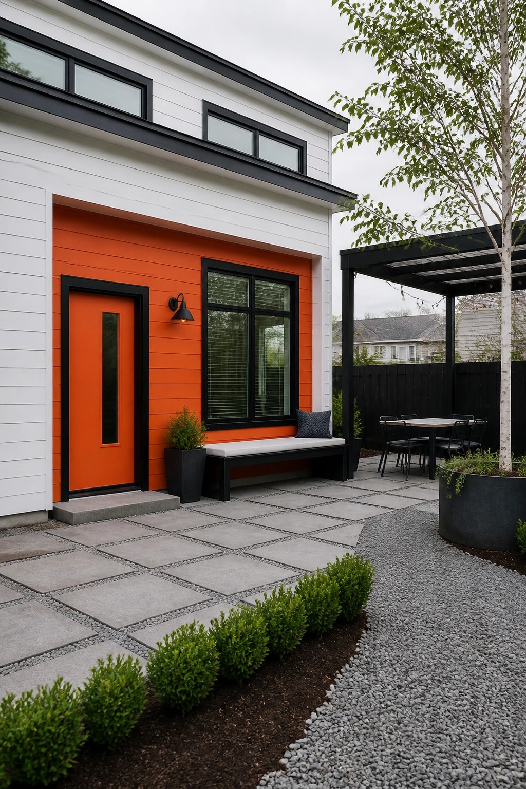
A bright orange accent works well when it is limited to one section of the house and framed by black trim. The color stands out cleanly against white siding without taking over the whole exterior, and the black frames keep the look sharp rather than busy.
This approach suits simple modern homes that need a single strong focal point near the entry. Keep the orange area fairly contained so it reads as an accent rather than the main color, and match the trim color on windows and doors for consistency.
Black Trim On Bright Orange Siding
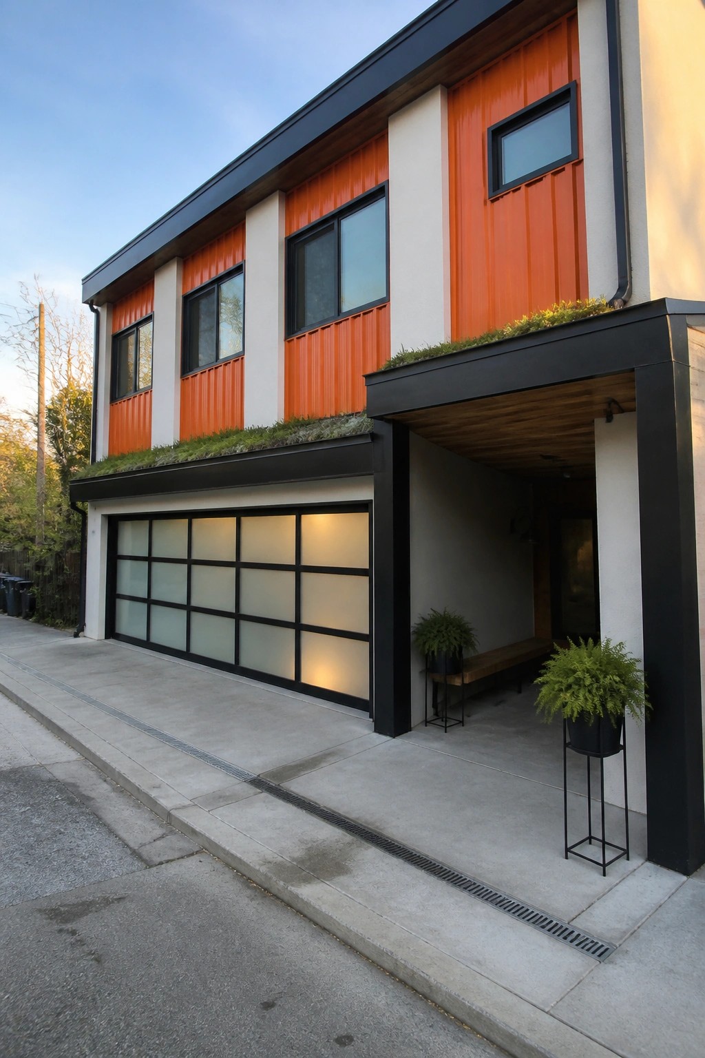
Bright orange siding can feel too bold on its own, but black trim changes that. The dark frames around windows and doors give the color something to push against, so the orange reads as intentional rather than loud. White sections between the orange panels keep the whole look from getting heavy.
This approach works best on modern or simple house shapes where the siding is the main feature. Keep the trim consistent in width and color, and use it around every opening and along rooflines. That single choice keeps the orange from looking flat while still letting the color do the work.
White Trim Creates Strong Contrast on Orange Siding
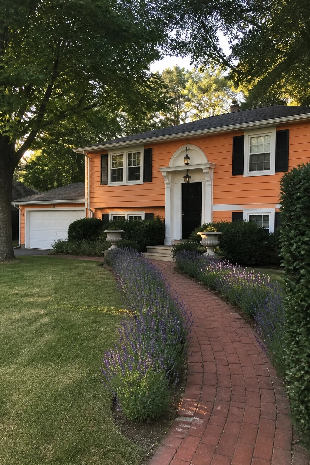
Bright orange siding stands out more when it is paired with crisp white trim around windows, doors, and the entry. The clean edges keep the color from feeling too bold or flat and give the house a finished look that reads as intentional rather than loud.
This works best on traditional two-story homes with simple rooflines. Keep the trim a true white and maintain it so the contrast stays sharp over time.
Orange Walls With White Trim On The Porch
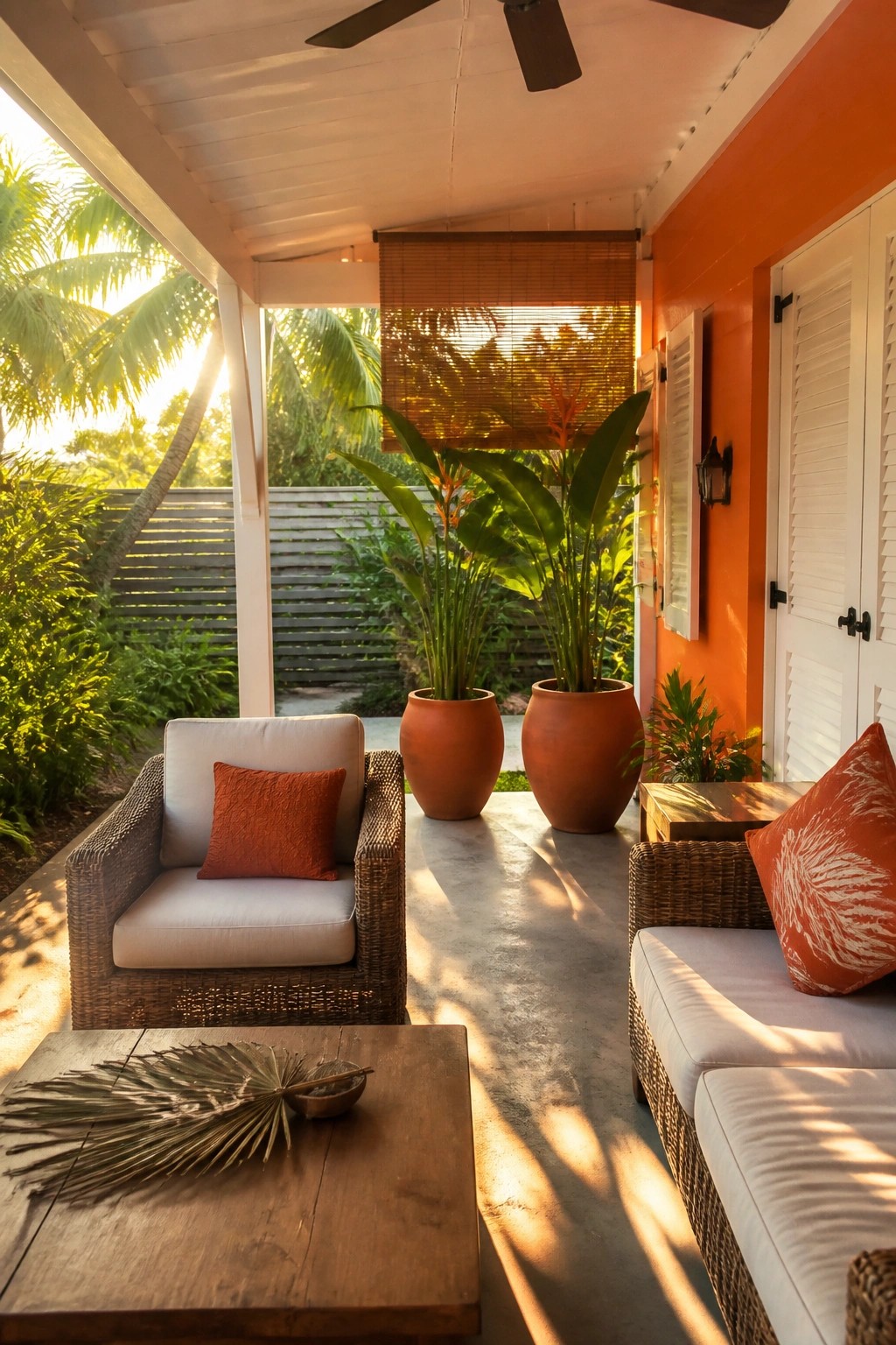
Bright orange walls paired with white trim give a porch a clean, lively look that stands out. The white doors and shutters break up the bold color so it does not feel heavy, and the contrast helps the space read as part of the main house rather than an afterthought.
This color move works best on homes that already have strong sunlight and simple architecture. Use it where the porch gets some shade during the day, and keep other elements like furniture and pots in neutral tones so the trim stays the main point of interest.
High Contrast Trim Defines Color Blocks
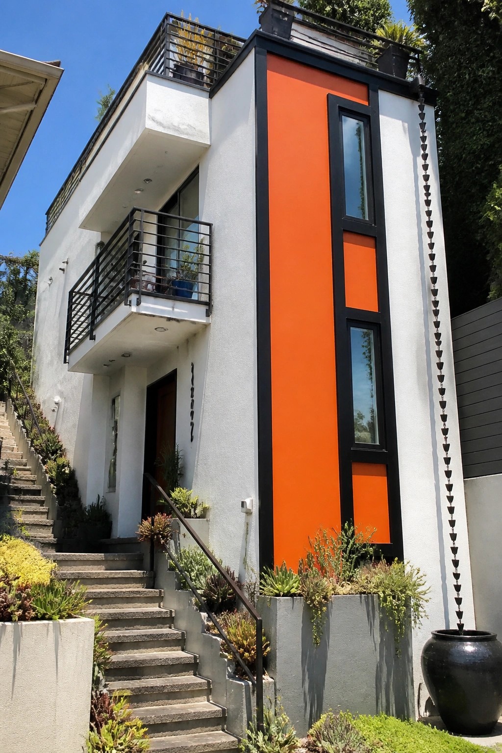
Black trim gives orange a clean edge against white walls so the color feels intentional instead of loud. The vertical panels stay sharp and the whole front reads as modern instead of busy.
This works best on houses with flat or simple wall sections where you can run the trim around whole color areas. Keep the rest of the exterior quiet so the contrast does the work without extra patterns or details competing.
Orange Bay Windows With Black Trim
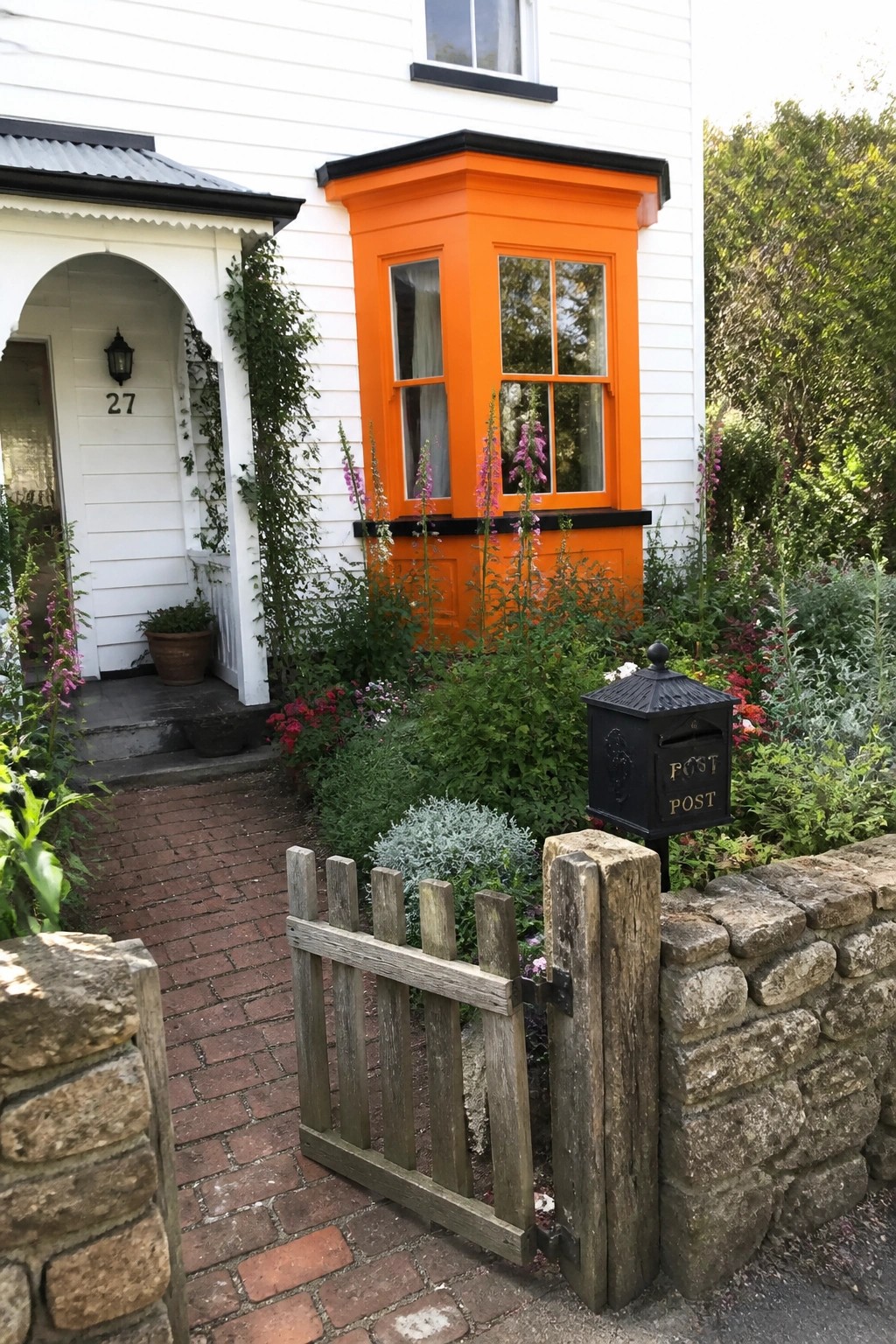
Painting a bay window bright orange and pairing it with black trim gives a white house a clear focal point. The strong contrast draws the eye straight to the window and makes the whole front feel more lively without extra ornament.
This works best on smaller or traditional homes where one bold color block can stand out against the white siding. Use it on a single prominent window rather than spreading the orange across too many surfaces, and keep the rest of the trim dark so the color stays balanced.
Frequently Asked Questions
Q: How do I pick an orange shade that still looks good after a few seasons outside? A: Grab sample pots and paint them on boards you can move around the yard. Watch how the color shifts from morning light to late afternoon. Choose the one that stays vibrant without turning muddy.
Q: Does the trim need special prep before I paint it white against the orange? A: Scrape off loose bits and wash the surfaces clean first. A solid primer keeps the white from yellowing over time. Then roll on two coats for that sharp contrast.
Q: What happens if I only repaint the trim and leave the orange walls alone? A: The fresh white will still pull the whole look together without a full redo. Focus on edges and corners where old trim shows wear. This keeps the high contrast the article highlights.
