

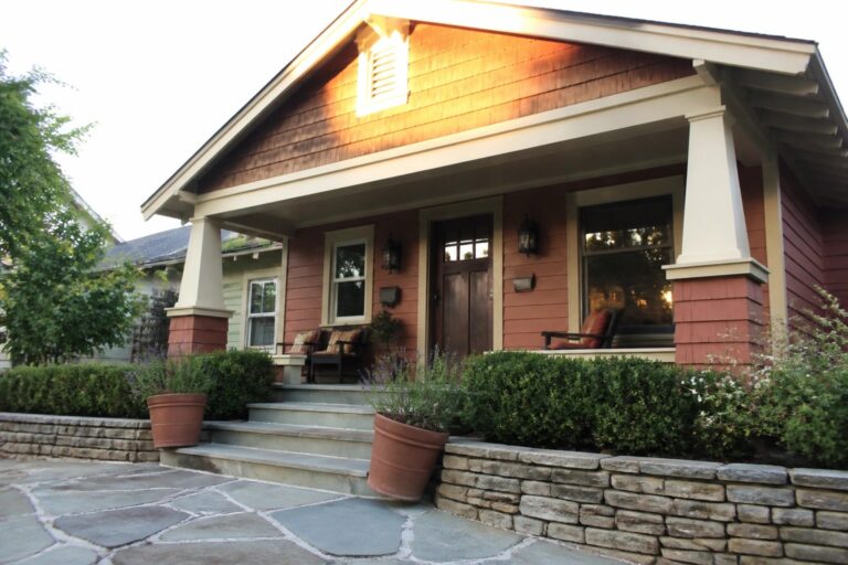
I often find that the right exterior colors can change how a whole street feels when you walk down it.
Burnt orange with cream trim tends to highlight the rooflines and entry points without overpowering the rest of the materials on the facade.
It works more often than I expect.
When I look at homes using this pairing, the cream edges keep the orange from looking too bold against things like stone or wood siding.
I wonder which of these approaches would hold up best once the light shifts throughout the day and the seasons change.
Pairing Burnt Orange Siding With Cream Trim
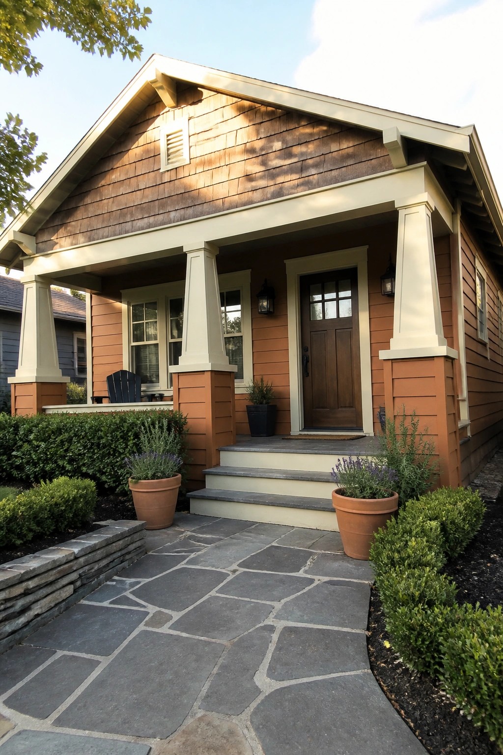
This color pairing gives a house a warm look that still feels balanced. The cream trim lightens the orange and helps the architectural details stand out without competing.
It works especially well on smaller homes or bungalows with straightforward lines. Keep the roof and foundation tones neutral so the siding and trim stay the main focus.
Cream Trim Highlights The Structure
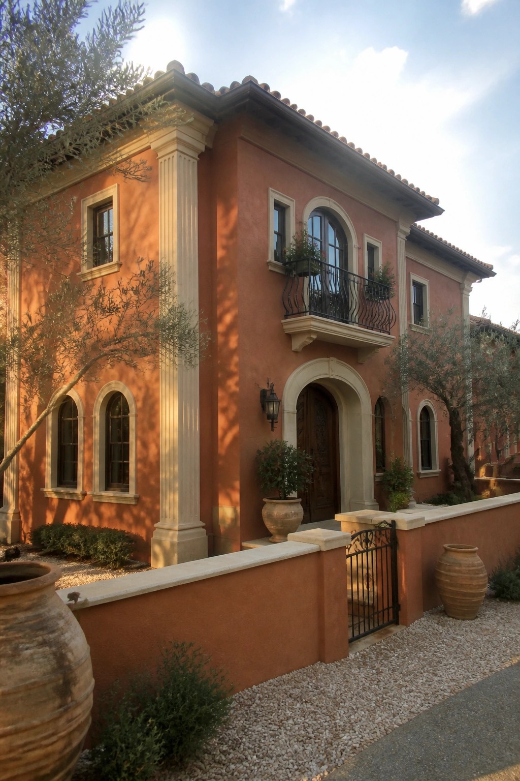
Cream trim works well against burnt orange walls because it makes the main shapes of the house easier to see. The light color on the columns and around the windows gives the eye clear lines to follow without fighting the warm tone of the stucco.
This approach suits homes that already have arches, columns, or simple rectangular forms. It keeps the exterior looking balanced and helps the color choice feel intentional rather than heavy.
Cream Trim That Defines the Burnt Orange Shape
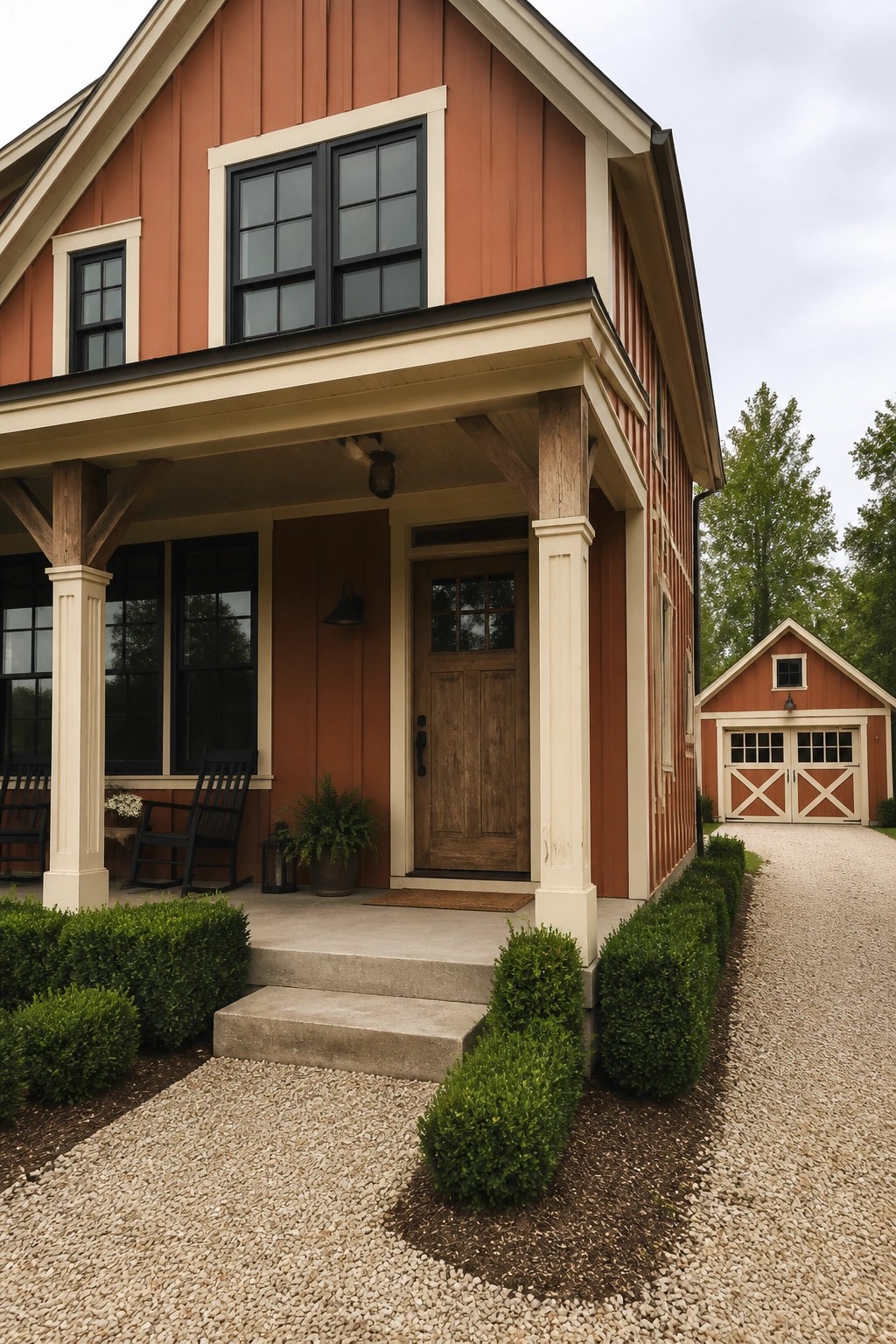
Cream trim around the roofline, windows, and porch posts gives the burnt orange siding a clean edge that keeps the color from overwhelming the house. The light accents make the gables and corners read more clearly, which helps the whole front feel balanced rather than heavy.
This approach suits homes with simple rooflines and a front porch. It works best when the trim color stays consistent on columns and window frames so the contrast stays sharp instead of scattered.
Burnt Orange Siding With Cream Trim
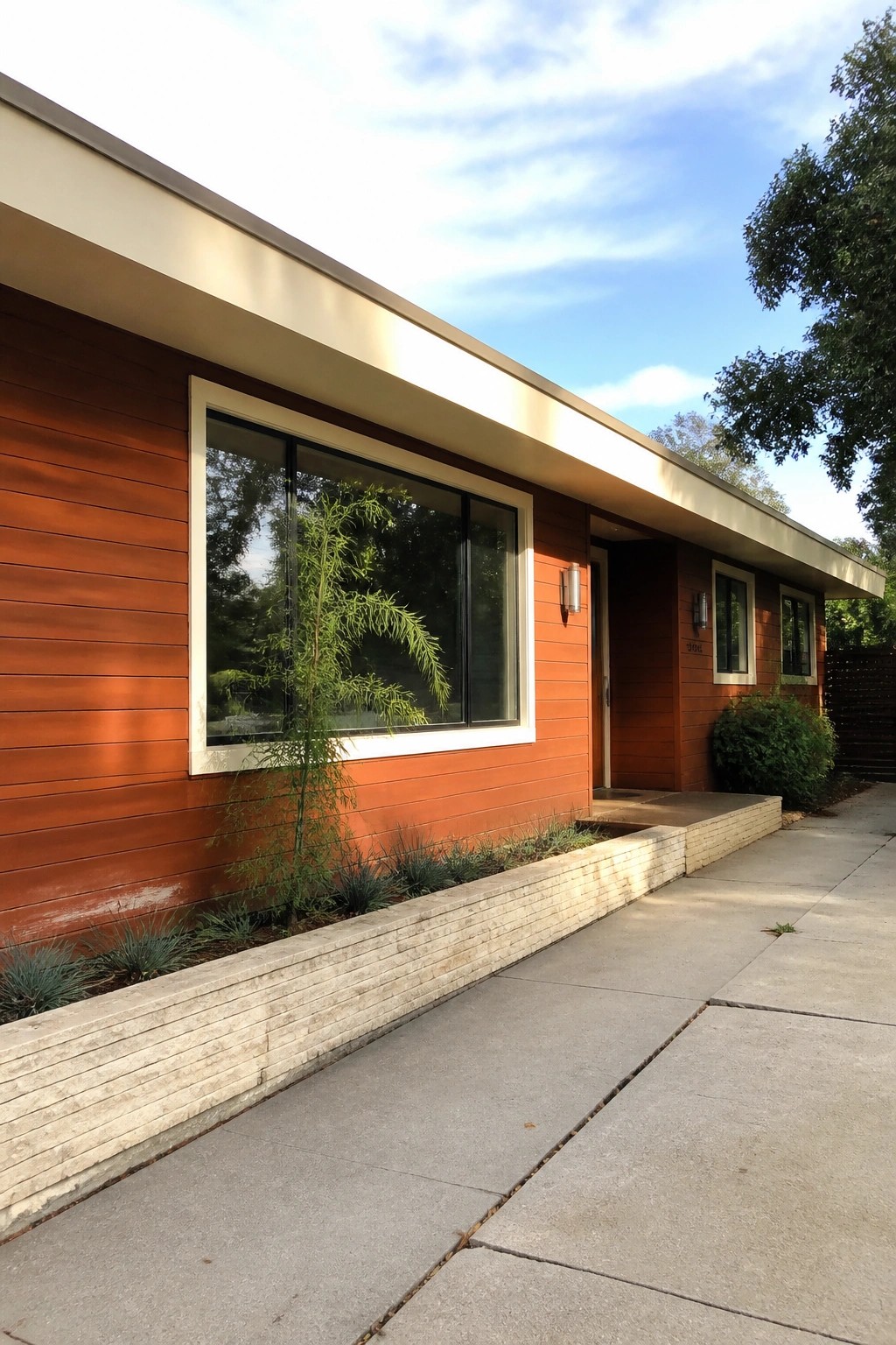
This color choice stands out because the cream trim gives the burnt orange siding a clear edge without making it feel too heavy. The white window frames and the light overhang break up the bold wall color and keep the whole front from looking flat. Horizontal siding helps too since the lines add some texture that works well with the strong tone.
It suits midcentury or modern homes that already have simple shapes and wide windows. Keep the trim bright and the siding in a matte finish so the orange stays warm instead of glaring. Avoid using too many other colors nearby or the contrast loses its effect.
Cream Trim With Burnt Orange Brick
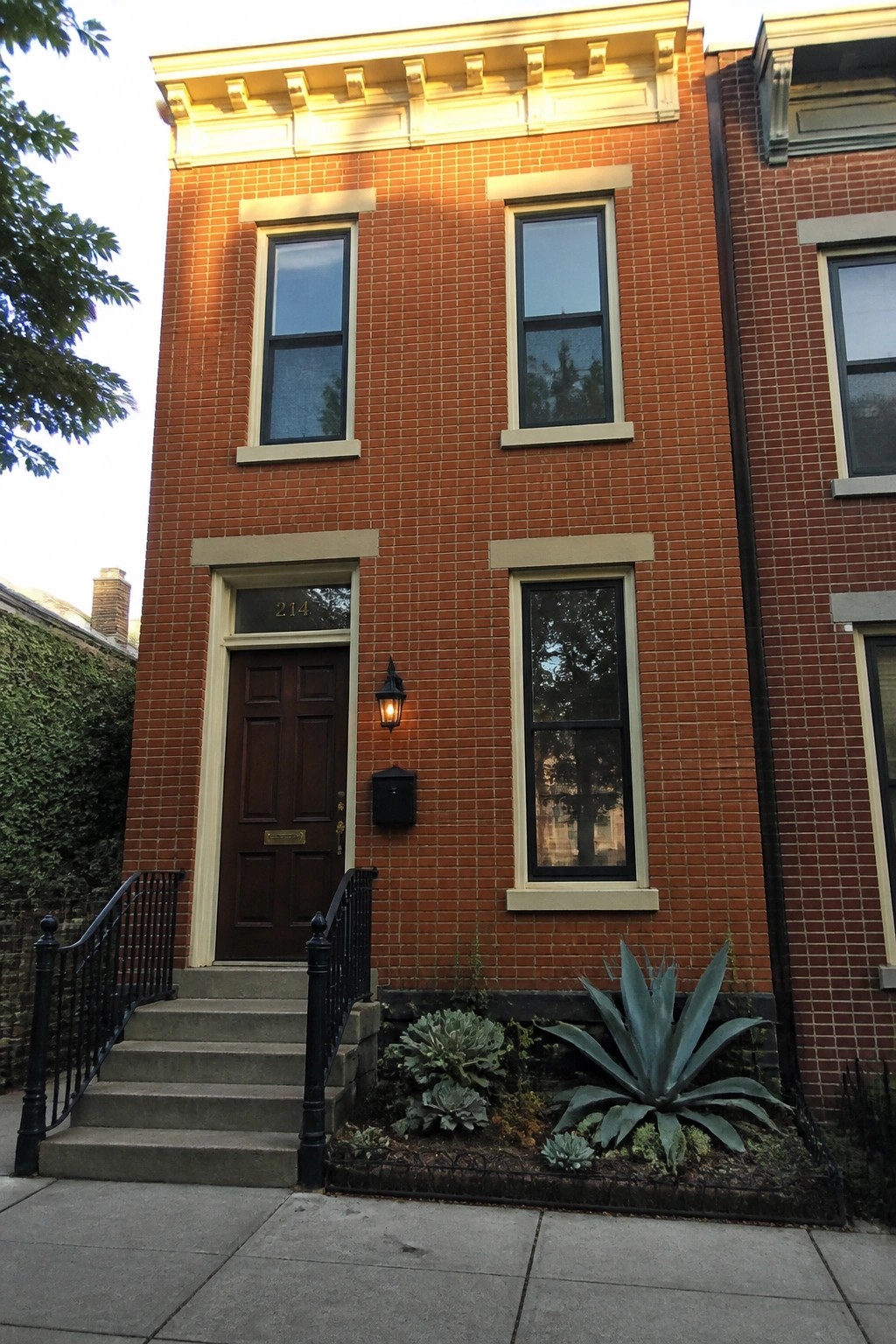
Cream trim around the windows and door gives this brick facade a sharper, more finished look. The light color breaks up the solid wall of warm brick and helps the openings feel more intentional.
This works especially well on row houses or narrow lots where you want the front to read as orderly rather than heavy. Keep the trim in a soft off-white so it sits comfortably with the brick instead of fighting it.
Using Cream Trim To Accent Burnt Orange Siding
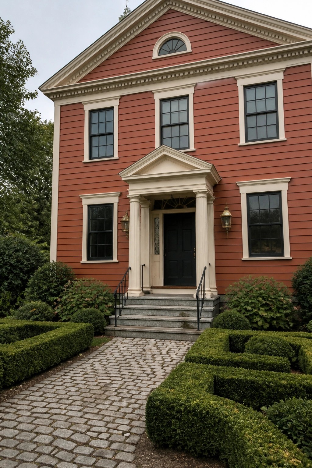
Cream trim gives burnt orange siding a sharper, more finished look. The light color outlines the windows and gable edges so the stronger shade does not feel heavy or flat.
This works best on homes with straightforward shapes and clear rooflines. Keep the trim fairly wide around openings, and match it to any columns or cornices so the whole front stays balanced.
Burnt Orange Siding With Cream Trim
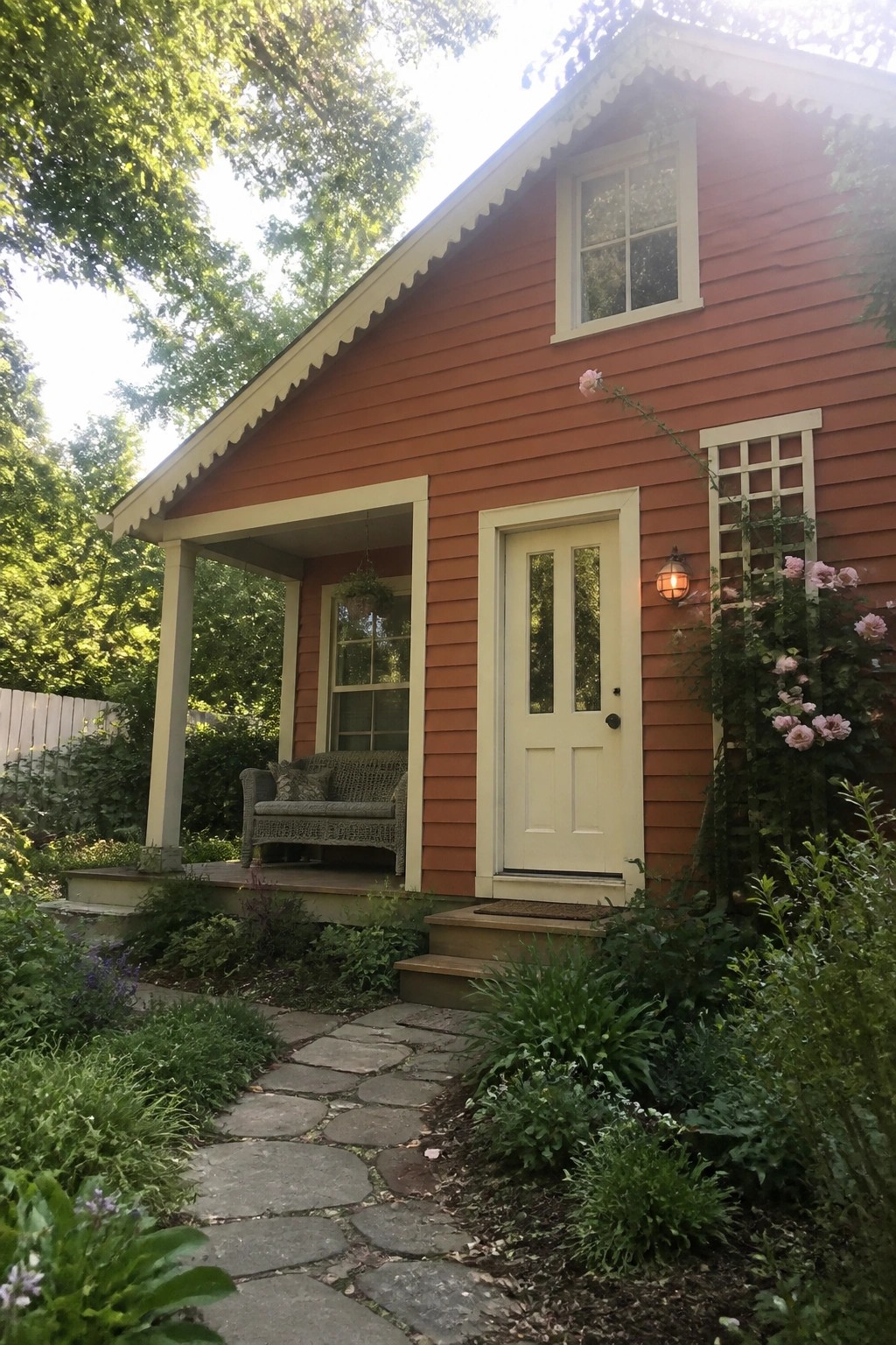
Burnt orange siding stands out more when the trim stays light. Cream around the windows, door, and porch edges keeps the color from looking heavy and gives the house a cleaner shape.
This works best on smaller or simple homes where the roofline is not too busy. Use the same cream on the door and porch posts to tie everything together without adding extra colors.
Burnt Orange Walls with Cream Trim
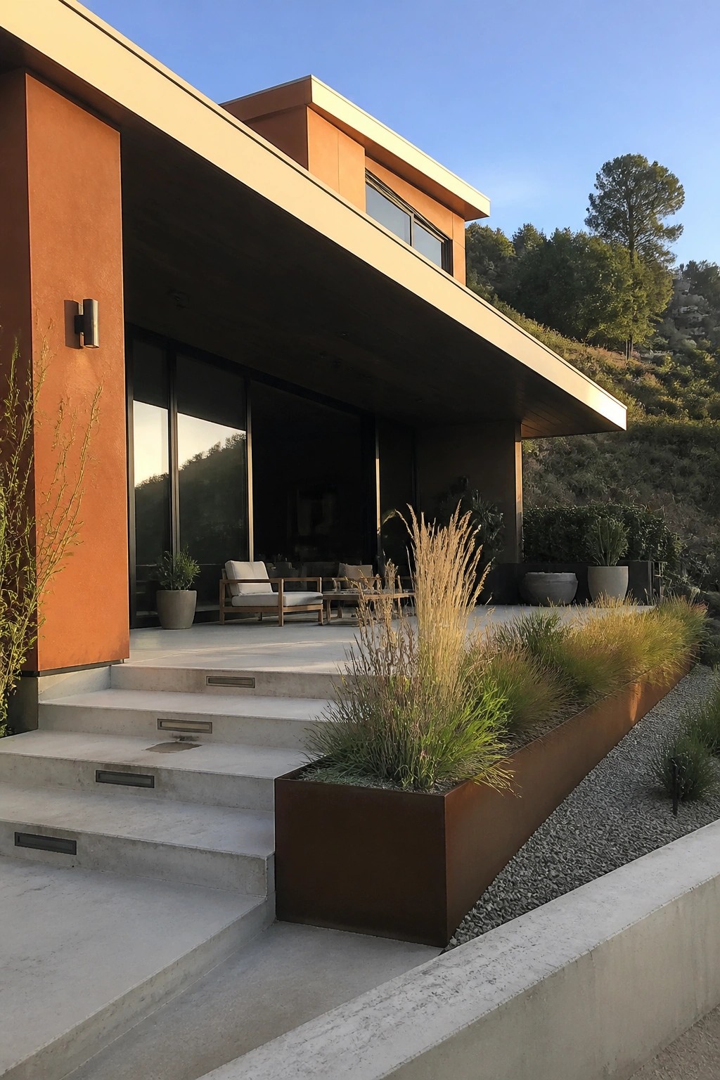
Burnt orange works well on a house exterior when it is paired with a lighter trim color. The cream tone on the overhangs and edges keeps the bold color from feeling too heavy and gives the facade a cleaner shape.
This approach suits modern homes in warm climates where you want the main walls to stand out without extra decoration. Keep the trim simple and let the color contrast carry the look.
Burnt Orange Siding and Cream Trim
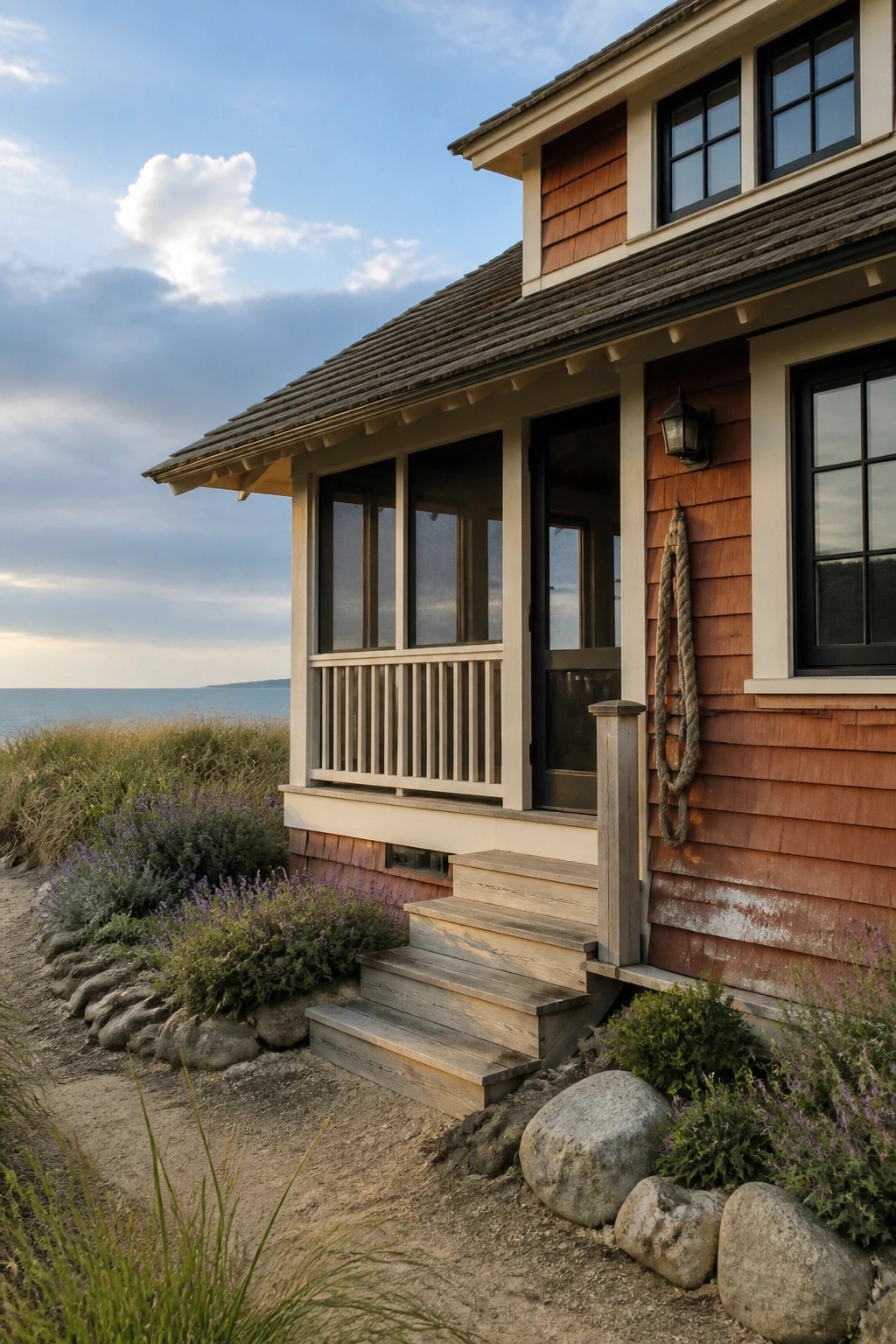
Burnt orange shingles give a house real presence without feeling loud, especially when the trim stays light and simple. The cream color softens the edges and helps the house feel a bit more open even on a smaller footprint.
This look works best on homes near water or in open landscapes where the light can play off the warm tone. Keep windows and railings straightforward so the two colors stay the focus, and expect to refresh the shingles every few years if the house gets strong sun or salt air.
Cream Trim on Arched Doorways
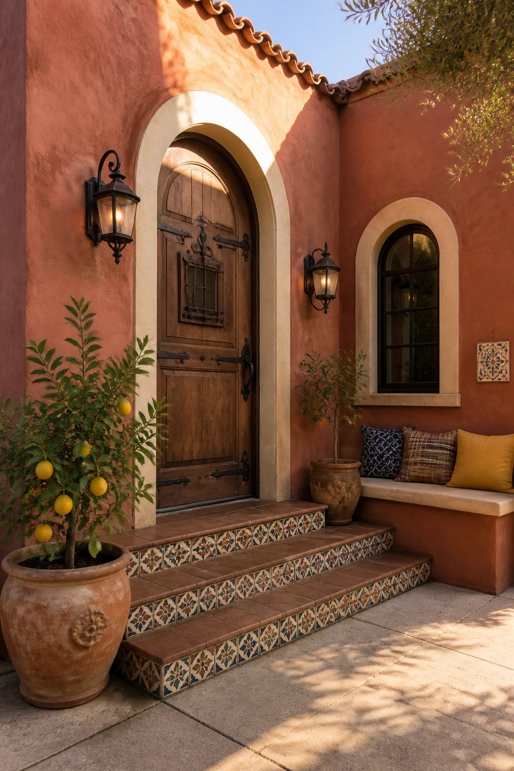
Burnt orange stucco gains a lot of character when it is paired with a wide cream arch around the front door. The light trim softens the strong wall color and gives the entry a clear focal point without needing extra decoration.
This approach works well on homes that already lean toward Mediterranean or Spanish styles. Keep the arch simple and let the color contrast do the work. It also helps the door stand out at night when the sconces are on.
Cream Trim Defines Burnt Orange Exteriors
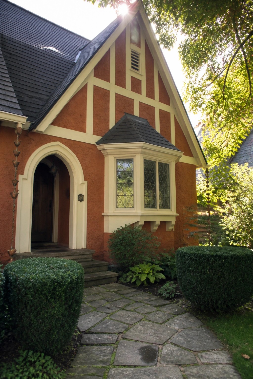
Cream trim works well with burnt orange because it keeps the color bold without letting it feel heavy. The trim outlines the gables and windows so the shape of the house stays clear even from the street.
This pairing suits homes with simple stucco or plaster walls and some architectural detail around the doors or roofline. It looks best when the trim stays fairly wide and the orange stays in the mid-tone range rather than going too dark.
Burnt Orange With Cream Trim
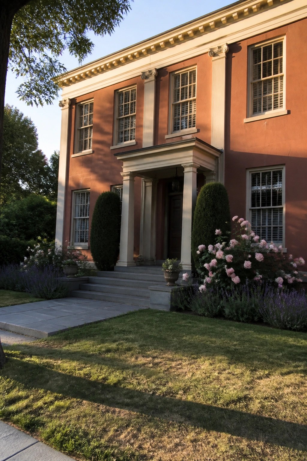
This color combination gives a house a solid, grounded look that still feels welcoming. The deep orange stands out on its own, while the cream trim keeps the whole facade from feeling heavy or flat.
It works especially well on homes with some classical details, since the lighter trim helps define windows, cornices, and columns. Stick with a muted shade of orange so the cream does not get lost in strong sunlight.
Pairing Burnt Orange Walls With Cream Trim
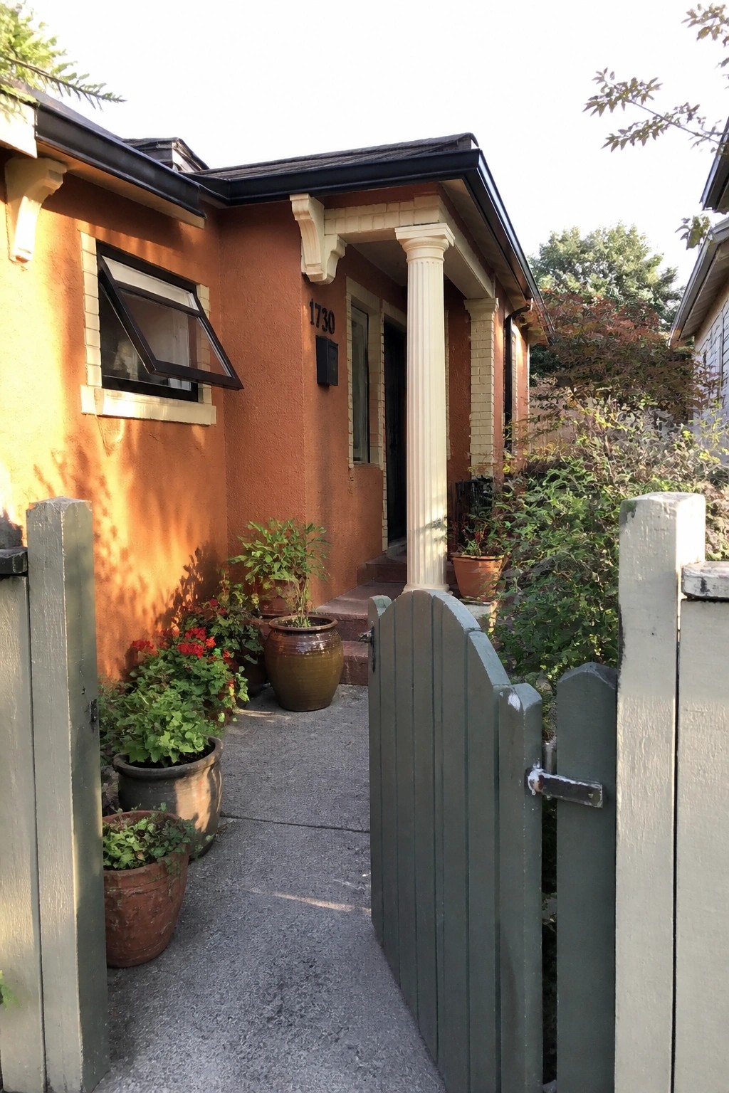
Burnt orange stucco looks stronger when the trim stays light. Cream on the window frames, columns, and eaves gives the color room to breathe and keeps the whole front from feeling flat.
This works best on smaller homes or older cottages where you want warmth without adding more detail. Use the cream only on the main architectural lines so the orange stays the focus.
Cream Trim Brings Definition to Orange Siding
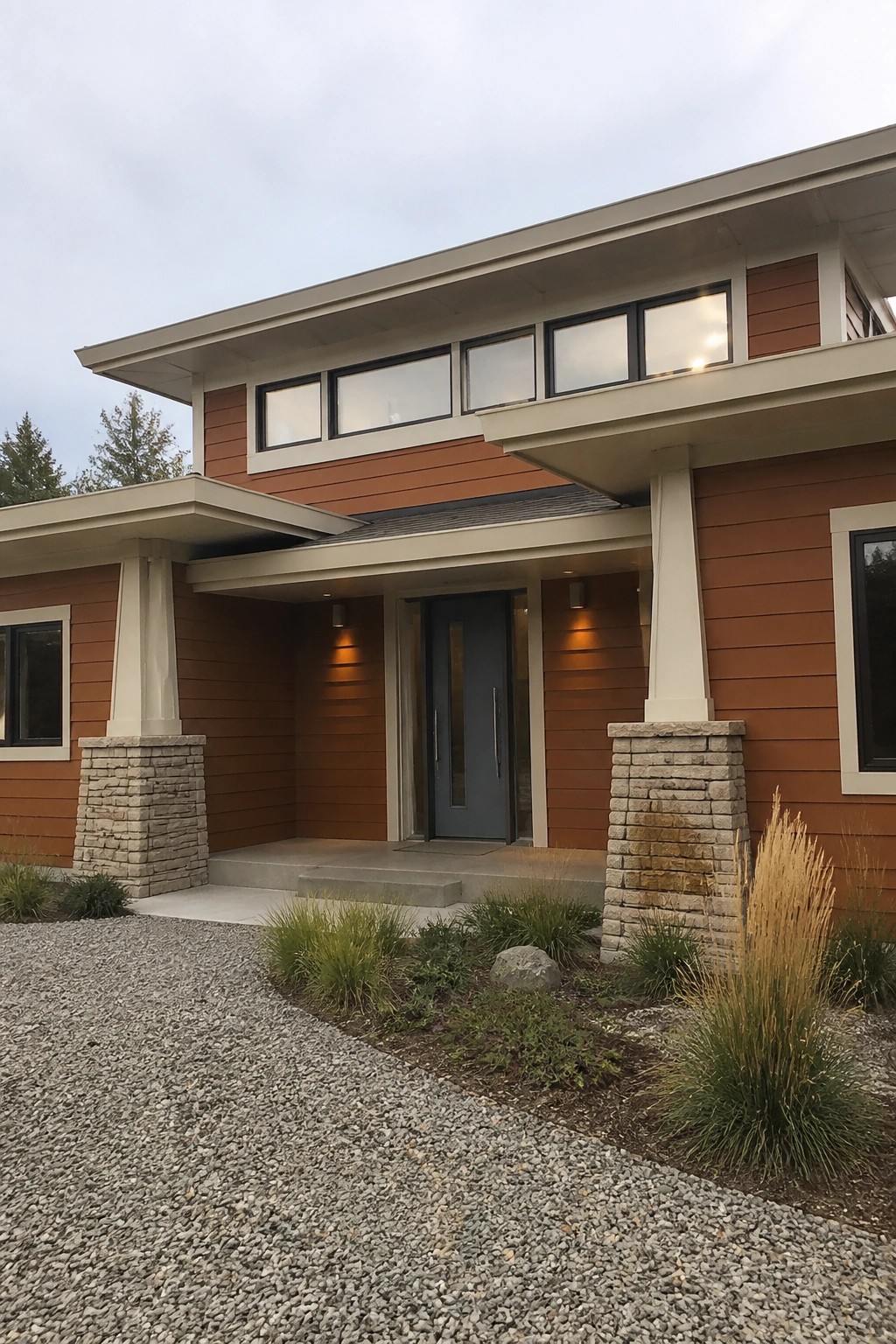
Cream trim works well with burnt orange siding because it keeps the color from feeling too heavy or flat. The light edges around the windows and roofline give the house a cleaner shape while still letting the orange stand out.
This approach suits modern homes that use horizontal siding. It helps the lines read clearly and works best when the trim color stays consistent around the main windows and overhangs. Stone bases at the base of the columns add a bit of weight so the whole look does not feel too light.
Brick Exteriors with Cream Trim
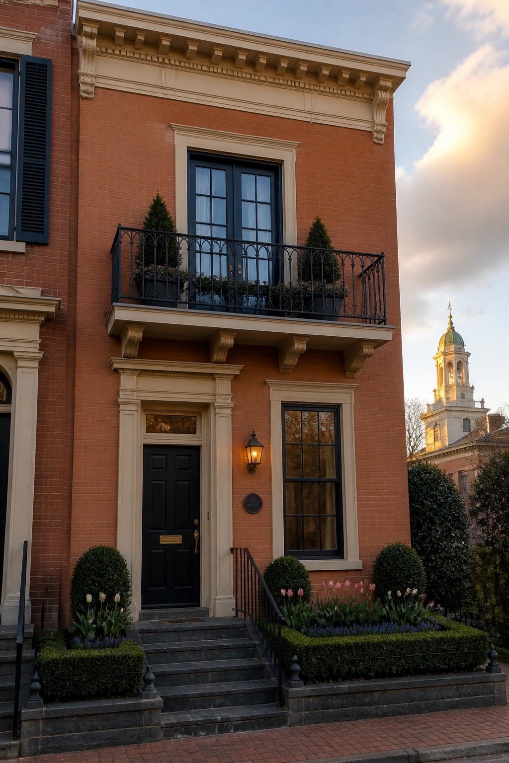
The burnt orange brick gets a cleaner, more finished look when cream trim runs around the windows, doors, and roofline. The light trim breaks up the solid color without making the house feel busy or overly fussy.
This approach works best on homes with straightforward shapes and standard window placements. Keep the trim width consistent and choose a matte finish so the brick stays the main focus. Darker doors and railings can add contrast without competing with the trim.
Burnt Orange Siding with Cream Trim
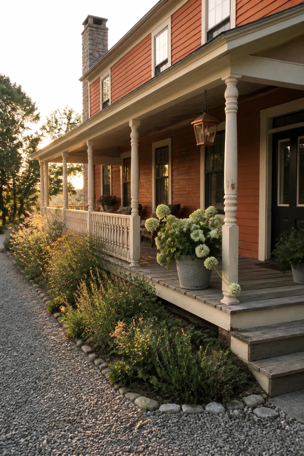
Burnt orange siding stands out more when it is framed by cream trim. The lighter color keeps the bold shade from feeling too heavy and helps the lines of the house read clearly from the street.
This approach works best on homes with porches or simple rooflines where the trim can run along eaves and posts. It suits older houses or those with a traditional shape, and the cream also pairs easily with stone or wood accents already on the property.
Burnt Orange Siding With Cream Trim
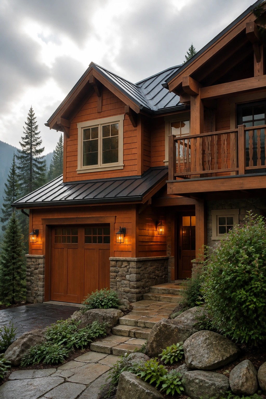
Burnt orange siding paired with cream trim gives a house a steady warmth that still feels grounded. The light trim keeps the color from feeling heavy, while the orange itself adds enough presence to stand out in a natural setting.
This combination works best on wood-sided homes with simple rooflines and some stone at the base. It suits wooded or hilly locations where you want the house to feel part of the landscape rather than competing with it.
Cream Trim Defines the Windows
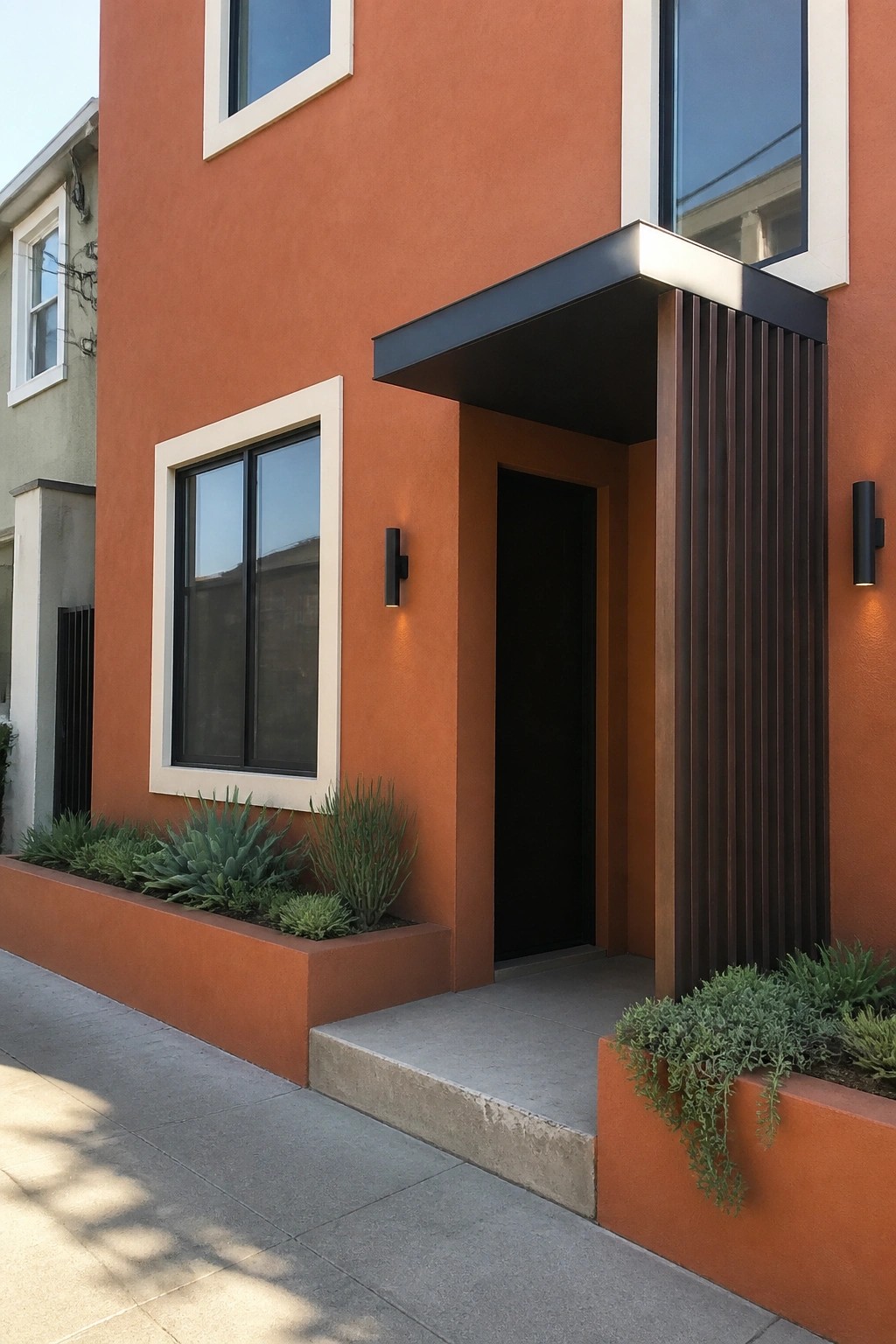
Cream trim gives burnt orange walls a clear shape and stops the color from feeling too heavy. It draws the eye to each window without needing extra decoration or bold accents elsewhere on the facade.
This approach works best on stucco or smooth plaster homes where the walls stay simple. Keep the trim width modest and match it to a dark door or metal details so the contrast stays balanced rather than busy.
Burnt Orange With Cream Trim
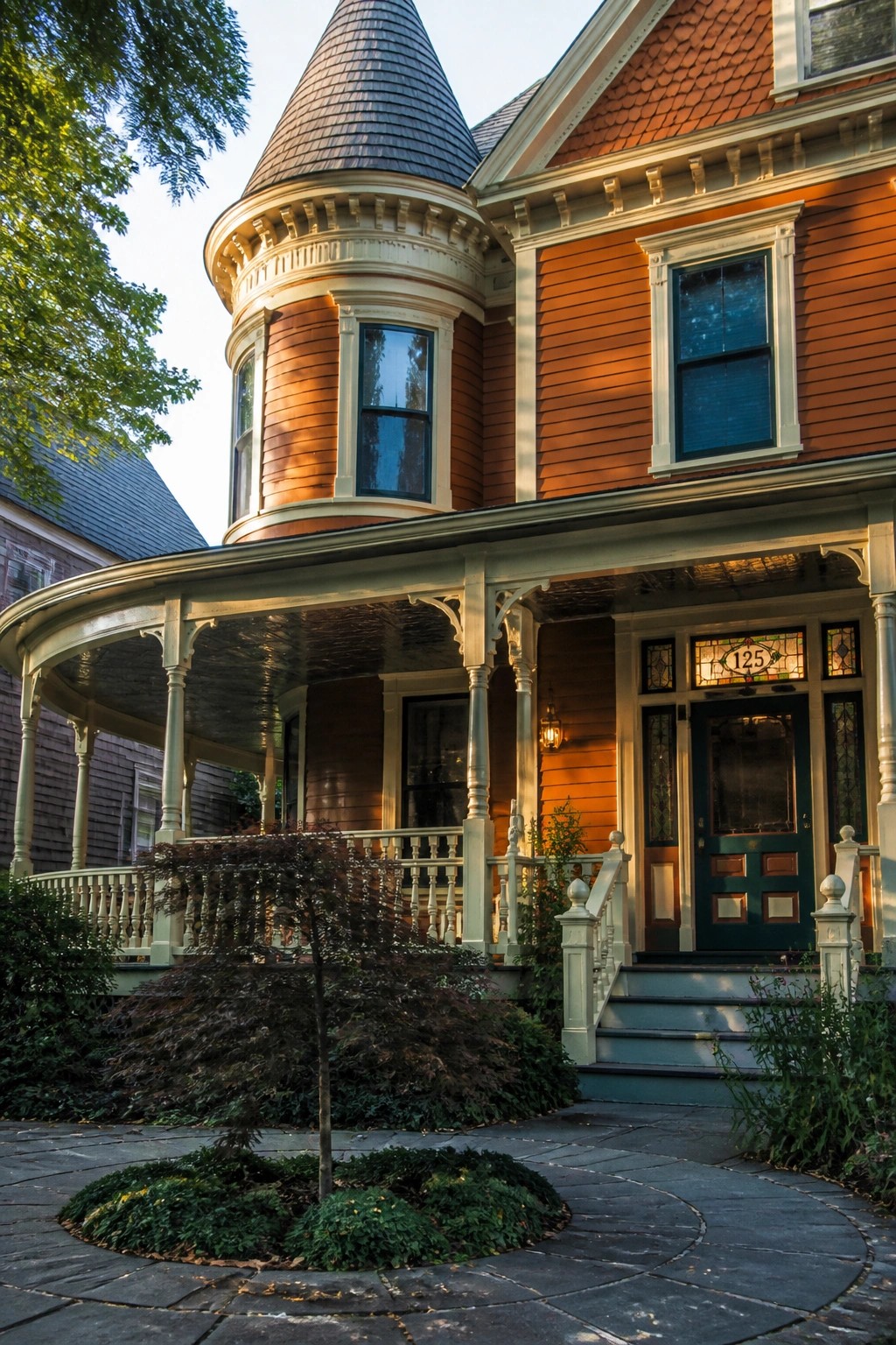
Burnt orange siding paired with cream trim gives a house real warmth while still feeling grounded. The color holds up well on homes that have rounded details or varied roof shapes, and the cream keeps the whole look from turning too heavy.
This works best on older homes or those with some architectural character already in place. Use it when you want curb appeal that reads friendly rather than stark, and keep any additional colors limited so the orange and cream stay the main story.
Frequently Asked Questions
Q: How do I choose the right burnt orange shade for my house? A: Grab several paint samples and brush them onto a board or wall section outside. Check the color at morning, noon, and dusk since light changes everything. Cream trim will balance bolder tones without extra effort.
Q: Will this color combo hold up well in rainy weather? A: Pick an exterior paint rated for moisture resistance and apply two solid coats. The burnt orange fades slower than brighter hues when sealed properly. Touch up any chips on the cream trim right away to keep the look fresh.
Q: Can I use burnt orange and cream trim if my roof is dark gray? A: Yes, that roof shade grounds the warmer walls nicely. Focus the orange on siding areas away from the roofline to prevent any heavy contrast. Test a small patch first so you see the full effect together.
