

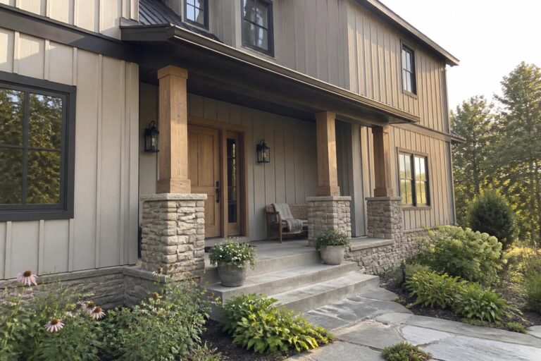
I often spend time watching how different neutral paints look on homes with stone because the stone can make some colors appear flatter than they do on their own.
When the sun hits at certain angles the undertones come out more and I have learned to account for that shift before finalizing any choice.
Testing a few options on site helps reveal which ones truly complement the stone without clashing in changing light.
Some shades I thought would work well ended up looking too stark once the whole house was painted.
It pays to observe the color at different times rather than deciding from a small swatch.
Warm Beige Siding Beside Natural Stone
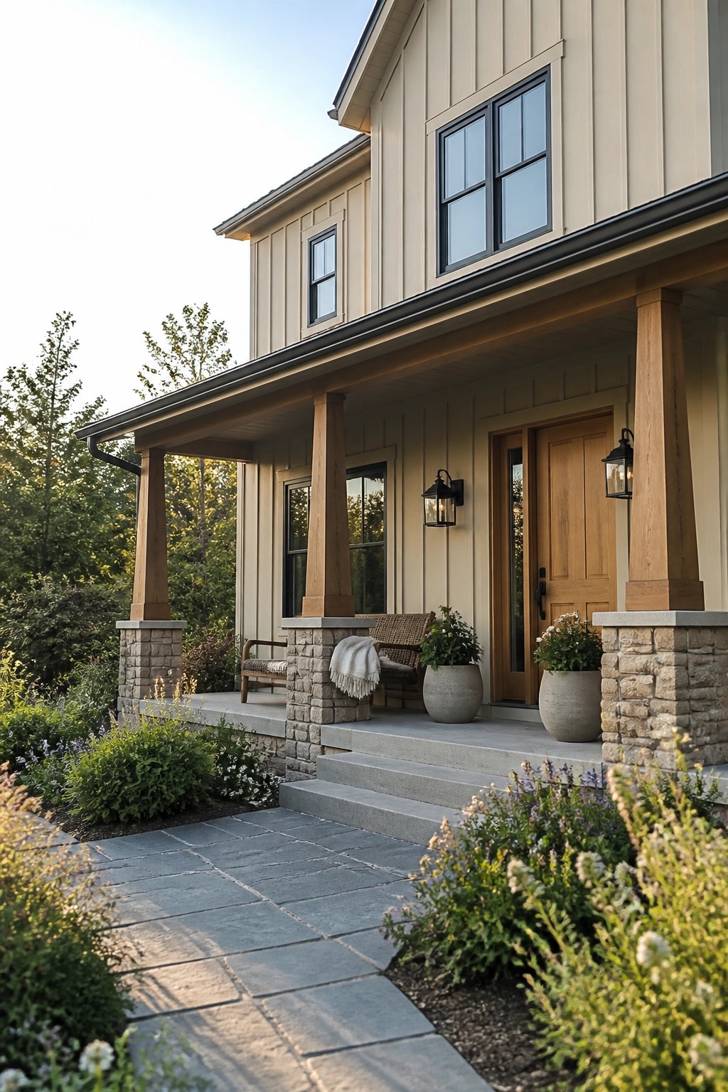
This warm beige on the siding sits right in that middle ground between a soft tan and a light greige. It feels calm and steady next to stone, which is why it works so well on homes that already have masonry details.
The color has a gentle warmth that keeps the stone from looking too cold. It holds up nicely in bright light and pairs cleanly with wood posts or black fixtures. Similar shades to consider include Sherwin Williams Accessible Beige, Benjamin Moore Edgecomb Gray, Behr Creamy Mushroom, or Farrow & Ball Stony Ground.
Warm Beige Siding Beside Natural Stone
This light warm beige on the siding gives the house a soft, clean look that still feels grounded. It reads very close to Sherwin Williams Accessible Beige or Benjamin Moore Edgecomb Gray, with a gentle creamy undertone that keeps it from feeling too cool or flat.
The color sits nicely against the stone base and works best on homes where you want something brighter than a true greige but not stark white. Pair it with charcoal roofing and simple white trim so the stone stays the main feature.
Taupe Siding Paired With Stone Columns
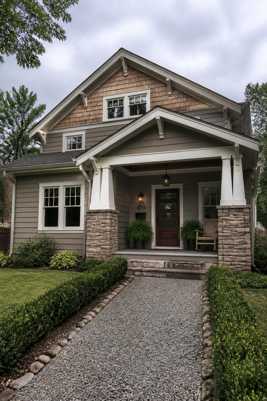
A warm taupe like this works well on the main siding because it stays soft without turning too cool next to the stone. It has a gentle gray-brown feel that sits comfortably on a house with natural masonry bases. Colors in this range often read best on homes that already have some texture from stone or brick.
It pairs easily with white trim and a darker roof. Try something close to Sherwin Williams Accessible Beige, Benjamin Moore Revere Pewter, or Behr Silver Strand if you want a similar mid-tone neutral. Just test a sample on the actual siding since stone can shift how the color lands in different light.
Warm Beige Beside Natural Stone
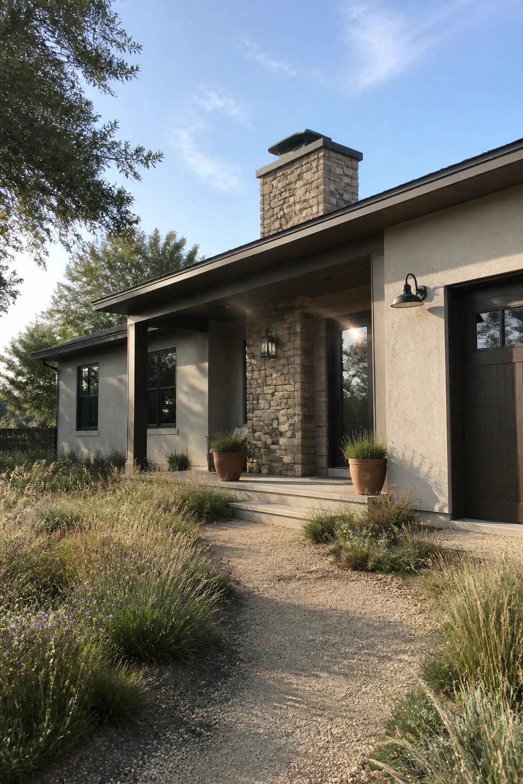
This light warm beige works well on the main walls because it stays soft without turning chalky next to the stone. It has a gentle earthy feel that lets the stone look like a natural part of the house rather than an added feature. Many people choose this type of neutral when they want the siding to feel quiet but still connected to the masonry.
It sits close to Sherwin Williams Accessible Beige or Benjamin Moore Edgecomb Gray, with a touch of the warmth found in Behr Creamy Mushroom. The color holds up nicely in daylight and pairs best with dark window frames and simple trim. Avoid pairing it with cool gray stone if you want to keep the same grounded look shown here.
Soft Gray Siding Beside Natural Stone
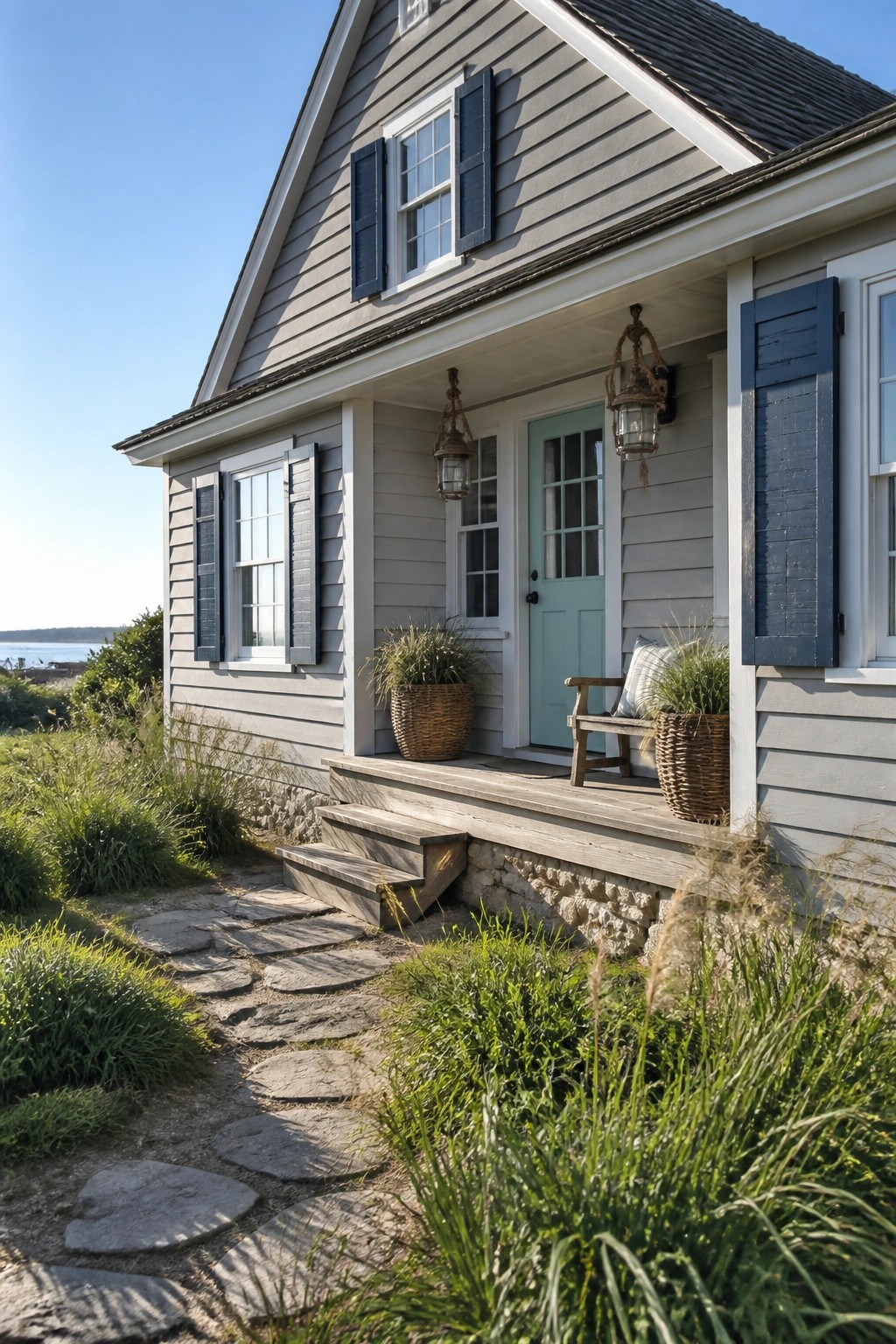
A soft gray like this gives the house a calm, clean look that feels right at home next to stone. It stays light enough to keep things bright but has enough depth to hold its own against the textured base.
This shade reads fairly cool and works best with simple trim and natural materials. Colors that come close include Sherwin Williams Repose Gray, Benjamin Moore Horizon, Behr Silver Strand, and Farrow & Ball Light Blue.
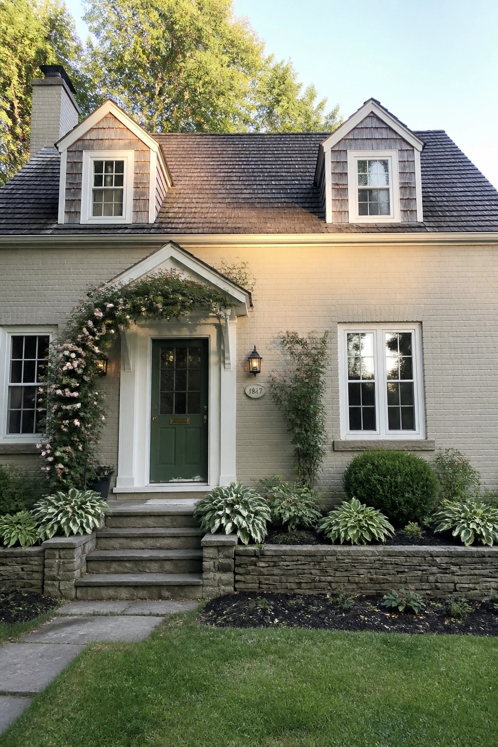
Pale Gray Brick With White Trim
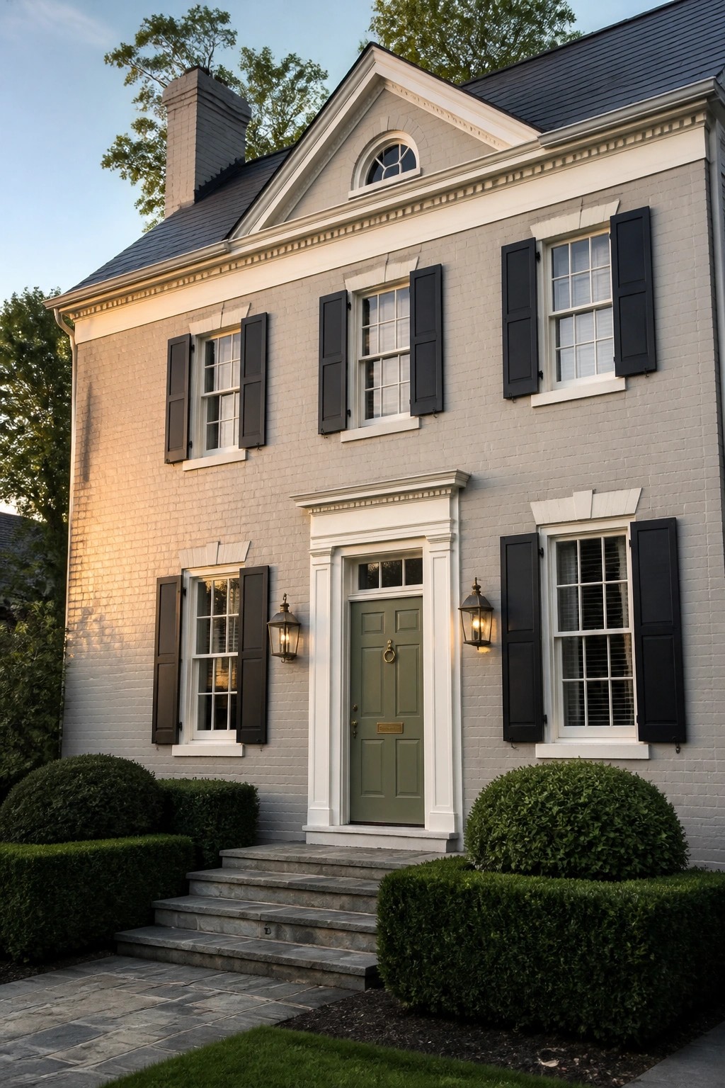
This soft light gray has a gentle warm undertone that keeps the brick looking clean without turning stark. It works well on older homes because it softens the texture of the brick while still letting some of that natural variation show through. Colors like this sit nicely between white and deeper neutrals, which makes them easy to live with year after year.
It pairs best with crisp white trim and dark window frames or shutters. On homes with stone accents it helps the stone feel more grounded rather than competing with it. Just watch that the gray does not pull too cool in strong afternoon light, since that can make the brick look flat.
Warm Beige Beside Natural Stone
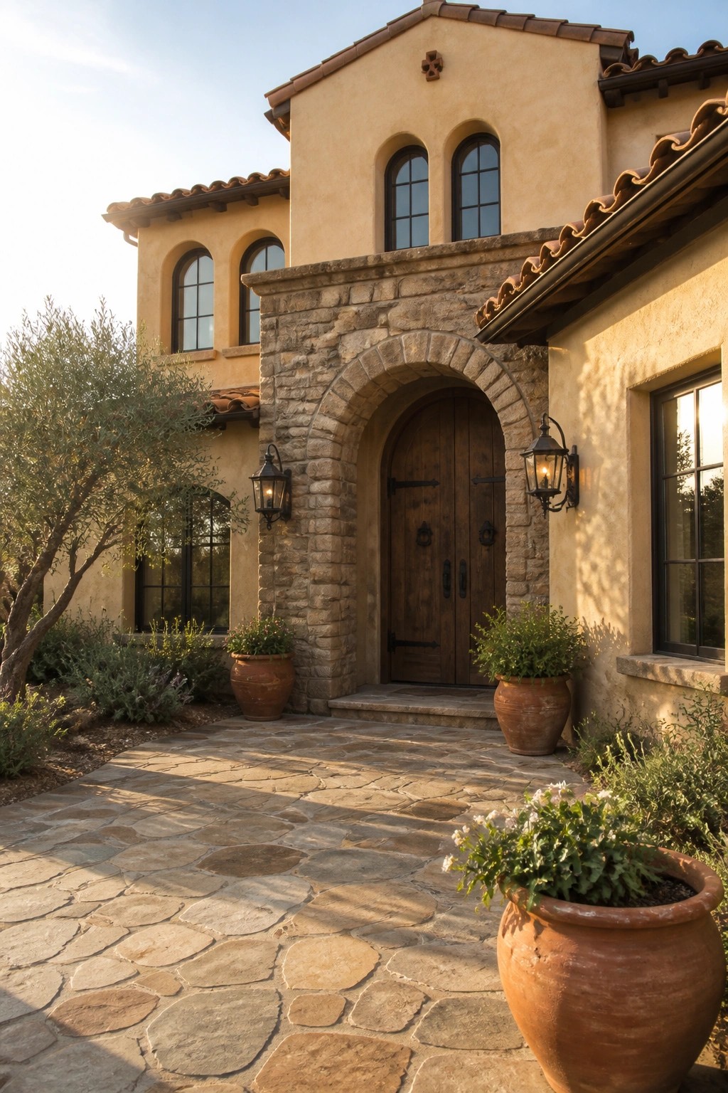
A warm beige stucco like this works well on homes that already have stone details. It sits in the sandy neutral family and feels soft rather than stark. Colors that come close include Sherwin Williams Accessible Beige, Benjamin Moore Manchester Tan, Behr Almond Wisp, and Farrow & Ball Slipper Satin.
The slight yellow undertone helps it blend with the stone instead of fighting it. It stays steady in bright sun and does not shift too cool at the end of the day. Pair it with darker stone and simple wood doors if you want the same relaxed look.
Warm Beige Siding Beside Natural Stone
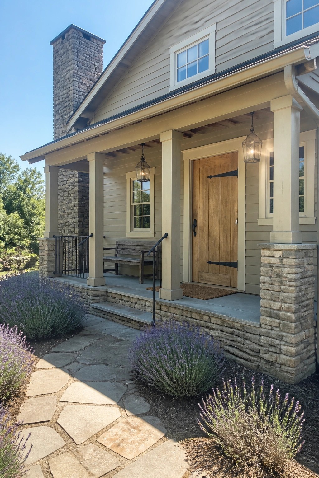
A light warm beige is a good choice for homes that already have plenty of stone. It keeps the whole exterior feeling soft and balanced instead of heavy.
This shade has a gentle yellow undertone that helps it sit nicely against the stone without looking too cool or flat. It works especially well with wood doors and simple trim, and it stays consistent even in bright daylight. Try something close to Sherwin Williams Accessible Beige or Benjamin Moore Manchester Tan if you want a similar effect.
Soft Gray Siding Against Light Stone
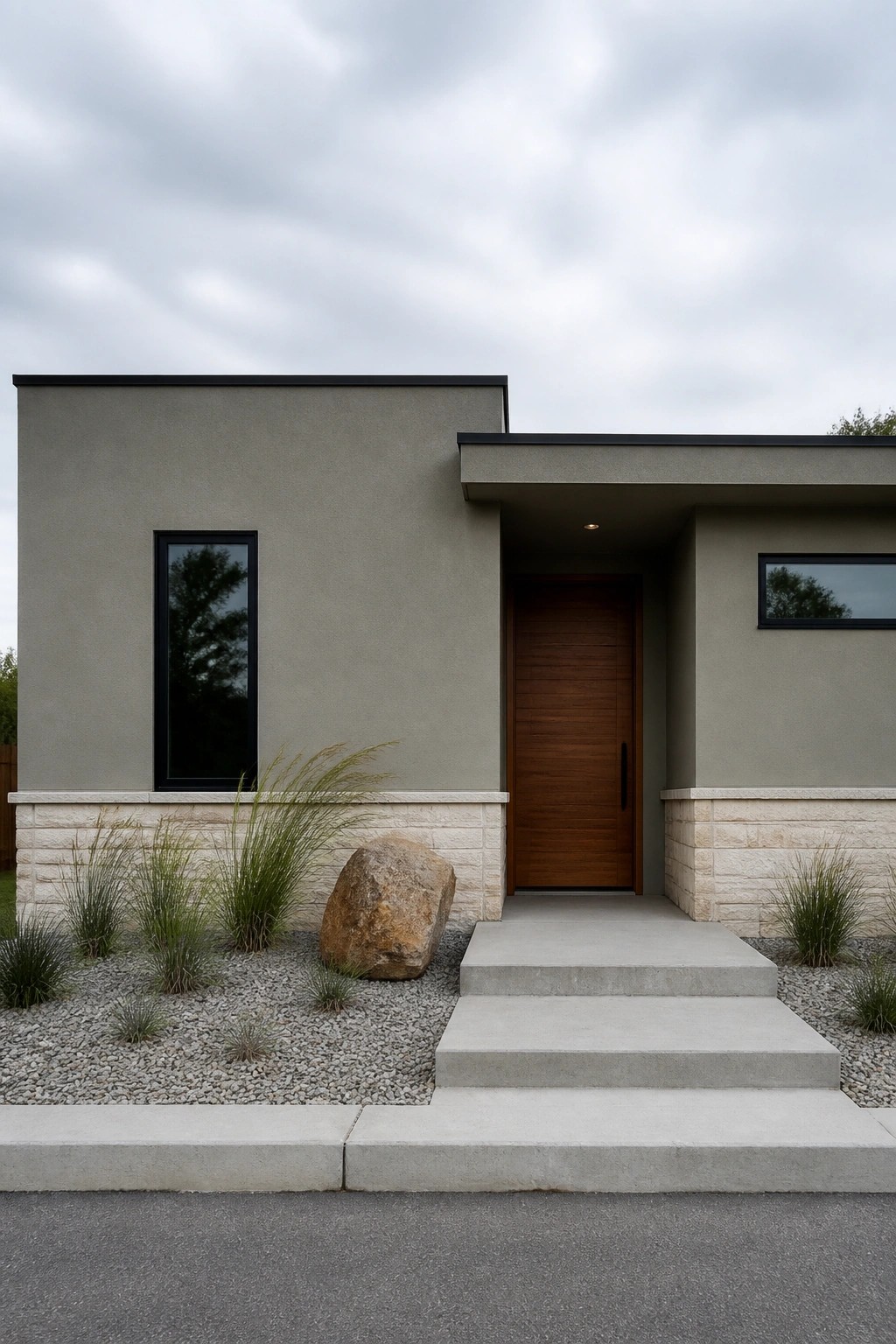
This soft warm gray works well on exterior walls because it sits quietly between beige and gray without leaning too hard either way. It has a muted tone that feels calm and steady next to the light stone base, which keeps the whole front from looking too stark or too plain. Many homeowners like this kind of neutral because it ages nicely and does not fight with other materials.
The color has a slight green undertone that shows up more in overcast light, so it reads a little softer than a straight gray. It pairs best with natural stone, wood doors, and simple concrete steps. Try it if you want something that feels current but still blends into older neighborhoods. Similar shades include Sherwin Williams Accessible Beige, Benjamin Moore Edgecomb Gray, and Behr Silver Gray.
Warm Taupe Against Natural Stone
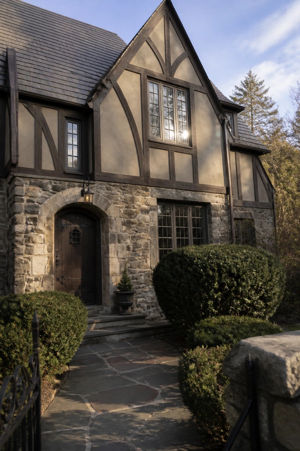
This warm taupe sits nicely on the stucco walls and gives the house a quiet, settled look. It feels like a soft mid-tone neutral that stays calm next to the rough stone base without competing with it. Many people reach for shades in this range because they read as neither too gray nor too brown once they are outside in daylight.
It pairs best with dark wood trim and charcoal roofing, both of which are already in place here. If your stone has cool gray tones, test the color on a sample board first since the warmth can shift a little depending on the light. Sherwin Williams Accessible Beige, Benjamin Moore Revere Pewter, and Behr Greige all land close to this effect.
Warm White Siding Against Natural Stone
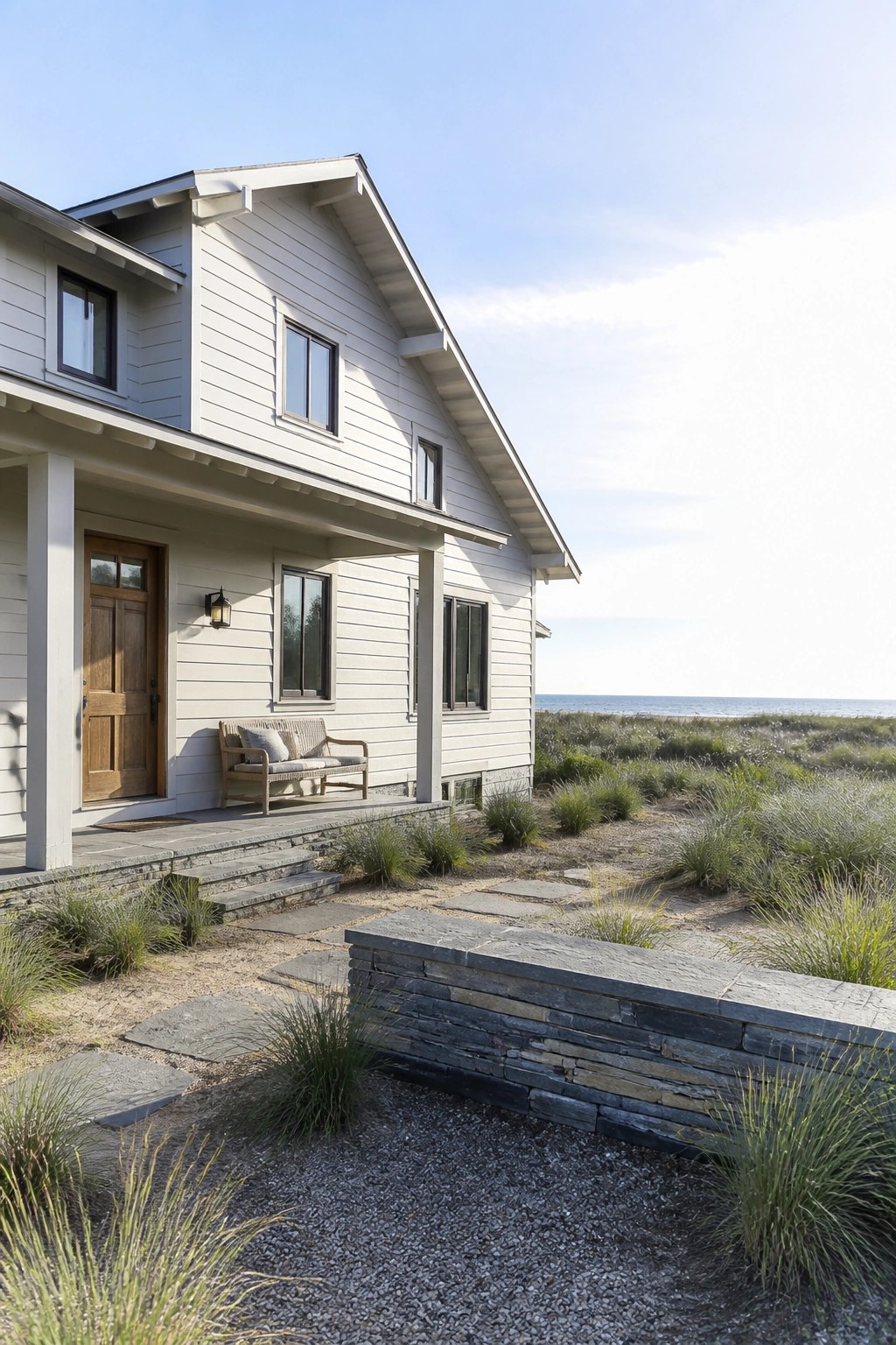
A light warm white works well on this house. It has a soft, slightly creamy tone that feels clean without looking stark next to the stone base. Many people choose this kind of neutral because it keeps the exterior feeling bright and simple while still pairing easily with natural materials.
The color sits close to Sherwin Williams Alabaster or Benjamin Moore White Dove. It can pick up a bit of warmth in full sun, so it tends to look best on homes with stone or wood accents rather than against very cool grays. Pair it with dark windows or charcoal roofing if you want a bit more contrast.
Creamy White Siding With Stone Foundation
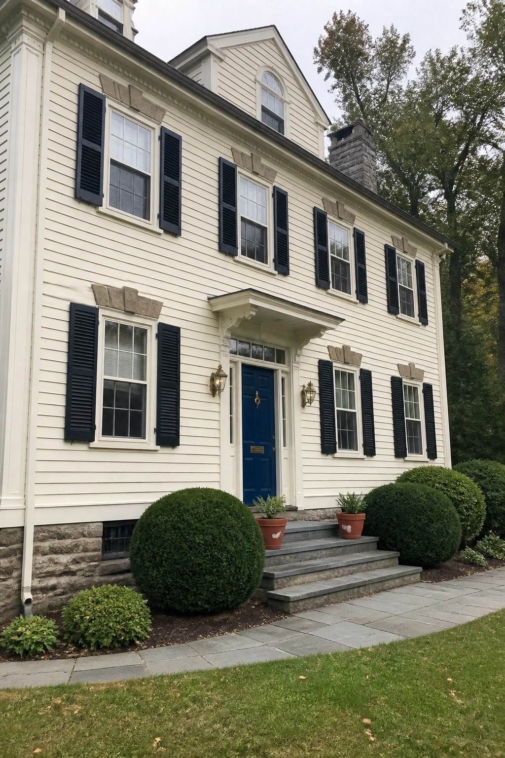
A soft creamy white works well on the siding here. It feels warm without turning yellow, and it keeps the whole house looking bright and settled. This kind of neutral sits nicely next to the gray stone base and gives the exterior a clean but not stark look.
It has a slight warmth that helps it blend with natural materials rather than fight them. Pair it with stone like this and simple dark shutters if you want the same balanced result. Watch the undertone in person though, since it can shift a bit depending on the light.
Warm Limestone Tone With White Windows
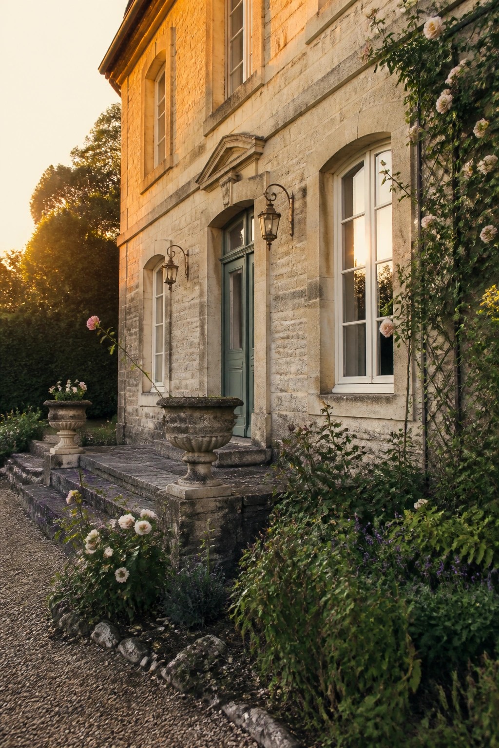
This house uses a soft warm neutral on the stone that feels very close to natural limestone. The color sits somewhere between a light beige and a creamy taupe, giving the masonry a gentle warmth without turning yellow or gray. It keeps the whole front looking calm and settled next to the roses and greenery.
The white window frames make the stone read a little softer, which is useful on older homes where you want the masonry to stay the main feature. It works best with simple trim colors and holds up well in changing daylight. Similar shades to consider include Benjamin Moore White Dove, Sherwin Williams Alabaster, Farrow & Ball Slipper Satin, or Behr Creamy Mushroom.
Warm Neutral Beside Natural Stone
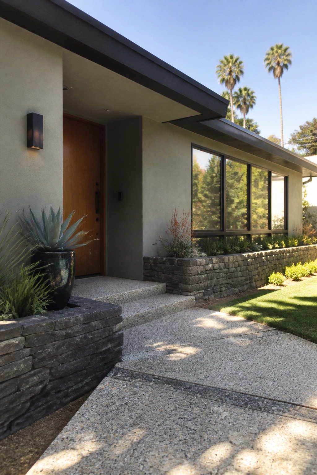
This house uses a soft warm neutral on the main walls that sits right next to the stacked stone. It is a mid-tone greige with a touch of warmth that keeps the whole front from feeling too stark. Many people reach for colors like Sherwin Williams Accessible Beige, Benjamin Moore Revere Pewter, or Behr’s version of Accessible Beige when they want something similar.
The stone brings out the slight warmth in the paint, so the color never reads flat or cold. It works especially well on homes that already have natural masonry because the neutral gives the stone room to show without competing. Just test a larger sample on site, since strong sunlight can make it look a bit lighter than it does on the chip.
Light Greige Siding With Natural Stone
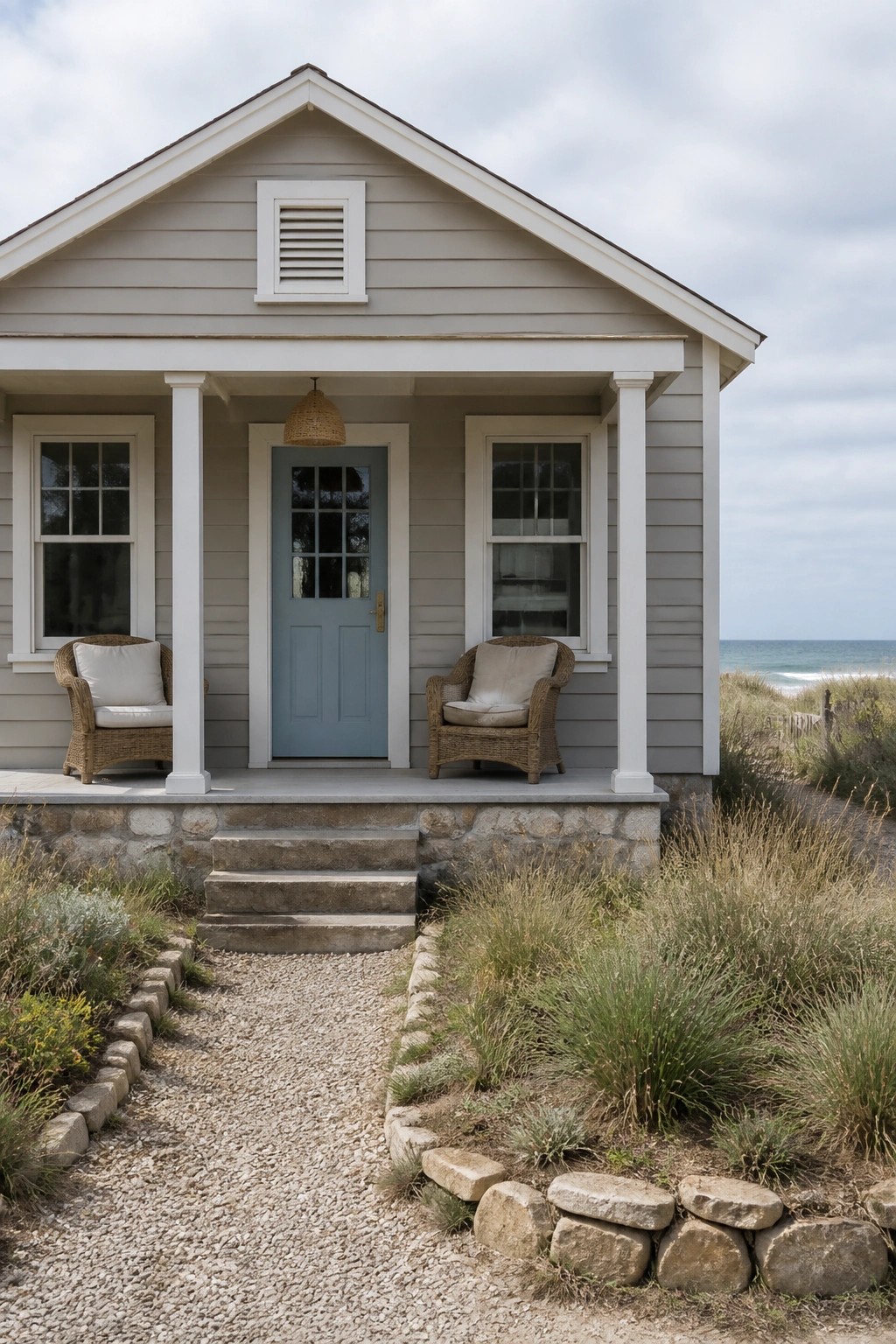
This house uses a soft greige on the siding that sits right between gray and beige. It reads as a calm neutral that feels warm enough for a coastal setting but still looks clean next to the stone base. Colors like this work well when you want something quieter than white without going too dark.
It has a slight warm undertone that keeps the stone from looking too cold. Sherwin Williams Repose Gray or Benjamin Moore Revere Pewter come close, as does Behr Silver Drop. Pair it with white trim and keep the stone or any wood accents simple so the color stays the main focus.
Warm Neutral Siding Beside Stone Accents
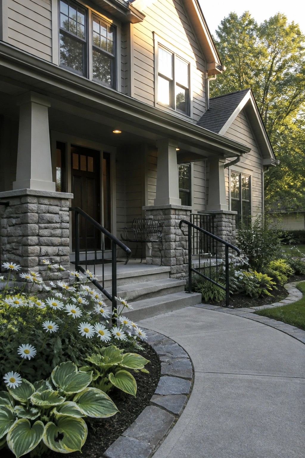
This house uses a light warm neutral on the siding that sits right between beige and gray. It has enough warmth to feel welcoming but stays soft enough that the stone pillars do not look too heavy next to it. Colors in this range tend to work well on homes that already have masonry details because they let the stone stay the main feature without competing.
The undertone here looks slightly golden in the light, which helps it blend with the surrounding greenery. It would pair nicely with charcoal roofing and black railings like the ones shown. If you try this direction, test a few samples on the actual siding since the stone color can shift how the neutral reads once it is up on the wall.
Warm Cream Brick Beside Stone Steps
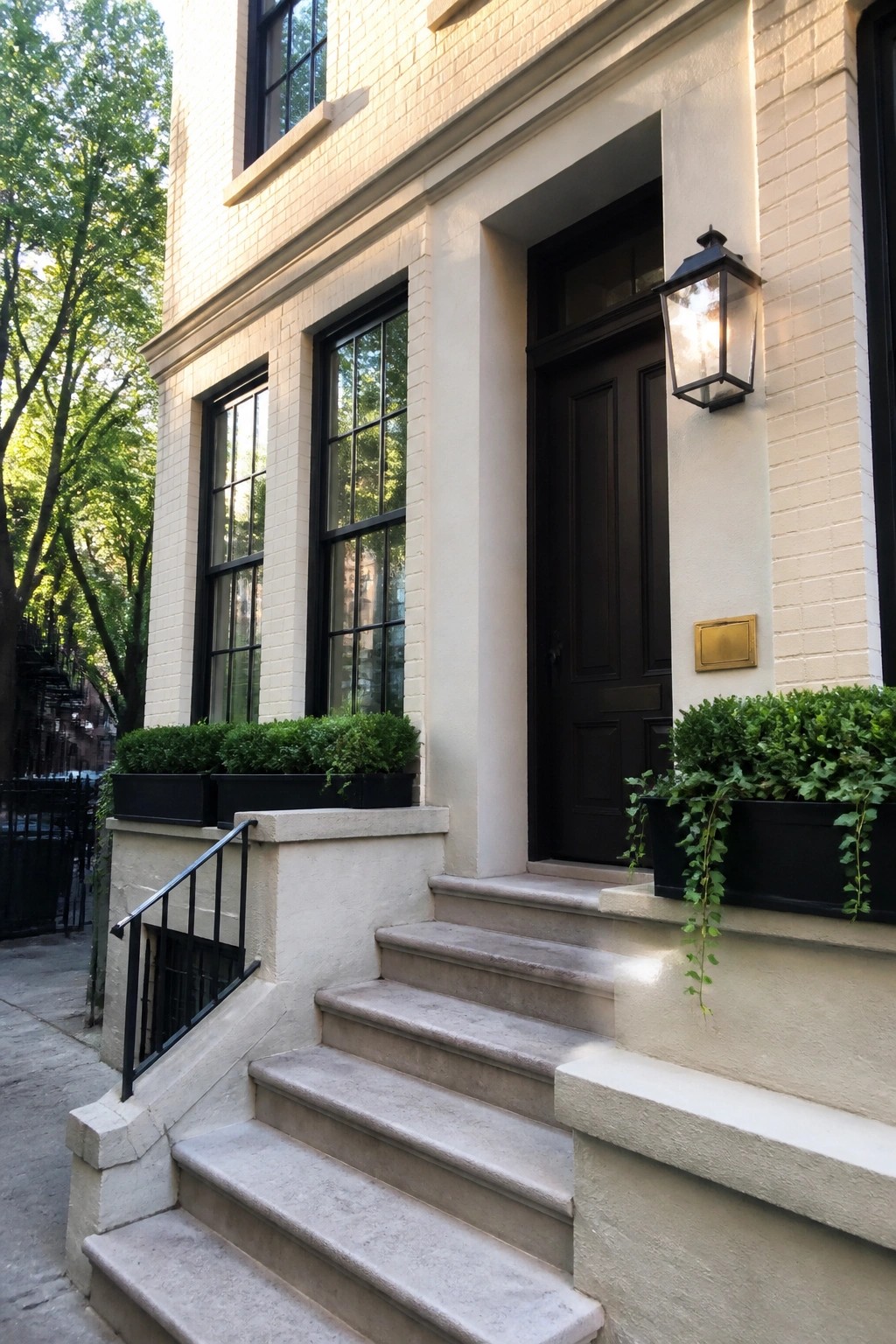
This warm cream color on the brick gives the house a soft, clean look that feels inviting without being stark. It reads as a light neutral with gentle warmth that helps the facade blend nicely with the stone accents and darker trim.
The color sits comfortably next to natural stone and black windows, so it works well on traditional homes that already have masonry details. It tends to stay bright in daylight but avoids looking cold, which makes it a safe choice if you want something brighter than beige but softer than pure white.
Soft Greige Beside Natural Stone
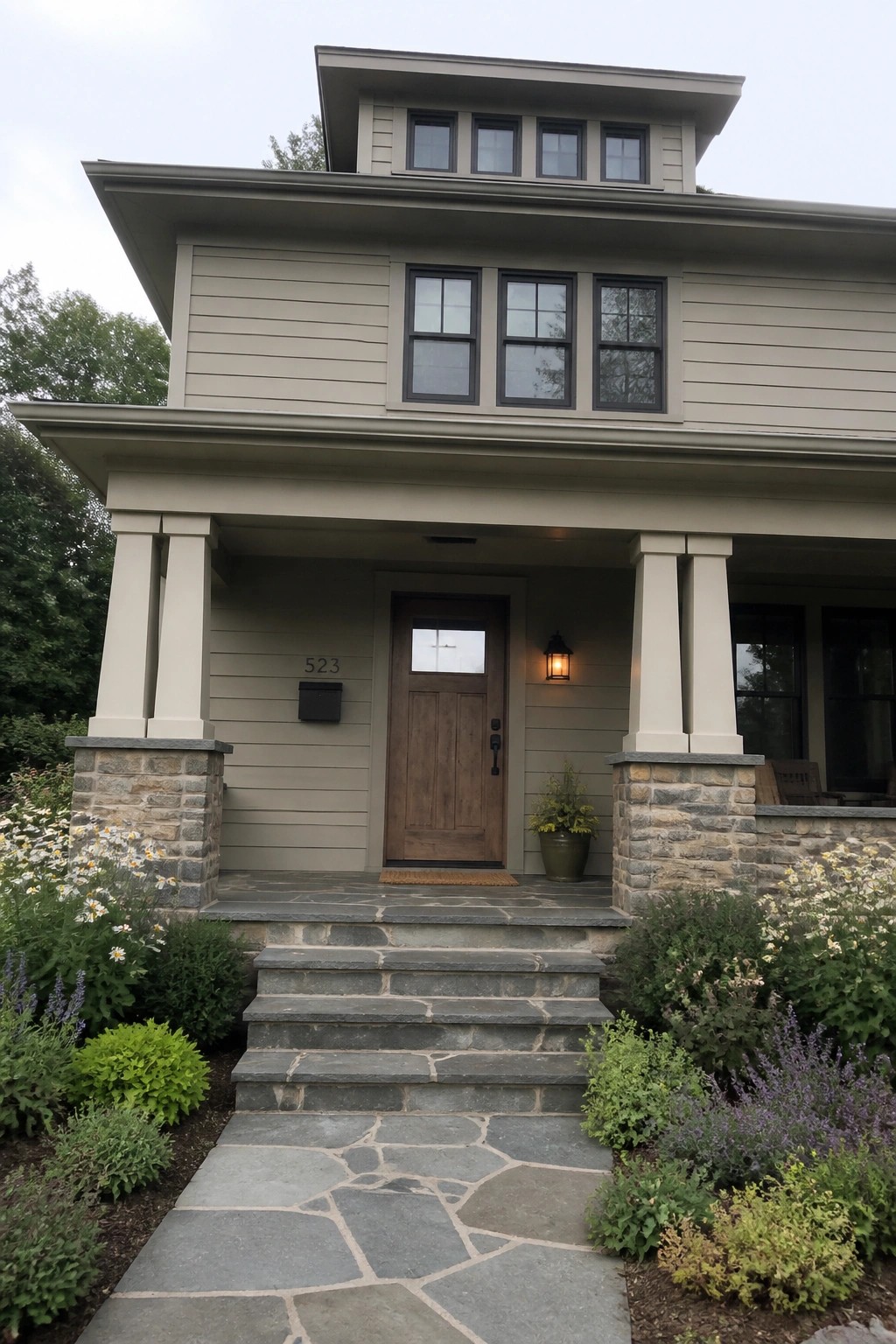
This house uses a soft greige that leans slightly green. It reads as a calm neutral that feels steady next to the stone without fighting it.
The color sits well on the siding because it stays even in changing light and gives the stone a cleaner contrast. It works best with black windows and simple wood doors, though it can look flat if the stone has too much variation in tone.
A two-story house painted in soft greige siding with stone porch columns.
Warm Gray Siding Beside Natural Stone
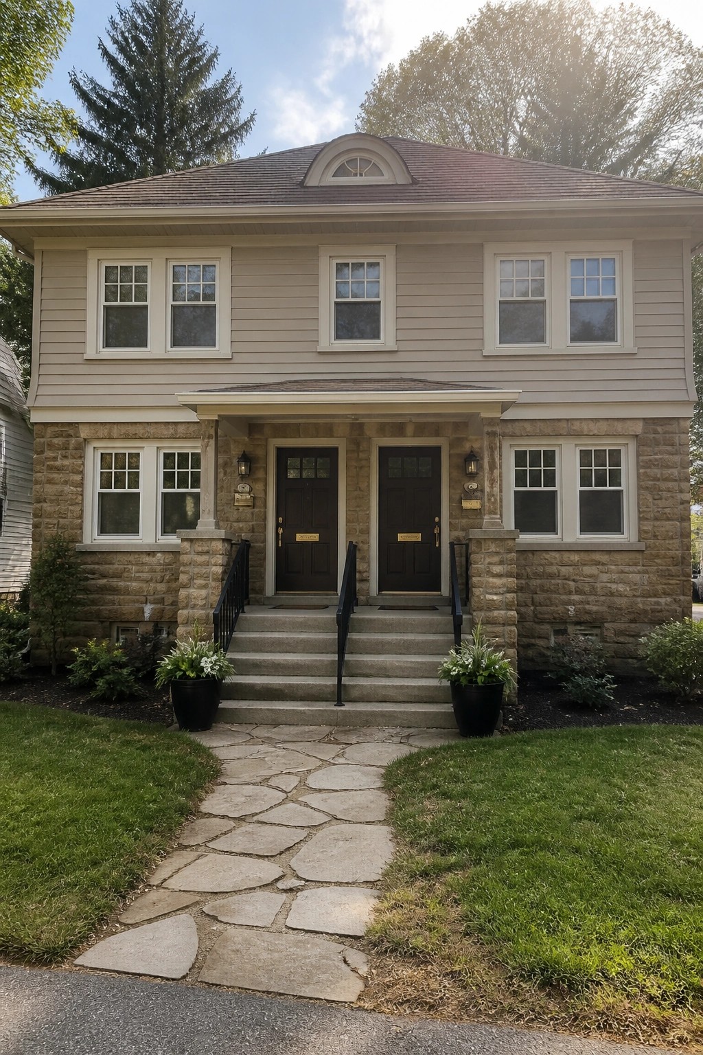
This siding color is a soft warm gray that leans slightly toward greige. It keeps the house looking clean without feeling too stark or cold next to the stone base. Many people like it because it gives a settled, traditional feel that still reads modern enough for most neighborhoods.
The tone has a mild warmth that helps it sit comfortably with natural stone rather than fighting against it. It tends to look best on homes with similar masonry details and works especially well when the roof and trim stay in the same neutral range. Colors like Sherwin Williams Agreeable Gray or Benjamin Moore Edgecomb Gray come close.
Muted Gray Siding With Stone Accents
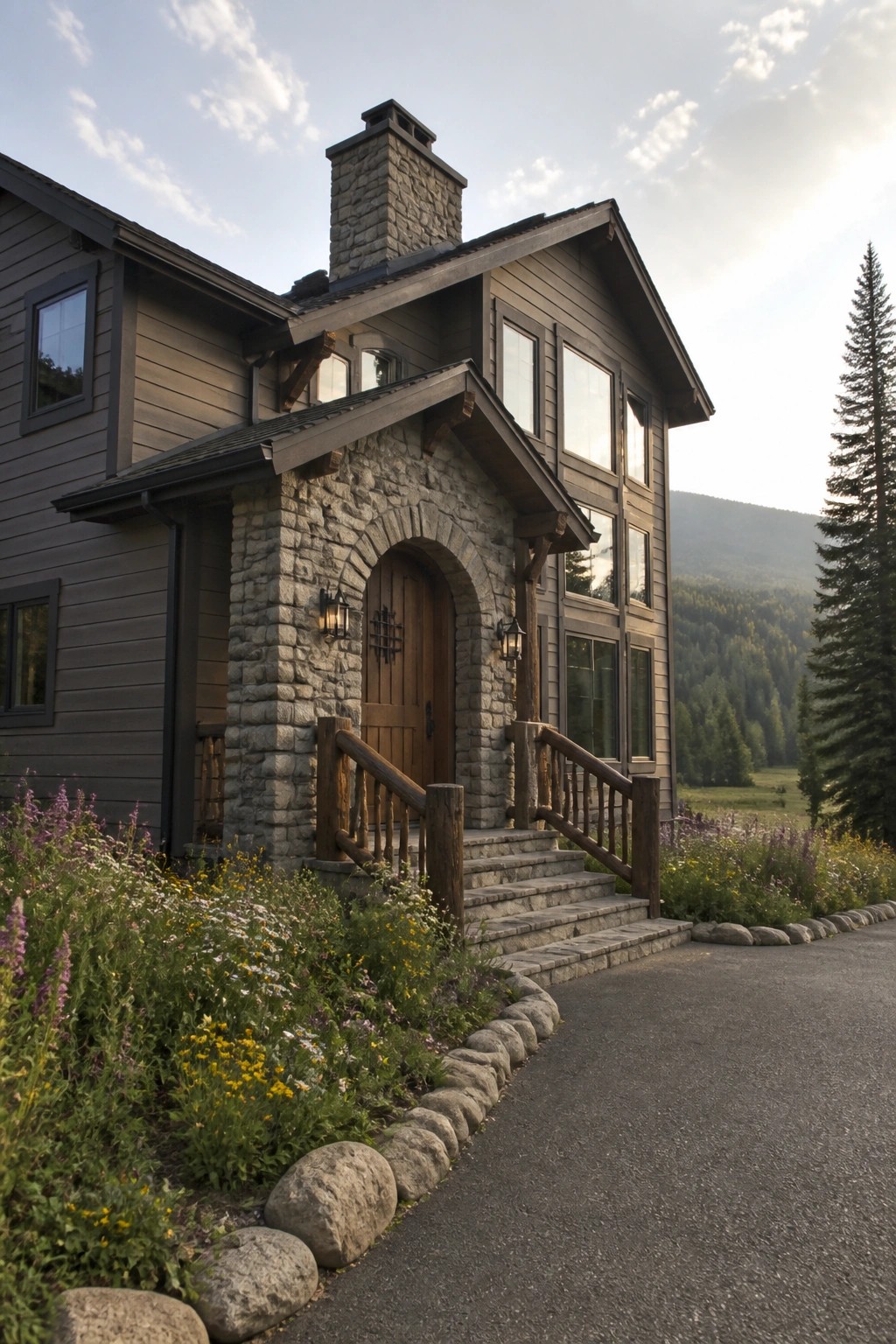
This house uses a soft gray-brown neutral on the siding that sits comfortably next to the stone entry. It is a mid-tone color with a slight warm lean that keeps the whole exterior from feeling too stark or cold. Many people like this kind of neutral because it works well on larger surfaces without overpowering the natural stone.
The color seems closest to Sherwin Williams Accessible Beige or Benjamin Moore Revere Pewter. It can also read near Behr Silver Gray or Farrow & Ball Elephant’s Breath depending on the light. Pair it with warm wood trim or dark metal details if you want a bit more contrast.
Warm White Walls Against Natural Stone
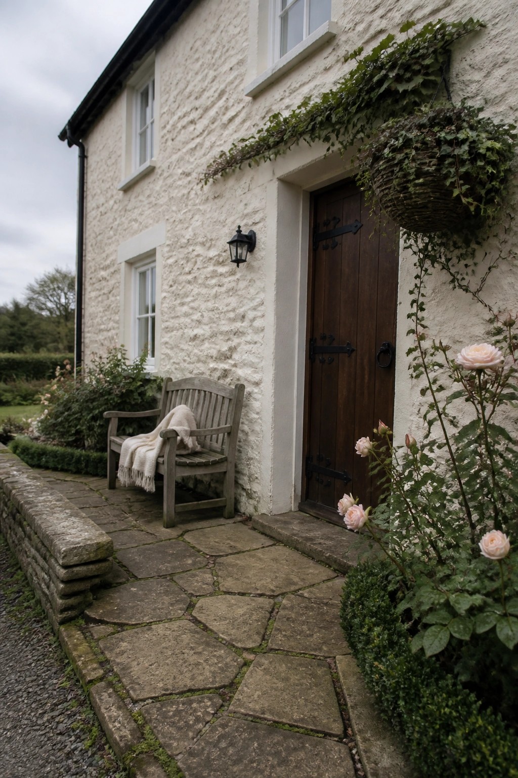
A soft warm white works well on this kind of rough plaster exterior. It keeps the house feeling light without going stark, and it sits comfortably next to the natural stone accents that run along the base and path. Colors like Benjamin Moore Simply White, Sherwin Williams Alabaster, or Behr Swiss Coffee give that same quiet, slightly creamy tone.
This shade stays clean in overcast light and does not pick up too much yellow from the stone. It pairs best with dark wood doors and simple black hardware, which helps the white read as intentional rather than plain. Just watch that the finish stays matte so the texture of the plaster stays visible.
Warm Beige Siding Against Natural Stone
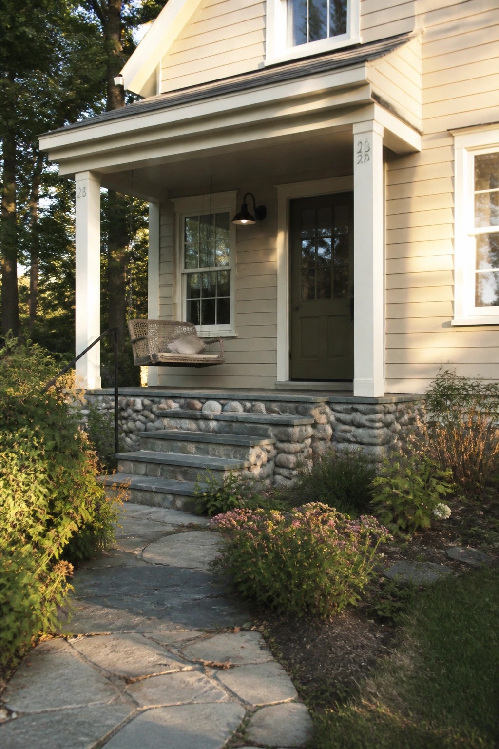
This light warm beige works well on homes that already have stone at the base. It sits in that soft neutral range that feels clean without going too stark or too cool next to the gray tones in the stone.
The color has a gentle yellow undertone that keeps it from looking flat outdoors. It pairs nicely with most stone foundations and works best on houses that get decent daylight so the warmth stays visible rather than shifting muddy.
Warm Greige Siding Against Natural Stone
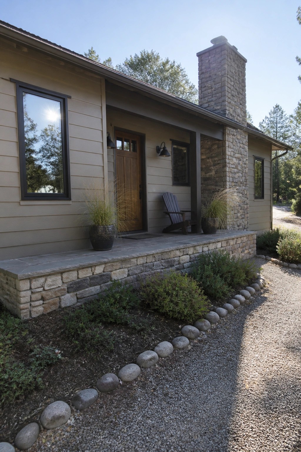
This house uses a soft warm greige on the siding. It sits right in the middle between beige and gray, giving a quiet, grounded look that lets the stone do most of the work.
The color has a light warmth that keeps it from feeling flat next to the rough stone. It works well on homes where the stone already brings texture, and it pairs cleanly with dark windows or simple trim without needing extra contrast.
Frequently Asked Questions
Q: How can I make sure the neutral color I choose looks good next to my stone all year long?
A: Paint a few large samples on plywood and prop them against the stone. Watch how the pair changes with rain or snow on the ground. The best matches hold up without shifting too much in different seasons.
Q: Is it better to match the stone or go for contrast with a neutral paint?
A: Go for a soft contrast instead of an exact match. That keeps the stone as the focal point while the color adds depth. Pick a neutral two shades lighter or darker than the stone’s main tone.
Q: What happens if the color I like looks different once it’s on the house?
A: But colors always shift once applied to a large surface. Check your top picks at different times of day before buying gallons. A quick repaint of one section saves you from a full redo later.
