

I often find that the way a house sits on its lot depends a lot on how the main color meets the trim and roofline from the street.
Picking tones that stay close together can keep the whole front from looking chopped up, especially once you factor in windows, doors, and any siding changes.
Materials like fiber cement or brick shift under daylight in ways that photos rarely show, so testing samples on the actual walls makes sense before committing.
Some work better in person.
I tend to note which combinations might suit my own entry and garage doors first, since those areas get the most wear and direct view from the sidewalk.
Soft Neutral Tones For A Calm Facade

Many modern homes look more settled when the main walls stay in one soft neutral instead of trying to add contrast everywhere. The color blends into the surroundings without pulling attention to every edge or joint.
This approach works best on simple shapes where the door, steps, and any metal accents can stay close in tone. It keeps the entry feeling quiet and makes the landscaping read as part of the whole rather than separate decoration.
Soft Gray With Wood For A Calm Exterior

A soft gray base paired with wood tones keeps the whole front of the house feeling quiet and balanced. The low contrast lets the shape of the building stand out without any one element fighting for attention.
This approach works best on homes with simple lines where you want the facade to feel settled rather than busy. Match the wood to doors, garage panels, or window trim, and keep any other accents in the same muted range so nothing jumps out.
Light Walls With Dark Accents
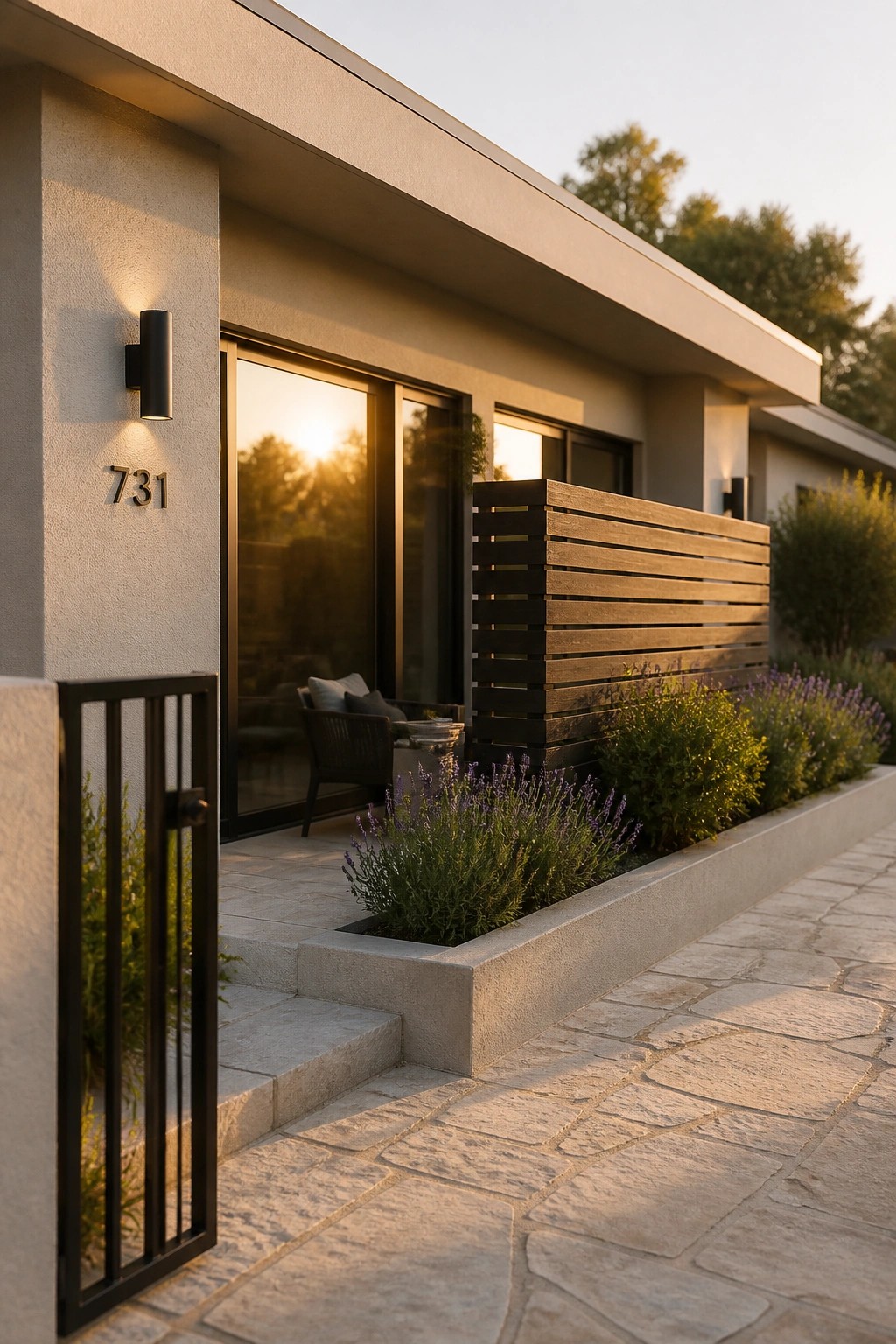
A light neutral wall color works well when you want the house to feel calm rather than stark. The dark metal trim, sconces, and horizontal screen stay quiet against it, so nothing jumps out or feels too sharp. This keeps the whole front simple and settled.
It suits homes with clean lines and not too many materials. Try the same light tone on the main walls and keep the darker pieces limited to windows, doors, and small fixtures. Stone paving and low planting can sit beside it without adding extra contrast.
Soft Green Exteriors With Low Contrast Trim

A soft green like this works well on modern homes because it feels calm without looking flat. The color sits back nicely against the street and pairs with simple dark railings and wood tones instead of fighting them. Many people like it because it gives the house presence without needing bright accents or bold trim.
This approach suits two or three story homes with clean lines. Keep the trim and metalwork close in tone to the main color so the whole front stays quiet. Avoid adding too many different materials or bright plantings right against the wall if you want the same low key result.
Matching The Trim To The Walls
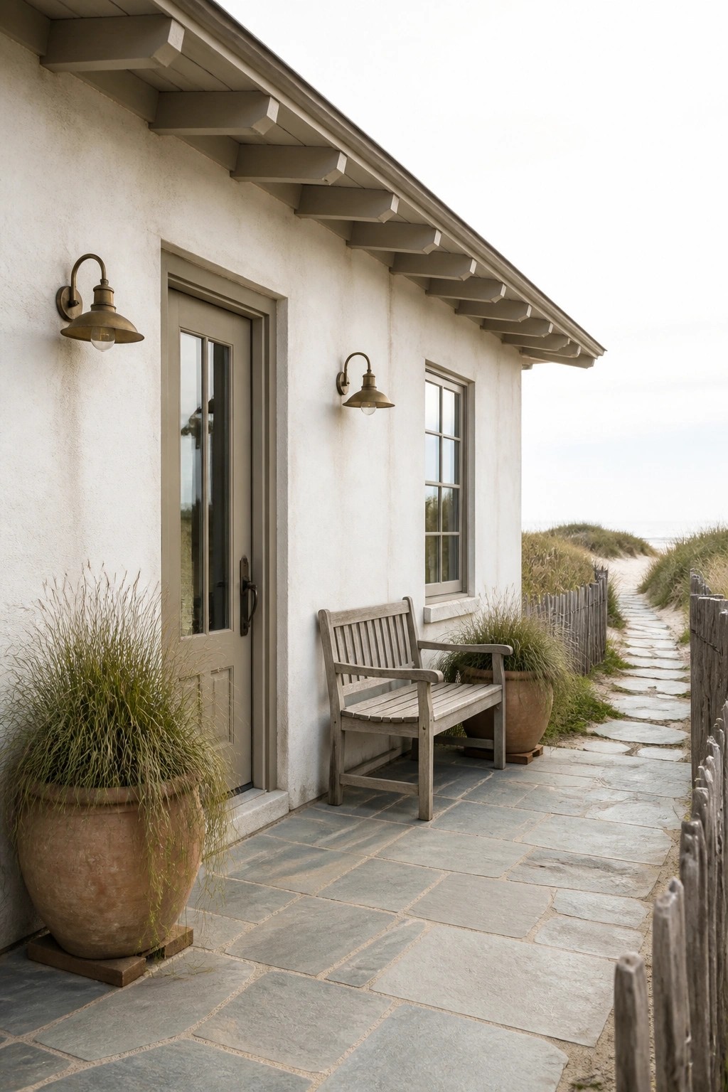
Painting the walls, door, and trim all the same muted tone gives the house a quiet, settled look. The color stays consistent from the stucco right down to the window frames and door, so nothing jumps out or breaks the surface. It works especially well on simple shapes where you want the house to feel calm rather than busy.
This approach suits smaller homes or coastal cottages that already have clean lines. Keep the color soft and slightly warm so it does not go flat in bright light. If the house has more architectural detail, test the color on a small section first to make sure the low contrast still reads as intentional rather than unfinished.
Soft Neutrals on the Siding

A soft neutral on the main siding helps the house sit quietly in its setting. The color stays calm on its own and does not fight with the roof or trim.
This approach suits homes with clean lines and simple shapes. It works best when the trim and roof stay a few shades darker so the whole facade feels pulled together without sharp contrast.
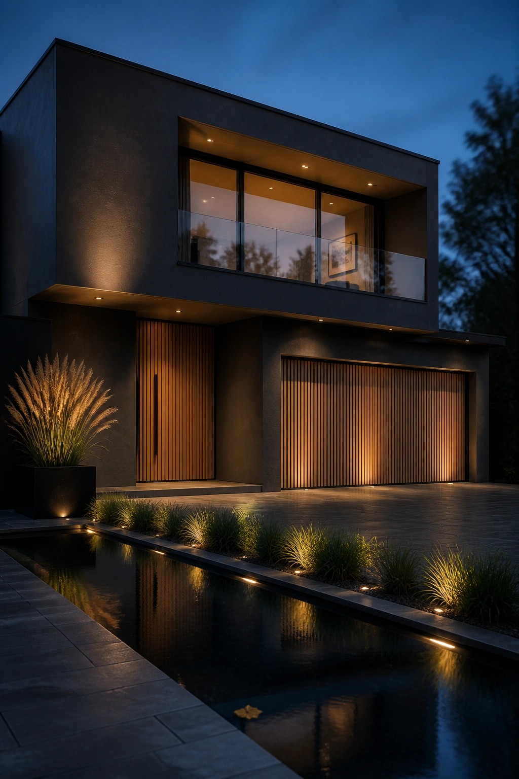
Monochromatic Dark Facades
Many modern homes use one deep color across the walls, doors, and trim. This keeps the whole exterior calm and simple instead of breaking it up with lighter accents or extra contrast.
It suits houses with clean lines and flat surfaces. Pair it with gravel paths and a few strong plants so the dark tone stays the main feature without feeling heavy.
Using Blended Neutrals on the Facade
Many houses feel more settled when the main wall color stays close to the trim and accents. The result is a calmer look that does not fight with the roof or any wood details. This approach works especially well on smaller or simpler homes where you want the shape to come through without extra visual noise.
It suits houses that already mix materials like wood shingles and stucco. Keep the shift between tones slight so nothing stands out sharply. The main thing to watch is making sure the door and any metal fixtures still read as intentional rather than afterthoughts.
One Muted Tone Across the Entire Exterior

Many modern homes look calmer when the walls, trim, and larger surfaces stay within the same soft color. This keeps the focus on the shape of the house rather than on color changes or busy contrast.
It suits homes with simple lines and works best when the main material sets the tone and everything else stays close to it. A light gray concrete finish paired with a matching wood screen, like the one shown here, keeps the whole front quiet without feeling flat.
Monochrome Gray for a Low-Contrast Modern Exterior

Many modern homes look calmer when the whole facade stays in one muted gray. This keeps the eye from jumping between different tones and lets the texture of the material do the work instead.
The approach suits narrow lots or streets with lots of older homes nearby. Use the same gray on walls, planters, and trim, then add a few plants to soften the lines without breaking the quiet feel.
Muted Green For A Calm Facade

A single soft color used across the walls and built in elements can make an exterior feel settled and quiet. The same muted green gray covers the house siding, planters, and the outdoor shower structure here. This keeps the focus on the wood deck and the glass doors rather than on separate pieces.
The approach works best on modern homes that sit in open or coastal spots. It reduces visual noise and pairs easily with natural materials like weathered wood. Just test the color in different lights first since these tones can shift more than you expect once they are on a large surface.
Stone And Wood For Low Contrast Facades

The combination of light stone and natural wood keeps the exterior colors close together. This avoids sharp lines between materials and gives the house a settled look that still reads modern.
It works best on homes surrounded by trees or open land where you want the structure to feel part of the setting rather than set against it. Keep the wood tones warm and the trim within the same range as the stone so nothing jumps out.
Keeping the Exterior Palette Calm and Cohesive

Many homes feel more settled when the siding, trim, and outdoor built-ins all stay within the same muted tone. This keeps the facade from breaking up visually and lets the clean lines of the architecture stand out on their own.
It suits compact modern homes or courtyard layouts where the outdoor spaces sit right against the house. The main thing is to test the color in both morning and afternoon light so it stays soft instead of shifting too blue or too gray.
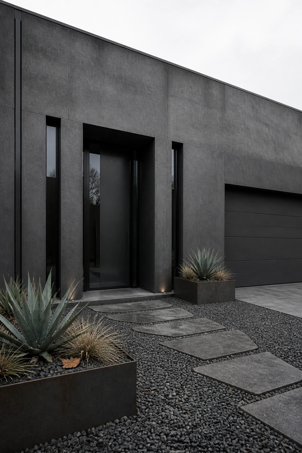
Dark Monochrome Exteriors

A dark monochrome palette helps a modern house settle quietly into its surroundings. Using one deep tone across the siding and keeping trim in the same range removes busy lines and lets the shape of the house stand out instead.
This works best on homes set in natural landscapes where you want the building to feel calm rather than bold. Choose a matte black or deep charcoal for the main surfaces and let stone or wood accents provide the only shift in texture.
Limited Neutral Palette For A Calm Facade

A tight range of warm neutrals on the main walls helps the exterior feel settled and quiet. Darker accents on the door and fixtures keep things from looking washed out while still staying low in contrast.
This approach works best on simple modern shapes where you can add one natural material like wood near the entry. It suits homes that sit close to landscaping or trees since the colors do not fight with the surroundings.
One Neutral Tone For The Whole Exterior

Many houses feel quieter when the walls, trim, and openings all stay within the same muted range. This removes busy contrast and lets the simple lines of the structure do the work instead.
It suits homes with clean rectangular shapes and works best when window frames and hardware stay close in tone to the main wall color. Concrete planters and gravel can sit in the same family without pulling attention away.
Using One Muted Color Across the Facade

A single muted color on the whole exterior can make a house feel calmer and more settled. It removes the usual back and forth between walls and trim, so the shape of the house stands out instead of the color changes.
This approach works best on simple modern forms where you want the look to stay quiet. Match the door and any small trim pieces to the main wall color, then let plants and steps provide the only contrast.
Soft Neutral Siding With Low Contrast Trim

Many houses feel calmer when the main color and the trim stay close in tone. This keeps the facade from looking busy and lets the shape of the house and any wood details stand out on their own.
It suits smaller homes or those with simple lines and natural materials. Choose a warm off-white or very light beige for the siding, match the trim closely, and let wood accents like posts or a pergola add the only noticeable shift.
Dark Monochrome Facades With Warm Wood Accents
Many modern homes work well with one deep color across the whole exterior. It keeps the look calm and lets the shape of the house matter more than busy trim details.
This direction suits homes with clean lines and large windows. Add vertical wood panels on the entry or garage doors to bring a bit of warmth while still staying low contrast overall.
Calm Facades With Concrete And Stone
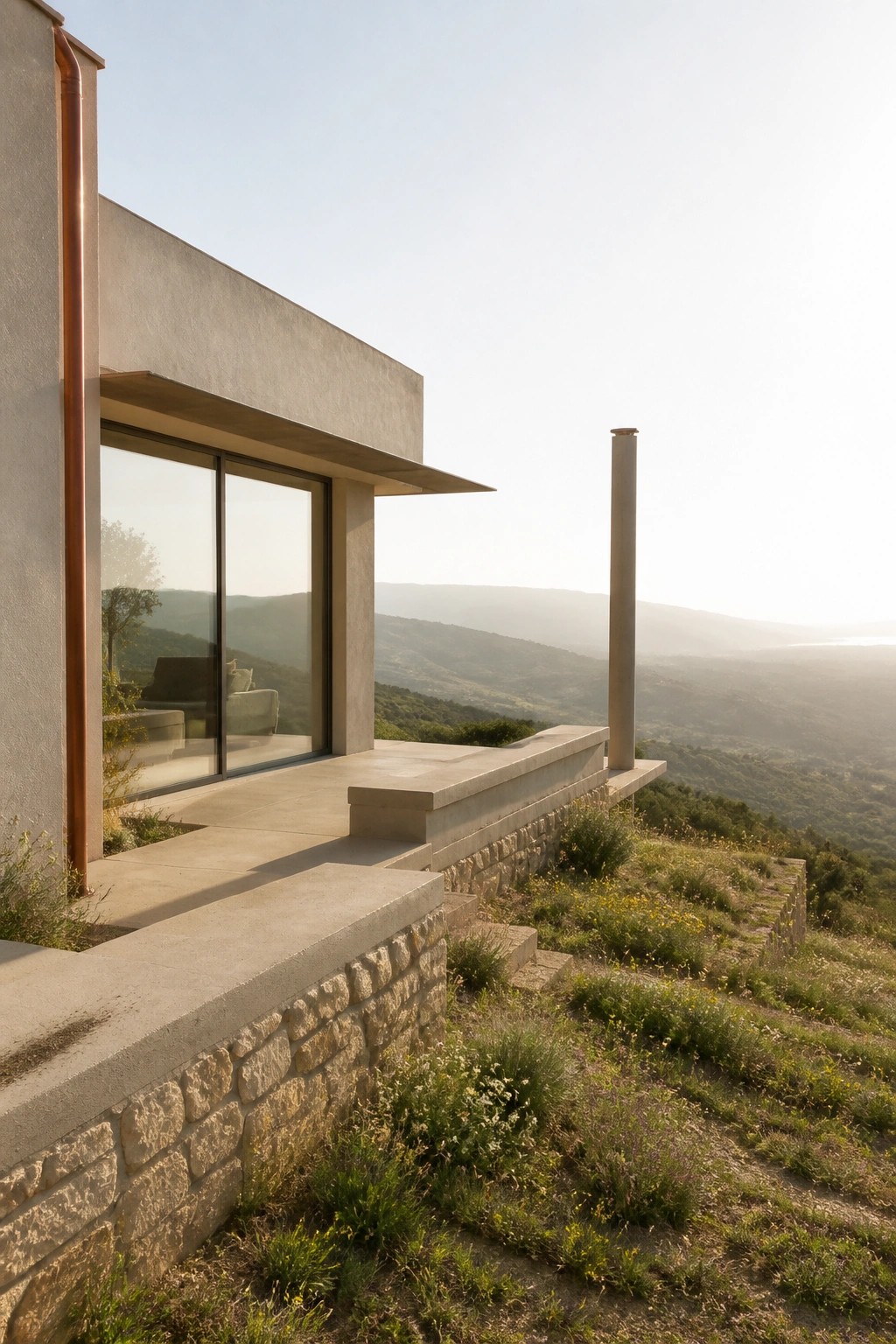
Many modern homes use concrete and stone in close tones so the whole exterior stays quiet. The materials sit next to each other without fighting, which keeps the house from feeling busy even when the shapes are bold.
This works best on homes set into hills or open landscapes where you want the building to settle into its surroundings. Match the concrete color to the stone as closely as you can and keep metal details like downspouts in a soft warm tone so nothing jumps forward.
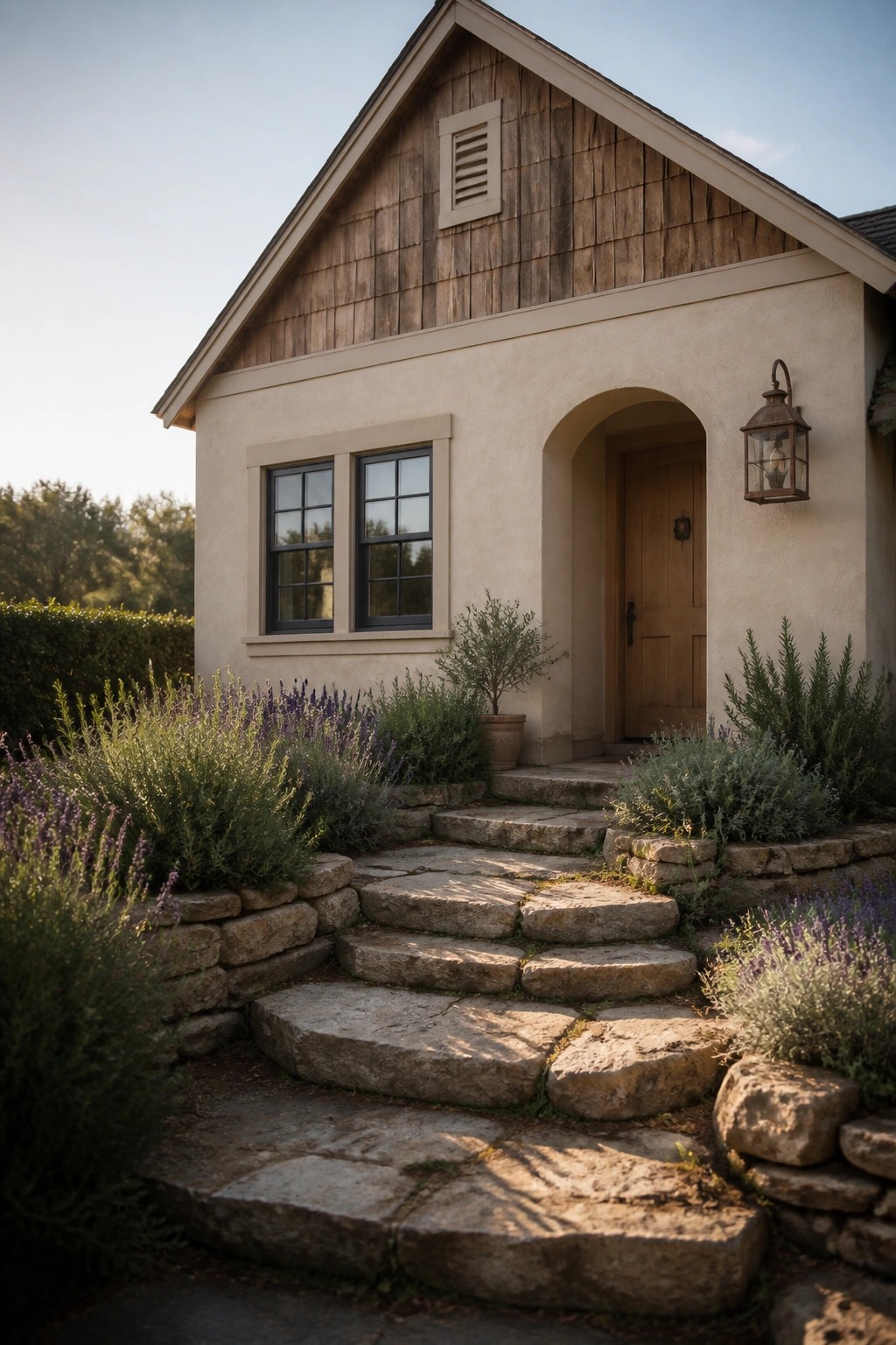
Earth Tones For Low Contrast Entries

A limited range of warm neutrals and natural textures can make an entry feel settled and calm without needing much contrast. The walls, paving, and accents all stay within the same family of browns and beiges, so nothing jumps out or feels busy.
This approach works well on modern homes that already have simple lines. Keep the trim and metal details close in tone to the main surfaces, and let texture do the work instead of color shifts. It suits dry climates where stone and concrete hold up well.
Low Contrast Neutrals for a Simple Exterior

A single muted tone used across the siding and trim keeps the whole front of the house feeling calm and settled. The door adds a bit of warmth without breaking the quiet look, and the result is a clean modern facade that does not fight for attention.
This approach works well on smaller or mid-sized homes where you want the shape of the house to stand out more than the colors. Stick to one or two close neutrals and let the wood door or a simple light fixture provide the only real shift in tone.
Earthy Neutrals For Calm Modern Facades

A simple way to keep a modern house feeling quiet is to stay with warm neutrals across the main surfaces. The walls, walkway, and accents all sit in the same soft range so nothing jumps out or creates sharp edges. This approach works especially well in dry climates where the light is strong and you want the house to settle into the landscape instead of fighting it.
Use the same tone on the body of the house and the trim, then bring in one or two slightly deeper materials like rusted metal or concrete pavers for the ground plane. It suits single-story homes with clean rooflines and gives you a finished look without needing a lot of extra color or detail.
Frequently Asked Questions
Q: How do I match trim to siding when my house faces both sun and shade all day? A: Walk the perimeter at midday and again near sunset. Note where light shifts the tones most, then pick a trim shade just one step lighter than the main color. This keeps the low contrast steady no matter the time.
Q: What if my current windows already have a slight sheen? A: Go for a matte or eggshell trim finish to mute any glare. The palette still reads calm because the sheen difference stays small. One coat usually brings everything in line.
Q: Will these palettes work on a house with wood siding that has visible grain? A: The grain adds quiet texture on its own. Stick with the suggested muted pairs so the trim does not fight the natural pattern. Brush a test strip across a few boards to check the blend before buying gallons.