

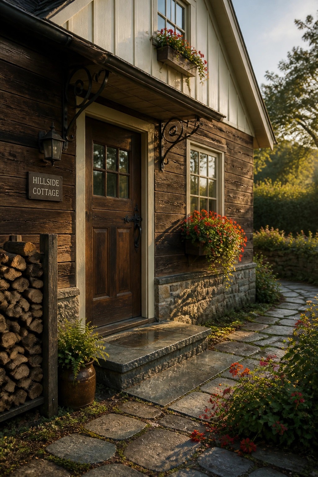
I often walk around neighborhoods and notice how two tone exteriors can make a house stand out in a quiet way from the curb.
Testing colors on the actual siding shows me how the tones shift with sunlight and shadows in ways that samples never reveal.
Some pairings fall flat once applied.
The choice also depends on the roof material and trim details because those elements tie the whole look together from the street.
I usually save photos of homes that handle this balance well so I can refer back when considering updates to my own place.
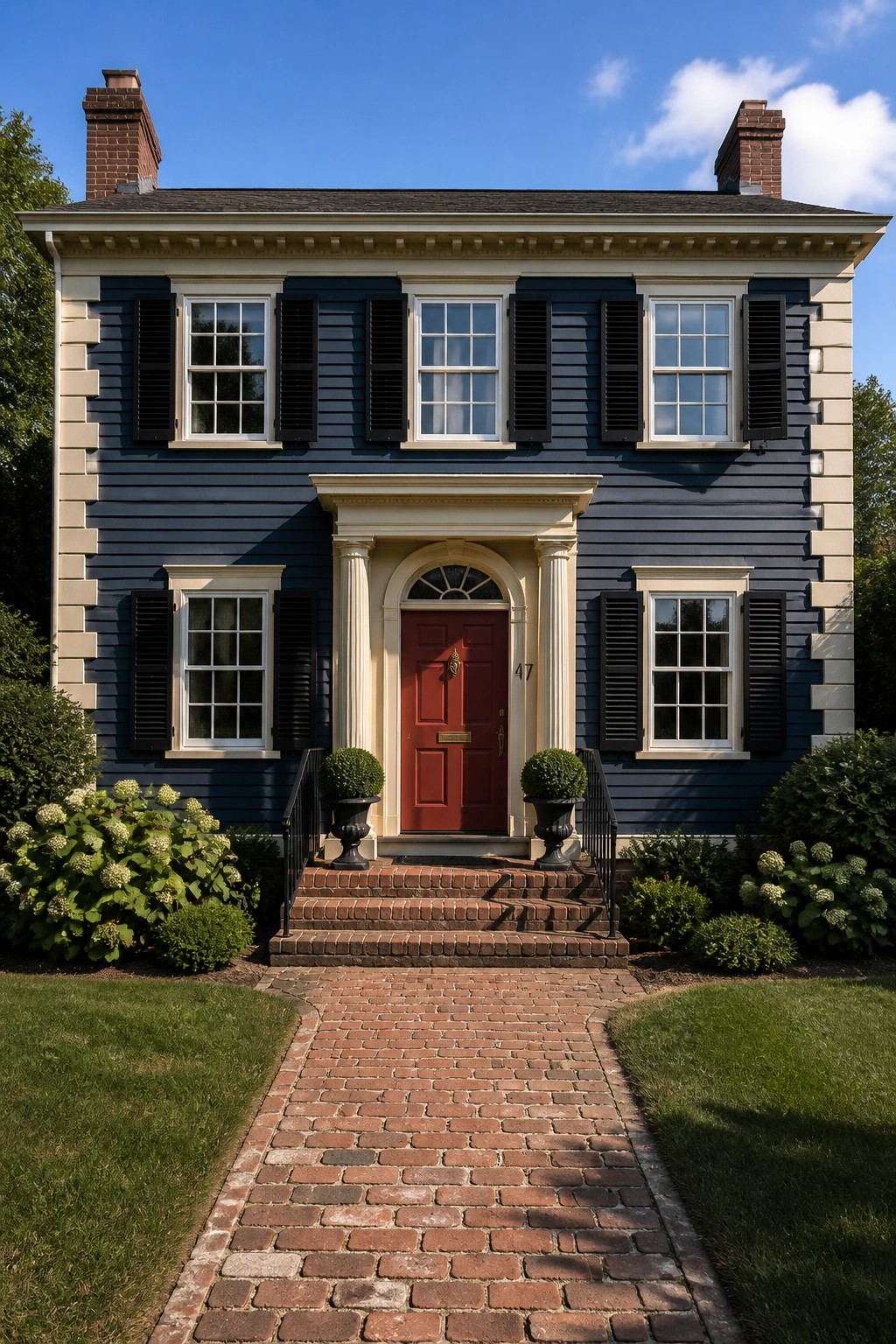
Soft Two Tone Colors For A Calm Facade
A light main color on the siding with a deeper shade on the window frames and door gives the house some shape without making it feel busy. The two tones stay close enough that the eye moves easily across the front instead of stopping at sharp contrasts.
This works especially well on smaller homes or cottages where you want a little definition but not a lot of fuss. Keep the darker color mostly on the trim and entry so the rest of the house stays simple and relaxed.
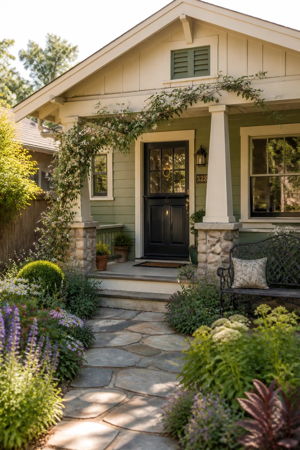
Warm Base Colors With Dark Trim
A warm stucco color gives a house a soft, grounded look that feels easy to live with. Pairing it with dark trim along the roofline and windows adds just enough contrast to make the shape stand out without extra decoration.
This works best on simpler house forms where the lines are clean. Stick to one warm tone and one dark accent so the contrast stays calm and the overall look stays balanced.
Two Tone Siding
Using two colors on the siding gives a house more shape without extra trim or details. The lower walls take a deeper shade while the upper part stays lighter, so the eye moves up naturally and the whole front feels a little taller and more settled.
This works best on smaller homes or cottages where a single color can look flat. Keep the change at a clear line, such as under the windows, and pick a dark door or trim color to hold it together.
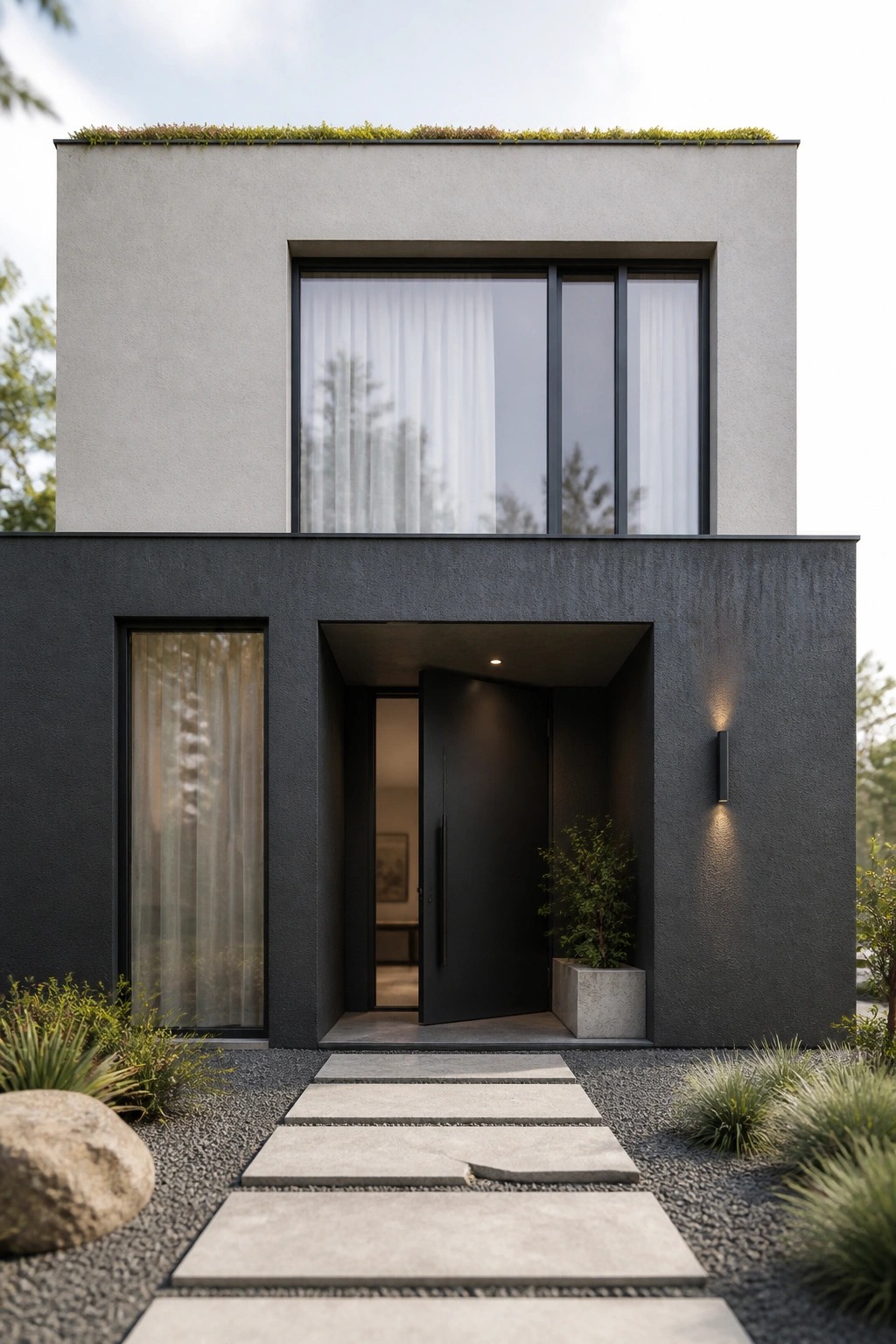
Two Tone Exteriors For Modern Homes
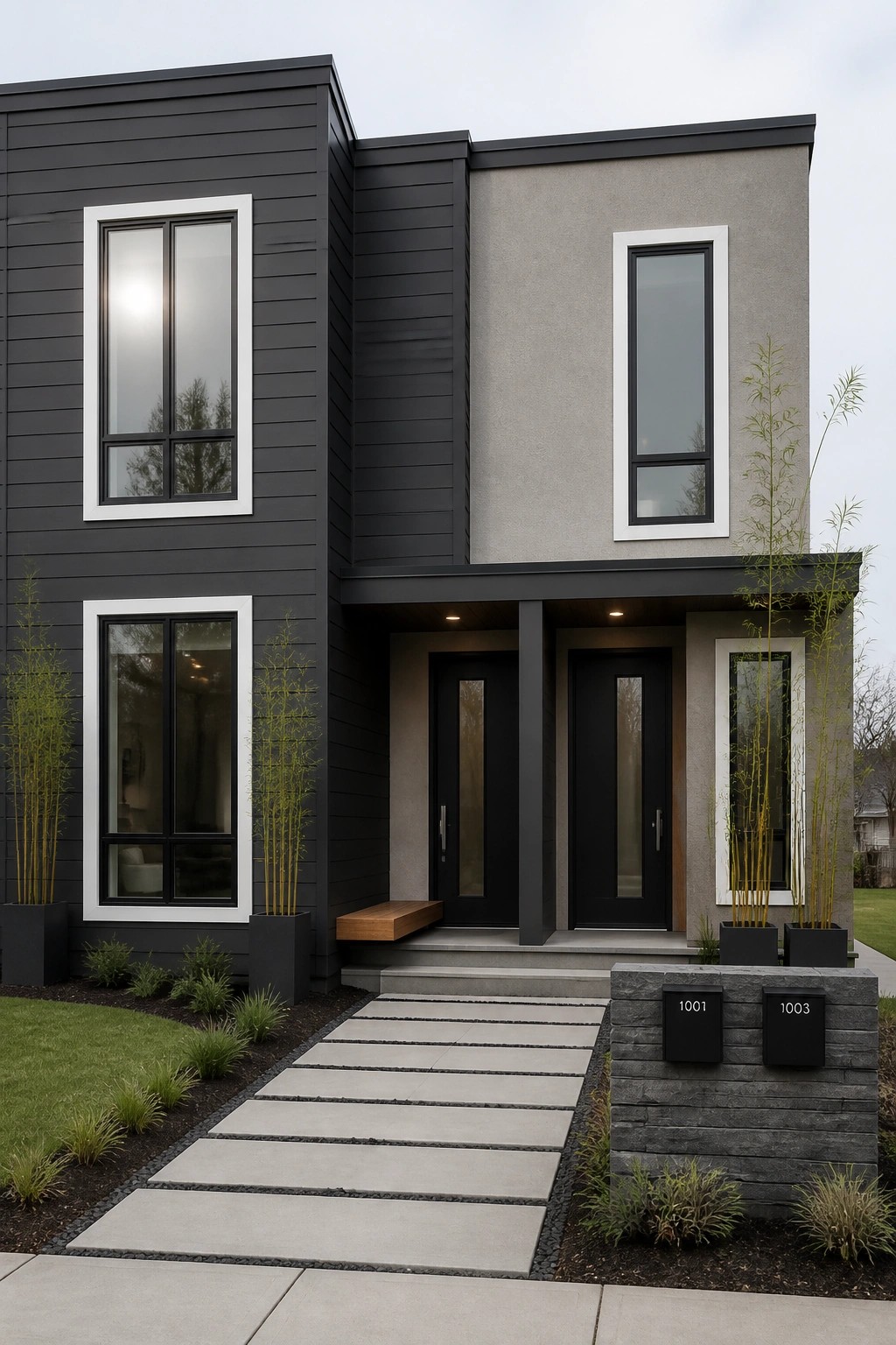
A simple split between dark and light tones on the facade gives the house more shape without extra trim or details. The darker siding on one section balances the lighter surface on the other, and the black doors and window frames keep the whole look clean.
This approach works best on straightforward modern shapes where the color change can follow the architecture. Stick to one bold dark tone and one soft neutral so the house stays calm rather than busy, and test the colors on a large sample first since they shift a lot in different light.
Dark Siding With Light Trim
Many homes gain a quiet sense of depth when the main siding color sits darker than the trim. The contrast defines the windows and corners without adding extra colors or busy patterns.
This works best on straightforward facades where the lines are already clean. Stick to one dark siding color, keep the trim light and consistent, and let the door provide the only real accent if you want one.
Two Tone Stucco In Warm Earth Shades
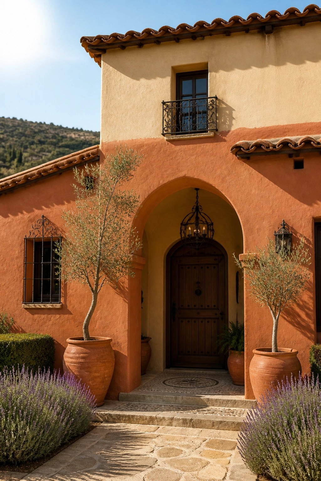
A deeper terracotta orange on the lower walls paired with a softer peach tone above gives this house more dimension. The shift in color helps define the arch and keeps the facade from looking flat, even with minimal trim or ornament.
This approach works best on homes with simple lines and Mediterranean details. Keep both colors in the same warm family and let the change happen at a natural break like a ledge or arch so the result stays balanced rather than busy.
Green Siding With Light Trim
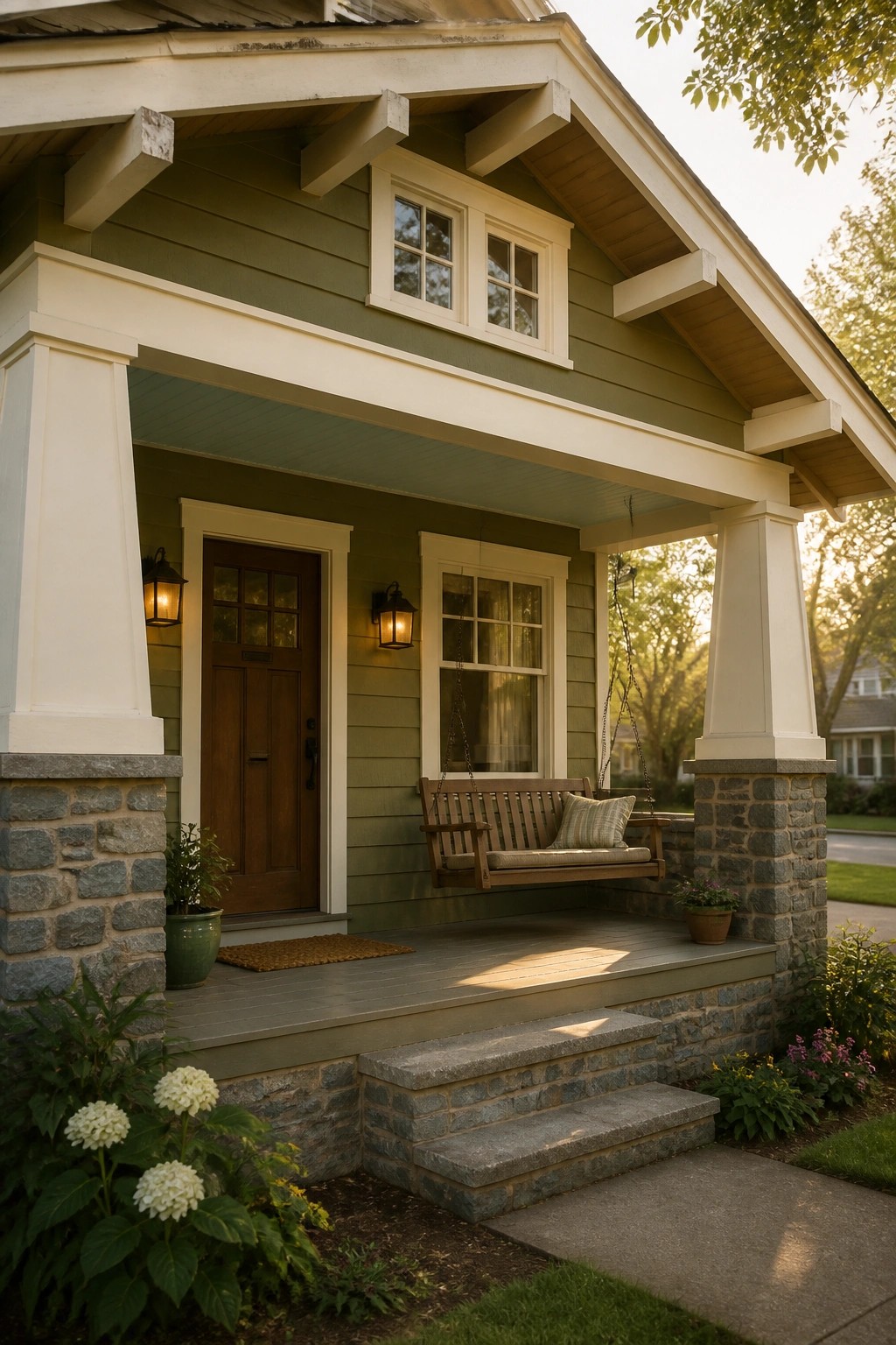
Many houses gain a quiet sense of depth when the main siding color sits a step darker than the trim. The green body color here stays calm and grounded while the lighter trim and porch ceiling keep the whole front from feeling heavy or flat.
This works best on homes that already have clear lines and some architectural detail. Keep the green soft rather than bright and pair it with an off-white or warm cream so the shift between the two tones feels easy instead of sharp.
Light Upper Level Over A Dark Lower Level
A light upper story sitting on a darker base gives the house more shape without adding extra colors or patterns. The contrast makes the building feel grounded while the lighter section keeps it from looking heavy or closed in. It works especially well on simple modern forms where you want the eye to move upward naturally.
This approach suits homes with clean lines and minimal trim. Keep the color change at a natural break like a floor line or roof edge, and stick to matte finishes so the split stays calm rather than busy. One black door or window frame is usually enough to tie the two tones together.
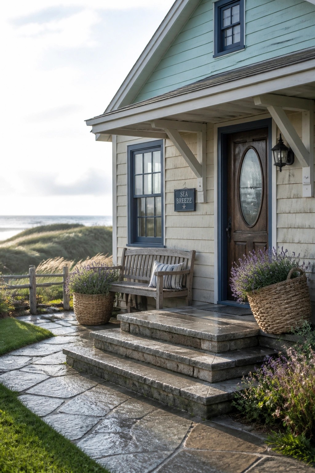
Light Gray Siding With White Trim
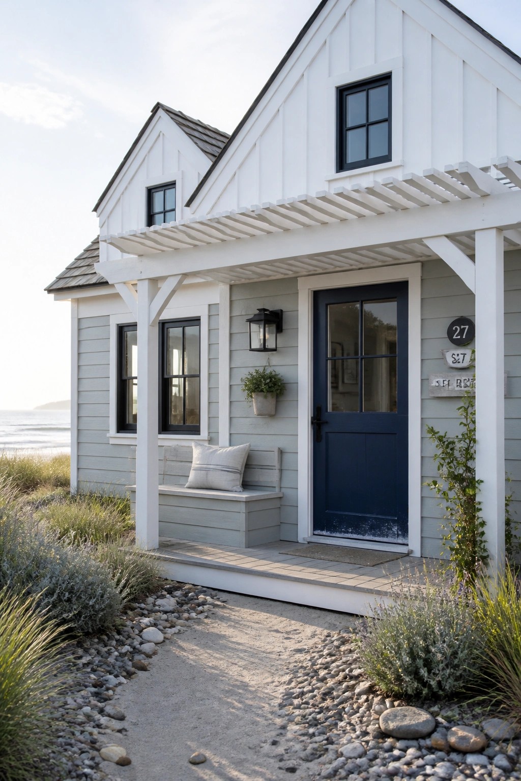
Many homes gain a quiet sense of depth when the main walls and the trim are painted in two soft tones instead of one. The light gray siding on the lower part of this house sits next to white gables and porch framing, so the shape of the rooflines stands out without any strong color changes.
This approach suits small cottages or simple beach houses where you want some visual interest but nothing busy. Keep the gray on the warmer side and use a deeper tone on the door so the entry feels grounded against the lighter surfaces.
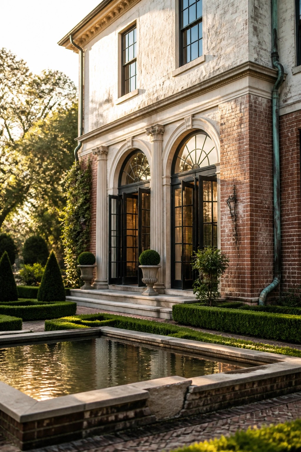
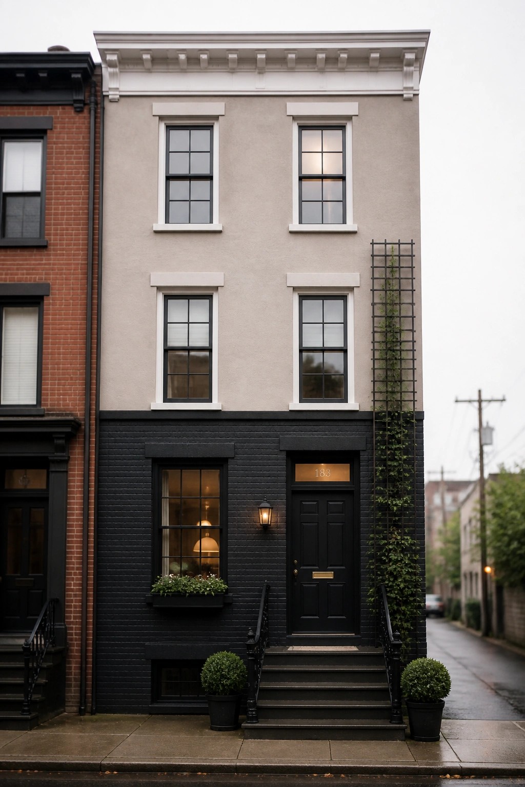
Dark Base With Brick Above
A dark lower section on the facade gives the house a solid, grounded feel while the lighter brick above keeps things from feeling heavy. This split works especially well when the dark color wraps the entry and ground floor windows, so the eye reads the house as one clean shape instead of a busy mix of materials.
It suits both older brick buildings getting an update and newer homes that need some weight at the base. Keep the color change at a natural break like a window sill line and limit any extra trim so the two tones stay the main feature.
Two Tone Siding In Soft Neutrals
Many homes gain more shape when the main siding sits a step darker than the trim. A warm neutral like this beige keeps the look calm while the slight shift in tone helps the rooflines and porch stand out without extra color.
This works best on houses with clear trim details and some stone at the base. Stick to one main siding color, white trim, and a natural stone accent so the contrast stays simple and the whole exterior feels balanced rather than busy.
Light Upper with Dark Lower Siding
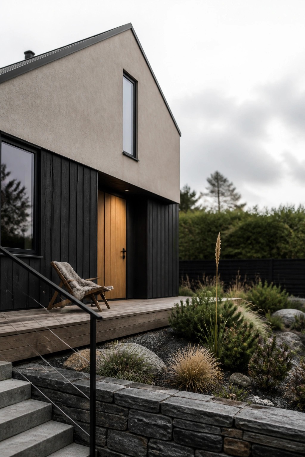
This color split gives the house a simple sense of height and weight. The lighter upper section reflects light and keeps the overall look open, while the darker lower section anchors the structure without extra trim or details.
It suits homes with straightforward rooflines and works best when the two tones stay close in temperature. Keep the transition clean at the change point and let one warm accent, like a wood door, soften the contrast.
Mixing Brick With Painted Stucco
One simple way to add depth to an exterior is to let brick cover part of the facade while a lighter painted surface takes over the rest. The change in texture and tone gives the house more interest without needing extra colors or complicated patterns.
This approach works best on homes that already have some traditional details. Keep the brick on the lower sections or corners and let the paint cover the main walls above. The key is to choose a light color that sits close to the brick rather than fighting it.
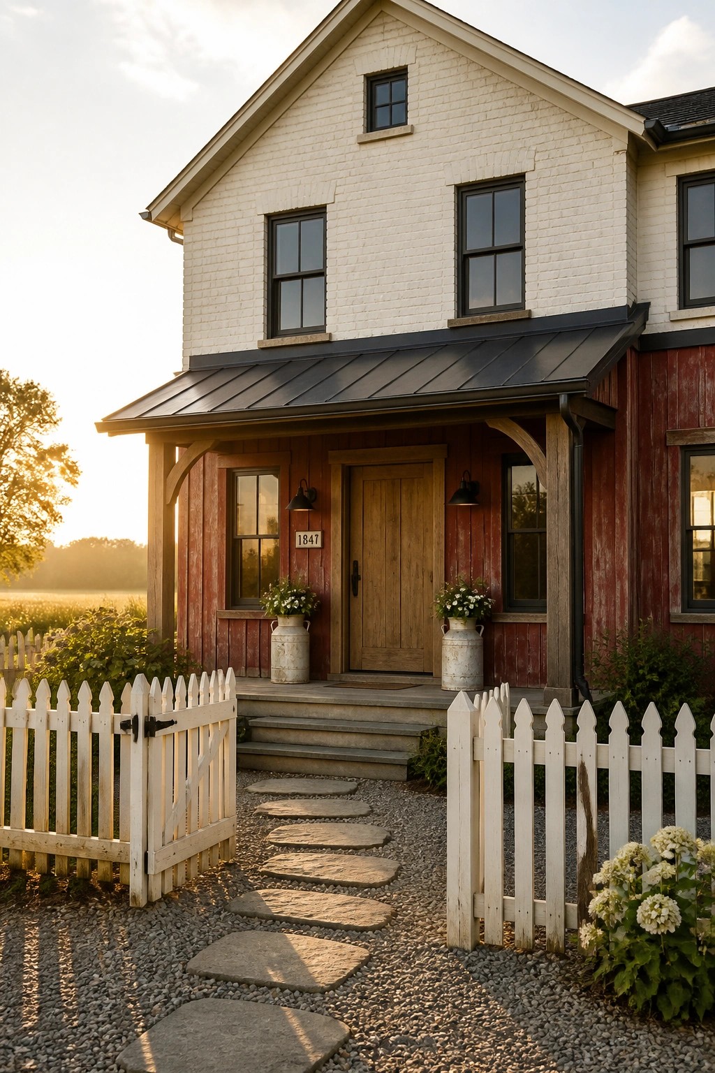
Dark Lower Walls With Lighter Upper Siding
A simple two tone approach works well when the lower part of the house uses a darker wood tone and the upper section shifts to a lighter color. This split keeps the house from looking flat while still feeling balanced and easy to live with. The stone base adds another layer without complicating the overall look.
This works best on smaller homes or cottages where you want some weight at the bottom but still need the house to feel open higher up. Keep the trim and windows in soft neutrals so the two main colors stay the focus. Avoid letting the darker shade creep too high or the effect can start to feel heavy.
Brick Base With A Smooth Upper Wall
A brick lower section gives the house some weight and texture while the smoother finish above keeps the overall look light. The shift between the two materials creates depth without relying on lots of extra colors or details.
This approach suits modern two story homes where you want a bit of contrast but still prefer a simple palette. Keep the tones fairly close so the change reads as intentional rather than abrupt.
Lighten the Gable
One simple way to add a bit of depth on an exterior is to paint the gable a lighter shade than the main body color. It gives the roofline a gentle lift without extra trim or strong contrast.
This works especially well on smaller homes or cottages where you want the house to feel balanced but not busy. Stick with soft tones on both sections and let the door or porch details carry a little weight.
Brick On The Upper Level
Many older homes already have a natural break between stories, and using brick only on the upper level keeps the look clean. The white brick here sits above the red painted siding without competing, so the house reads as one simple shape instead of a mix of busy details.
This approach works best on two story homes where you want some contrast but still need the whole facade to feel balanced. Stick to one light tone above and one deeper color below, and let the trim stay the same throughout so nothing fights for attention.
Horizontal Color Breaks On The Facade
A simple two tone approach works well when the upper section of the house gets a warmer tone while the main walls stay cooler and more neutral. This creates a clear break that adds interest without needing lots of extra trim or details. The entry stays grounded because the door and surrounding wall stay in the same family as the lower color.
This works best on homes with a strong horizontal line near the roof edge or a second story band. Keep the upper tone soft and earthy so it does not fight the lower color. Avoid letting the break line up with windows if you want the look to stay calm.
Dark Lower Levels With A Lighter Upper Facade
A dark base on the lower part of the house gives the whole front a grounded look while the lighter color above keeps things from feeling heavy. This split works especially well on narrow homes or row houses where you want some separation without adding extra trim or details.
It suits older brick homes or simple stucco fronts that already have a clear line between floors. Keep the darker color on the foundation and first level, then switch to the lighter shade above the second floor windows. Just make sure the transition lines up with an existing architectural break so the change feels natural rather than painted on.
Stone Base With Wood Siding
A stone base paired with wood siding above gives the house a solid, grounded look without adding extra colors or patterns. The lower section feels heavier and more permanent while the wood keeps the upper part lighter and warmer. This split works especially well on single story homes where you want some visual weight near the ground.
It suits homes with simple rooflines and plenty of windows. Keep the stone in a neutral tone and the wood in a mid range brown so the contrast stays calm rather than busy. Avoid stacking too many other materials on top of this mix.
Frequently Asked Questions
Q: What parts of the house work best for the second color?
A: Try the gables or the area around the front door first. These spots add depth while the main walls stay calm and dominant. Large flat surfaces look better in the lighter tone.
Q: How do I keep the two colors from clashing once they are up?
A: Pull both shades from the same color family so they sit next to each other without fighting. Paint a few sample boards and check them at noon and again at sunset. A softer second color usually prevents any jarring jump.
Q: My trim already stands out. Will two tones still look right?
A: Let the second house color stay quiet next to that trim. This stops the whole front from feeling crowded. Stick with one main wall color covering most of the siding.