

When I look at modern houses with flat roofs and large windows, the color choices on the exterior set the tone for how the whole place reads from the curb.
I have seen palettes that look balanced in a rendering but end up making the clean lines feel flat or washed out once the materials are in place.
Roof edges and window frames need tones that connect without extra contrast, and I usually test a few samples on the actual siding first.
Large windows pull in reflections from the sky and nearby surfaces, so the main wall color has to work with whatever shows up in the glass throughout the day.
A simple base that ties the trim and roofline together tends to hold up better over time than anything too layered.
Warm Wood Against Cool Gray Exteriors
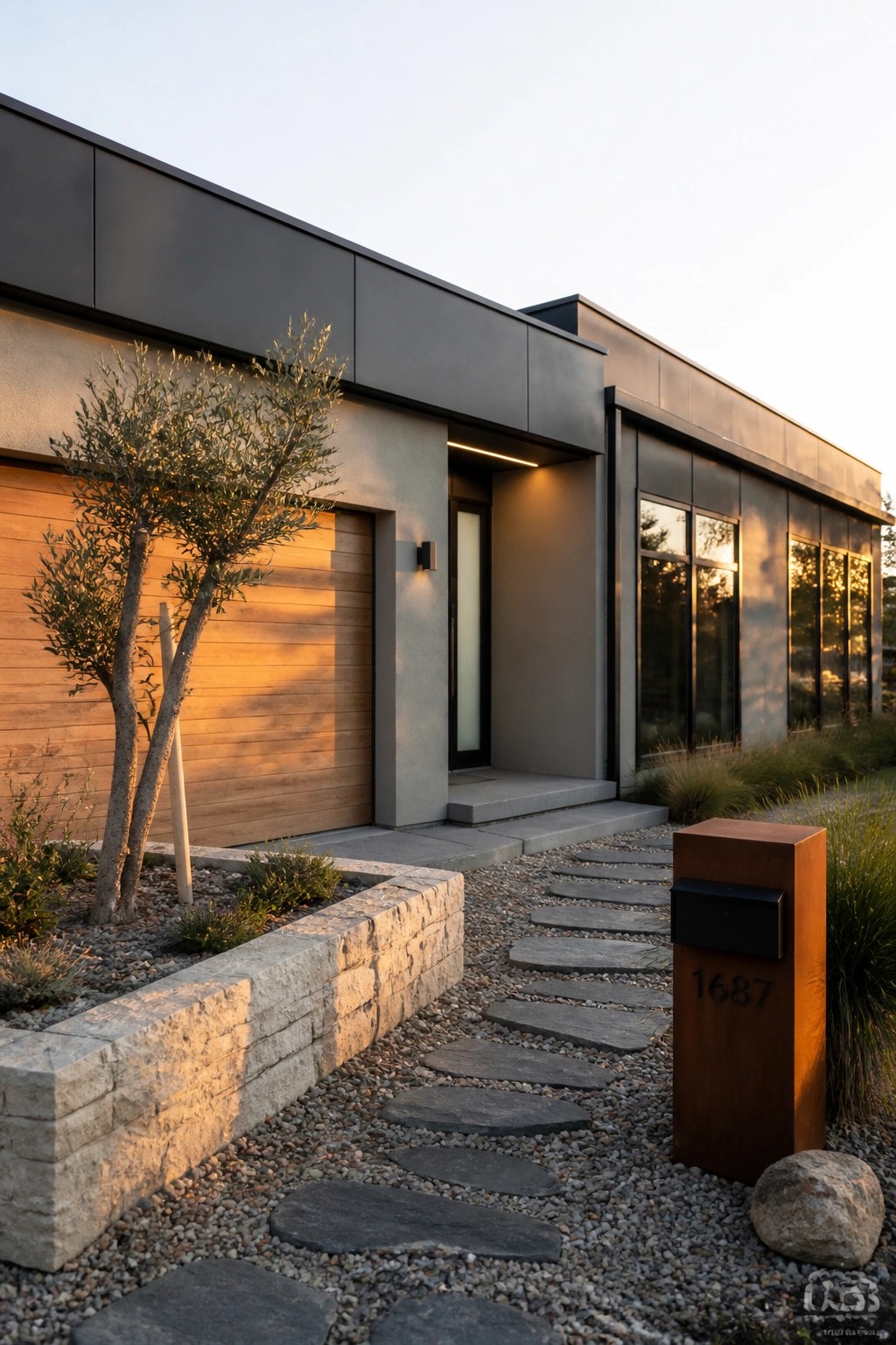
A simple way to keep a modern flat roof house from feeling too stark is to bring in one strong warm element against the cooler grays and dark metals. The wood garage door here does that job well. It adds just enough natural tone to balance the concrete walls and dark upper panels without breaking the clean lines.
This approach works best on homes that already have a limited palette. Use the wood on a large flat surface like a garage door or an entry panel so it reads as a deliberate choice rather than scattered accents. It suits single-story modern houses with big windows and minimal trim.
Soft Gray With Warm Wood Tones
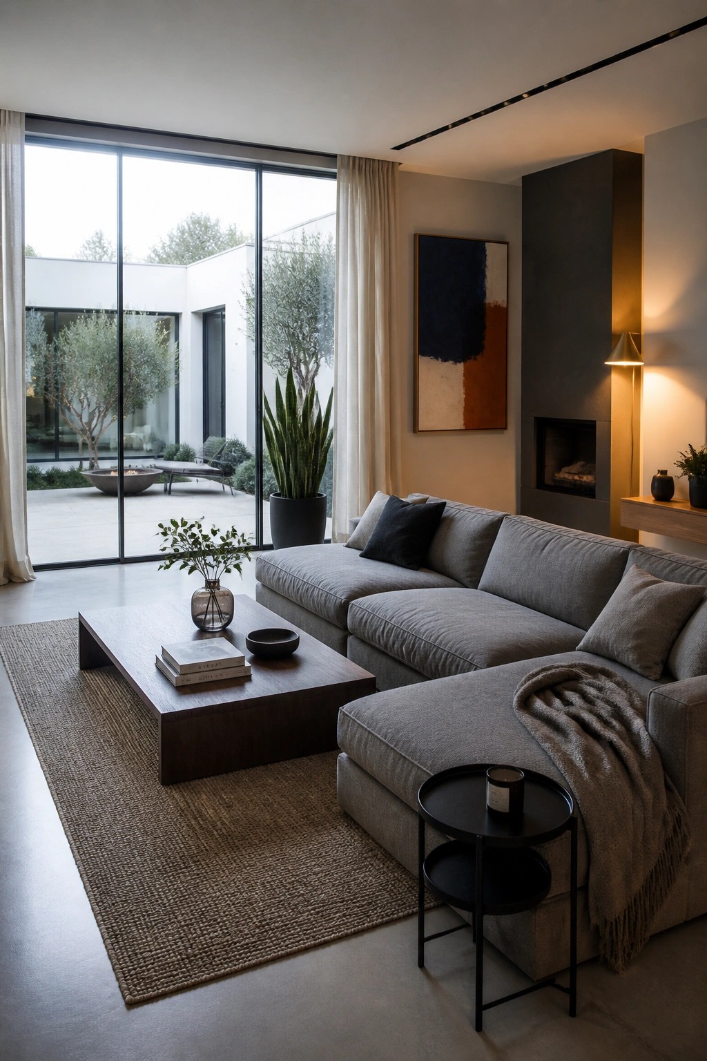
Many modern rooms start with a soft gray sofa as the main piece. It gives a calm base that works with big windows and simple lines without feeling heavy.
Adding warm wood furniture and a few deeper tones in the art keeps the space balanced. This mix works best in homes that get plenty of natural light and already have clean architecture.
Gray And White Kitchen Palettes
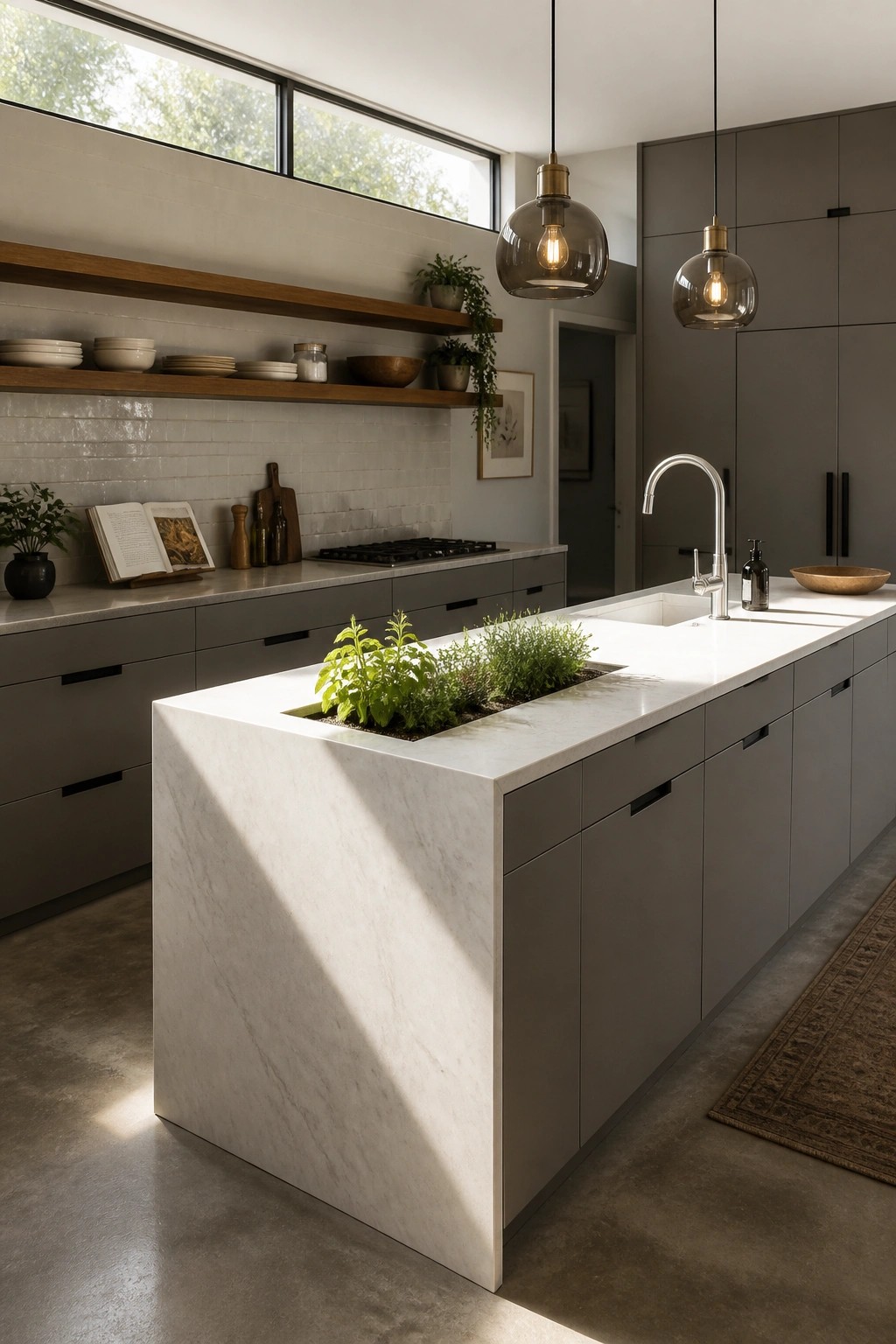
A simple gray and white scheme works well in a modern kitchen because it keeps the space feeling open and calm. The gray cabinets provide a quiet background while the white island and counters add brightness without extra color or pattern.
This approach suits homes with large windows and clean lines since the light colors reflect daylight and help the room feel connected to the outdoors. Stick to matte finishes on the cabinets and a single stone for the island so the palette stays consistent and easy to live with.
Terracotta And Olive Green In Dining Areas

Many modern homes use terracotta flooring with olive green seating to bring a natural warmth into spaces that have clean lines and big windows. The colors feel grounded and work well with black accents and light walls, keeping the room from feeling too stark.
This palette suits homes with flat roofs and simple architecture. Place terracotta on the floor and use olive on chairs or benches so the tones balance each other. Keep other surfaces neutral to let the warmth come through without adding extra pattern.
Warm Neutral Colors For A Restful Bedroom
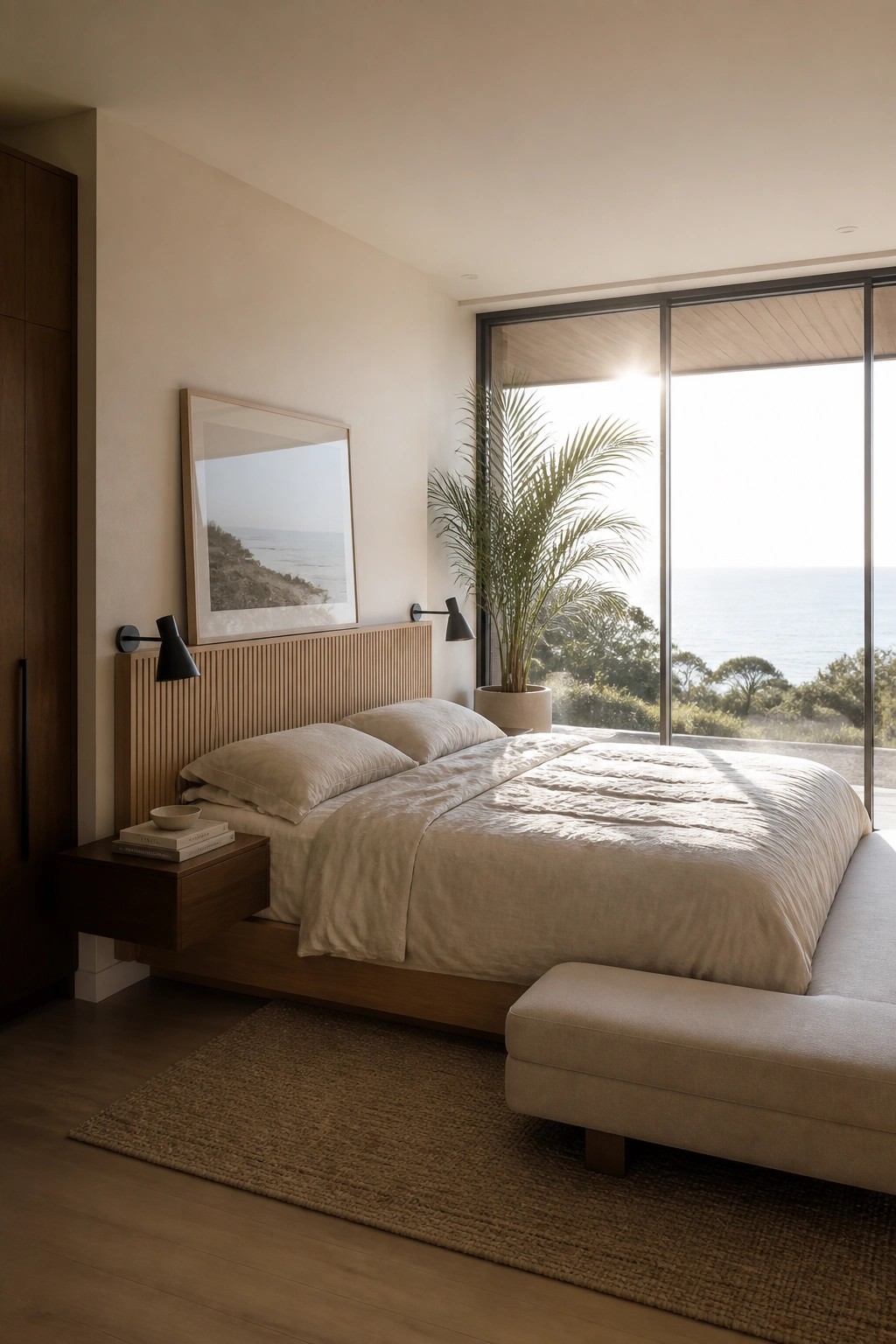
Many modern bedrooms use a warm neutral palette to keep things calm and simple. The soft beige tones on the walls and bedding help the space feel quiet even when the room gets plenty of natural light from big windows.
This color choice works well in homes with clean lines and large glass areas. Stick to light wood, linen fabrics, and off-white walls so the view outside becomes the main focus without extra color fighting against it.
Consistent Dark Tiling Throughout the Bathroom
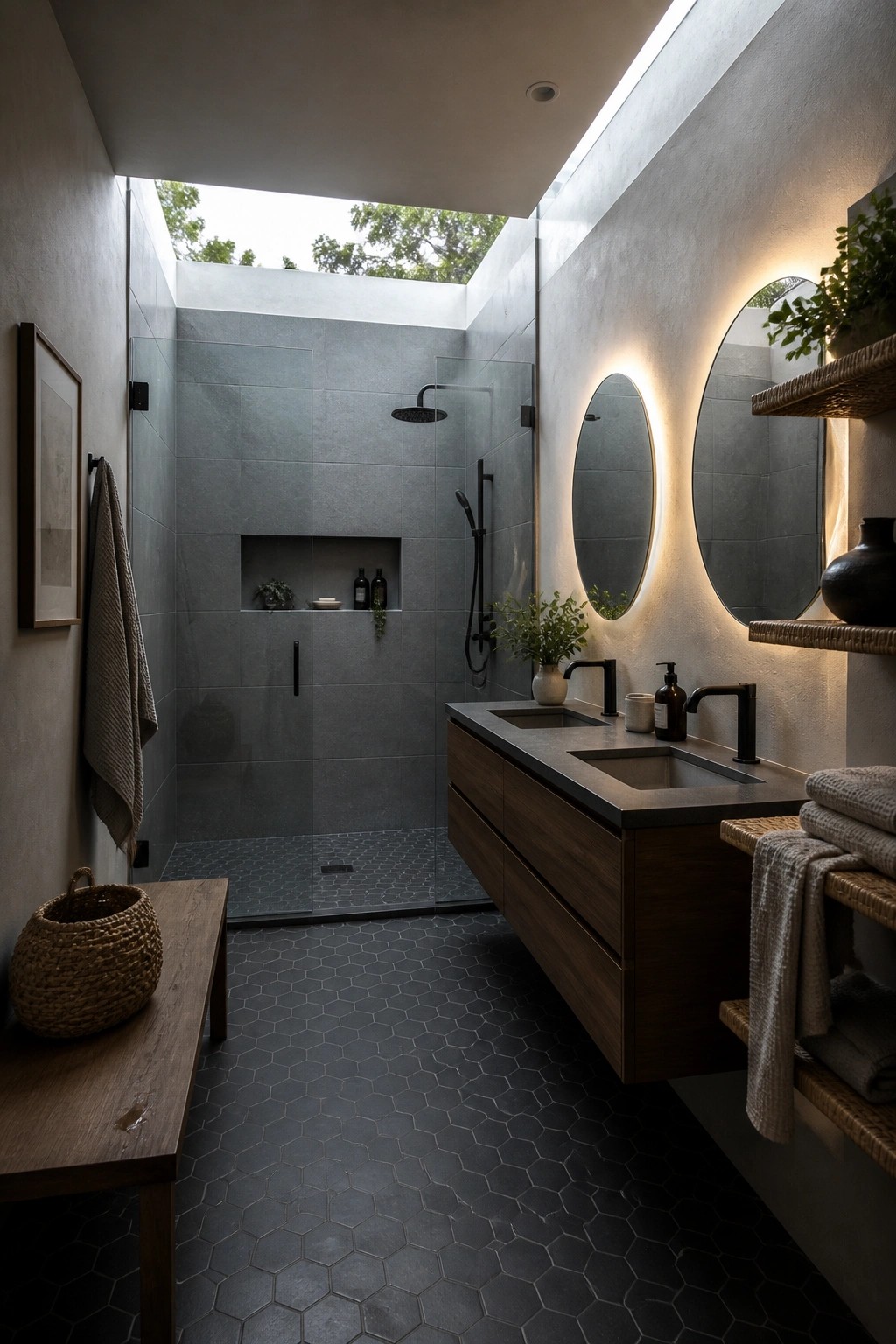
Many bathrooms feel choppy when different materials meet at every turn. Using the same dark gray tile on the floor and all the way up the shower walls keeps the room feeling steady and calm instead of busy.
This approach works especially well in smaller or open-plan baths where you want the space to read as one surface rather than separate zones. Just watch the grout color so it does not break the effect, and balance the darkness with wood tones or a skylight for light.
Warm Wood With White Walls In Offices
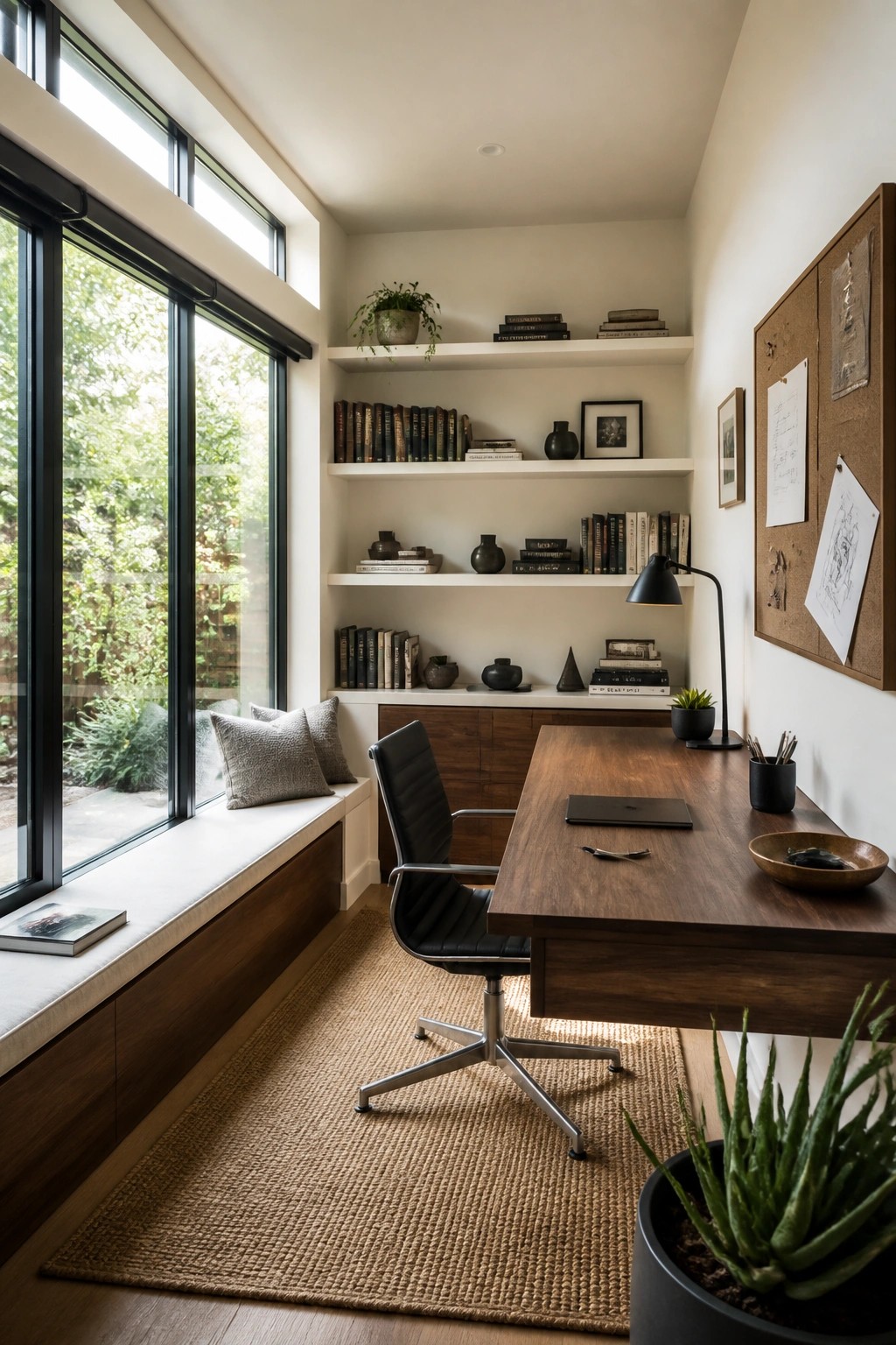
Many modern homes use white walls and built-in shelving to keep an office feeling open and calm. Adding wood tones through the desk and lower cabinetry brings just enough warmth without breaking the clean look.
This works best in houses that already have large windows and simple lines. Keep the palette limited to white, wood, and a few black accents so the room stays practical for daily work.
A Warm Neutral Base With Dark Accents
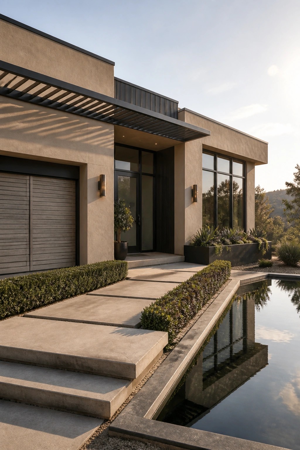
Warm beige walls paired with dark gray and black accents give a modern flat roof home a grounded look without feeling cold. The contrast keeps the clean lines sharp while the lighter base color helps the house blend into a sunny setting. It works especially well when the roofline stays simple and the windows are large.
This approach suits homes with minimal ornamentation and open outdoor spaces. Stick to two or three tones total, and let the darkest shade handle the trim, pergola, and window frames so the main walls stay bright. Avoid adding too many extra colors that could break up the calm effect.
Outdoor Seating Built Around a Fire Pit
Many homes place the fire pit right in the middle of the seating instead of off to the side. This keeps the layout simple and gives everyone an easy spot to gather without needing extra tables or decor to fill the space.
It works especially well under a covered overhang on homes with clean lines and large windows. The fire pit stays usable later into the evening, and the seating can stay modular so you can shift pieces around as needed.
Dark Exteriors That Highlight Foliage
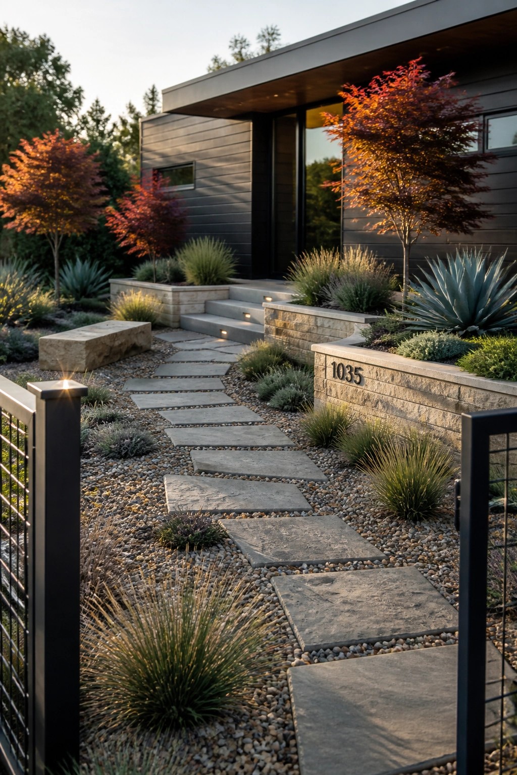
A dark exterior works well when the goal is to keep the focus on the surrounding plants rather than on extra trim or details. The deep siding color here lets the red and orange trees stand out without competing for attention. It also helps the stone walls feel more grounded.
This approach suits modern homes with flat roofs and simple window placements. Keep the plantings bold in color and keep the hardscape simple so the dark tone does not feel heavy. Too much pattern on the ground can fight with the siding, so stick with gravel or clean pavers.
Wood And Charcoal For Balcony Seating
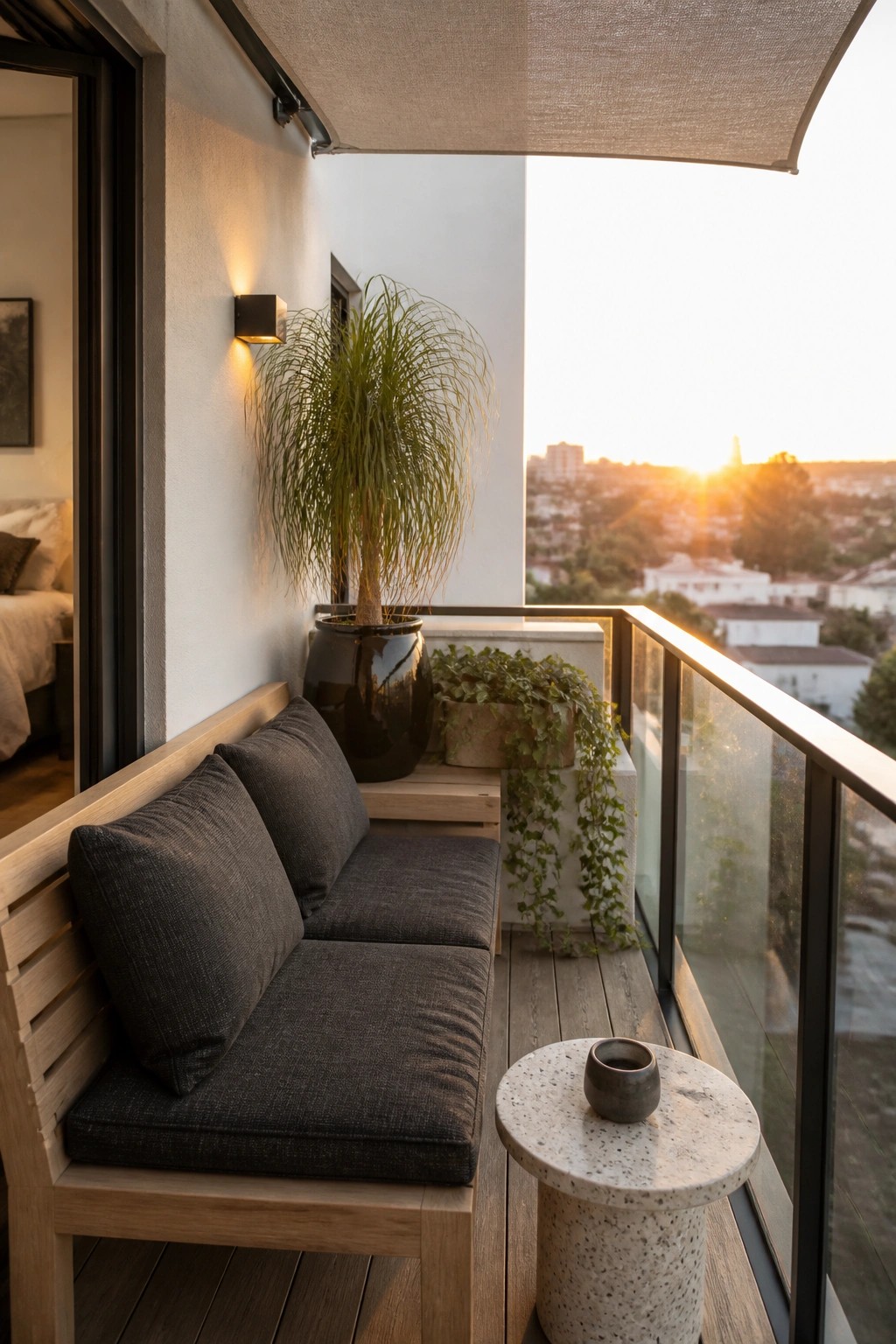
A simple wooden bench with dark charcoal cushions turns a small balcony into a place you actually want to sit. The colors stay quiet and let the view and the plants do the talking. It feels like an easy extension of an indoor room without trying too hard.
This works best on modern balconies with clean railings and flat rooflines. Keep the cushions in a sturdy outdoor fabric and add just one or two plants in dark pots. Skip bright colors or too many pillows if you want the same calm look to hold up over time.
Built-In Benches For Everyday Storage
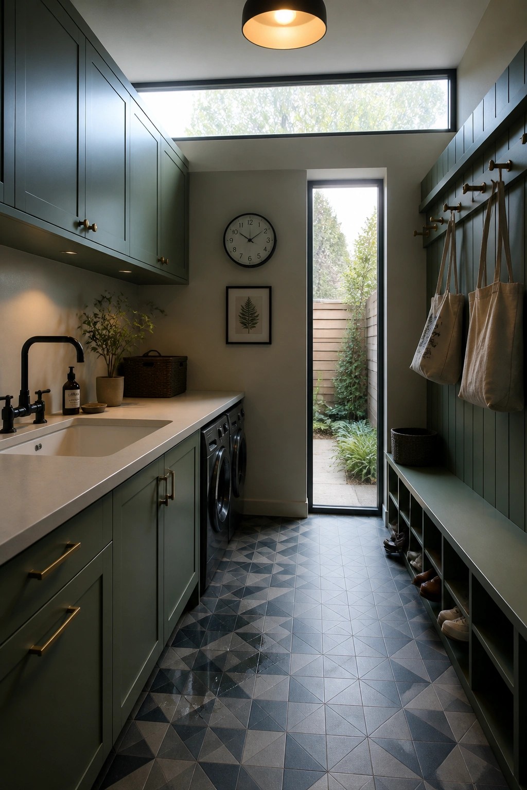
A bench with open cubbies along one wall gives a narrow room a clear spot for shoes, bags, and coats without crowding the floor. The setup works especially well when the bench matches the cabinet color, so the whole length reads as one piece rather than separate storage units.
This works best in homes where the laundry room also serves as the main entry from the yard. Keep the cubbies shallow enough that items stay visible, and leave a little open floor space in front so the bench stays usable for sitting.
Sunken Seating In Patio Layouts
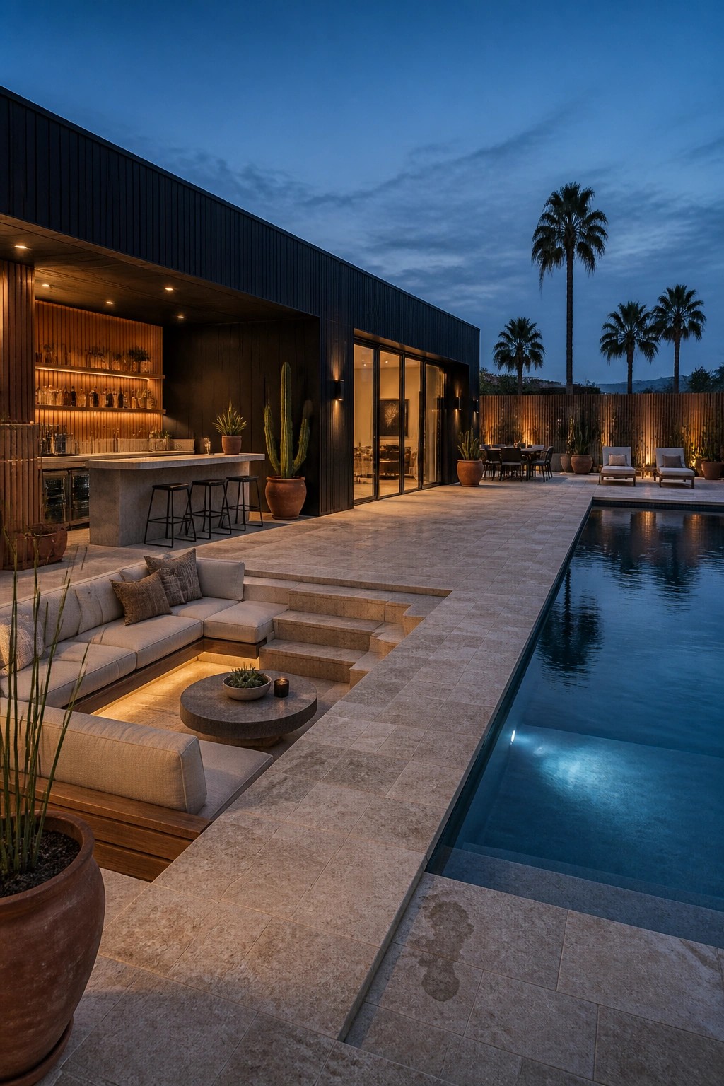
A sunken seating area gives the outdoor space a clear sense of separation without needing walls or screens. It pulls the main living zone down a step or two, which makes the seating feel more settled and contained while still keeping it open to the rest of the patio.
This works especially well on flat sites where the pool runs alongside the house. Keep the surrounding paving simple and match the step height to standard seating depth so the drop feels natural rather than steep. The result is a patio that feels zoned without looking chopped up.
Warm Earth Tones for Bedroom Color Palettes
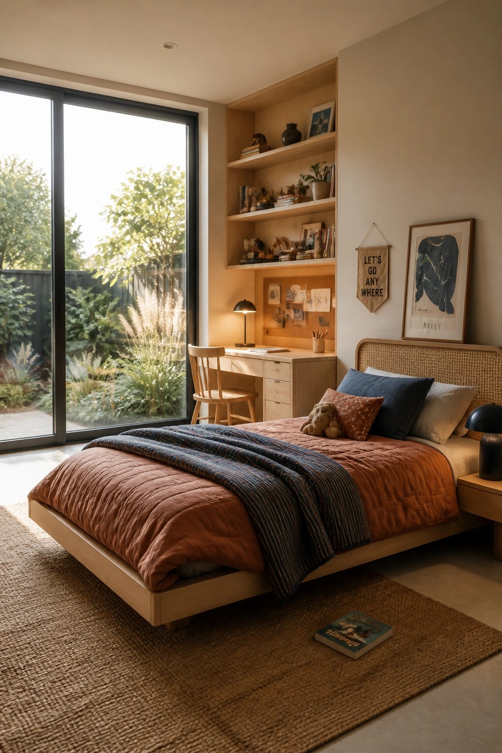
Terracotta and deep blue work well together in bedrooms because they feel grounded without making the space too heavy. The mix of a rust colored quilt with a striped blue throw adds warmth while still keeping the room light, especially when paired with pale wood and a large window that brings in plenty of natural light.
This palette suits modern homes with clean lines and big windows since the colors absorb some of the brightness and make the room feel more lived in. It works best when you keep the walls neutral and let the textiles do the work, rather than adding too many extra patterns or dark furniture pieces that could close the space in.
Using Light Neutrals Against Dark Accents
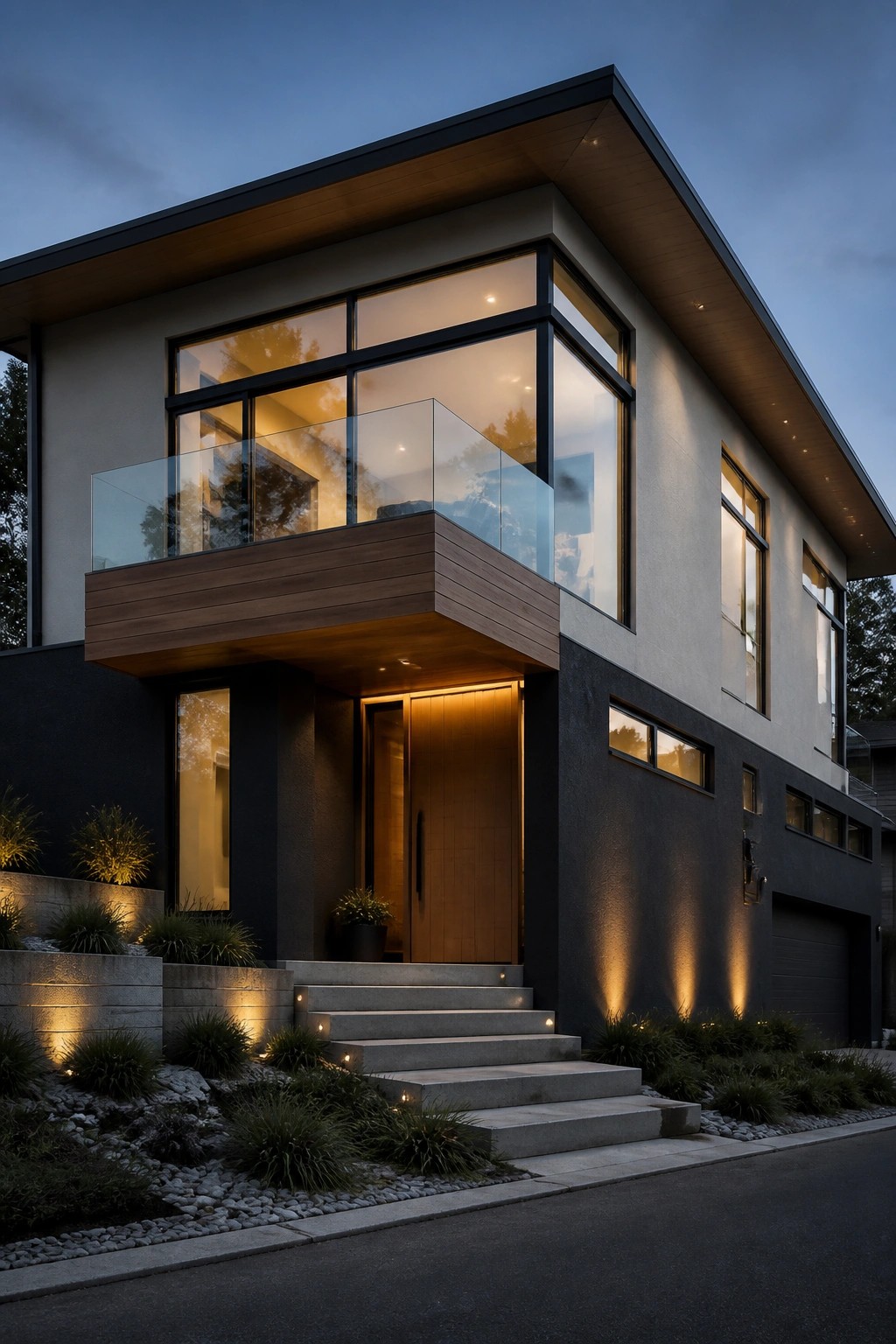
Many modern homes look better when the main walls stay light while the lower sections and trim go darker. This split keeps the house from feeling too heavy but still gives it some weight at the base. The wood around the door and balcony adds just enough warmth so the grays do not go cold.
This approach works well on houses with flat roofs and big windows because the contrast keeps the clean lines sharp. It suits two-story homes where you want the upper floor to feel lighter and more open. Stick to two or three tones total and let the wood handle the rest.
Earthy Greens With Warm Terracotta Accents
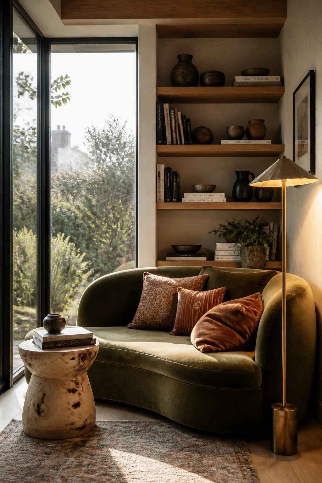
Many modern rooms with large windows can feel a bit stark if the colors stay too cool or neutral. Adding a deep green sofa and layering in terracotta and rust pillows helps anchor the space and brings a natural warmth that works with clean lines and plenty of light.
This approach suits homes that want a calm but lived-in feel. Keep the walls light, use wood tones on shelves or flooring, and stick to just a few accent colors so the palette stays simple and easy to live with.
Dark Exteriors With Warm Wood Ceilings
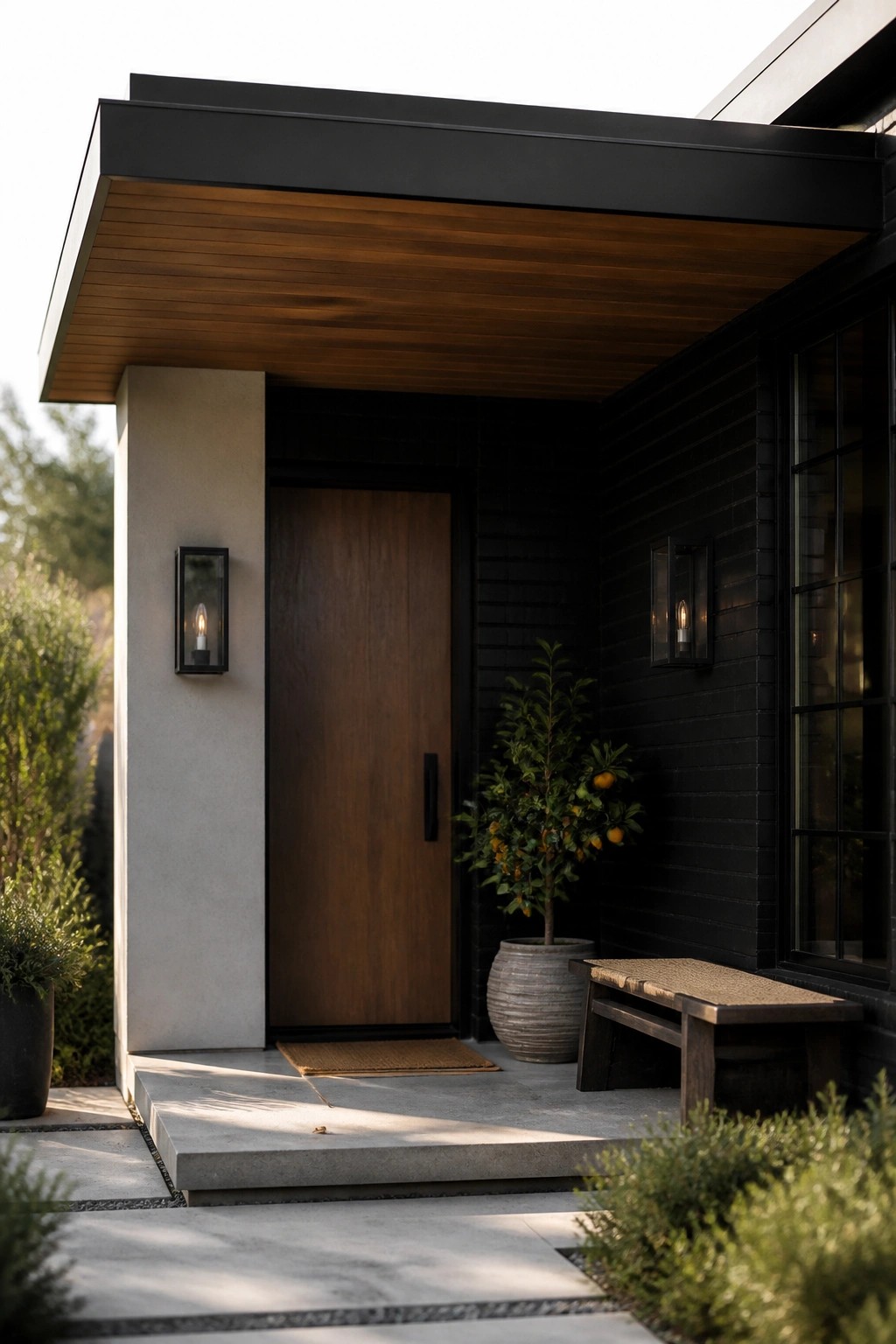
Many modern homes lean on a deep black or charcoal siding to give the facade weight and keep the lines sharp. The wood ceiling on the overhang adds a single warm note that stops the dark palette from feeling too heavy or cold.
This works best on flat roof homes where the roofline stays simple and clean. Use the same wood tone sparingly elsewhere, such as on a door or small accent, and let the dark siding do most of the work against large windows.
Dark Wood and Deep Green for Dining
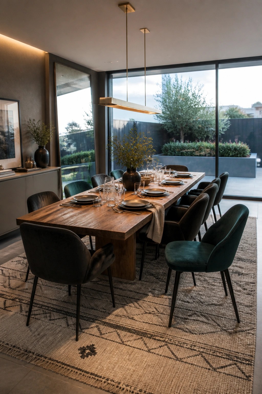
Many modern homes are leaning into deeper colors for dining rooms instead of staying light and neutral. A long wood table paired with black and green chairs gives the space weight and makes it feel more lived in.
This approach works best in rooms with big windows, where the dark tones keep the brightness from feeling empty. It fits homes with clean lines because the colors add interest without extra patterns or layers.
Light Wood Floors In Narrow Hallways
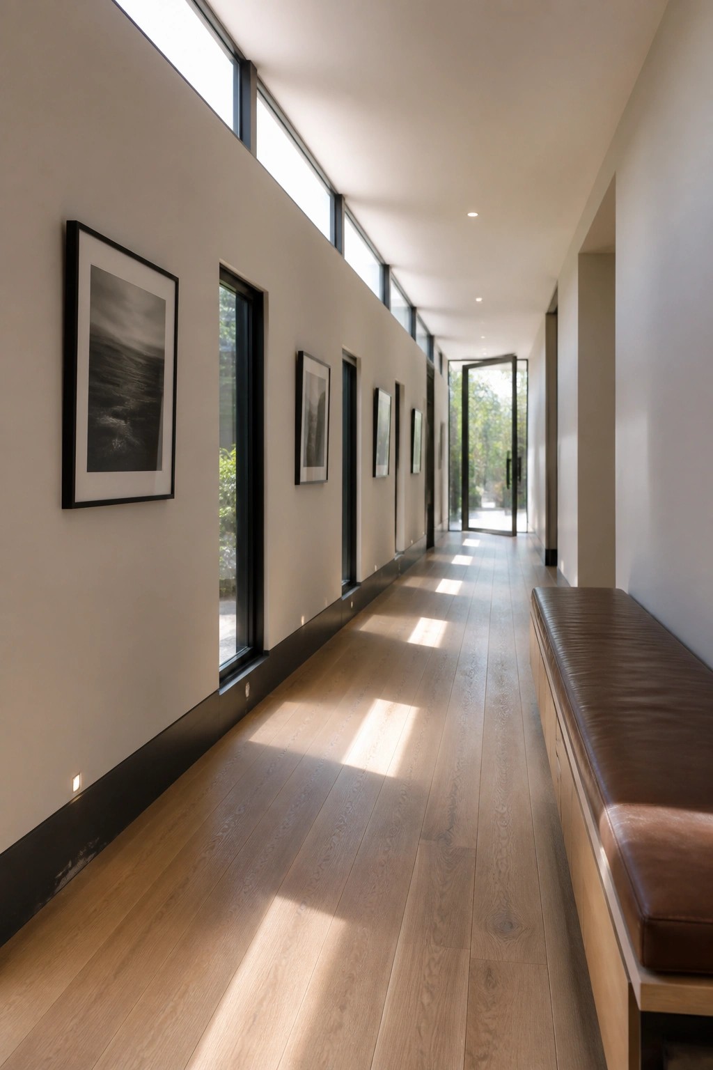
Light wood flooring helps a long hallway feel brighter and more open. The pale tones catch sunlight from high windows and spread it down the length of the space, which keeps the area from feeling closed in.
This approach works best in homes with clean lines and plenty of natural light. Pair the floor with white walls and simple dark trim so the wood stays the main material without adding extra color or pattern.
A Central Fire Pit For Terrace Seating
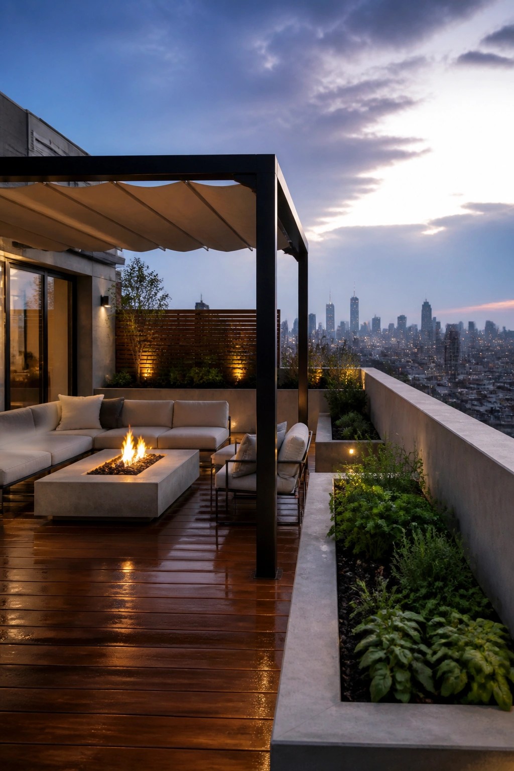
A fire pit placed right in the middle of the seating layout turns a rooftop deck into a space people actually use after dark. It gives the area a clear purpose without needing walls or extra structures, and the neutral furniture and wood decking keep everything simple and tied together.
This setup works best on flat roofs where you have open floor space and want to create one main gathering spot. Keep the surrounding seating low and the materials consistent so the fire stays the focus instead of competing with too many other elements.
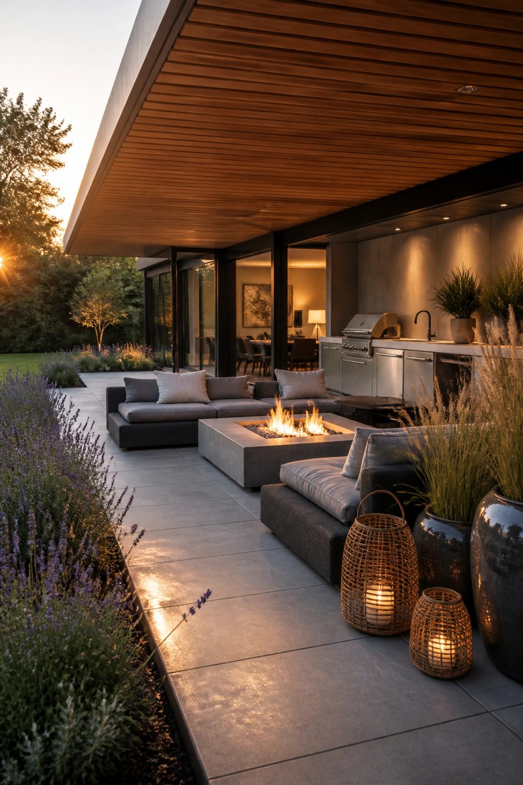
Covered Outdoor Kitchens
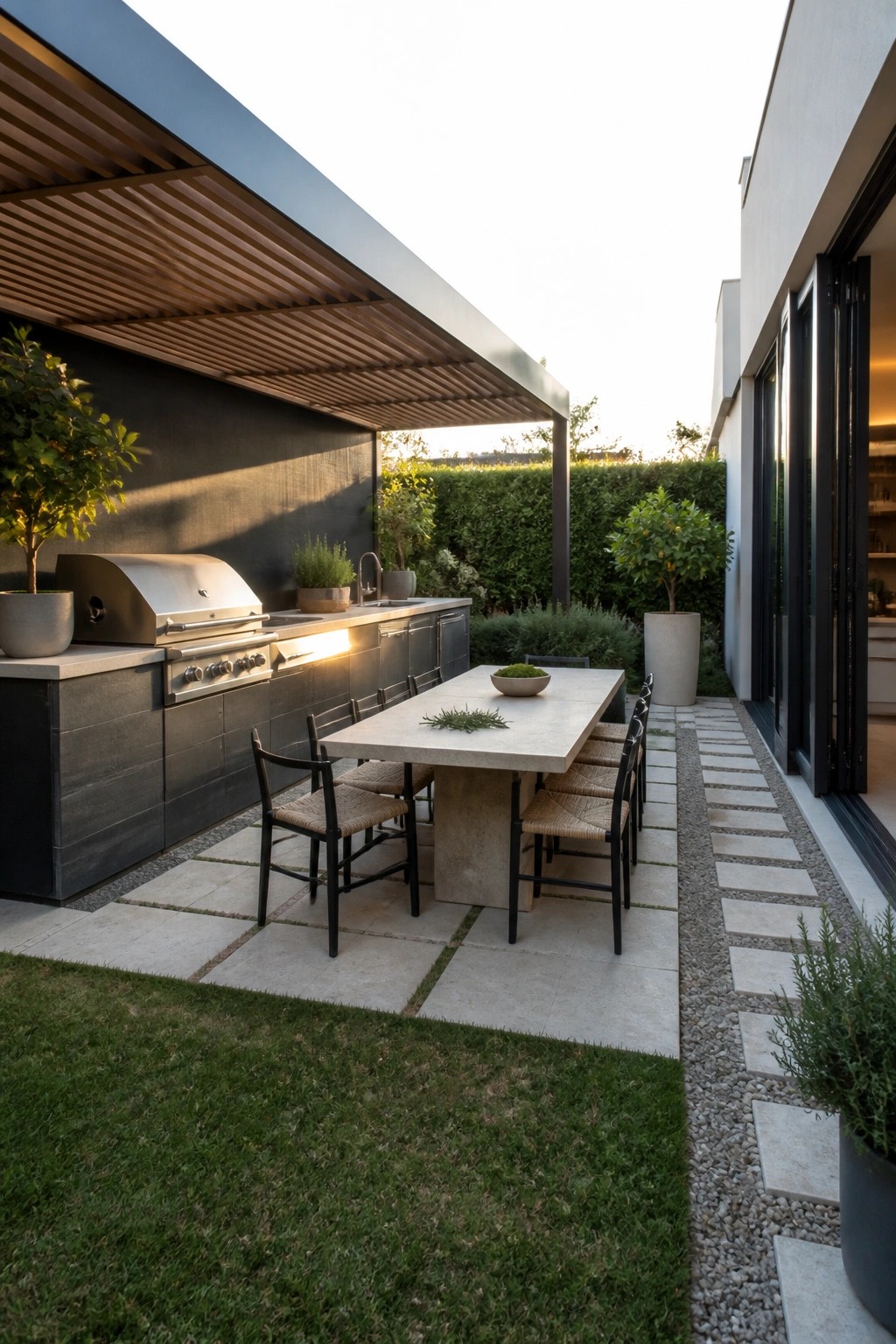
An outdoor kitchen works better when it has some kind of roof overhead. It turns the space into something you can actually use most days instead of only on perfect weather days.
This setup fits homes with flat roofs and simple lines because the cover can match the architecture without looking added on later. Keep the grill and counters along one wall and place a dining table right beside it so cooking and eating stay in the same spot.
Frequently Asked Questions
Q: How do I pick colors that let my big windows stand out instead of competing with them?
A: Go with soft neutrals on the main walls so the glass becomes the focal point. Add one deeper shade on the trim or a single accent wall to frame the view without crowding it. This keeps the whole exterior feeling open and balanced.
Q: What works best for the flat roof when the rest of the house uses light tones?
A: Match the roof to a slightly darker version of your main wall color. It creates a clean top line that emphasizes the architecture rather than drawing attention upward. Test a small patch first to see how it reads from the street.
Q: Can I use one of these palettes on a house that already has some existing paint?
A: Pull two or three hues from the palette that sit close to what is already there. Update just the trim and any smaller details first to see how the new tones settle in. The large windows will help unify the final look.
Q: Do these colors need special care in bright sun?
A: Choose paints labeled for high UV resistance and apply them in two thin coats. The flat roof surfaces will show wear first so plan to check those every couple of years.