

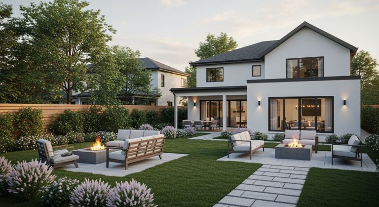
Some homes just get it.
You drive by and something pulls your eye.
It isn’t about the size or the price tag.
It’s a sense of harmony. A feeling that everything is exactly where it’s supposed to be.
This isn’t an accident. It’s design. And it has its own quiet logic.
It All Starts with Proportion and Scale
The most important invisible rule is proportion.
It’s the relationship between all the parts of a house. The windows to the wall, the roof to the body, the door to the entryway.
When the proportions are right, the house feels settled and pleasing.
When they’re wrong, it just feels… off.
Think of a tiny cottage with a giant, imposing two-story portico. It’s completely out of scale. The pieces don’t speak the same language.
Good design also considers human scale.1 A home should feel like it was built for people. The height of the ceilings, the size of the windows, the width of the doorways all contribute to a feeling of comfort and belonging.
There’s a reason ancient architecture so often referenced things like the Golden Ratio, a special number often written as ϕ (phi).
Certain mathematical relationships just feel naturally balanced to the human eye.
A classic Cape Cod house works because its steep roof pitch is perfectly proportioned to its cozy, symmetrical body.2 A sprawling desert modern home feels right because its low, horizontal profile mirrors the vast landscape.
The scale is appropriate for the style and its surroundings. It just makes sense.
The Rhythm of Repetition
Our brains are wired to find comfort in patterns.
In architecture, this translates to rhythm and repetition.
It’s the steady beat that makes a design feel cohesive.
Take a simple row of double-hung windows on a traditional Colonial home. Their consistent size and spacing create a calm, predictable rhythm. It’s orderly. It’s classic.
Or look at the strong vertical lines of board and batten siding on a modern farmhouse. That repetition gives the home texture and visual height. It draws the eye upward.
It’s clean. It’s structured. It works.
But pure repetition can be a little boring if you’re not careful.
The best designs know how to play with the pattern. They establish a rhythm and then introduce a thoughtful accent to break it.
Imagine a long, dark gray modern home with a series of identical, floor-to-ceiling windows. Then, right at the entrance, a front door made of warm, natural cedar.
That single change creates a focal point. It’s a moment of contrast that makes the whole composition more interesting. It says, “Look here.”
This is the key. Establish a pattern, then break it with purpose.
Finding Balance: Symmetry and Asymmetry
Every good design has a sense of visual balance.
The most obvious way to achieve this is with symmetry.
Think of a classic Georgian home. The front door is perfectly centered, with an equal number of windows mirroring each other on both sides. It’s formal, grounded, and stable. There’s a powerful sense of order.
Symmetry is timeless. But it can sometimes feel a bit rigid.
The other approach is asymmetry. And it’s often more dynamic.
Asymmetrical design doesn’t mean a house is lopsided. It means the visual weight is balanced, even if the elements themselves aren’t identical.
It’s a bit harder to pull off. But the result feels more relaxed and effortlessly modern.
A large picture window on one side of a facade might be balanced by the visual mass of a stone chimney and a smaller window on the other. A prominent garage wing can be balanced by a strong, intersecting roofline over the main living space.
The pieces aren’t the same, but they feel like they have equal presence.
Many Mid-Century Modern or Scandinavian-inspired homes use asymmetry to create that feeling of casual, organic flow.3 The form follows the function inside, and the exterior reflects that with a more varied, yet still balanced, look.
Recommended Products

【Curtains Set】: Set includes 2 panels of abstract geometric printed blackout curtain(42 inch wide by 84 inch long each). Our curtains are grommet design, which makes our curtains easy to install and slide smoothly

❤MATERIAL USED:polyester. Per set including 2 panels, extremely soft to touch.

Size:Includes 2 Blackout Curtains, The Total Length Of The 2 Pieces Is 42 Inches In Width And 45 Inches In Length. These Curtains Feature An Innovative Rod Pocket Design For Easy Installation And Smooth Sliding.
When Materials and Texture Do the Talking
A home’s form is only half the story.
The materials used for the exterior are what give it character and life.
A good design uses materials that enhance its architectural style and feel appropriate for its setting. And it doesn’t try to use too many at once.
A minimalist home might rely on super-smooth white stucco and dark metal window frames. The beauty is in the crispness and the lack of texture. It’s all about clean lines and sharp contrast.
But a rustic cabin in the woods calls for the opposite.
It needs texture. Rough-cut timber, a natural stone foundation, maybe some weathered steel. These materials feel warm and tactile. They connect the structure to the earth around it.
A common mistake is throwing too many materials at one house.
That jumble of brick, with some vinyl siding, a bit of stone veneer, and maybe some stucco accents. It rarely works. The house ends up looking confused and busy.
A more disciplined palette is almost always better.
Choosing two or three materials that complement each other is enough. The contrast between them is what creates visual interest. Think about how smooth metal siding plays against the warmth of wood. Or how dark-stained cedar pops against light-colored brick.
It’s a curated, intentional choice.
The Connection to the Ground
A house shouldn’t look like it was just dropped from the sky onto a plot of land.
The best designs feel anchored. They look like they belong right where they are.
This is all about managing the transition from the vertical walls to the horizontal ground plane. A house needs to be gracefully connected to its site.
Landscaping is the easiest way to do this. Foundation plantings, like shrubs and perennials, soften that hard line where the house meets the dirt.
But the architecture itself can do a lot of the work.
Creating a solid base, or plinth, is a classic technique. The bottom few feet of the house might be clad in a heavier, more textured material like stone or brick, with a lighter material like wood or stucco above. This gives the entire structure a sense of weight and permanence. It feels grounded.
Porches and decks are also brilliant connectors.
They extend the home’s living space outward, creating a middle ground between the house and the yard. Low garden walls, patios, and thoughtfully designed walkways all do the same thing. They blur the lines.
The home doesn’t just stop at its walls. It reaches out and engages with the landscape.
And when all these pieces come together, you get that feeling.
The principles aren’t rigid rules. They’re just guides. The most stunning homes often know exactly when to break them for effect.
It comes down to intention.
When every line, material, and proportion feels considered, the whole design sings.
That’s when a house feels right. Because it is.
