

When I drive through older neighborhoods, the houses with bold blue exteriors always stand out for how they refresh tired facades and boost curb appeal.
Those shades work best when they complement siding materials like clapboard or fiber cement, while highlighting rooflines and drawing attention to the front entry.
I tested a few blues on our trim years ago, and learned quickly that the right one ties brick accents to the overall look without overwhelming it.
Blues hold up well against changing light too.
A handful of these colors strike that balance, making them solid choices to adapt for your own home’s street presence.
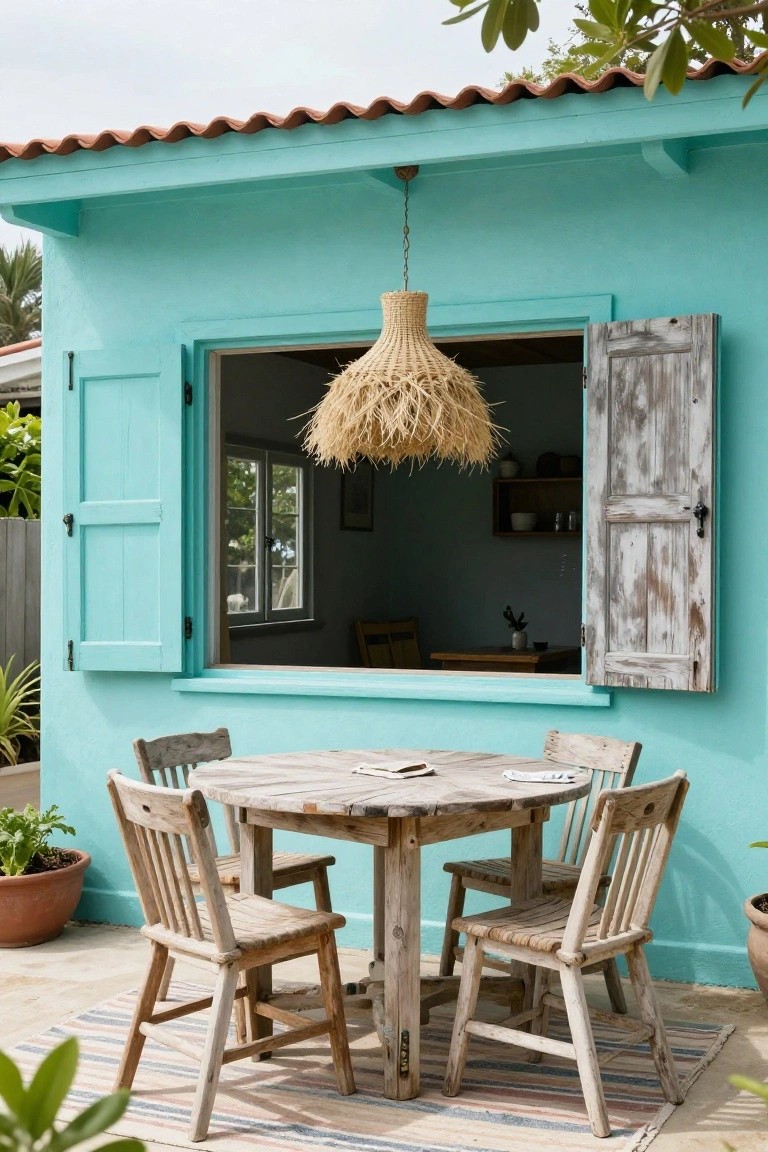
Light Blue Shingle Siding
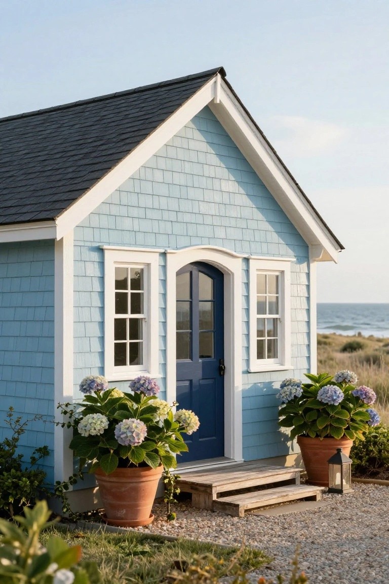
This light blue paint on shingle siding catches the eye without trying too hard. It gives a house that fresh coastal feel, especially near the water. The soft shade works well on textured shingles. It looks clean against white trim and a deeper blue door. And those big hydrangeas nearby just make it feel right at home.
Try this color on smaller structures like guest houses or cottages first. It suits beachy spots or anywhere you want a relaxed vibe. Keep trim crisp white. Pair the door with navy for contrast. Just make sure the blue isn’t too pale. Otherwise it might wash out on overcast days.
Navy Blue Vertical Siding
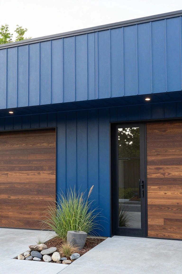
Navy blue vertical siding like this makes a house feel modern and bold right away. The deep color pops against a plain sky or green trees, and those tall planks give the facade some nice texture and height. The warm wood on the garage doors pulls it together without much fuss.
This look suits newer homes or updates to older ranch styles in town or suburbs. Go for it on the main street-facing side, and keep plantings low-key, like a single tall grass and some rocks at the base. Just make sure the wood trim matches well so it doesn’t fight the blue.
Craftsman Facade in Deep Navy Blue
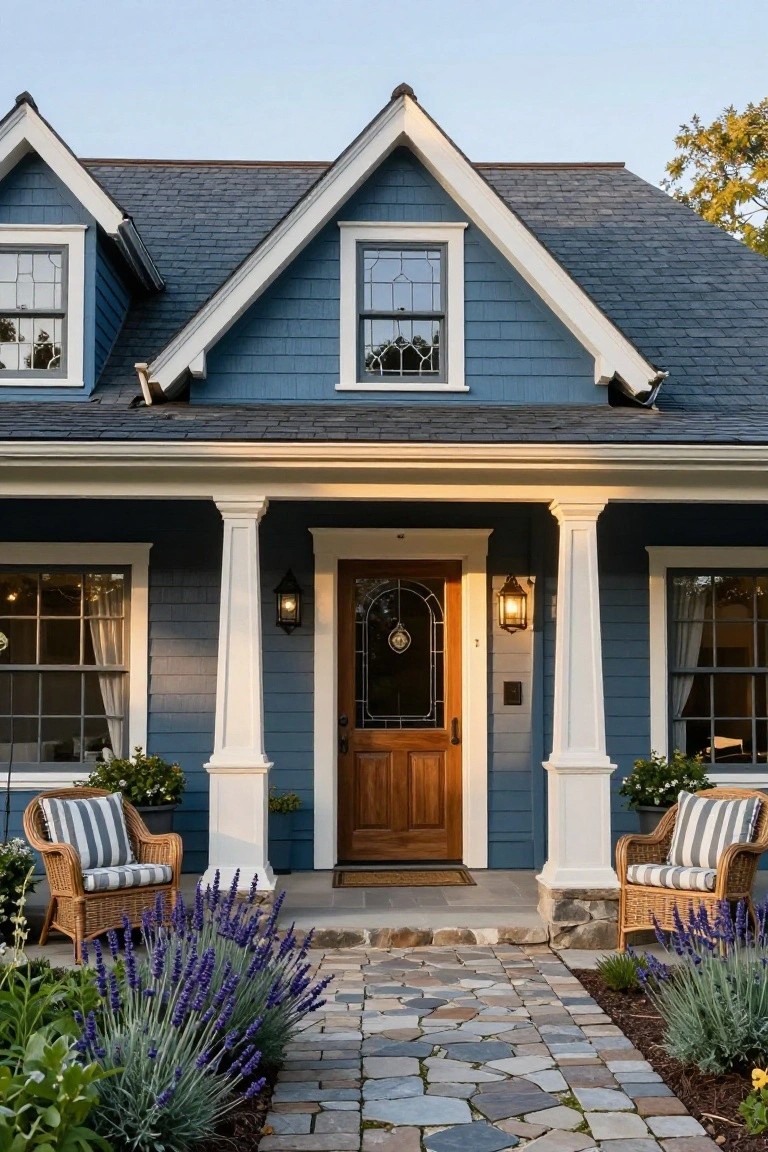
A deep navy blue paint on the siding gives this Craftsman house a solid, grounded look that feels right at home in any neighborhood. The color picks up on the dark slate roof while the white trim on the gables, porch columns, and window frames keeps everything sharp and balanced. It’s one of those exteriors that looks put-together without trying too hard.
Try this shade on homes with simple gable roofs and front porches, especially if you have some white architectural details already. It suits older bungalows or new builds aiming for that classic vibe. Just make sure your door has some wood grain showing… it ties the blue back to earth. Add low plants along the path if you want a softer edge.
Recommended Products

Ideal for use on interior/exterior surfaces including wood, plastic, plaster, metal, masonry and unglazed ceramic
SPRAY PAINT AND PRIMER – Krylon COLORmaxx Spray Paint and Primer delivers premium coverage and superior color with adhesion and durability. This primer and spray paint can be used on wood, metal, wicker, most plastics, glass, plaster/ceramic and more.

Use for a variety of indoor and outdoor project surfaces including wood, metal, plaster, masonry or unglazed ceramic
Blue Door on a Mint Green Cottage

A deep blue front door like this one really makes a mint green house feel more alive. The soft green shingles give the place a calm, cottage vibe, but that blue pops right at the entry with its diamond window detail. White trim around the edges keeps everything crisp, and it all comes together for a welcoming look without trying too hard.
This works best on smaller homes or bungalows where you want some color play but not a full repaint. Pair it with a white picket fence or simple roses out front, and it boosts curb appeal on a budget. Just make sure the blue shade has enough contrast so it doesn’t blend into shady spots.
Light Blue Siding on a Cottage Front
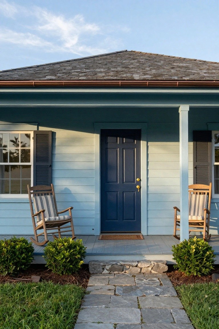
This kind of light blue paint on the house siding gives a house that easy, lived-in coastal feel. It’s not too bright or bold. Instead, it settles right into the landscape, especially with the navy blue front door pulling some focus to the entry. Rocking chairs on the porch add to that relaxed porch-sitting vibe without trying too hard.
You can pull this off on older homes or simple cottages where you want curb appeal that doesn’t shout. Pick a siding color a few shades lighter than your door trim for that natural contrast. It works best in sunny spots or near water. Just make sure the trim stays crisp white to keep things clean.
Powder Blue on Ornate Townhouses
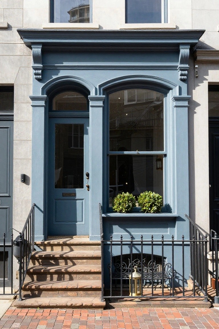
A soft powder blue like this brings out the best in traditional townhouses with carved trim and arched entries. It gives the whole facade a calm, lived-in feel that stands out nicely from plain neighbors, especially with simple plants tucked into window boxes.
This color suits rowhouses or Victorians in brick-paved neighborhoods best. Pair it with brass door hardware and black railings to keep things sharp. Just stick to one shade all over the trim and door so it doesn’t look patchy.
Navy Blue Board-and-Batten Siding
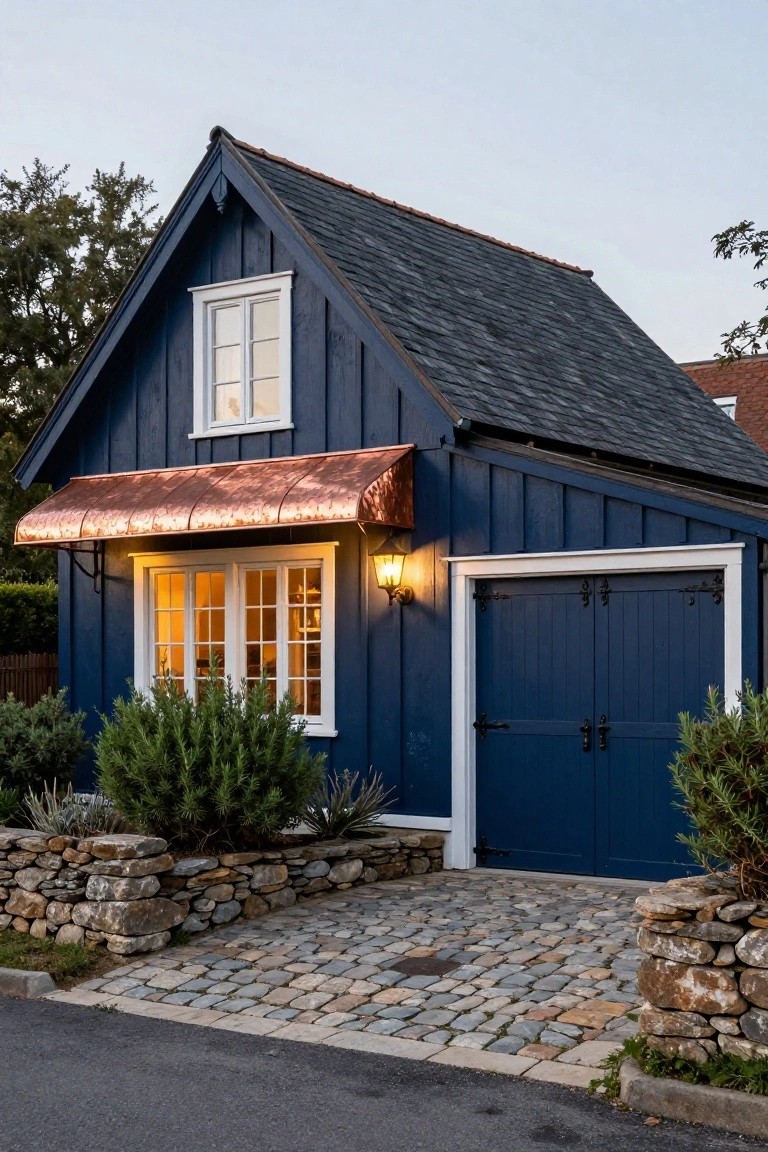
Navy blue paint on board-and-batten siding turns a simple garage or small house into something that really stands out. The vertical lines give it a clean, structured look, and that deep shade feels bold without being too bright. A copper awning over the windows adds a bit of shine that warms things up.
This works best on compact buildings like garages or cottages where you want curb appeal without fuss. Pair it with white window frames and dark doors for contrast. It suits homes in wooded areas or near the coast, but make sure the trim stays crisp to avoid a muddy feel.
Recommended Products

Ready to use, pre-mixed door and trim paint offers a fresh new look on interior or exterior metal, wood and fiberglass

Use for a variety of indoor and outdoor project surfaces including wood, metal, plaster, masonry or unglazed ceramic

ALL-IN-1 PAINT & PRIMER: A hardy multi-purpose and multi-surface one-coat paint and primer in one for almost any indoor or outdoor surface. A wall, ceiling, floor, skirting board, cabinet, furniture and door paint for your bathroom, kitchen, home and garden.
Muted Blue Walls with Black Door
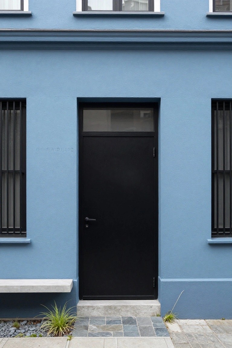
A soft muted blue paint covers the walls here, giving the house a calm modern look that feels fresh without trying too hard. The black door with its frosted glass panel pulls focus right to the entry, creating nice contrast that makes the whole facade pop. It’s a simple combo but it works because the blue stays subtle while the black adds some edge.
This setup suits newer homes or additions where you want color on the outside but keep things clean. Pair it with matching black window frames and minimal plants around the steps, like these grasses. Watch the shade of blue though. Too bright and it fights the black. Lighter like this keeps it easygoing.
Poolside Lounge with Succulent Accents
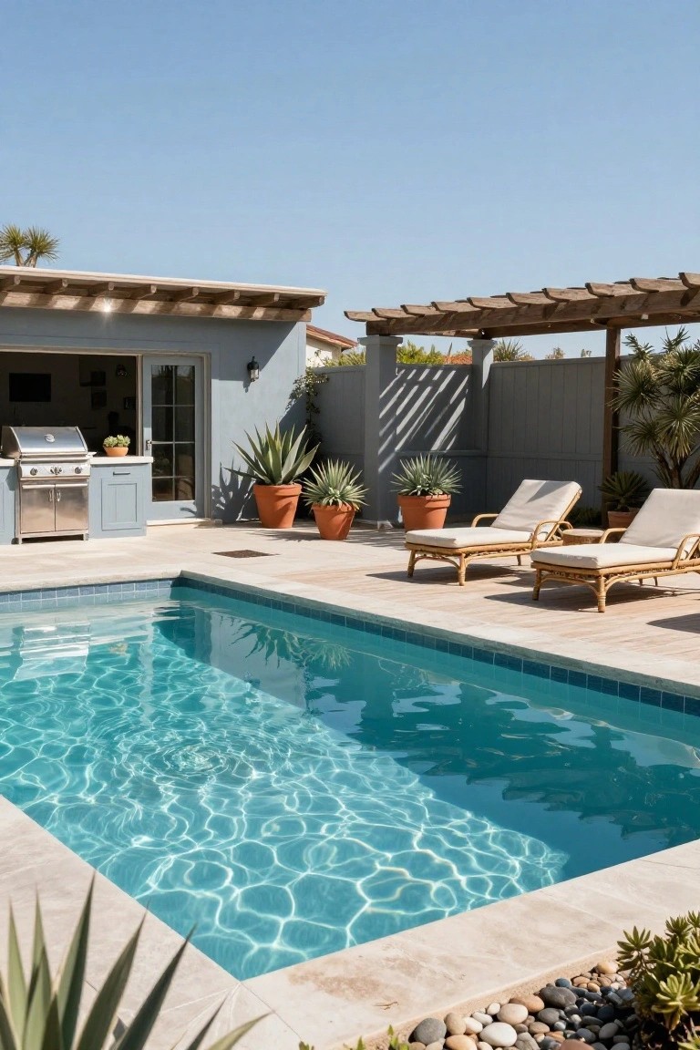
Nothing beats kicking back by the pool on a simple lounge chair, especially when the edge is lined with gravel and tough agave plants in terracotta pots. This keeps the look clean and modern without a lot of fussy maintenance. The blue water pops right against the neutral deck and house wall, making the whole spot feel fresh and easy.
Try this around a smaller backyard pool where space is tight. It suits sunny, dry areas best, since agaves handle heat and low water well. Skip it in wet climates, though. Add gravel beds for that loose, natural border, and cluster a few pots for height. Keeps things practical too, no mowing needed.
Light Blue Colonial Facade
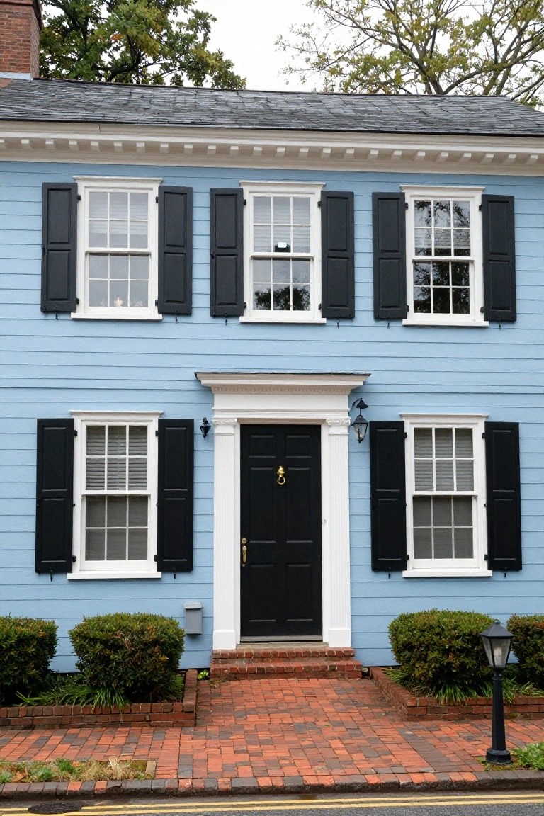
This light powder blue paint gives a traditional colonial house a fresh, clean look without going too bold. The color sits quietly against the trees and sky but really comes alive with those black shutters framing the windows. It’s the kind of shade that feels right at home in an older neighborhood, keeping things classic while standing out just enough.
Try it on two-story homes with simple lines like this one. Pair the blue siding with black shutters and a dark front door, plus white trim around the windows and entry for sharp contrast. It works best where you want curb appeal that lasts year-round… just keep an eye on dirt buildup since lighter colors show it more.
Teal Blue Board-and-Batten Siding
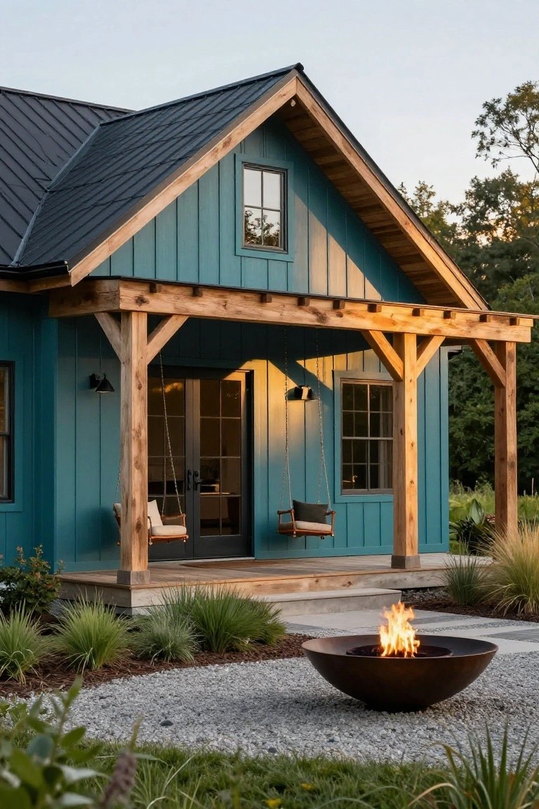
This shade of teal blue works great on board-and-batten siding. It gives a house that crisp, modern farmhouse feel without going too country. The vertical lines of the siding make the color read clean from the street. Pair it with natural wood on the porch posts and beams like you see here, and it keeps things balanced. Not too bright, but it stands out nicely against green plants and gravel.
Try this on a small gable-front cottage or cabin. It suits spots with trees around, where the blue picks up on the sky and leaves. Go for a metal roof in dark gray to echo the wood tones. Just make sure the trim stays light so the siding does the main work. Avoid big houses, though. The color shines best on something cozy scale.
Recommended Products
ALL-IN-1 PAINT & PRIMER: A hardy multi-purpose and multi-surface one-coat paint and primer in one for almost any indoor or outdoor surface. A wall, ceiling, floor, skirting board, cabinet, furniture and door paint for your bathroom, kitchen, home and garden.
ALL-IN-1 PAINT & PRIMER: A hardy multi-purpose and multi-surface one-coat paint and primer in one for almost any indoor or outdoor surface. A wall, ceiling, floor, skirting board, cabinet, furniture and door paint for your bathroom, kitchen, home and garden.

Extremely durable outdoor paint ideal for use on properly prepared exterior wood, brick, masonry, concrete, weathered aluminum, weathered vinyl siding*, and primed metal substrates
Bright Turquoise on a Beachy Cabana
This turquoise paint turns a simple cabana into something that really stands out against greenery and sand. It’s a bold blue-green shade that feels tropical without trying too hard. The color works because it picks up on ocean vibes and pairs easy with natural wood furniture right outside, like that round table and chairs you see here.
Try it on a pool house or garden shed where you want casual color that lasts in the sun. It suits coastal homes or backyards with palms and potted plants best. Just make sure the trim stays light to keep things fresh, and avoid it on big houses where it might overwhelm.
Muted Teal Stucco Exteriors
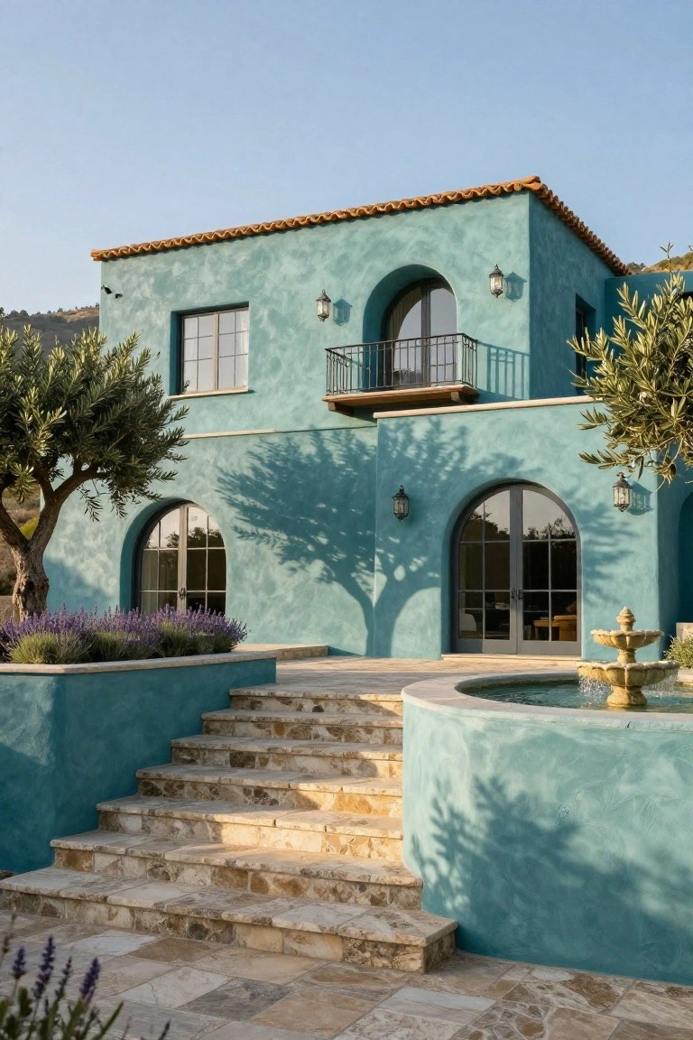
A soft teal stucco like this brings a relaxed Mediterranean vibe to house facades. It stands out just enough against a terracotta tile roof and simple arched windows, without feeling too bold. The color echoes nearby plants like olive trees, making the whole front yard feel connected and easy on the eyes.
This shade suits Spanish Revival or Southwestern homes in sunny areas best. Pair it with stone steps or a fountain at the entry to keep things grounded. Avoid cooler gray tones nearby, since they can make the teal look washed out on overcast days.
Deep Blue Paint on a Terraced House
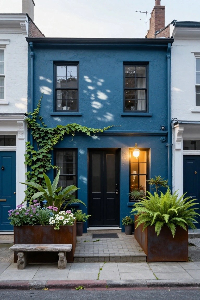
A deep blue like this turns a plain terraced house into something that catches the eye right away. It’s painted on what looks like a classic narrow city home, squeezed between white neighbors. The color feels strong but not overpowering, especially with ivy climbing up one side and a few plants out front to break it up.
This works great for older row houses or townhomes in urban spots. Just make sure the trim stays crisp in black or white, and add some pots or climbers to keep it from feeling too stark. Avoid it on super sunny walls where it might fade fast.
Frequently Asked Questions
Q: How do I test a blue paint color on my house before painting the whole thing?
A: Grab a few sample cans and paint large swatches on different sides of your home. Walk around at different times of day to see how the light hits it. That way you avoid any big surprises once the job’s done.
Q: Will a darker blue hide dirt and wear better than a lighter one?
A: Darker blues mask dirt, pollen, and mildew way better than pastels do. They also bounce back from rain splatters without showing every mark. Pick one if your area gets a lot of weather.
Q: What trim colors pair best with these blue exteriors?
A: White trim keeps things crisp and lets the blue shine. Go for soft grays or blacks if you want more contrast that feels modern. Test a few combos right on your siding.
Q: Can I use blue paint on a brick house?
A: Brush or roll a solid blue stain over the brick for a fresh pop without hiding the texture. It soaks in and lasts years. Just clean the surface first for good adhesion.