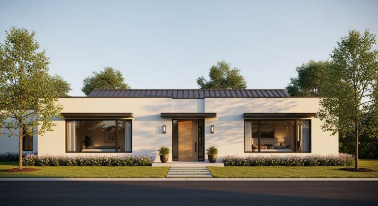
There’s a feeling some houses give off.
A sense of calm, of rightness.
It’s an unspoken quiet confidence.
You pull up and your brain just sort of… settles.
Often that feeling starts with symmetry.
The Oldest Trick in the Book
Our brains are wired for patterns.
We are, at our core, pattern-seeking machines. And symmetry is the simplest, most satisfying pattern there is.
It’s order. It’s predictability. It’s peace.
Think about the classic, iconic house shapes. The American Colonial with its central door, flanked by an equal number of windows on each side.1 The shutters are identical. The dormers are lined up. It’s a perfect mirror image.
Or the stately Georgian mansion. Its entire facade is a study in precision. The central portico, the balanced wings, the unwavering grid of the windows.
There’s a reason these styles feel so permanent, so grounded. They don’t challenge us. They don’t ask us to figure anything out.
The design does the work for us.
This kind of formal balance communicates stability and tradition. It feels safe. It feels like it’s always been there, and always will be.
It’s a design language that says everything is under control.
And in a chaotic world, that’s a pretty powerful message for a home to send.
Looks great. Feels right.
When Balance Feels Alive
Symmetry isn’t just for traditional homes, though.
A modern house can be fiercely symmetrical. Picture a sleek, flat-roofed structure with a central glass entryway. On either side, identical volumes clad in wood or dark metal.
It’s clean. It’s modern. It works.
In this context, symmetry feels less about tradition and more about intention. It’s a deliberate, minimalist statement.
The balance can come from the architecture itself, or from the features on it.
A modern farmhouse might use a symmetrical A-frame gable as its centerpiece. Then it balances that with matching board-and-batten siding on both sides. Maybe two identical gooseneck barn lights flanking the front door.
Even smaller details contribute.
The fenestration, just a fancy word for the arrangement of windows, is a huge part of it. A row of clerestory windows marching across the top of a wall creates a rhythm. A pair of large picture windows on either side of a fireplace creates a focal point.
It’s all about creating an axis, a real or imaginary centerline that the house is built around.
And everything on the left has a partner on the right.
The effect is soothing. It’s visually quiet.
The Art of Breaking the Rules
But perfect, rigid symmetry can get a little boring.
A little too predictable.
Sometimes it can feel static, almost sterile. Like a museum piece you’re not supposed to touch.
That’s where asymmetry comes in.
This is the design choice that says, “I’m confident enough to be a little off-kilter.”
It’s not about chaos. Not at all. It’s about a different kind of balance. A dynamic balance.
A Mid-Century Modern home is a masterclass in this. You might have a long, low roofline on one side, abruptly meeting a taller, vertical element of stone or brick on the other. The entrance might be tucked away, off to the side, under a deep overhang.
It’s not symmetrical. But it feels balanced.
How?
It’s about visual weight.
A large, simple shape on one side can be balanced by a smaller, more complex collection of shapes on the other. A wall of glass can be visually balanced by a heavy, textured stone chimney.
This creates tension. It creates interest.
It makes your eye move across the facade, taking in the whole story.
A desert-modern home might have a dramatic, cantilevered roof extending far out to one side. It’s a bold, asymmetrical move. But it’s balanced by the low, solid mass of the main house.
One part is light and airy, the other is heavy and grounded. Together, they create a perfect, if unequal, partnership.
It feels alive.
Finding a Felt Equilibrium
Most homes today aren’t one or the other.
They’re not perfectly symmetrical, and they’re not wildly asymmetrical.
They live somewhere in the middle. They aim for a felt balance, an equilibrium that isn’t about mathematical precision but about a cohesive feeling.
Maybe the house itself is a simple, symmetrical box. But the garage is attached to one side, throwing off the perfect mirror image.
That’s okay. In fact, it’s often better.
Landscaping can be a powerful tool to restore that sense of balance. A large, mature tree can provide the visual weight needed to counterbalance an attached garage or a one-sided addition.
A meandering stone path leading to an off-center door feels more natural, more organic, than a straight concrete line.
Material choices also play a huge role.
A home might have a large bank of windows on the left side of its front elevation. To balance it, the right side might feature a smaller window but be clad in a heavier, more textured material like stone or dark-stained cedar.
The visual weight of the material does the balancing act.
It’s a conversation between different elements.
It’s a balance of mass, texture, and void.
A prominent chimney on one side. A deep-set porch on the other. A single, dramatic roofline that slopes more in one direction.
These are the things that give a house its unique personality. Its character.
It’s not about being perfect.
It’s about being resolved. It’s about all the different pieces, symmetrical or not, coming together to create a single, unified whole.
That’s the goal, really.
To create a home that just feels right. Instantly.
Whether it’s a perfect mirror or a carefully composed collage, balance is what makes a design feel complete.
It’s the quiet foundation for everything else.

