

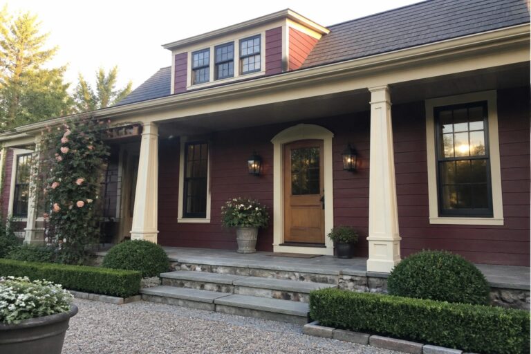
I have always noticed that a deep red on a house exterior can either make the whole place feel grounded or a bit heavy, depending on how the trim is handled.
Pairing it with cream trim seems to bring out the warmth without overwhelming the lines of the roof or the entry.
The balance matters more than I expected.
In my own neighborhood I have seen similar shades work well when the cream stays soft rather than bright.
Looking at these examples has me thinking about which color details I would test first if I were updating my own front facade.
Red Siding with Cream Trim
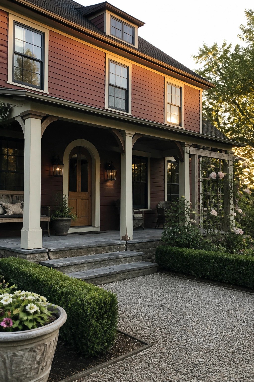
A deep red exterior paired with cream trim gives a house a grounded and friendly presence. The contrast keeps the color from feeling heavy while still letting the red read as the main feature.
This works best on homes with some architectural detail to highlight, like porches or divided windows. Use the cream on columns, window frames, and eaves so the red stays bold without overwhelming the whole facade.
Cream Trim To Define The Roofline
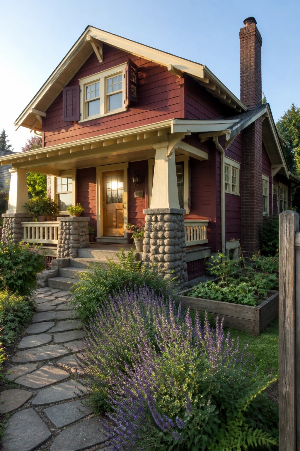
Cream trim stands out against deep red siding because it gives the roof edges and window frames a clear shape. The contrast keeps the house from looking flat and helps the gable lines read cleanly from the street.
This works best on houses with simple roof forms and traditional details. Stone bases on the porch columns add weight at the bottom so the trim does not feel too light on top.
Cream Trim Defines The Red Exterior

The deep wine red siding on this house gains a lot of its character from the cream trim. It runs along the eaves, around every window, and along the porch posts, which keeps the bold color from feeling flat or heavy.
This works especially well on homes with gables or bay windows because the lighter trim outlines the shape. Match the trim color on all the main edges and openings, and avoid adding too many other accent colors that could compete with the red.
Cream Trim Brings Balance to Red Brick

The cream trim around the windows and doorway gives the red brick a sharper look. It prevents the deep color from feeling too heavy on a two-story facade.
This works especially well on homes with evenly spaced windows. Use it when you want the front door to stand out while keeping the overall palette calm.
Cream Trim on Red Brick Facades
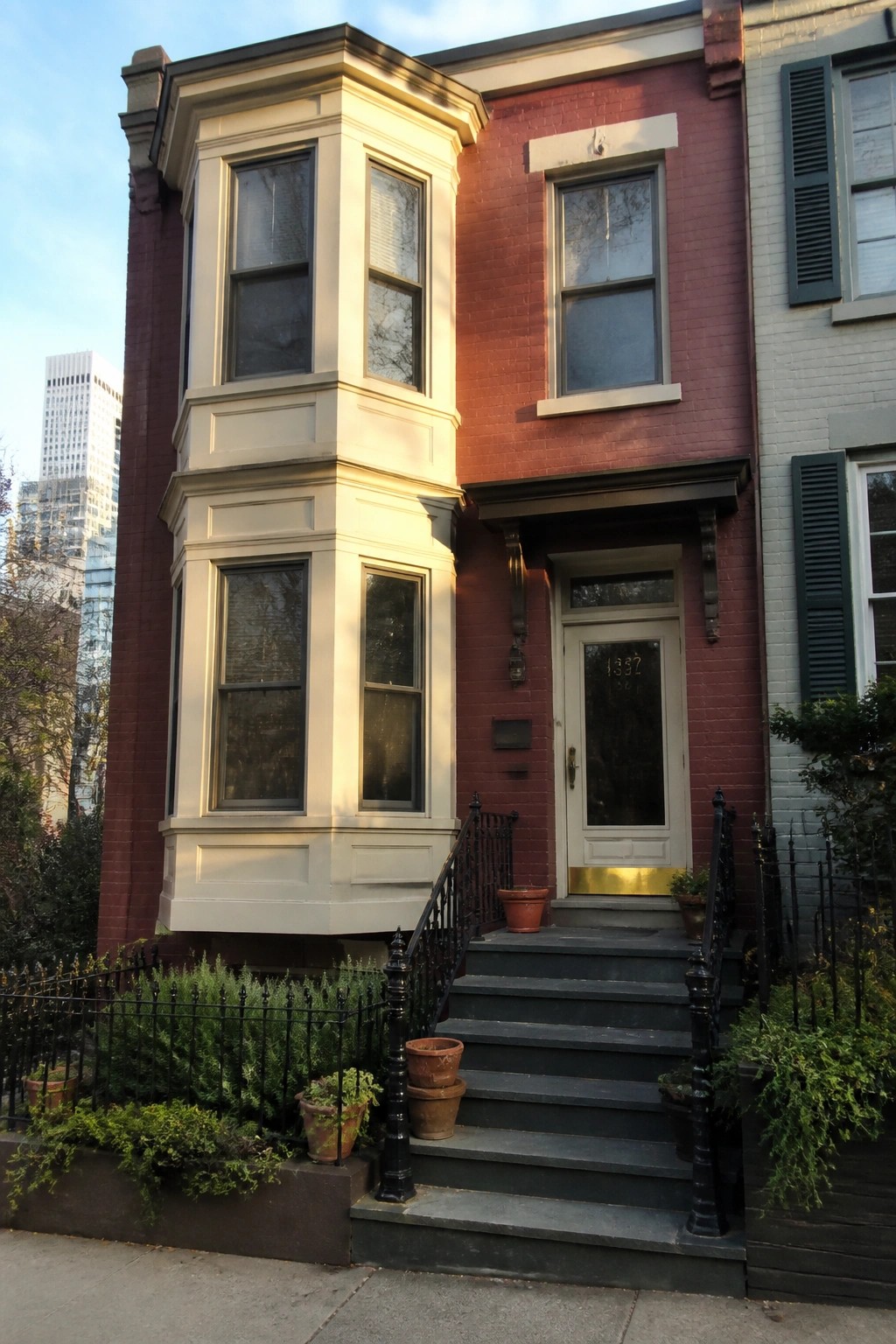
Cream trim works well on red brick because it breaks up the solid color without competing with it. The light shade draws attention to the shape of the bay window and other details, giving the front a cleaner look overall.
This approach suits older row houses or homes with strong architectural lines. Keep the trim simple and avoid adding too many extra colors on the same wall.
Cream Trim Balances Wine Red Siding
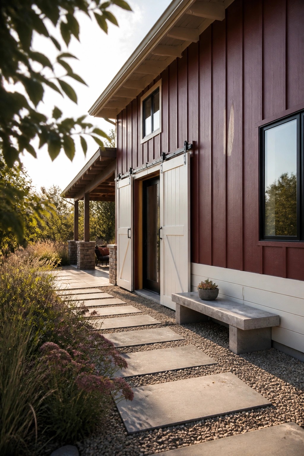
Wine red siding can feel heavy on its own, but adding cream trim and doors changes how the color reads. The lighter accents keep the red from dominating while still letting it come through as the main feature.
This works especially well on homes with clean lines and simple shapes. Stick to just a few cream elements like doors, window frames, and base trim rather than covering too much of the facade.
Arched Entries on Red Stucco Homes

Paired arches with cream stone columns give a red house a clear focal point at the front door. The shape softens the strong color and creates a sense of depth that flat walls do not offer.
This works best on Mediterranean or Spanish-style homes where the roof tiles and stucco already lean warm. Keep the columns simple and let the red do most of the work so the entry stays balanced rather than busy.
Wine Red Siding With Cream Trim
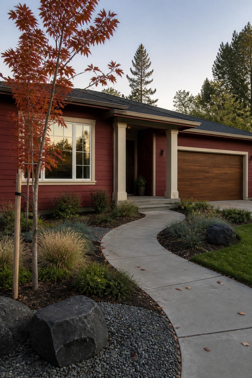
A deep red on the house siding stands out more when it is paired with cream trim. The light color on the window frames and porch columns keeps the red from feeling too heavy and gives the front a balanced look that still reads as bold.
This approach works best on houses with simple shapes and not too many small details. It helps the entry area feel more defined without adding extra colors or materials that might compete.
Stone Arches at the Entry

A stone arch around the front door adds weight and texture to a red house with cream trim. It keeps the painted surfaces from feeling flat and gives the entry a more permanent look that fits older styles.
This approach works best on homes with a bit of architectural detail already in place. Use a natural stone tone that does not match the red or cream exactly, and keep the arch scaled to the door rather than oversized.
Cream Trim Against Wine Red Walls
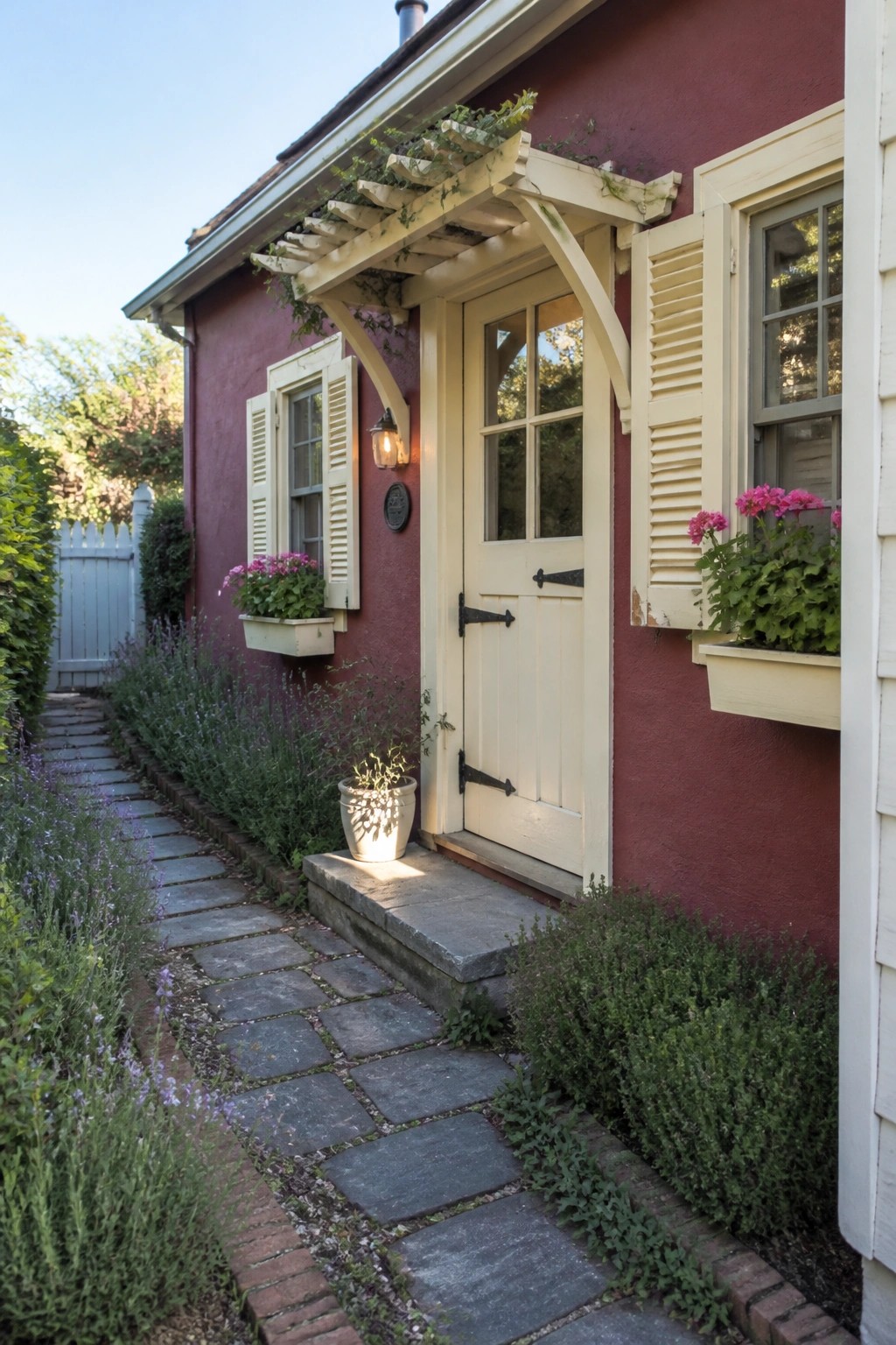
Cream trim gives a wine red house a clean and settled look. It makes the door and window openings read clearly without adding any extra detail or decoration.
This approach works well on smaller homes or cottages where the goal is to keep the facade simple. Choose a warm off-white rather than a stark white so the two colors sit comfortably together in changing light.
Cream Trim Framing Red Doors and Windows
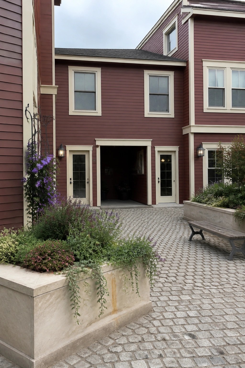
Deep red siding stands out more when the trim is kept light. Cream frames around the windows and doors keep the color from feeling too dark and help the whole front read as balanced rather than bold.
This approach suits houses with straightforward shapes and works best when the red is a true wine tone instead of bright. It also leaves room for simple planting beds along the foundation without competing for attention.
Matte Red Siding With Consistent Cream Accents
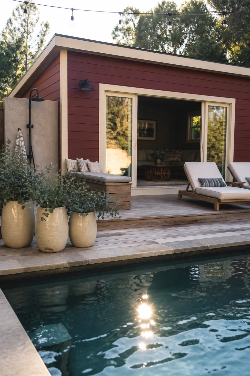
Deep red siding stands out more when the trim stays light. The cream color around the doors and windows here keeps the red from feeling too dark or heavy, and it gives the whole front a cleaner line.
This works best on houses with fairly simple shapes. Stick with matte siding and keep the trim consistent on every opening so the contrast stays sharp without extra details getting in the way.
Cream Portico on Wine Red Walls

A cream portico with tall columns stands out nicely against the deep wine red walls. It breaks up the solid color and makes the entrance feel more defined and welcoming.
This detail works best on houses with a traditional shape and enough height to carry the scale. Keep the trim consistent across windows and corners so the contrast stays clean rather than busy.
Pairing Wine Red With Cream Trim

This color choice gives a modern house a clear identity without needing lots of extra detail. The deep red panels stand out against the lighter trim, and the contrast makes the whole shape read more cleanly from the street.
It works best on homes with simple forms and flat rooflines. Use it when you want something stronger than gray or white but still want the house to feel put together rather than loud. Keep windows and doors dark so the red and cream stay the main focus.
Cream Trim With Deep Red Siding
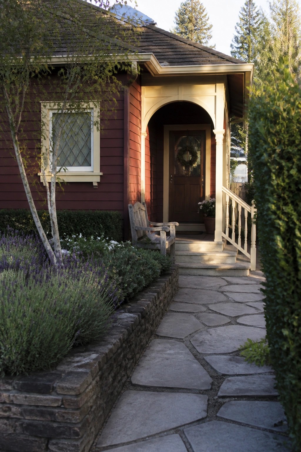
Many older homes gain a lot of character when the main walls are painted a deep red and the trim is kept light. Cream works especially well here because it softens the red without making the house feel washed out.
This color pairing suits traditional homes with a defined entry. Keep the cream tone warm rather than stark, and carry it across window frames, porch posts, and the door surround so the contrast stays consistent.
Deep Red Siding On Traditional Homes
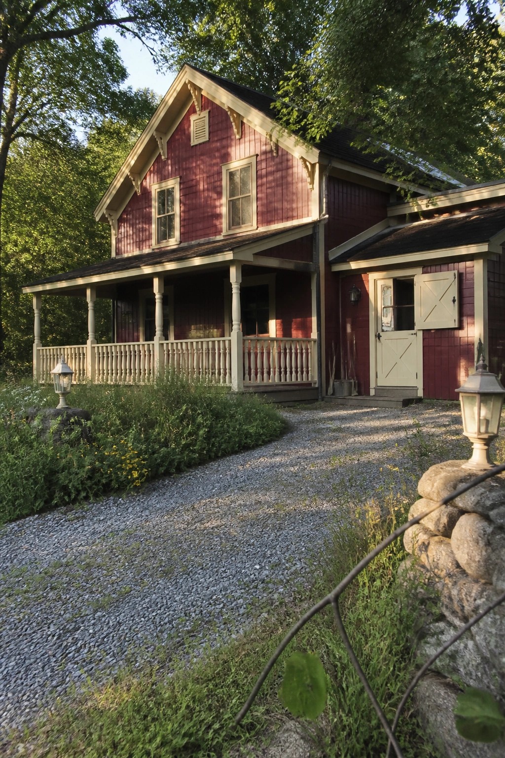
A deep red exterior color gives a house real presence while still feeling grounded. Cream trim around the windows, eaves, and porch posts keeps the look from turning too dark or heavy.
This color choice suits older homes with gabled roofs and covered porches. It works best when the trim stays light and simple so the red stays the main feature instead of competing with too many other details.
Deep Red Siding With Cream Trim
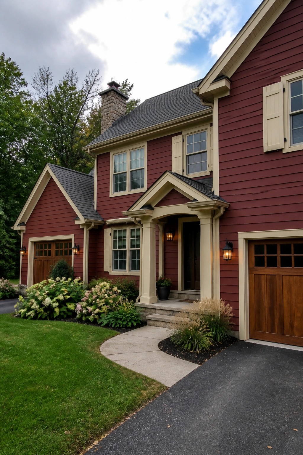
A deep wine red on the siding paired with cream trim gives a house a solid, traditional feel without looking heavy. The light trim outlines the windows, doors, and roof edges so the shape of the house reads clearly from the street.
This color mix works best on homes with defined architectural details like columns or gables. Keep the cream consistent on every trim piece and avoid adding too many other colors that could break up the clean contrast.
Wine Red Paint With Cream Trim

This color pairing gives older homes a rich but still friendly look. The deep red makes the whole facade feel substantial, while the cream trim keeps the details from disappearing into the color.
It works especially well on brick houses that already have some trim work around the windows and porch. Keep the red consistent across the main walls and let the cream highlight columns, window frames, and cornices so the house reads as one clean shape from the street.
Deep Red Vertical Siding With Soft Cream Details
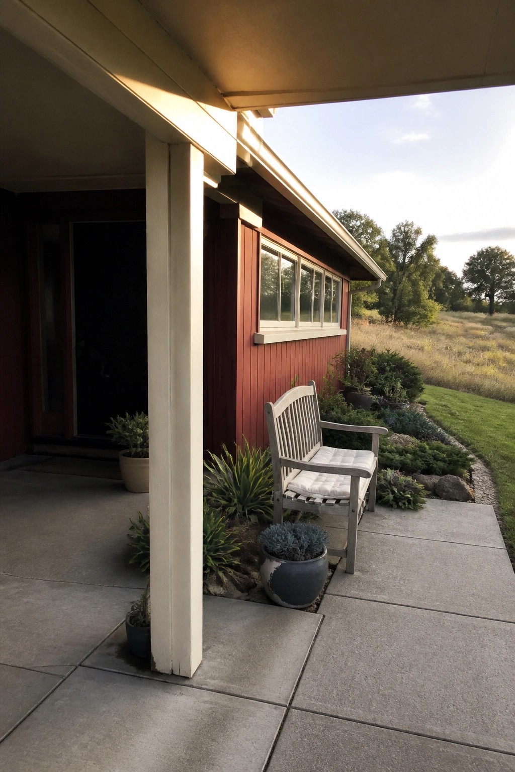
Deep red siding paired with cream trim gives a house a clean, settled look. The contrast keeps the color from feeling too dark while still letting the red read as the main feature.
This approach works best on homes with straightforward shapes and vertical siding. It suits places where you want the house to feel grounded without needing extra details or bold accents.
Cream Accents for a Grounded Red Cottage Exterior
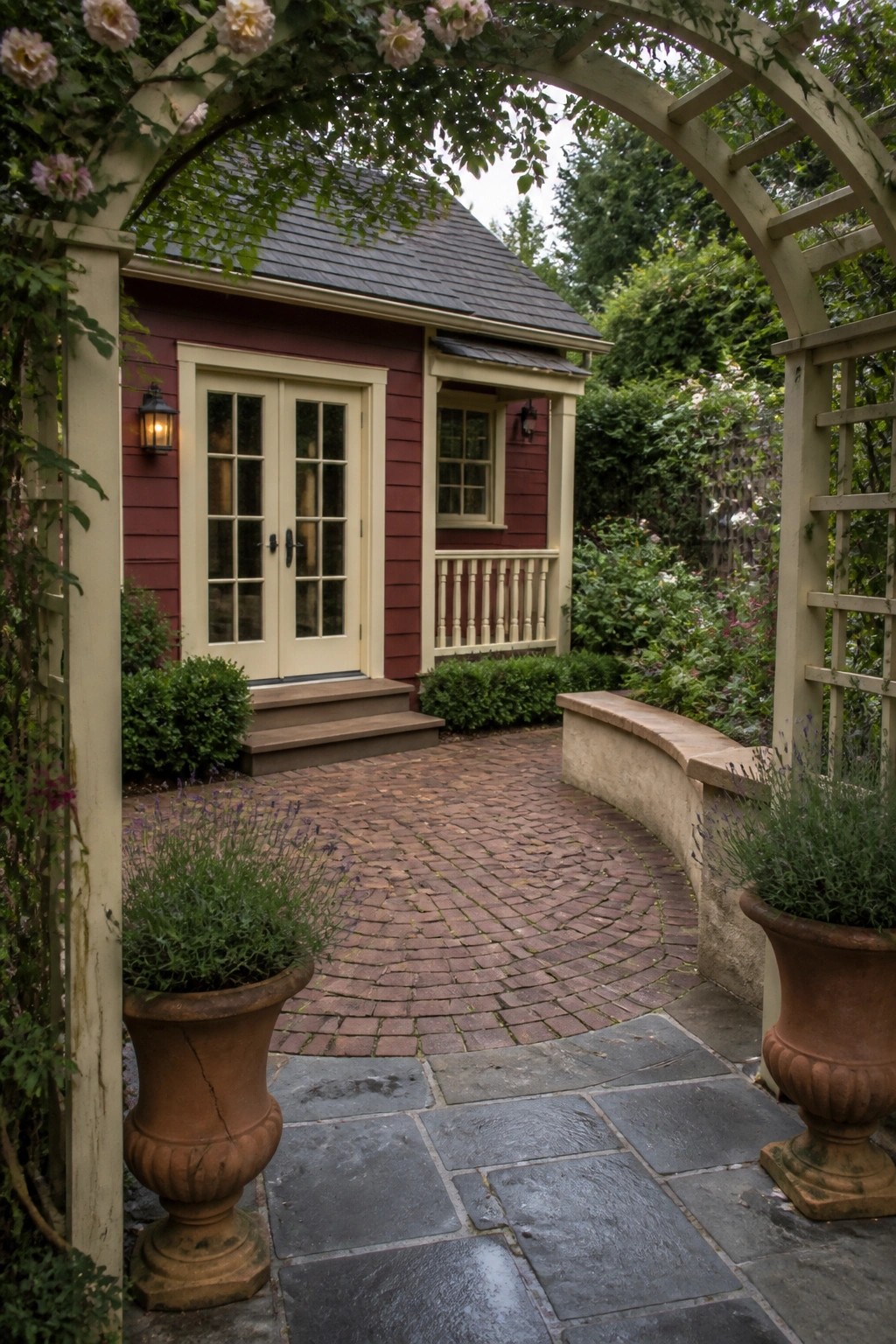
Deep red siding paired with cream trim gives a house a clear, traditional look that still feels approachable. The contrast helps the windows and doors stand out without extra decoration.
This approach works best on smaller homes or cottages where you want the front to feel grounded. Keep the red rich rather than bright, and let simple plantings soften the base of the walls.
Frequently Asked Questions
Q: How do I choose a wine red that won’t clash with my existing roof? A: Start by pulling a few paint chips and holding them up against your roof tiles in full sun. A deeper wine red with brown undertones tends to blend better than bright reds. Walk around the block and see how similar homes look from the street before you commit.
Q: Will cream trim make the red look too formal on a simple ranch house? A: Cream trim softens the red and keeps it from feeling heavy on smaller homes. Stick with a matte finish on the trim so it reads casual instead of polished. The contrast still gives the house nice definition without extra details.
Q: How often should I plan to repaint the red sections? A: Most wine reds need a fresh coat every five to seven years depending on sun exposure. The cream trim usually lasts longer and only needs spot cleaning in between. Check the south side first each spring for any fading.
