

Japandi rooms often rely on subtle shifts between warm whites, soft grays, and earthy neutrals, so the undertones matter as much as the color names.
I find that a shade that looks calm on a paint chip can turn pink, green, or surprisingly cool once it sits beside wood flooring, pale trim, and natural fabrics.
Low contrast works best when the colors still have enough difference to give walls and furnishings quiet definition, especially as daylight changes through the room.
A small sample can reveal a lot.
I would test the softer combinations in the actual room and check them in morning and evening light before settling on a palette.
Warm Greige Walls With Dark Wood

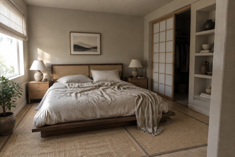
The walls look like a warm greige, a soft neutral that sits between beige and gray. A close match might be Benjamin Moore Pale Oak, Sherwin-Williams Accessible Beige, or Behr’s Wheat Bread, though the photo alone can’t confirm an exact shade. It’s a useful choice for a bedroom because it feels quieter than a stronger beige but still has enough warmth for a restful room.
The greige works especially well beside the dark wood bed frame, which makes the wall color read a little lighter. In a room with limited daylight, test a sample first, since some greiges can look more beige once the light fades.
Warm Greige Walls With Natural Wood

The walls look closest to a warm greige, a muted neutral that sits between beige and gray. Similar colors include Benjamin Moore Pashmina, Sherwin-Williams Accessible Beige, and Farrow & Ball Drop Cloth. It’s a useful choice for a living room when you want more warmth than a cool gray but less yellow than a traditional beige.
The color reads softly beside the wood floor and coffee table, while the large window keeps the room from feeling too dim. It should suit rooms with warm wood and cream fabrics; test a sample first, since greige can look browner in low light.
Warm Greige Cabinetry With a Butcher-Block Island
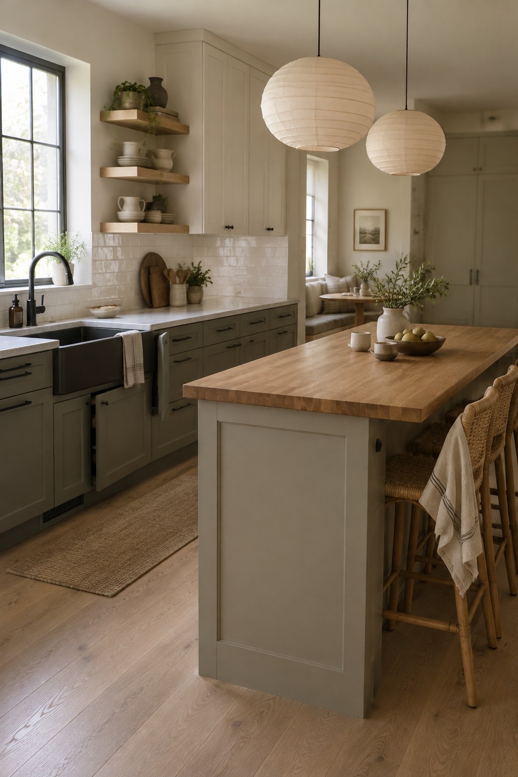
The cabinetry reads as a warm greige, a soft neutral between beige and gray. For similar shades, I’d look at Benjamin Moore Pale Oak, Sherwin-Williams Accessible Beige, or Behr Sand Fossil. This color gives the kitchen a little more warmth than a cool gray, while still keeping the overall palette quiet.
Here, the greige sits beside a light wood countertop, which makes the cabinets feel warmer. It works well in kitchens with wood floors or cream tile, especially if you want a neutral that won’t look stark. Test a sample in your own light first, since greige can lean more beige or gray from one room to another.
Warm Greige Beside Natural Wood

The walls read as a warm off-white greige, close to Benjamin Moore Classic Gray, Sherwin-Williams Egret White, or Farrow & Ball School House White. This kind of quiet neutral suits a Japandi bathroom because it keeps the walls soft without making the room feel stark.
The shade looks especially at home beside the wood vanity and charcoal floor tile. Check a sample in both daylight and evening light, since a warm greige can look creamier after dark.
Muted Greige Walls With a Warm Wood Table
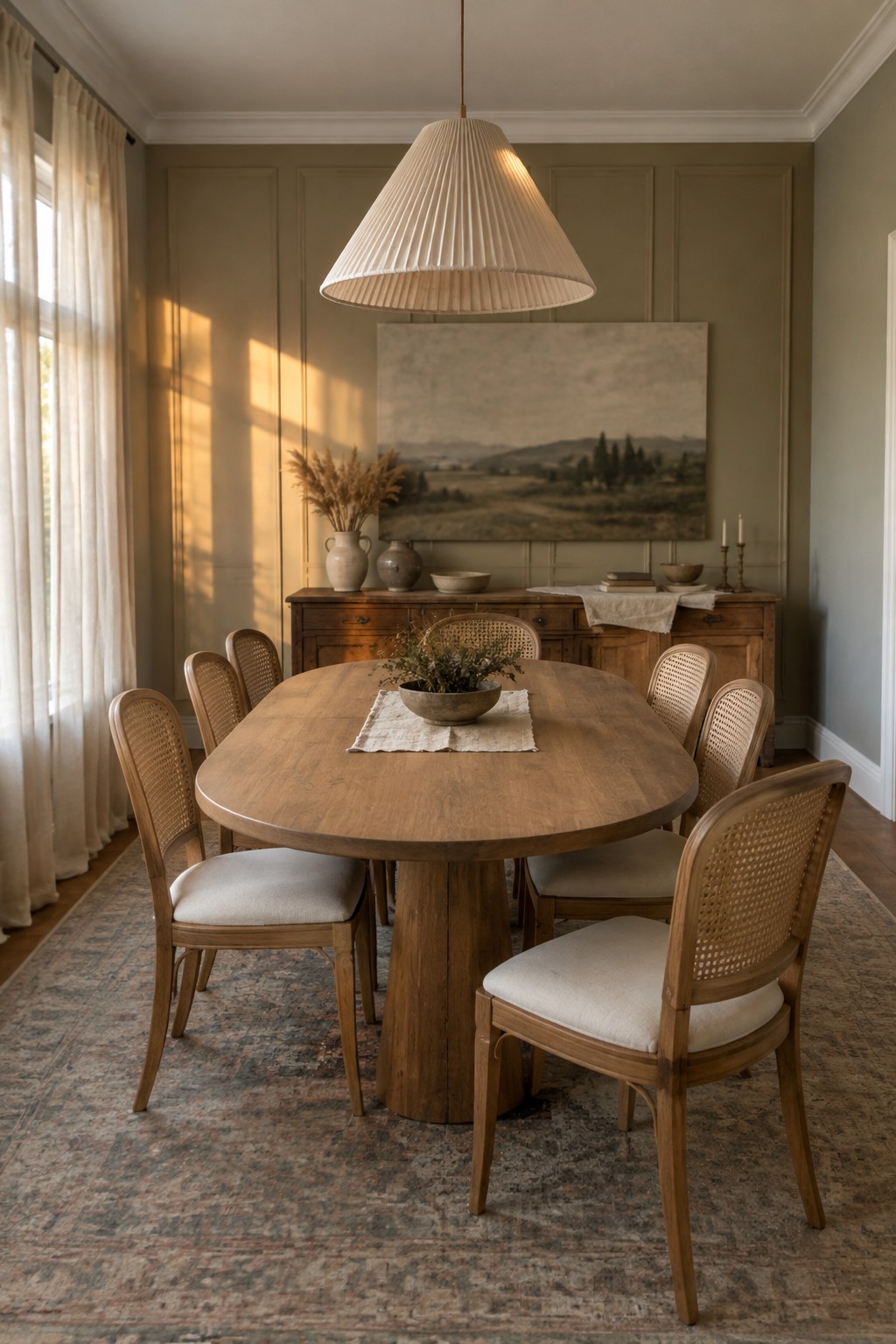
The walls read as a muted warm greige, close to Benjamin Moore Pashmina or Sherwin-Williams Accessible Beige, though the exact match is uncertain. It’s a soft neutral that gives the dining room more color than plain white without making the walls feel busy.
The shade has a slight earthy cast that suits the natural wood table and sideboard. It should work well in rooms with warm wood and gentle daylight; test a sample first, since greige can look duller in a darker room.
Warm Greige Walls Beside Honey-Toned Flooring

This entryway’s walls read as a warm greige, a soft neutral between beige and gray. Close matches might include Sherwin-Williams Accessible Beige, Benjamin Moore Pale Oak, or Behr Blank Canvas, though the photo can’t confirm an exact shade. It’s a useful choice for a hallway because it stays quiet while still feeling warmer than a cool gray.
The white wainscoting keeps the lower walls looking light, while the wood floor brings out the beige side of the paint. Sample a few shades in your own hallway, since limited natural light can make greige look darker or more brown.
Warm Greige Built-Ins Alongside Dark Wood
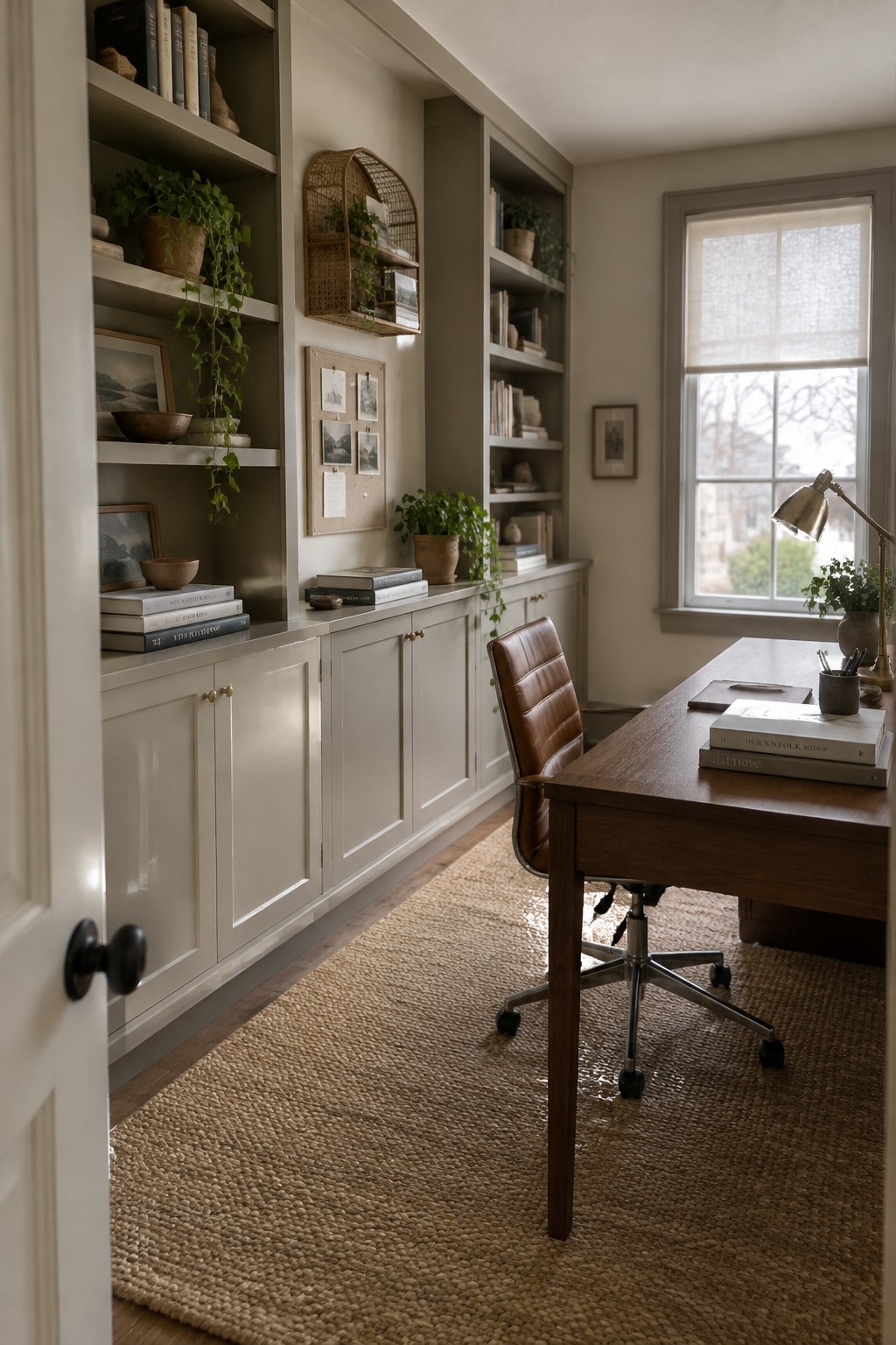
This looks like a warm greige, a soft neutral that sits between beige and gray. Close paint matches might include Benjamin Moore Pashmina, Sherwin-Williams Accessible Beige, or Farrow & Ball Elephant’s Breath. Using the shade across both the lower cabinets and open shelving gives the room a quieter, more connected look.
The color has a muted, slightly earthy cast, which works well beside the dark wood desk and warm woven flooring. In a room with less daylight, test a sample first, since greige can read browner or grayer depending on the light.
Warm Beige Walls Beside Honey-Toned Wood

This nursery’s walls look like a warm beige, close to Benjamin Moore Edgecomb Gray, Sherwin-Williams Accessible Beige, or Behr Wheat Bread. It’s a soft neutral that feels gentle without looking stark, and it works well when you want a room to feel settled but still light.
The color has a slight earthy quality, which suits the honey-toned wood crib and flooring. It should work in a nursery or bedroom with similar wood finishes; test a sample first, since warm light can make beige look more yellow.
Warm Greige Above White Tile
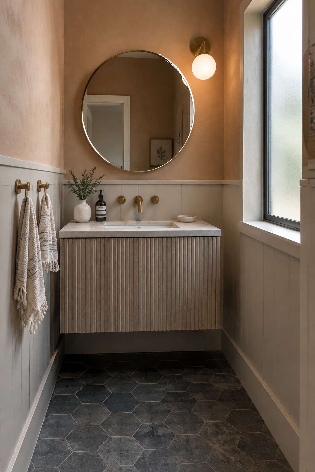
This small bathroom uses a warm greige paint that looks closest to Benjamin Moore Edgecomb Gray, Sherwin-Williams Accessible Beige, or Behr Wheat Bread. It sits between beige and gray, so it feels softer than a cool gray without turning yellow. The color works well on the upper walls, where it gives the room a gentle contrast with the white tile below.
In daylight, this shade may read a little more gray, while warm bulbs bring out its beige side. Pair it with white tile and muted wood, and test a sample on the wall first since greige can shift with the light.
Warm Greige Cabinetry With Pale Marble

This kitchen’s painted cabinetry looks closest to a warm greige, a muted gray-brown that feels softer than a cool gray. It suits a Japandi palette because it keeps the built-ins quiet while still giving them some color. The pale marble countertop keeps the pairing light.
In changing daylight, the cabinets may read grayer in some spots and browner in others. Look for a greige with a gentle warm undertone, and test a sample beside your countertop before painting. It works especially well with natural wood and simple, low-contrast finishes.
Warm Greige Walls With Pale Oak
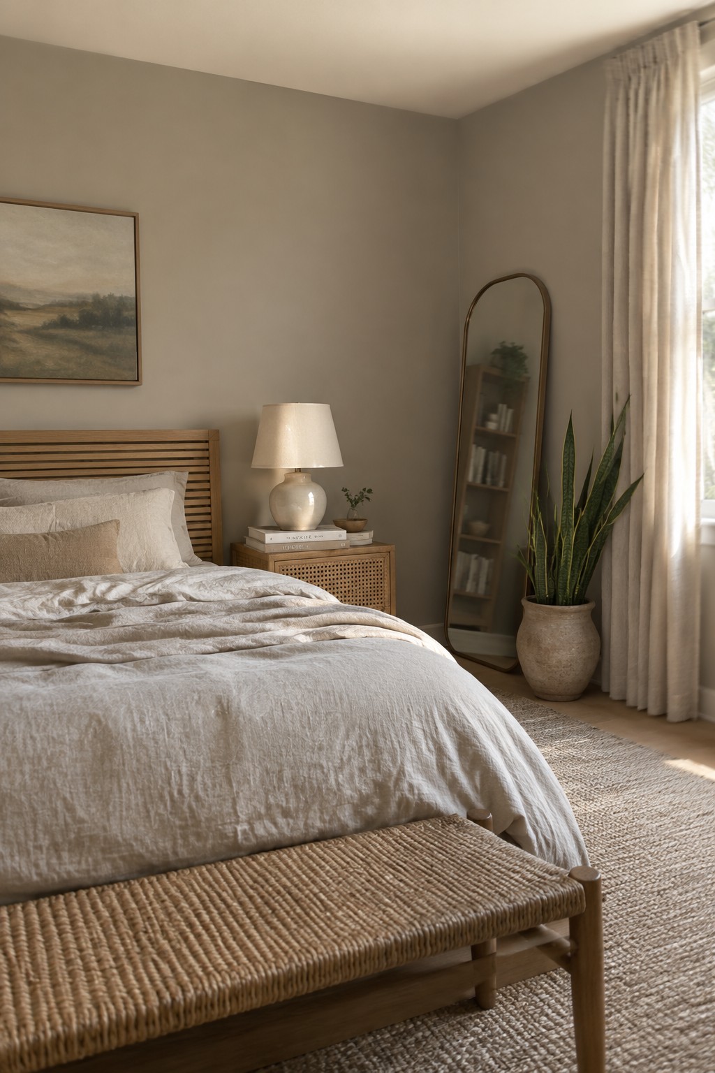
A warm greige is a good fit for these bedroom walls. It sits between beige and gray, with enough warmth to keep the room from feeling cool or stark. The exact paint match is hard to pin down from a photo, but Sherwin-Williams Agreeable Gray, Benjamin Moore Pale Oak, and Behr Wheat Bread are reasonable colors to sample.
The shade works well with the light wood headboard and other natural materials, and it suits bedrooms where you want a quiet neutral rather than a crisp white. Check samples in both daylight and lamplight, since greige can look noticeably more beige or gray as the light changes.
Warm Greige Built-Ins in a Narrow Mudroom

This looks like a warm greige, a muted neutral that sits between beige and gray. Close matches might include Sherwin-Williams Accessible Beige, Benjamin Moore Edgecomb Gray, or Behr Toasty Gray, though the exact shade is hard to pin down from a photo. Using it across the built-in cabinets gives this narrow mudroom a quiet, consistent look.
The color leans warm beside the wood floor, but it should still read fairly neutral in daylight. It works well with natural wood and soft cream tones; test a sample in the room first, since greige can look more beige or more gray as the light changes.
Warm Greige Shelving Beside Woven Baskets
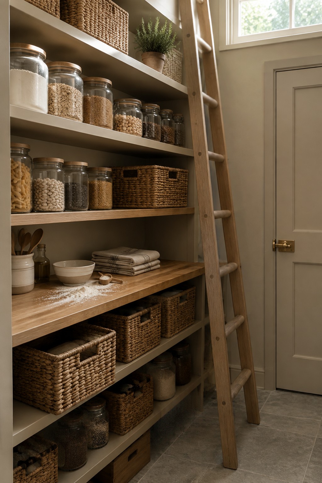
This looks like a warm greige paint on the pantry shelving, a soft neutral that sits between beige and gray. It keeps the built-in shelves from feeling stark, while the natural wood shelves and baskets give the color a warmer cast.
I’d look for close matches in Sherwin-Williams Agreeable Gray, Benjamin Moore Pale Oak, or Behr Cotton Grey. The exact shade is hard to pin down from a photo, so test a few samples in the pantry’s light. A warm greige like this works well where you want shelves and stored items to feel coordinated without making the room too dark.
Warm Greige Around a Compact Work Nook
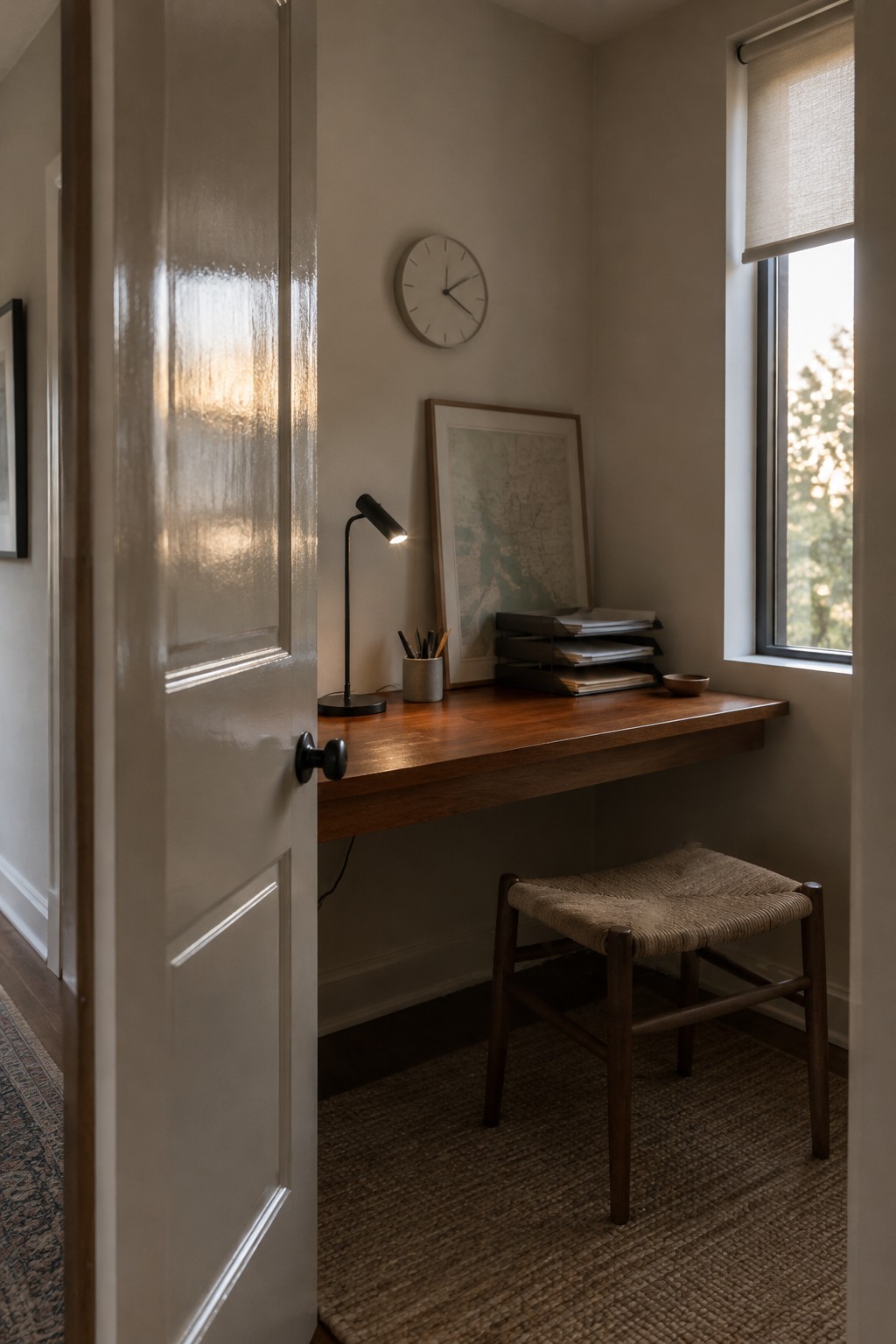
This looks like a warm greige, a quiet neutral that sits between beige and gray. Close matches might include Benjamin Moore Pale Oak, Sherwin-Williams Accessible Beige, or Farrow & Ball Skimming Stone. It suits a small work nook because it feels softer than a cool gray without turning strongly yellow.
The color reads especially well beside the dark wood desk, which gives the pale walls a little contrast. In a room with less daylight, test a sample first since the beige undertone may become more noticeable.
Warm Greige Walls Across Built-Ins
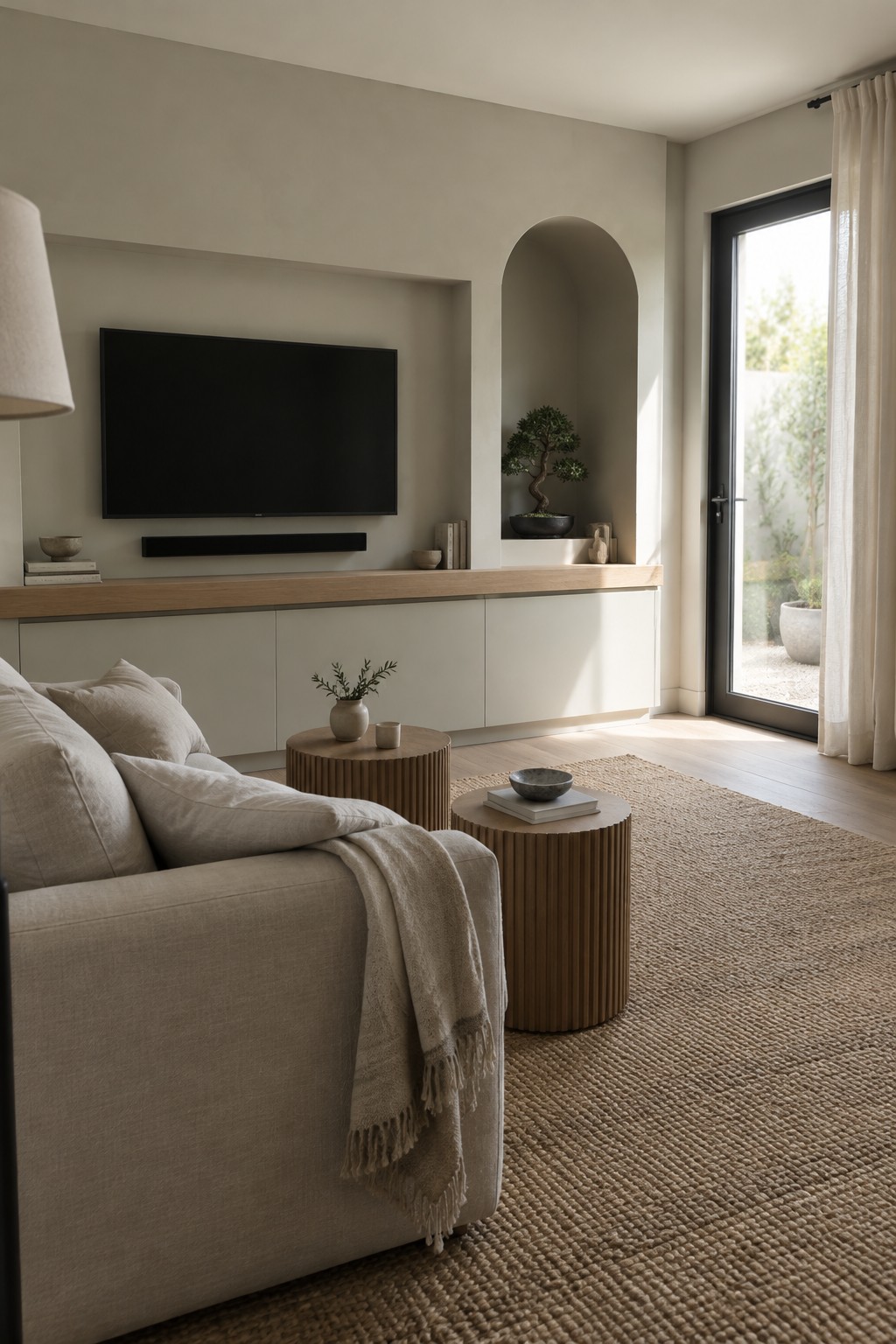
Warm greige is the main paint idea here, and it looks closest to Benjamin Moore Pale Oak, Sherwin-Williams Egret White, or Behr Wheat Bread. This light, muted neutral covers both the living room walls and the built-in cabinetry, giving the room a low-contrast look without making the surfaces feel stark.
The color leans beige in the natural window light, while the pale wood counter keeps the palette soft and easy to live with. It suits a calm living room, especially if you want the built-ins to blend in rather than stand apart. Test a sample on both the wall and cabinetry first, since the same greige can read differently on each surface.
Warm Greige Cabinetry With a Marble Counter

A warm greige is the main paint idea here. For an unbranded match, I’d look at Benjamin Moore Edgecomb Gray, Sherwin-Williams Accessible Beige, or Behr Blank Canvas. This kind of soft neutral keeps lower cabinets from feeling stark while still working as a quiet backdrop in a laundry room.
Its beige undertone sits comfortably beside the pale marble counter, and the natural wood shelves keep the palette from turning too cool. Try samples in the room before choosing, since daylight can make greige look much lighter.
Warm Greige Beside a Patterned Stair Runner
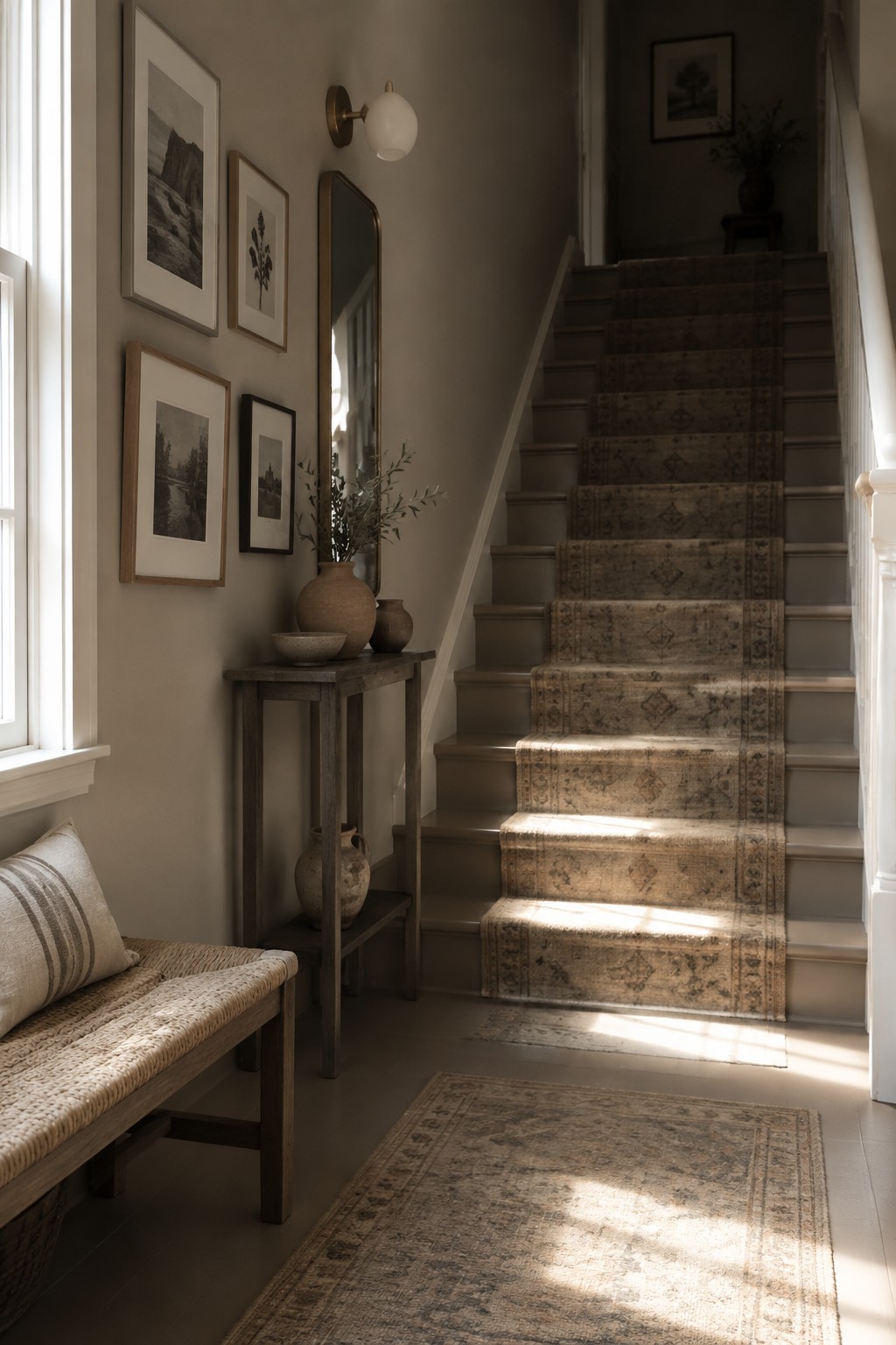
A warm greige is the likely paint direction here, close to Benjamin Moore Edgecomb Gray or Sherwin-Williams Accessible Beige. It sits between beige and gray, making it a useful neutral for an entry where a brighter white might feel too stark.
The color works well with the dark wood stair trim and the runner’s muted tan tones. In strong window light, it may read lighter and more beige, so test a sample on the wall before choosing a shade.
Terracotta Walls Beside a Woven Headboard
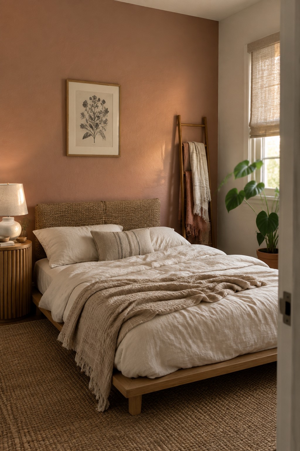
This muted terracotta wall color looks closest to Benjamin Moore Terra Cotta Tile, with Sherwin-Williams Cavern Clay and Behr Canyon Dusk as possible alternatives. It is a warm, earthy shade that feels softer than a strong red or orange, and the woven headboard shows how well it can sit beside natural textures.
In a bedroom, this color works best with warm wood and quiet cream or oatmeal tones. Natural window light can make it look more peachy, so sample it on the wall before committing.
Frequently Asked Questions
Q: How do I keep a low-contrast Japandi palette from feeling flat?
A: Give the colors different jobs: use a warm neutral on the walls, a slightly deeper shade on larger furniture, and a pale tone for textiles. Natural wood grain and woven fabrics add quiet texture without breaking the soft palette.
Q: Can I use white in a Japandi room, or will it feel too stark?
A: Yes, but choose a creamy or softened white instead of a crisp, cool one. It sits more naturally beside beige, taupe, and warm wood.
Q: What’s an easy way to test a palette before painting?
A: Try large paint samples on a few walls and look at them in morning and evening light. A color that seems gentle in the store can read much cooler at home.
Q: Do Japandi colors work in a small room?
A: They do. Keep the main surfaces light and bring in a little contrast through wood, a rug, or one darker accent so the room still has definition.
