

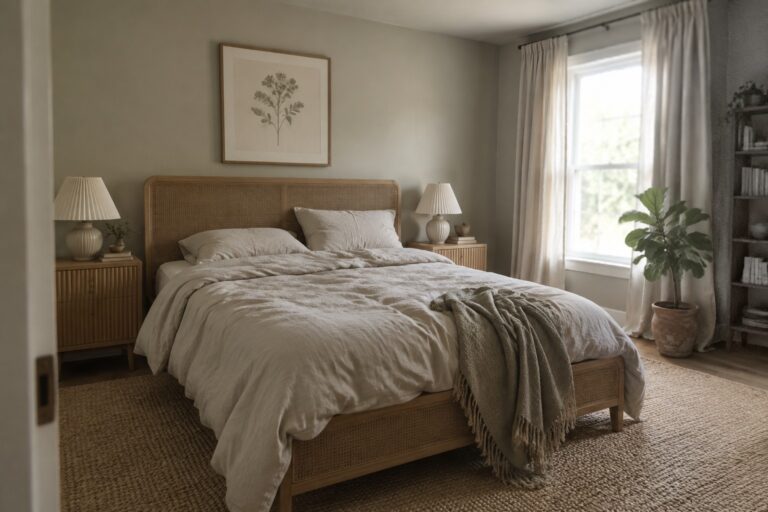
Muted pastels can give a Japandi room a gentle warmth without taking away from its clean lines and natural materials.
I find these shades work best when their undertones sit comfortably beside wood floors, simple furniture, and the whites or creams used on trim and walls.
Changing daylight can make a soft green look cooler or a dusty pink feel more pronounced, so I would test samples where the color will actually be seen.
The right accent should add a little contrast while still feeling calm against the room’s fabrics and finishes.
A sample that stays balanced from morning to evening is worth a closer look.
Muted Sage Walls Beside Woven Wood
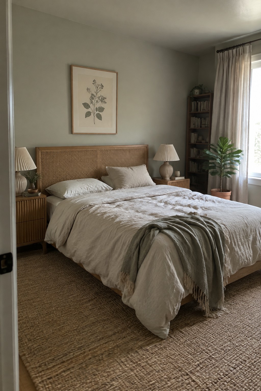
This muted green reads as a soft, gray-leaning sage. It seems closest to Benjamin Moore October Mist, Sherwin-Williams Clary Sage, or Farrow & Ball Mizzle, though the room’s lighting can shift how it looks. The color feels gentle without turning plain, which makes it a good choice for a bedroom or another room where you want a quiet backdrop.
Here, the sage works well beside the warm woven wood headboard. In a dimmer room, it may look grayer, so test a sample on more than one wall before painting the whole room. Creamy whites and natural wood are easy companions.
Muted Blue-Gray Walls With Warm Wood
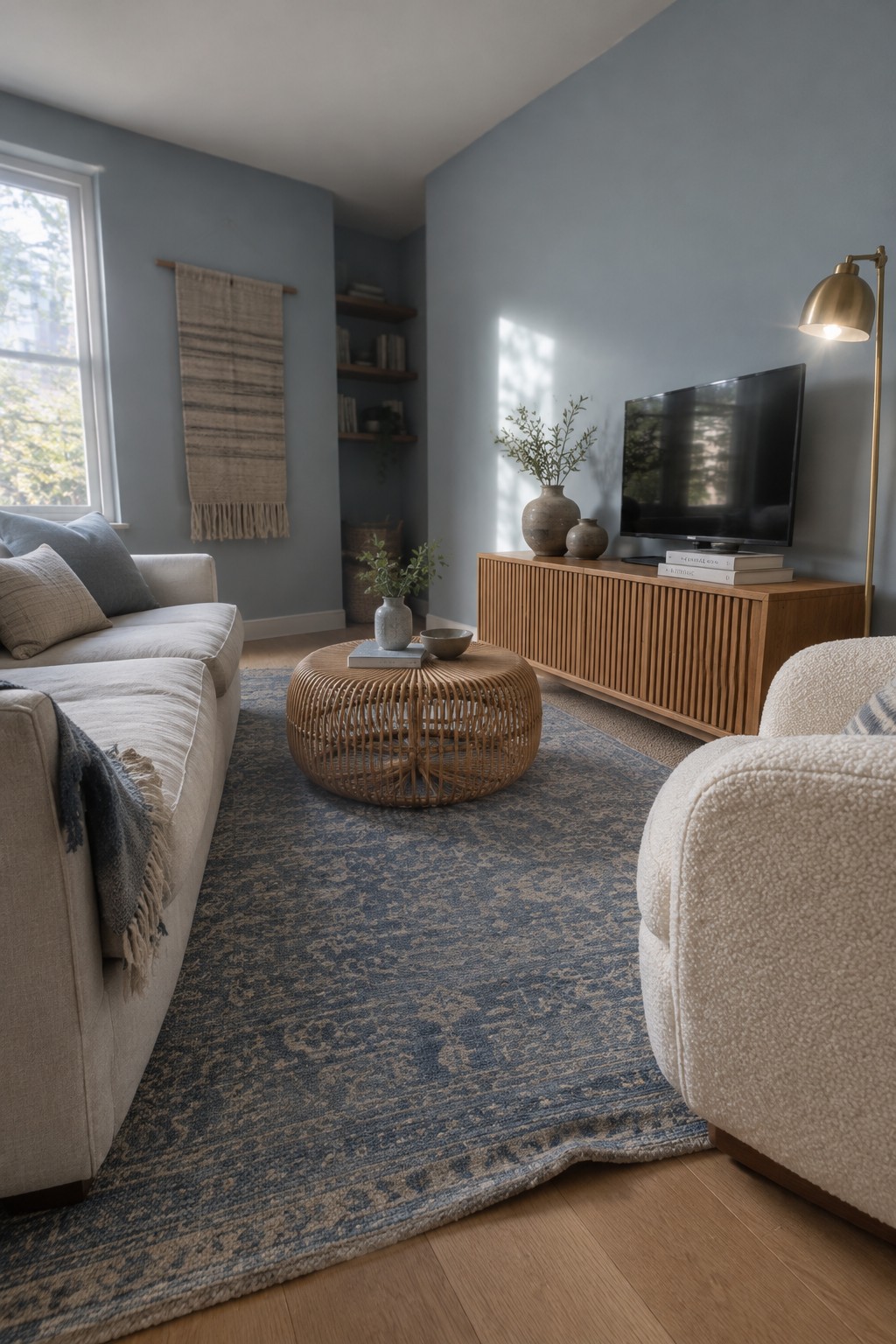
The walls read as a muted blue-gray, a cool, soft color that suits a relaxed living room. It looks close to Benjamin Moore Smoke, Sherwin-Williams Misty, or Behr Light Drizzle, though the exact match is hard to pin down from a photo. The shade feels gentle rather than stark, and the warm wood floor and media console give it a comfortable contrast.
In a room with less daylight, this blue-gray may look a little deeper and cooler, so test a sample on more than one wall before choosing it. Cream upholstery and natural wood are easy pairings; crisp white can make the color feel cooler.
Muted Taupe Cabinets With Warm Oak
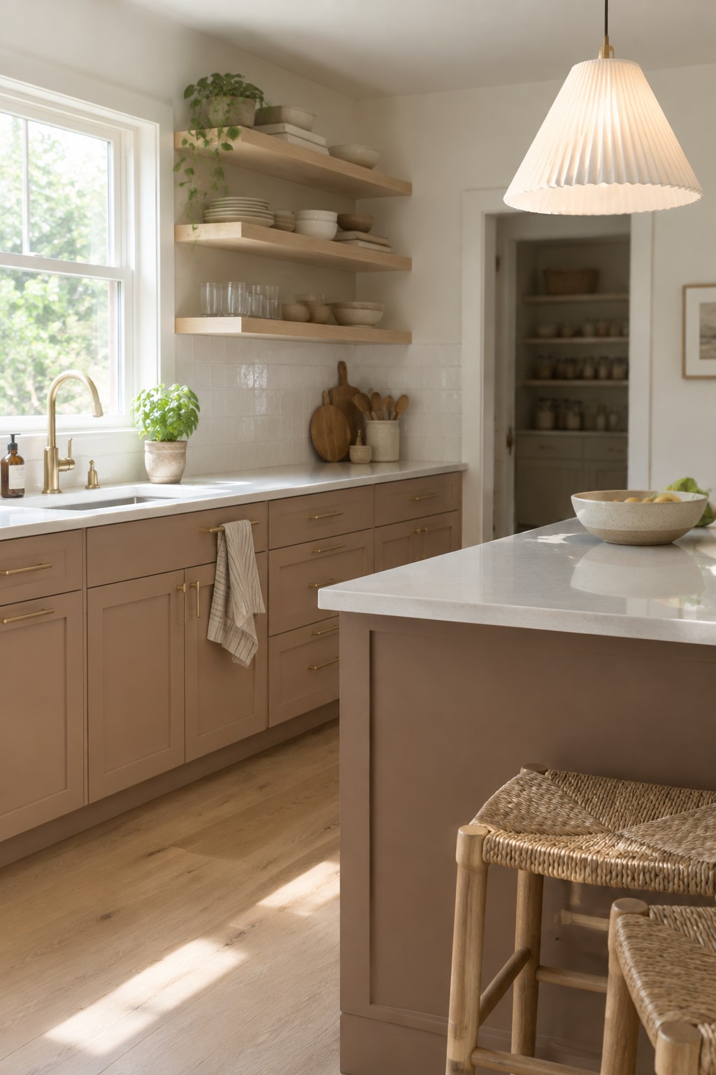
The cabinets look closest to a muted taupe, a soft brown-beige with a warm undertone. For similar shades, consider Benjamin Moore Pashmina, Sherwin-Williams Loggia, or Farrow & Ball Mouse’s Back. It’s a gentle alternative to white cabinetry and feels easy to live with in a kitchen.
Warm oak shelves and flooring suit this color well, while the pale counters keep the room from looking too brown. In a kitchen with less daylight, test a sample first, since taupe can read darker or more gray depending on the light.
Warm Greige Walls With Natural Oak
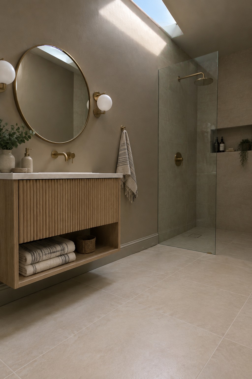
This bathroom’s walls read as a warm greige, a quiet mix of beige and gray that suits a muted Japandi palette. It looks closest to Benjamin Moore Pale Oak, Sherwin-Williams Accessible Beige, or Farrow & Ball Skimming Stone, though the photo can’t confirm an exact match. The gentle neutral lets the natural oak vanity feel at home without making the room look too brown.
In a bathroom, this color works well with light stone tile and simple wood finishes. Check a sample in both daylight and evening light, since greige can lean more beige or gray depending on the room.
Dusty Rose Walls With Light Oak
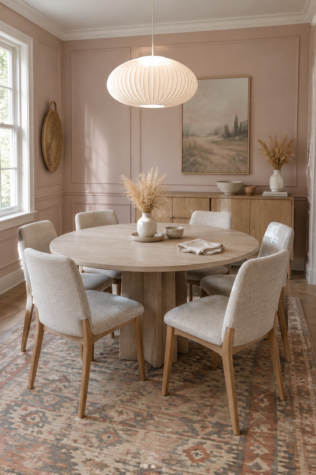
The walls look like a muted dusty rose, a warm pastel with a little beige in it. A close match might be Benjamin Moore First Light, Sherwin-Williams Malted Milk, or Farrow & Ball Setting Plaster. This kind of pink feels gentle rather than sugary, so it can work well in a dining room or sitting room.
In daylight, the color may look paler and more peachy; in a dimmer room, its rosy tone will show more. Light oak is an easy pairing, as it keeps the room feeling natural. Test a large sample first, since some blush paints can read more pink than expected.
Alt text: Dusty rose dining room walls with light oak furniture and cream upholstered chairs.
Pale Greige Above Traditional Wood Paneling
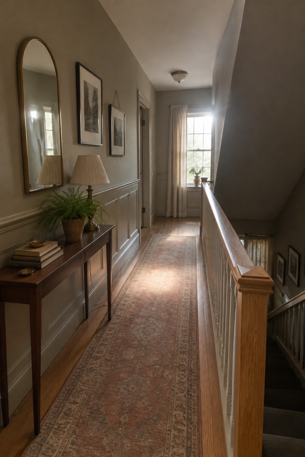
This hallway color reads as a warm pale greige, close to Benjamin Moore Classic Gray, Sherwin-Williams Egret White, or Behr Cotton Grey. It is a soft neutral rather than a clear beige, which makes it a useful choice for a narrow passage without making the walls feel stark.
The shade sits well above the white paneling, while the wood floor keeps the neutral from feeling too cool. In a dimmer hallway, test a sample first, since pale greige can shift toward beige or gray depending on the light.
Alt text: Pale greige paint covers the upper walls of a narrow upstairs hallway above white paneling.
Gray-Green Built-Ins With Dark Wood
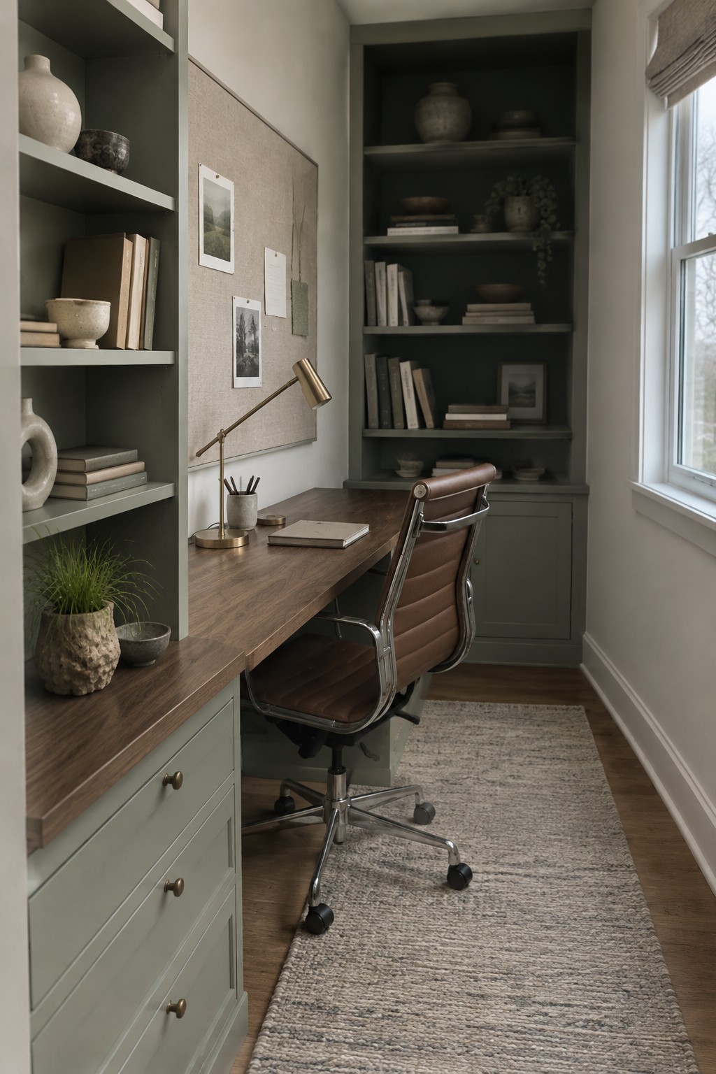
This muted gray-green paint looks close to Benjamin Moore October Mist, though the exact shade is hard to pin down from a photo. It works well across both the shelves and desk cabinetry, giving a small office a quiet color without making the walls feel busy.
The gray undertone keeps the green from turning too bright, while the dark wood desktop makes it read a little warmer. Try it in a study or other compact room with natural wood nearby, and test a sample first since the shade may look cooler in weaker daylight.
Dusty Peach Walls With Light Oak
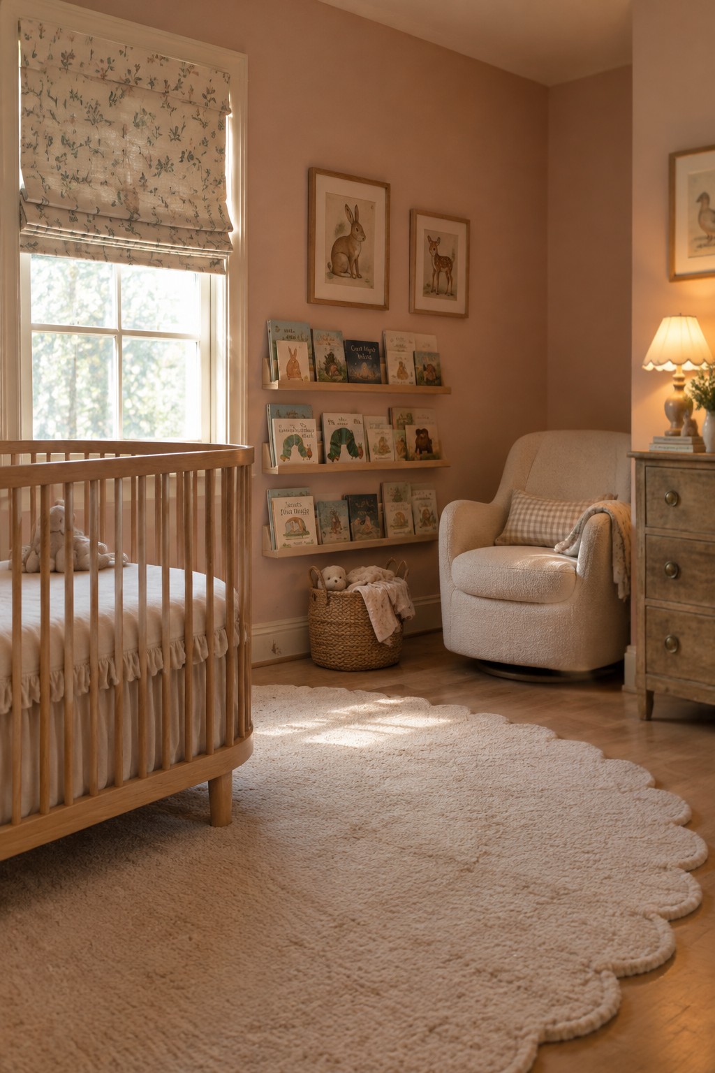
A muted peachy beige is the main paint idea here, close to Farrow & Ball’s Setting Plaster, Benjamin Moore’s Venetian Portico, or Sherwin-Williams’ Intimate White. It reads as a soft, warm neutral rather than a clear pink, so it can make a nursery feel gentle without leaning too sweet.
The light oak crib suits this color, but the walls may look more peach in warm lamplight. It works best with creamy whites and natural wood; test a sample first if the room gets little daylight.
Blue-Gray Walls Across a Built-In Reading Nook
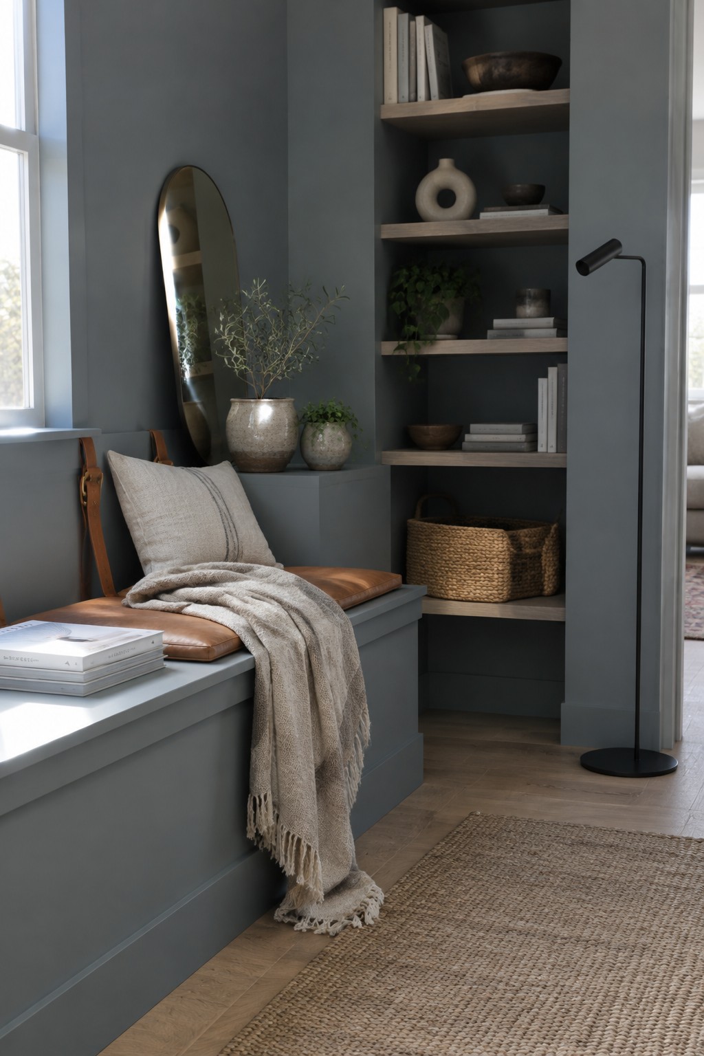
The wall color looks like a muted blue-gray, close to Benjamin Moore Boothbay Gray, Sherwin-Williams North Star, or Behr Light French Gray. It’s a soft, mid-tone shade that gives a built-in reading nook a tucked-away feel without making it too dark.
The cool gray-blue can shift depending on the light, so it’s worth testing a sample in the room first. Warm wood flooring and natural wood shelves help keep the color from reading too chilly.
Muted Olive Built-Ins Beside Warm Wood
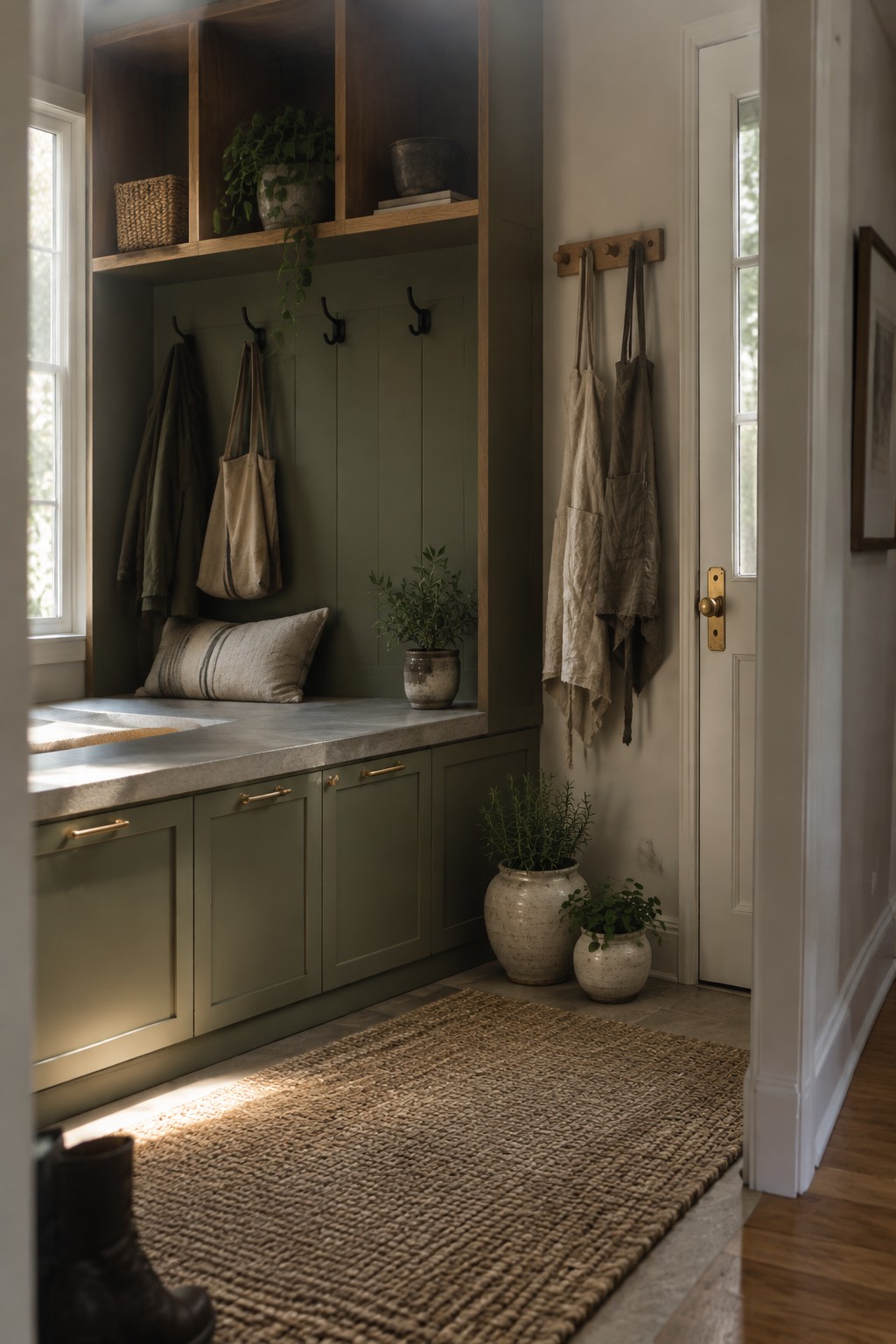
A muted olive green is the main paint idea here, and it looks close to Benjamin Moore October Mist, Sherwin-Williams Evergreen Fog, or Farrow & Ball Lichen. This soft gray-green works well across both the lower cabinets and the built-in nook, so the storage feels like part of the room rather than a separate feature.
The green has a subdued, slightly earthy cast that suits the warm wood shelves and natural stone counter. It should work especially well in an entry or mudroom with good daylight; in a darker space, test a sample first, since olive tones can look browner when light is limited.
Warm Greige Island Beside Oak Cabinetry
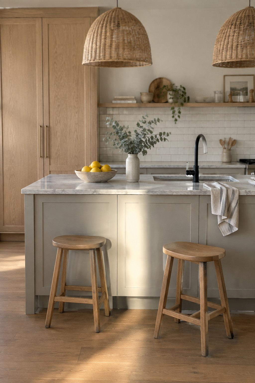
A warm greige paint color is a good fit for this kitchen island. It reads as a muted beige-gray rather than a cool gray, and it gives the island a quiet contrast with the light oak cabinets. For similar shades, look at Benjamin Moore Pale Oak, Sherwin-Williams Accessible Beige, or Farrow & Ball Skimming Stone.
This kind of neutral suits a Japandi kitchen where you want color without a strong contrast. The nearby oak helps bring out its warmer side, while the pale marble countertop keeps the combination feeling light. Test a sample in your kitchen first, since greige can lean more gray or beige depending on the room’s light.
Warm Greige Walls Around a Built-In Nook
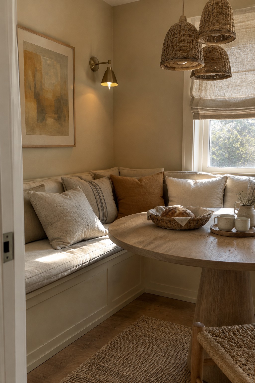
The walls read as a warm greige, somewhere between beige and soft taupe. Close matches might include Benjamin Moore Pale Oak, Sherwin-Williams Accessible Beige, or Behr Blank Canvas. It’s a quiet neutral that suits a small dining nook without making it feel stark.
In daylight, the color looks a little lighter, while the natural wood floor keeps it from reading too cool. Try it with cream trim and warm wood; test a sample first, since greige can shift noticeably from room to room.
Muted Sage Walls Above Patterned Tile
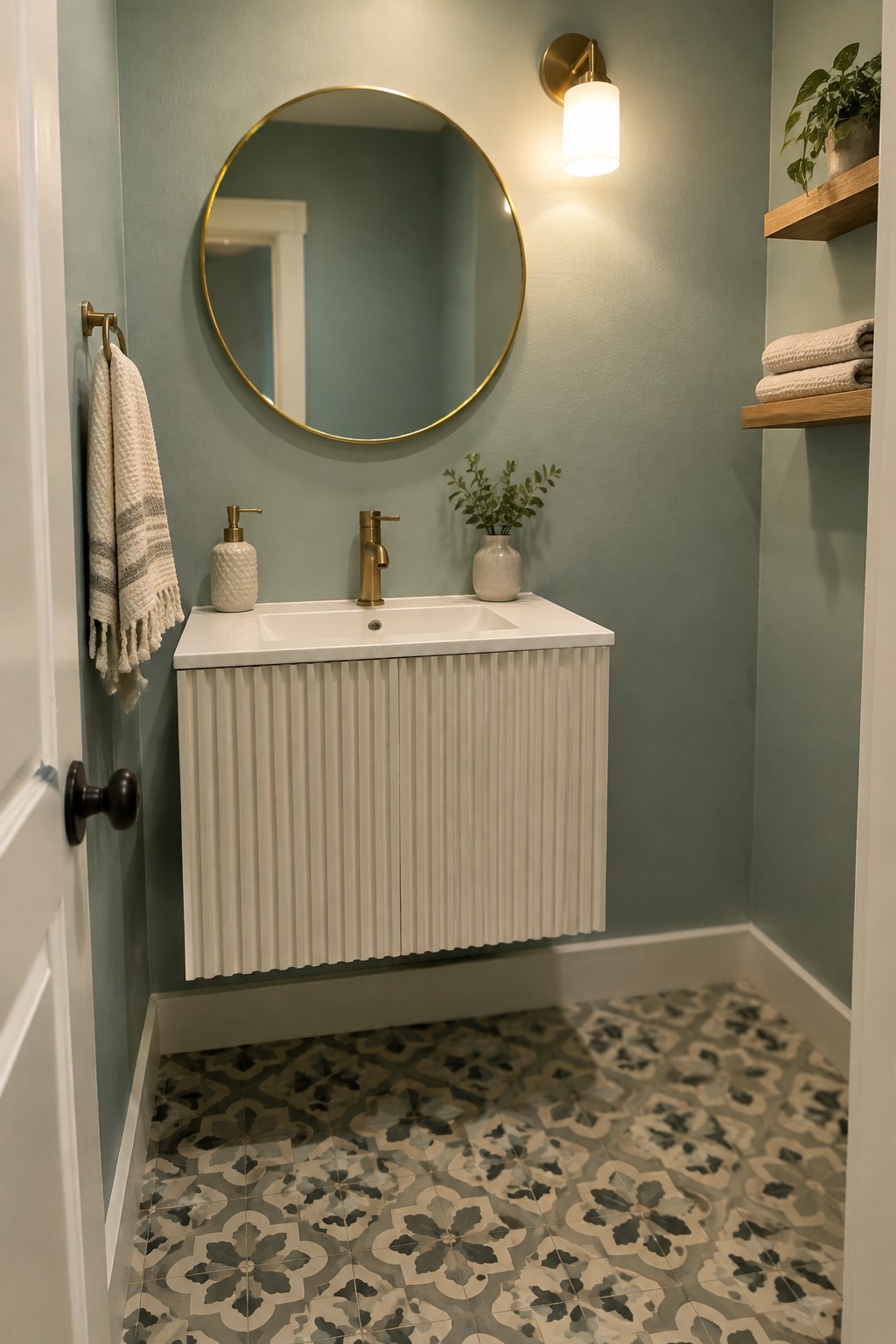
This looks like a muted sage green, close to Sherwin-Williams Clary Sage or Benjamin Moore October Mist. It has a soft gray undertone, which keeps the green from feeling too bright in a small bathroom. The color works well when you want something gentler than white but still fairly quiet.
The patterned floor has gray and cream tones that suit the sage without competing with it. Try warm white trim and simple brass details, and test a sample on the wall first since bathroom lighting can shift the green.
Muted Terracotta Walls With Warm Wood
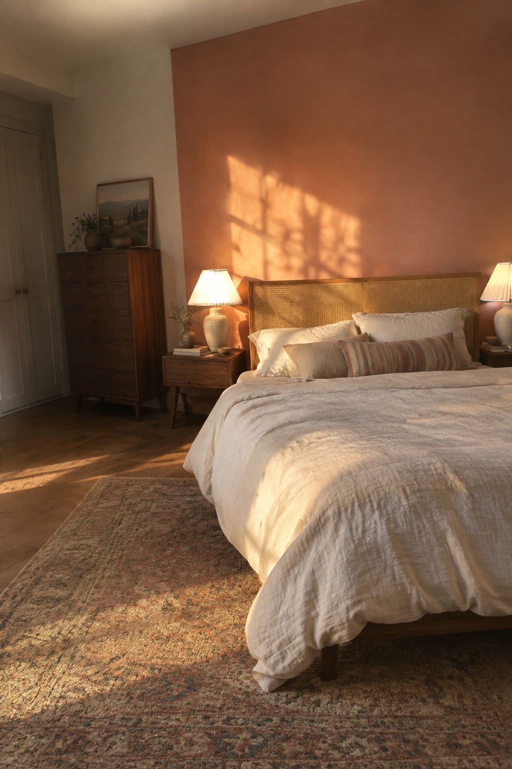
A muted terracotta wall color looks closest to a soft, peachy clay shade. It brings gentle warmth to a bedroom without reading as bright orange, and the large painted wall gives the color room to feel calm rather than busy. Similar colors include Benjamin Moore Terra Cotta Tile, Sherwin-Williams Redend Point, and Farrow & Ball Setting Plaster.
The shade can look more peach in strong daylight and more earthy in softer light, so it’s worth testing on the wall first. It pairs naturally with dark wood and cream bedding; keep other accents fairly quiet if you want the wall color to stay easy to live with.
Warm Greige on a Traditional Entry Door
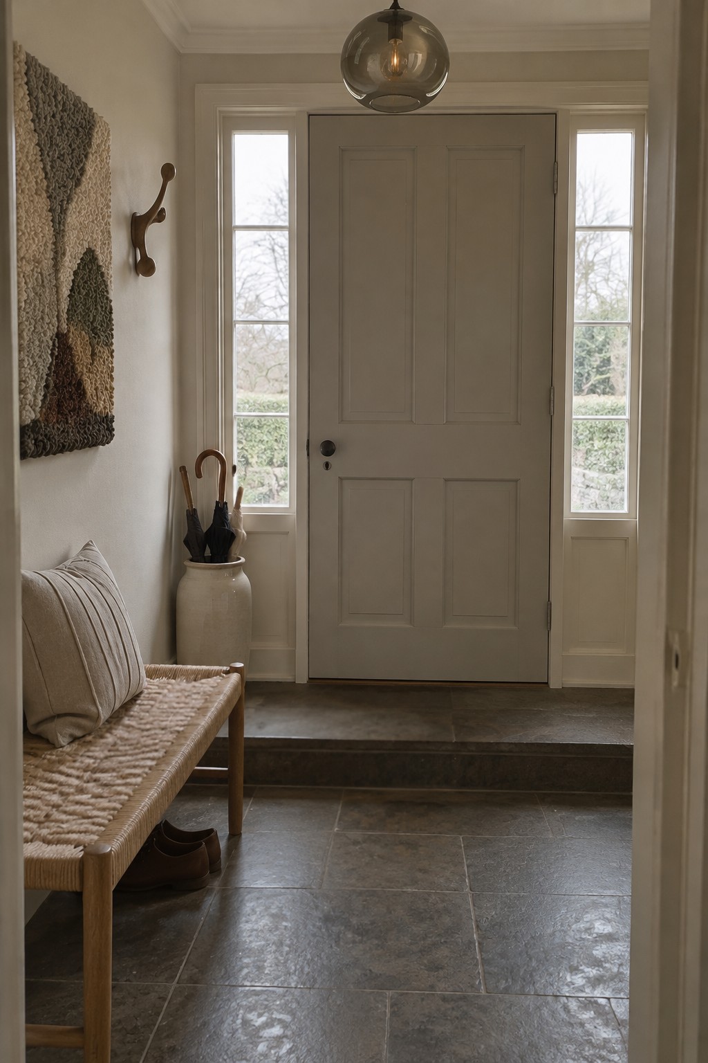
A warm greige paint color suits this traditional entry, and the door reads close to Benjamin Moore Pashmina or Sherwin-Williams Accessible Beige. It sits between beige and gray, giving the doorway a little more color than a plain white door without making it feel dark.
The shade looks especially at home beside the pale trim and dark stone floor. In a room with limited natural light, test a sample first, since greige can lean cooler or more beige depending on the light.
Muted Sage Across Cabinets and Walls
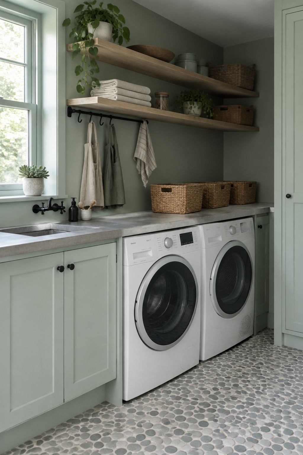
This muted sage green reads close to a soft gray-green, with a gentle, earthy quality. A similar color might be Benjamin Moore October Mist, Sherwin-Williams Clary Sage, or Farrow & Ball Mizzle. It suits a laundry room well, where green cabinetry can make everyday storage feel less utilitarian.
The shade looks especially good with the warm wood shelves and pale stone counter. In a dimmer room, test a sample first, since sage can look grayer or darker without much daylight.
Warm Greige Walls Beside a Wood Staircase

The wall color looks like a warm greige, close to Benjamin Moore Pale Oak, Sherwin-Williams Accessible Beige, or Farrow & Ball Skimming Stone. It is a quiet neutral with enough warmth to suit a stair landing without making the narrow space feel stark.
The natural wood steps and railing bring out its beige side, while the soft neutral stays flexible with patterned rugs and simple textiles. In a dimmer hallway, test a sample first, since this kind of greige can look more gray or more beige as the light changes.
Muted Mauve Walls With Warm Leather
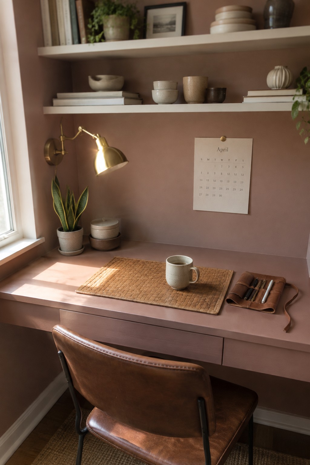
The walls read as a muted mauve, a dusty pink-brown that feels softer than a straight blush. For a close unbranded match, I’d look at Benjamin Moore’s Proposal, Sherwin-Williams Intimate White, or Farrow & Ball’s Sulking Room Pink. It suits a small work area because the color has enough warmth to feel settled without becoming too bright.
In changing daylight, this shade can lean pink or more brown, so test a sample on the wall first. It pairs easily with warm leather and natural wood, while creamy white accents keep the palette from feeling too rosy.
Muted Blush Vanity With Warm Tile
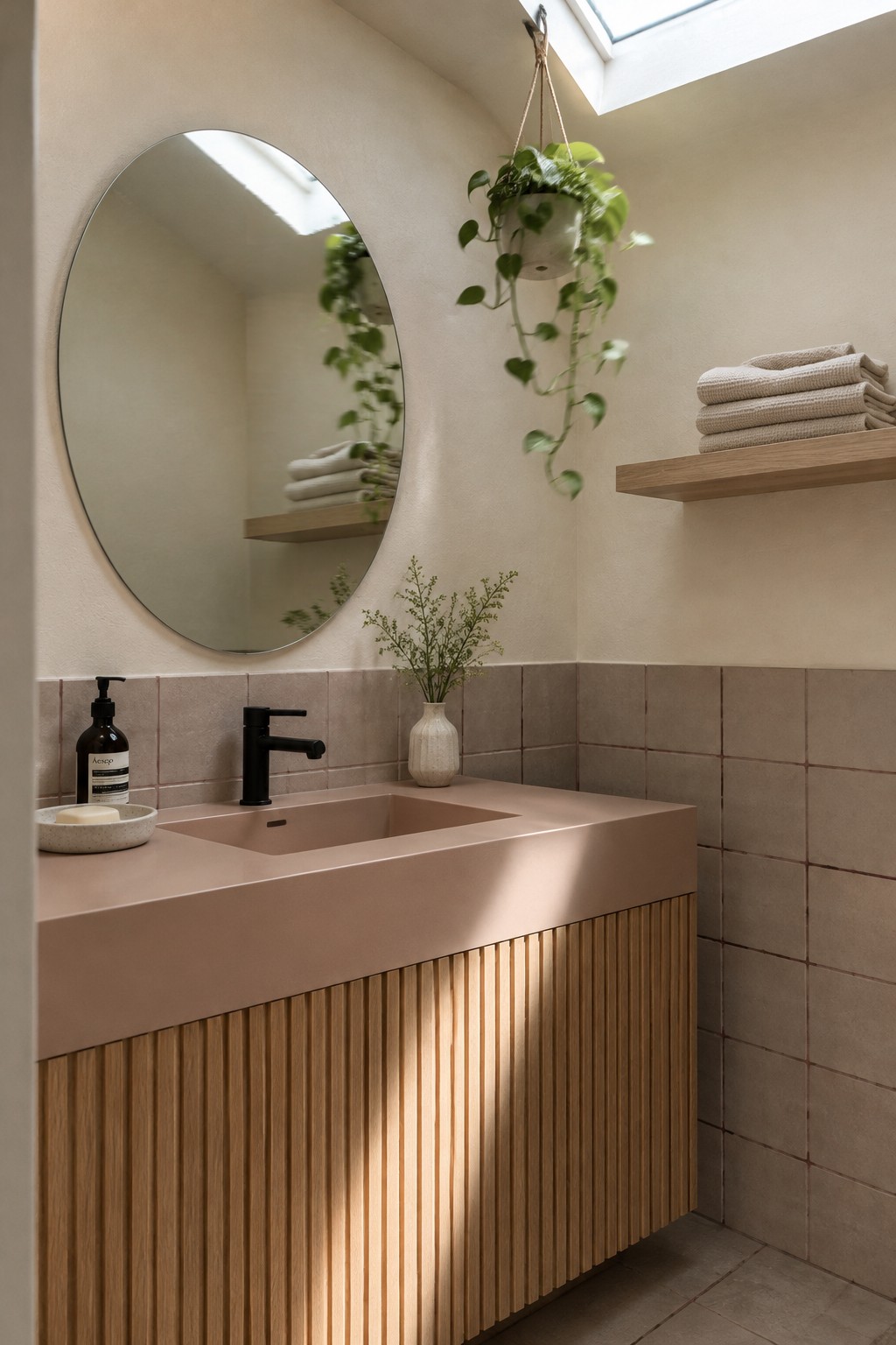
A muted blush pink is the main paint idea here, with a warm, earthy quality rather than a sugary one. It looks close to Farrow & Ball’s Setting Plaster, Benjamin Moore’s First Light, or Sherwin-Williams’ Intimate White, though the exact match is hard to pin down. Used on a bathroom vanity, this soft color feels gentle without making the room look too pale.
The warm tile helps the pink read more like a muted clay shade. It would suit a small bathroom with good natural light, and it pairs easily with light oak or simple black hardware. Check a sample in the room first, since blush can look more peach or more pink depending on the light.
Warm Greige Walls With Walnut Furniture
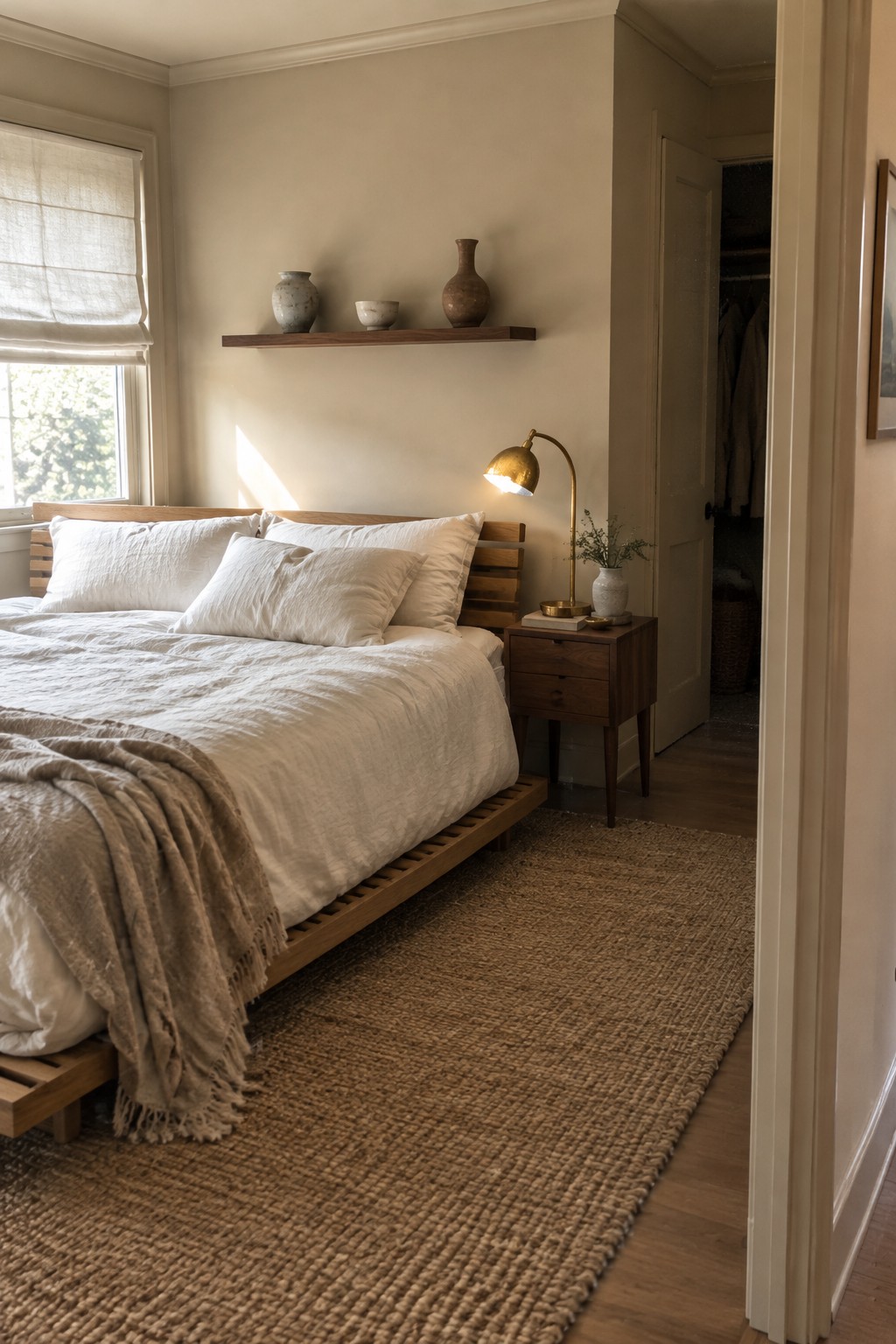
A warm greige, somewhere between beige and soft gray, would suit a bedroom like this. It looks closest to Benjamin Moore Pale Oak, Sherwin-Williams Accessible Beige, or Behr Blank Canvas. The color feels gentle rather than stark, so it works well as a quiet backdrop without making a room feel too cool.
Beside the dark walnut bed and pale wood floor, this shade can read a little warmer. In a dim room, test a sample first, since some greiges turn noticeably brown as the light fades.
Frequently Asked Questions
Q: How do I keep pastel Japandi colors from making a room feel too sweet?
A: Pair them with warm wood, stone, or woven textures, and keep the pastel shades dusty rather than sugary. A little charcoal or deep brown can add a grounded note.
Q: Can I use more than one soft accent color in the same room?
A: Yes, but give each color a clear role. Try sage on a cushion and muted blush in a small piece of art, while keeping the walls and larger furnishings calm and neutral.
Q: What colors work well with light oak furniture?
A: Warm white, soft greige, muted sage, and pale clay all sit nicely beside light oak. If the room feels too pale, add contrast through dark wood or a few black details.
Q: How can I test a color scheme before painting?
A: Bring home paint samples and look at them near your furniture in morning and evening light. Colors can shift more than you expect, so live with the samples for a few days before choosing.
