


Green paint can feel calm and grounded in a room, but the wrong undertone may turn muddy beside warm wood or make white trim look stark.
I find that moss and sage shades often shift noticeably as daylight moves across walls, so a color that looks soft on a sample can feel cooler or darker once it covers a larger surface.
In a Japandi-inspired space, muted greens tend to work best when they sit comfortably with natural wood, simple furniture, and the room’s existing finishes.
I would test a few shades on the wall and check them in morning light, at midday, and after dark before choosing one.
The right green should feel settled in the room rather than competing with everything around it.
Muted Sage Beside Warm Wood

This looks like a muted sage green, a gray-leaning shade that feels soft rather than bright. Close matches might include Benjamin Moore October Mist, Sherwin-Williams Clary Sage, or Farrow & Ball Mizzle. On bedroom walls, this kind of green is an easy alternative to beige and works especially well with warm wood.
The color may look grayer in low light and greener near a window, so it’s worth testing a sample on more than one wall. Warm oak and simple white linens suit it well; very cool whites can make the walls seem a little dull.
Muted Sage Beside Warm Wood

This muted sage green looks closest to Benjamin Moore October Mist, with similar possibilities in Sherwin-Williams Clary Sage or Farrow & Ball Mizzle. It is a soft, earthy green rather than a bright or blue-toned one, and it gives a living room a calm backdrop without making it feel dark.
The warm wood media cabinet suits this shade, while daylight from a large window helps show its subtle green tone. It would work well in a room with wood floors or other natural finishes; test a sample first, since sage can look grayer in less direct light.
Olive Green Cabinets With Warm Wood
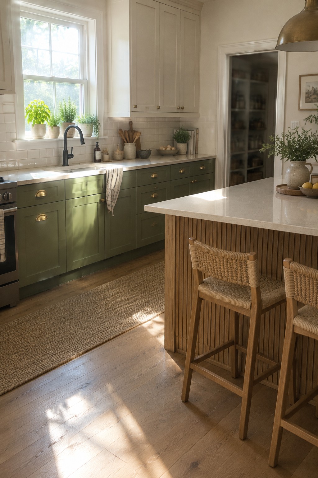
The cabinets read as a muted olive green, a color that feels earthy without looking too dark. Since the exact paint is hard to confirm from a photo, likely matches include Sherwin-Williams Evergreen Fog, Benjamin Moore October Mist, or Farrow & Ball French Gray.
This kind of green works well in a kitchen, especially beside the island’s warm wood slats. Check a sample in your own light first, since olive tones can lean more yellow or gray depending on the room.
Muted Sage Beside Warm Wood
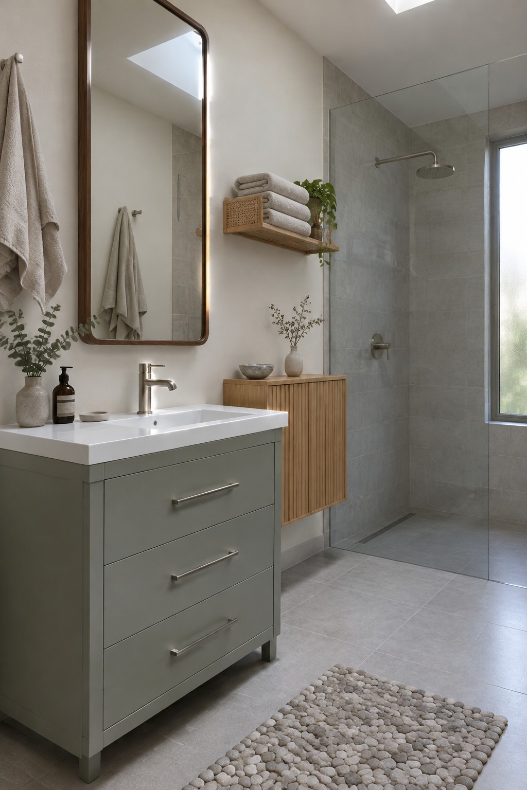
This bathroom’s paint idea is a muted sage green, though the walls here read closer to a soft gray-green. Similar shades include Benjamin Moore October Mist, Sherwin-Williams Clary Sage, or Behr Sage Gray. It’s a quiet color that can bring a little green into a bathroom without making the room feel dark.
The sage works well with the warm wood vanity and pale gray tile. In a room with less daylight, test a sample first, since gray-green paint can look cooler and duller than expected.
Muted Sage Across Paneled Walls
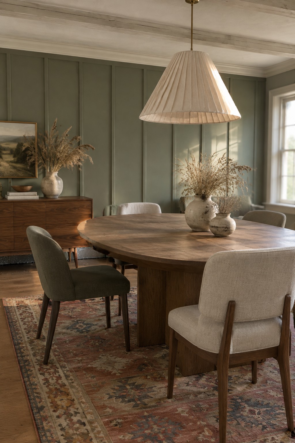
A muted, gray-leaning sage green seems closest to this wall color. For similar shades, look at Benjamin Moore Saybrook Sage, Sherwin-Williams Clary Sage, or Farrow & Ball Mizzle. Painting the wall panels and the wall behind them in one color gives the room a settled look without making the green feel too strong.
The color suits warm wood especially well, as it does here with the dining table and floor. In a room with less daylight, test a sample first, since a gray sage can read darker and cooler than expected.
Pale Sage Above Warm Wood
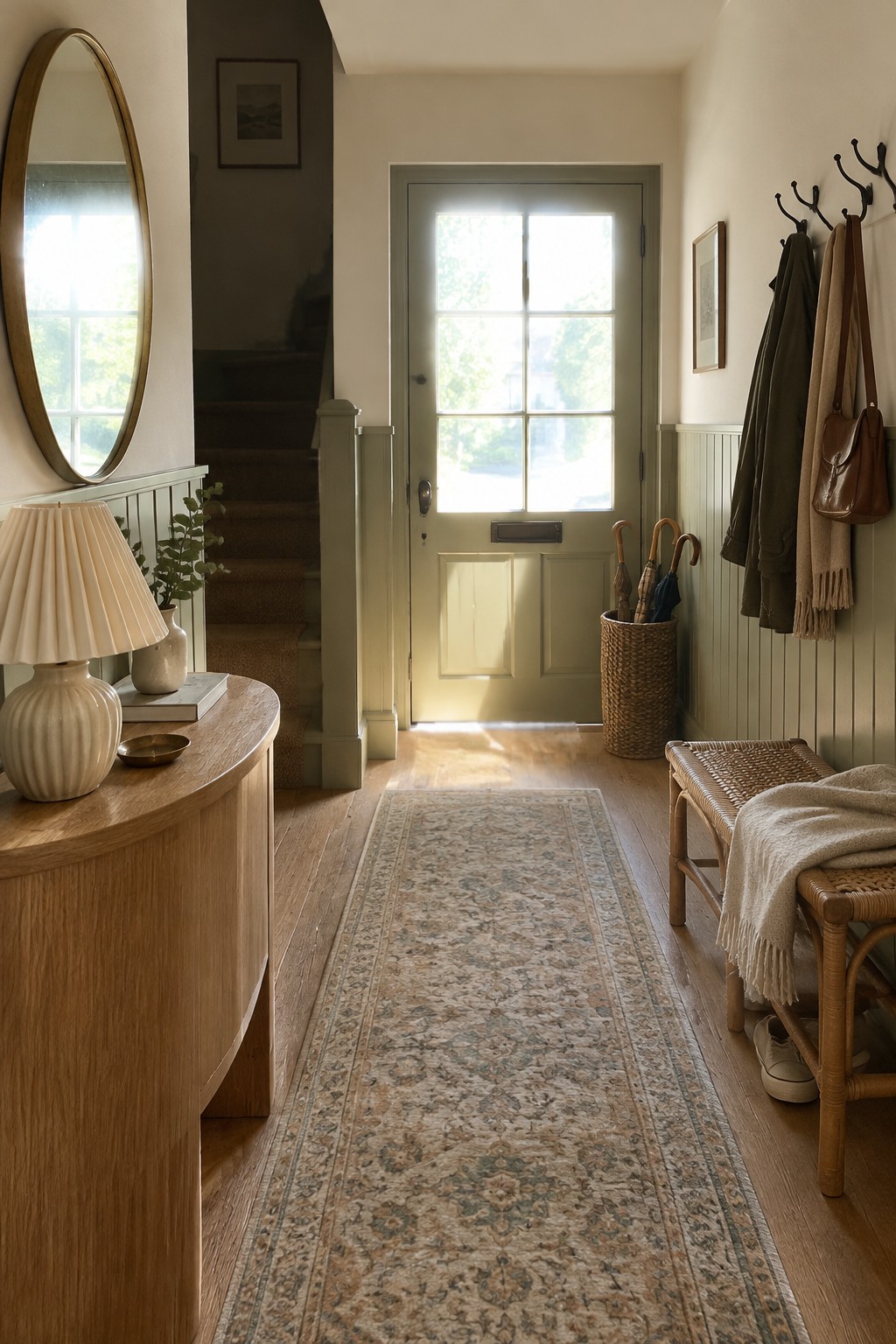
A pale, muted sage green would suit an entry like this. It reads closer to a soft gray-green than a bright leaf green. For similar shades, look at Benjamin Moore October Mist, Sherwin-Williams Clary Sage, or Farrow & Ball Mizzle. It’s a gentle way to bring green into a narrow hallway without making it feel dark.
The warm oak flooring helps the color feel less cool, while the daylight at the door may make it look paler during the day. Try a sample on more than one wall before choosing, since a sage can shift noticeably as the light changes.
Deep Sage Across Built-Ins and Desk

This reads as a deep, muted sage green, close to Sherwin-Williams Retreat, Benjamin Moore Essex Green, or Farrow & Ball Green Smoke. Using the color across the built-in shelves and desk cabinetry gives it a settled, library-like feel, while the warm wood desktop keeps the green from feeling too cool.
The shade leans gray and may look darker in rooms with less daylight. Try it in a study or home office, and check a sample beside your wood flooring before painting the whole space.
Olive Green Walls With Woven Rattan

This muted olive green looks closest to a warm, yellow-based sage. Similar colors include Benjamin Moore Saybrook Sage, Sherwin-Williams Clary Sage, and Farrow & Ball Lichen. It feels earthy without being too dark, making it a good choice for a small reading nook or a room with a few painted walls.
The color looks especially natural beside the chair’s woven rattan, which brings out its warmer side. In a dim room, this green may read deeper and more brown, so sample it on the wall before painting the whole space.
Muted Sage on a Bedroom Accent Wall

A muted sage green with a gray cast looks like the closest fit for this bedroom wall. It reads soft rather than bright, so it gives the room color without making the small space feel too heavy.
The shade works well beside the warm wood floor and natural rattan headboard. In a dimmer room, it may look more gray, so test a sample on the wall before settling on a color. Similar options include Benjamin Moore October Mist, Sherwin-Williams Evergreen Fog, or Behr Laurel Tree.
Sage Green Across the Island and Cabinetry

This kitchen’s muted sage green looks closest to a soft, gray-leaning green. For similar shades, consider Benjamin Moore October Mist, Sherwin-Williams Clary Sage, or Farrow & Ball Mizzle. Using the color on both the island and the back cabinetry gives the room a settled, coordinated look without making it feel too dark.
The warm wood counters keep the green from reading chilly, while the light coming through the window helps show its softer side. It’s a good approach for a kitchen with natural wood and neutral finishes; test a sample first, since sage can look grayer in dimmer light.
Muted Sage Above White Bathroom Tile
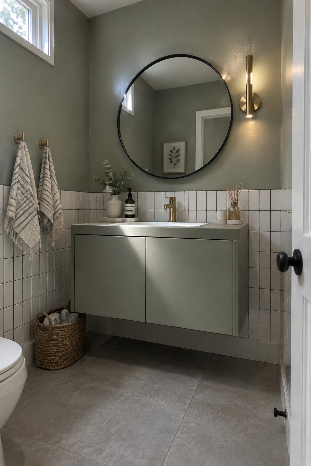
This looks like a muted gray-green sage, close to Sherwin-Williams Evergreen Fog, Benjamin Moore October Mist, or Behr Jojoba. It is a useful choice for a small bathroom because it brings in color without making the walls feel too strong, and it pairs easily with simple white tile.
The shade reads slightly cool, though the gray in it keeps it from looking minty. It should work well in a bathroom with natural light; in a darker room, test a sample first, since sage can look deeper than expected.
Muted Sage Across Hallway Wainscoting
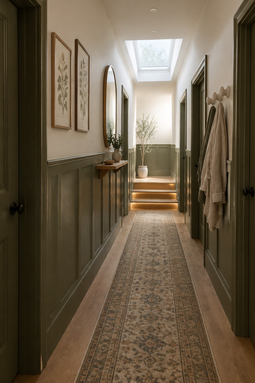
This muted olive-sage reads closest to Sherwin-Williams Ripe Olive, Benjamin Moore Vintage Vogue, or Farrow & Ball Treron, though the exact match is uncertain. Using the deeper green on the hallway wainscoting gives the narrow space definition without making all the walls feel dark.
The color leans earthy rather than blue, and it works well with the warm wood floor and cream upper walls. In a hallway with limited daylight, sample it in place first, since it may look darker than expected.
Muted Sage Across the Entry Built-Ins
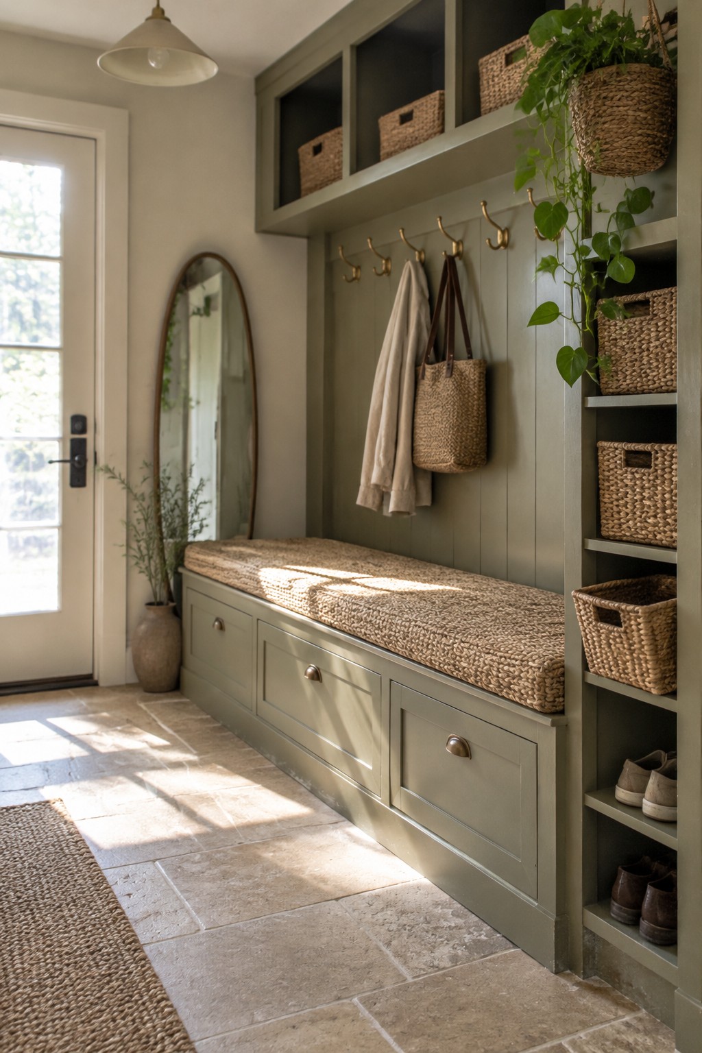
This built-in entryway reads as a muted, gray-leaning sage green. A close match might be Sherwin-Williams Evergreen Fog, Benjamin Moore October Mist, or Farrow & Ball Mizzle, though the exact shade is hard to tell from a photo. Painting the paneled wall, bench, and shelving the same color makes the long storage area feel like one useful unit.
The green looks calm beside the woven baskets and warm stone floor. It should work well in an entry with natural light, but check a sample in the room first, since a shaded hallway can make sage look grayer.
Muted Sage Across Laundry Cabinets

The cabinets look like a muted sage green with a cool, gray cast. For an unbranded match, I’d look at Benjamin Moore October Mist, Sherwin-Williams Clary Sage, or Farrow & Ball Mizzle. This mid-tone green works well on both upper and lower cabinetry when you want color without making a small utility room feel too dark.
Daylight from the high window may bring out the cooler side of the paint, while the white sink and counter keep the palette light. Warm wood shelving is a useful pairing; test samples in the room first, since this kind of sage can look grayer in dim light.
Pale Sage Walls in Soft Window Light
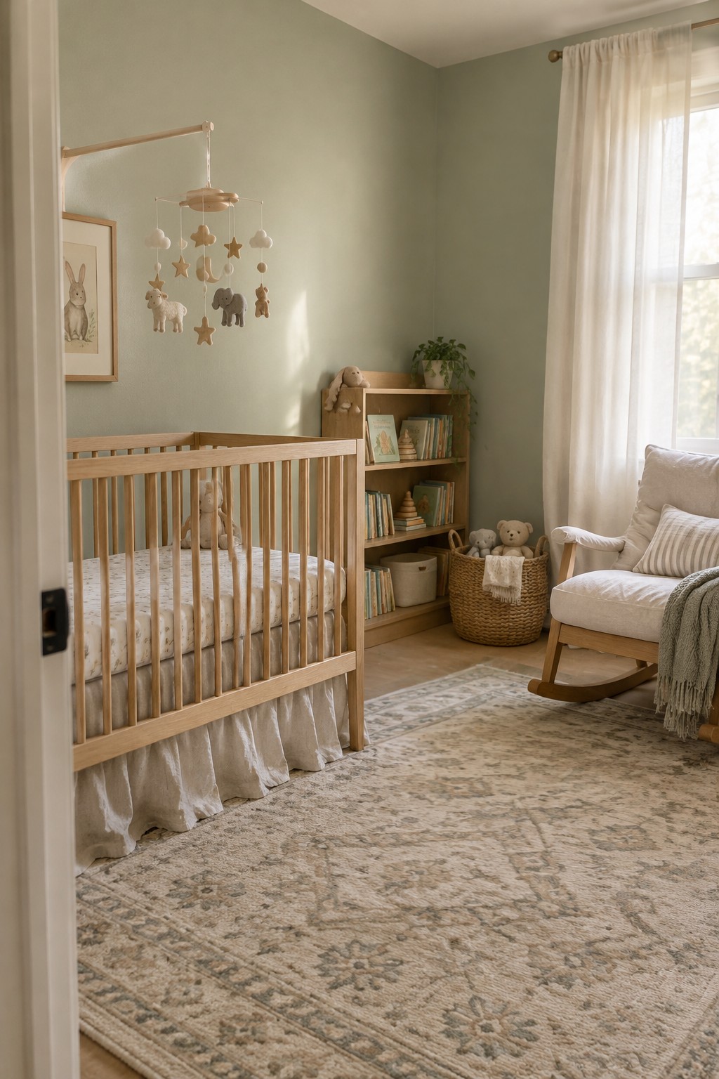
This room’s pale sage green reads as a muted, slightly gray green. A close match might be Benjamin Moore October Mist, Sherwin-Williams Clary Sage, or Behr Sage Gray, though the exact shade is hard to pin down from a photo. It’s a gentle choice for a nursery because it gives the walls color without making the room feel busy.
The daylight keeps the green looking light, while the warm wood crib gives it a softer, earthier feel. Try this kind of sage in a room with good natural light and pair it with cream or warm wood; in a dim room, it may read grayer.
Dusty Sage on Pantry Shelving

A muted sage green is the closest color family here, with a gray undertone that keeps it from reading too bright. For likely matches, I’d look at Benjamin Moore Saybrook Sage, Sherwin-Williams Clary Sage, or Farrow & Ball Mizzle. This kind of green works well on pantry shelving because it gives the storage area color without making it feel busy.
The warm wood shelves suit the cooler green, while a high window brings in plenty of daylight. In a dimmer pantry, test a sample first, since the gray undertone may look darker than expected.
Muted Sage Beside Cream Tile
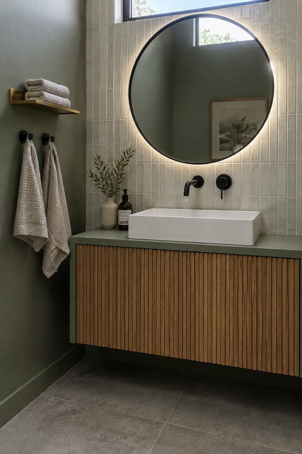
This looks like a muted sage green, close to Benjamin Moore October Mist, Sherwin-Williams Clary Sage, or Farrow & Ball Mizzle. It has a soft gray undertone, so it feels calm without reading as a bright green. On a bathroom wall, this shade is an easy way to bring color into a small space.
The sage works well beside the warm cream tile and wood vanity. In a bathroom with less daylight, test a sample first, since the gray in the color may look stronger when the room is dim.
Deep Sage Across Shelves and Walls

This built-in reading nook uses a deep, muted sage that reads slightly gray rather than bright or yellow-green. For an unbranded match, I’d look at Benjamin Moore Vintage Vogue, Sherwin-Williams Pewter Green, or Farrow & Ball Green Smoke. Painting the shelves and surrounding walls the same color makes the tall storage feel like one calm, continuous feature.
The shade is dark enough to feel cozy, so it works best where there is some natural light. Warm wood at the desk helps it feel less cool, while a brighter white could make the green look sharper by contrast.
Muted Sage Across Cabinets and Open Shelves

This is a muted, slightly gray sage green, likely close to Sherwin-Williams Evergreen Fog, Benjamin Moore October Mist, or Farrow & Ball Mizzle. Using it on both the upper and lower cabinets gives the room a quieter, more unified look than mixing several cabinet colors.
The green pairs easily with the pale countertop and woven baskets, which bring in warmer natural tones. It should work well in a kitchen or utility room with decent daylight; in a darker room, test a sample first, since the gray undertone may read heavier than expected.
Pale Sage Beside Dark Wood
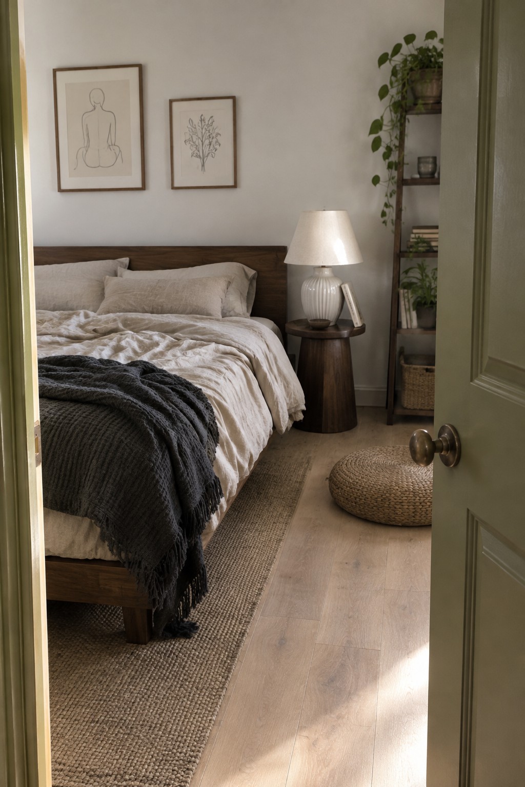
This bedroom’s walls read as a pale, muted sage, closer to a soft green-gray than a bright green. It seems near Benjamin Moore October Mist, Sherwin-Williams Clary Sage, or Farrow & Ball Mizzle, though the photo can’t confirm an exact match. It’s a gentle way to bring green into a bedroom without making the walls feel too strong.
The shade pairs well with the dark wood headboard and light flooring. In a dimmer room, it may look grayer, so test a sample on the wall before painting the whole space.
Muted Sage Across the Range Hood and Shelves

This kitchen’s paint reads as a muted, slightly gray sage green. Similar colors include Benjamin Moore October Mist, Sherwin-Williams Clary Sage, and Farrow & Ball Mizzle, though the exact match is hard to confirm from a photo. Using the color on the range hood and open shelving gives it more presence than a small accent, without covering every cabinet.
The green looks especially at home beside the warm wood counters and island. It should work well in a kitchen with good natural light; in a darker room, test a sample first, since gray-green paint can look deeper than expected.
Muted Sage Above Warm Oak in a Small Bathroom

This paint idea is a pale, muted sage green, close to Sherwin-Williams Sea Salt, Benjamin Moore Healing Aloe, or Behr Breezeway. The green is subtle enough for a small bathroom, where it adds color without making the narrow room feel closed in.
The sage reads a little gray beside the warm oak vanity, so it suits wood finishes better than a sharp, cool white might. Try it on the walls with a simple white trim, and test a sample in both daylight and artificial light before painting.
Frequently Asked Questions
Q: How can I use sage green without making a room feel too cool?
A: Pair it with warm wood, creamy white, or a touch of sandy beige. Those warmer notes keep sage feeling soft and welcoming, especially in a room with limited natural light.
Q: Which green works best for a small room?
A: A light, muted sage can bring in color without making the walls feel heavy. Try it on one wall or in textiles first if you’re unsure about painting the whole room.
Q: What colors go well with moss green in a Japandi space?
A: Moss green looks grounded beside natural wood, warm white, and charcoal accents. Keep the rest of the palette quiet so the green can add depth without taking over.
Q: Can I mix different shades of green in one room?
A: Yes. Choose greens with similar muted undertones, such as sage and olive, then vary their use through paint, cushions, or plants.
