

Dark Japandi rooms can feel grounded and restful, but the wrong paint undertone may make walnut furniture look dull or overly orange.
I find that deep brown, charcoal, and muted green shades shift quite a bit between morning light and warm lamps, so a sample that looks balanced on a paint chip can feel much heavier on the wall.
Soft contrast usually helps these darker colors sit well beside walnut, especially when trim, flooring, and fabrics bring in a little variation.
I would test the paint beside the actual wood and other finishes in the room, since even a small change in undertone can alter the whole palette.
Some of these combinations are worth trying on a large sample first, where you can see how they settle into your space throughout the day.
Charcoal Walls Beside Rich Walnut
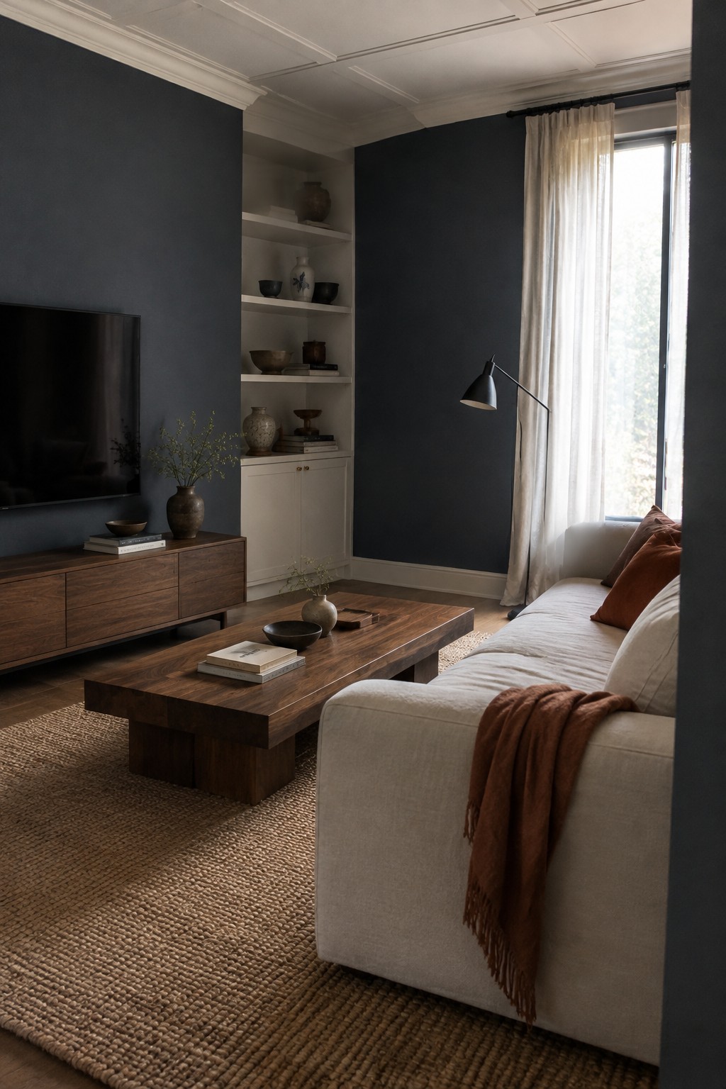
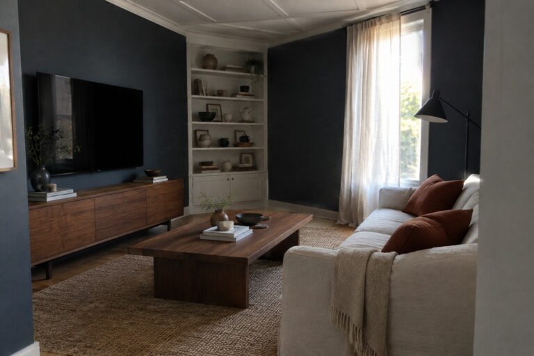
The walls look closest to a deep charcoal with a cool, slightly blue undertone. Similar colors include Benjamin Moore Kendall Charcoal, Sherwin-Williams Iron Ore, and Farrow & Ball Railings, though the exact shade is hard to confirm from a photo. It’s a useful choice for a living room when you want a darker backdrop without going fully black.
The walnut furniture keeps the charcoal from feeling too cold, while the white ceiling and trim give the room some contrast. This color works best where there’s good natural light; in a dim room, it may read nearly black, so test a sample before painting all the walls.
Muted Taupe Walls Beside Walnut
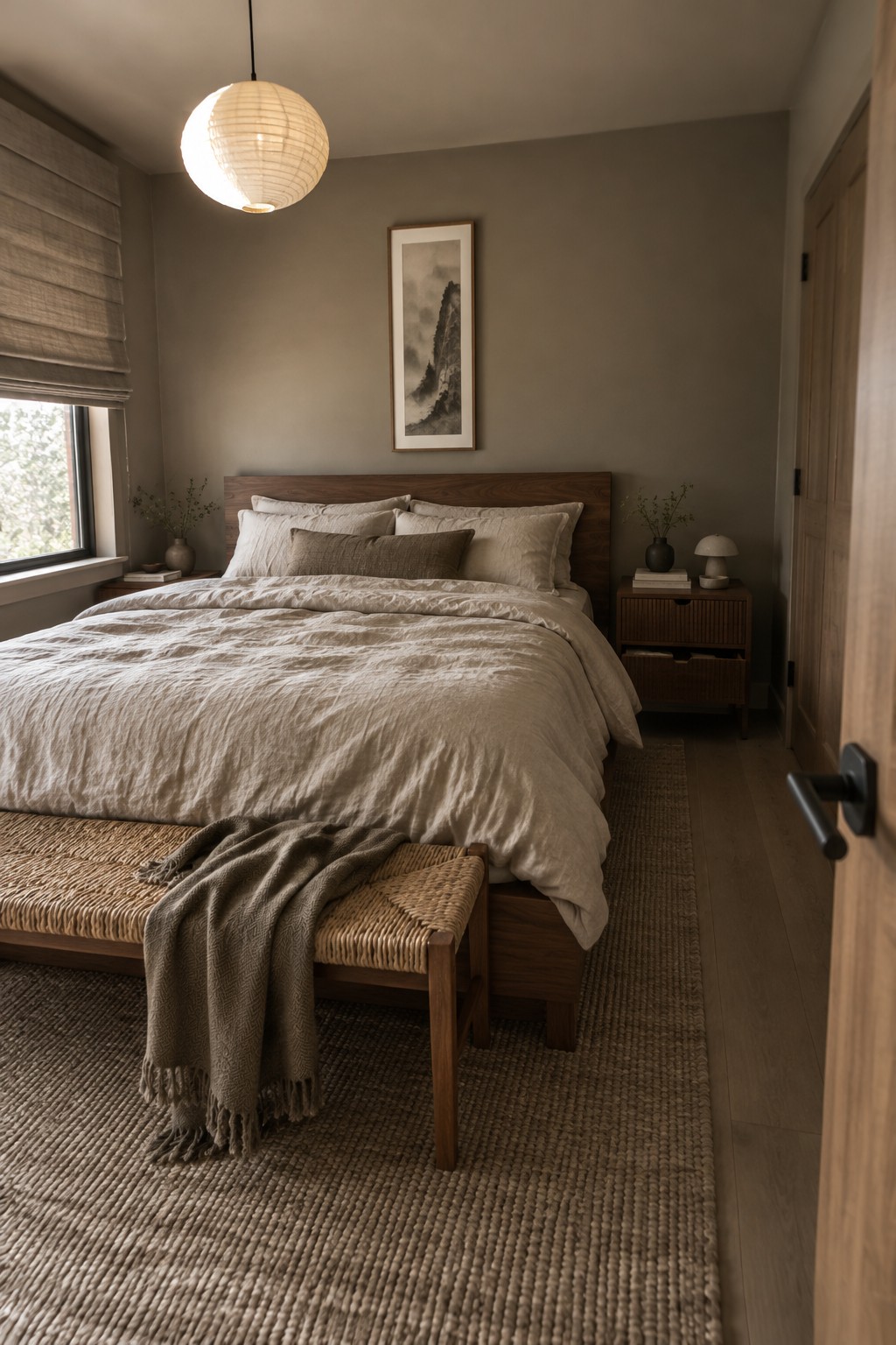
The walls look like a warm, muted taupe, close to Benjamin Moore Pashmina, Sherwin-Williams Mega Greige, or Farrow & Ball Elephant’s Breath. This soft brown-gray is a useful choice for a bedroom because it feels restful without turning the walls stark or pale.
The walnut headboard brings out the warmer side of the paint, while daylight from the window may make it read a little grayer. Try a sample on more than one wall before committing, especially if the room gets limited natural light.
Muted Olive Walls Beside Walnut Furniture

The walls look closest to a muted olive-gray, a quiet green with enough warmth to suit a traditional entry. In an unbranded palette, likely matches include Benjamin Moore October Mist, Sherwin-Williams Evergreen Fog, or Farrow & Ball Pigeon. This kind of shade is a useful way to bring color into a hallway without making it feel too bright.
Warm wood works naturally beside the green, as seen with the walnut-toned console. In a dimmer hall, the color may read deeper and grayer, so sample it on more than one wall before painting the whole space.
Deep Olive Cabinets With Rich Walnut
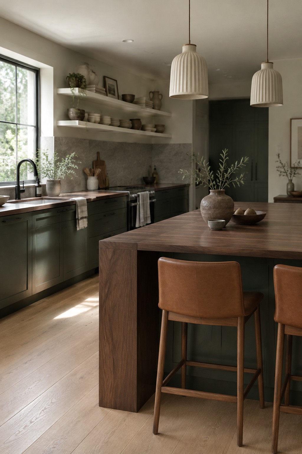
This kitchen’s main paint idea is a deep, muted olive green on the cabinets. It looks closest to shades like Benjamin Moore Vintage Vogue, Sherwin-Williams Pewter Green, or Farrow & Ball Treron, though the exact match is hard to tell from a photo. The green feels earthy rather than bright, and it suits a kitchen where you want color without making the cabinets feel too bold.
The warm walnut island helps bring out the olive undertone. In a room with less daylight, this green may read darker, so test a sample beside your wood finishes before painting all the cabinetry.
Charcoal Walls With Walnut Dining Furniture
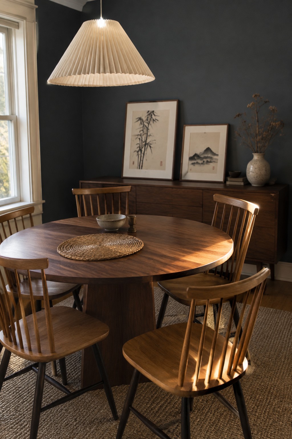
For this dining room, the paint reads as a deep charcoal with a soft, slightly warm undertone. It looks closest to Benjamin Moore Kendall Charcoal, Sherwin-Williams Iron Ore, or Farrow & Ball Off-Black, though the exact shade is hard to confirm from a photo. Against rich walnut, charcoal feels moody without making the room seem cold.
This deep color works best where there is enough daylight to keep the walls from reading nearly black. Natural wood is an easy partner, and a warm white ceiling or trim can keep the contrast comfortable. Test a sample in both daylight and evening light before painting the whole room.
Deep Charcoal-Green Walls With Walnut
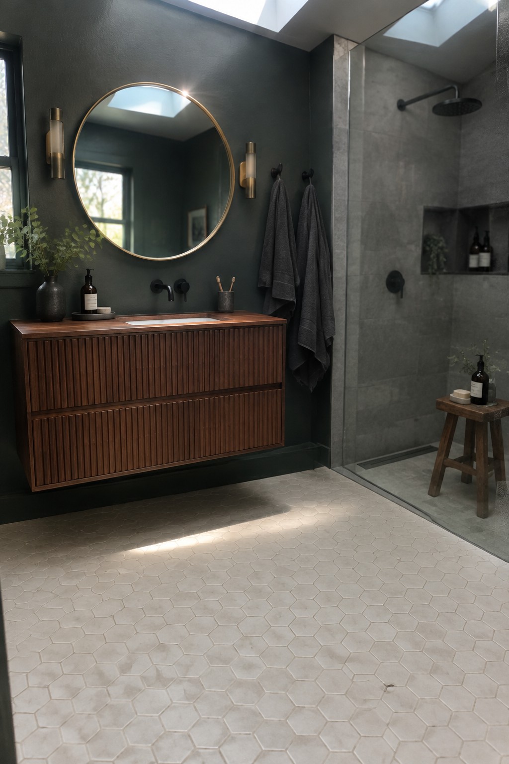
This looks like a deep charcoal-green, close to Benjamin Moore’s Essex Green or Sherwin-Williams’ Greenblack, though the exact match is hard to know from a photo. It reads dark and slightly cool, which gives rich walnut a clear contrast without making the bathroom feel stark.
The color can shift toward near-black in dim light, so it works best where there is some daylight or good task lighting. Warm wood and pale tile help keep the overall palette from feeling too dark.
Deep Blue-Gray Walls Around Walnut Built-Ins

This looks like a deep blue-gray, close to Benjamin Moore Wrought Iron, Sherwin-Williams Grays Harbor, or Farrow & Ball Inchyra Blue. It is dark enough to make the walnut shelving feel especially rich, while still reading as a soft color rather than plain black.
Window light brings out the cooler side of the paint, so it may look more charcoal in a dim room. Try it on walls around walnut built-ins, and use a sample first if the room gets little daylight.
Deep Olive Walls With Walnut Furniture
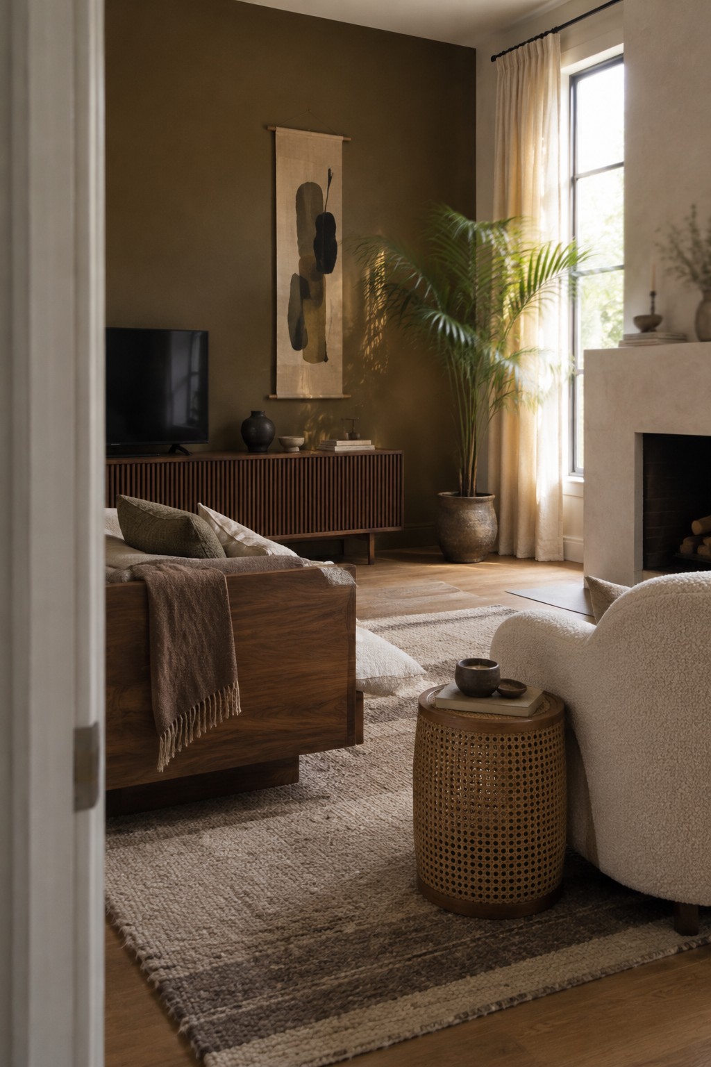
The wall color looks like a deep, muted olive, close to Benjamin Moore Dark Olive or Sherwin-Williams Ripe Olive. It reads earthy rather than bright, and the rich walnut furniture gives it a natural pairing without making the room feel overly dark.
In a living room, this shade works best with some daylight and lighter materials nearby, such as a cream rug or upholstery. It may look nearly brown in a dim room, so test a sample on the wall before committing.
Warm Charcoal Walls With a Walnut Slat Headboard

The walls read as a warm charcoal brown, close to Benjamin Moore Kendall Charcoal or Sherwin-Williams Urbane Bronze, though the exact match is hard to tell from a photo. It’s a deep, muted color that suits a bedroom, especially beside the walnut slat headboard. The contrast feels calm rather than stark.
In changing daylight, this shade may look browner or more gray, so test a sample on more than one wall before painting the whole room. Creamy bedding keeps the dark walls from feeling too heavy, while a lighter ceiling helps the room stay open.
Dark Charcoal Cabinets With Walnut Counters
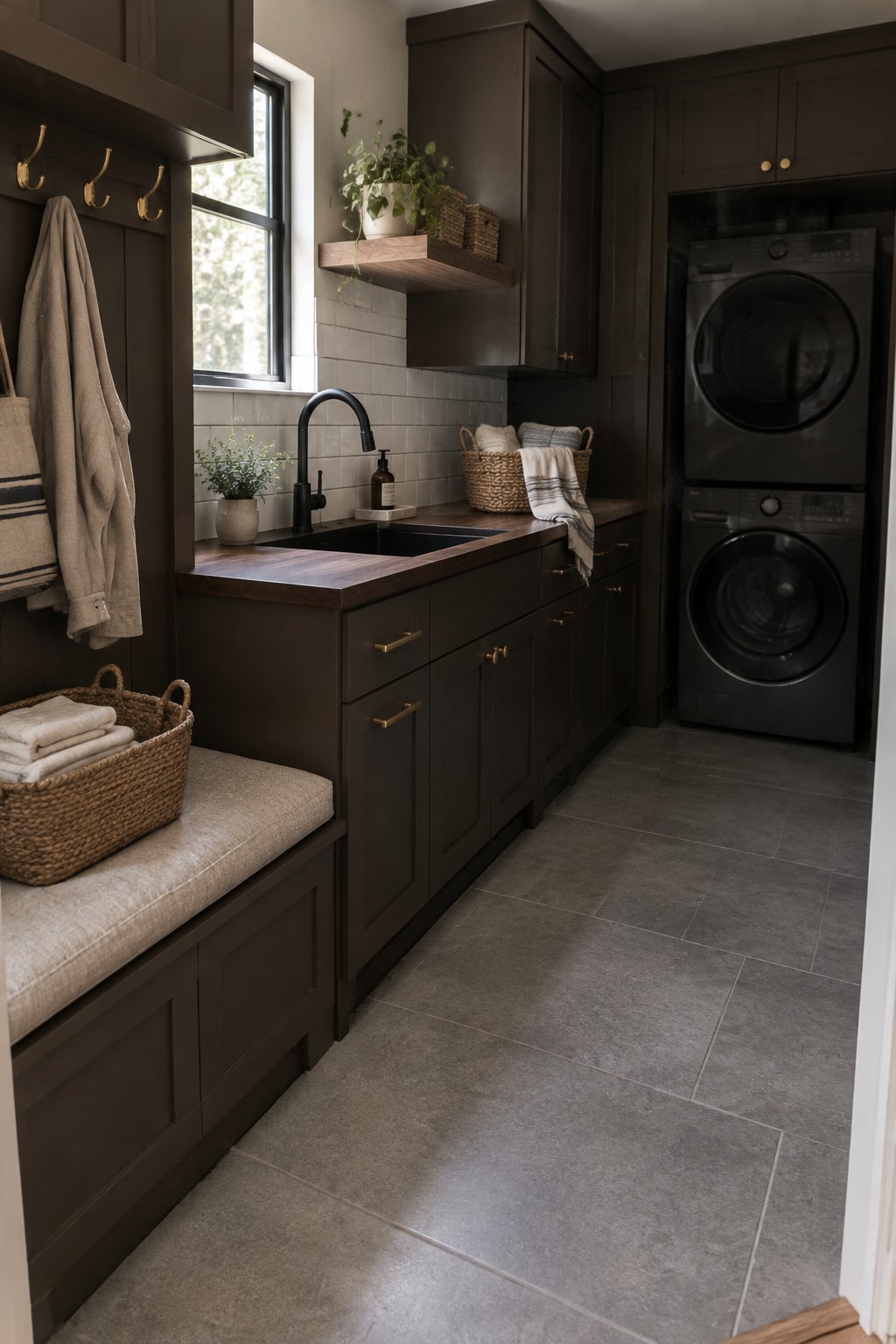
A deep charcoal brown is the main paint idea here, and it looks close to Benjamin Moore Kendall Charcoal, Sherwin-Williams Iron Ore, or Behr Cracked Pepper. This dark, warm-leaning neutral suits a laundry room where you want the cabinetry to feel substantial without using a stark black.
The walnut counter keeps the cabinets from reading too cool, while the window gives the dark paint some natural light. Try a warm charcoal sample beside your wood before committing, since a cooler shade can look a little flat in a room with dark tile.
Blue-Gray Cabinets With a Walnut Island
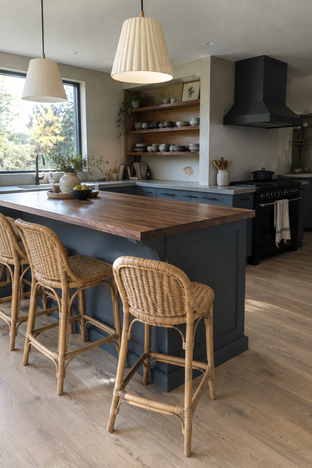
A muted blue-gray paint looks like a good match for the kitchen cabinetry here. It is a cool, fairly deep color, but the rich walnut island keeps the overall palette from feeling too cold. For a similar shade, look at Benjamin Moore Boothbay Gray, Sherwin-Williams Smoky Blue, or Farrow & Ball De Nimes.
This color works well on cabinets when you want something darker than a pale neutral without going all the way to navy. Natural wood is an easy pairing, and warm white walls or counters can keep the kitchen feeling balanced. Check a sample in your own light, since blue-gray paint can read much bluer in a bright room.
Warm Charcoal Walls With a Walnut Dining Nook

A warm charcoal-brown is the main paint idea here. It reads close to a deep mushroom or smoky taupe, with likely matches such as Benjamin Moore Kendall Charcoal, Sherwin-Williams Urbane Bronze, or Farrow & Ball Mouse’s Back. The dark color suits a narrow dining nook, where it gives the walls a quiet, enclosed feel without competing with the rich walnut table and bench.
In dimmer areas, this shade can look quite deep, so it works best when there’s some natural light or a warm lamp nearby. Pair it with walnut and soft cream or linen tones, and test a sample first to make sure the brown undertone doesn’t turn too muddy in your room.
Deep Green Walls With Walnut Joinery
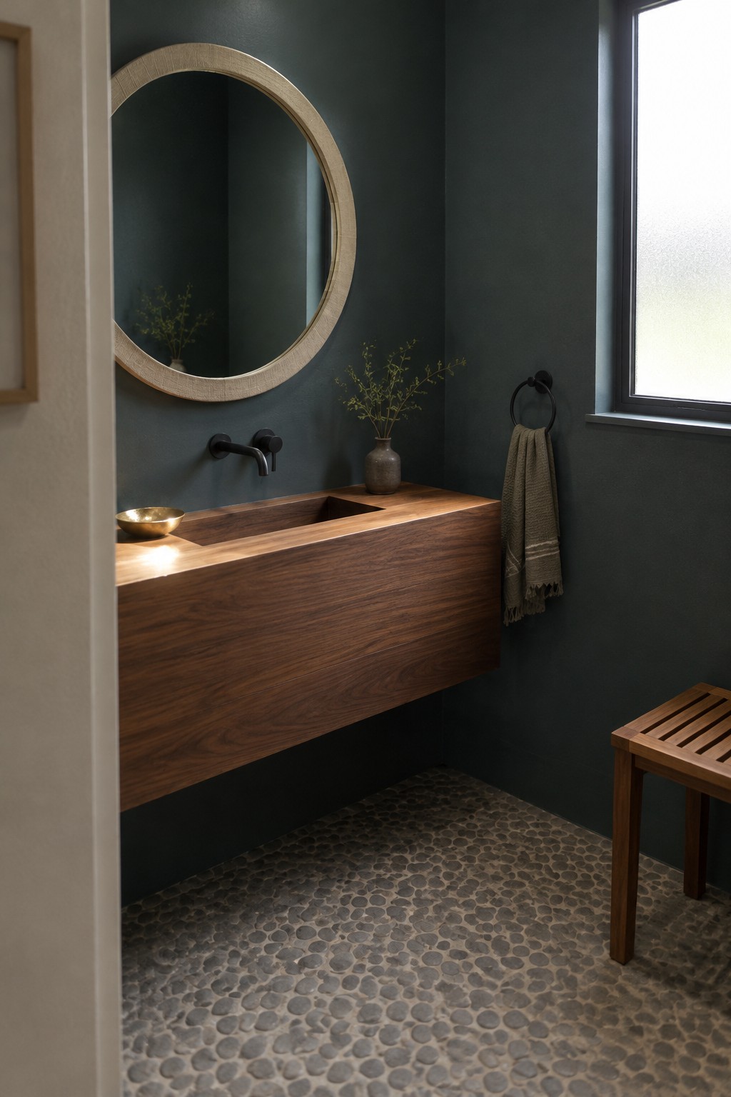
A deep, muted green is the main paint idea here. It reads close to a dark teal-green, though the exact shade is hard to pin down from a photo. For similar colors, consider Benjamin Moore Essex Green, Sherwin-Williams Pewter Green, or Farrow & Ball Studio Green.
This kind of shade suits a small bathroom when you want the walls to feel rich rather than bright. The walnut vanity keeps the green from reading too cold, while natural window light can bring out its softer side. Test a sample in the room first, since a darker green may look nearly charcoal in low light.
Deep Olive Walls Beside Cognac Leather

These walls look closest to a deep olive green, a muted, earthy color rather than a bright green. Similar shades include Benjamin Moore Backwoods, Sherwin-Williams Ripe Olive, or Farrow & Ball Studio Green, though the exact match is uncertain. It’s a good choice for a reading corner or living room when you want dark walls to feel warm rather than stark.
The green has a brownish cast that sits comfortably beside the rich walnut furniture and cognac leather. It may look nearly charcoal in a dim room, so sample it on more than one wall before committing. Natural daylight helps show its olive side.
Deep Charcoal Walls With Walnut Furniture
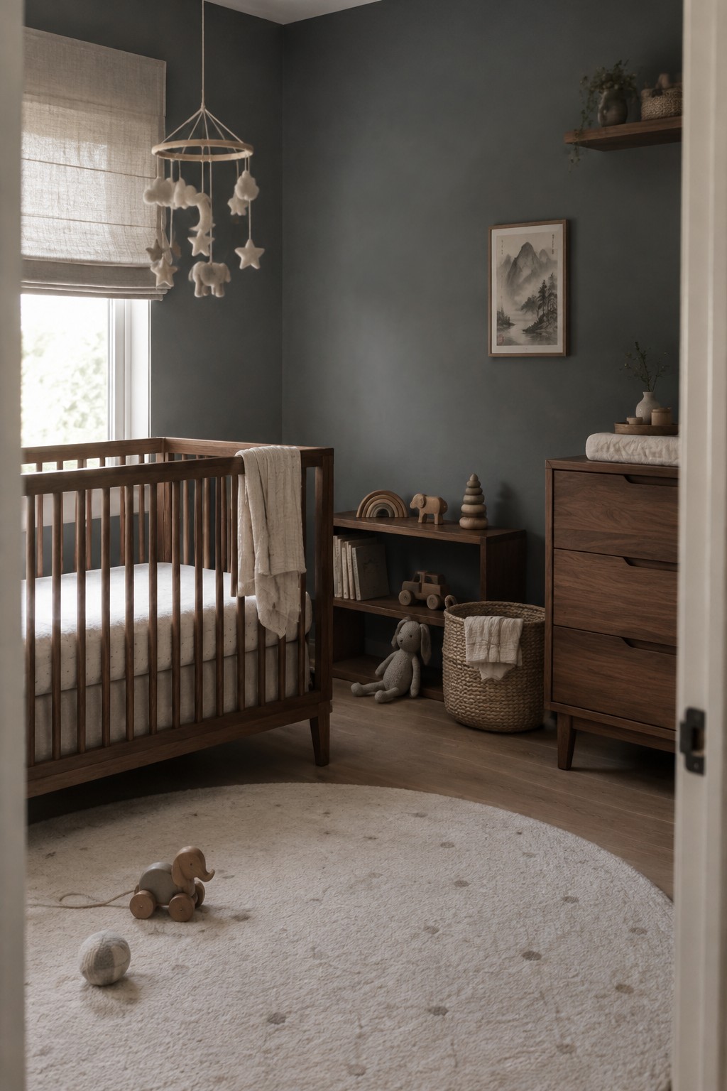
The walls read as a deep charcoal gray with a subtle warm cast. For an unbranded match, I’d look at Benjamin Moore Kendall Charcoal, Sherwin-Williams Iron Ore, or Farrow & Ball Down Pipe. This kind of dark neutral suits a Japandi room because it feels quiet rather than stark, and the walnut furniture keeps it from reading too cool.
The color may look darker in a room with limited daylight, so test a sample on more than one wall first. Here, the natural wood helps bring out its softer side; warm white or oatmeal textiles would work well alongside it.
Deep Olive Walls in Soft Window Light
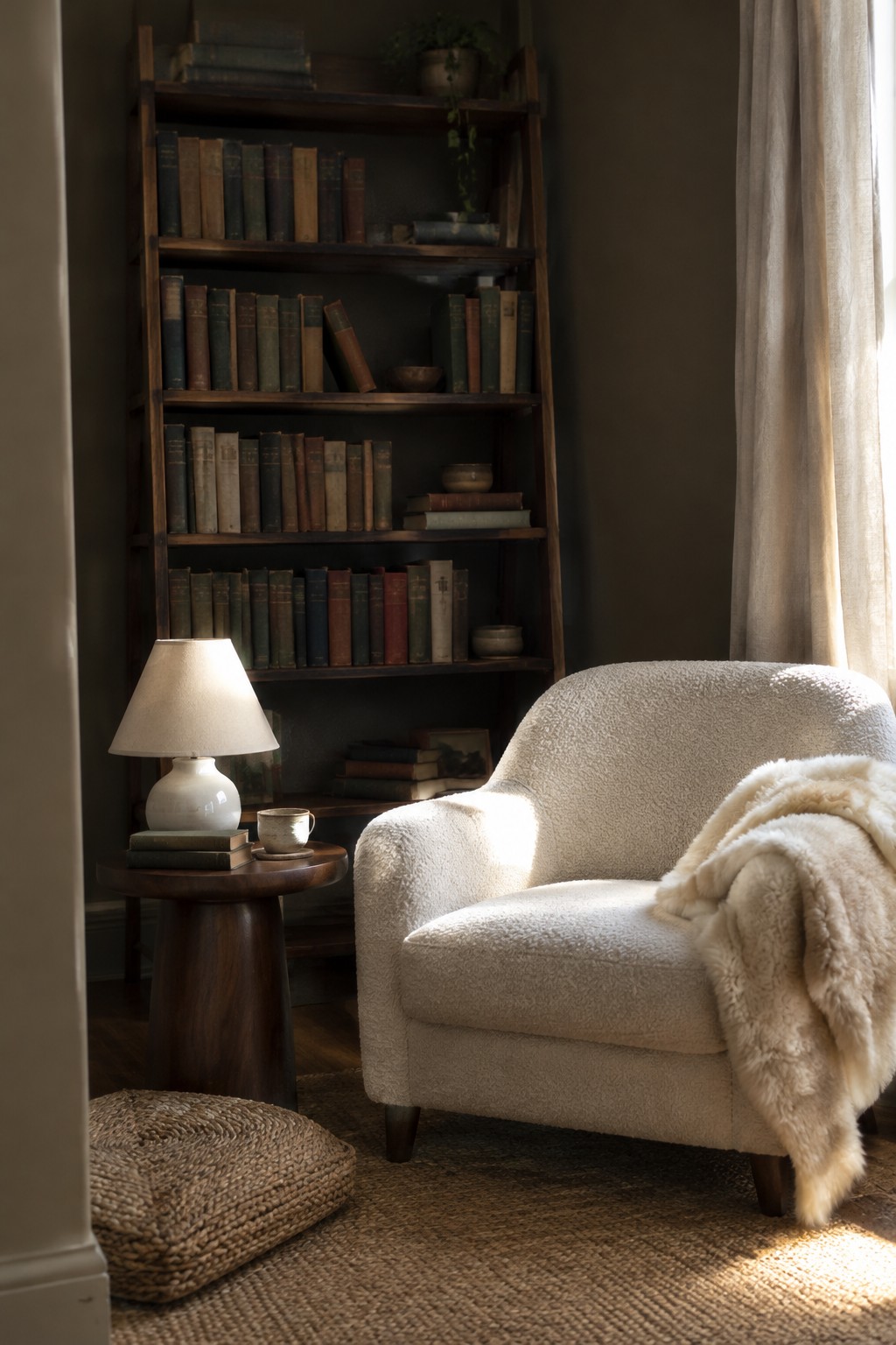
Deep olive green is a good fit for a dark Japandi palette, and this wall color looks closest to that earthy, muted family. It feels richer than sage but less stark than charcoal, so it can make a reading nook feel tucked away without making the paint seem too bold.
The color may look browner in a dim room, while natural window light can bring out its green side. Pair it with rich walnut shelving and cream upholstery, and test a sample on the wall before committing. A small patch can read differently once the light changes.
Midnight Blue Built-Ins With Walnut
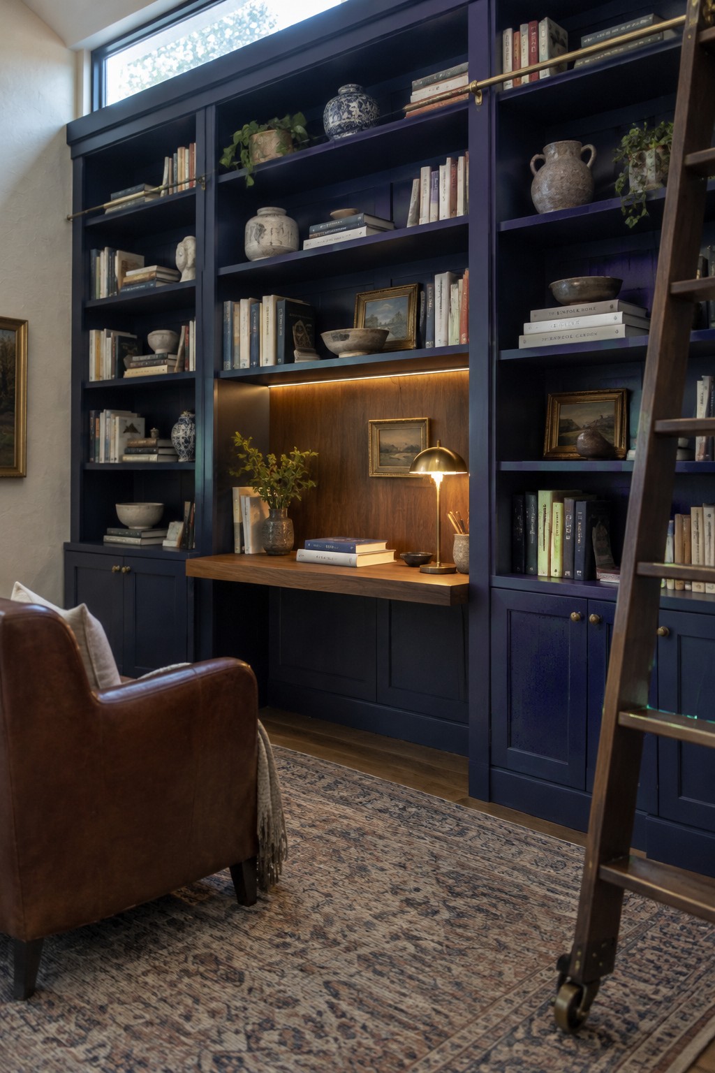
A deep blue-black paint color looks closest to Benjamin Moore Hale Navy, though the built-ins read darker in the shelving’s shade. This kind of blue feels rich without being as stark as pure black, and painting the shelves and lower cabinets alike gives the room a settled, continuous look.
The walnut desk brings in a warm contrast that keeps the dark paint from feeling too cool. This color works well in a study or reading nook with good window light; in a dimmer room, it may look nearly black, so test a large sample before painting.
A Warm Greige Entry With Dark Walnut
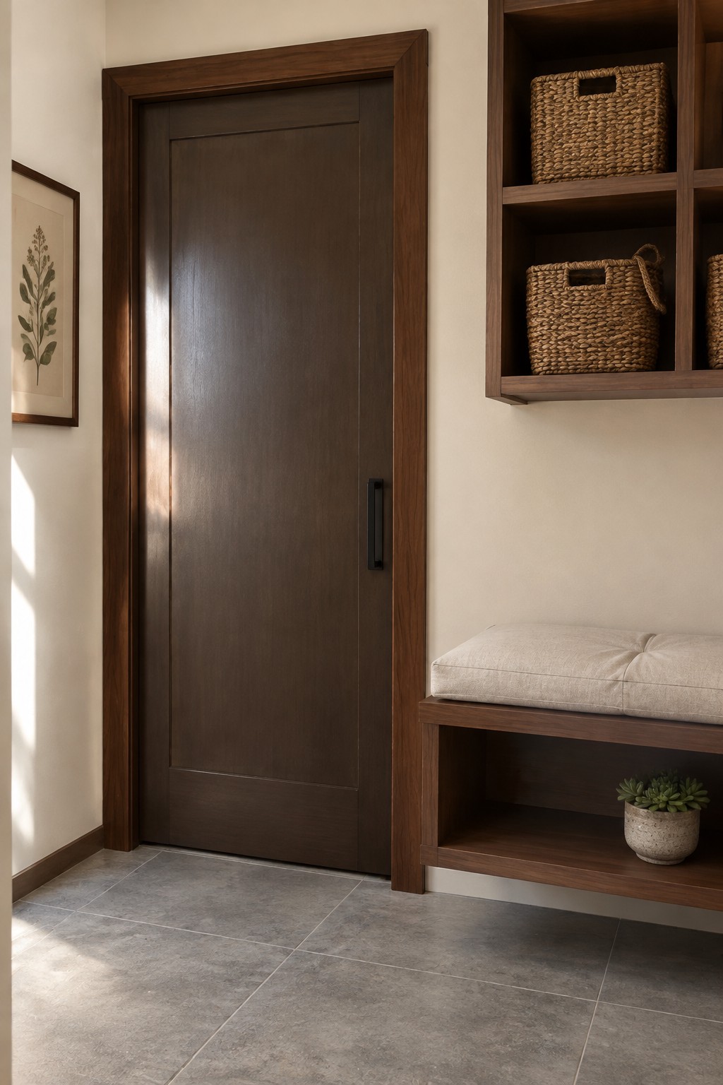
For the painted walls, I’d look at a warm greige or light taupe, with likely matches such as Benjamin Moore Edgecomb Gray, Sherwin-Williams Accessible Beige, or Behr Wheat Bread. It’s a quiet neutral that lets the rich walnut door and built-in bench stand out without making the entry feel stark.
The gray tile gives this warmer wall color a useful contrast. Try a few samples in the entry first, since the light here can make greige look more beige than gray.
Deep Blue-Gray Paint in a Small Bathroom
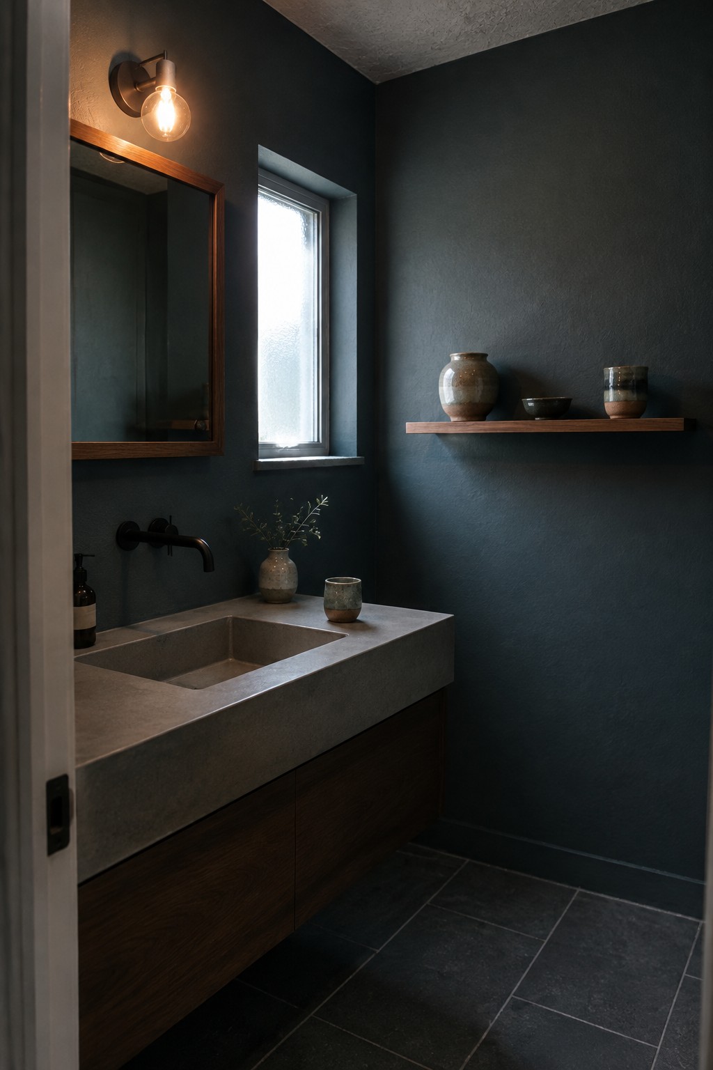
A deep blue-gray, close to Benjamin Moore Knoxville Gray or Sherwin-Williams Cyberspace, suits a bathroom where a darker color can feel cozy rather than overwhelming. The exact shade is hard to pin down from a photo, but this one reads cool and muted against the warm walnut vanity.
In a room with limited daylight, test a sample first, since blue-gray paint can look nearly charcoal in darker corners. Warm wood and simple stone surfaces help keep the color from feeling too cold.
Deep Blue-Green Around the Fireplace
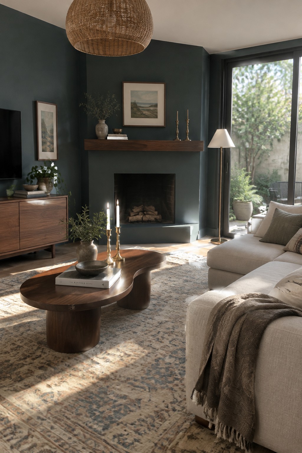
This looks like a deep blue-green, close to Benjamin Moore Aegean Teal or Sherwin-Williams Still Water, though the exact match is hard to tell from a photo. It is a muted, dark color rather than a bright teal, and painting the fireplace wall and adjoining walls the same shade gives the room a settled, cohesive feel.
Rich walnut works well beside this cooler green because the wood brings in a warmer note. In a room with good window light, the paint can still show its blue-green character; in a darker room, it may read nearly charcoal. Try samples on more than one wall before settling on a shade.
Deep Charcoal Walls Beside Walnut Slats
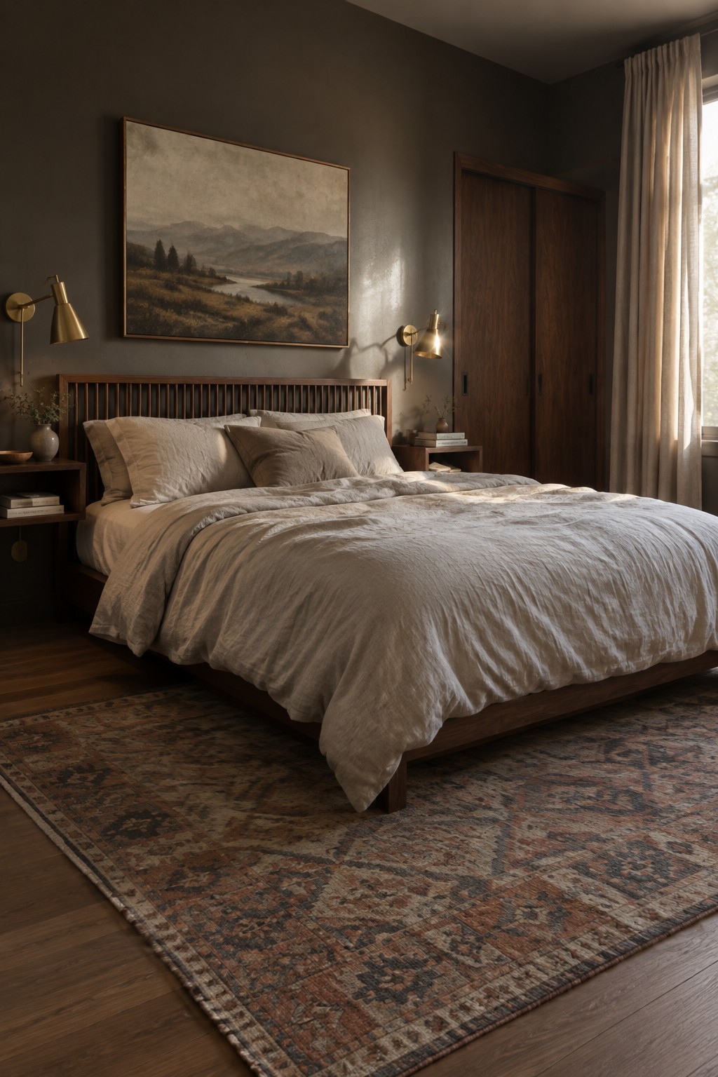
The walls look like a warm, deep charcoal, close to Benjamin Moore Kendall Charcoal, Sherwin-Williams Iron Ore, or Behr Cracked Pepper. This kind of near-black neutral gives a bedroom a quiet, enclosed feel without the starkness of a true black. It works especially well with a walnut slat headboard.
The brown undertone in the charcoal helps it sit comfortably beside the warm wood. Since dark walls can look nearly black in a dim room, test a sample in both daylight and lamplight before committing. Cream or oatmeal bedding is an easy way to keep the room from feeling too heavy.
Frequently Asked Questions
Q: Will dark Japandi colors make a small room feel cramped?
A: They can, especially if every wall and surface is dark. Try a deep walnut piece or one charcoal accent wall, then keep the rest warm and light with cream, sand, or soft gray.
Q: What wall color works best with rich walnut furniture?
A: Warm off-white is an easy match because it softens walnut’s depth without making the room feel stark. For a moodier look, try muted olive or smoky taupe.
Q: How do I keep a dark Japandi palette from feeling cold?
A: Bring in texture and warm light. Linen, woven shades, and softly glowing lamps add comfort without taking away from the clean, simple feel.
Q: Can I mix black accents with walnut?
A: Yes, but use black in small touches, such as a lamp, frame, or cabinet pull. Too much can compete with walnut and make the room feel heavier.
