

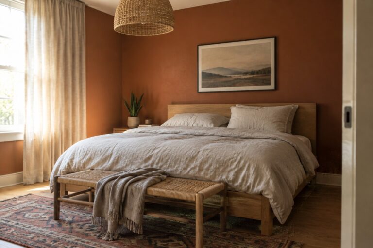
Japandi rooms often feel calm because their colors stay close to nature, but warm earth tones can shift more than I expect once they meet a room’s light and existing finishes.
A sandy beige may turn yellow beside pale oak, while a muted clay can look richer against a soft white wall or dark wood.
I usually test the quieter shades first, since undertones can make a pared-back palette feel balanced or unexpectedly muddy.
Furniture, flooring, and trim all affect how these colors read, so I like to judge samples in the room rather than on a small paint card.
Some combinations are especially worth testing in morning and evening light, when their warmth and depth become easier to see.
Terracotta Walls Beside Warm Wood
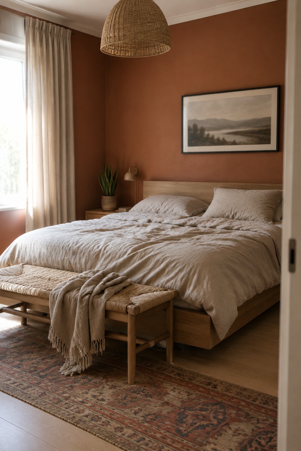
The walls read as a muted terracotta, a warm, earthy reddish brown. For similar shades, look at Benjamin Moore Terra Cotta Tile, Sherwin-Williams Cavern Clay, or Farrow & Ball Red Earth. It’s a comfortable choice for a bedroom, especially if you want color without going very dark.
The shade leans rusty rather than pink, and natural light helps keep it from feeling too heavy. It pairs easily with the warm wood bed and pale, natural fabrics shown here. Test a sample first, since terracotta can look much stronger in a dim room.
Warm Greige Across the Fireplace Wall and Built-Ins
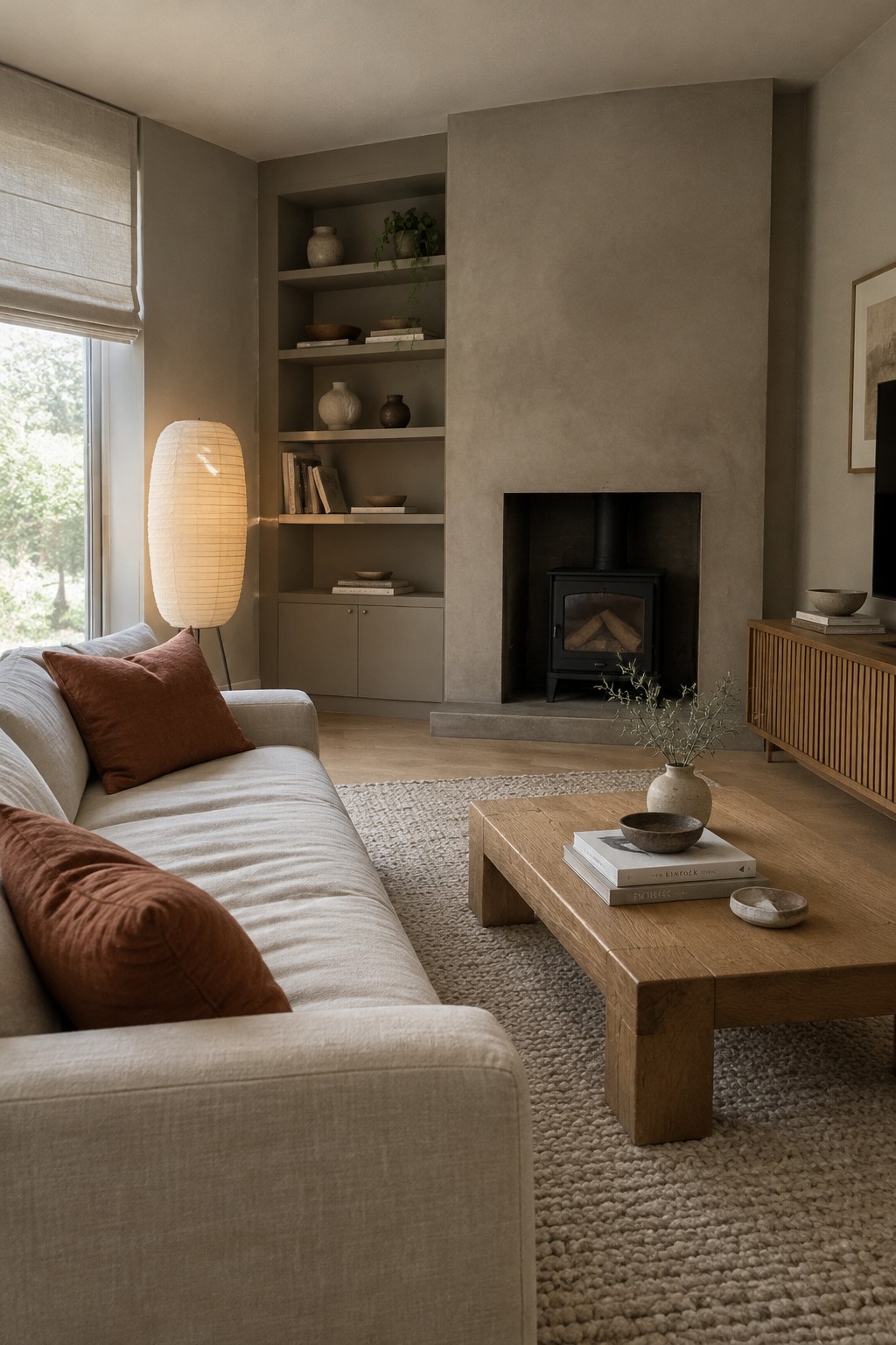
This warm greige reads close to a muted taupe, with a soft brown undertone. For similar unbranded paint options, look at Benjamin Moore Pashmina, Sherwin-Williams Mega Greige, or Farrow & Ball Drop Cloth. Using one shade across the fireplace wall and built-ins makes the large surfaces feel connected without turning them stark white.
The color works well with the oak floor and other warm wood, but it may look darker in a room with less natural light. Try a sample on both the main wall and inside the shelving before settling on a shade.
Muted Sage Cabinetry With Warm Wood
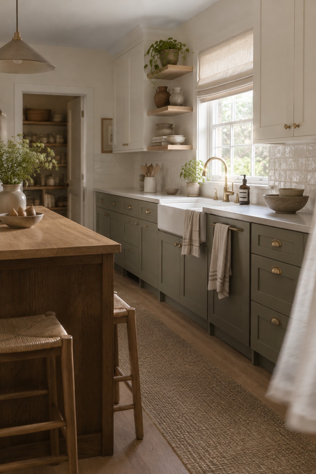
This kitchen’s painted cabinetry reads as a muted sage green with a warm, slightly gray undertone. For an unbranded match, I’d look at Benjamin Moore October Mist, Sherwin-Williams Clary Sage, or Farrow & Ball Mizzle. It’s a gentle way to bring color into a kitchen without making the cabinets feel too bold.
The sage works especially well beside the natural wood island and warm-toned floor. In a bright kitchen it may look lighter, so test a sample near the cabinets before choosing a shade.
Warm Greige Walls With Pale Oak
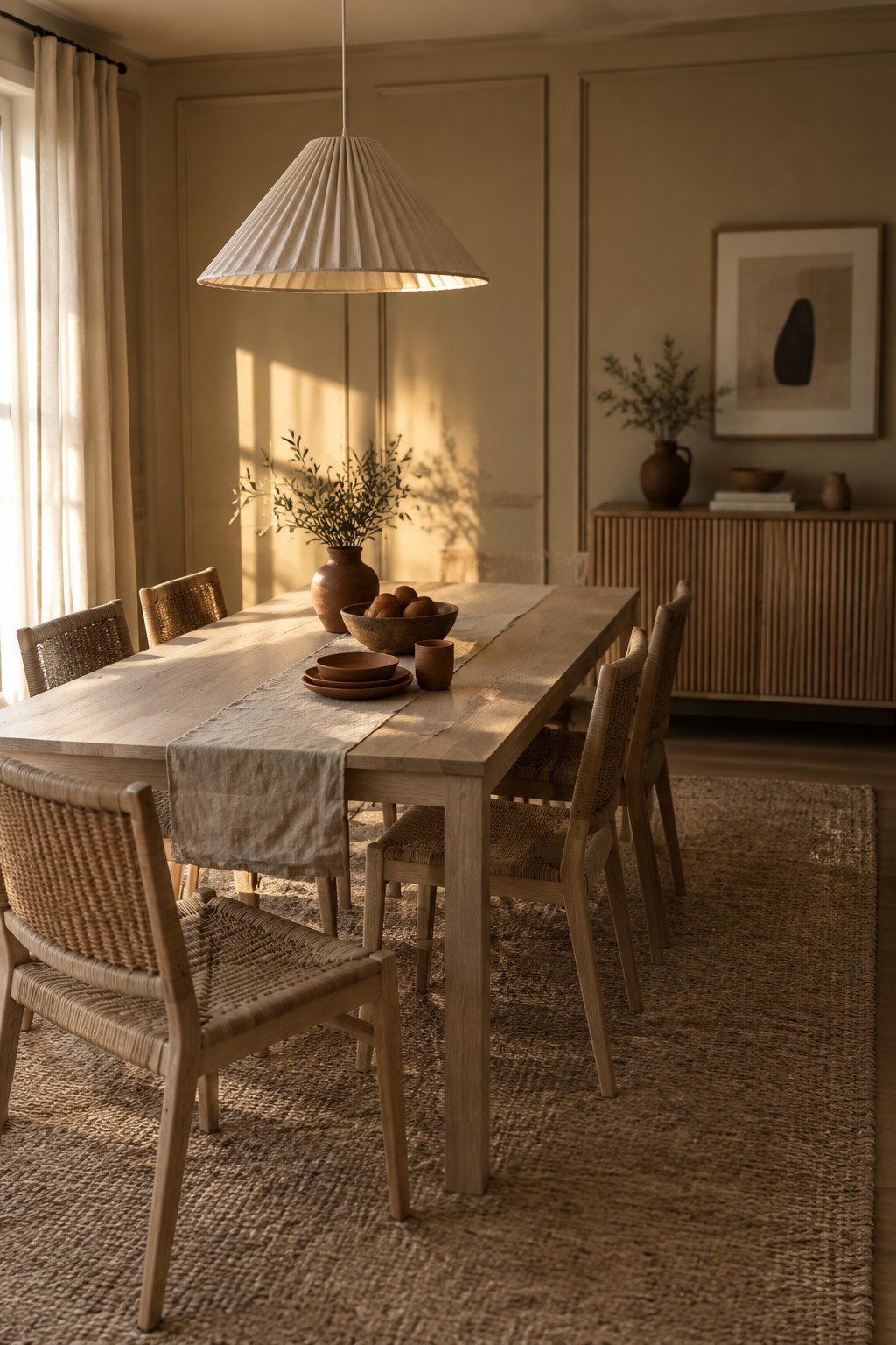
The walls read as a warm greige, likely close to Benjamin Moore Pale Oak, Sherwin-Williams Shoji White, or Behr Blank Canvas. This light, muted neutral suits a Japandi dining room because it feels softer than a stark white while still keeping the room open.
Its beige undertone works especially well beside pale wood, as it does here. In a room with less daylight, test a sample first since the color may look deeper and more beige.
Warm Greige With Fluted Oak Cabinetry

A warm greige is the main paint idea here, and it reads close to a light taupe with a soft beige undertone. For an unbranded match, I’d look at Sherwin-Williams Accessible Beige, Benjamin Moore Balboa Mist, or Behr Blank Canvas. This kind of neutral feels gentle rather than stark, and it suits a bathroom where you want the wood cabinetry to remain the main feature.
The shade works well beside the fluted oak because both have a warm, natural cast. In brighter daylight it may look lighter and more beige, so test a sample on the wall before choosing; greige can shift noticeably from one room to another.
Ochre Walls Beside Dark Wood

This warm ochre paint reads as a muted golden brown, close to shades like Benjamin Moore Hasbrouck Brown or Sherwin-Williams Tassel. It suits a Japandi palette when you want a richer wall color without going to a deep chocolate brown.
The color’s earthy yellow undertone works well with the dark wood chair and natural wood floor. It will look strongest in rooms with good daylight, while a small test patch can show whether it feels too golden in your own light.
Soft Terracotta Walls in a Narrow Entry
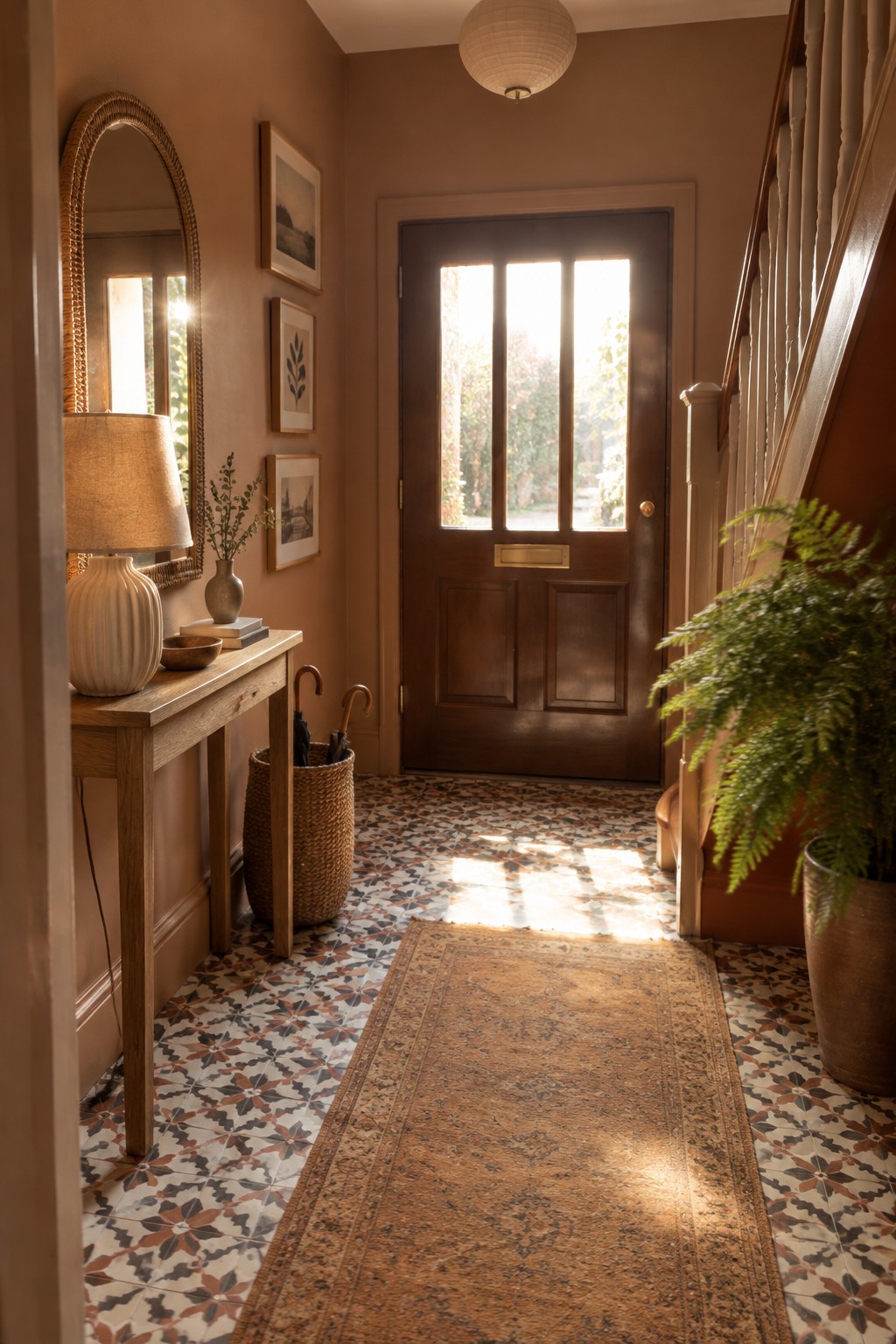
A muted terracotta paint would suit this entry, with a warm, earthy brown undertone. It looks closest to Sherwin-Williams Cavern Clay, Benjamin Moore Terra Cotta Tile, or Farrow & Ball Red Earth, though the exact match is hard to pin down. The color gives a narrow hallway a little more character without needing a bold, bright shade.
Warm wood is a natural pairing, and the patterned floor shows how terracotta can sit comfortably alongside several colors. In a dimmer entry, choose a lighter, dustier version so the walls do not feel too heavy.
Muted Olive Green Across Walls and Built-Ins
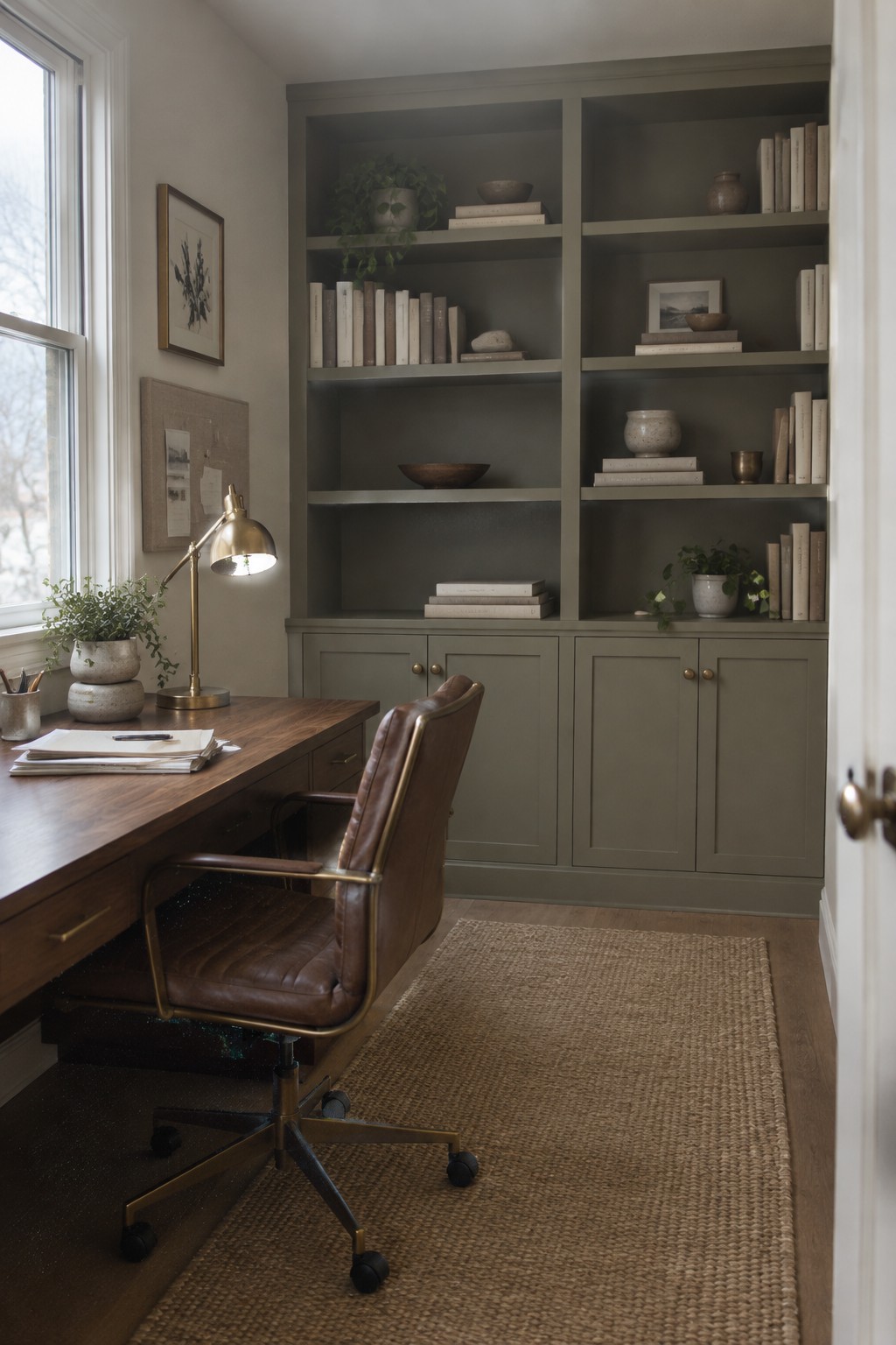
This muted olive green looks closest to a deep gray-green, similar to Benjamin Moore Vintage Vogue, Sherwin-Williams Shade-Grown, or Farrow & Ball Treron. Painting the built-in shelves and lower cabinets in the same color gives this small office a settled, tucked-away feel without relying on a bright accent wall.
The shade leans earthy rather than blue, so it pairs naturally with the dark wood desk and woven rug. Window light keeps the green from reading too heavy; in a darker room, test a sample first, since it may look nearly charcoal.
Warm Peach Walls Above Cream Wainscoting

The walls look like a muted peach with a warm, earthy undertone. Close matches might include Benjamin Moore Soft Pumpkin, Sherwin-Williams Peach Fuzz, or Behr Canyon Dusk, though the exact shade is hard to tell from a photo. This kind of soft color can bring a gentle warmth to a nursery without feeling too bright.
The cream wainscoting gives the peach a clear stopping point and keeps it from taking over the room. It works well with light wood and natural woven textures; test a sample first, since peach can look stronger in bright daylight.
Warm Greige Walls Along a Narrow Hallway
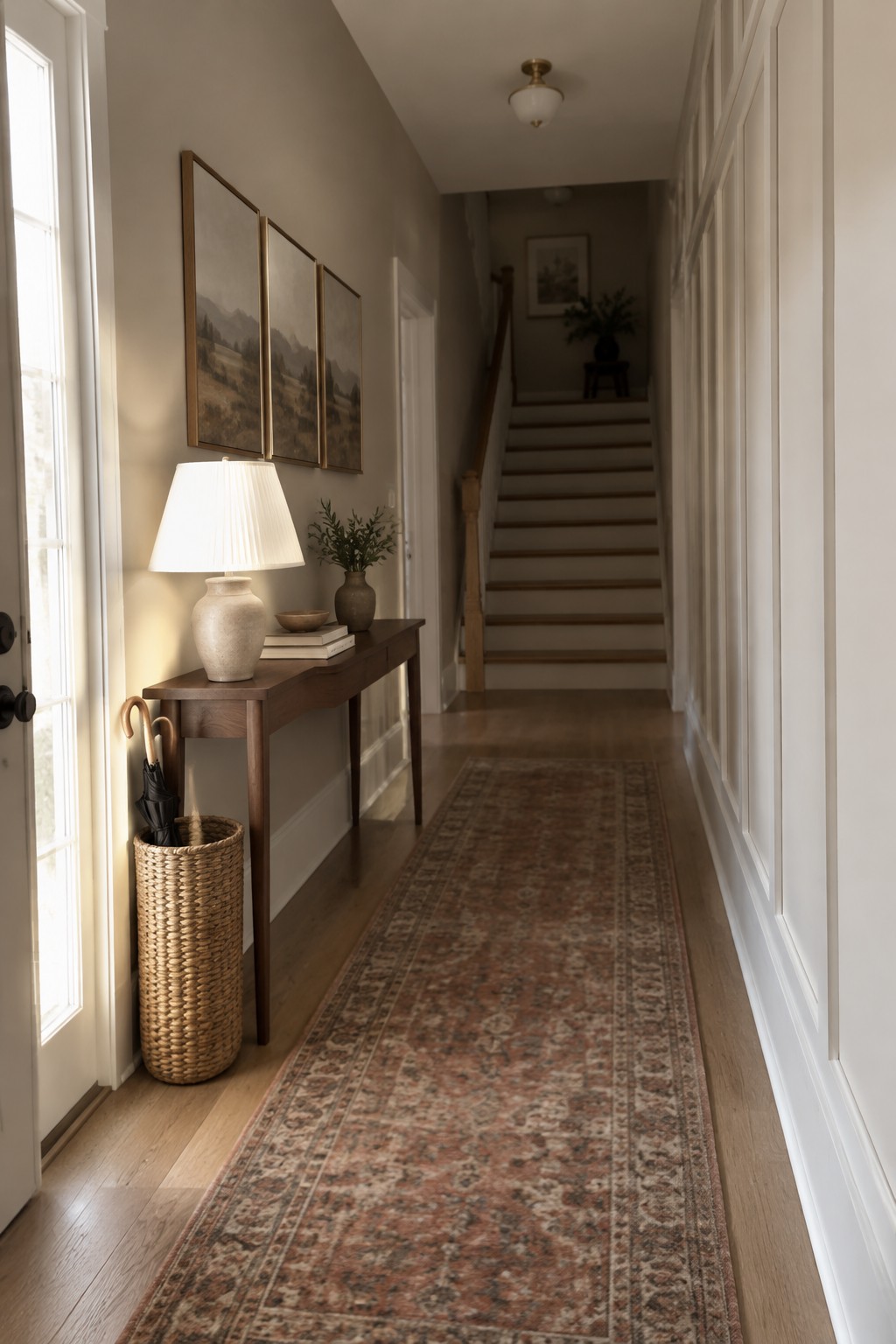
The walls read as a warm greige, close to Sherwin-Williams Accessible Beige, Benjamin Moore Edgecomb Gray, or Behr Wheat Bread. This soft neutral suits a long hallway because it feels warmer than a cool gray without becoming strongly beige.
In changing natural light, the color may look a little grayer in the distance and more beige near the windows. It pairs easily with the white trim and wood flooring here; test a sample in both the brighter and dimmer parts of the hall before painting.
Terracotta Island With a Warm Wood Counter
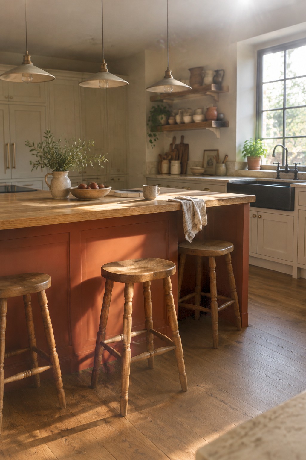
A muted terracotta red is the main paint idea here. It reads as a warm, earthy shade rather than a bright orange, and it gives a kitchen island color without making every cabinet feel bold. I’d place it near Benjamin Moore Potters Clay, Sherwin-Williams Cavern Clay, or Behr Canyon Dusk, though the exact match is hard to tell from a photo.
The thick wood counter helps the terracotta feel at home in a natural, Japandi-style palette. This kind of color suits a kitchen with warm wood floors and cream cabinetry; test a sample in both daylight and evening light, since terracotta can look much more orange in a bright room.
Warm Taupe Across the Shelves and Built-Ins

This warm taupe looks closest to a soft mushroom brown, with likely matches such as Benjamin Moore Pashmina or Sherwin-Williams Urbane Bronze lightened to a softer tone. It gives the built-in shelves a quiet, finished look without the stark contrast of white paint. The color works especially well when the shelving and surrounding cabinetry share the same shade.
The undertone leans brown rather than cool gray, so it sits comfortably beside the walnut cabinet fronts and wood floor. In a dimmer room, test a sample first, since taupe can read noticeably darker when it gets less daylight.
Warm Taupe Cabinetry Around a Stacked Washer and Dryer

The cabinetry reads as a warm taupe, a soft earth-toned neutral that looks closest to Benjamin Moore Pashmina, Sherwin-Williams Balanced Beige, or Farrow & Ball Jitney. It gives this small laundry room a gentle, settled feel without making the cabinets look too dark.
The shade has a slight beige-gray quality, so it works well with the white countertop and pale floor tile. It should suit a room with modest daylight, though I’d test a sample first, since taupe can look more gray in cooler light.
Warm Greige Paneling Above a Wood Bench

A warm greige paint, somewhere between muted olive and taupe, gives this entry a quiet, grounded look. A close match might be Benjamin Moore Pashmina, Sherwin-Williams Tony Taupe, or Farrow & Ball Mouse’s Back, though the exact shade is hard to pin down from a photo. Painting the wall paneling and bench base in a similar color keeps the built-in feeling simple.
The color has a soft earthy undertone that works well beside the light wood seat. It suits an entry or mudroom, especially one with natural materials and subdued colors. In a dimmer space, test a sample first, since greige can read browner or greener depending on the light.
Warm Taupe Above Textured Tile
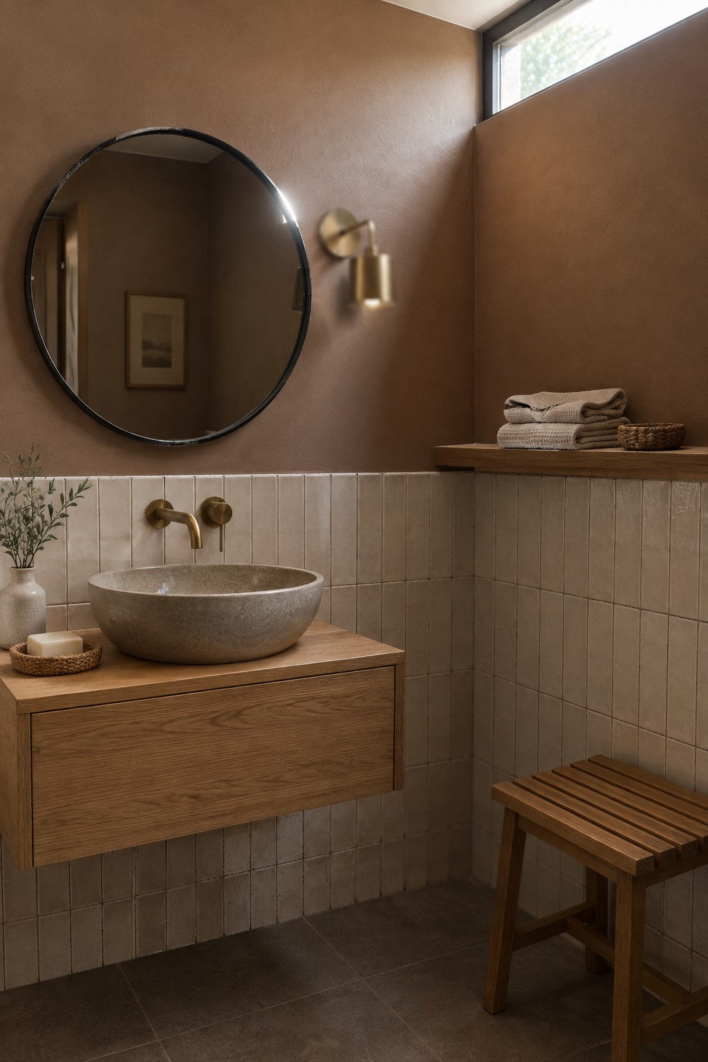
A warm taupe paint color gives this bathroom a soft, earthy look. It seems closest to Benjamin Moore Pashmina, Sherwin-Williams Shiitake, or Farrow & Ball Mouse’s Back, though the exact match is hard to tell from a photo. The muted brown tone feels comfortable in a small room without making the walls look stark.
The taupe works well above the handmade beige tile, which has a slightly lighter, more varied finish. Try it with natural wood and brushed brass, and test a sample in the room first, since this kind of warm neutral can read darker in a bathroom with limited daylight.
Warm Greige With a Woven Rattan Headboard

Warm greige is a good fit for a bedroom when you want a neutral that feels softer than plain white. The walls here read as a light, warm beige with a subtle gray cast. A close match might be Benjamin Moore Pale Oak, Sherwin-Williams Accessible Beige, or Behr Blank Canvas.
This color tends to shift with the light, so test a sample on the wall before painting the whole room. It pairs easily with natural wood and woven materials, and it works especially well with soft white bedding. In a dim room, it may look more beige than gray.
Warm Brown Shelving With Amber Undertones

The built-in shelving reads as a warm, medium brown, close to a muted chestnut or tobacco shade. For an unbranded match, I’d look at Benjamin Moore Alexandria Beige, Sherwin-Williams Turkish Coffee, or Farrow & Ball Salon Drab. This kind of earthy brown gives a pantry a settled, tucked-away feel without making the woodwork look too dark.
The brown has a reddish warmth that pairs naturally with woven baskets and other wood tones. It suits a pantry or small nook where you want the shelves to feel substantial; in a room with little natural light, testing a sample first can help keep it from reading too deep.
Warm Terracotta Paneling With Natural Rattan
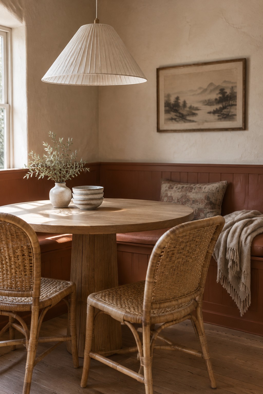
A muted terracotta or warm clay paint would suit the lower wall paneling here. It is a deep, earthy shade rather than a bright orange, and it pairs easily with natural wood tones. For similar colors, look at Benjamin Moore Terra Cotta Tile, Sherwin-Williams Cavern Clay, or Farrow & Ball Red Earth.
In a room with less daylight, this color may read darker and browner, so test a sample before painting the full wall. It works well with pale plaster or cream above the paneling, and the rattan chairs show how naturally it sits beside woven materials.
Olive Paneling With Fluted Oak
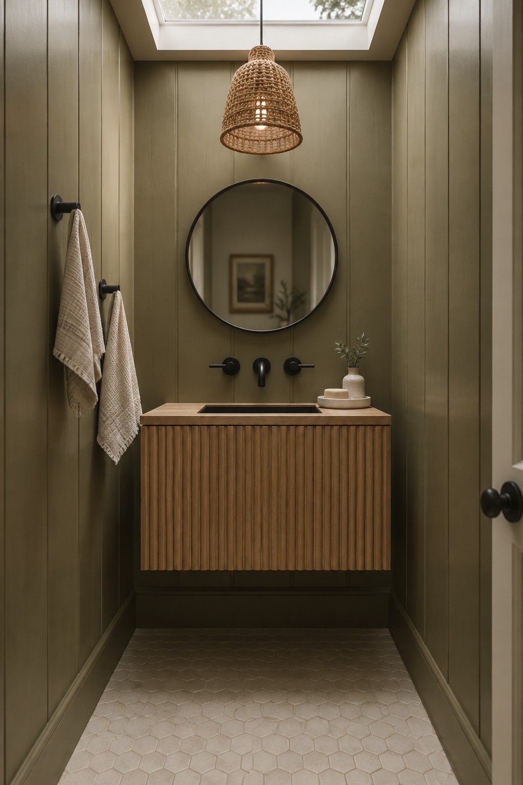
This looks like a muted olive green, close to Benjamin Moore Tate Olive, Sherwin-Williams Evergreen Fog, or Farrow & Ball Treron. It’s a warm, earthy choice for a small bathroom, where painted wall panels give the color a little texture without making it feel busy.
The shade may read browner in softer light, so sample it in the room before painting. It pairs naturally with the fluted oak vanity; a pale neutral on the floor keeps the narrow space from feeling too dark.
Rust-Terracotta Walls With Natural Wood
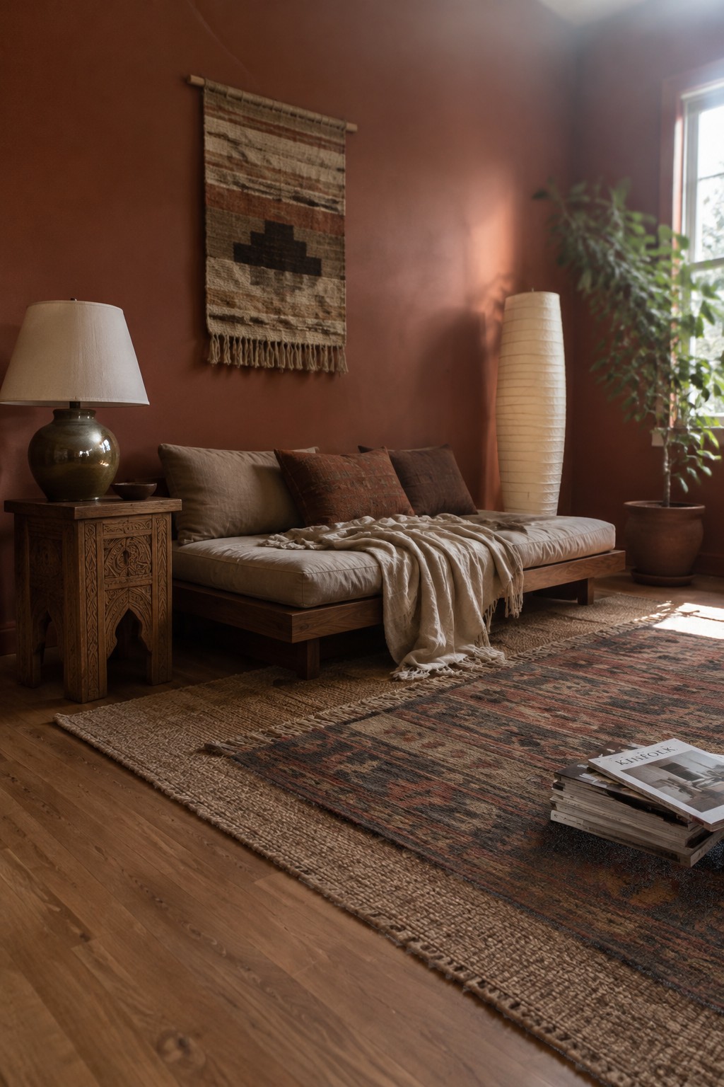
The walls read as a muted rust terracotta, a warm, earthy color that feels more settled than bright orange. A close match might be Benjamin Moore Terra Cotta Tile, Sherwin-Williams Cavern Clay, or Behr Canyon Dusk, though the exact shade is hard to pin down from a photo. It’s a good choice for a room that needs color without feeling too lively.
The reddish-brown tone pairs easily with the natural wood floor and darker wood furniture. In a room with less daylight, it may look deeper and browner, so test a sample on more than one wall before committing.
Warm Taupe Vanity With Creamy Stone
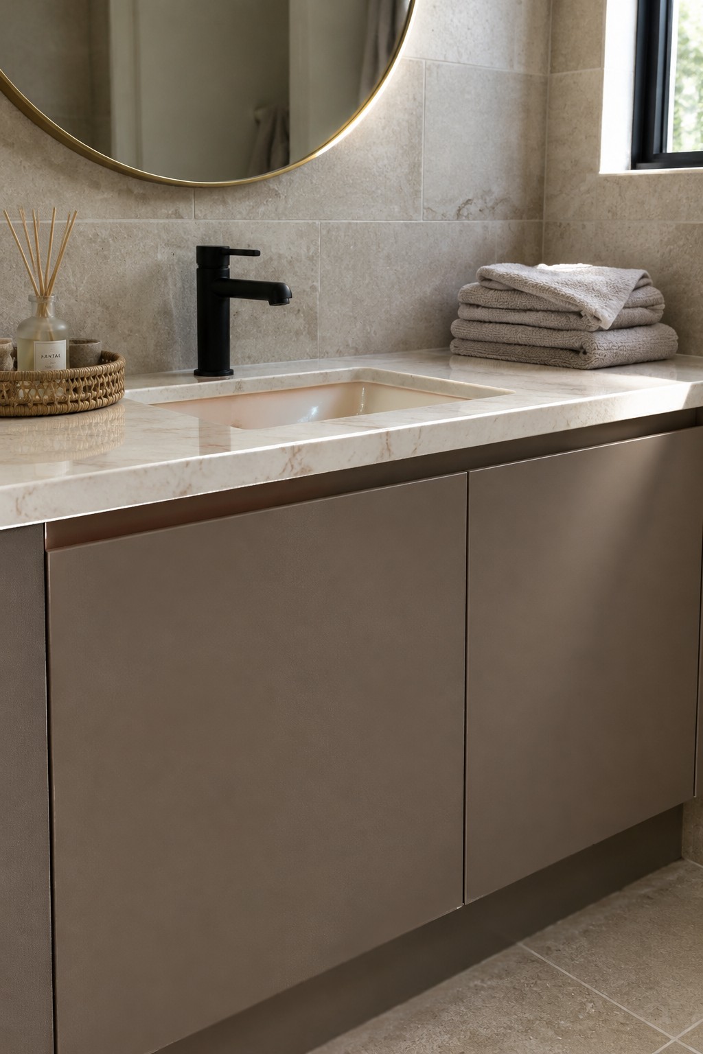
The vanity color reads as a warm taupe, close to Benjamin Moore Pashmina or Sherwin-Williams Tony Taupe, though the exact match is hard to pin down from a photo. It’s a quiet, earthy neutral that gives the cabinetry more character than plain white without making the bathroom feel dark.
The creamy stone countertop and wall tile suit this color well. In a bathroom with natural light, warm taupe should keep its soft brown quality; under cooler bulbs, it may look grayer. Sample it beside your tile before committing, since those undertones can shift.
Warm Taupe Walls Beside Slatted Oak

A warm taupe, with a soft brown-gray undertone, is a good fit for an entryway that needs to feel calm without looking stark. A close match might be Benjamin Moore Pashmina, Sherwin-Williams Balanced Beige, or Behr Sandstone Cove. The muted wall color works well with the slatted oak bench, which keeps the neutral palette from feeling too cool.
This shade suits a hallway or mudroom with limited natural light, though it can look darker in a deep alcove. Test a sample on the wall first, and pair it with warm wood or creamy upholstery.
Rust-Terracotta Walls With Woven Textures
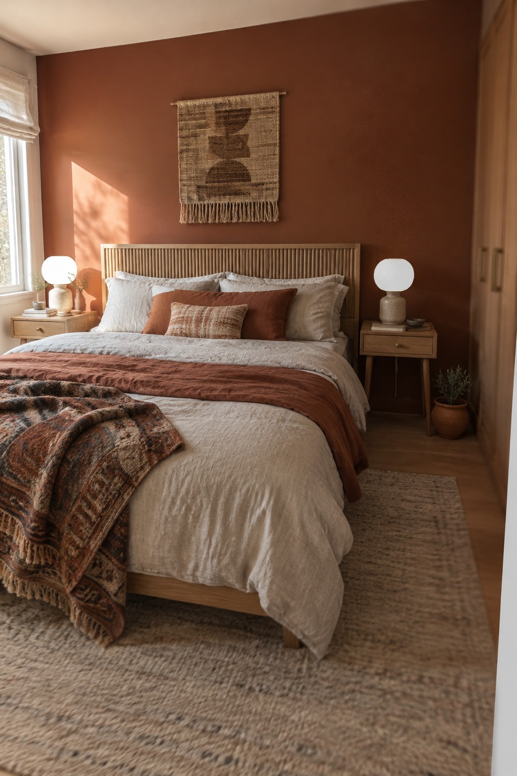
The bedroom walls read as a muted rust terracotta, a warm, earthy color that looks closest to Sherwin-Williams Cavern Clay, Benjamin Moore Potters Clay, or Farrow & Ball Red Earth. It gives a bedroom more color than a beige neutral without making the walls feel too bright.
The shade works especially well with the natural oak headboard and other warm wood. In a room with less daylight, test a sample first, since terracotta can look browner and deeper in dim light.
Frequently Asked Questions
Q: How do I keep warm earth tones from making a small room feel too dark?
A: Use lighter shades like cream, sand, or pale clay on the walls, then bring in deeper browns through smaller details. Natural light and a few reflective surfaces can also keep the room feeling open.
Q: Can I mix wood tones in a Japandi room?
A: Yes. Pair woods with similar warmth, such as pale oak and medium walnut, and let one tone take the lead. A little contrast feels natural, while too many competing finishes can make the room feel busy.
Q: What accent colour works with a terracotta Japandi palette?
A: Muted olive or sage adds a gentle contrast without pulling attention away from the terracotta. Try it in a cushion, a ceramic piece, or a plant pot before using it across a large area.
Q: How can I add colour without making the room feel cluttered?
A: Choose a few textiles or handmade objects in related earthy shades, and leave plenty of clear space around them. Japandi rooms feel calm when colour has room to breathe.
