

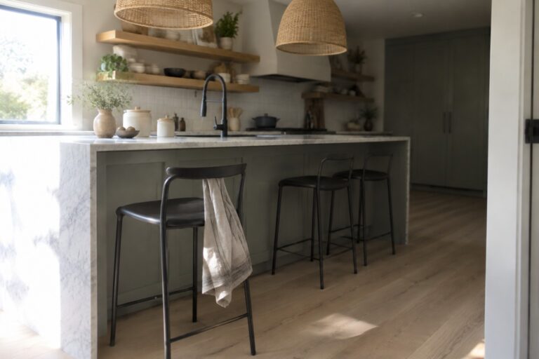
I find Japandi kitchens feel most settled when the paint works with the natural stone rather than competing for attention.
Soft whites, muted greens, and warm neutrals can shift noticeably as daylight moves across a room, so their undertones matter as much as the color on the swatch.
I would test each shade beside the countertop and backsplash, then check how it looks against cabinetry, flooring, and trim.
Some tones can turn too cool next to creamy stone, while others may look muddy under warm evening lights.
A few palettes are especially worth sampling in your own kitchen before you commit.
Muted Green Cabinets With White Marble
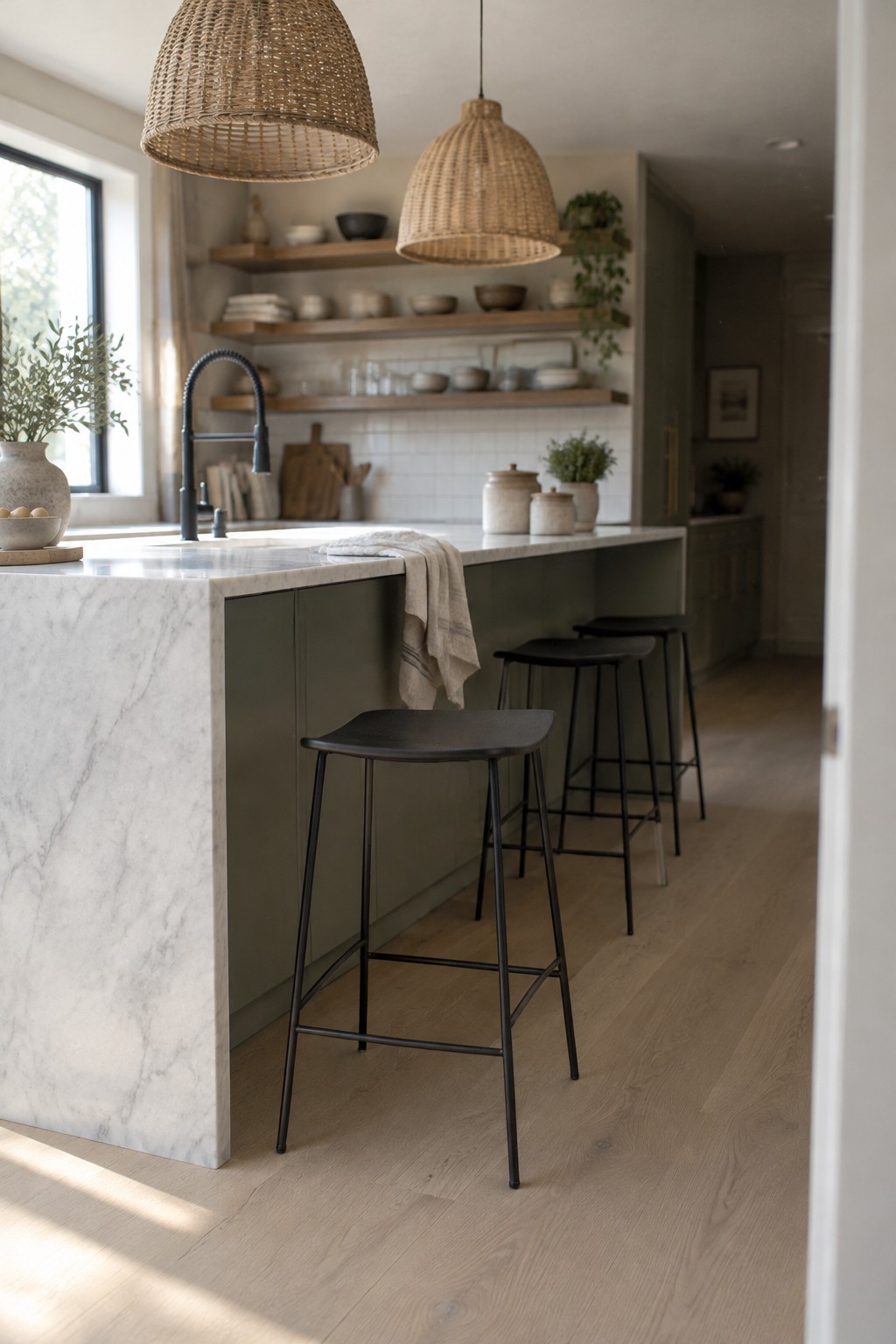
The kitchen cabinetry looks like a muted, slightly olive green, close to Sherwin-Williams Evergreen Fog, Benjamin Moore October Mist, or Farrow & Ball Mizzle. It’s a softer choice than a deep forest green and works well when you want color without making the cabinets feel too bold.
Beside white marble, this green reads earthy rather than gray. It should suit a bright kitchen with natural wood floors, though it’s worth testing a sample in your own light before painting a full run of cabinets.
Warm Greige Cabinets With Dark Stone
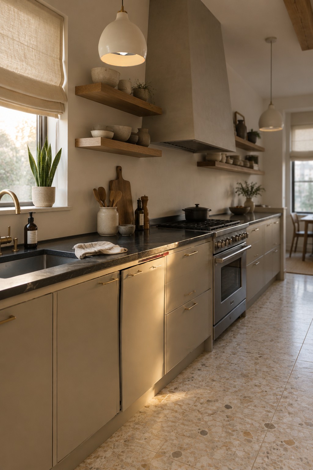
The cabinets read as a warm greige, a soft beige-gray that suits a Japandi kitchen without feeling stark. For an unbranded match, I’d look at Benjamin Moore Pale Oak, Sherwin-Williams Accessible Beige, or Farrow & Ball Skimming Stone. The exact shade is hard to pin down from a photo, but this muted neutral works well across a long run of cabinets.
The dark stone countertop gives the lighter paint a clear contrast, while the warm undertone keeps the cabinets from looking too cool. Try samples in the kitchen’s natural light, since greige can shift noticeably from one room to another.
Warm Greige Cabinets With Natural Stone
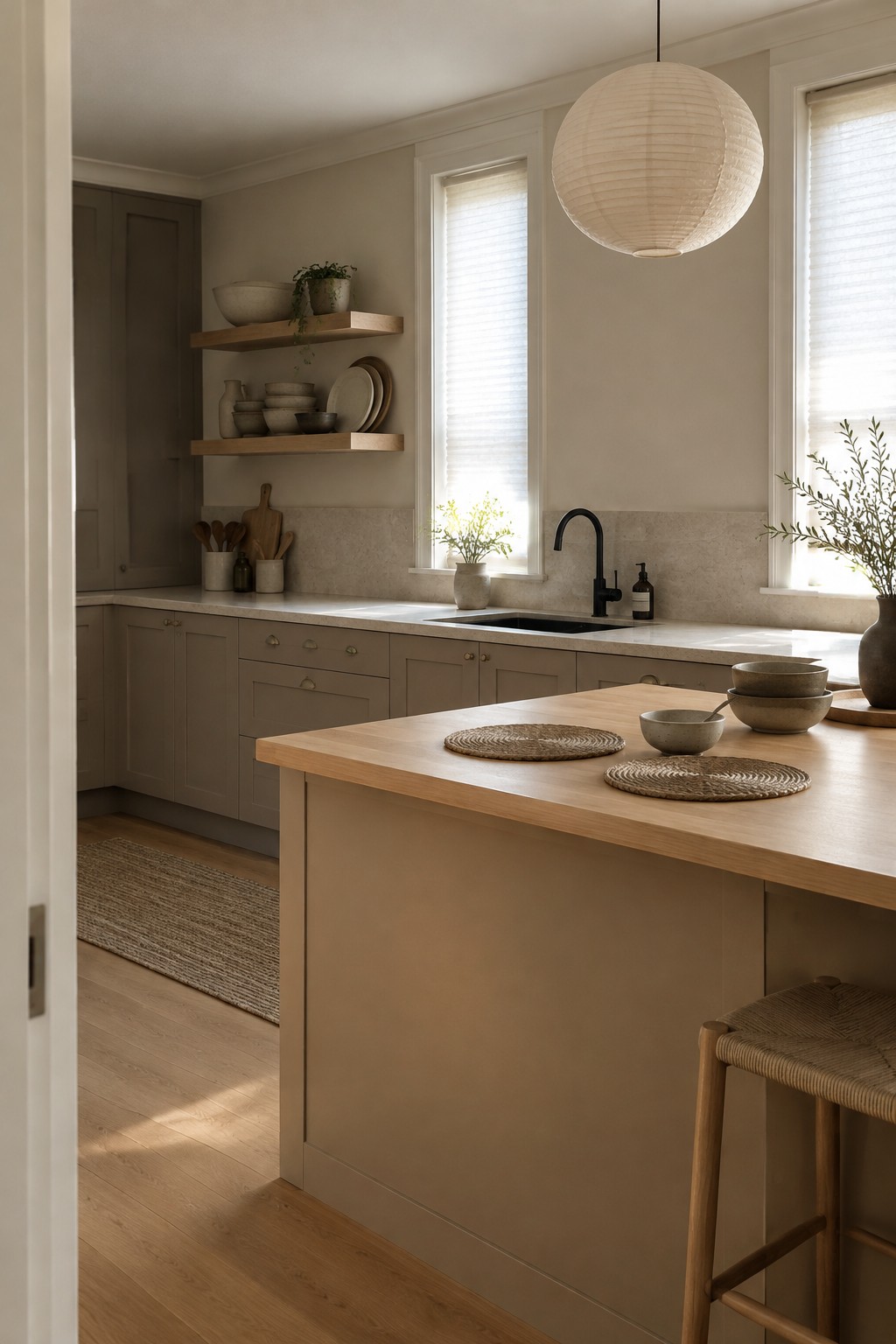
A warm greige paint color looks like the closest fit for these kitchen cabinets. It sits between beige and gray, with enough warmth to work comfortably beside the pale stone backsplash without looking too yellow. This kind of muted neutral is a useful choice when you want painted cabinets that feel softer than white.
The exact shade is hard to pin down from a photo, but it’s in the range of Sherwin-Williams Accessible Beige, Benjamin Moore Edgecomb Gray, or Farrow & Ball Skimming Stone. Natural wood on the island helps the cabinet color feel at home; sample your choices beside the stone, since greige can look noticeably cooler in less daylight.
Muted Blue-Gray Cabinets With Dark Stone
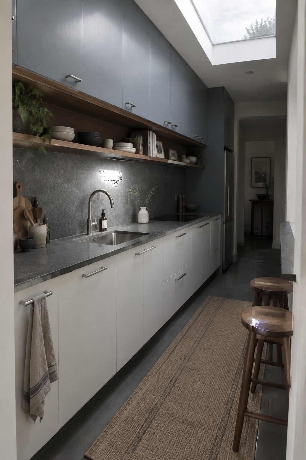
This looks like a muted blue-gray paint for kitchen cabinetry, with a cool, slightly charcoal cast. Similar colors include Benjamin Moore Normandy, Sherwin-Williams Smoky Blue, or Farrow & Ball De Nimes, though the exact match is hard to tell from a photo. It’s a useful choice when you want color without a bright or busy look.
The cool cabinets work well beside the dark stone counter and backsplash. Warm wood shelves keep the combination from feeling too cold, so consider adding wood accents if your kitchen has limited natural light.
Olive Cabinets Beside Travertine
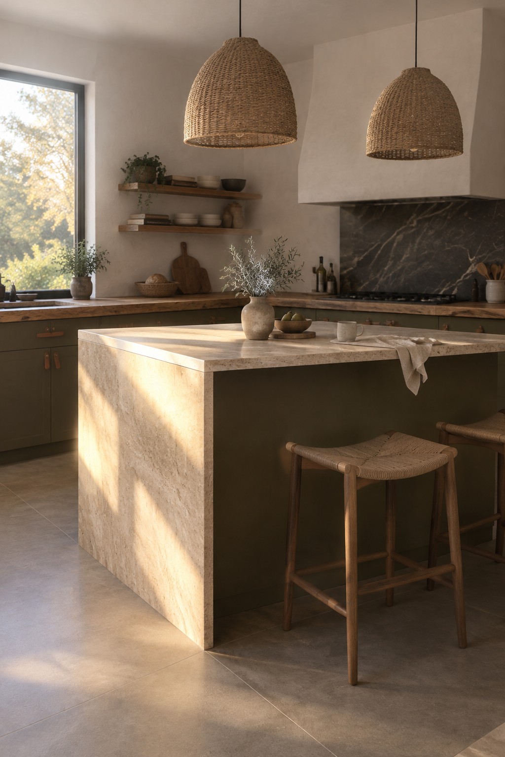
The cabinets look closest to a deep olive green, a muted, earthy shade that suits a Japandi kitchen. For similar paint colors, try Benjamin Moore Caldwell Green, Sherwin-Williams Ripe Olive, or Farrow & Ball Treron. The green gives the light natural stone a quieter contrast than black or navy would.
Warm daylight brings out the cabinets’ brown undertone, while the stone island keeps the palette from feeling too dark. This color is a good fit for kitchens with warm wood or creamy stone; in a dim room, test a sample first, since olive can read much darker.
Charcoal Cabinets Beside Warm Oak
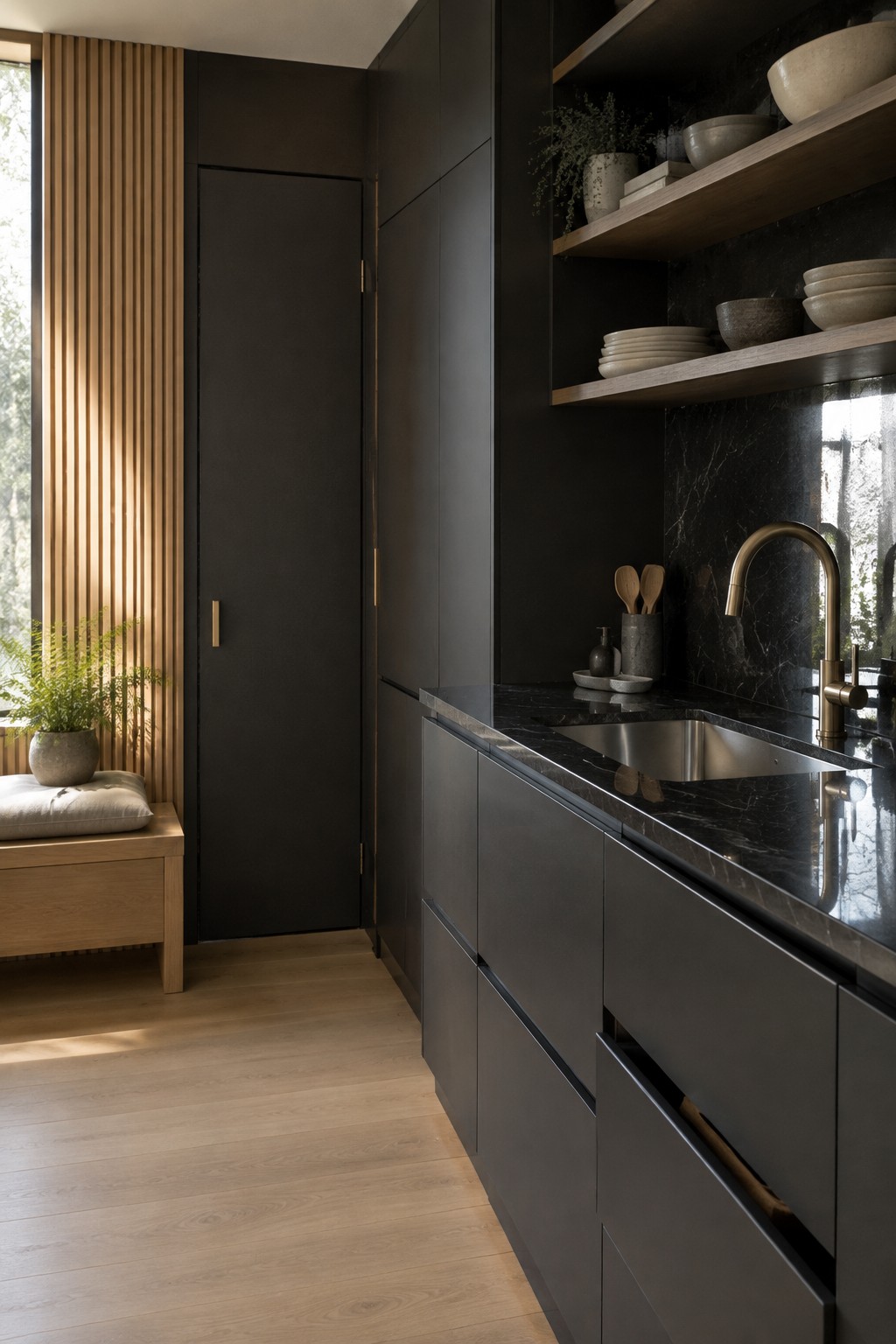
The cabinets look closest to a soft charcoal, a deep neutral that feels less stark than true black. It suits a Japandi kitchen because it keeps the cabinetry simple while letting the natural materials stand out.
Here, pale oak flooring and open shelves keep the dark paint from making the kitchen feel too closed in. This color works best with good natural light; in a dim room, it may read almost black.
Blue-Gray Cabinets Beside Dark Stone
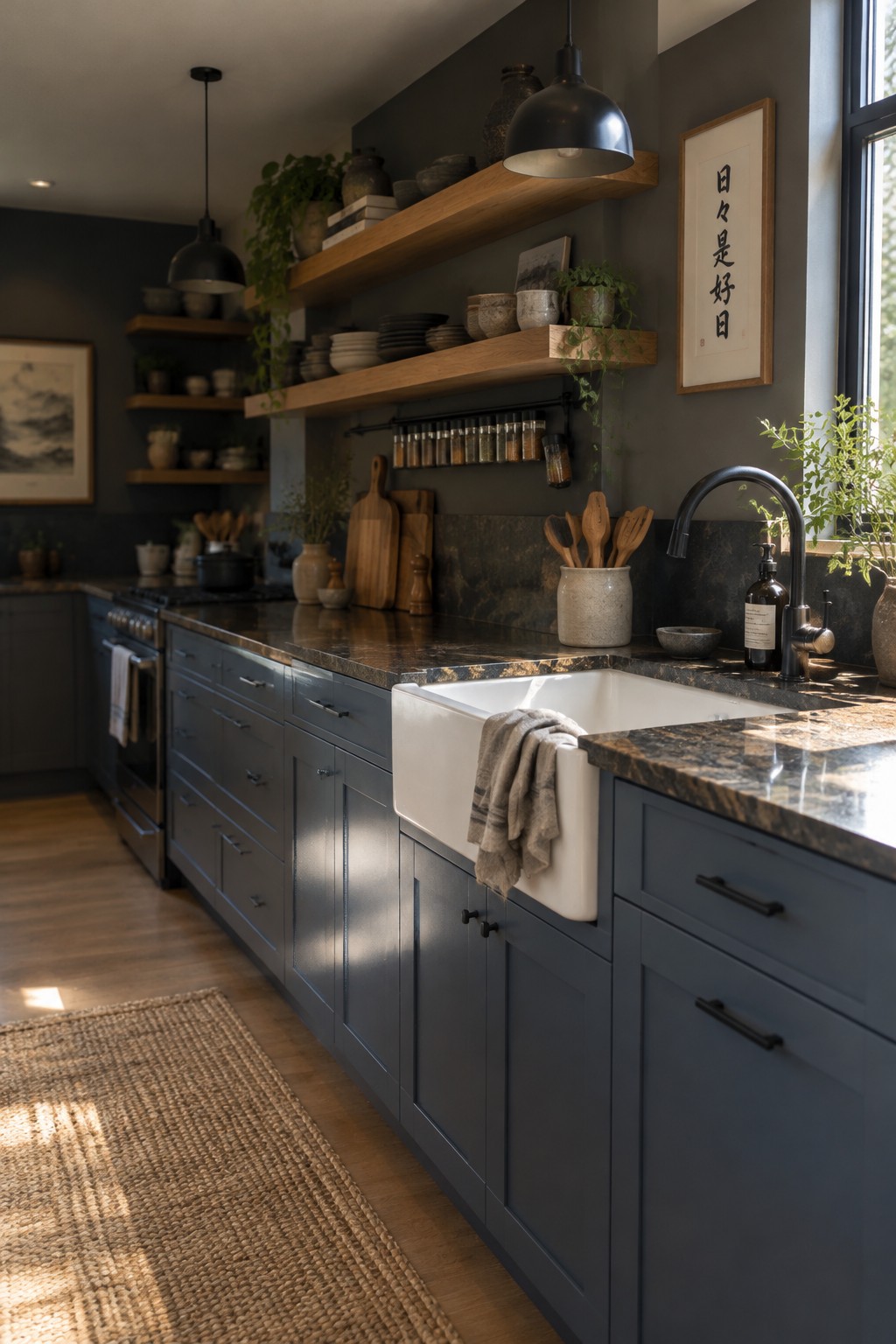
These cabinets look like a deep blue-gray, close to Sherwin-Williams Smoky Blue, Benjamin Moore Van Deusen Blue, or Farrow & Ball De Nimes. It’s a muted, slightly cool color that gives a kitchen a little more character than plain gray without reading as bright blue.
The dark stone counters make the cabinets look deeper, so this color works best where there’s some natural light. Warm wood shelves and flooring help keep the cool paint from feeling too stark. Try samples beside your countertop first, since blue-gray can shift quite a bit depending on the light.
Muted Green Cabinets Beside Pale Marble
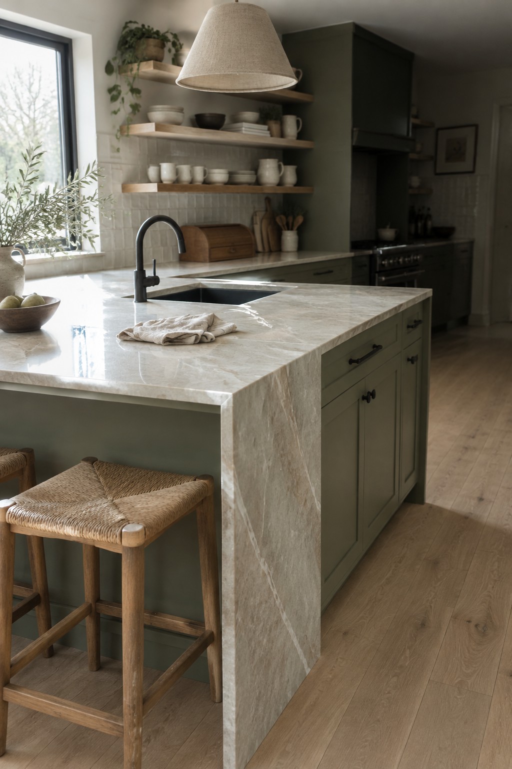
This muted, warm gray-green looks closest to Sherwin-Williams Evergreen Fog, though the exact shade is hard to tell from a photo. It works well on kitchen cabinets when you want color without a strong contrast, especially with pale natural stone.
The stone’s creamy veining and the warm wood floor keep the green from reading too cool. In a kitchen with less daylight, test a sample first, since this kind of muted green can look grayer in shade.
Pale Gray Cabinets With Terrazzo Flooring
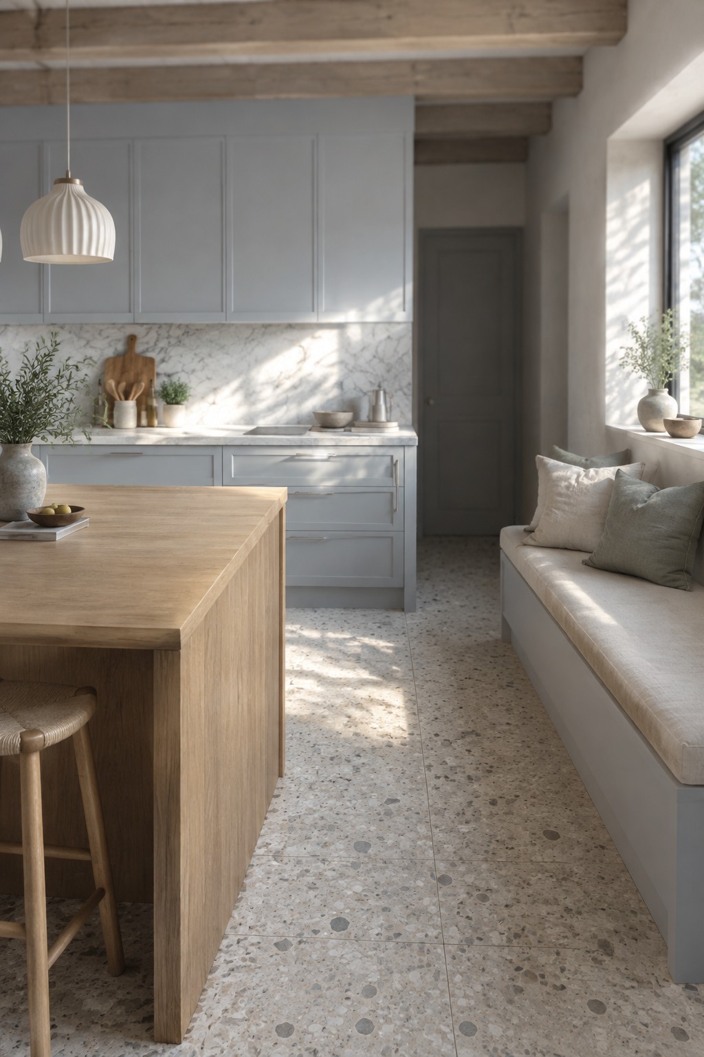
This kitchen’s cabinets look closest to a pale, cool gray, though the exact paint color is hard to pin down from a photo. Similar shades include Benjamin Moore Gray Owl, Sherwin-Williams Passive, and Behr Silver Drop. The light gray keeps the cabinetry simple and lets the natural stone surfaces feel like part of the palette rather than an extra feature.
The gray has a soft, slightly blue cast in the daylight. It pairs well with warm wood and terrazzo, but sample it in your own kitchen first, since cooler light can make it feel more blue.
Warm Taupe Cabinets With Cream Stone
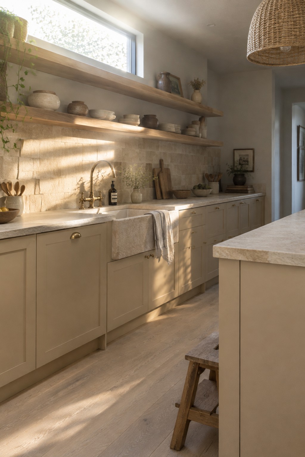
The cabinetry looks closest to a warm taupe, a muted beige-brown that feels softer than gray. For similar shades, consider Benjamin Moore Pashmina, Sherwin-Williams Balanced Beige, or Farrow & Ball Jitney. This color works well in a kitchen because it gives the cabinets some definition without competing with the natural stone.
The stone backsplash and counter have a related creamy tone, so the palette feels connected rather than stark. Warm daylight brings out the beige in the paint; in a darker kitchen, test samples first to make sure the cabinets don’t read too brown.
Terracotta Cabinets Beside Pale Stone
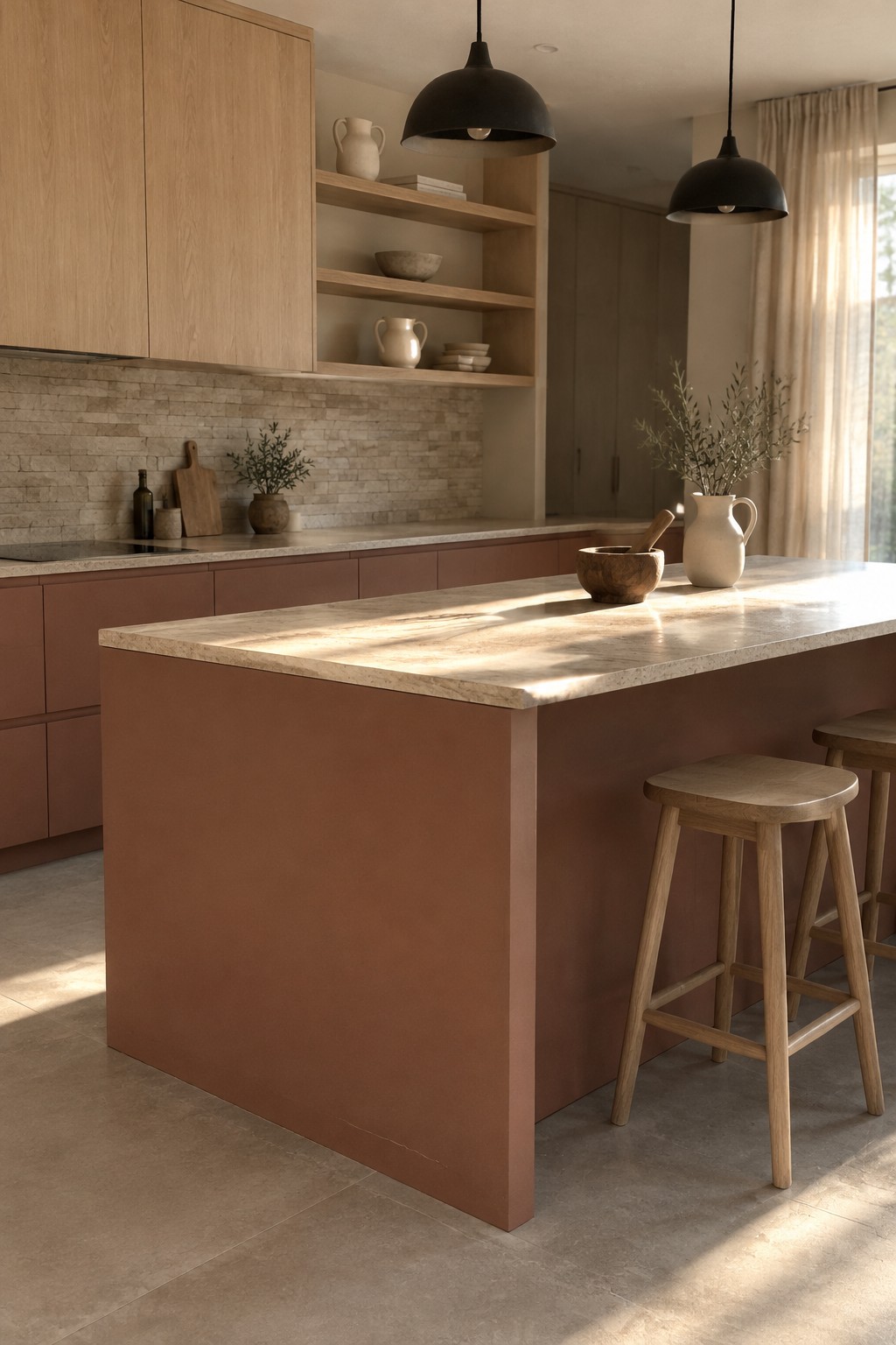
A muted terracotta or clay paint color gives these kitchen cabinets a warm, earthy look without reading as bright orange. It seems closest to colors like Benjamin Moore Terra Cotta Tile, Sherwin-Williams Cavern Clay, or Farrow & Ball Red Earth, though the photo can’t confirm an exact match. The color works especially well when used on the island as well as the lower cabinets.
Pale natural stone helps keep the clay tone from feeling too heavy, while the oak brings out its brown undertone. This is a good direction for a kitchen with plenty of natural light. In a darker room, test a sample first, since terracotta can look deeper and redder than expected.
Warm Greige Cabinets With Natural Stone
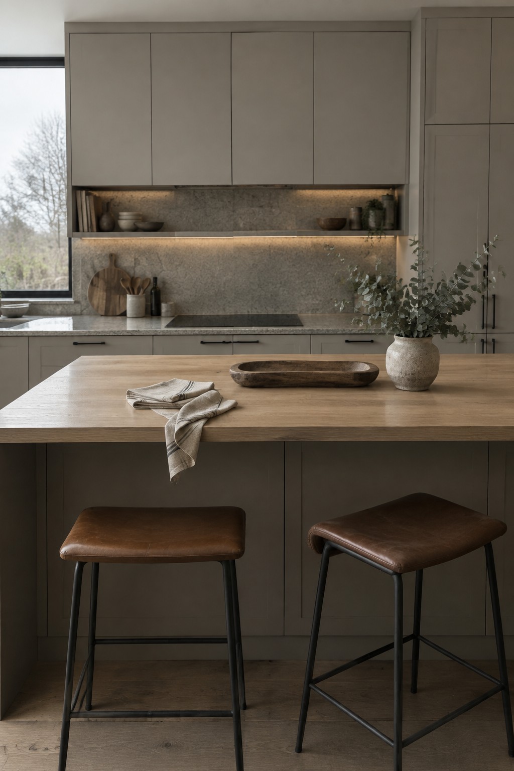
The cabinets read as a warm greige, a soft gray-brown that suits a Japandi kitchen without feeling stark. Similar colors include Sherwin-Williams Accessible Beige, Benjamin Moore Pashmina, or Farrow & Ball Skimming Stone, though the exact match is hard to tell from a photo.
The muted cabinet color works well with the natural stone backsplash and countertop, since neither has a sharp contrast. It can look darker in a room with limited daylight, so sample it beside your stone and warm wood before painting.
Blackened Navy Cabinets With Warm Walnut
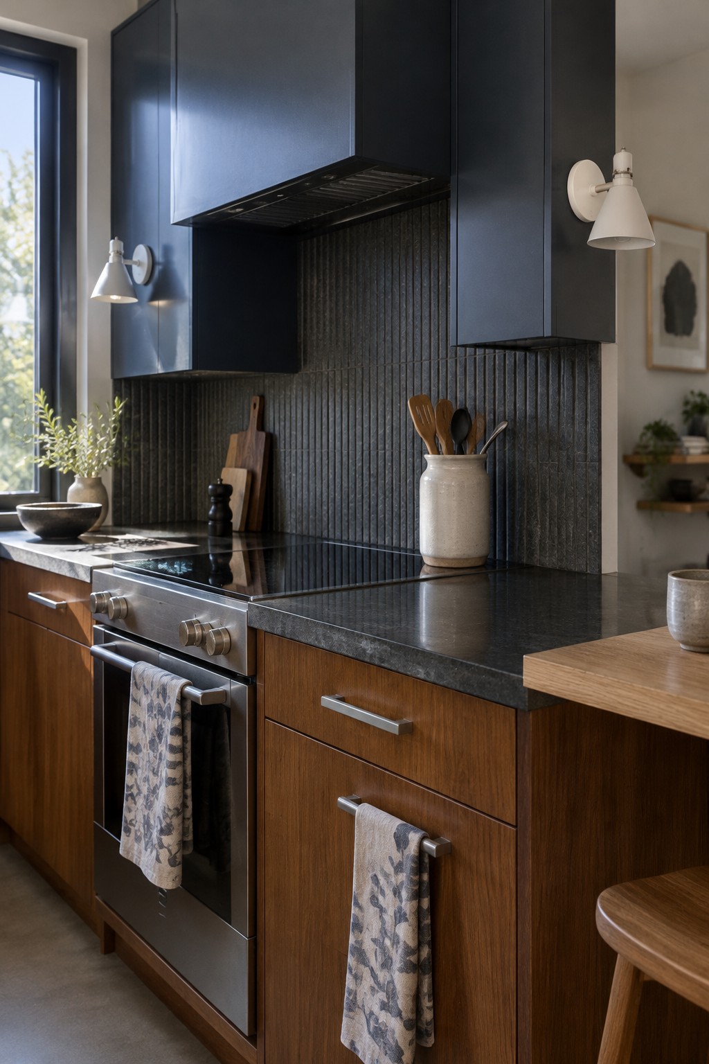
A deep charcoal navy is the main paint idea here, though the cabinets may read nearly black in some light. It feels calm rather than bright, and it gives a Japandi kitchen a simple way to contrast with natural materials. I’d look at Benjamin Moore Hale Navy, Sherwin-Williams Inkwell, or Farrow & Ball Hague Blue as possible matches.
The cool blue undertone keeps the dark color from reading as plain black, while the walnut cabinetry brings in a warmer note. This shade works best with good natural light and a restrained palette; sample it at home first, since it can look much darker in a dim kitchen.
Warm Cream Cabinets Beside Veined Marble
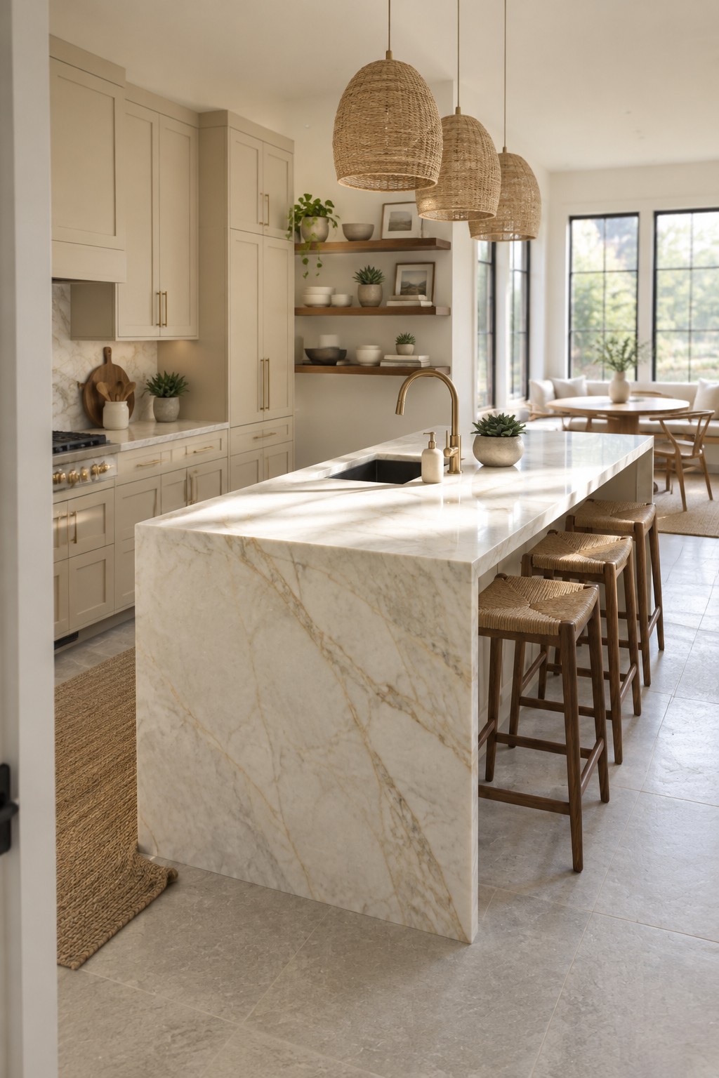
This kitchen’s paint reads as a warm cream, close to Benjamin Moore Swiss Coffee, Sherwin-Williams Creamy, or Farrow & Ball School House White. It’s a soft neutral rather than a stark white, so it suits a kitchen where you want the cabinets to feel light without looking cold.
The creamy color works well beside the marble’s warm veining and brass hardware. In a room with plenty of daylight, it should stay fairly bright; in a dimmer kitchen, test a sample first, since warm creams can look more yellow.
Warm Greige Walls Beside Veined Marble
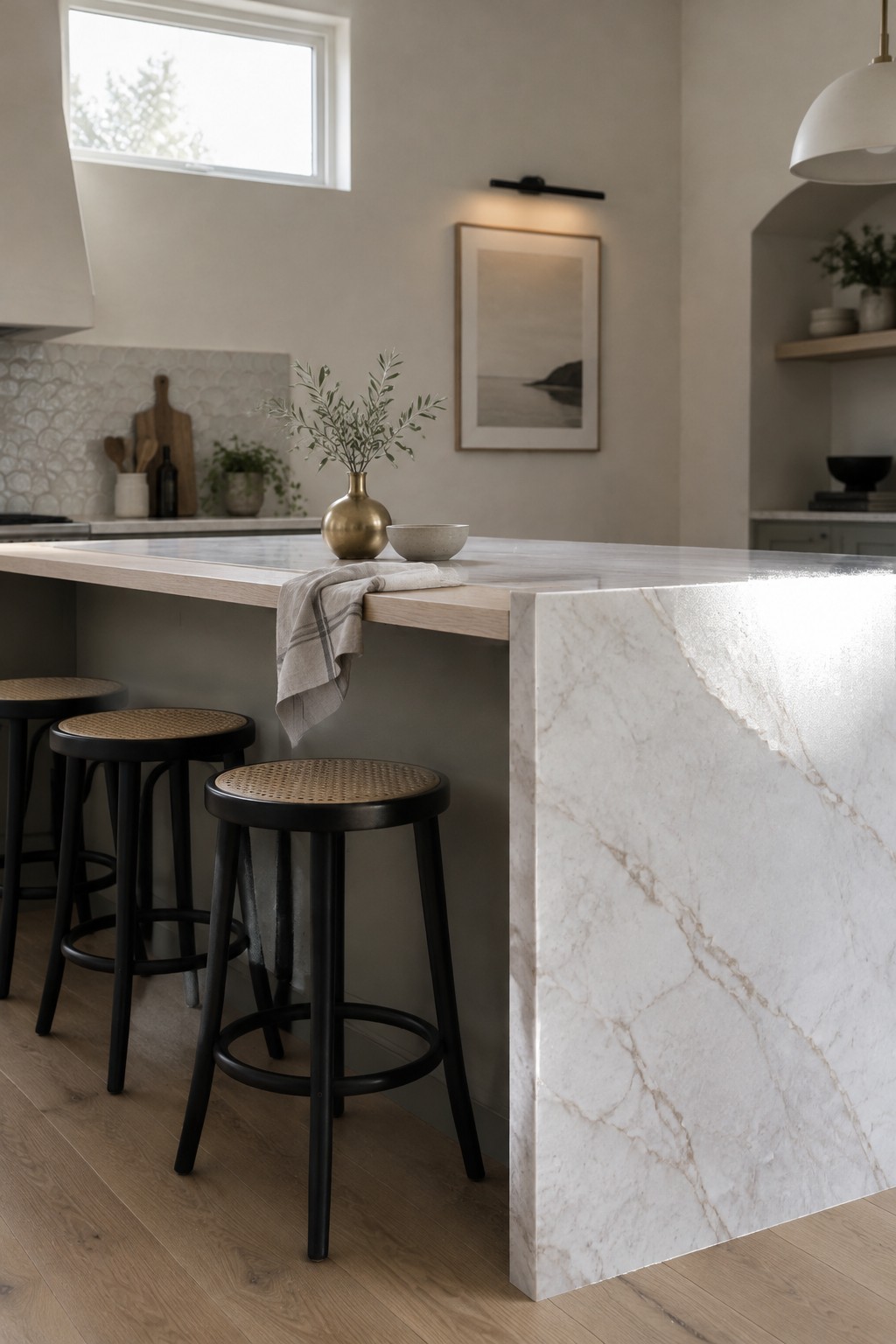
This kitchen’s paint reads as a warm greige, a soft mix of beige and gray. A close match might be Sherwin-Williams Agreeable Gray, Benjamin Moore Edgecomb Gray, or Farrow & Ball Skimming Stone, though the exact shade is hard to pin down from a photo. It’s a useful neutral for a Japandi kitchen because it feels quieter than a crisp white and pairs easily with pale natural stone.
The marble’s warm veining suits this color, while the greige keeps the room from turning too cool. It should work well with light wood floors and simple cabinetry, but test a sample in your own kitchen first, since this kind of neutral can look grayer in cooler light.
Warm Greige Cabinets Beside Pebble Stone
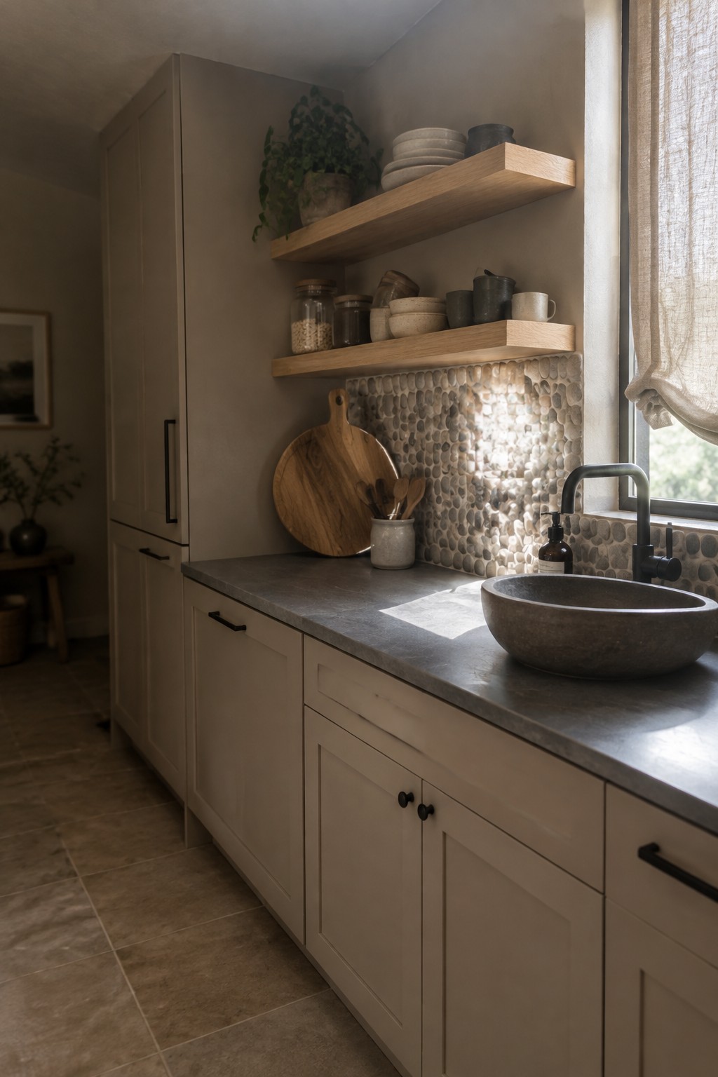
Warm greige cabinetry is the main paint idea here. It looks like a soft beige-gray, and close matches might include Benjamin Moore Pashmina, Sherwin-Williams Accessible Beige, or Behr Perfect Taupe. This kind of neutral suits a Japandi kitchen because it feels calm without looking stark.
The color leans warm beside the rounded natural-stone backsplash, so a cooler gray might look out of place. Try it with a similar stone or a dark countertop, and check a sample in your kitchen’s daylight before choosing.
Forest Green Walls and Cabinets With Dark Stone

This kitchen’s deep, muted green looks closest to a forest green, with a slightly olive cast. For similar unbranded paint options, consider Benjamin Moore Essex Green, Sherwin-Williams Pewter Green, or Farrow & Ball Green Smoke. Using the color across both the walls and cabinetry gives the kitchen a cohesive, tucked-in feel.
The green sits well beside the charcoal stone backsplash and counter, while the wood island keeps the palette from feeling too cool. It will look darker in shaded areas, so test a sample on both the wall and a cabinet before committing.
Warm Greige Cabinets With Pale Marble
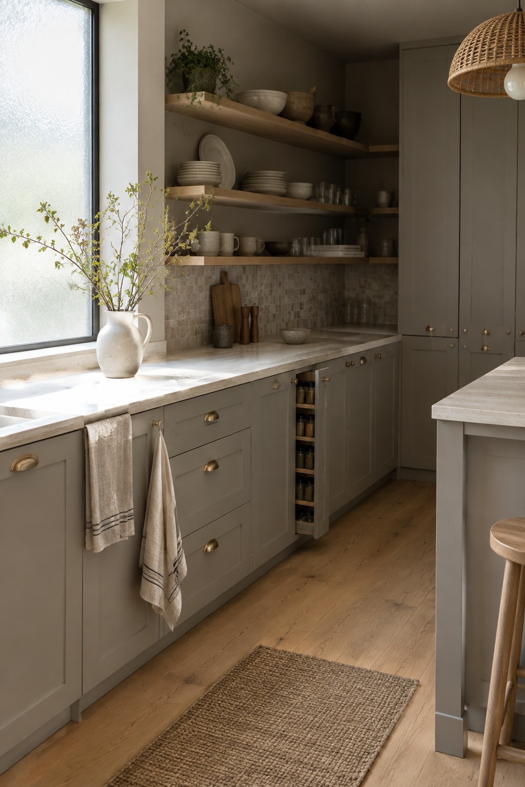
The cabinets look closest to a warm greige, a soft mix of gray and brown. Similar colors include Benjamin Moore Pashmina, Sherwin-Williams Accessible Beige, and Farrow & Ball Elephant’s Breath. It’s a useful choice for a Japandi kitchen because it feels quieter than a crisp white but still lets the natural stone stand out.
The marble’s pale veining keeps the cabinets from reading too dark, while the wood floor suits their earthy undertone. In a kitchen with less daylight, test a sample first, since this kind of greige can look more brown or gray depending on the light.
Muted Sage Cabinetry With Speckled Stone
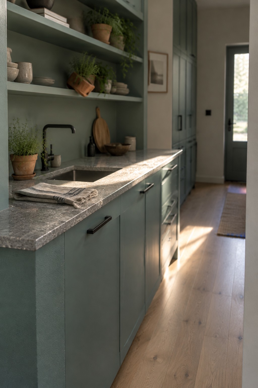
This kitchen’s paint reads as a muted sage green, with a gray cast that keeps it from looking too bright. It seems closest to Benjamin Moore October Mist, Sherwin-Williams Evergreen Fog, or Farrow & Ball Mizzle, though the exact match is hard to tell from a photo. The color works well across both the cabinets and open shelving, giving the narrow kitchen one calm, consistent backdrop.
The stone counter has a cool, speckled pattern that suits the gray in the green. Natural wood flooring keeps the palette from feeling chilly, and the sage should look different as daylight shifts through the room. Test a sample beside your own counter before painting, since this shade can read grayer in dimmer kitchens.
Blush Marble With Warm Cream Cabinetry
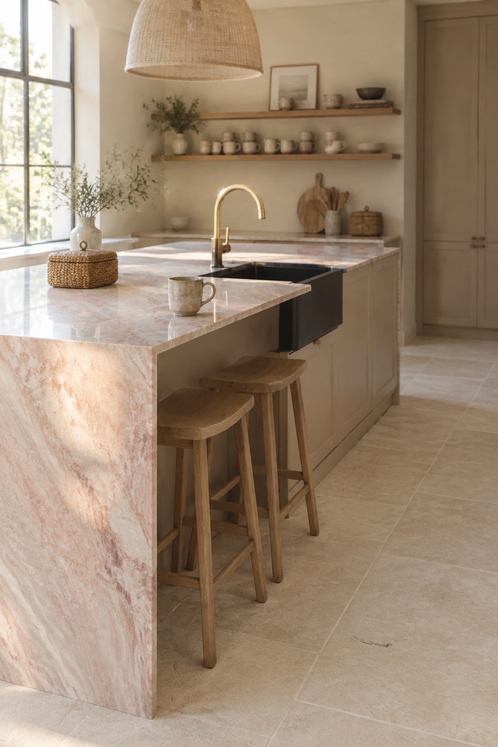
The cabinetry reads as a warm cream, close to Benjamin Moore Swiss Coffee, Sherwin-Williams Alabaster, or Farrow & Ball School House White. This soft off-white suits a Japandi kitchen because it feels gentler than a crisp white and lets natural stone remain part of the color scheme.
Here, the warm cabinets sit beside pink-veined marble, so a cooler white could look out of place. Try a few samples in your own kitchen first, since cream paint can turn more yellow in some light.
Muted Green-Gray Cabinets With Marbled Stone
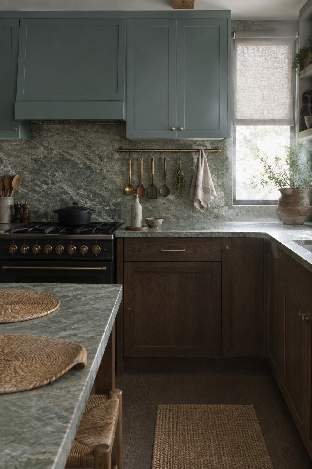
This kitchen’s painted cabinets read as a muted green-gray, a color family that suits a natural-stone palette without feeling too bright. For an unbranded match, I’d look at Benjamin Moore October Mist, Sherwin-Williams Evergreen Fog, or Farrow & Ball Pigeon. The shade has enough gray in it to feel settled beside the veined stone.
In changing window light, it may lean greener or cooler, so test a sample near the stone before painting. Dark wood below the counter gives this mid-tone color a practical partner, especially in a kitchen with plenty of daylight.
Warm Greige Cabinets Beside Pebble Stone
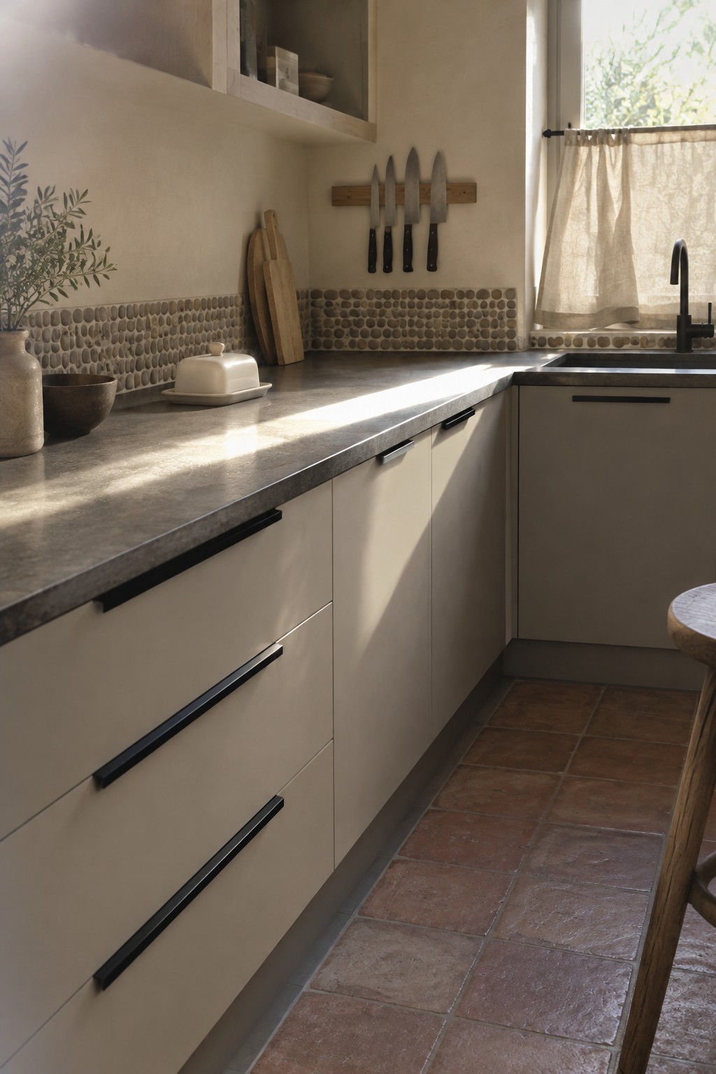
The cabinets look like a warm greige, a soft neutral between beige and gray. Close matches might include Benjamin Moore Edgecomb Gray, Sherwin-Williams Accessible Beige, or Behr Sandstone Cove. It’s a useful choice for a kitchen because it feels warmer than a cool gray but still gives the room a quiet, simple look.
Beside the rounded stone backsplash, this shade reads especially natural. Try it with dark counters or warm wood, and sample it in your own kitchen first, since cooler light can bring out more gray.
Warm Taupe Cabinetry With Blush Stone
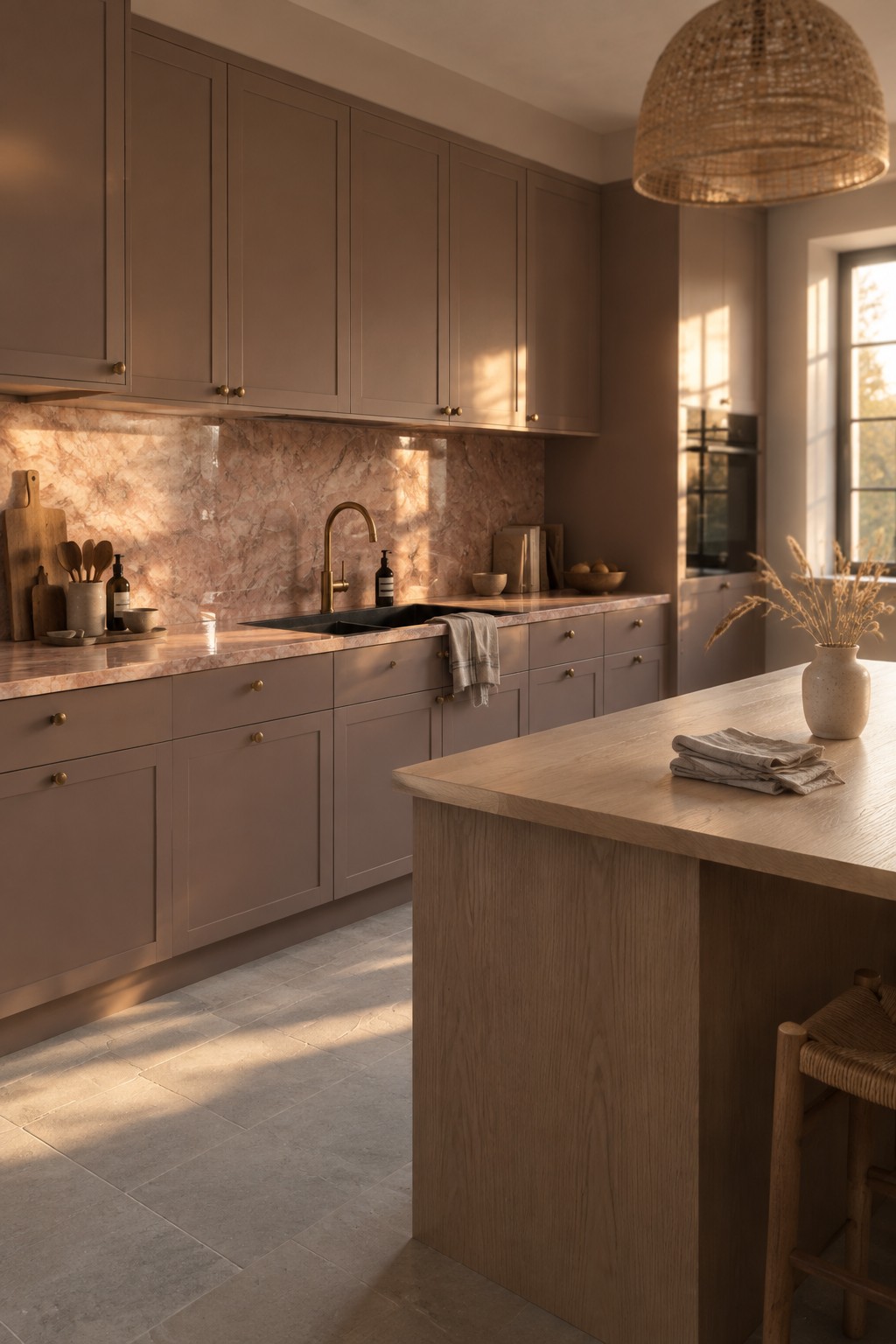
This kitchen reads as warm taupe, a muted brown-gray that looks closest to Benjamin Moore Pashmina, Sherwin-Williams Tony Taupe, or Farrow & Ball Elephant’s Breath. It’s a useful choice for cabinetry when you want more color than cream but still want a quiet backdrop for natural stone.
The pink-beige veining in the stone brings out the taupe’s warmer side, while daylight can make the cabinets look a little grayer. Try samples beside your own counters before painting, since this color may feel quite different in a dim kitchen.
Deep Olive Cabinetry Along a Sunlit Stone Counter
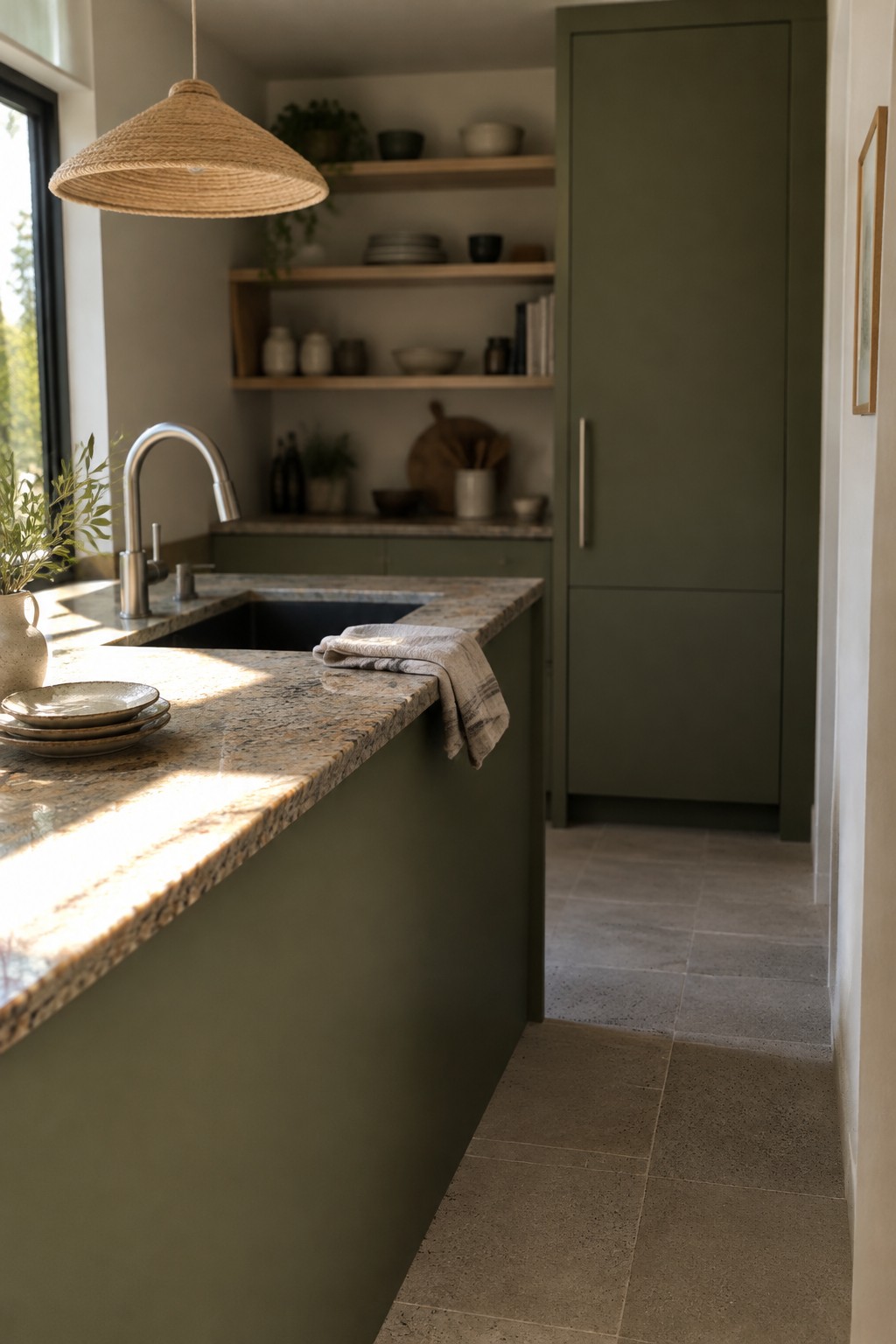
This kitchen’s paint reads as a deep olive green, close to Benjamin Moore Gloucester Sage, Sherwin-Williams Pewter Green, or Farrow & Ball Treron. It gives the cabinetry a muted, earthy look, while the speckled natural stone keeps the palette from feeling too uniform.
The green has a subdued, slightly gray cast, though strong window light can make it look warmer. It works well in a kitchen with natural stone and other quiet materials; test a sample in both daylight and evening light before painting.
Frequently Asked Questions
Q: How do I choose a Japandi cabinet color when my stone already has a lot of movement?
A: Let the stone lead. If it has strong veining or varied colors, pair it with simple cabinets in a quiet shade pulled from the stone, such as warm white, soft taupe, or muted brown.
Q: Can I use black in a Japandi kitchen without making it feel too stark?
A: Yes. Try black on a small area, like a faucet, cabinet pulls, or a single accent. Warm wood and softly textured stone will keep the contrast from feeling cold.
Q: What if my natural stone looks cooler than the wood I want to use?
A: Bring in a sample of the wood and compare it with the stone in your kitchen’s natural light. A touch of warm white or greige between the two can help them sit comfortably together.
Q: Are polished stone counters too formal for a Japandi kitchen?
A: Not necessarily, but a honed or leathered finish usually feels softer and more relaxed. If you already have polished stone, balance its shine with matte cabinets and natural wood.
