

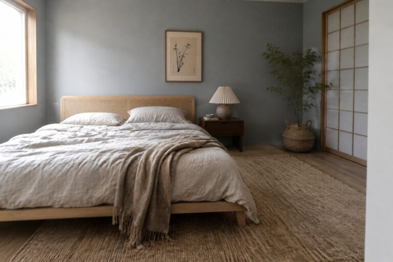
Muted blue can bring a quiet sense of color to a room, but its undertones matter once it sits beside warm wood, creamy walls, and natural fabrics.
I find that a blue that looks soft on a paint chip can turn steely in cool daylight or more gray near dark flooring, so I’d test samples where the light changes through the day.
Warm whites and gentle beige tones can help keep the blue grounded, while trim and larger furniture often determine whether the whole palette feels balanced.
The contrast should feel calm, not washed out.
I’d start with a few shades on different walls and check them beside the room’s existing finishes before settling on a color scheme.
Muted Blue-Gray Walls Beside Warm Wood
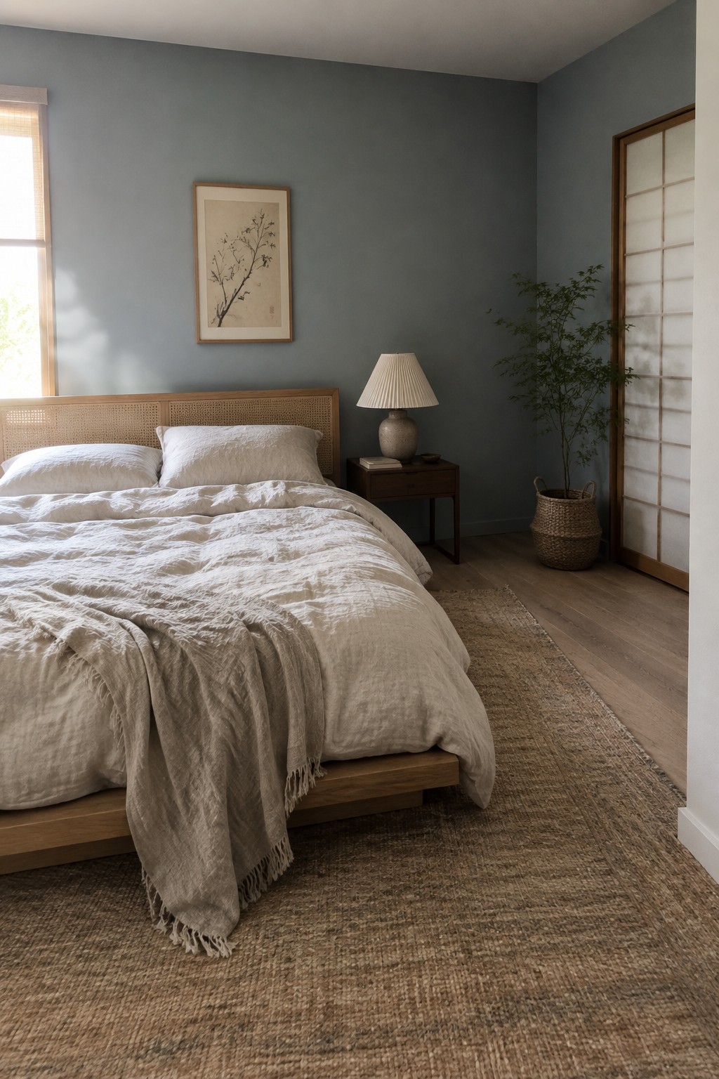
This looks like a muted blue-gray, close to Benjamin Moore Smoke, Sherwin-Williams Stardew, or Farrow & Ball Parma Gray. The color feels soft rather than chilly, so it can bring some character to a bedroom without making the walls feel too strong.
Warm wood helps keep this blue-gray comfortable, while white or cream fabrics make an easy pairing. It should work especially well in a room with good natural light; in a darker space, test a sample first, since the gray undertone may read deeper.
Muted Blue Walls With Warm Wood
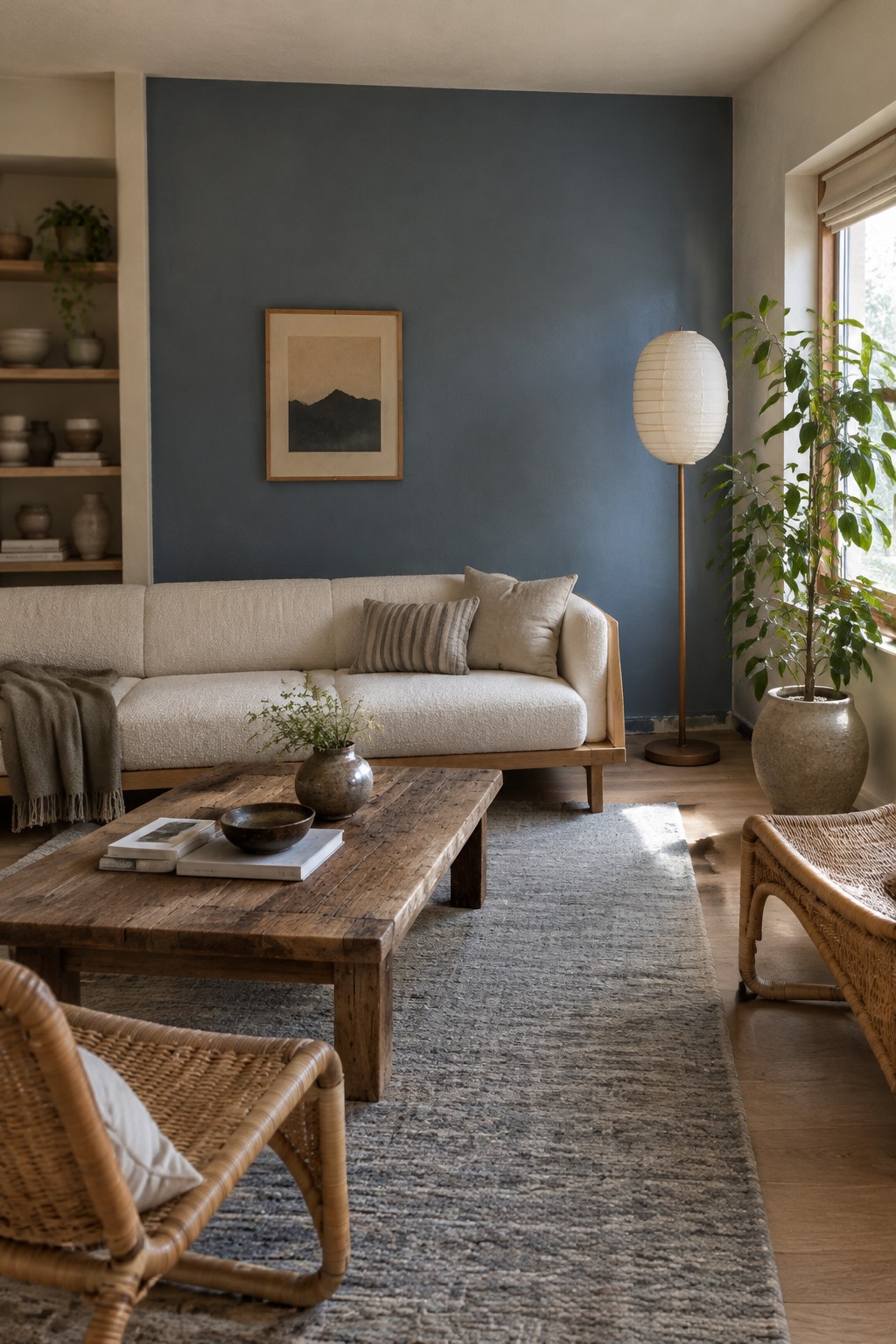
This looks like a muted blue with a gray undertone, somewhere between slate blue and blue-gray. For an unbranded match, I’d compare it with Sherwin-Williams Smoky Blue, Benjamin Moore Knoxville Gray, or Behr Blueprint. It gives the living room a deeper color without making the walls feel too bright or sharp.
The blue works well beside the sofa’s warm wood frame and the wood floor. It can look cooler in shaded areas, so warm neutrals and natural wood help keep the room comfortable rather than chilly.
Muted Blue-Gray Wainscoting Beside Warm Oak
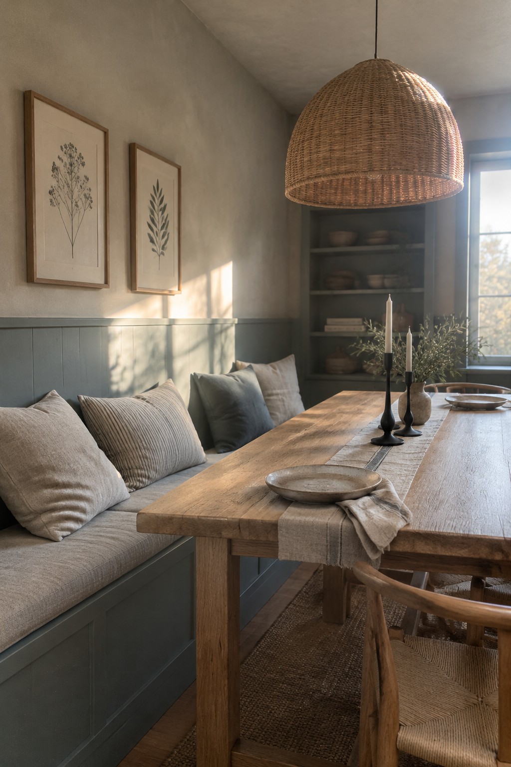
This muted blue-gray paint looks closest to a soft, slightly green-leaning blue. Similar shades include Benjamin Moore Smoke, Sherwin-Williams Stardew, and Farrow & Ball Blue Gray, though the match is only an estimate. Used on the lower wall, it gives the dining nook a little color without making the whole room feel cool.
The warm oak table and natural wood trim help the blue-gray feel at home. It should work well in a room with gentle daylight and warm neutral fabrics; in a darker space, test a sample first, since this color may read grayer.
Muted Blue Cabinets Beside Warm Wood
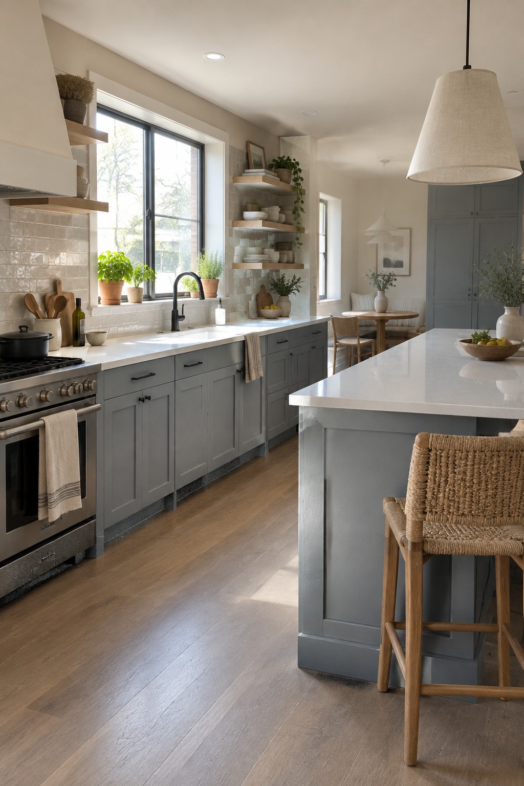
A muted blue-gray is the main paint idea here. It looks closest to Benjamin Moore Boothbay Gray, Sherwin-Williams Smoky Blue, or Farrow & Ball Light Blue, though the exact match is hard to know from a photo. This kind of soft blue feels calm without being too cool, especially on kitchen cabinets.
The gray in the color keeps it from looking overly bright, while the warm wood floor gives it a comfortable contrast. It works well with creamy white counters and simple natural materials. In a darker kitchen, test a sample first, since the blue may read grayer with less daylight.
Dusty Blue Above a Fluted Wood Vanity
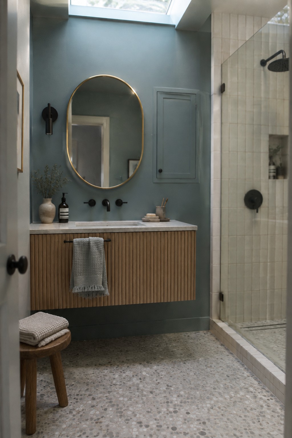
This muted blue-green paint reads close to a dusty blue-gray, with a slight cool cast. Similar shades include Benjamin Moore Smoke, Sherwin-Williams Stardew, or Farrow & Ball Light Blue, though the exact match is hard to pin down. It’s a useful choice for a bathroom when you want color without going too dark.
The blue looks especially comfortable beside the vanity’s warm wood, which keeps the wall from feeling cold. Try it with creamy stone or tile, and test a sample in the room first since daylight can bring out its gray or green undertones.
Muted Blue-Gray Walls in a Narrow Entry
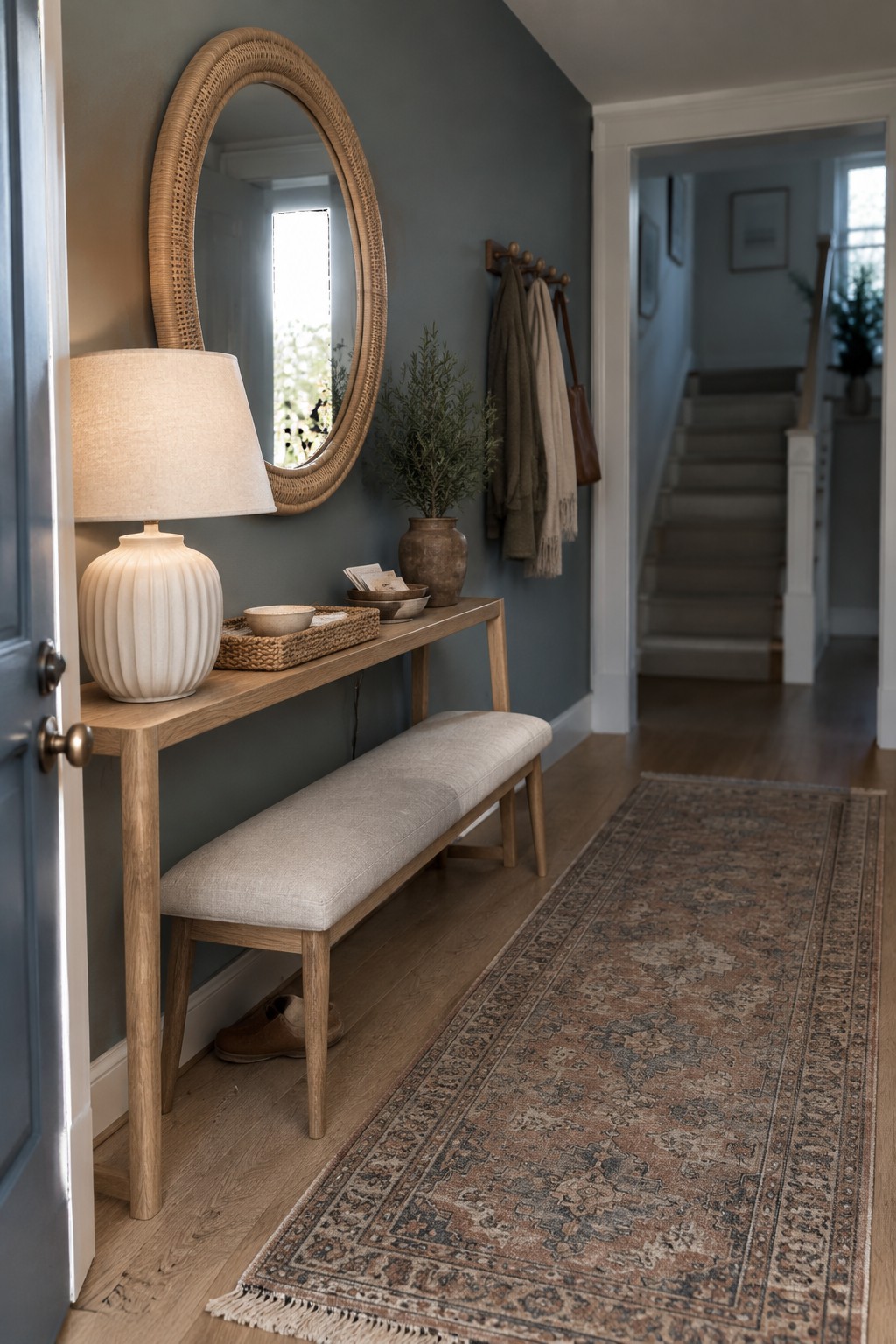
The wall color reads as a muted blue-gray, close to Benjamin Moore Boothbay Gray or Sherwin-Williams Stardew, though the exact shade is hard to pin down from a photo. It’s a soft, mid-tone color that gives a narrow entry some character without making it feel too dark.
Warm oak flooring suits this cooler blue well. In a dim hallway, test a sample first, since the gray undertone may look stronger without much daylight.
Blue-Gray Built-Ins With Warm Wood
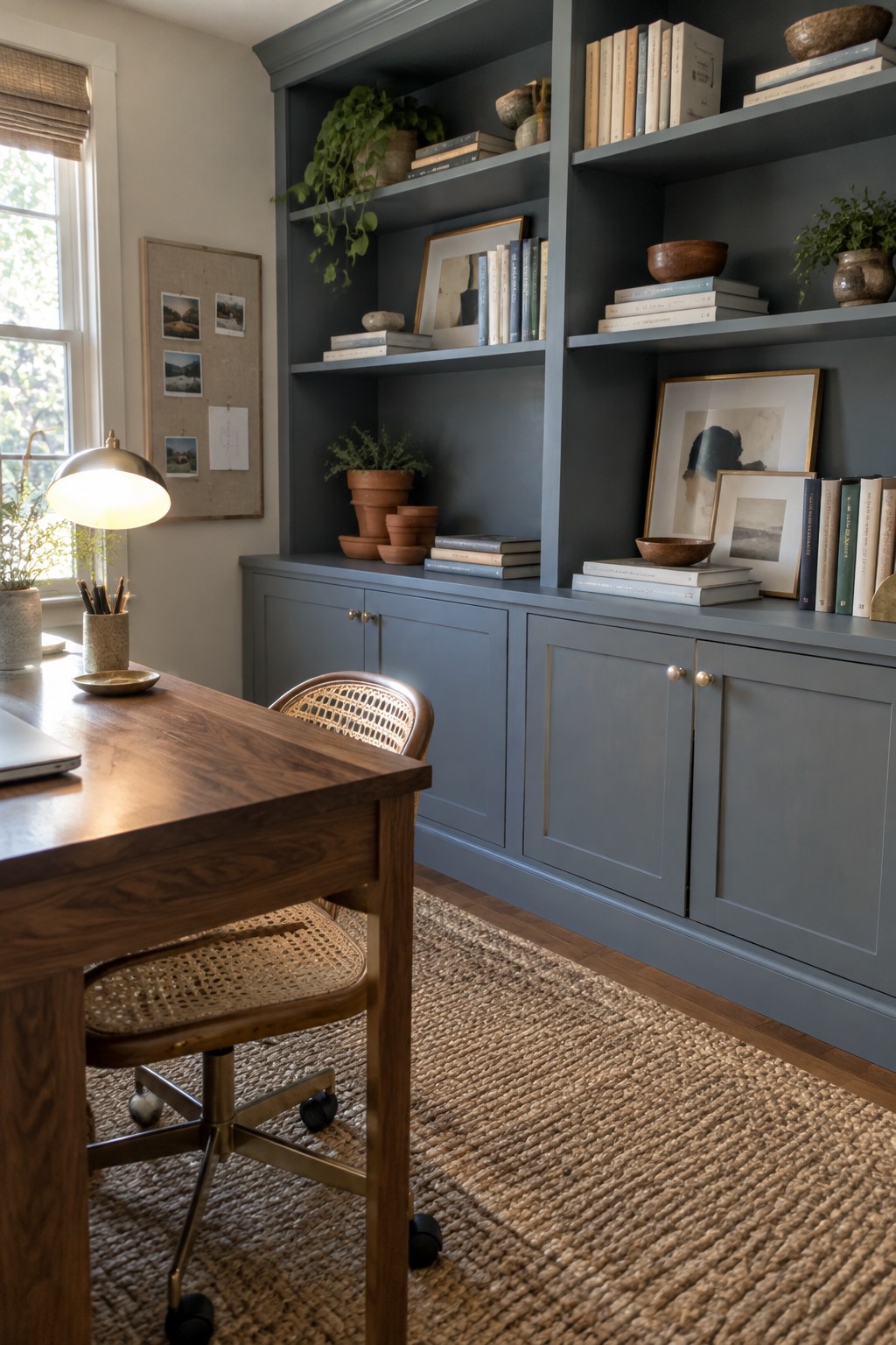
This muted blue-gray looks closest to a dusty slate blue, with likely matches such as Benjamin Moore Boothbay Gray or Sherwin-Williams Smoky Blue. On built-in shelving and cabinets, it reads as a calm, slightly cool color rather than a bright blue. The wide painted surface gives a home office a more settled feel without making the walls seem too dark.
Warm wood flooring and the desk help keep the blue from feeling chilly. It should work well in a room with good natural light, though samples are worth checking on the shelves and lower cabinets since blue-gray paint can look grayer in dimmer areas.
Pale Blue-Gray Walls With Natural Wood

The walls look like a pale, muted blue-gray, close to Benjamin Moore Smoke, Sherwin-Williams Krypton, or Farrow & Ball Light Blue. It’s a gentle color for a nursery or bedroom when you want something cooler than beige but not too strong.
The blue-gray has a soft, slightly green cast that changes with the light. Natural wood keeps it from feeling chilly, and warm white trim or cream fabrics would suit it too. Try a sample on more than one wall, since this shade can look grayer in a dim room.
Muted Blue-Gray Across the Media Wall
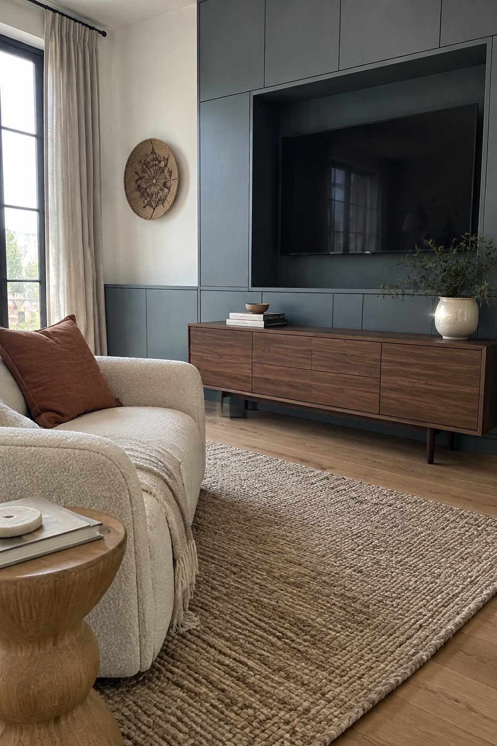
This reads as a muted blue-gray, close to shades like Sherwin-Williams Smoky Blue, Benjamin Moore Smoke, or Farrow & Ball De Nimes. It’s a quieter choice than a strong navy, and using it across the built-in media wall gives the living room a more finished look without making the color feel too bright.
The shade appears slightly cool, so warm wood helps keep the room comfortable rather than stark. It should work well in a living room with natural light; in a darker room, sample it first, since blue-gray can look deeper than expected.
Muted Blue Wainscoting Along a Narrow Hall

The paint reads as a muted blue-gray, close to Benjamin Moore Boothbay Gray, Sherwin-Williams Smoky Blue, or Farrow & Ball Light Blue. Used on the lower wall paneling in a narrow hallway, this softer blue gives the passage color without making it feel too enclosed.
Its gray undertone keeps it from looking overly bright, while the wood floor brings in a warmer note. Try it with warm white above the paneling and sample it in the hall’s own light, since a shaded corridor can make blue-gray paint look darker.
Muted Blue-Gray Walls Above a Linen Banquette

A muted blue-gray paint is a good fit for this kind of Japandi dining nook. It looks closest to Benjamin Moore Boothbay Gray, though Sherwin-Williams Stardew or Farrow & Ball De Nimes could give a similar effect. The color feels calm without reading as plain gray, and the warm wood keeps it from seeming chilly.
In a room with limited natural light, this shade may look grayer and a little deeper, so test a sample before painting a large area. It works well with warm wood and soft beige upholstery, especially when you want color without making a small dining space feel busy.
Muted Blue-Gray Above White Bathroom Tile
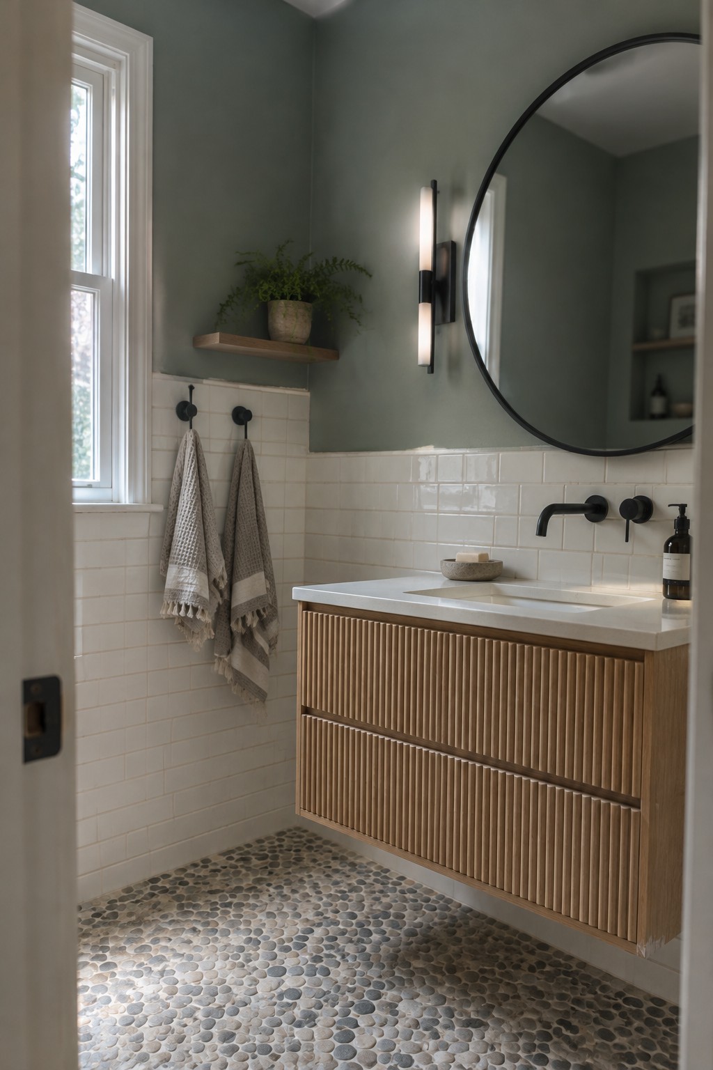
A muted blue-gray is a good fit for a small bathroom when you want color without making the room feel dark. It reads as a soft, slightly green-leaning blue here; likely matches include Benjamin Moore Smoke, Sherwin-Williams Silver Strand, or Behr Light French Gray, though the exact paint is hard to pin down from a photo.
The color works well above white tile, which keeps the lower half of the room feeling bright. Try it in a bathroom with warm wood, and test a sample first, since cooler light can make blue-gray paint look more gray.
Muted Blue-Gray Cabinets With Butcher-Block Counters
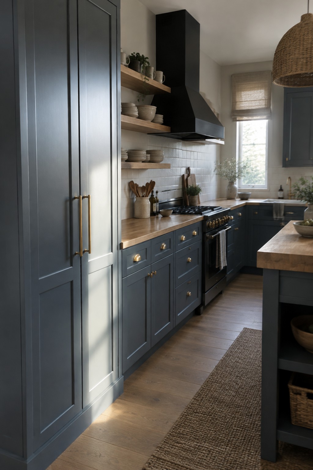
This muted blue-gray reads close to a dusty slate, with a cool undertone that keeps the kitchen from feeling too dark. Similar colors include Benjamin Moore Boothbay Gray, Sherwin-Williams Smoky Blue, and Farrow & Ball De Nimes. The shade suits cabinetry well, especially when you want color without a bright or highly saturated look.
Warm wood counters help balance the cooler paint, while the white tile keeps the cabinets from feeling too heavy. In a kitchen with limited natural light, test a sample first, since blue-gray can look darker or more gray depending on the room.
Muted Blue-Gray Around a Backlit Vanity
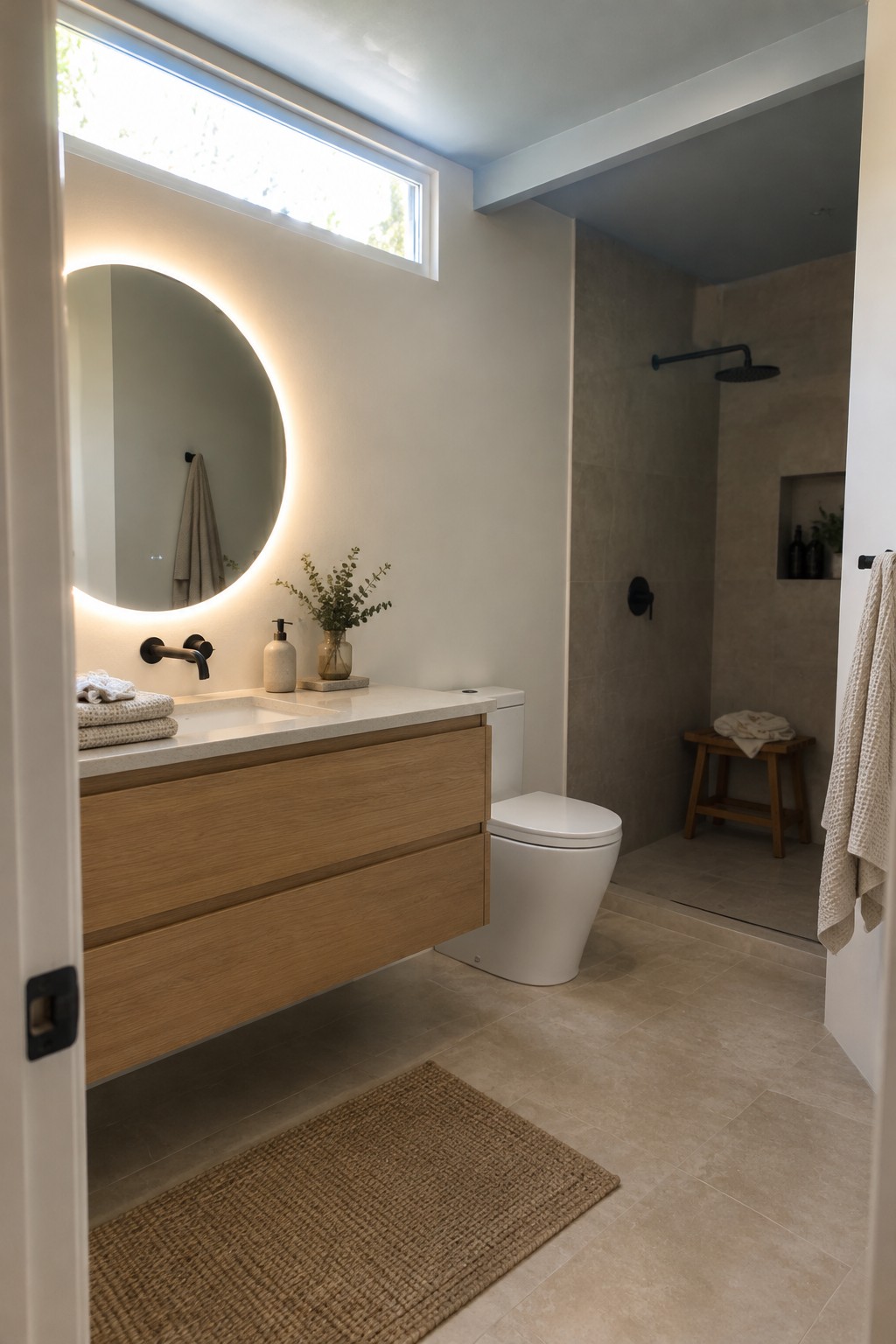
A muted blue-gray would suit this bathroom’s large painted wall, though the image reads more warm neutral than blue. For a true blue-gray, Benjamin Moore Smoke, Sherwin-Williams Misty, or Behr Light Drizzle are possible starting points. This color family can bring a quiet hint of blue without making a small bathroom feel too cool.
Choose a shade with a little warmth so it works with the oak vanity and beige tile. Daylight can make blue undertones more noticeable, so test a sample on the wall before painting the whole room.
Blue-Gray Built-Ins Around a Mudroom Bench
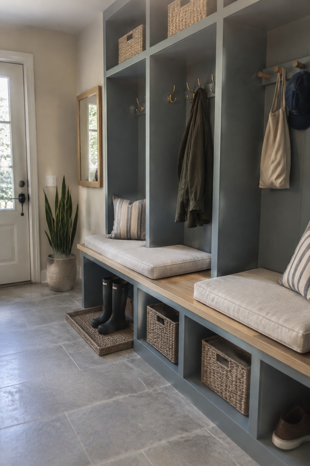
This muted blue-gray looks close to a dusty slate blue, with a cool gray cast. For similar shades, consider Benjamin Moore Boothbay Gray, Sherwin-Williams Smoky Blue, or Behr Blueprint. Painting the cubbies and bench structure the same color gives this entry a tidy, built-in look without making the shade feel too bold.
The blue-gray works well beside the bench’s warm wood top, which keeps the cool paint from feeling stark. It suits an entry or mudroom with good natural light; in a darker space, test a sample first, since it may read more gray than blue.
Muted Blue-Gray Around a Built-In Bookcase
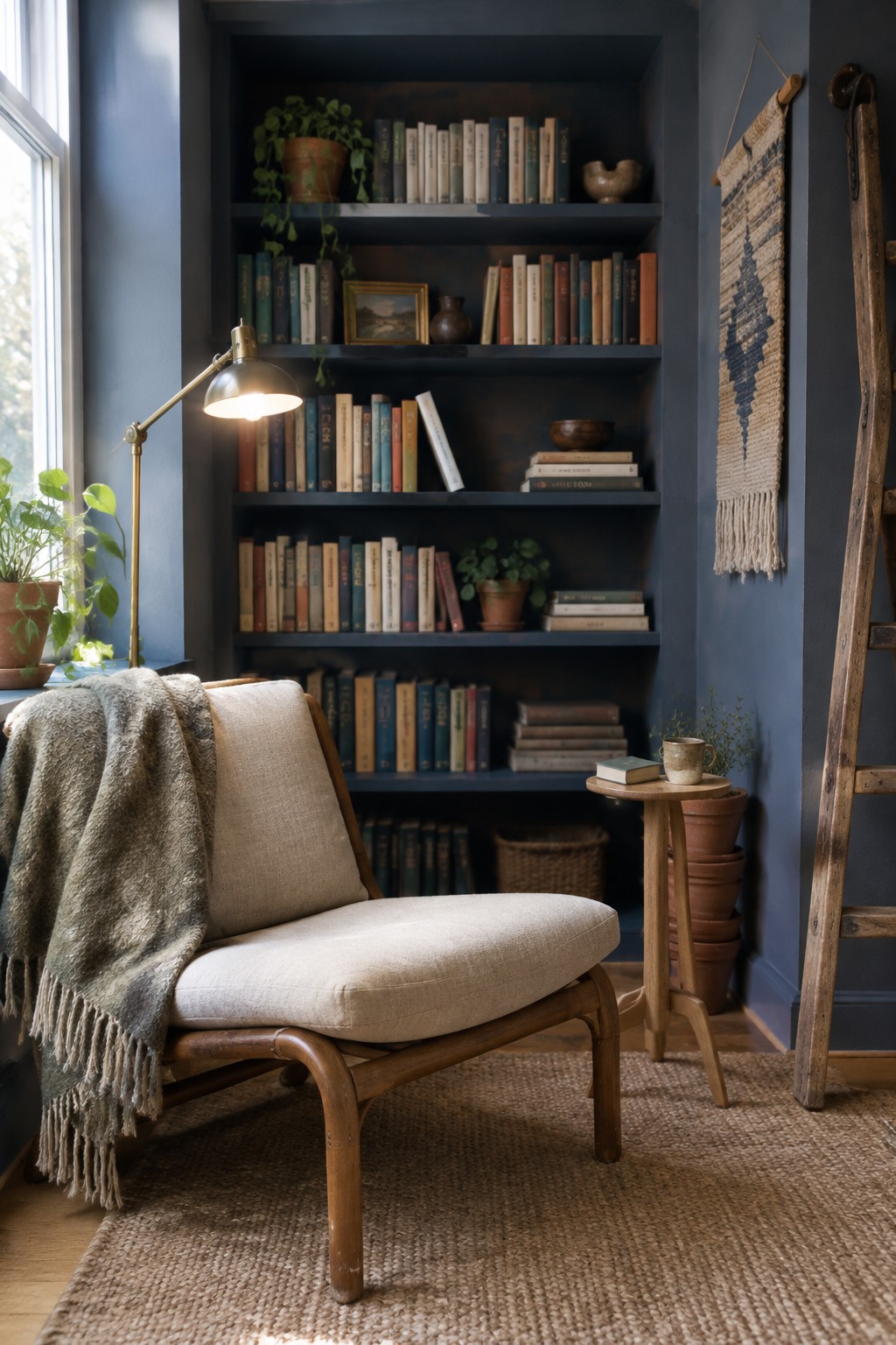
Muted blue-gray paint gives this reading nook a calm, slightly moody feel. It looks closest to Benjamin Moore Van Deusen Blue, though Sherwin-Williams Smoky Blue or Farrow & Ball De Nimes could be worth sampling too. Painting the walls and bookcase the same color makes the shelving feel like part of the room rather than a separate piece.
The shade leans cool, so warm wood and cream upholstery help keep it from feeling chilly. It suits a cozy study or reading corner, especially where daylight can reach it. Check a sample in both daylight and lamplight before committing, since blue-gray can look darker once the sun goes down.
Muted Blue Wainscoting With Warm Wood

This muted blue-gray paint looks close to a soft, slightly warm blue, rather than a crisp or icy shade. For similar colors, I’d look at Benjamin Moore Smoke, Sherwin-Williams Stardew, or Farrow & Ball Light Blue. Using it on the lower wall panels gives the room color without making the upper walls feel heavy.
The warm wood table and floor suit the blue’s gentle gray undertone. It should work well in a dining room with good window light, though a sample is worth checking in the room since blue-gray can look cooler on cloudy days.
Muted Blue-Gray Laundry Cabinets With White Stone
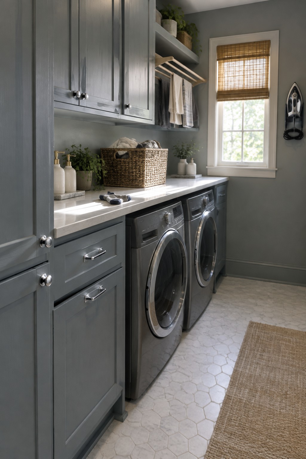
This muted blue-gray reads as a soft, slightly cool blue with a gray base. For an unbranded match, I’d look at Benjamin Moore Boothbay Gray, Sherwin-Williams Smoky Blue, or Behr Adirondack Blue. It suits laundry cabinets well because it brings color to the room without making the cabinetry feel too bold.
The white stone counter keeps the blue-gray from reading too dark, while warm wood accents can make it feel less cool. Try the paint sample beside your countertop first, since the room’s light can shift the color toward gray or blue.
Muted Blue-Gray Walls With Warm Wood Floors
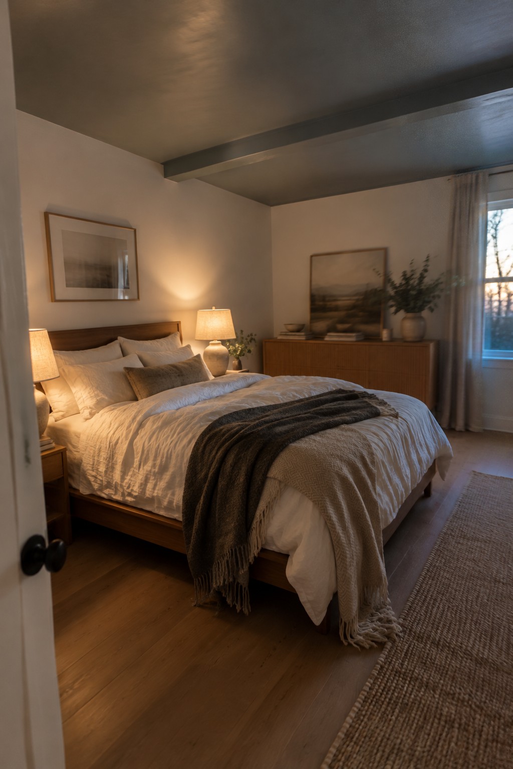
Muted blue-gray is a good fit for a bedroom when you want color without making the walls feel too strong. This room reads mostly warm and neutral, so a soft blue-gray would bring in a cooler note while still sitting comfortably with the wood floor.
Look for a shade with a little gray in it, rather than a clear or icy blue. It can shift cooler in daylight, so test a sample beside the floor before painting the whole room. Warm white bedding and natural wood keep the combination easy to live with.
Frequently Asked Questions
Q: How do I keep muted blue from making a small room feel cold?
A: Use blue on a smaller surface, like a headboard or lower cabinets, and let warm white, wood, and woven textures fill the rest of the room. A soft, dusty blue usually feels gentler than a sharp or icy shade.
Q: What wood tones work best with Japandi blue?
A: Light oak and ash keep the palette calm and airy, while walnut adds a little depth. Try to repeat the same wood tone in a few places so the room feels settled rather than mismatched.
Q: Can I use blue and beige together without the room looking flat?
A: Yes. Mix a few textures, such as matte painted walls, linen, and natural wood, and vary the shades slightly. A deeper blue accent can give the softer neutrals some contrast.
Q: What if I only want to add a little blue?
A: Start with a cushion, ceramic vase, or piece of art. It’s an easy way to see how the color feels in your light before committing to a painted wall.
