

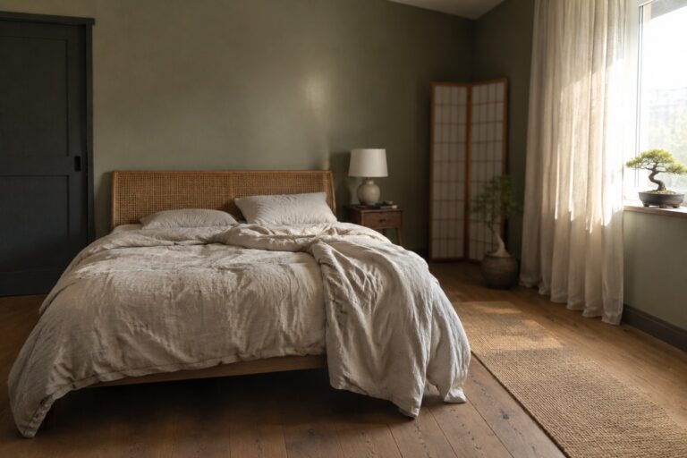
Japandi interiors often rely on a quiet base, but the right accent color keeps a room from feeling flat.
I find that warm whites, muted greens, and earthy browns can shift noticeably as daylight moves across walls and floors.
Their undertones matter just as much as the colors themselves, especially beside pale wood, dark trim, and textured fabrics.
A shade that looks calm on a sample card may feel too cool or too strong once it fills a room.
I’d test the softer options in a few spots first and watch how they sit with your furniture throughout the day.
Muted Olive Walls With Warm Wood
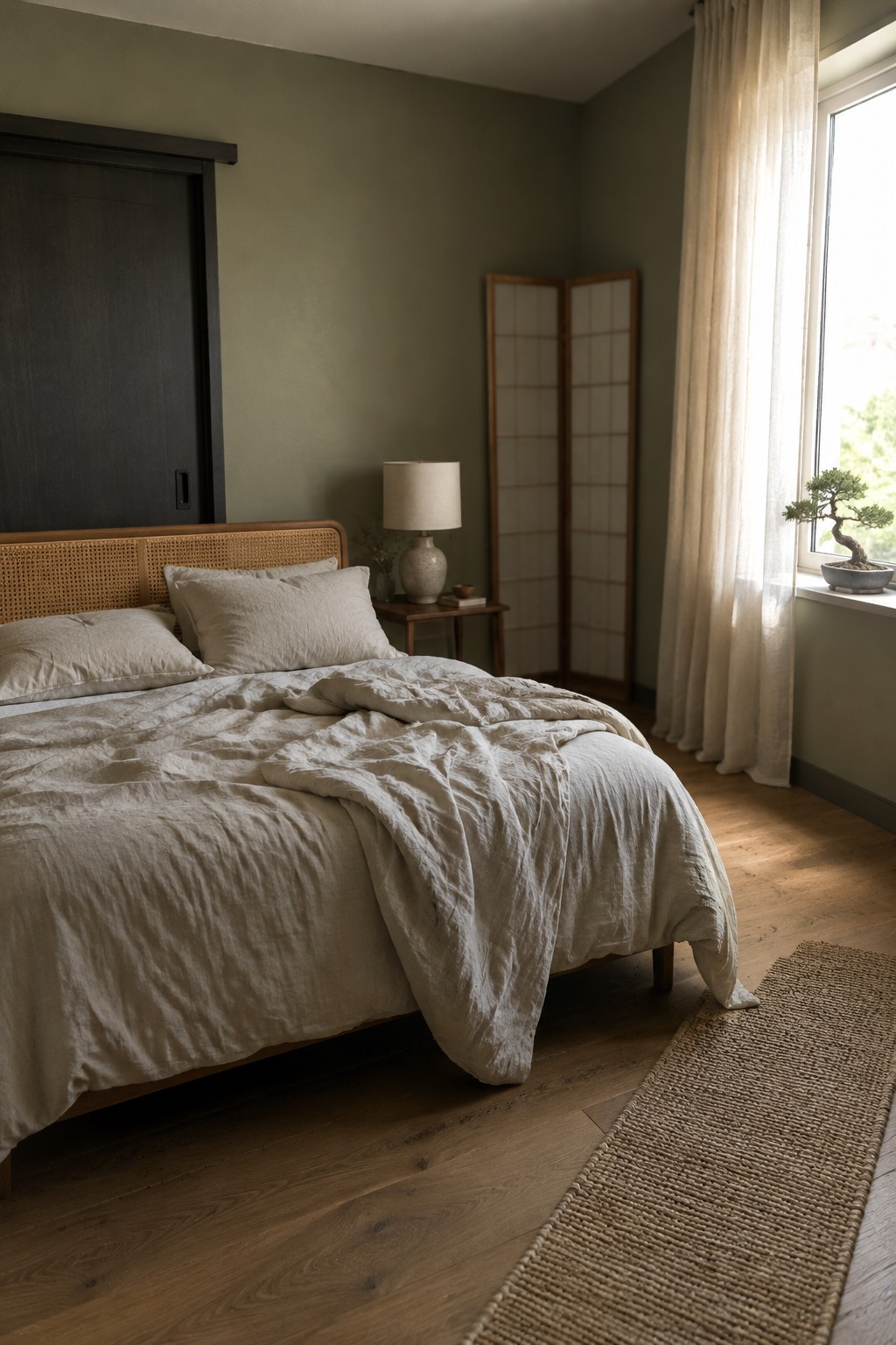
The walls look like a muted olive green, close to Sherwin-Williams Evergreen Fog, Benjamin Moore October Mist, or Farrow & Ball Treron. It’s a subdued, earthy color that gives a bedroom a little more character than a plain neutral without making it feel too dark.
The green has a gray cast, which works well with the warm wood floor and cane headboard. It may look cooler in a dim room, so test a sample on more than one wall before painting.
Terracotta Walls With Warm Wood
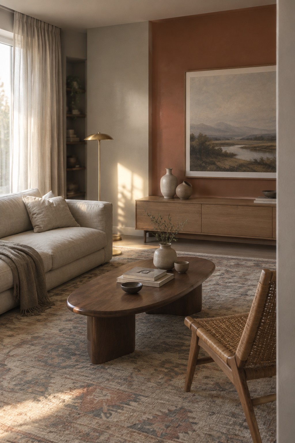
This muted terracotta reads as a soft, earthy red-brown rather than a bright orange. For an unbranded match, I’d look at Benjamin Moore Potters Clay, Sherwin-Williams Cavern Clay, or Farrow & Ball Red Earth. It gives a living room some color while still feeling easy to live with.
The shade looks especially comfortable beside the oak-toned sideboard and coffee table. In a room with less natural light, test a sample first, since terracotta can look darker and more red-brown on the wall than expected.
Blue-Gray Cabinets With Warm Wood
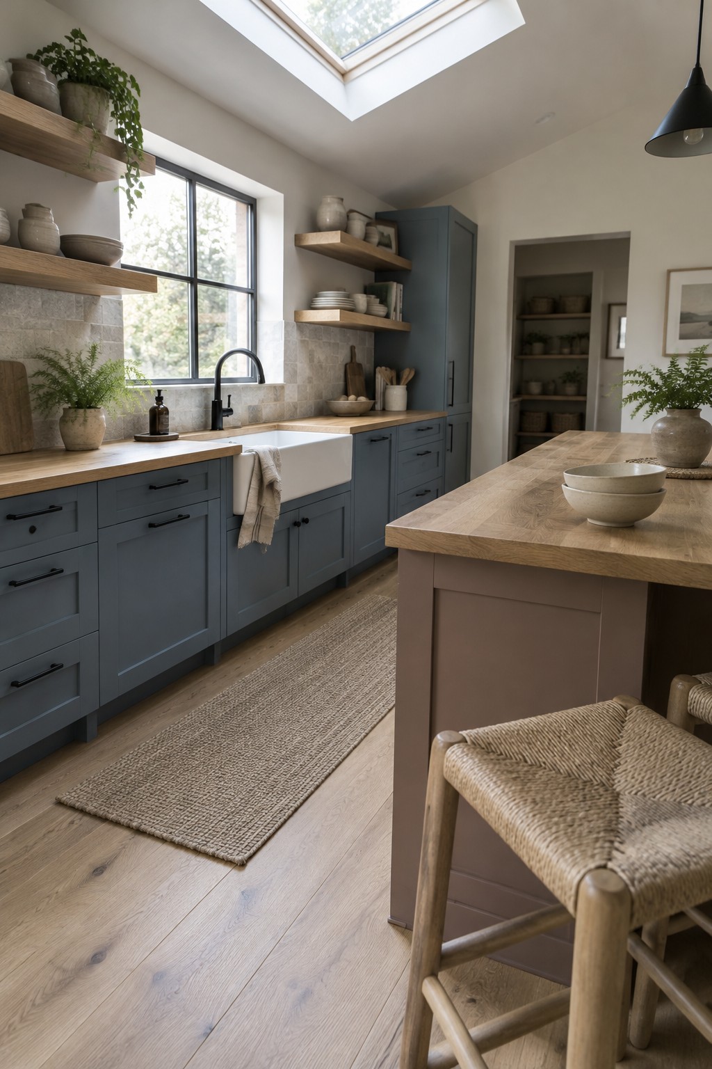
This kitchen’s cabinets read as a muted blue-gray, close to Benjamin Moore Boothbay Gray, Sherwin-Williams Misty, or Farrow & Ball De Nimes. It’s a softer choice than navy, but still gives the cabinetry a clear color without making the room feel dark.
The shade has a cool cast, so the warm wood counters and pale floor help it feel comfortable rather than chilly. It could work well in a bright kitchen; test a sample first, since less daylight may make the gray notes more noticeable.
Warm Greige Beside Light Oak
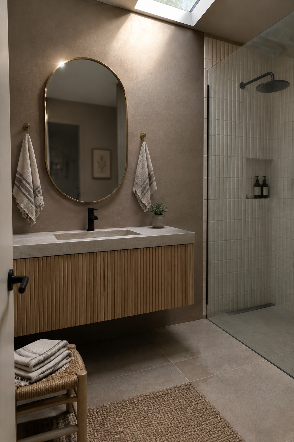
This warm greige paint reads close to Benjamin Moore Pale Oak, Sherwin-Williams Accessible Beige, or Farrow & Ball Skimming Stone. It suits a small bathroom well because it feels softer than a crisp white while still keeping the walls light.
The subtle beige undertone works naturally with the light oak vanity and pale stone counter. In a bathroom with little daylight, test a sample first, since the color may look deeper or more taupe than expected.
Rust-Red Walls Across the Dining Room Built-In
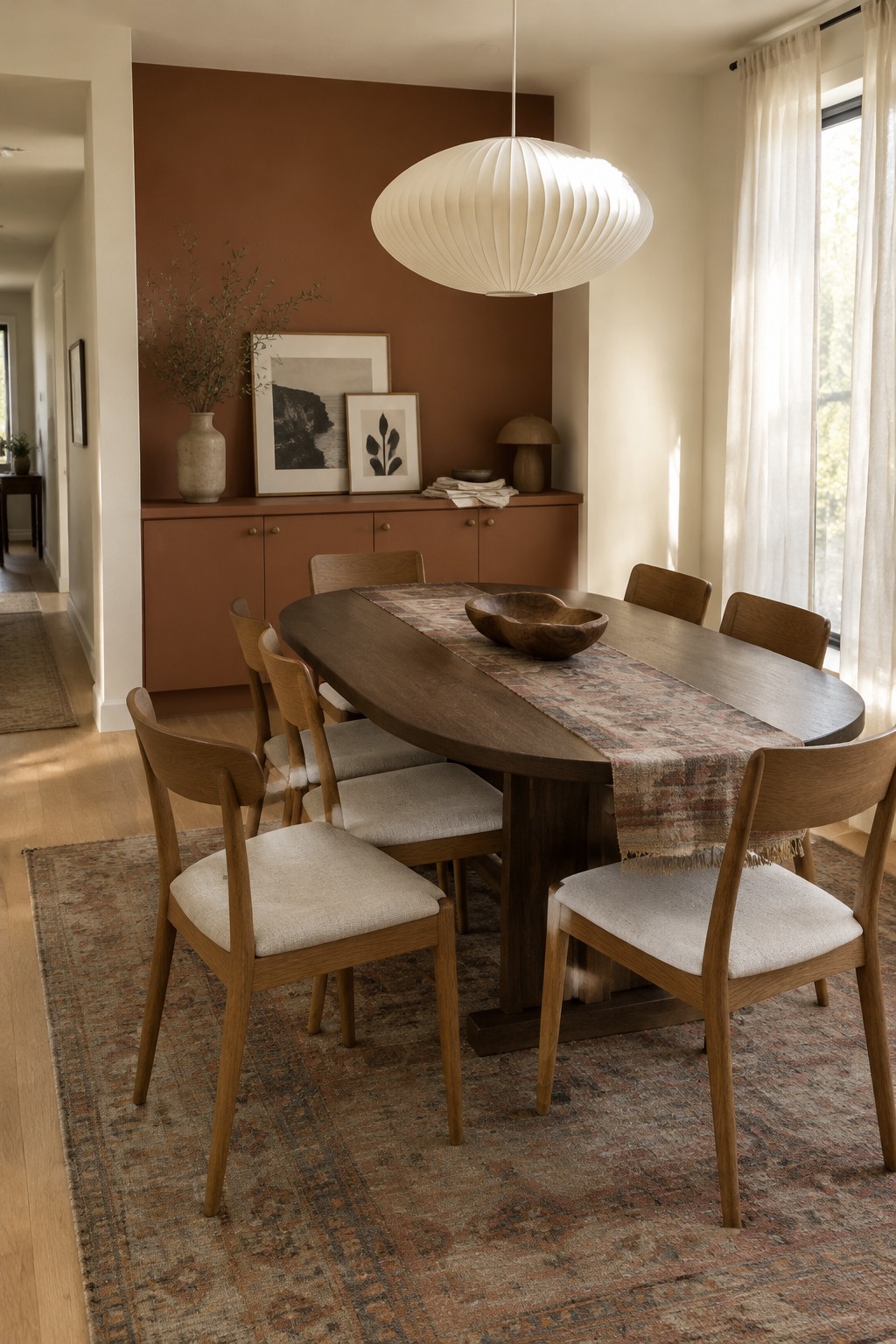
The wall color looks like a muted rust or clay red, close to terracotta, with a warm brown undertone. It’s a useful choice when you want a dining room to feel warmer without relying on a bright, strong red. Painting the built-in cabinets the same shade carries the color across the back wall.
The warm wood table and chairs suit this earthy color, while cream nearby keeps it from feeling too dark. It should work especially well in a room with good natural light. Test a sample first, since clay reds can look browner or more orange as the light changes.
Soft Gray Walls Around a Patterned Tile Hallway
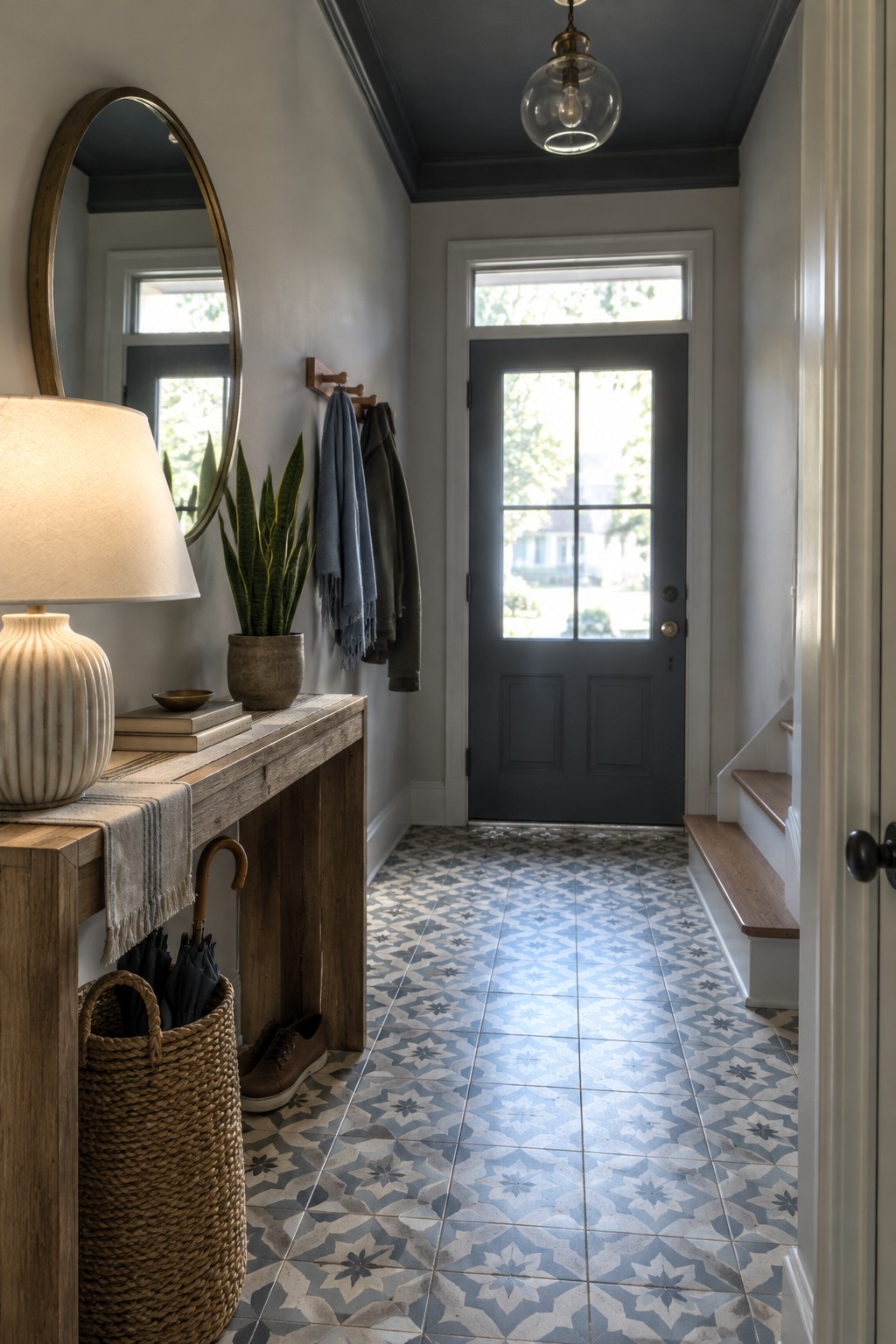
The walls look like a soft, slightly cool gray, close to Sherwin-Williams Passive, Benjamin Moore Gray Owl, or Behr Silver Drop. It is a quiet neutral that suits a narrow entry without making the space feel closed in.
The patterned blue-gray floor gives the wall color a cooler cast, so a warmer gray may work better if your hallway gets little natural light. Try a sample beside your trim before painting the whole space.
Deep Green Walls Across Built-Ins
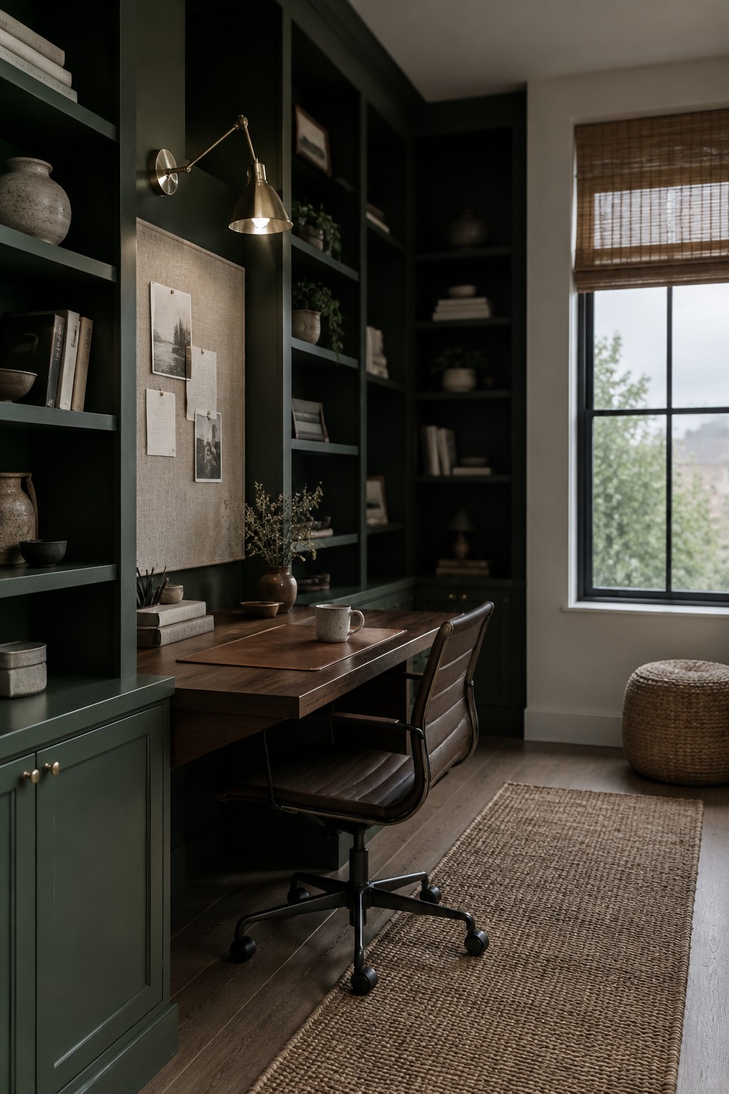
This looks like a deep, muted forest green with a slightly gray undertone. For similar shades, I’d look at Benjamin Moore Essex Green, Sherwin-Williams Pewter Green, or Farrow & Ball Studio Green. Using the color on both the walls and built-in shelves makes sense in a study, where a darker shade can feel settled rather than stark.
The warm wood desk keeps the green from reading too cool, while daylight from the window helps show its softer side. Try a sample on more than one wall first; in a dim room, this deep shade may look almost black.
Blush Walls With Sage-Green Trim
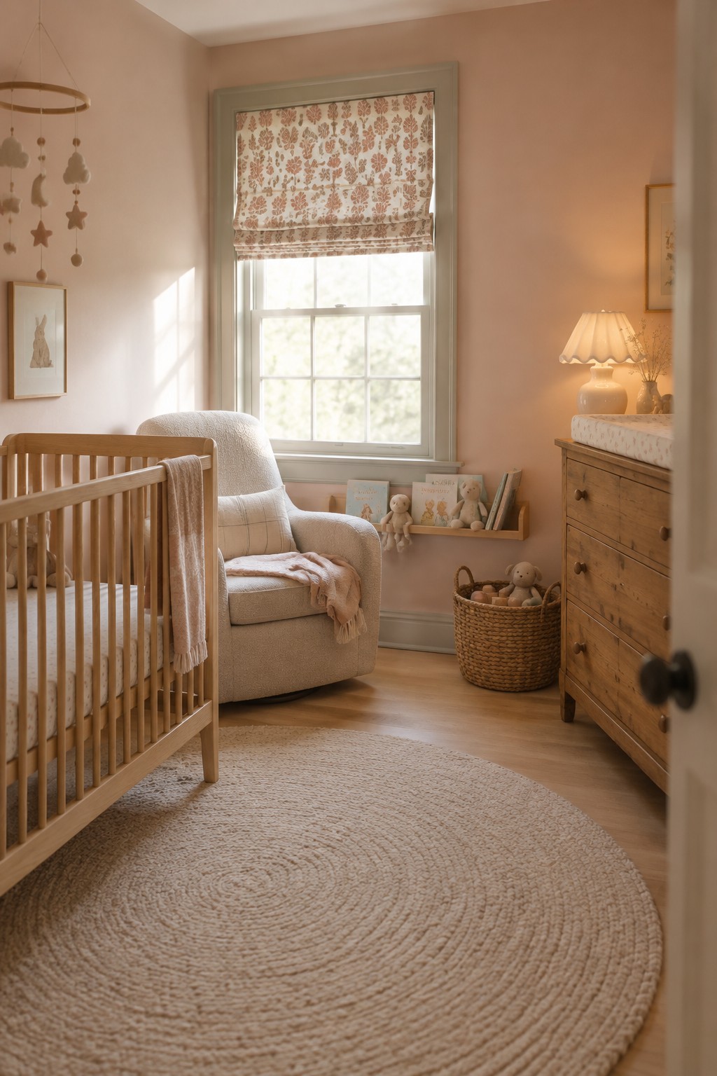
The walls look like a pale, warm blush, close to Benjamin Moore First Light or Sherwin-Williams Intimate White. It’s a soft color rather than a strong pink, so it can work well in a nursery or bedroom without taking over the room.
The muted sage-green window trim gives the blush a calmer, slightly earthy edge. In a room with warm wood flooring, this pairing feels gentle and easy to live with. Check a paint sample in both daylight and lamplight, since blush can look more peachy once the light gets warm.
Muted Sage Across Walls and Built-Ins
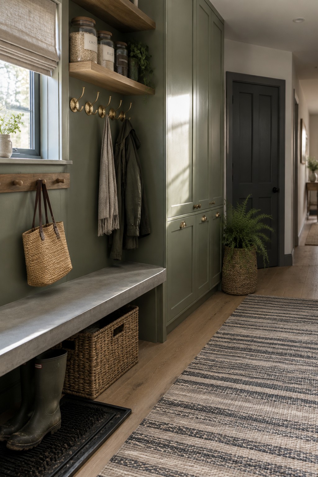
This interior uses a muted sage green that looks closest to Sherwin-Williams Clary Sage, Benjamin Moore October Mist, or Farrow & Ball French Gray. It is a soft, earthy green, and carrying it across both the entry walls and cabinetry makes the color feel like one considered choice rather than a small accent.
The green has a slightly gray cast, which suits the warm wood shelves and floor. It should work well in an entry or mudroom with some natural light; in a dimmer space, test a sample first, since this shade may read darker.
Slate Blue Door Against Warm Beige Walls

For this interior, the painted door reads as a muted slate blue, close to Benjamin Moore Boothbay Gray, Sherwin-Williams Stardew, or Farrow & Ball De Nimes. It is a calm blue-gray rather than a bright blue, and using it on one door gives a neutral hallway a little contrast without covering every wall in color.
The warm beige walls keep the cooler door from feeling stark, while the wood floor suits the natural, simple Japandi palette. This kind of blue-gray works well in an entry or hallway with warm wood and cream tones. Test a sample in the actual light first, since gray-blue paint can look more blue or more subdued from one part of the day to another.
A Dusty Blue-Gray Wall Beside Warm Wood
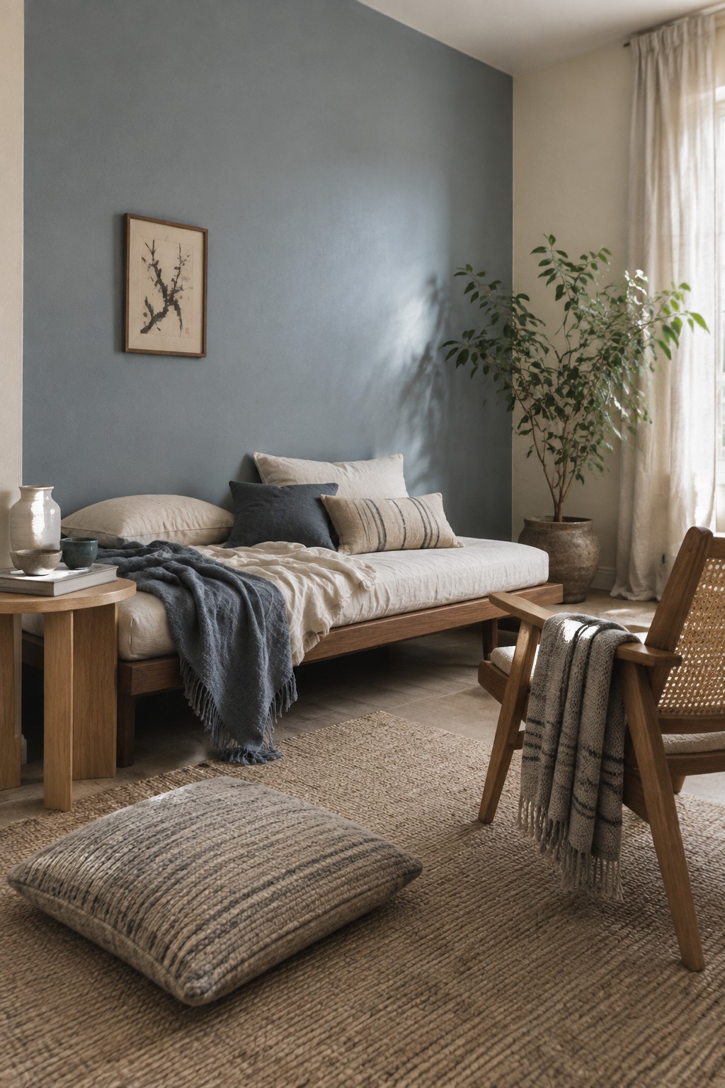
This wall looks like a muted blue-gray, close to Benjamin Moore Boothbay Gray, Sherwin-Williams Stardew, or Farrow & Ball Parma Gray. It has a quiet, slightly cool quality that suits a Japandi room without making the color feel stark. Against the warm wood bed frame, it feels settled and easy to live with.
In changing daylight, the gray may come forward more than the blue, so test a sample on the wall before painting the whole room. Cream and natural linen keep the combination gentle, while dark wood adds a little contrast.
Warm Taupe Built-Ins Beneath a Skylight

This looks like a warm taupe, a brown-leaning neutral that could suit built-ins or a small home office. Close matches might include Sherwin-Williams Accessible Beige, Benjamin Moore Pashmina, or Farrow & Ball Mouse’s Back. It gives the shelves and desk a quieter look than bright white paint.
The shade appears deeper inside the shelving, while daylight from above keeps the overall color from feeling too heavy. It pairs naturally with the pale wood desktop, but sample it in the room first, since taupe can look quite different in low light.
Rust-Toned Island With Pale Marble
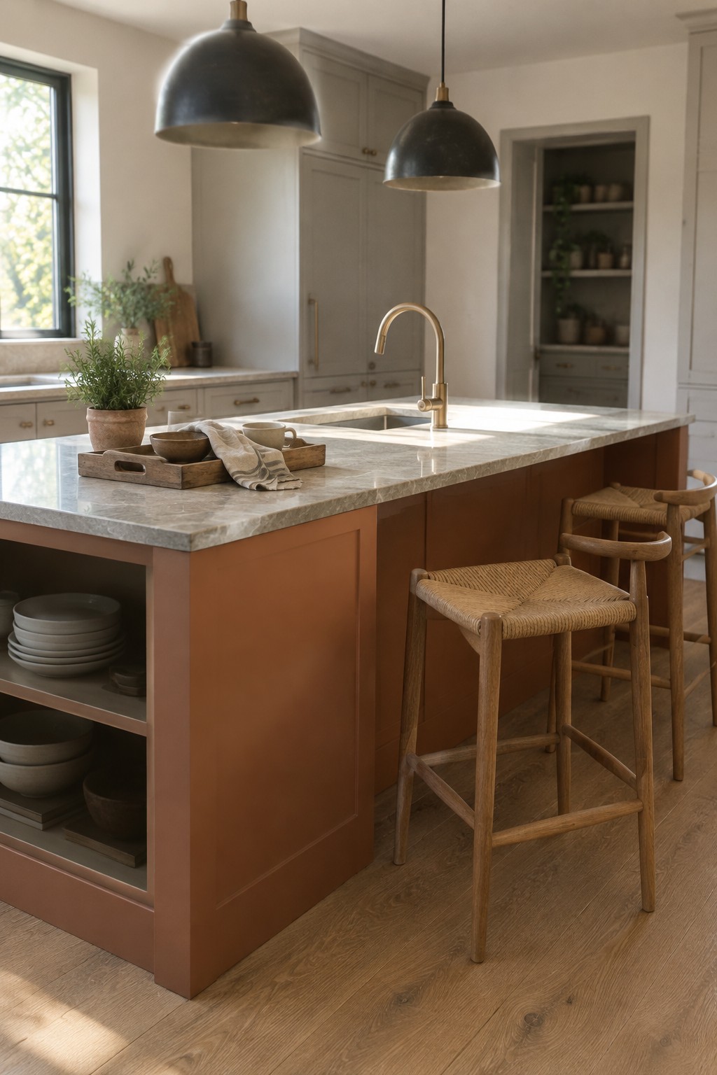
A muted terracotta or rust-red paint looks like the closest color idea for this kitchen island. It’s a warm, earthy shade, but the pale marble countertop keeps it from reading too dark. The color is a good way to bring warmth to a kitchen without painting every cabinet.
This kind of red can shift more orange in bright light, so test a sample beside your flooring before committing. It pairs naturally with warm wood and simple cream or white finishes; cooler gray accents may make it look dull.
Charcoal Vanity With a Fluted Wood Face
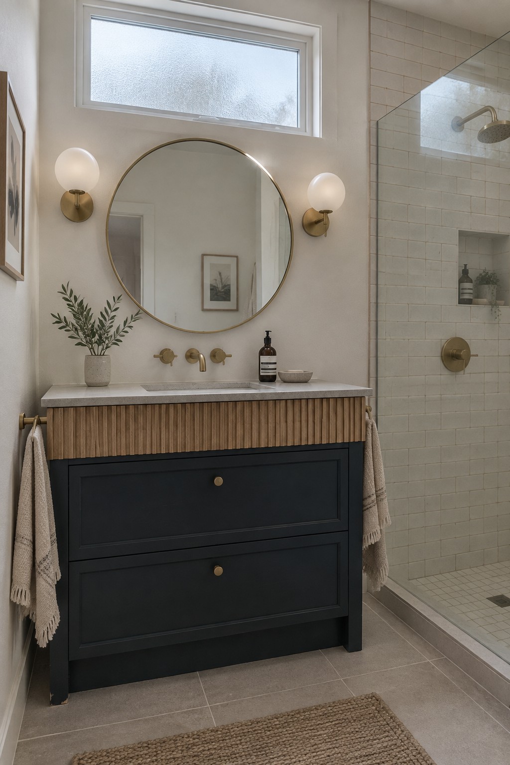
This is a deep charcoal paint color, likely close to Sherwin-Williams Iron Ore, Benjamin Moore Kendall Charcoal, or Behr Cracked Pepper. It gives the vanity a dark, clean outline without the starkness of pure black, while the natural wood front keeps the look from feeling too cold.
Brass hardware and the pale stone counter suit this color well. In a small or dim bathroom, test a sample first, since charcoal can read nearly black when there isn’t much natural light.
Olive Walls Around the TV Nook

This looks like a muted olive green, close to Benjamin Moore Tate Olive, Sherwin-Williams Ripe Olive, or Farrow & Ball Olive. It is a deep, earthy color, but the softer undertone keeps it from reading as a stark dark green. Using it inside a recessed wall area gives the TV a quieter place to sit without painting the whole room dark.
The shade will look warmer beside the oak flooring and wood console, especially in a room with good natural light. It could work well around a media nook or fireplace, though a small, dim room may make it feel heavier than expected.
Warm Greige Walls With Woven Wood
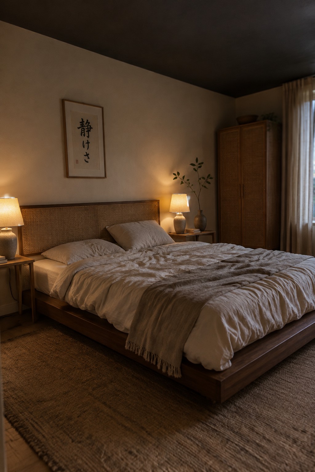
For this bedroom, I’d place the wall color near a warm greige, with likely matches such as Sherwin-Williams Accessible Beige, Benjamin Moore Edgecomb Gray, or Behr Wheat Bread. It’s a quiet, mid-light neutral that suits a bedroom without reading stark or overly yellow.
The warm wood headboard helps the greige feel natural, while soft white bedding keeps the palette from becoming too dark. Check a sample in both daylight and lamplight, since warm evening bulbs can make this kind of neutral look more beige.
Frequently Asked Questions
Q: How do I choose a dominant color for a Japandi room?
A: Start with a warm neutral you can live with every day, such as ivory, sand, or soft greige. Use it on the largest surfaces, then bring in darker or more muted accents for depth.
Q: Can Japandi style include black without making a room feel harsh?
A: Yes. Try black in small doses, such as a lamp, chair frame, or cabinet pull, against warm wood and lighter walls. That contrast adds definition without taking over the room.
Q: What accent colors work well with Japandi neutrals?
A: Muted green, clay, and dusty blue pair naturally with warm neutrals. Choose one accent and repeat it in a few places, like a cushion and a piece of pottery, rather than spreading several colors around.
Q: How can I test a color scheme before painting the whole room?
A: Paint a sample on a large piece of paper and move it around the room at different times of day. Natural and artificial light can shift a color more than you might expect.
