


I like how limewash gives Japandi rooms a soft, uneven finish, though its color can shift as daylight moves across the walls.
Warm whites, muted greens, and earthy browns often look calm on their own, but nearby wood, stone, and upholstery can bring out undertones that are easy to miss on a small paint chip.
Trim matters too, since a crisp white edge can make a muted wall color feel cooler while natural wood keeps it grounded.
The best shades leave room for texture rather than making every surface compete for attention.
I’d test a few samples on different walls and check them in morning and evening light before settling on a palette.
Muted Sage Limewash With Warm Wood
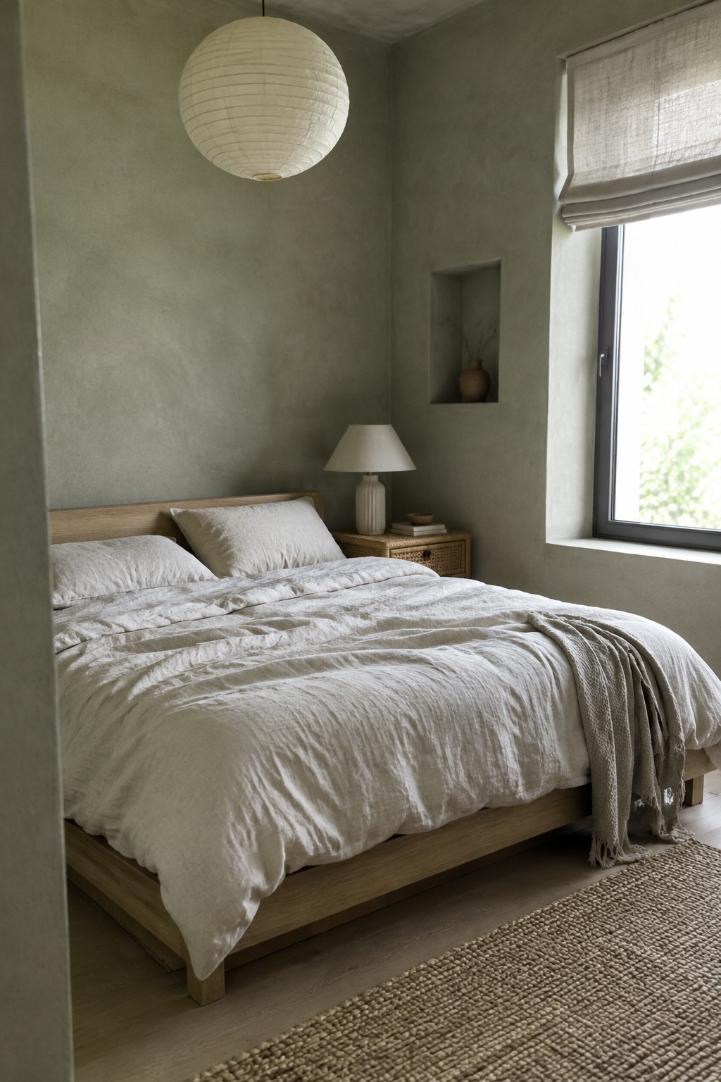
This muted sage limewash reads as a soft gray-green, with an earthy undertone rather than a clear, leafy green. It looks closest to a pale sage such as Benjamin Moore October Mist, Sherwin-Williams Clary Sage, or Farrow & Ball Mizzle. The gentle variation in the limewash finish suits a bedroom where a smooth, even wall color might feel a little plain.
The warm wood bed helps the green feel comfortable instead of cool. In a room with less daylight, this shade may look grayer, so test a sample on more than one wall before painting the whole room.
Warm Greige Limewash Beside Dark Wood

This wall color reads as a warm greige, with a soft taupe cast rather than a cool gray. It looks closest to Benjamin Moore Pale Oak, Sherwin-Williams Accessible Beige, or Farrow & Ball Skimming Stone, though the exact match is hard to pin down from a photo. A limewash finish gives the color a gentle variation that suits a relaxed Japandi room.
The dark wood cabinetry makes the wall feel lighter without turning it stark. Try this kind of greige in a living room with warm wood floors, and test a sample in both daylight and evening light, since the taupe undertone can become more noticeable as the room gets dimmer.
Muted Olive Limewash Beside Warm Oak

This kitchen’s wall color reads as a warm, muted olive, though it could shift a little with the light. For an unbranded match, I’d look at Benjamin Moore Louisburg Green, Sherwin-Williams Ripe Olive, or Farrow & Ball Treron. The soft, uneven limewash finish keeps the earthy color from looking too uniform.
It works well with the honey-toned oak cabinetry because both have a natural warmth. Try a sample on more than one wall before committing; in a dimmer kitchen, this olive may look considerably deeper.
Warm Greige Walls Beside Dark Wood

This entry’s walls read as a warm greige, a soft beige-gray that suits a quiet Japandi palette. The closest matches may be Benjamin Moore Pale Oak, Sherwin-Williams Accessible Beige, or Farrow & Ball Skimming Stone. The muted color feels gentle rather than stark, and it works well in an older home with traditional trim.
The shade looks a little deeper in the dim hallway, so test a sample there before painting. It pairs naturally with the dark wood floor and would also suit limewash for a softly varied finish.
Blue-Gray Limewash Around an Arched Nook

This interior reads as a muted blue-gray, with a soft, chalky limewash finish. It looks closest to colors like Benjamin Moore Smoke, Sherwin-Williams Debonair, or Farrow & Ball Parma Gray, though the exact match is hard to pin down from a photo. The subtle variation in the finish keeps the cool color from feeling too flat.
Here, the same color carries into the arched shelves, so the niche feels like part of the wall rather than a separate feature. Warm wood furniture is a useful pairing for this blue-gray; in a room with little daylight, test a sample first, since the color may look cooler and darker.
Pale Green Tile With Warm Wood
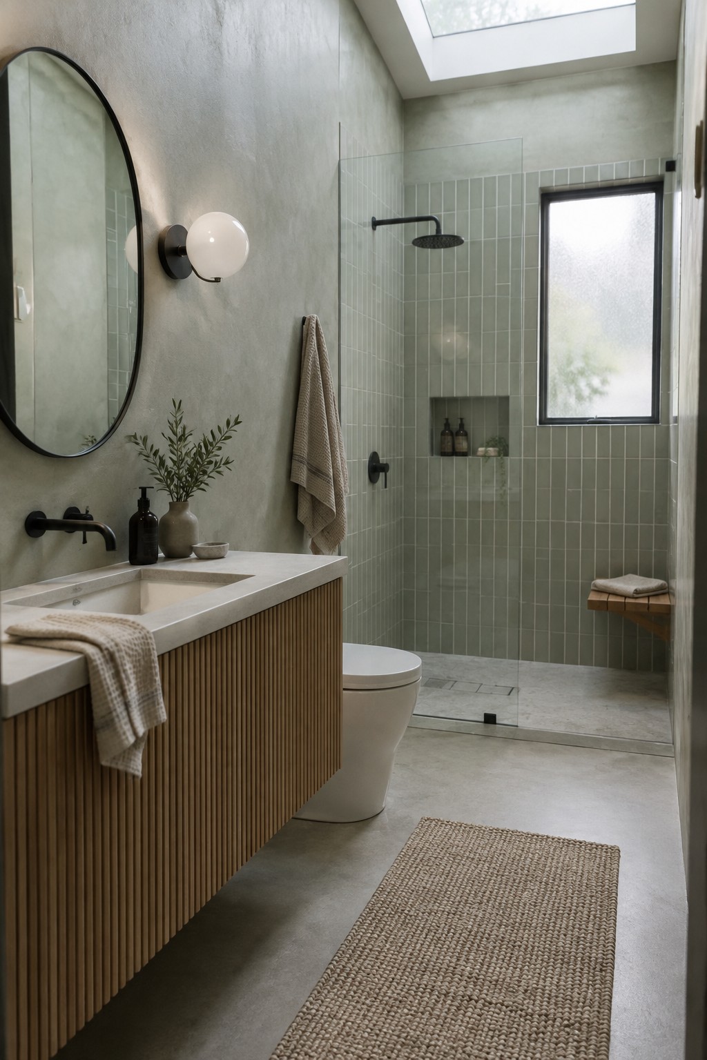
A pale, gray-green paint color would suit this Japandi bathroom, though the wall tile appears to carry most of the color here. For a similar limewash look, I’d consider Benjamin Moore October Mist, Sherwin-Williams Clary Sage, or Farrow & Ball Mizzle. Each has a muted, earthy quality that works well in a bathroom without feeling too bright.
The tall window and skylight give this soft shade plenty of daylight, while the wood vanity keeps it from reading cold. Try a sample on the wall before committing, since green can shift noticeably with changing light. It pairs easily with warm wood and pale stone.
Terracotta Limewash Beside Dark Wood
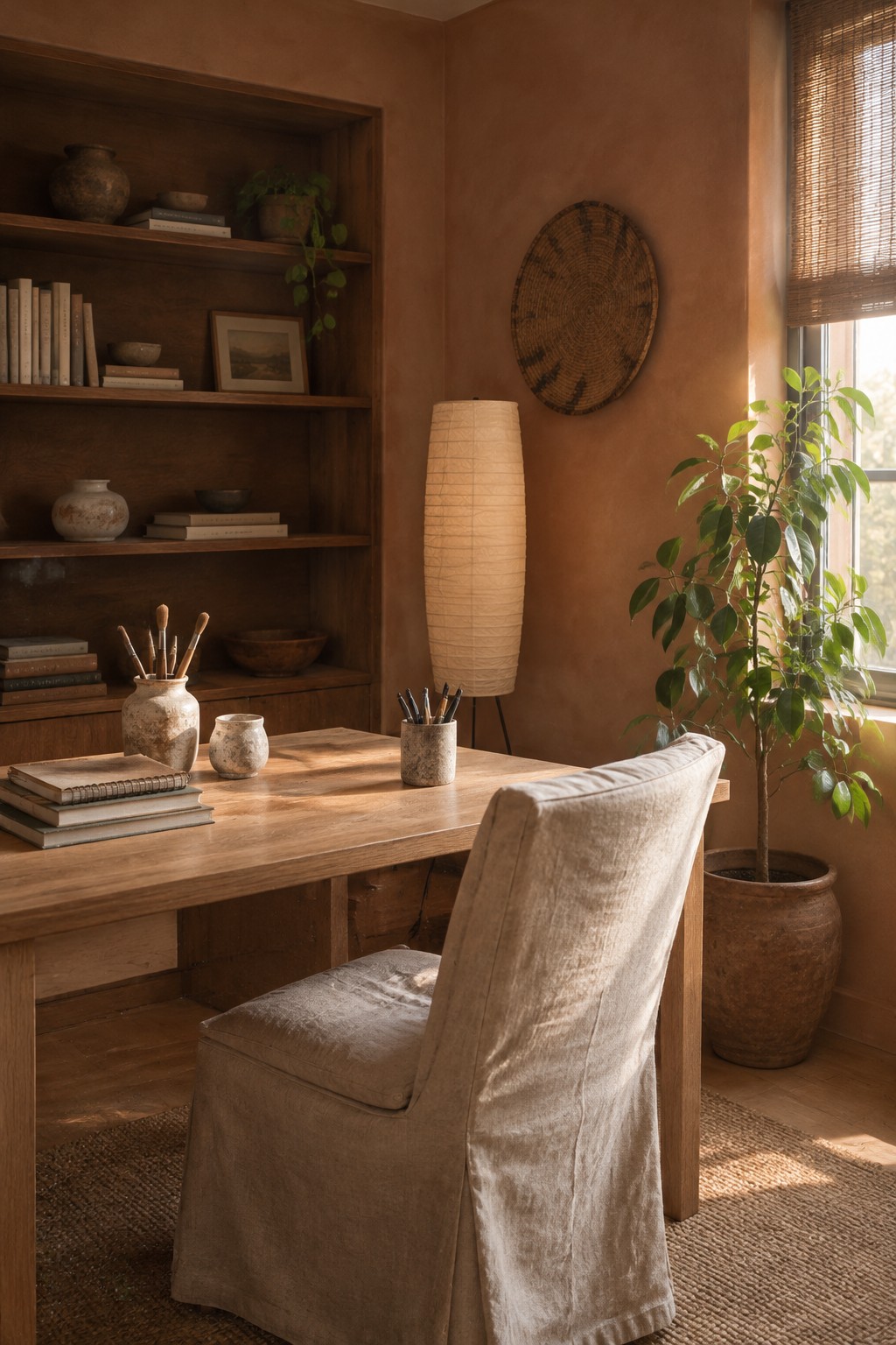
A warm terracotta-brown limewash is a good fit for a Japandi room that needs more color than beige but still feels quiet. The exact shade is hard to pin down from a photo, but it reads close to Benjamin Moore Adobe Dust, Sherwin-Williams Cavern Clay, or Farrow & Ball Red Earth.
The limewash finish gives the color a soft, uneven look rather than a flat painted surface. It works especially well with dark wood, which keeps the warm walls from feeling too orange. Test a sample in different light first, since this family can look quite strong in a small room.
Pale Blue-Green Limewash Beneath a Skylight

This looks like a pale blue-green limewash, close to Benjamin Moore Gray Cashmere or Sherwin-Williams Sea Salt, though the exact match is hard to pin down from a photo. The muted color gives the nursery walls a soft, cloudy finish without making the small room feel dark.
Its cool gray undertone may read bluer in some light, so test a sample on more than one wall first. Pale wood furniture suits it well, and a warmer white on the ceiling can keep the room from feeling too chilly.
Warm Ochre Limewash in a Narrow Hallway
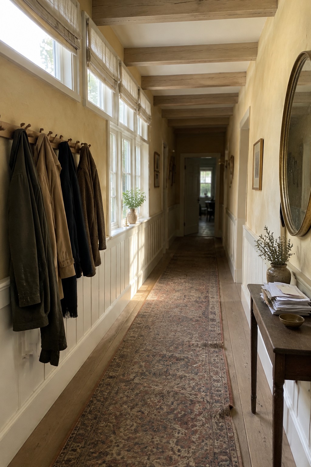
A muted warm ochre, close to a soft yellow-beige limewash, would suit this hallway. For ready-made color matches, look at Benjamin Moore’s Muslin, Sherwin-Williams’ Maison Blanche, or Farrow & Ball’s String. The earthy color gives a long passage a little more warmth than plain white without making it feel too dark.
Daylight from the tall windows will bring out the yellow undertone, while the wood ceiling beams and floor keep the palette natural. Test a sample in both bright and shaded parts of the hall, since limewash can vary across a long wall.
Warm Taupe Limewash Around Built-In Shelves

Warm taupe limewash seems closest to a soft mushroom beige, with possible matches like Benjamin Moore Edgecomb Gray or Sherwin-Williams Accessible Beige. It gives a small pantry a muted, earthy feel without making the walls look stark or too dark.
The shade has a gentle brown undertone that suits the wooden shelves and counter. In a room with limited daylight, test a sample first, since taupe can read deeper in shade.
Charcoal-Gray Limewash With Pale Stone

A muted charcoal-gray limewash seems closest to this kitchen’s main wall color. It has a soft, cloudy finish rather than a flat, solid look, and its cool gray tone suits a quiet Japandi palette. The pale stone countertop keeps the darker walls from feeling too heavy.
In window light, this gray can read a little lighter, while shaded corners may look more charcoal. Try it in a kitchen with good natural light, and pair it with pale wood or simple cream cabinetry. Test a sample first, since limewash can vary across the wall.
Olive Limewash With a Fluted Wood Vanity
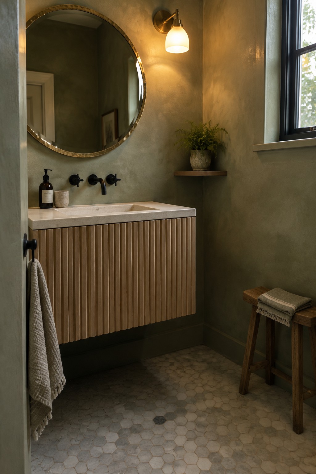
This wall color reads as a muted olive green, with a soft, earthy cast. For an unbranded match, I’d look at Benjamin Moore October Mist, Sherwin-Williams Evergreen Fog, or Farrow & Ball Mizzle. The limewash finish gives the small bathroom walls gentle variation, while the wood vanity keeps the green from feeling too cool.
The shade can look more gray in dim corners and greener in brighter light, so test a sample on more than one wall before committing. It works well with warm wood and pale stone, and a creamy white on nearby trim can keep the room from becoming too dark.
Warm Rose Limewash Beside Natural Wood

Warm rose-beige limewash gives these walls a muted, earthy color rather than a clear pink. It looks closest to shades such as Benjamin Moore First Light, Farrow & Ball Setting Plaster, or Sherwin-Williams Redend Point, though the exact match is hard to confirm from a photo. The soft variation in limewash keeps the color from looking too uniform.
This shade suits a relaxed living room, especially with natural wood and cream-colored fabrics nearby. It can read more peachy in warm light, so test a sample on the wall before painting the whole room.
Warm Greige Limewash Beside Terracotta Tile

A warm greige limewash is a good fit for this entry, though the exact shade is hard to pin down from a photo. It sits between beige and gray, with an earthy cast that suits a wabi-sabi Japandi palette. The softly varied finish keeps the neutral from looking too flat.
Terracotta floor tiles bring out the warmer side of the color, so I’d test samples in the entry’s natural light before choosing a shade. Look at warm greiges such as Sherwin-Williams Accessible Beige, Benjamin Moore Pale Oak, or Farrow & Ball Skimming Stone.
Terracotta Limewash Beside Dark Wood
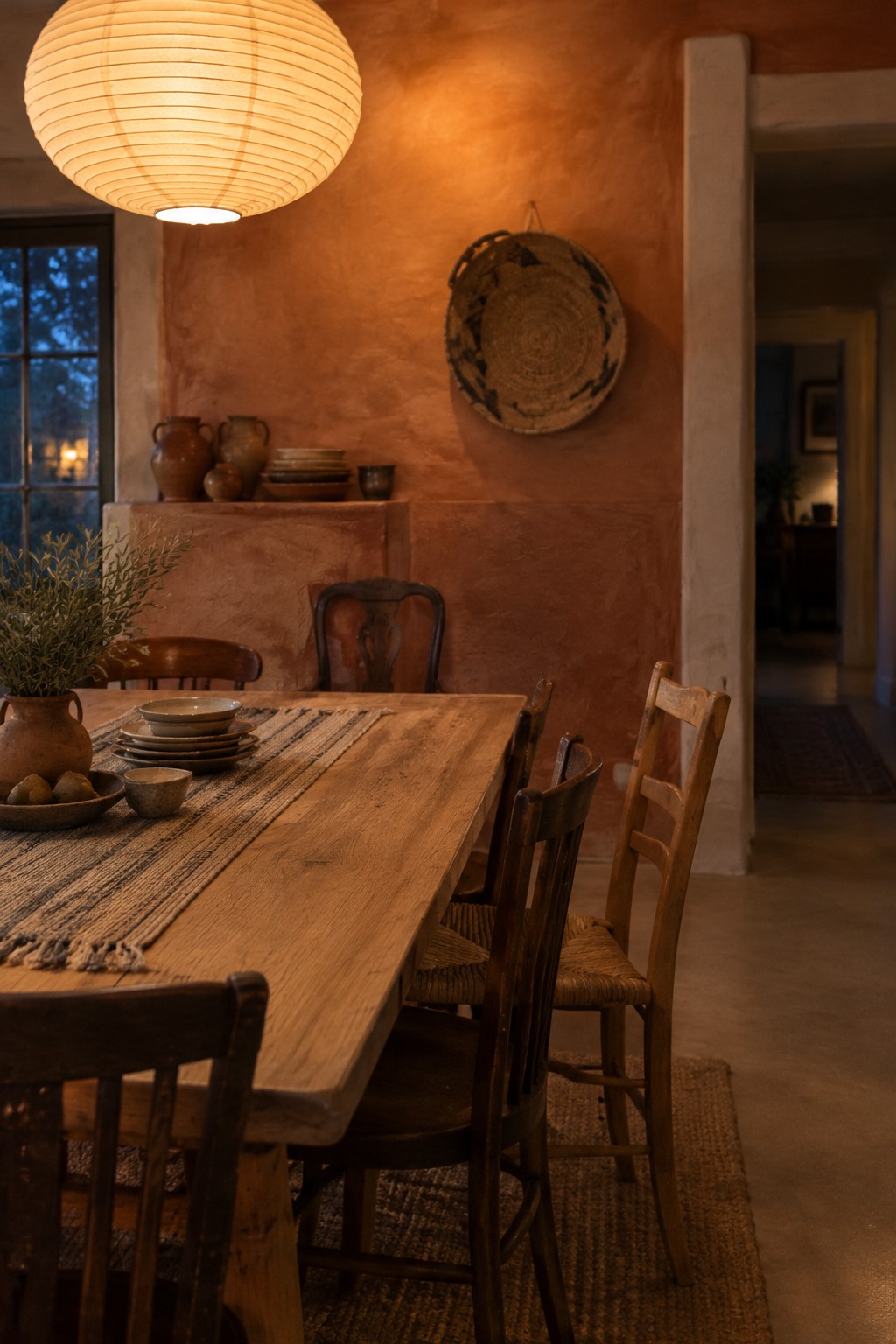
This warm terracotta wall color looks closest to a muted clay or rust shade, with a soft, uneven limewash finish. It gives the dining area a cozy feel without needing a brighter, more saturated orange. For similar colors, look at Benjamin Moore Potters Clay, Sherwin-Williams Cavern Clay, or Farrow & Ball Red Earth.
The finish can vary a little across the wall, which suits the rustic wood table and chairs. It works well in a dining room with warm wood, though a sample is worth testing first since terracotta can read quite dark in a room with limited daylight.
Warm Taupe Limewash Beside Dark Wood
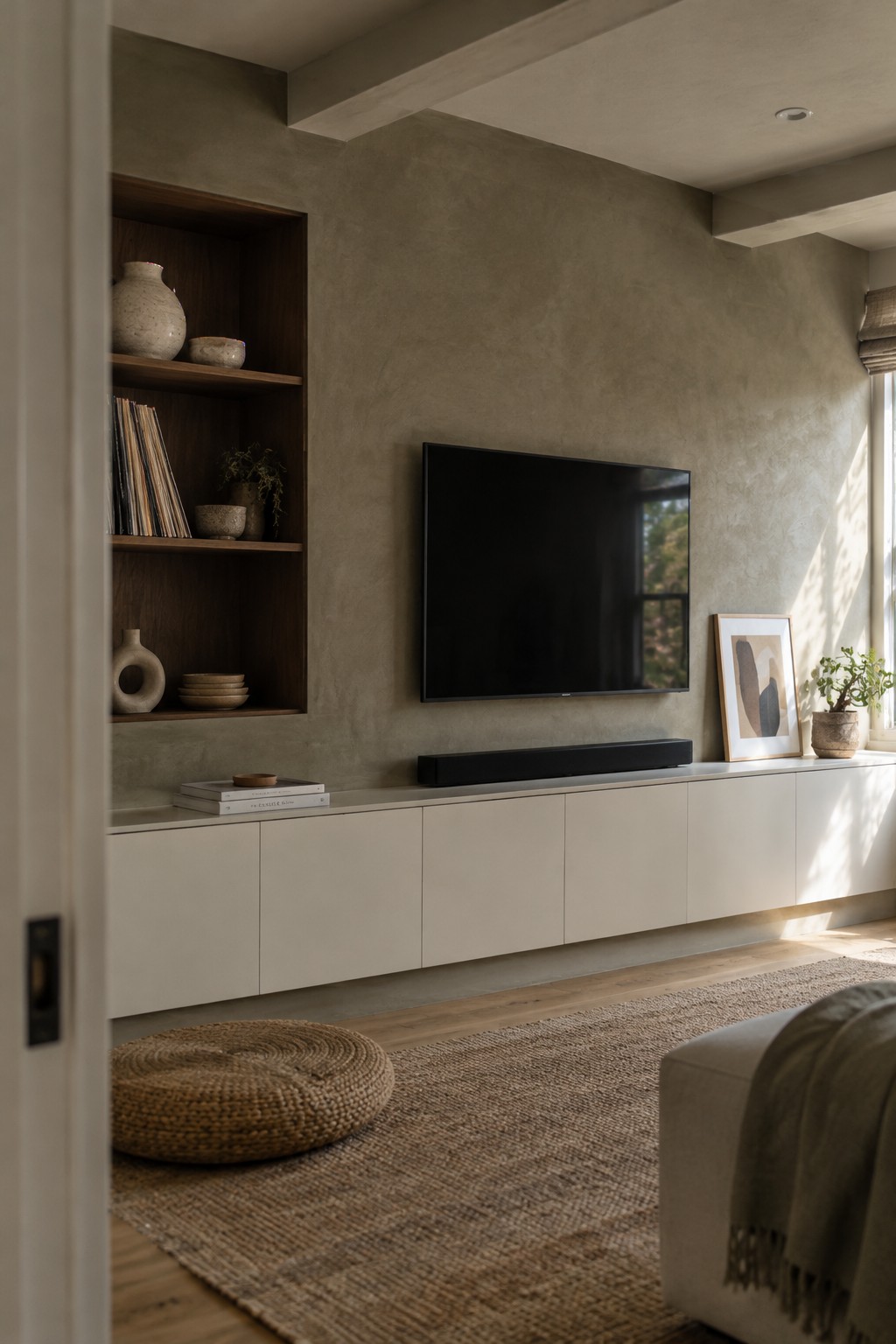
This warm taupe limewash reads as a soft, earthy neutral, with a slight gray cast that keeps it from looking too beige. It would suit a Japandi living room where you want a little wall texture without a strong color statement. A close match might be Benjamin Moore Pashmina, Sherwin-Williams Tony Taupe, or Farrow & Ball Elephant’s Breath, though the exact shade is hard to pin down from a photo.
The dark wood shelving makes the lighter wall color feel more distinct, while the limewash finish keeps the overall effect gentle. Try samples on more than one wall, since daylight can shift taupe toward gray or brown.
Warm Blush Limewash in a Small Bathroom

A muted blush-pink limewash is the main paint idea here. It reads as a warm, dusty pink rather than a bright pastel, and it gives a small bathroom a softer feel without making the walls look plain. Similar shades might include Farrow & Ball Setting Plaster, Benjamin Moore First Light, or Sherwin-Williams Intimate White.
The color’s earthy undertone works well with the patterned floor tile and warm brass. In a bathroom with limited daylight, test a sample first, since blush can look more beige or more pink as the light changes.
Plum-Brown Limewash Behind a Cane Bed
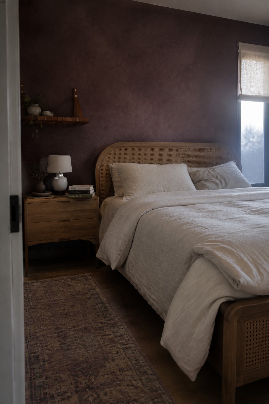
A deep plum-brown is the main paint idea here, with a soft, uneven limewash finish that keeps the wall from reading as a flat dark brown. It looks close to Farrow & Ball Pelt or Benjamin Moore Dark Burgundy, though the exact shade is hard to pin down from a photo. This kind of muted, earthy color works well when you want a bedroom to feel cozy without using a stark charcoal.
The color leans warm beside the cane headboard and dark wood, while daylight from the window brings out its softer, slightly dusty side. Try it on one bedroom wall first, since a shade this deep can feel heavy in a room with little natural light. Cream or linen-colored bedding is an easy pairing.
Frequently Asked Questions
Q: How do I keep limewash walls from making a small room feel too dark?
A: Choose a light, warm shade like soft cream, pale clay, or muted sage, and test it on a large patch of wall first. Limewash shifts with the light, so check the sample in the morning and evening before committing.
Q: What colors work well with limewash in a Japandi room?
A: Pair the wall color with natural wood, linen, and a few grounded accents such as charcoal, rust, or olive. Keeping the accents muted lets the wall’s soft variation do its thing.
Q: Can I use limewash in a bathroom or kitchen?
A: Yes, but choose a suitable finish for the room and protect areas that get splashed often. In a bathroom, keep limewash away from the direct shower spray unless the product is designed for wet zones.
Q: How do I add color without losing the calm, wabi-sabi feel?
A: Start with one or two earthy colors in small touches, like a cushion, ceramic bowl, or artwork. A little unevenness and wear can feel right here, so the room doesn’t need to look perfectly matched.
