

I’ve spent time walking neighborhoods noticing how a house’s exterior colors either pull you in or make you drive past without a second glance. The best ones play off the facade’s materials, like siding or brick, and frame the entryway without competing with the roofline. I once mocked up a couple of palettes on our trim to check curb appeal at dusk, and it showed me right away which felt grounded in real light. Colors that harmonize like that boost the whole street view. These draw from setups worth adapting to your own home’s lines and surroundings.
White Siding with Navy Shutters
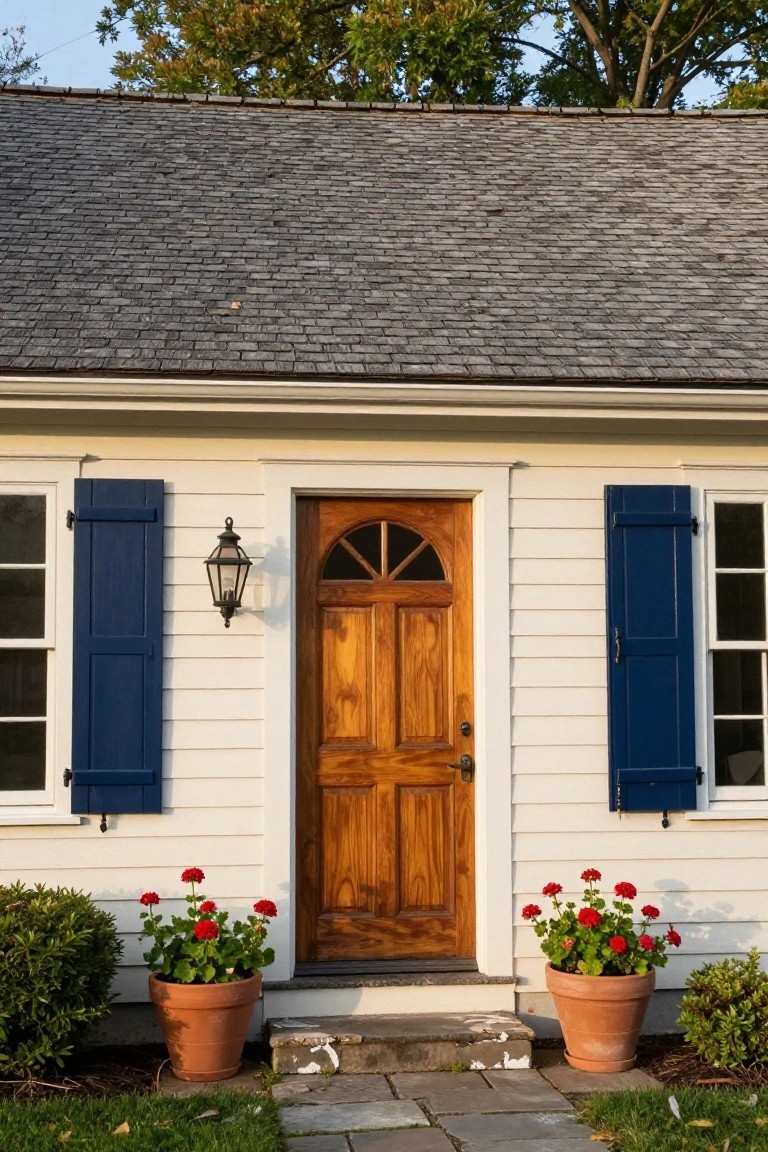
This setup takes basic white clapboard siding and adds navy blue shutters on the windows. A warm wood door sits right in the middle, with a simple lantern light next to it. The colors play off each other nicely. White keeps things bright and clean. Navy gives some weight without going dark. And that wood door brings in natural tones that feel right at home.
Try it on smaller houses like colonials or capes. It suits older neighborhoods where you want to fit in but stand out a bit. Pot up some red geraniums by the steps for extra color. Just keep the plantings simple so they don’t take over. Works best if your roof is neutral, like dark gray slate.
Neutral Gray House with Sage Green Door
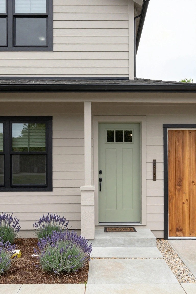
This look uses a soft beige-gray siding that feels calm and easy on the eyes. Black frames around the windows and a simple porch post add some crisp lines without overdoing it. Then the sage green front door steps in as the main color note. It gives the entry a fresh welcoming feel that pulls you right up the steps. Lavender plants nearby pick up a purple hint that ties in nicely too.
Try this on a single-story ranch or craftsman style home where you want subtle charm. The gray keeps things low-key for neighborhoods with rules on bold colors. Pick a green door with some texture like panels for interest. Pair it with natural wood on the garage to warm things up. Just make sure the plants stay neat so they don’t steal the show.
Turquoise Siding for Beach Houses
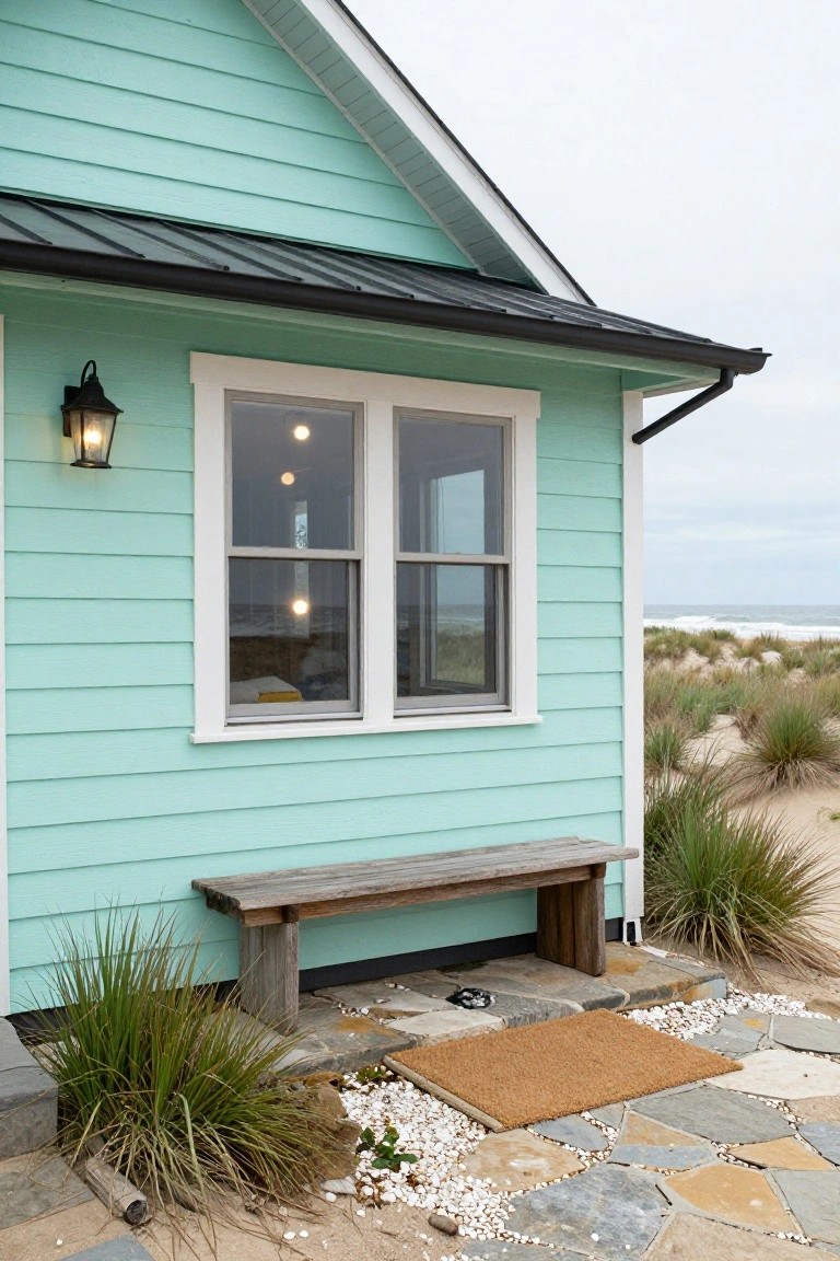
This light turquoise clapboard siding gives a beach house that fresh ocean feel right away. It picks up the color of the sea and sky without being too bold. Paired with a black metal roof and white window trim, it keeps things crisp and simple. The weathered bench out front adds a casual touch that fits the relaxed vibe.
Try this look on cottages or smaller homes near the water. It works best where you want color but not a lot of fuss. Stick to clean lines on windows and doors so the siding stays the star. Avoid darker shades nearby or it might feel heavy.
Classic Adobe Stucco Exterior
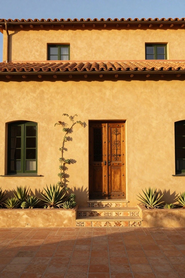
Soft beige stucco walls like this one catch the light just right. They work well with a terracotta tile roof and matching steps around the entry. The warm tones feel grounded and easy on the eyes. That wooden door adds a bit more depth without overdoing it.
This palette suits sunny spots, like the Southwest or Mediterranean-style homes. Paint your walls in a similar sandy beige, then echo it with terracotta on roof or pavers. Green plants along the base bring some life… keeps things from feeling too uniform.
Black Brick Exterior with Wood Canopy
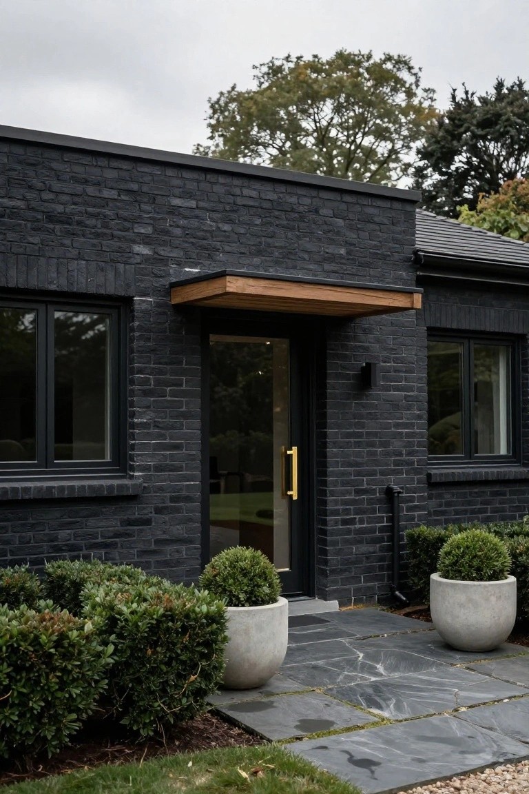
Black brick gives this house a strong, modern edge that feels right at home in a wooded setting. The slim wood canopy over the entry pulls in some warmth without softening things too much. Paired with a gold door handle and simple boxwood pots, it keeps the look clean and a bit dramatic.
Try this on a newer build or a renovated older home where you want curb appeal that stands out. Stick to dark slate paths and white pots to let the brick and wood do their thing. It works best when the landscaping stays low-key… no big flower beds needed.
Green and White House Exterior
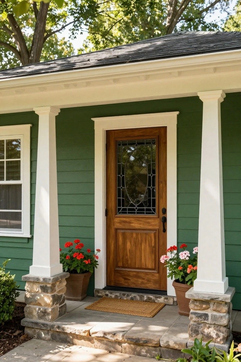
A soft green siding like this gives a house a calm, natural feel that blends right into tree-lined neighborhoods. The crisp white trim on the porch columns and roofline keeps things clean and bright. That dark wood door with its glass insert pulls it together without overpowering, and a couple pots of red geraniums add just the right pop of color.
This combo works best on bungalow or cottage-style homes where you want approachable curb appeal. It suits shady spots or cooler climates since the green reads deeper there. Skip super glossy paints though. Matte finishes hold up better and let the house settle in nicely.
Soft Gray Siding with Black Trim
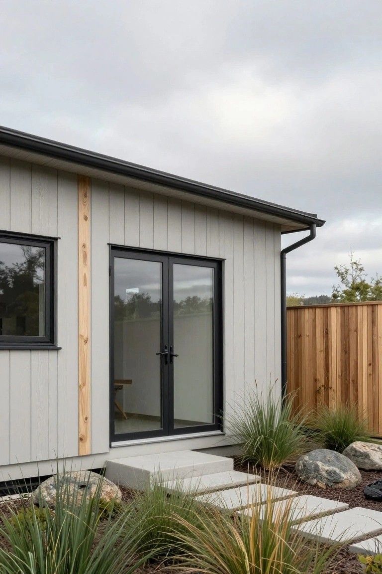
Gray siding in a soft tone like this keeps a house looking fresh and simple. It pairs nicely with black frames on the windows and doors for a crisp edge. That one tall wood beam running up the side brings in a bit of natural color without overdoing it.
This setup fits ranch-style homes or modern sheds in backyard spots. Use concrete steps out front and keep plants low like grasses around the base. It holds up well in cloudy areas where you want the house to blend a little with the sky.
Classic White House with Red Door
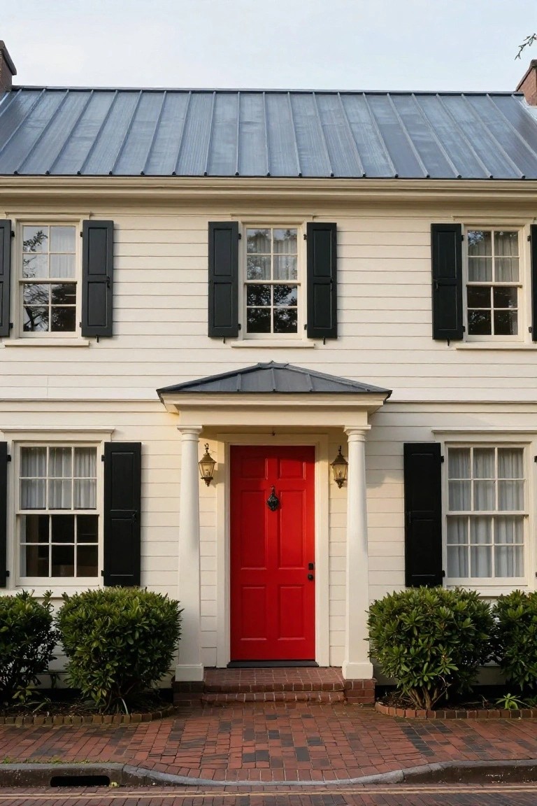
A white house like this one keeps things simple and clean. The black shutters add some shape without fuss, and that red door right in the middle pulls your eye straight to the entry. It’s a look that’s been around forever but still feels fresh, especially on older style homes. The gray metal roof ties it in without stealing the show.
Try this on a colonial or farmhouse type house where you want curb appeal without a big remodel. Paint the door a true red, not too bright, and keep the rest neutral. Boxwoods or low shrubs on the sides help frame it. Works best where the brick path or walkway leads right up, making the door the welcome spot.
Warm Beige Stucco with Wood Door
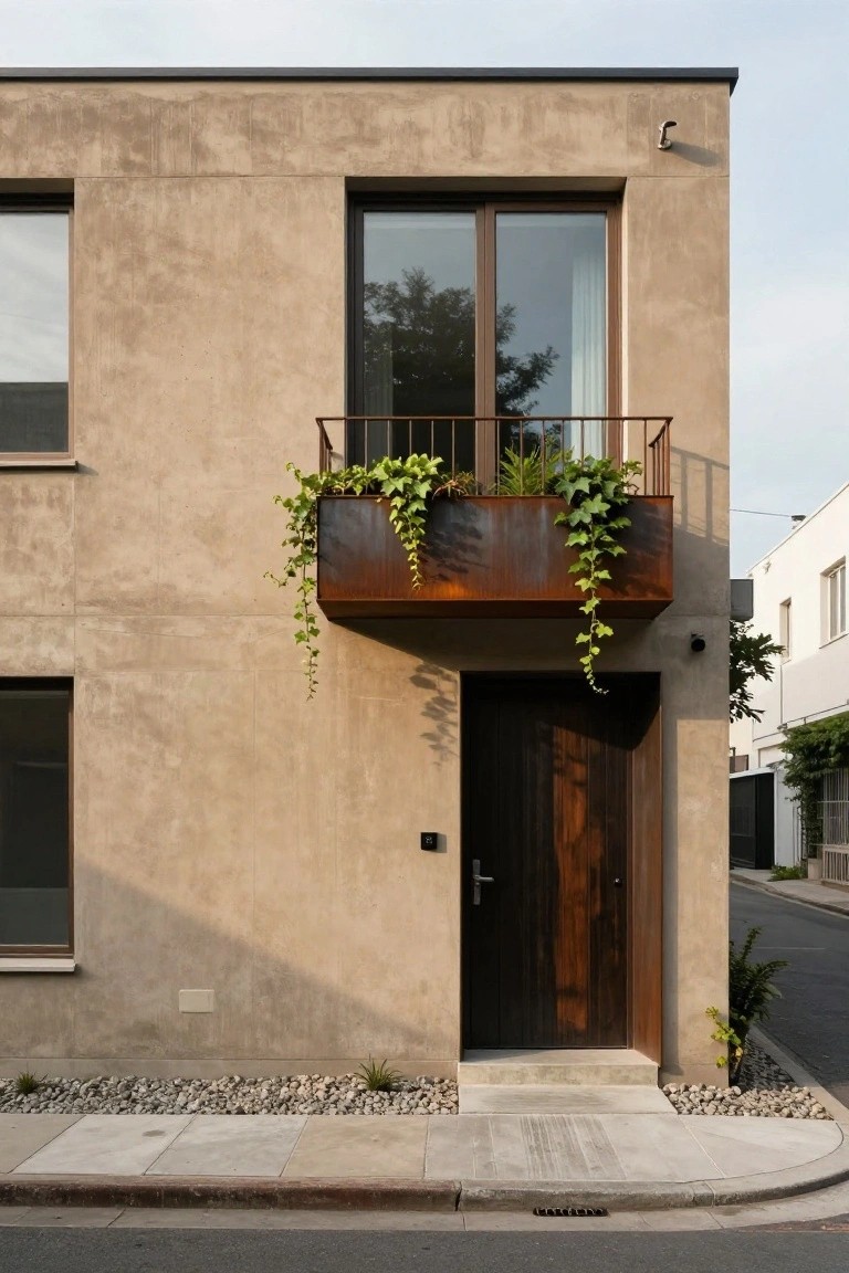
A warm beige stucco finish on the house walls gives this exterior a soft, grounded look that feels right at home in a neighborhood setting. Paired with a dark wood front door, it keeps things simple and welcoming without much fuss. That rusty metal planter box overflowing with ivy adds just a touch of rust and green to pull it all together nicely.
This palette works best on modern or minimalist homes where you want curb appeal that doesn’t shout. Use it on single-story or low-profile houses, especially with some gravel mulch around the base to keep maintenance low. Skip it if your area gets too much direct sun, as the beige can show dirt faster than darker shades.
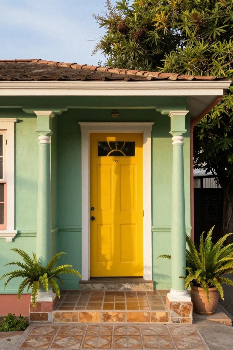
Turquoise Exterior with Yellow Door
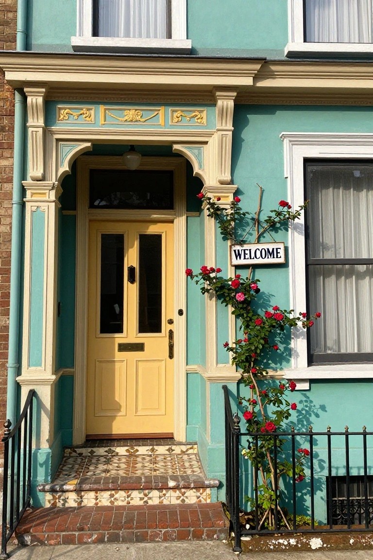
A turquoise house exterior paired with a yellow front door gives your home a fresh, cheerful look that stands out on the street. The bold blue-green walls work well with cream trim around the windows and entry, and those climbing red roses along the side pull in a bit of color without overdoing it. It’s a simple way to add personality to a traditional facade.
This combo suits older homes like rowhouses or cottages in milder climates where the colors won’t fade too fast. Pick a durable exterior paint, and keep the roses trimmed back from the door. It brightens up shady streets… or anywhere you want more curb appeal without a full redo.
White Siding with Green Doors
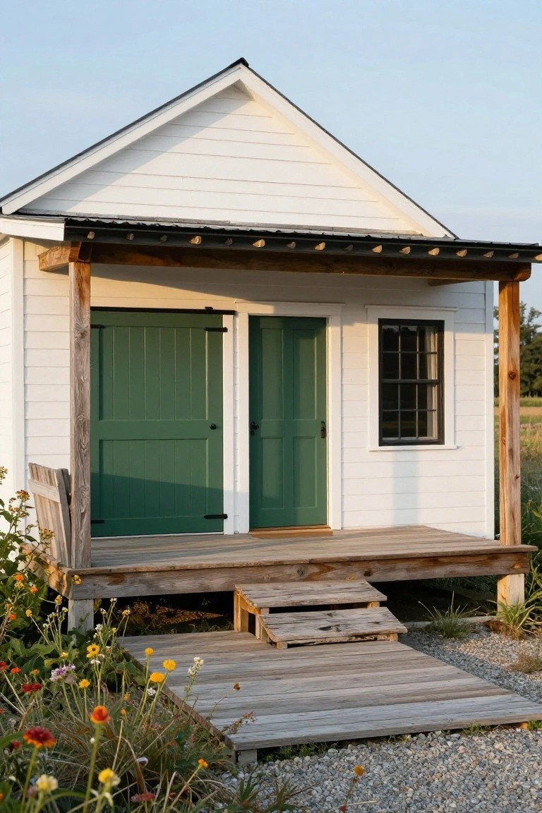
A straightforward pairing of crisp white clapboard siding and deep green doors works well on small structures like this one. White keeps the look light and timeless. Green on the doors pulls in the outdoors without overwhelming things.
Try it on a garden shed, playhouse, or cottage where you want curb appeal on a budget. It suits rural spots or yards with wildflowers nearby. Pick a true green, not too bright, so it ages nicely with wood trim.
Soft Ochre Stucco Entryway
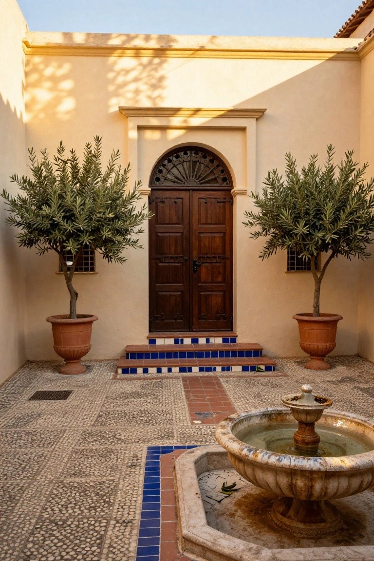
A soft ochre stucco gives this courtyard entry a warm glow that picks up the sunlight just right. The dark wood door pulls focus without overpowering, and the blue tiles on the steps bring in a bit of brighter color that ties back to Mediterranean roots. Potted olive trees in terracotta add some green life on both sides.
This palette suits older homes or new builds aiming for a relaxed Spanish or Moroccan vibe, especially around patios or smaller front entries. Use it where you want low-key curb appeal that ages well. Keep the stucco clean and the wood sealed, and it holds up nicely over time.
Pale Blue Walls with Wood Frames
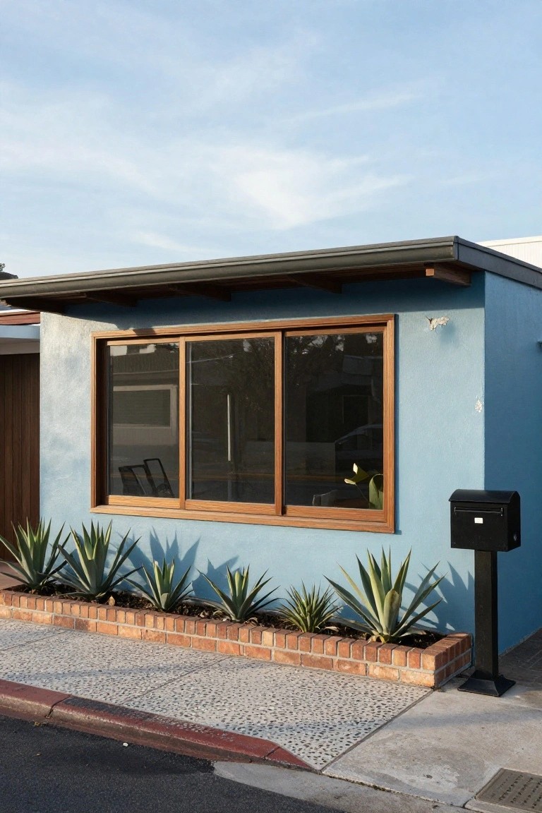
A soft pale blue on the house walls looks clean and relaxed, especially with warm timber frames around the big sliding windows. That blue isn’t too bright. It picks up the sky on a clear day and stays easy on the eyes. The wood adds just enough contrast to keep things from feeling cold.
This setup works great on ranch-style or simple modern homes, particularly in coastal or dry areas. Line the base with tough plants like agaves in a brick edge. Skip busy trim. The combo holds up to sun and gives steady curb appeal.
Blue Timbers on Cream Walls
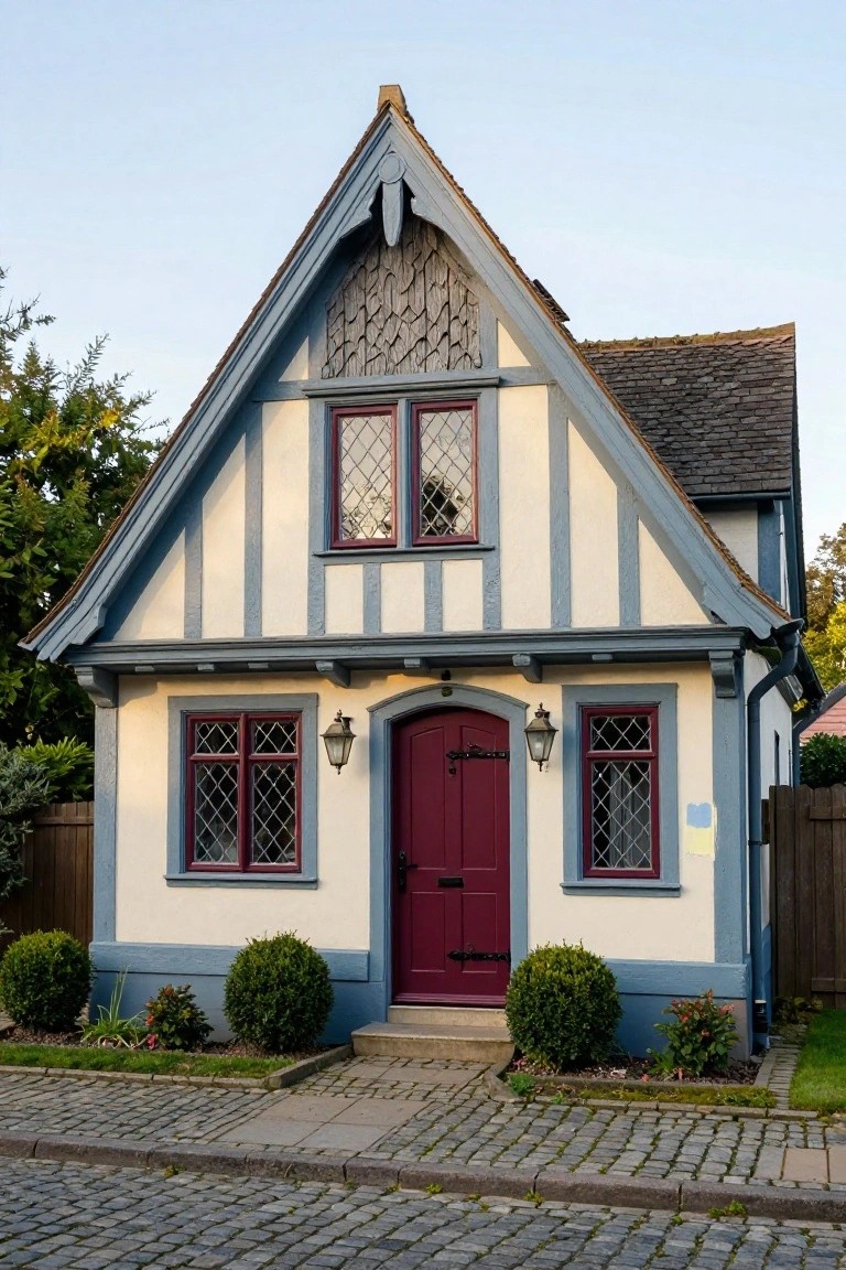
This setup takes the old Tudor half-timber look and gives it a cooler edge with dark blue-gray beams over cream stucco. The red door and window frames pop just enough without overdoing it. It keeps that storybook house feel but looks fresh on a regular street.
Try this on smaller homes or cottages where you want classic charm without the usual black-and-white heaviness. Works best in neighborhoods with some greenery around. Pair the colors with simple shrubs out front, and skip busy trim. Just make sure the blue isn’t too bright, or it might clash in full sun.
Clean White with Navy Trim
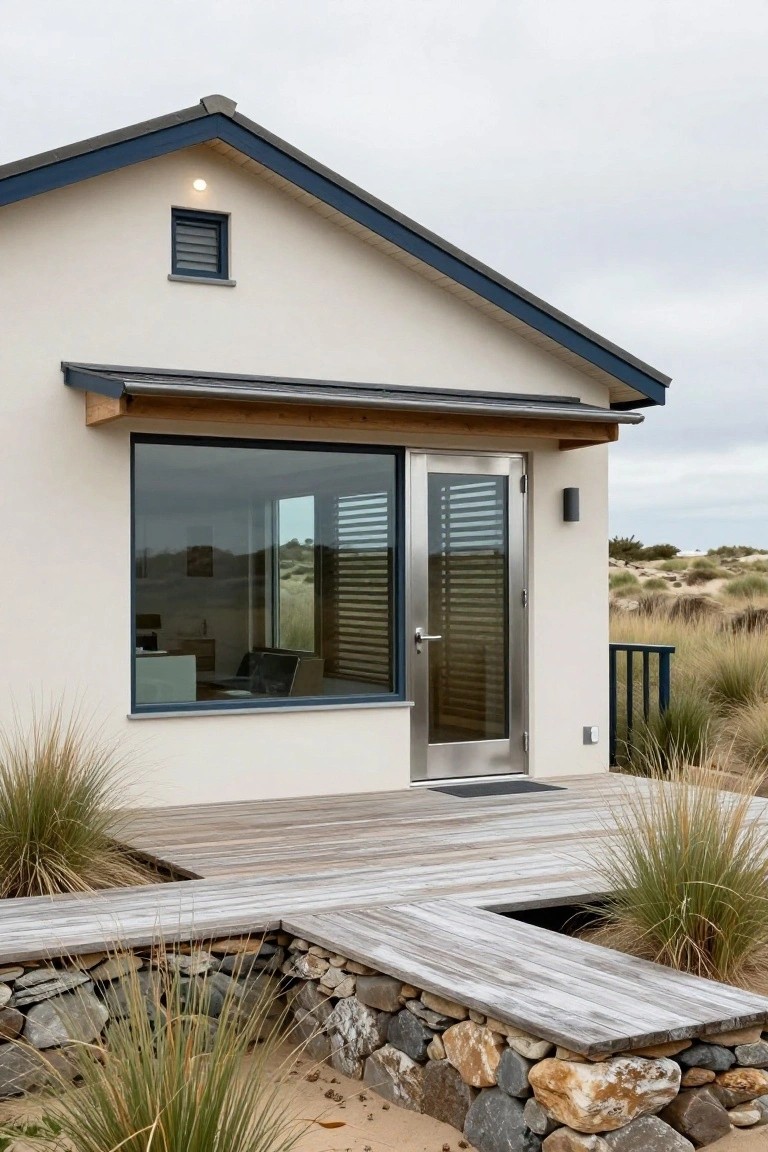
This look uses a bright white exterior paired with navy blue on the roof edges and trim. It keeps things simple and fresh, especially around sandy dunes or coastal spots. The white bounces light around nicely, while the navy adds just enough punch without overwhelming the clean lines.
Try it on smaller homes or cabins where you want a modern feel that blends into nature. White paint or stucco works on most siding, and navy holds up well on shakes or metal roofs. Skip busier colors nearby…stick to natural plants and wood tones to let the palette shine.
Orange Door on Dark Siding
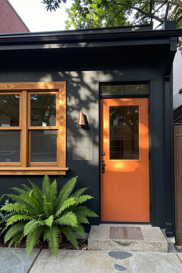
A bright orange door pops right out against nearly black siding. That simple color switch turns a plain entry into the main event. Wood frames around the windows keep things from feeling too stark, and a bit of green planting softens the base.
This look fits smaller homes or backyard studios where you want some personality without overdoing it. Pick a warm orange like rust or terracotta so it blends with natural wood tones nearby. It works best on flat facades facing the street.
Stone Cottage with Lavender Accents

Stone cottages like this one keep things simple with their natural beige walls and dark slate roofs. The real color comes from clusters of lavender plants tucked into window boxes and beds right along the base. That soft purple repeats without overwhelming the neutral base. It gives the place a lived-in feel that looks right at home in the country.
You can pull this off on any older masonry house or even a stucco one if you want that cottage vibe. Plant lavender where it gets good sun, like near the entry or under windows, and mix in a pot or two of geraniums for a bit of red if you like. It works best in mild climates since lavender hates wet feet. Skip it if your spot stays too shady.
Yellow Door on Mint Green House
A bright yellow front door stands out against mint green siding. That simple color switch turns a plain entry into something cheerful and noticeable. The yellow pulls your eye straight to the door, while the soft green keeps the house from feeling too bold.
This works well on cottages or bungalows in sunny spots. Flank the steps with potted ferns like you see here to add some green without much work. Skip it on larger homes, though. The contrast might get lost.
White Stucco with Warm Wood Door
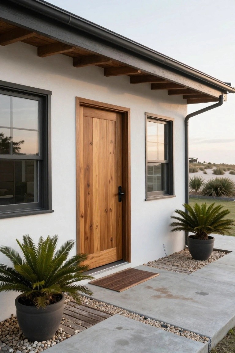
White stucco walls make a house look fresh and bright. Pair them with a solid wood door in a natural cedar tone, like this one, and you get a cozy entry that pulls people right in. Black frames around the windows keep things crisp without overpowering the look.
This setup fits beach houses or dry climates where you want low upkeep. Stain the door to match local wood, add a couple pots of palms out front. It suits ranch or modern styles… just avoid dark roofs that fight the white.
Classic White House with Navy Shutters
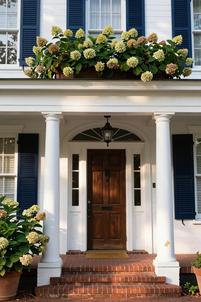
This look uses clean white siding and crisp navy shutters to give a house that straightforward, all-American feel. The white keeps things bright and open, while the navy adds just enough punch without going overboard. A dark wood door pulls it together, and those creamy hydrangeas in pots soften the edges a bit. It’s a combo that never really goes out of style.
Try it on a traditional or colonial-style home, especially if you have a porch with columns. The white works best in full sun so the navy pops more. Keep plantings neutral like those pale blooms to avoid clashing. One thing… skip black shutters here. Navy feels fresher and less stark.
Recommended Products

One Piece Injection Molded Polypropylene Construction
One Piece Injection Molded Polypropylene Construction

One Piece Injection Molded Polypropylene Construction
Warm Wood Paired with Gray Base
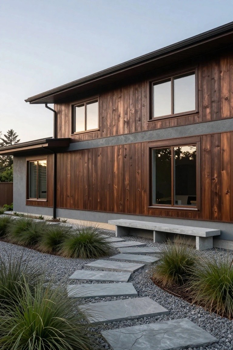
This look uses rich cedar siding up top against a smooth gray stucco lower section. The warm brown tones from the wood give the house a natural feel while the cool gray keeps things grounded and modern. It works because the contrast pulls the eye without overwhelming, and those big windows let light play off both materials nicely.
Try it on homes in wooded or coastal spots where you want something sturdy yet not too heavy. Pair the gray with concrete paths or benches like the one here, and keep plantings simple with grasses. Skip it if your lot is super sunny, the wood might fade faster without good sealing.
Rustic Log Cabin with Stone Base
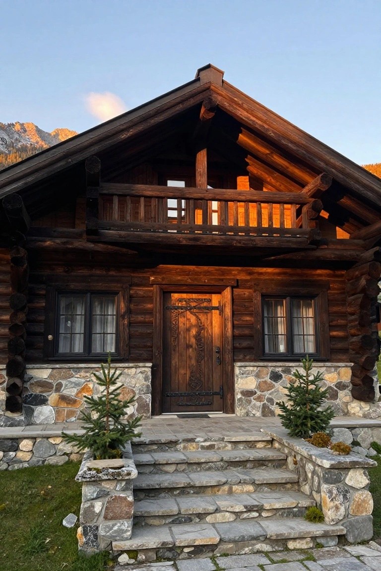
This exterior pulls together dark stained logs for the walls and a rough stone foundation below. The deep browns in the wood warm things up against cooler stone grays and earth tones. It blends right into hilly or wooded settings without trying too hard.
Use it on smaller homes or cabins where you want a sturdy, low-fuss look. Pick logs with a heavy stain for depth, and keep the stones varied in size. Works best in cooler climates… hides wear from snow and rain nicely.
Frequently Asked Questions
Q: My house has red brick siding. Which palettes fit best?
A: Go for earthy or neutral mixes like the ones with taupes and soft greens. They complement the brick’s warmth without clashing. Paint the trim to pull it all together.
Q: How do I test these colors on my actual house?
A: Grab quart samples and brush large patches right on the siding.
Live with them a few days…
Check morning, noon, and evening light.
Q: What’s a safe pick if I’m selling soon?
A: Choose timeless grays or beiges from the coastal or farmhouse options. Buyers gravitate to them. They boost curb appeal fast.
Q: Can I add a bold front door to a neutral palette?
And yeah, it works wonders.
Pick a deep teal or mustard against light siding.
It draws eyes without overwhelming the rest.