

When you pull up to a house, its exterior color hits you first and decides if the whole place feels welcoming or out of place. I tried a muted blue on a friend’s bungalow once, and it grounded the facade perfectly against the brick chimney without stealing focus from the entry. Shades that work best respect the siding material and roof pitch, blending them into the landscape instead of fighting it. Curb appeal comes alive when trim contrasts just enough to guide the eye along windows and doors. A handful here are practical enough to test on your own place next season.
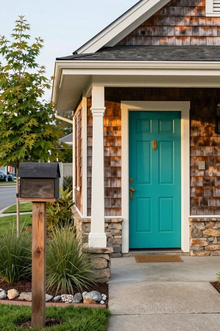
Navy Blue Door on Gray Shingle Siding
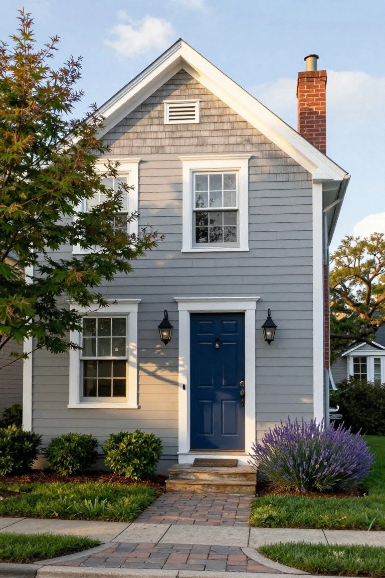
A navy blue front door gives this gray shingle house a simple pop of color that makes the whole facade feel more welcoming. The neutral gray siding keeps things calm and classic, while the deep blue door adds just enough contrast without overwhelming the look. Paired with white trim and black lanterns, it creates an easy entry point that draws the eye right to the front.
This color combo works well on coastal or traditional homes in milder climates, where the shingles blend with natural surroundings. Try it on a smaller house to boost curb appeal, but stick to one bold accent like the door, and keep plantings low-key with things like lavender bushes nearby. Avoid darker grays if your area gets heavy sun, as they can fade faster.
Bold Yellow Door on Dark Exterior
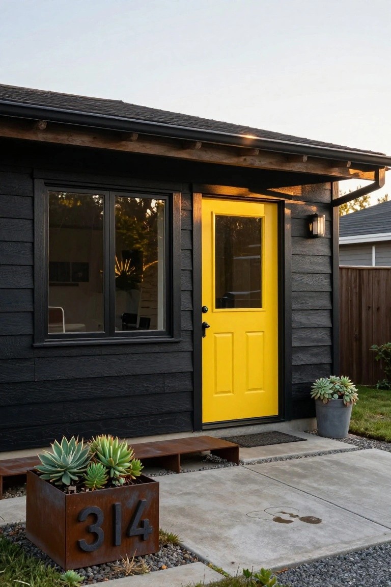
A bright yellow front door stands out sharp against black siding. That contrast grabs your eye from the street and points right to the entry. It keeps the house looking modern and sleek, but the color adds a friendly pop that says welcome home.
This works best on smaller homes or ADUs where you want quick curb appeal. Stick to clean lines around it, like a simple metal planter with succulents, and avoid busy landscaping. Darker homes in gray or rainy areas pull it off nicely… just test the yellow shade in real light first.
Soft Terracotta Stucco Walls
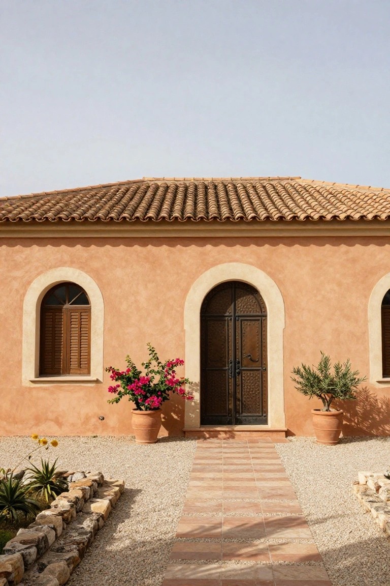
A soft terracotta shade on stucco walls brings out that easy Mediterranean vibe without trying too hard. It picks up the warm tones from the roof tiles and gravel ground, making the whole front of the house feel connected to its spot. Folks like it because it looks lived-in right away, not stark or new.
This color works best on ranch-style or low-slung homes in dry, sunny areas. Add a few big pots with bougainvillea by the arched door for some pop. Skip it if your yard stays shady. It holds up well to sun and gives good curb appeal year round.
Navy Blue House with Red Door
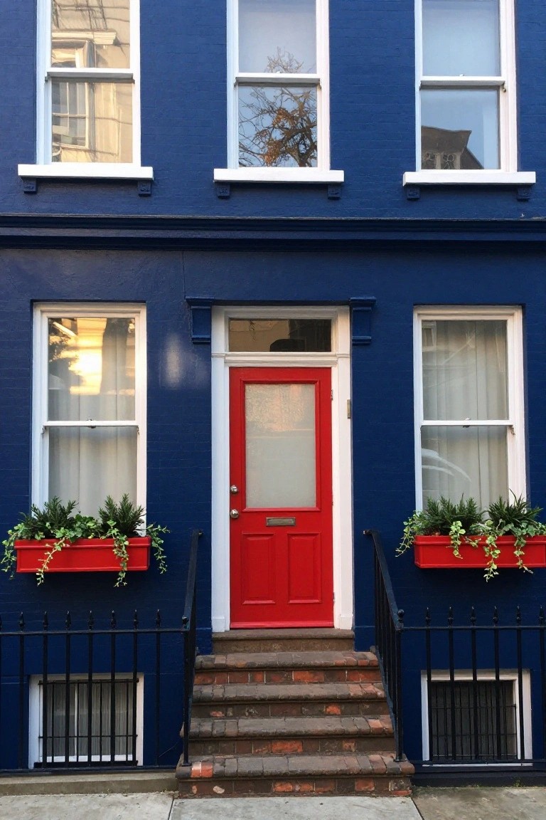
A deep navy blue paint on the house body paired with a classic red front door is one of those simple color choices that really wakes up a traditional facade. The dark blue gives a solid, grounded look while the red door pulls your eye right to the entrance. It feels fresh but nods to older row houses you see in city neighborhoods.
This combo suits brick sidewalks and urban spots best, especially on taller narrow homes like townhouses. Match the red with window box planters for extra pop, but keep the trim white to let the two main colors shine. Just test the shades in different light… navy can shift cooler at night.
Sage Green Siding with Red Door
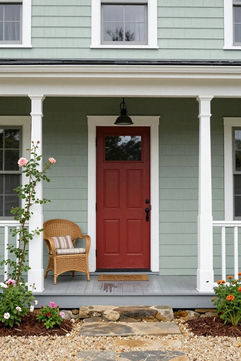
A soft sage green on the siding gives this house a calm, nature-inspired feel that fits right into a garden setting. Then that red front door pulls your eye straight to the entry. It’s a simple way to add some energy without going overboard. White columns and trim make sure everything stays clean and balanced.
This color combo works best on older-style homes like farmhouses or cottages, especially ones with a front porch. Add a chair and some potted plants nearby, and it feels lived-in right away. Just make sure the green isn’t too yellow if your area has lots of sun… it can shift over time.
Crisp White Walls with Warm Wood Garage
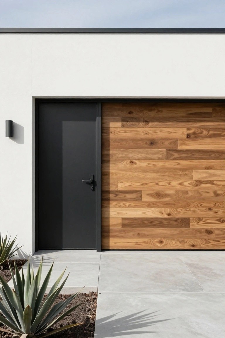
A simple way to warm up a stark white exterior is with a wood-paneled garage door. Here, the light walnut tones stand out against the smooth white stucco, giving the house a modern feel without losing that clean look. The black entry door adds a sharp contrast that pulls everything together. It’s a quiet way to make the front approachable.
This works best on flat modern facades or mid-century homes where you want subtle texture. Go for vertical wood slats in teak or oak for interest, and keep plantings like agaves low around the base. Avoid busy patterns. It suits sunny climates… holds up well over time.
Green Door on Brick House
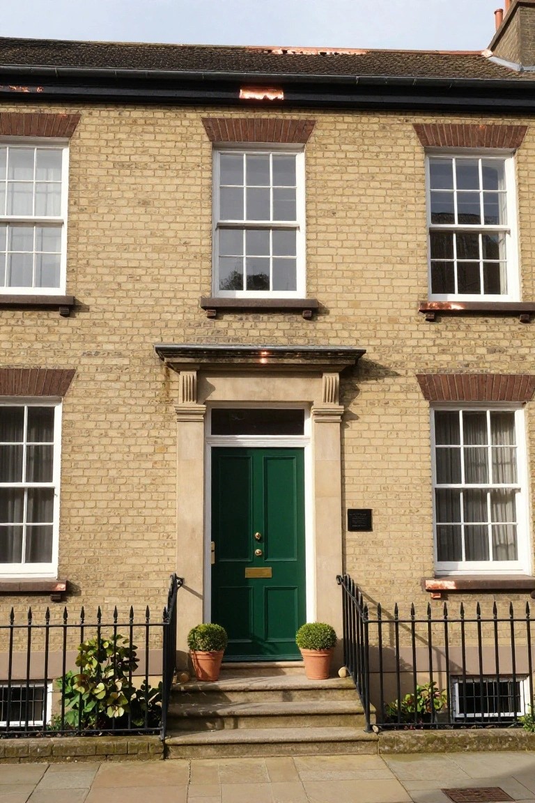
A green front door gives a plain brick exterior real punch without much effort. Against the warm yellow tones of the brick, it pulls your eye straight to the entry and makes the whole place feel more alive. Simple touches like matching pots next to the steps tie it together nicely.
This look suits classic townhouses or semis from the Georgian or Victorian era. Pick a glossy shade of green with black iron hardware for contrast, and keep the brick and trim neutral so the door does the talking. It won’t work as well on super modern builds…stick to older styles.
Soft Cream Stucco Exteriors
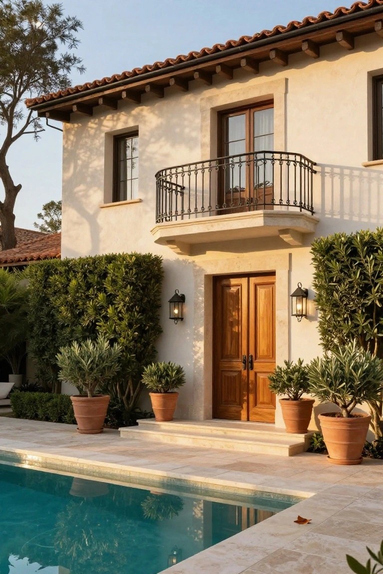
A soft cream stucco finish on the walls brings out a warm, sunny vibe that fits right into Mediterranean-style homes. It plays nice with the terracotta roof tiles and lets the rich wood on the entry doors stand out just enough. This color choice keeps things light and timeless, avoiding the harshness of bright white.
Try it on ranch or Spanish revival houses where you want curb appeal without too much upkeep. It suits warmer climates best, and adding lanterns by the door ties it together. Just make sure the stucco gets a good base coat to hold the color over years.
Blue Door on Red Brick
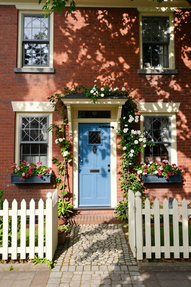
A blue front door gives this red brick house a fresh, welcoming lift without changing much else. The deep brick color stays classic, but that vibrant blue pulls your eye right to the entry. Climbing roses frame it softly, and simple flower boxes keep things lively.
Try this on traditional or colonial-style homes where the brick is already a strong base. Pick a glossy blue paint for weather resistance, and pair it with white trim or greenery for balance. It works best on quieter streets, adding charm without overwhelming the neighborhood look.
Warm Ochre Stucco Exterior
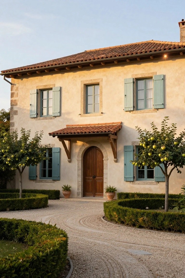
Warm ochre stucco wraps this house in a soft, sunny glow that feels right at home in a rural spot. The color pulls from the earth around it, teaming up with terracotta roof tiles for that easy Mediterranean flow, while teal shutters keep things fresh without shouting.
This setup suits older stone houses or ranch styles getting a refresh. Line the entry with fruit trees and low hedges like here to draw the eye in. Stick to matte finishes so the look stays relaxed, not flashy.
Yellow Door on White Siding
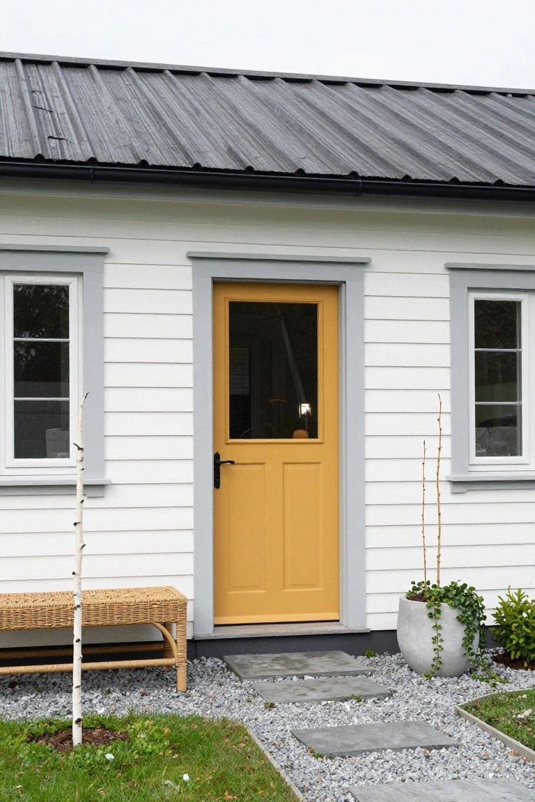
A plain white house like this one comes alive with a mustard yellow front door. The color pulls your eye right to the entry, giving the whole facade some cheer without overdoing it. White siding keeps things crisp and timeless. That yellow just works, especially with gray trim around the windows and door.
Try this on a small cottage or starter home where you want easy curb appeal. Pick a durable exterior paint in a warm yellow tone. It holds up in most weather. Keep the yard simple, maybe gravel paths and a bench nearby. Not every house needs bold accents everywhere.
Green Victorian Facade with Orange Door
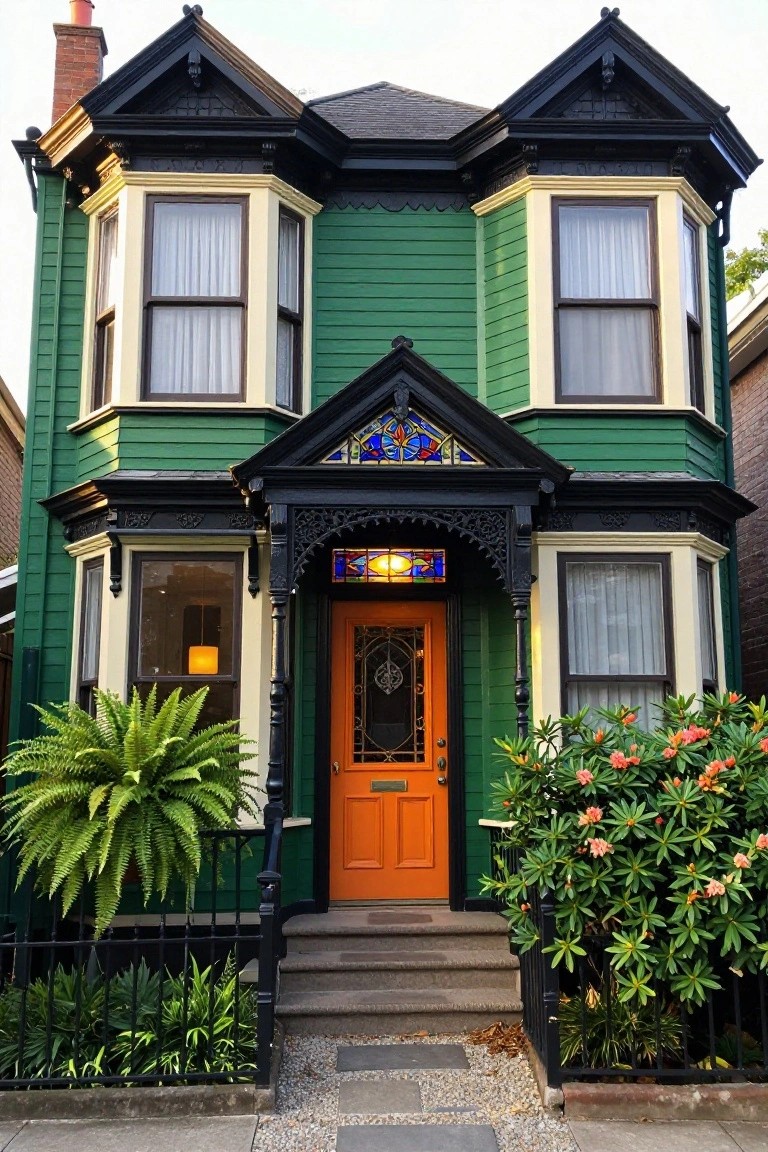
A deep green siding on this older Victorian house keeps that classic feel while the bright orange front door brings some real life to the entry. Black trim outlines everything sharply, and a bit of stained glass above the door ties into the historic style without going overboard. It’s a simple way to make a house stand out on the street.
Try this on homes from the late 1800s or early 1900s, especially where the architecture has lots of angles and details. The green works in shady spots or brighter neighborhoods. Just make sure the door color pops against the trim, and keep plants around the base low-key so they don’t fight the colors.
Bright Turquoise Front Door
A turquoise front door like this one brings instant cheer to a simple shingle house. The color stands out against the weathered cedar siding and white trim without overwhelming the look. It pulls your eye right to the entry and makes the whole facade feel more alive and approachable.
This works best on homes with neutral exteriors, like Craftsman bungalows or coastal cottages. Go for a semi-gloss paint to handle weather, and pair it with brass hardware for contrast. Just test the shade in different lights first… it can shift a bit outdoors.
White Stucco with Wood Cladding
White stucco covers most of this modern house, keeping things clean and bright. Then wood planks run up one side, adding texture and a bit of natural color. Black frames around the big sliding doors tie it together without overpowering. It’s a simple way to make a plain white exterior feel more lived-in.
This combo works great on homes near the coast or in sunny spots. Pick a light wood like cedar that won’t fade too fast. Put the cladding on a corner or entry side to draw the eye. Skip it if your area gets heavy rain, though. Keeps the look sharp either way.
Pink Brick Cottage with Green Door

Pink brick walls make a house feel playful and cottage-like right away. Pair them with a mint green door, and you get a fresh pop that draws the eye without trying too hard. The climbing wisteria over the entry adds some natural frame, keeping things soft around the edges. It’s a color combo that works because the pink stays gentle on older-style homes, while the green keeps it from feeling too sweet.
This look suits small townhouses or country cottages best, especially where you want curb appeal that nods to tradition. Paint the door in a soft seafoam shade, and add window boxes with geraniums for extra life. Just keep the brick clean, since pink shows dirt more than neutral tones. It comes together easy on a simple facade.
Warm Stucco with Stone Accents
A soft beige stucco covers most of this house exterior. Rough stone fills in around the entry and base. That mix keeps things simple but gives the place some real texture and weight. The warm tones pull it all together without much fuss.
Try this on single-story homes or anywhere the yard meets the house. It suits drier spots where stone holds up year-round. Add a wood door like the one here for a bit of darkness. Just make sure the stucco color isn’t too pale or it washes out.
Bright Red House with Blue Door
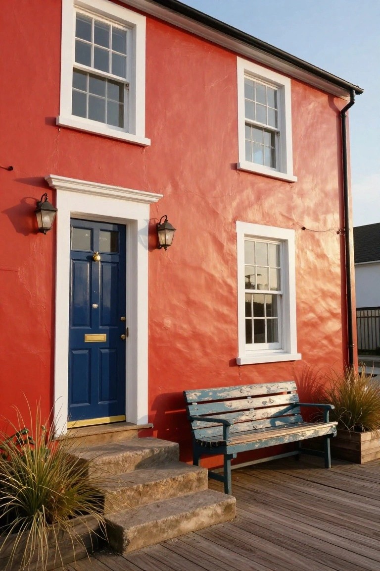
A bright red exterior like this one grabs your attention right away. The deep blue front door adds strong contrast without overdoing it. White window frames and matching lanterns tie everything together nicely.
This color combo suits coastal cottages or older homes with some character. Go for a textured paint finish to mimic plaster walls. It holds up well near water but pick fade-resistant paints for sunny spots. A simple bench out front makes the entry feel welcoming.
Pale Blue Siding with Green Shutters
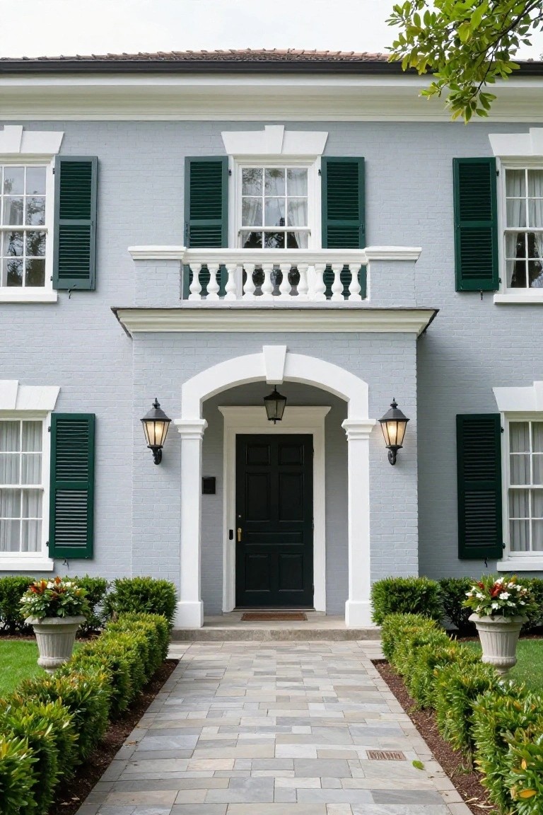
This light blue-gray siding gives a house a calm, classic feel that fits right into neighborhoods with a mix of older homes. The green shutters add just enough contrast without overwhelming things, and the white trim around windows and doors keeps everything crisp. It’s a look that feels fresh but not trendy, especially with the black door pulling it together at the entry.
Try this on a two-story house with simple lines, like Colonial or Craftsman styles. It works best where you want subtle color that changes a bit with the light through the day. Keep landscaping simple, like boxwoods along the path, so the house color stays the main focus. Avoid darker roofs, though, since they can make the blue look too muted.
Frequently Asked Questions
Q: How do I pick a color from these ideas that actually looks good on my house?
A: Stand outside and snap photos of your house from the street. Hold printed color swatches from the article up to the pics on your screen. You’ll spot what clicks with your siding and roof right away.
Q: Testing paint samples outside – does the sun mess with the real color?
A: Paint samples early in the morning and check them again at noon and late afternoon. Sun shifts tones fast, so chase that light around your yard. Pick the one that shines through all day.
Q: Dark colors like charcoal – won’t they fade super quick?
A: Quality paints hold dark shades longer than cheap ones. Clean the siding once a year to knock off dust and pollen. They stay sharp way longer than you expect.
Q: Can I pair two colors from the list, say sage green with terracotta?
A: Pair them where one leads and the other accents, like body and door. Test small first. It works great.