

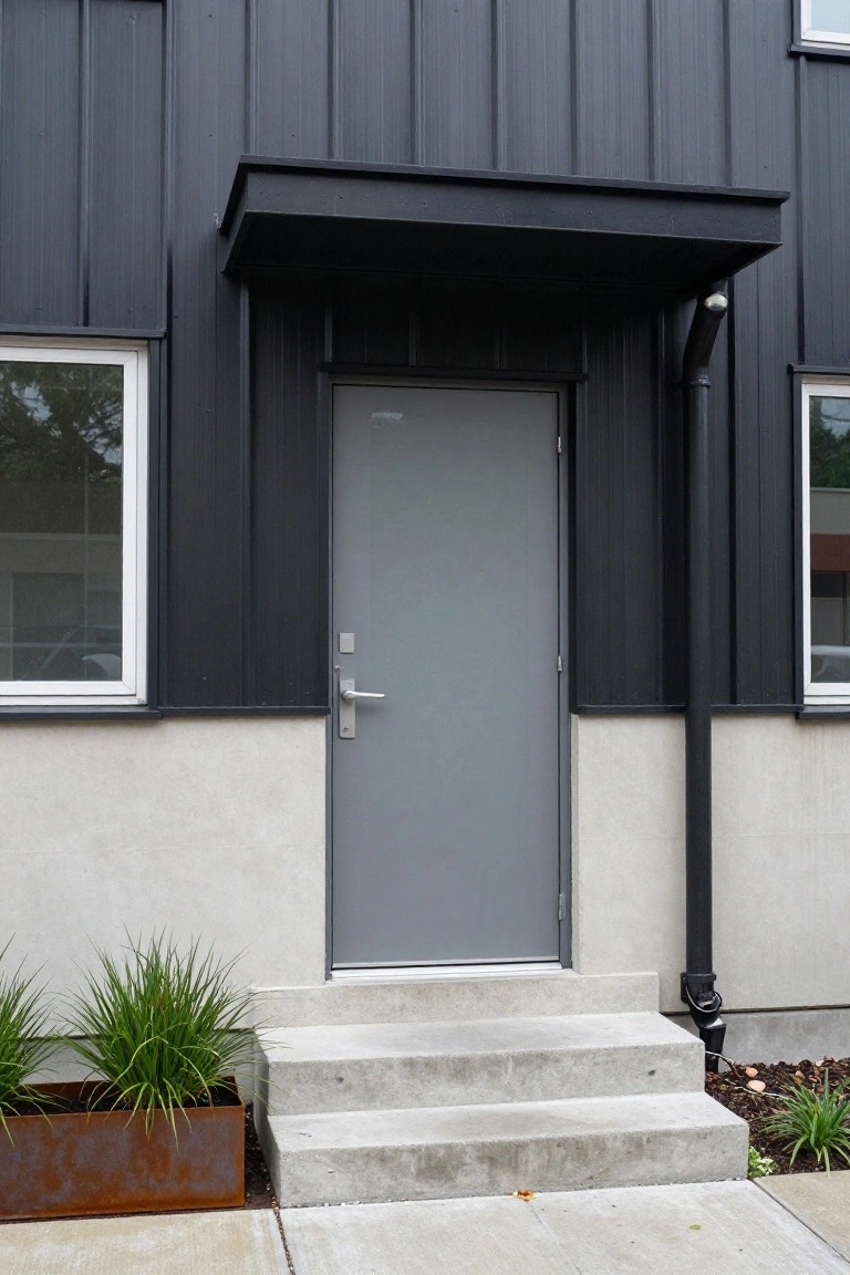
I’ve noticed that a smart two-tone exterior color scheme often makes a house’s facade feel more defined and alive from the street. It plays up elements like the roofline or front entry, helping simpler structures stand out without overwhelming the neighborhood. Too much contrast, though, can make materials like siding or stone look disjointed instead of cohesive. When I helped a neighbor pick tones for their ranch-style home, a charcoal base with lighter trim grounded it beautifully against their yard. Certain pairings just read right in person.
Two-Tone White and Dark Gray Facade
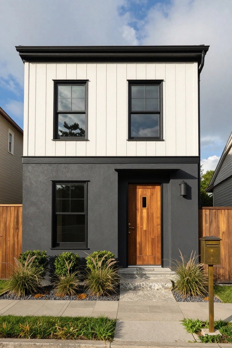
This setup splits the front of the house with white vertical siding up top and dark gray stucco down low. The change at mid-height gives the place a lifted look. Black trim around the windows and that warm wood door keep things from feeling too stark.
Try it on a straightforward two-story box like this. It suits most neighborhoods, especially if you want modern without going all one color. Just make sure the gray is matte so it doesn’t show dirt too fast.
Recommended Products
Use for a variety of indoor and outdoor project surfaces including wood, metal, plaster, masonry or unglazed ceramic

This high-quality, acrylic latex water-base interior/exterior paint offers excellent hiding properties with great adhesion and water repellency on textured interior and exterior surfaces

Includes 30 featured and newest released color card. Sprayed on color to see our colors in your homes lighting for more accurate color choices.
Gray Siding with Blue Front Door
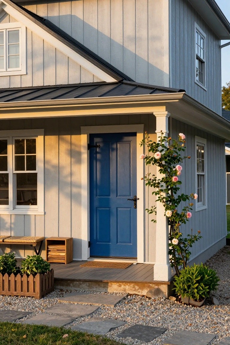
A light gray siding like this gives a house a clean, modern look without being too stark. Pair it with a deep blue front door, and you get that pop of color right where people notice it first. The blue draws the eye to the entry without overwhelming the whole facade. It keeps things simple but welcoming.
This combo works great on craftsman or farmhouse style homes in suburban spots. Use it where you want curb appeal that lasts year round. Stick to matte finishes on both to avoid glare, and make sure the door trim stays white for clean lines. Just about any size house pulls it off.
Two-Tone Blue Shingle Siding
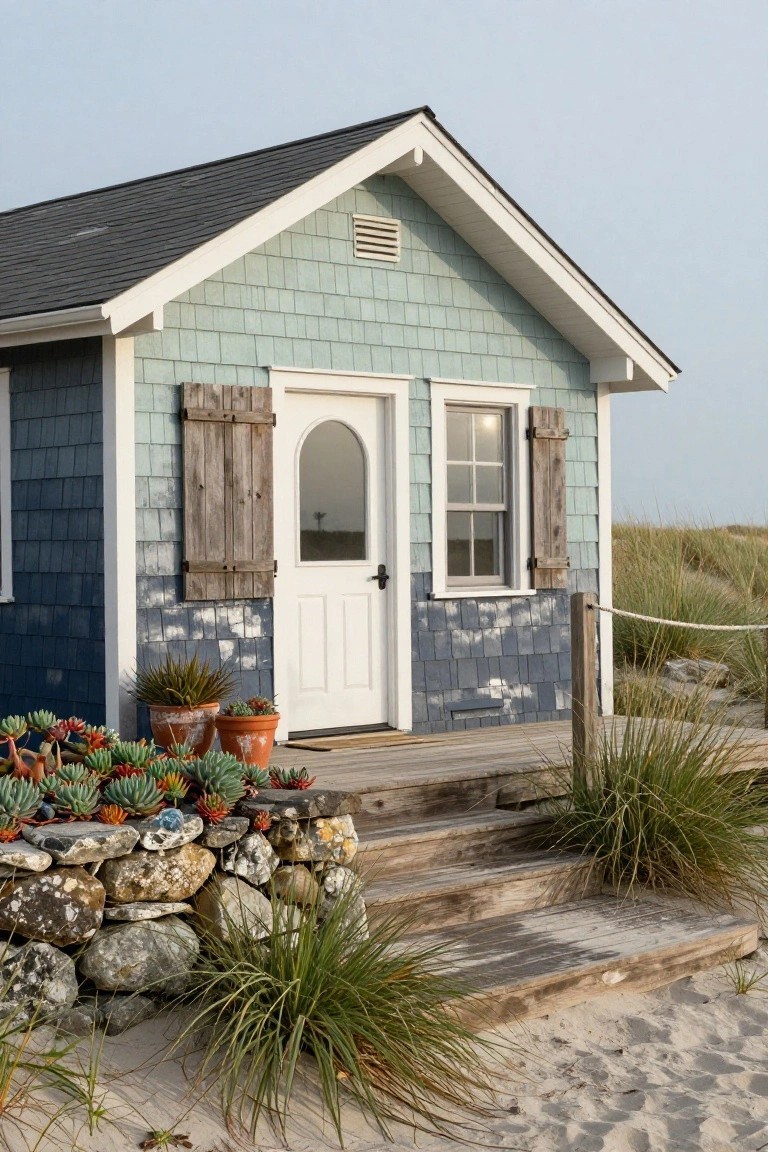
This look takes shingle siding and paints it in two shades of blue. Up top it’s a pale, washed-out blue-green that blends with the sky. Lower down it darkens to a solid navy blue around the base. White trim on the door and windows sets it off clean. The effect makes a simple cottage feel right at home by the beach.
Try it on bungalows or small homes in coastal spots, or anywhere you want a relaxed vibe. Use exterior paint rated for humidity and sun. Add a few tough plants like succulents in pots near the entry. It works best where the house sits low… no need for fussy landscaping.
Recommended Products

Extremely durable outdoor paint ideal for use on properly prepared exterior wood, brick, masonry, concrete, weathered aluminum, weathered vinyl siding*, and primed metal substrates

Use for a variety of indoor and outdoor project surfaces including wood, metal, plaster, masonry or unglazed ceramic

ALL-IN-1 PAINT & PRIMER: A hardy multi-purpose and multi-surface one-coat paint and primer in one for almost any indoor or outdoor surface. A wall, ceiling, floor, skirting board, cabinet, furniture and door paint for your bathroom, kitchen, home and garden.
Pale Stucco with Terracotta Roof
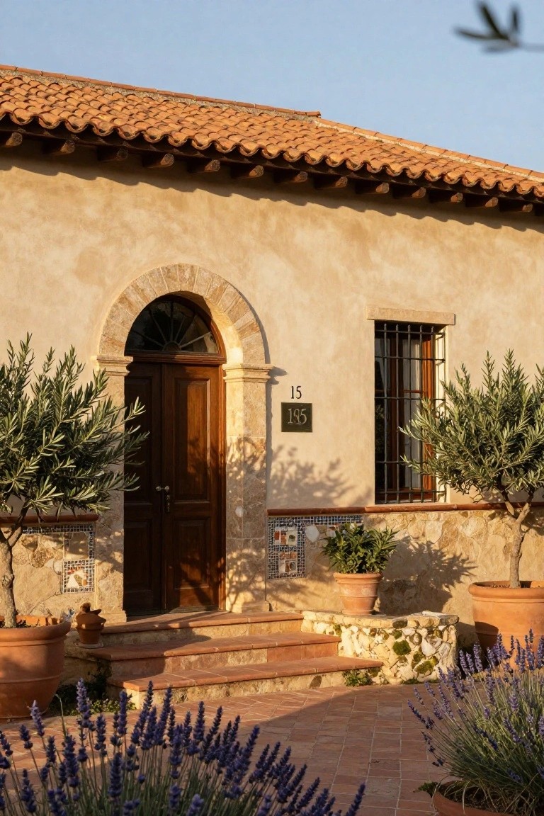
This setup pairs soft pale stucco walls with warm terracotta roof tiles for a clean two-tone look. The light walls keep things bright and open while the roof adds that rich orange-red glow. It feels right at home in sunny spots and pulls the eye up to the roofline nicely.
You can pull this off on ranch houses or anything with a bit of Spanish or Italian flair. Add olive trees by the entry and some lavender along the path to tie it together. Just make sure your roof tiles match the warm tones so it doesn’t look off. Works great where you want simple curb appeal that lasts.
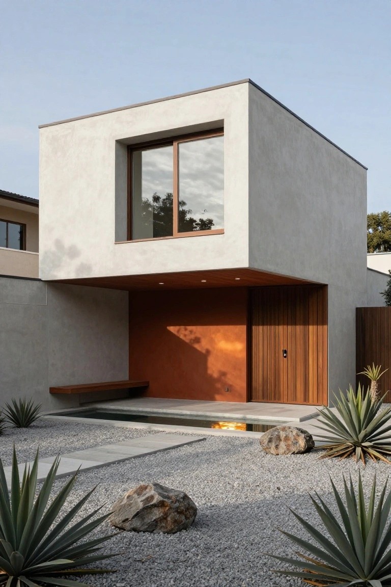
Creamy Stucco with Black Trim
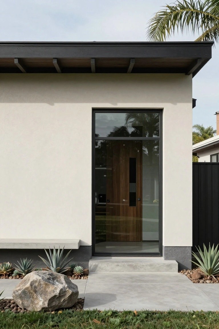
A soft creamy stucco covers most of the walls here, paired with slim black metal frames on the big glass window and door. That dark trim and the concrete base at the bottom create a simple two-tone effect. It keeps things modern and crisp, especially against a blue sky, without needing much else to make the entry pop.
This setup suits sunny spots like Southern California homes, where the light walls bounce back heat and the black adds some edge. Use it on flat or low-slung houses to highlight the architecture. Go easy on extra colors in the landscaping, though. A few agaves and rocks work fine… keeps the house the star.
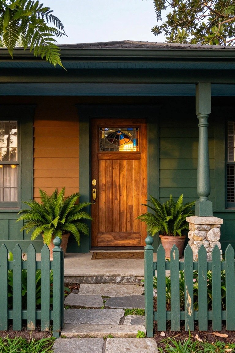
Sage Green Siding with White Trim
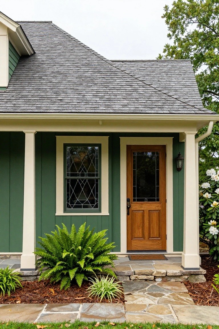
A soft sage green on the siding works nicely with creamy white trim on the porch columns and window frames. That combo keeps things fresh and calm. The wooden entry door pulls it together without overpowering the paint. It’s a solid choice for houses that want to blend into the yard a bit.
Try this on older bungalows or Craftsman homes where you want curb appeal that lasts. It suits shady spots under trees… just make sure the green isn’t too dark or it can feel heavy. Add plants around the base like ferns to tie it to the landscape.
Two-Tone Brick Facade
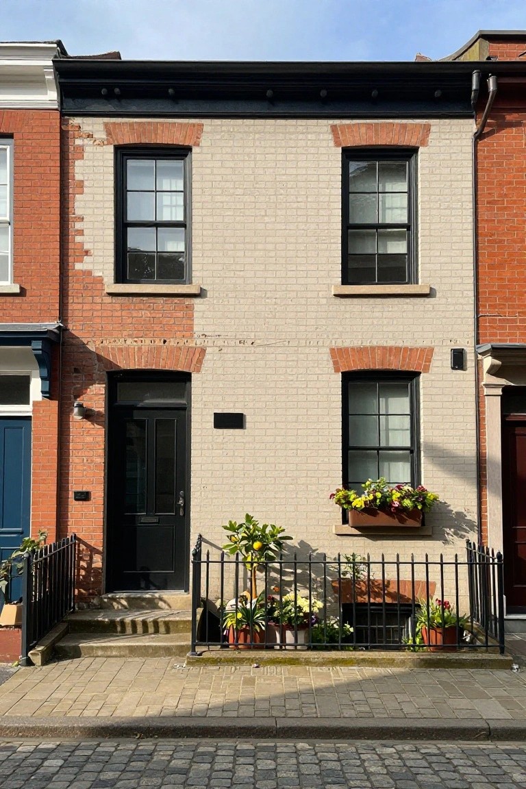
This setup takes a light beige brick for most of the front and mixes in red brick along the edges, arches, and corners. Black frames on the windows and door add sharp contrast. It’s a straightforward way to update a plain brick house. Gives it more character. Stands out nicely next to similar neighbors.
Homes like this rowhouse do well with it. Think older city streets or townhouse blocks. Pick bricks that match your local style so it blends in but pops. Plants in pots out front help too. Keeps maintenance low since it’s mostly natural brick.
Rustic Wood Shingles Over Stone Base
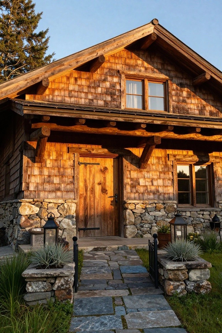
This exterior pulls off a simple two-tone look with warm cedar shingles covering the upper walls and a rugged stone foundation below. The wood catches the light just right, making the house feel settled into its spot without trying too hard. That stone base adds real weight down low. Keeps things from floating visually.
Homes like this work best in wooded or hilly areas where you want that cabin vibe. Use local stone for the base to blend in, and keep the shingles unstained for a natural fade over time. Stone paths leading up fit right in… just seal the wood every couple years to hold up against weather.
Navy Blue Siding with White Trim
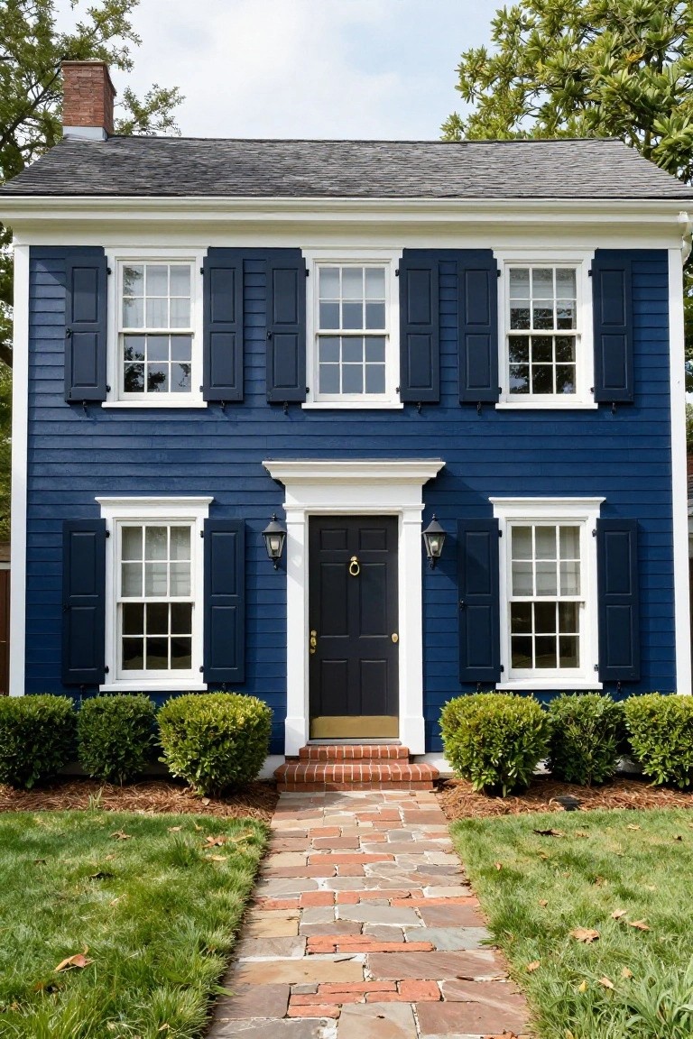
Navy blue siding like this gives a house a crisp, classic look that feels fresh without trying too hard. The deep color on the clapboard body pops against the bright white trim around the windows and eaves. It makes the whole facade stand out, especially with that black door adding a bit of contrast right at the entry.
This combo works great on traditional homes like colonials or capes in suburban spots. Pair it with simple shrubs along the front and a brick path to keep things grounded. Just make sure the navy is a true shade, not too gray, or it might look dull in shady yards.
Black Exterior with Wood Cladding
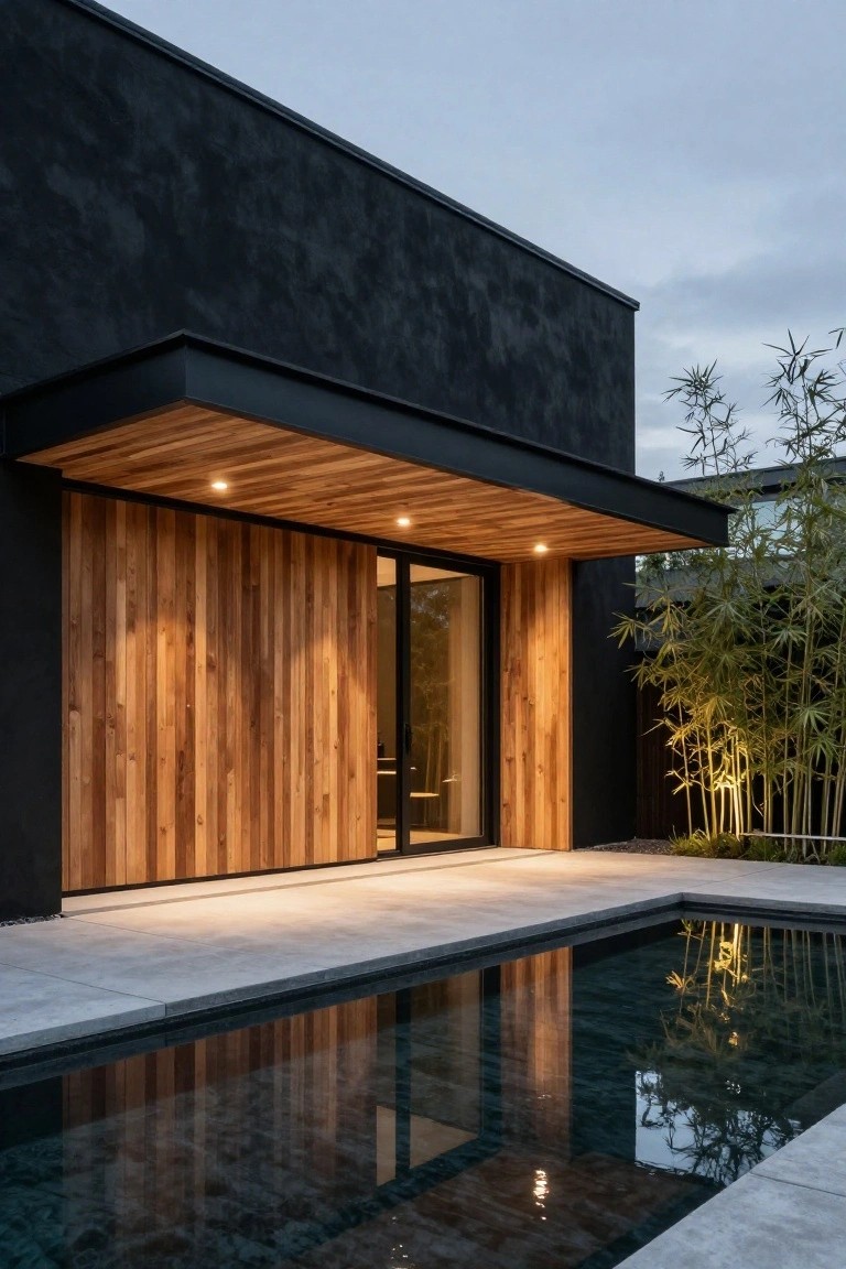
A dark black stucco covers most of the house walls here, setting a strong modern base. Then warm vertical wood panels wrap the entry area, adding texture and a bit of natural feel. That simple two-tone switch keeps things bold but not stark. The black handles big surfaces fine, while the wood pulls your eye to the door.
This setup suits flat-roof modern homes or even ranch styles looking for update. Use it on larger facades where the black won’t overwhelm. Go for cedar or similar wood left natural, and line it up vertically next to glass doors or windows. Just check your climate, wood needs protection from too much wet.
White Over Sage Green Two-Tone Exterior
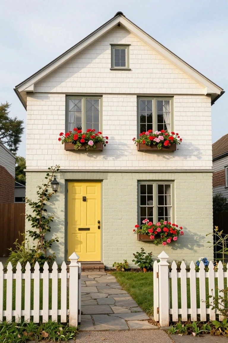
A simple split down the middle works wonders here. White shingles cover the upper story for a crisp, airy look, while sage green paints the base and adds some grounded color. That yellow door pulls it all together without trying too hard. Flower boxes overflowing with red geraniums keep things lively.
This setup suits cottage-style homes or older neighborhoods where you want subtle charm. Divide at the foundation line or chair rail height, then pick a bold door shade that echoes your flowers or trim. It hides dirt better on the lower half too. Pair with a picket fence for extra welcome.
Wood and White Two-Tone Coastal Exterior
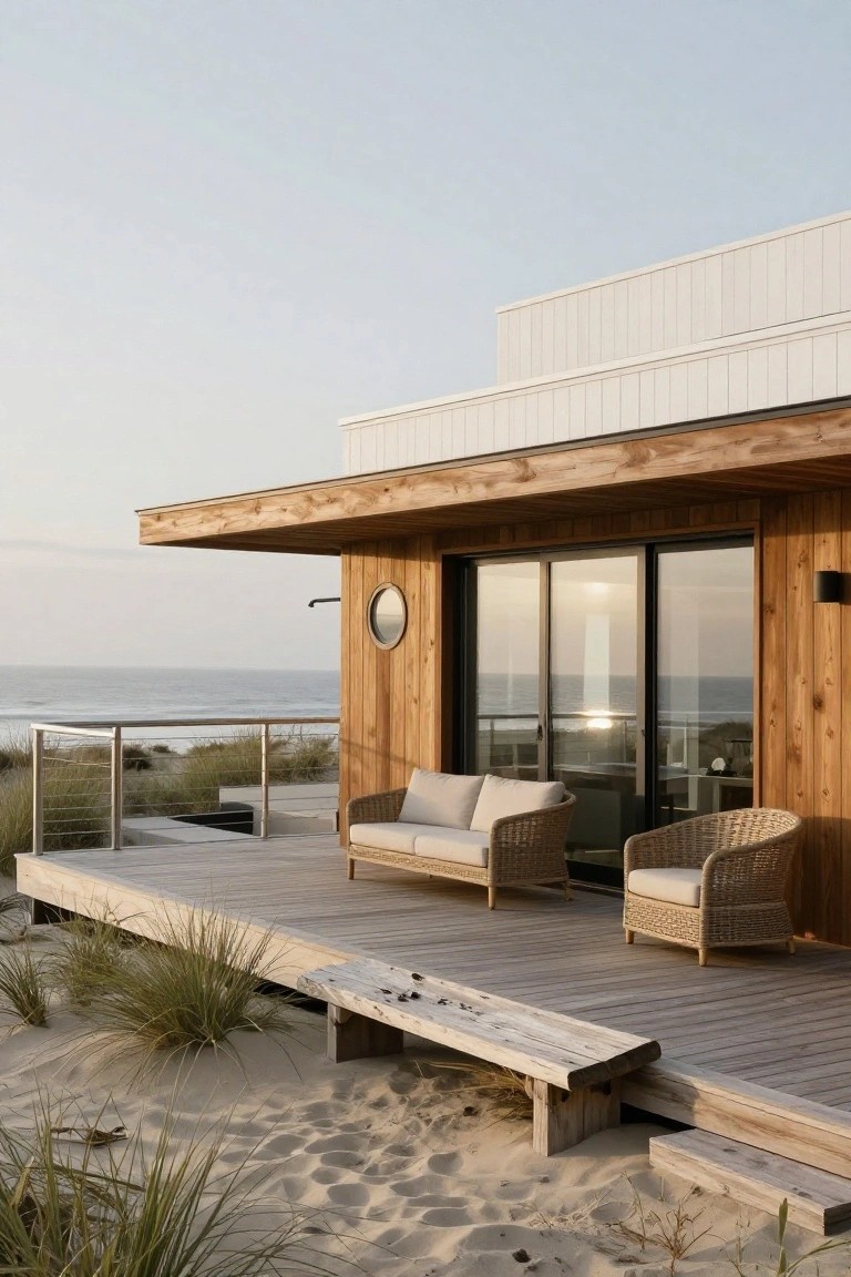
Warm cedar wood covers the lower half of this beach house, while crisp white panels wrap the upper section. That simple split creates a grounded yet airy look. The wood picks up the natural tones around it, like the dunes, and the white lifts everything without overpowering the scene.
This combo works great on homes near water or in casual spots where you want modern style that doesn’t fight the landscape. Use vertical wood planks below for texture and horizontal white siding above to keep it clean. Seal the wood well against salt air, and it holds up for years.
Dark Siding Over Light Base
This setup splits the facade with dark corrugated metal siding on the upper walls and a pale stucco finish down low. The two tones add some height to the house and make the entry steps and door stand out more. It’s a clean way to go modern without painting everything black.
Try it on ranch-style or boxy homes that need more definition. Keep the door in a matching mid-gray tone, and add simple plants along the side like these tall grasses. It holds up well in rainy areas since metal sheds water fast.
Half-Timbered Two-Tone Facade
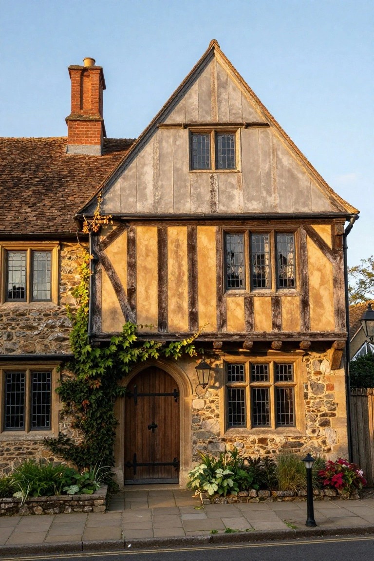
Dark wooden timbers stand out against light plaster walls in this classic setup, with a stone base adding weight down low. That simple contrast gives the house real character. It feels lived-in and sturdy, like something from an old village street.
You can pull this off on cottages or older homes by staining beams deep brown and whitewashing the plaster for a soft glow. The stone keeps things grounded. It suits spots with some greenery around, maybe ivy trailing up. Skip it on boxy new builds.
Teal and Beige Two-Tone Exterior
This setup uses a soft teal on the main walls paired with a beige stucco base around the entry. It keeps the house looking modern without being too bold. The color split draws attention to the front door naturally. That wooden door and path fit right in too.
Try this on a mid-sized home in a coastal or suburban spot. The teal works well in milder climates where you want some color but not a lot of upkeep. Just make sure the trim stays neutral so it doesn’t compete. Avoid super sunny areas unless you like repainting now and then.
Charcoal Gray and White Siding Combo
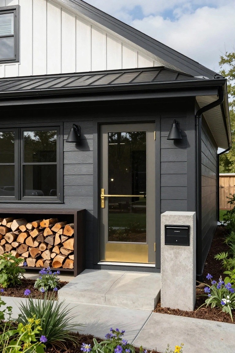
This setup splits the exterior with white shiplap siding up high and charcoal gray board-and-batten lower down. The dark base anchors the house to the ground. It keeps things fresh without going all one color. Black window frames tie it together nicely.
It fits modern farmhouses or simple ranch homes best. Add a slim metal roof and keep plantings low around the entry. Glass doors let light in. Watch the proportions though… too much dark can feel closed off.
Green House with Rust Siding
A dark green body on this house pairs nicely with a strip of rust-colored siding right next to the front door. The warm wood door picks up that orange tone too, making the entry feel like the focal point. It’s a simple two-tone look that gives an older bungalow a fresh yet settled vibe.
This setup works well on Craftsman or ranch homes in mild climates. Keep the rust section narrow, maybe just framing the door area, so the green stays dominant. Add potted ferns like these for some easy green layering. Just test the colors on your siding first, since light changes them a bit.
Stucco Walls with Wood Entry Accents
A light stucco finish covers most of this house exterior. Then warm wood shows up on the tall front door and a simple bench nearby. That mix keeps things looking modern and boxy without feeling cold. The neutral base lets the wood bring some life to the entry.
This setup works well on smaller homes or ones in dry areas. Pair it with gravel ground cover to stay low maintenance. It suits places where you want curb appeal without much color fuss. Just seal the wood well so it holds up over time.
Red Brick House with Green Door
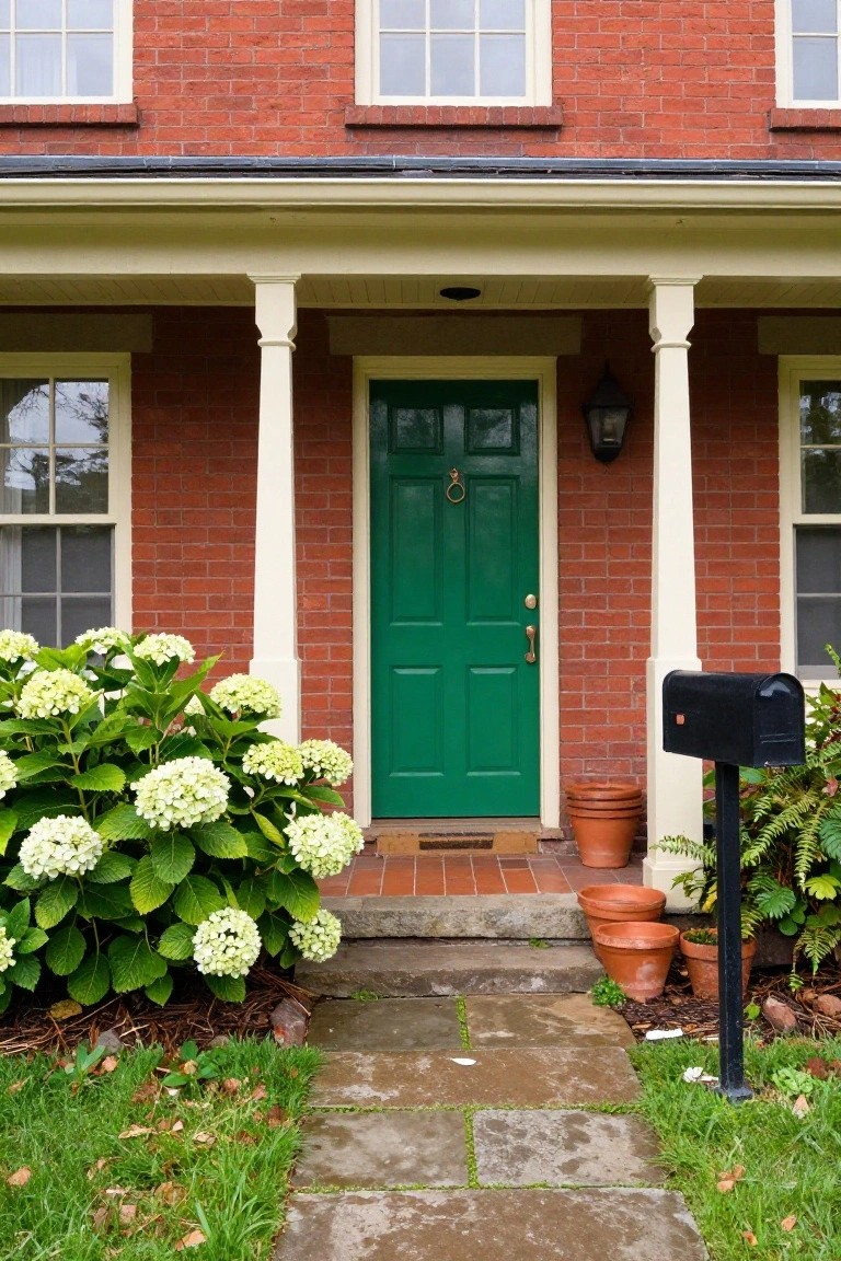
A red brick exterior like this one gets a fresh lift from white porch columns and a deep green front door. The brick keeps that solid, timeless base while the green door pulls your eye right to the entry. It’s a simple two-tone switch that feels classic but not stuffy.
This look fits older homes or colonials best, especially where you want curb appeal without big changes. Stick to glossy green paint on the door for shine, and match the white trim on windows and porch. Plants like those big hydrangeas nearby soften the edges nicely. Just keep the door bold, nothing too pastel.
Warm Beige Stucco with Terracotta Roof
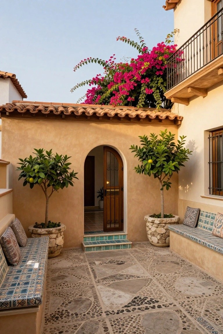
This combo gives a house that easy Mediterranean feel without trying too hard. The soft beige stucco walls catch the light just right, while the deeper terracotta roof tiles add some grounded warmth. It works because the tones play off each other nicely. One sits quiet and one pulls a bit more color. In the photo you see it framing an arched entry door, with potted lemon trees on either side.
Try this on homes in sunny spots, like the Southwest or anywhere with dry heat. It holds up well to sun fading and looks right at home next to desert plants or even bougainvillea like in the shot. Skip it if your area gets a lot of rain, though. The roof color pops best on simple shapes, no busy trim needed.
Frequently Asked Questions
Q: How do I test these two-tone ideas on my actual house before committing to paint?
A: Pick up small cans of your top picks from the paint store. Paint big swatches on scrap plywood or foam board and prop them against your siding. Walk around at morning, noon, and evening light to catch how they play.
Q: Should I go darker on the bottom or the top for my two-tone setup?
A: Darker shades on the bottom ground the house and make it feel sturdier, like it’s hugging the earth. Flip it for a lighter base if your yard slopes up or you want an airy lift. Play to your home’s shape.
Q: Will two tones work if my house has a lot of brick?
A: Paint the trim, siding, or upper sections to contrast the brick. Let the brick stay natural, it adds texture without extra work. This combo pops without overwhelming.
Q: How do I keep the crisp line between colors sharp over time?
A: Caulk the edge well right after painting. Touch up every couple years before cracks form. Skip it, and weathering blurs everything fast.