

When I drive past houses in my neighborhood, a blue exterior often grabs my attention first because it sharpens the facade’s lines against the roof and landscaping. The shade matters a lot with how the color settles on different materials like clapboard or brick, making some homes feel more grounded and others airier. Lighter blues tend to widen a narrow entryway visually, while richer tones add weight to sprawling ranch styles without clashing. I tested a mid-tone blue on our trim years ago, and it pulled the whole front together in a way plain grays never did. Certain blues stand out enough to save for your own place if curb appeal feels flat right now.
Soft Blue Shingle Cottage Exterior

This shade of soft blue on shingle siding keeps a cottage looking light and easygoing. It picks up the sky without shouting, and the white trim makes everything pop just right. That warm wood door adds a bit of contrast too, so the house feels solid and lived-in from the street.
Try it on smaller homes with shingled roofs or classic shapes like this one. It fits coastal spots or country settings where you want the house to blend with nature. Just keep plantings simple around the base, like those lavender pots, to let the color do its thing.
Deep Navy Blue Vertical Siding
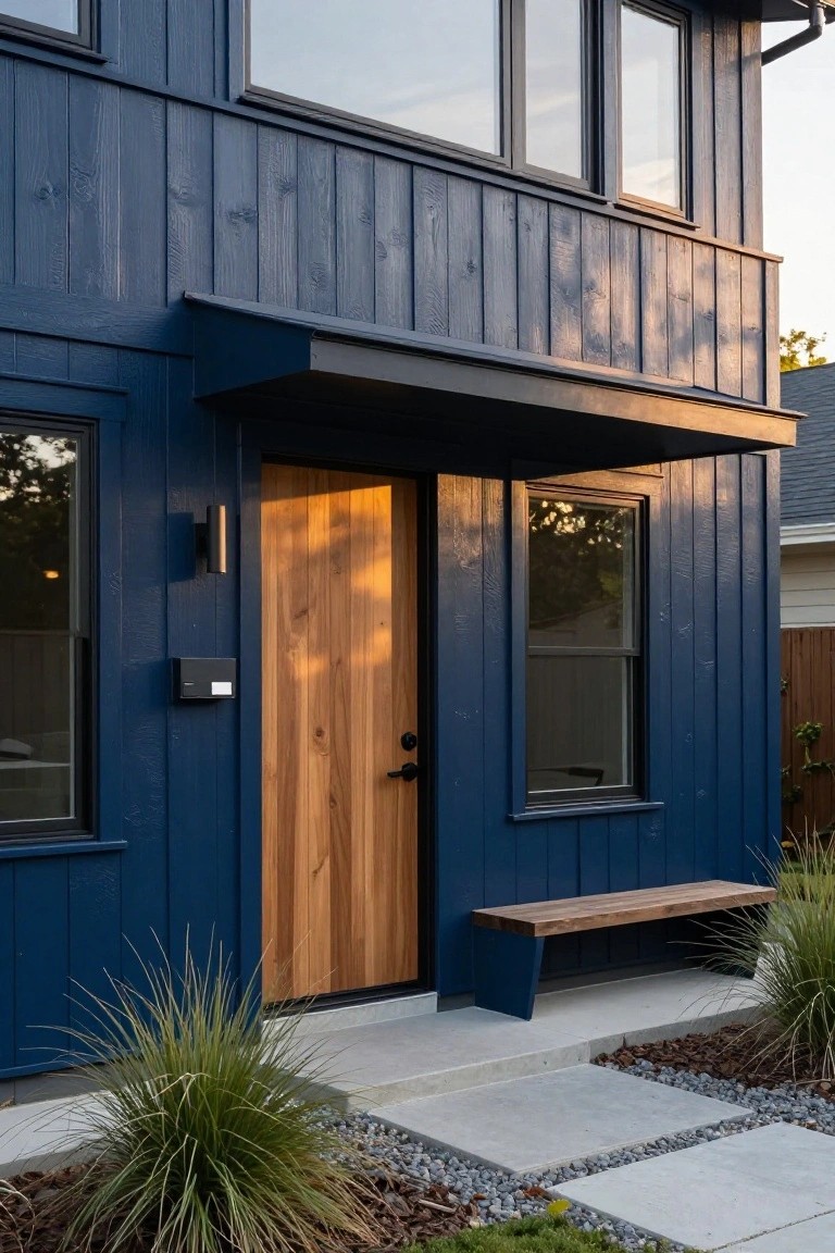
This shade of deep navy blue works well on vertical board-and-batten siding. It gives the house a strong, modern feel that stands out from lighter blues. The wood grain texture keeps it from looking too flat, and that warm wood door right by the entry pulls in some natural contrast.
Try it on homes with clean lines, like ranch or contemporary styles. It suits tree-lined neighborhoods where the color reads nicely against greenery. Go for black trim and hardware to match, and keep accents simple so the blue does the main work.
Vibrant Orange Door on Blue Exterior
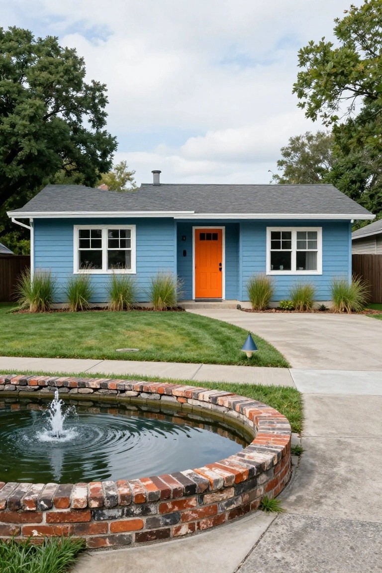
A cool blue siding like this one gets a real lift from a bright orange front door. The contrast pulls your eye right to the entryway and makes the whole house feel more welcoming without much effort. It’s a simple switch that turns a standard facade into something with personality.
This works best on cozy cottages or ranch-style homes where you want curb appeal on a budget. Stick to clean white trim around the windows to keep it crisp, and add low grasses along the base for a grounded look. Just avoid too many other colors, or it might feel busy.
Soft Blue Shingle Siding
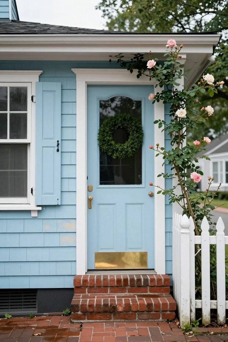
This shade of blue on shingle siding gives a house that easy, lived-in feel. It’s not too bright, just a gentle wash that blends with overcast skies and green leaves. The climbing roses in soft pink pull it together, making the entry look welcoming right away.
Try it on a bungalow or small cottage where you want curb appeal without much fuss. White trim keeps things crisp, and brick steps add a sturdy base. It suits neighborhoods with trees and older homes. Just make sure the roses get enough sun to climb nicely.
Navy Blue Shingle Siding
Navy blue shingle siding like this gives a house real texture and presence without going overboard. It catches the light in a way that flat paint never could, and that wooden door pulls it all together nicely. Folks notice the depth right away, especially with the white trim keeping things crisp.
This shade works best on homes with some Craftsman or coastal vibes, maybe in a neighborhood with trees and a bit of slope. Pair it with stone accents around the entry and simple potted plants. Steer clear of super sunny spots though, or it might fade quicker than you’d like.
Bright Blue Stucco Exterior
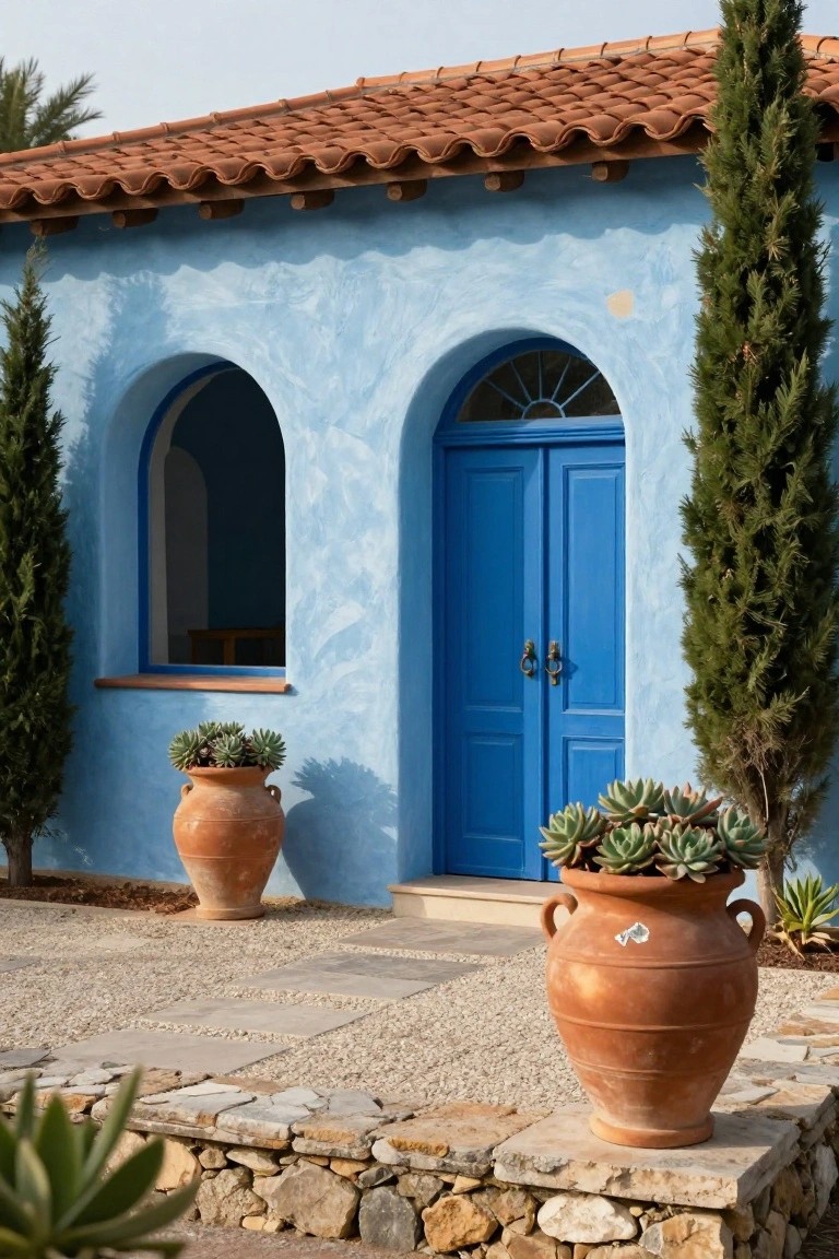
A bright blue on stucco walls makes a house stand right out. This shade has a sunny, sky-like feel that works well in warm spots. The rough stucco texture grabs the paint nicely, and it pairs easy with a red tile roof and simple clay pots out front.
Try it on ranch-style homes or cottages in dry areas. Keep accents warm like those pots with succulents, and stone steps leading up. It suits places with lots of sun… shade can make the blue look flat.
White Brick with Bold Blue Trim
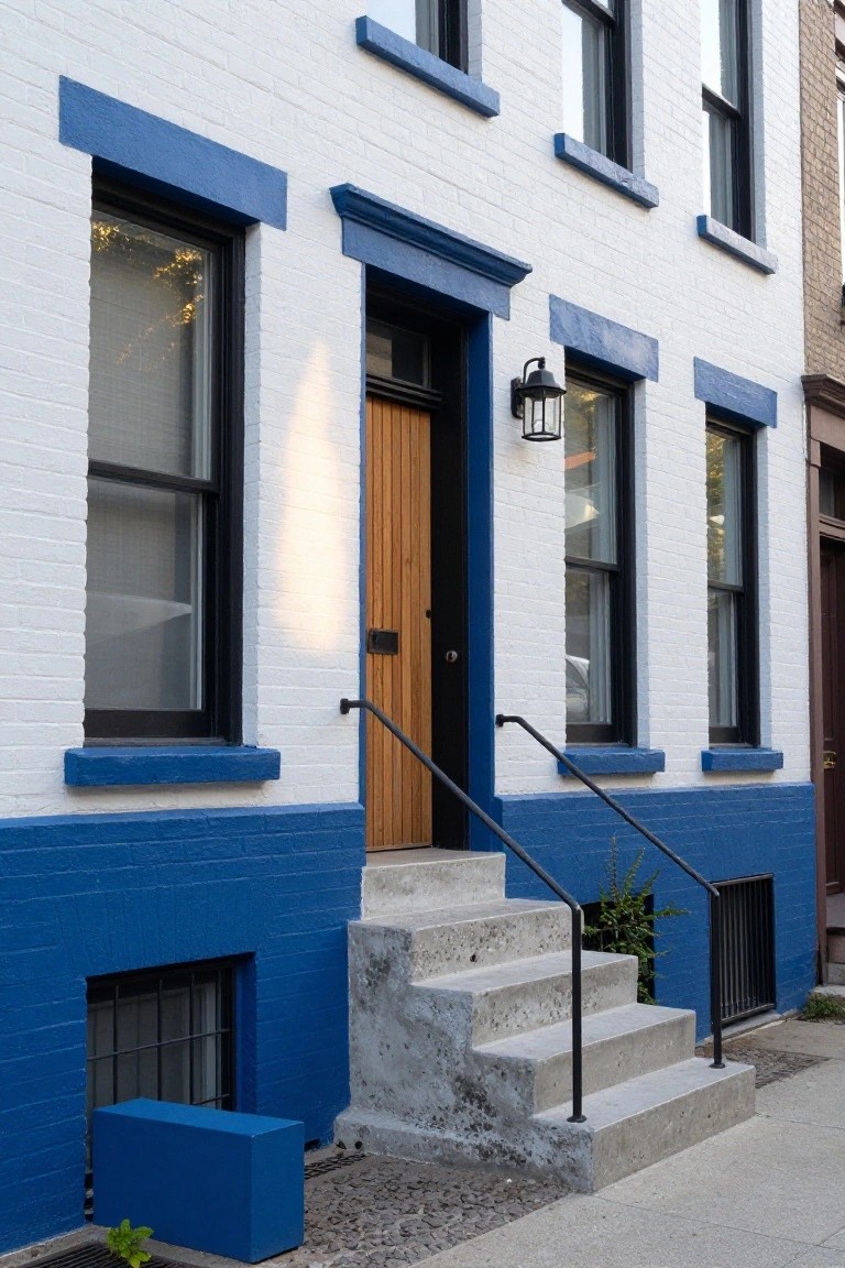
This rowhouse keeps the upper brick painted a clean white, then adds blue trim around every window and the door surround. The lower base goes fully blue too, right up to the sidewalk. That contrast makes the whole front stand out sharp and fresh. It’s a straightforward way to update an older place without changing the bones.
Try it on city rowhouses or narrow urban homes where you want curb appeal that grabs eyes. Pick a bright blue paint for the trim, sills, and stoop area. It suits brick best but works on siding too. Just test the shade in sunlight first, so it doesn’t fade to gray.
Navy Blue Clapboard Siding
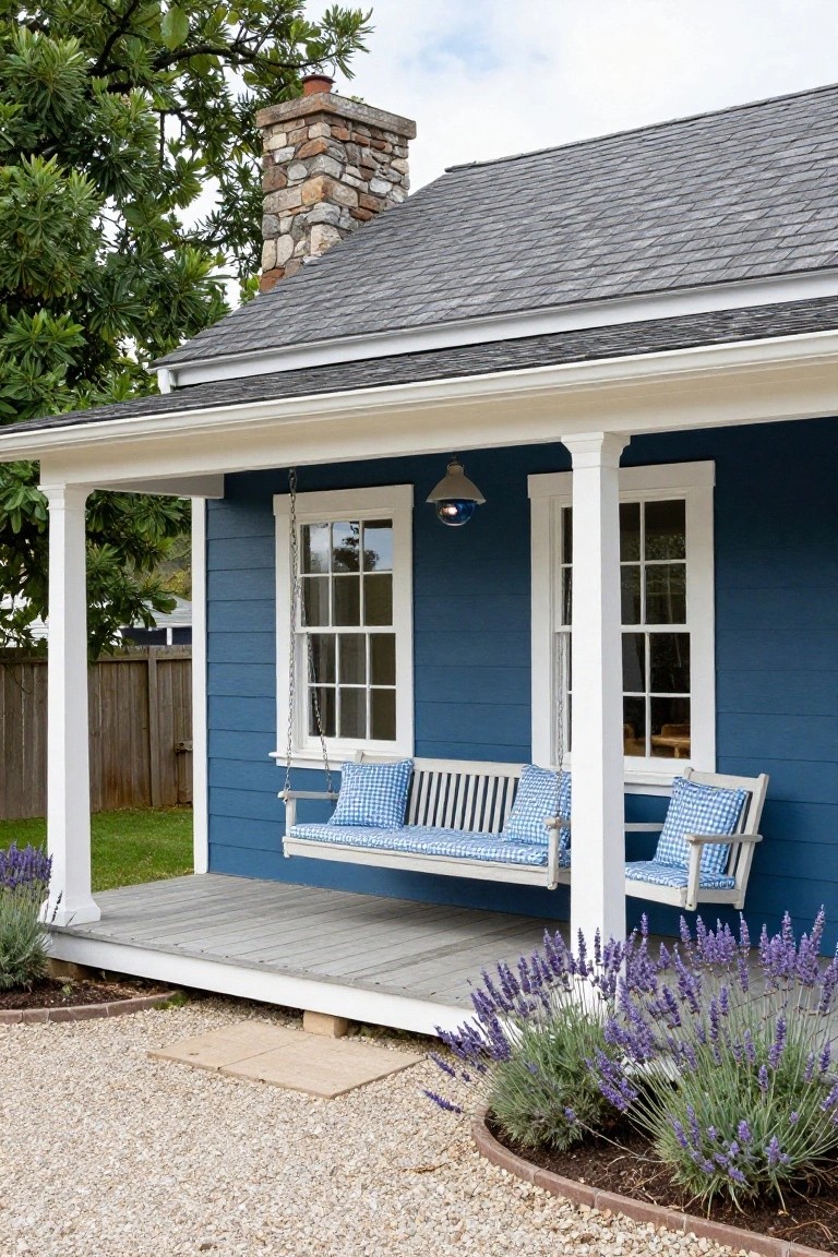
A deep navy blue paint on clapboard siding like this turns a simple cottage into something that catches the eye right away. The color feels steady and classic, especially against white window frames and porch columns. It holds up well in different lights, staying rich without washing out.
This shade works best on homes with straightforward lines, like bungalows or farmhouses under 2,000 square feet. Paint the body navy, keep trim crisp white, and add a porch swing for that lived-in feel. Skip it on larger houses, though. It can start to look heavy there. Just plant some low lavender along the base to tie it to the yard.
Turquoise Blue Front Door
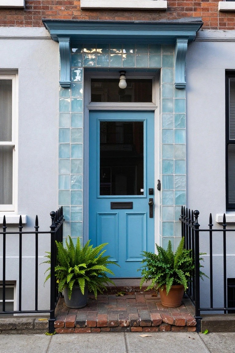
A turquoise blue front door like this one grabs attention right away on a simple house facade. The matching glossy blue tiles around the porch frame it nicely, making the entry feel special without overdoing things. Those light walls and brick details let the blue shade do the work, turning a plain row house into something with real curb appeal.
You can pull this off on older homes or narrow townhouses where you want one bold color move up front. Add a couple potted ferns for green contrast, like here, and keep the rest neutral. Just make sure the blue isn’t too dark, or it might blend into shadows.
Soft Blue on a Traditional Facade
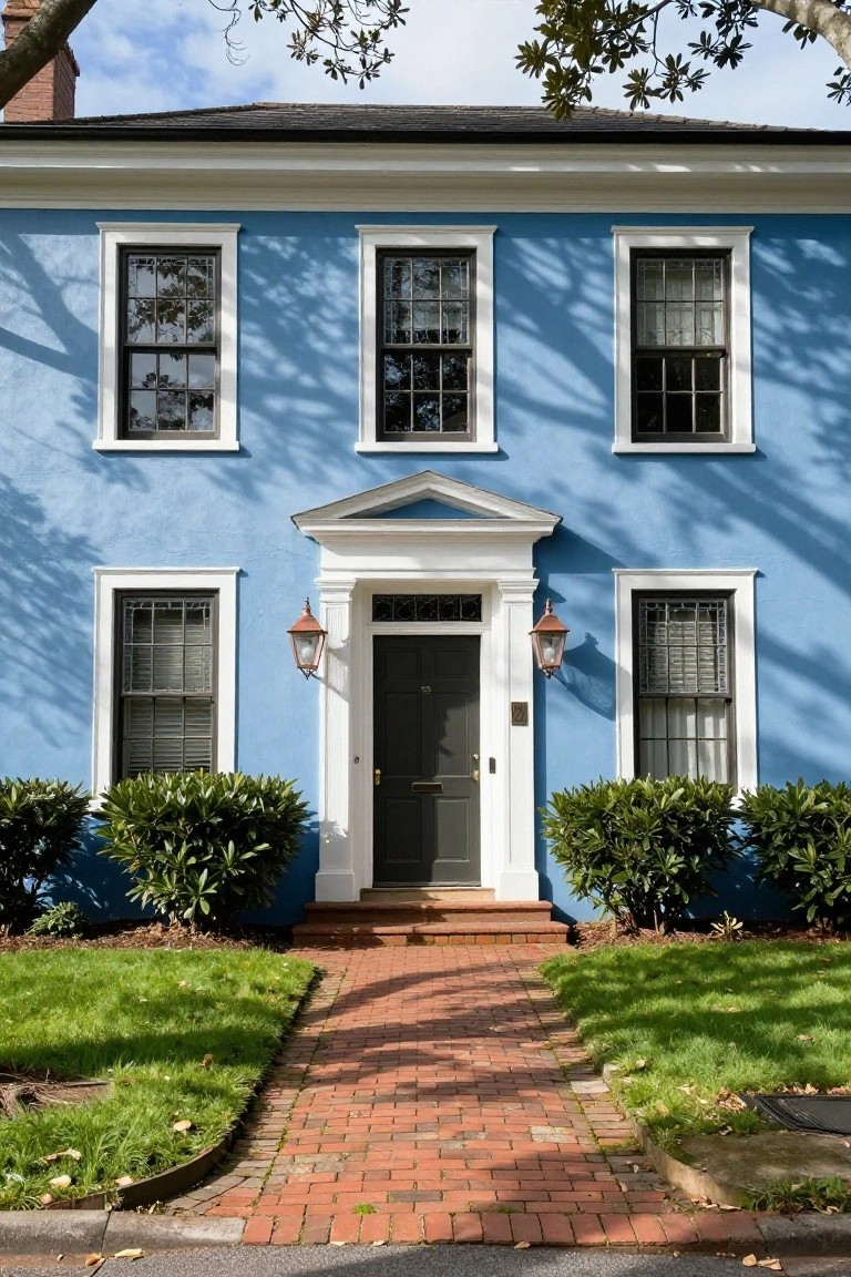
This shade of blue feels just right on older homes like colonials or Federals. It’s not too bright, more like a faded sky that settles easy on clapboard siding. The white trim pops clean against it, and that black door adds a simple anchor. Folks notice it without it shouting.
Try this on homes with straightforward lines and big windows. It works in neighborhoods where you want to fit in but stand out a touch. Keep the trim bright white, maybe add lanterns by the door like here. Skip it if your house has bold brick, though. It shines best where the blue can breathe.
Deep Navy Blue Siding
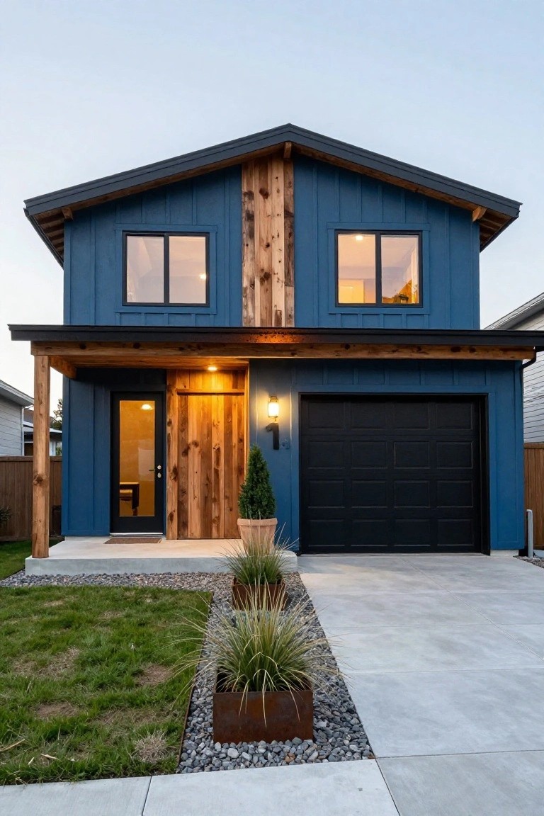
A deep navy blue like this on siding gives your house real presence from the street. It’s darker than most blues so it doesn’t shout, but it still pulls the eye right to the front door and that wood porch. The wood running up the center keeps things from feeling cold.
This shade fits modern farmhouses or ranch homes pretty well. Use it on vertical board-and-batten for extra interest. Black garage doors go nicely with it, and simple yard plants help tie everything down.
Muted Blue Stucco Exterior
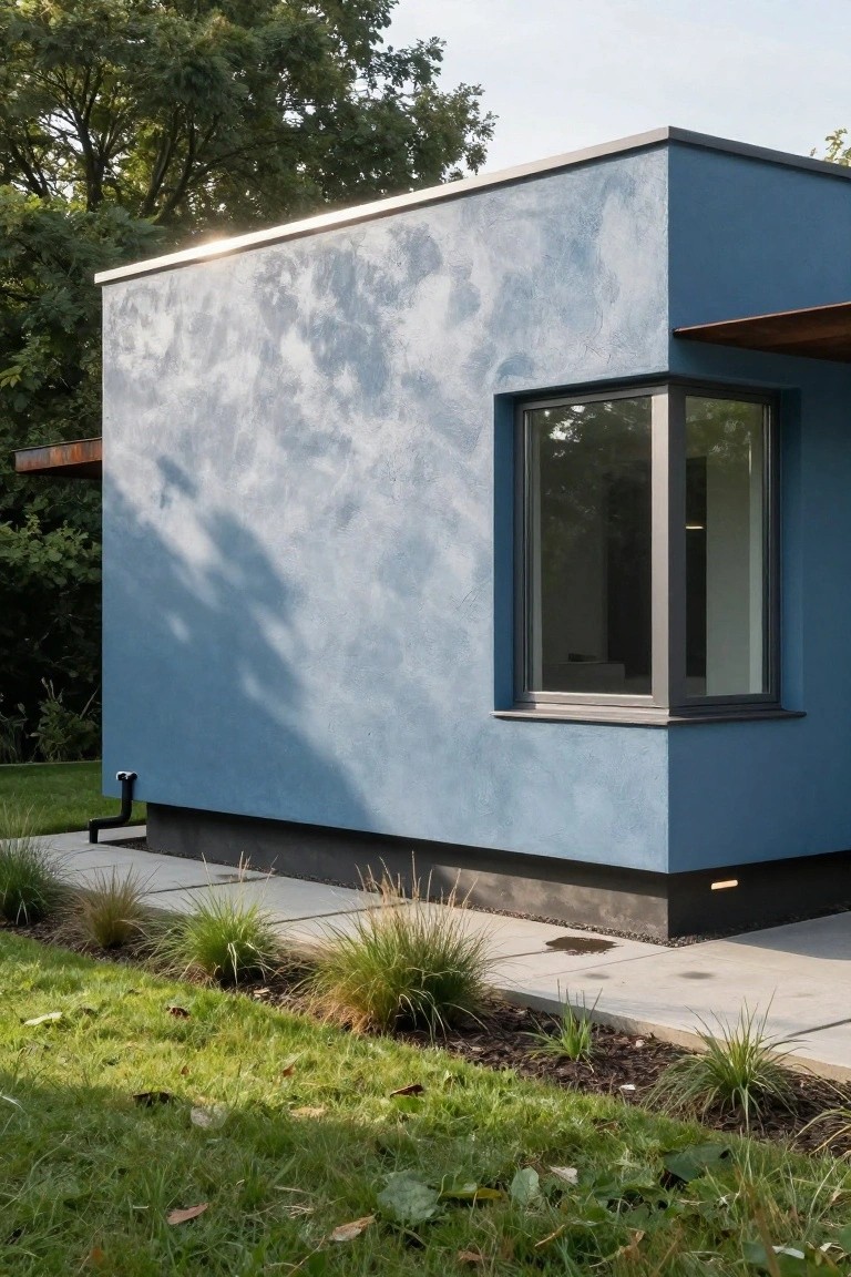
A soft blue stucco covers the walls of this modern house. The color feels calm and pulls back from brighter blues. It works because the texture catches light in a subtle way, making the boxy shape less severe. That drain pipe and corner window stay simple against it.
This shade suits homes in green settings or suburbs where you want some presence without shouting. Use it on plaster or render over block. Keep windows dark framed and landscaping low around the base. Avoid busy trim. It holds up well in shade too.
Pale Blue Stucco Exterior
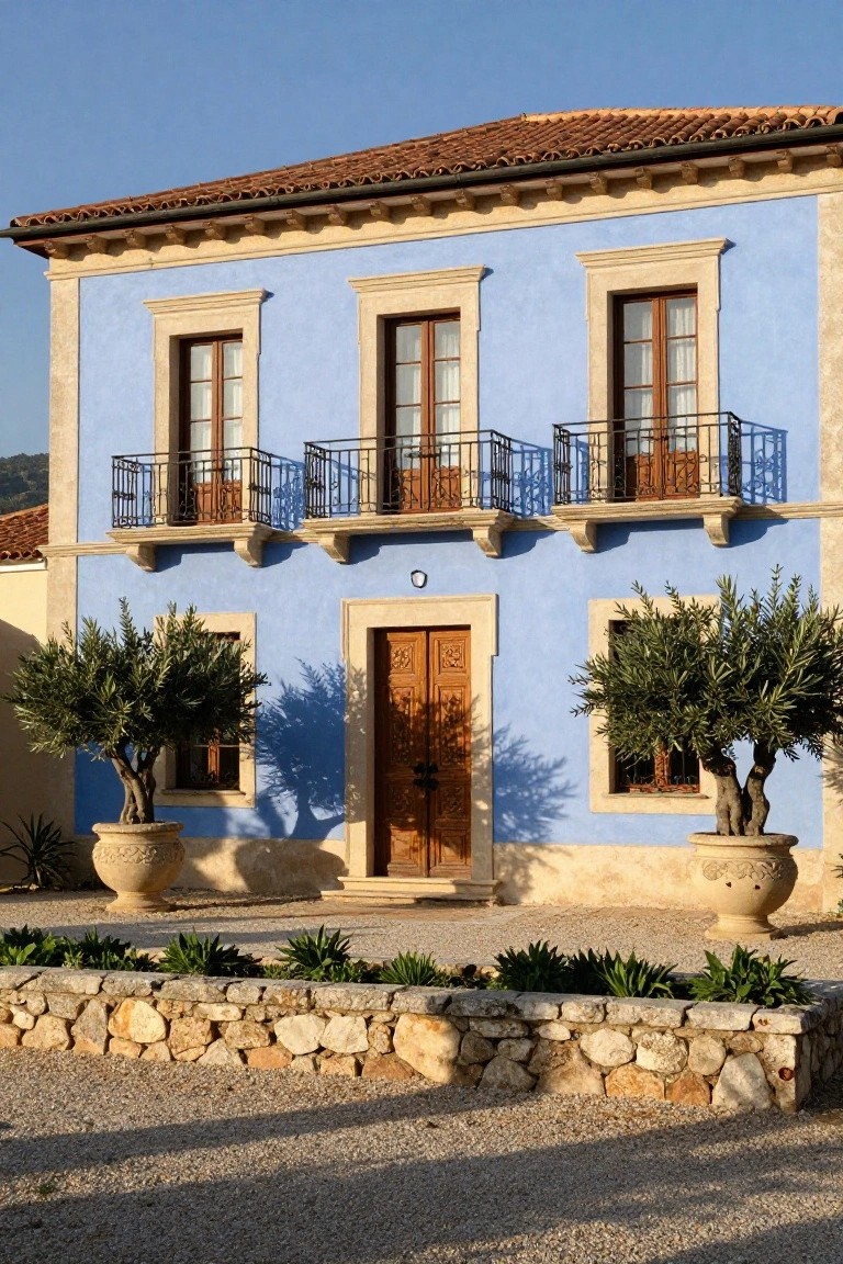
A pale blue paint like this on stucco walls keeps a house feeling light and easy in a warm spot. It plays right off the terracotta roof tiles without overpowering them. Olive trees in big pots on either side of the entry add some green that settles everything down nicely.
Try this shade on older style homes with tile roofs or stone trim. It suits places with lots of sun where you want the outside to look relaxed year round. Just make sure the blue isn’t too white or it might show dirt faster.
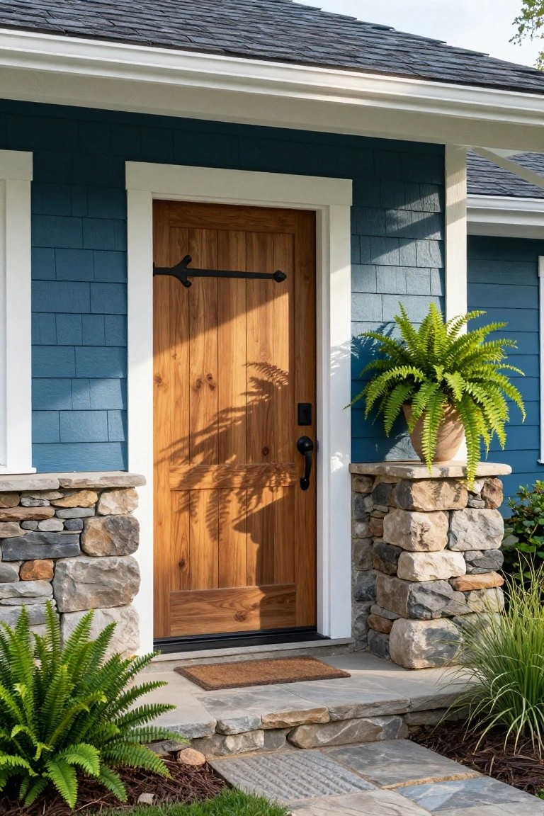
Muted Blue Siding Paired with Stone
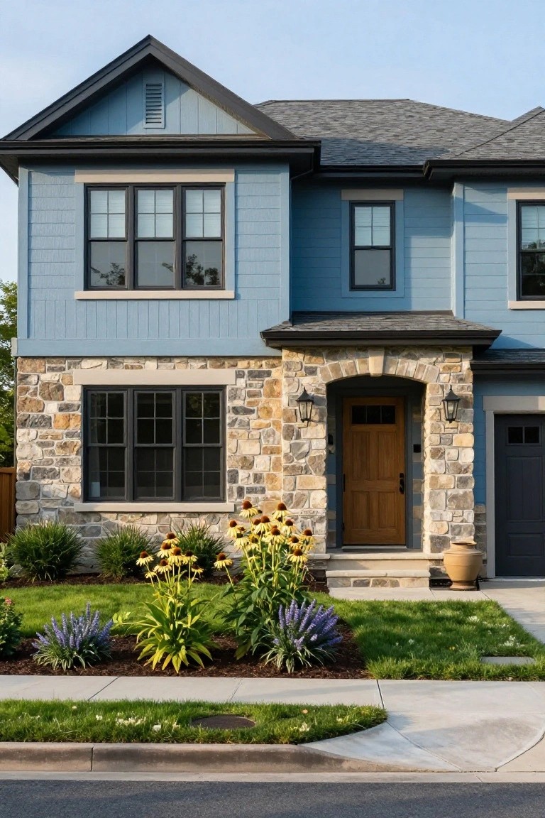
A house like this shows how a soft, dusty blue siding can make a front facade feel fresh and steady. The color sits quietly against the mix of stone at the base and entry arch, plus that warm wood door. It keeps things balanced, not too cool or stark, especially with dark window frames pulling it together.
This look fits homes with some traditional lines, like gables and stone work, in milder climates. Go for it on two-story setups where you want curb appeal that lasts through seasons. Add low plants out front to echo the stone tones, but skip anything too fussy… it stays clean that way.
Soft Blue Shingles for Coastal Charm
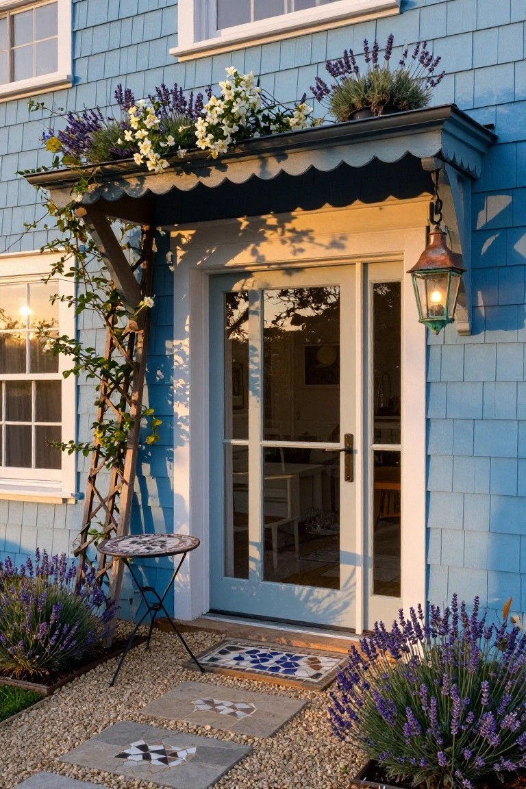
This soft blue shingle siding catches the light just right, giving the house that easy coastal vibe without trying too hard. Around the entry, lavender plants in pots and along the base pick up on the purple undertones in the blue. It makes the whole front feel pulled together and welcoming, like a summer cottage by the sea.
You’ll see this shade work best on shaker-style or Cape Cod homes where you want a gentle color that fades into the landscape. Frame the door with a simple trellis and repeat the lavender nearby. Skip it on super modern boxes, though. It needs some traditional lines to really settle in.
Navy Blue on a Backyard Shed
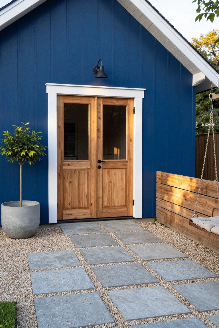
A deep navy blue like this works great on smaller outbuildings such as sheds or garages. It gives them presence in the yard without dominating the main house. The color pops against green grass and trees. Those natural wood doors keep it from feeling too stark. White trim around the entry ties it all together nicely.
Try this shade if you want a backyard spot that feels intentional and sturdy. It suits casual homes with some modern edge, like farmhouses or cottages. Paint the siding first, then add wood accents at the door for balance. Watch the scale though. On a tiny shed it shines, but bigger structures might need lighter shades nearby.
Frequently Asked Questions
Q: How do I pick a blue shade that matches my house’s architecture?
A: Look at your roof and siding first. Pick a blue that echoes those tones, like a soft navy for Craftsman homes or a bright turquoise for ranch styles. That pulls everything together without clashing.
Q: Will a dark blue make my small house look even smaller?
A: Go lighter instead. Pale sky blues open up the space and bounce light around. Dark shades swallow small homes, so save those for bigger ones.
Q: What’s the easiest way to see how a blue will look on my actual house?
A: Grab large paint samples and slap them on poster board. Prop them against your siding at different times of day. Sunlight changes everything, so check morning, noon, and evening.
Q: But what about neighborhood rules – can I still go bold?
A: Rules vary, so peek at your HOA guidelines or chat with neighbors. Bold blues pop if others have neutrals, but tone it down a notch if everyone’s playing safe. You want to stand out, not start fights.