

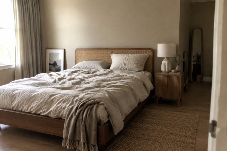
Low light can make even a gentle wall color look cooler or heavier than it did on a paint chip, especially beside dark floors or warm wood.
I find that Japandi shades work best when their undertones feel at home with the room’s trim, furniture, and natural materials rather than competing with them.
Soft greiges, muted greens, and warm off-whites can keep a dim space calm, though some may turn muddy when the light fades.
A small sample on more than one wall can show how a color shifts from morning to evening and against the surfaces around it.
I’d test the quieter, warmer shades first.
Warm Greige Walls Beside Woven Cane
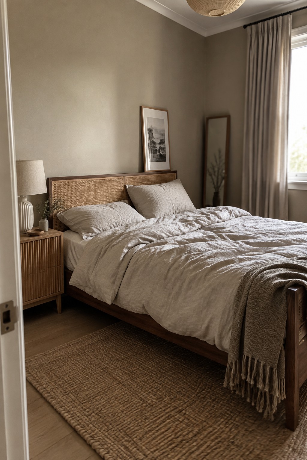
The walls look like a warm greige, a soft beige-gray that suits a low-light bedroom without feeling stark. This shade seems close to Benjamin Moore Pale Oak, Sherwin-Williams Accessible Beige, or Farrow & Ball Skimming Stone, though the exact match is hard to tell from a photo.
The color has a gentle warmth that works well with the cane headboard and other natural wood. In a dim room, test a sample on more than one wall first, since greige can lean browner or grayer depending on the light.
Charcoal Blue Walls With Warm Wood Shelving
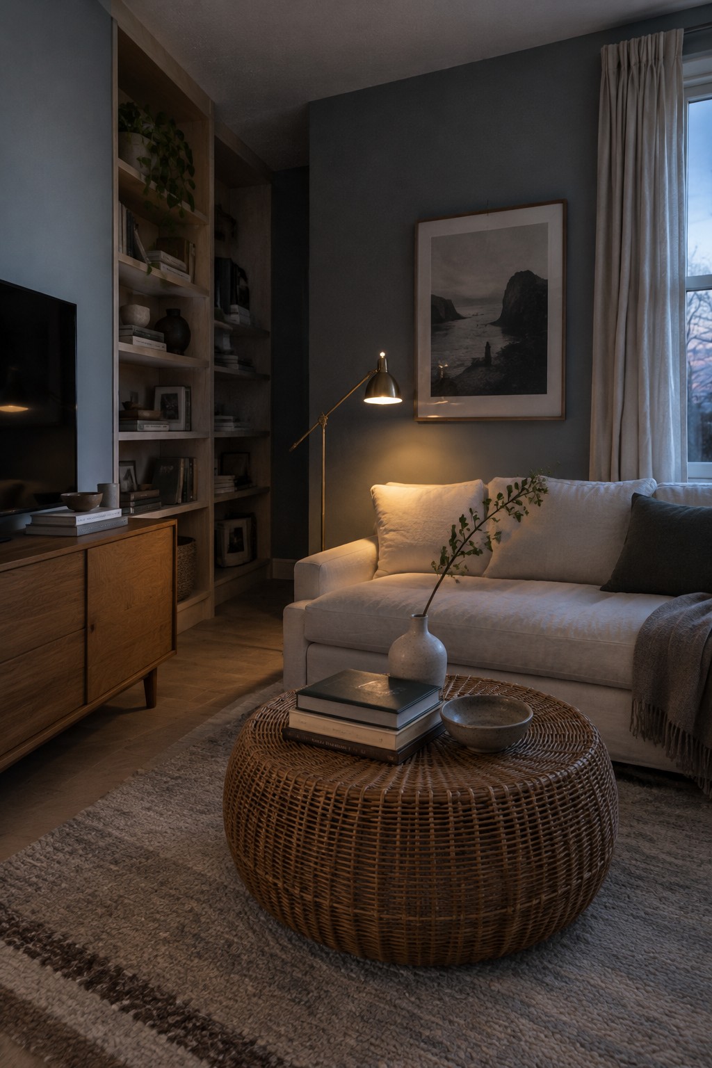
The walls look like a deep charcoal blue, close to Benjamin Moore Kendall Charcoal or Sherwin-Williams Cyberspace. It is a subdued, cool color that can give a low-light living room a settled feel without turning to plain black.
Warm wood shelving helps keep the shade from reading too cold. This color works best when you’re comfortable with a darker room; try it on one wall first if you’re unsure, since low light can make it look nearly black.
Warm Greige Walls in a Narrow Hallway
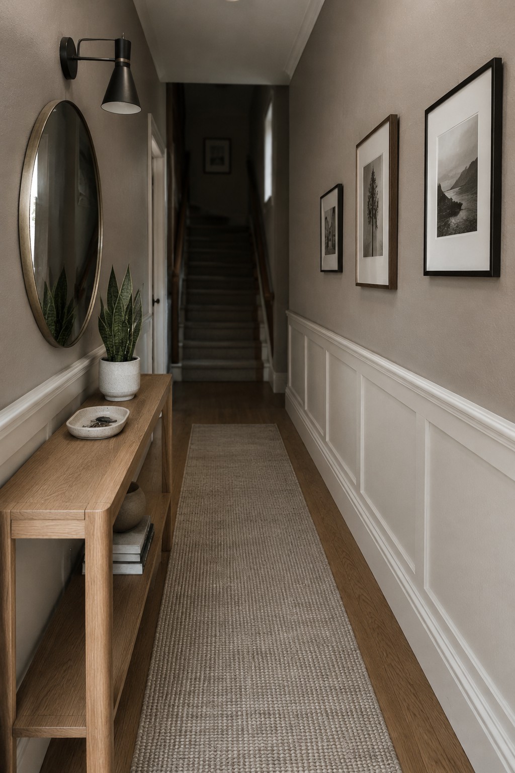
The walls read as a warm greige, a soft mix of beige and gray that suits a low-light hallway. It looks closest to Benjamin Moore Pale Oak, Sherwin-Williams Accessible Beige, or Farrow & Ball Drop Cloth, though the photo can’t confirm an exact match. This kind of muted neutral is gentle without looking stark.
In a hallway with limited natural light, greige can feel a little deeper than it does on a paint chip. The white paneling and warm wood floor help keep it from reading too gray. Test a sample on the wall first, especially if your bulbs are cool-toned.
Muted Sage Walls Beside Warm Oak
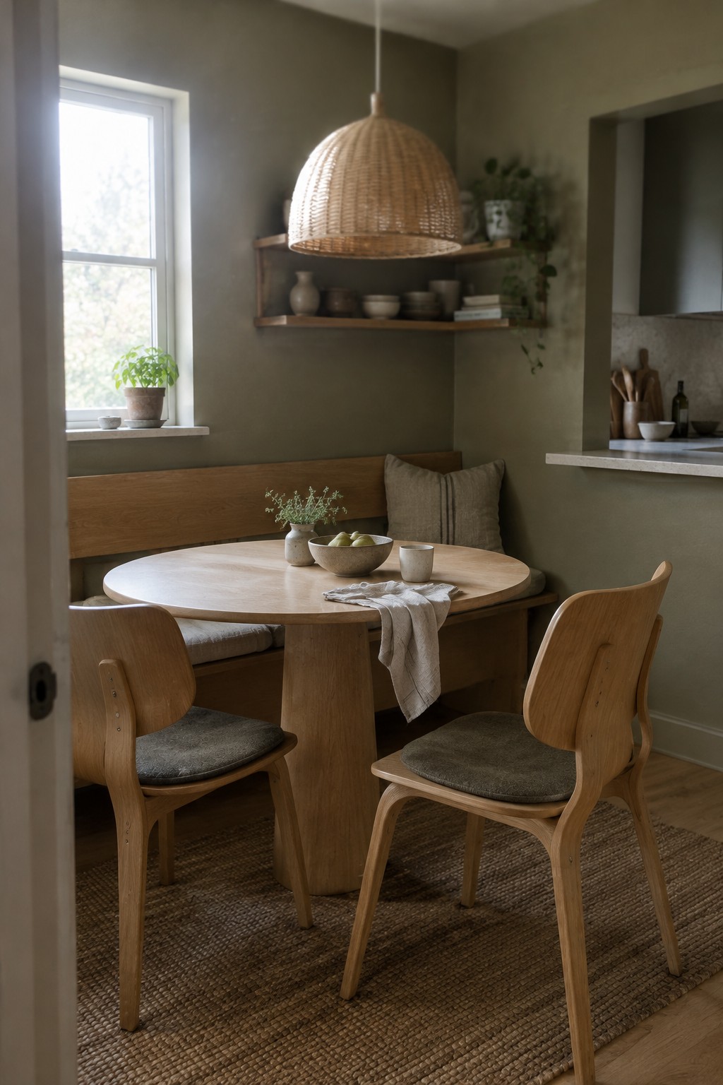
This looks like a muted sage green with a gray, slightly earthy cast. For similar shades, I’d look at Benjamin Moore October Mist, Sherwin-Williams Clary Sage, or Farrow & Ball Mizzle. It’s a gentle choice for a dining nook because it gives the walls color without making the small area feel too busy.
The warm oak bench and table suit this shade, while the window helps keep the green from reading too dark. In a low-light room, sample it on more than one wall first, since sage can look grayer or deeper when daylight is limited.
Warm Taupe Walls With Dark Wood Furniture

A warm taupe or brown-leaning greige looks closest here. For unbranded paint matches, consider Benjamin Moore Pashmina, Sherwin-Williams Accessible Beige, or Farrow & Ball Elephant’s Breath. This muted neutral suits a low-light dining room because it feels calm rather than stark, and it works naturally with dark wood.
In dim light, the color may read browner and deeper, so test a sample on the wall before painting the whole room. It pairs well with warm wood and cream upholstery; a cooler gray could make the walls feel dull by comparison.
Pale Greige Above a Fluted Vanity
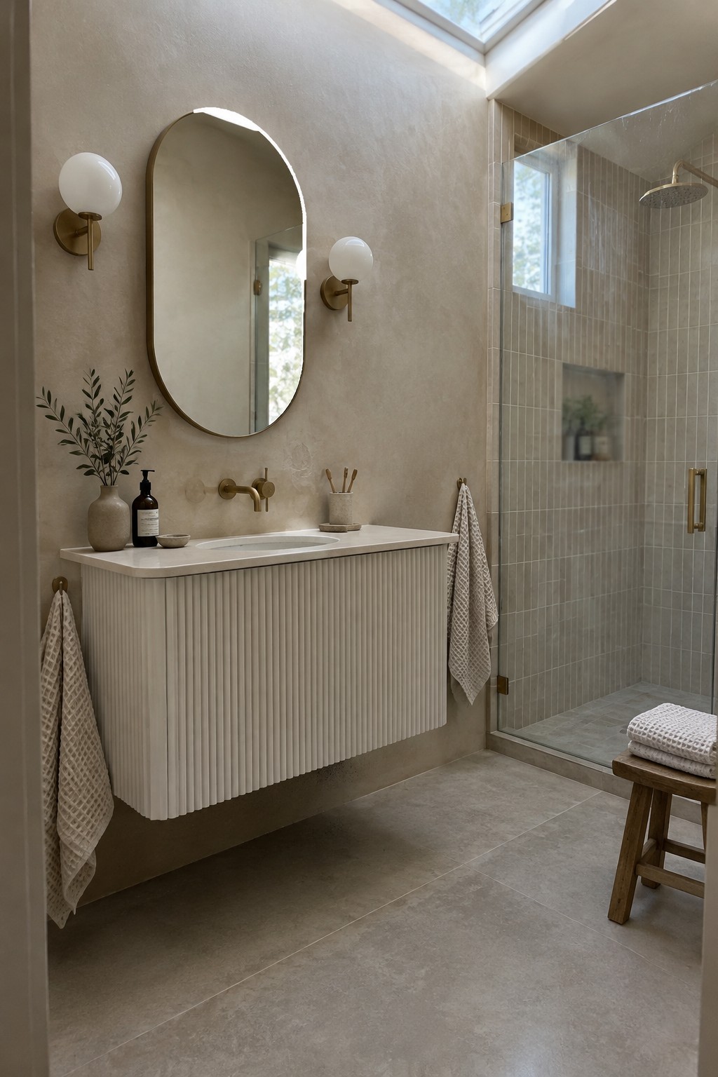
The walls look like a warm pale greige, close to Benjamin Moore Pale Oak, Sherwin-Williams Egret White, or Farrow & Ball Skimming Stone. It is a soft neutral with enough warmth to keep a bathroom from feeling stark, while still looking light and simple.
In a low-light room, this shade can read more beige, so test a sample on the wall before committing. It pairs well with the creamy vanity and pale stone surfaces here, and works nicely when you want a quiet backdrop rather than a strong contrast.
Olive Green Walls Across the Study
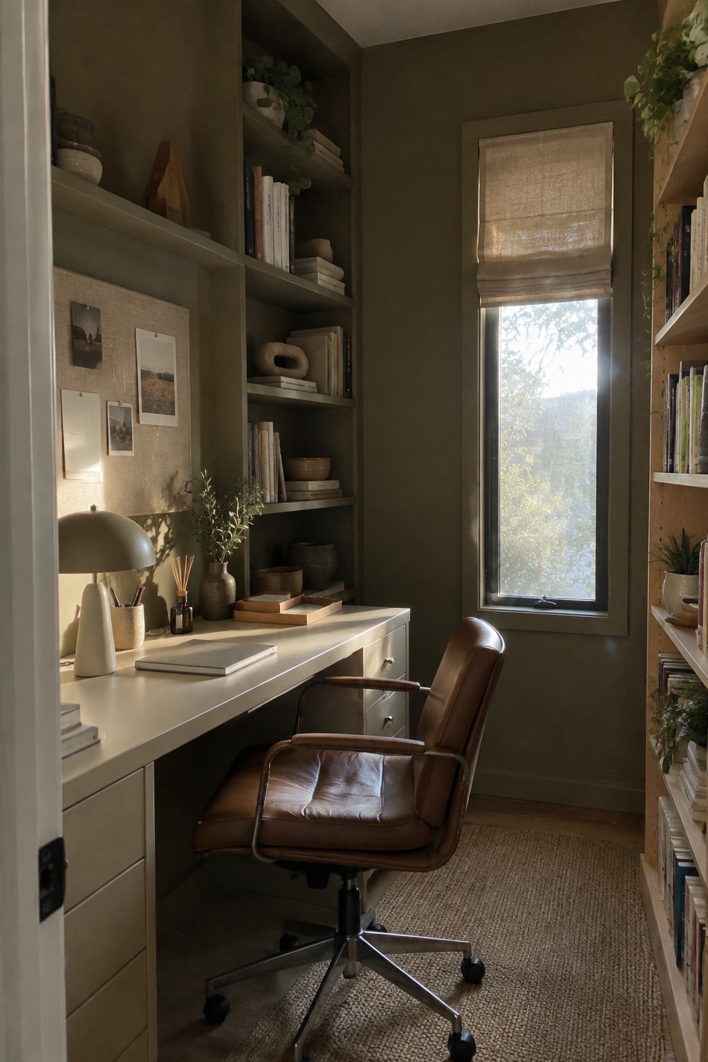
For this low-light study, the walls and built-ins read as a deep, muted olive green. It has a brownish warmth that keeps the color from feeling too cool or stark, and painting the shelves to match gives the narrow room a more settled look. A close unbranded match might be Benjamin Moore Vintage Vogue or Sherwin-Williams Shade-Grown.
The window brings in some daylight, but this shade will look darker in rooms with less of it, so test a sample on more than one wall first. Warm wood and brown leather sit comfortably beside olive green; use lighter wood or cream accents if you want the room to feel less enclosed.
Soft Greige Walls Beside Natural Oak
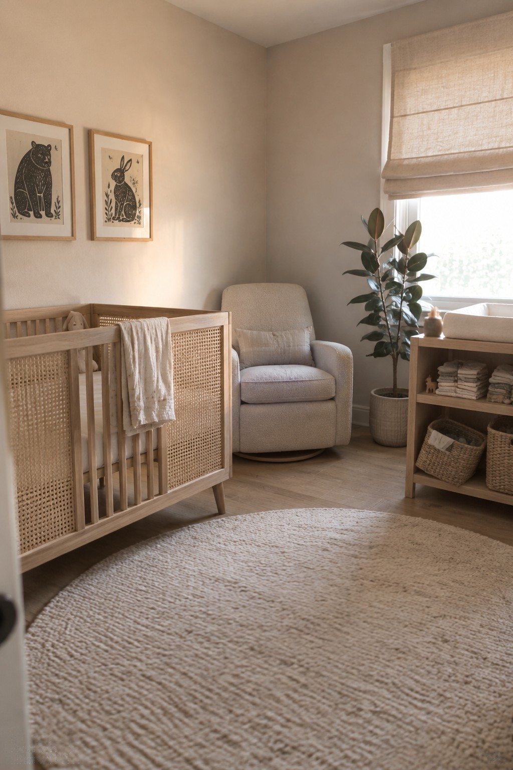
The walls look like a warm, pale greige, somewhere between beige and soft gray. For similar shades, I’d look at Benjamin Moore Pale Oak, Sherwin-Williams Egret White, or Behr Blank Canvas. This gentle neutral suits a low-light nursery because it feels soft without making the walls look stark.
The color appears warmer beside the natural oak crib, so it should work well with light wood and cream textiles. Check a sample on the wall first, since greige can look noticeably grayer in dimmer corners.
Charcoal Gray Walls With Warm Wood

The walls look like a deep charcoal gray with a muted, slightly cool undertone. For a close match, I’d look at Benjamin Moore Kendall Charcoal, Sherwin-Williams Peppercorn, or Behr Cracked Pepper. It’s a useful choice for a low-light room when you want a calm, cocoon-like feel rather than a bright white backdrop.
Warm wood keeps the dark paint from feeling too cold, while the window brings in some cooler daylight that may make the gray look bluer. Try a sample on more than one wall before committing, since charcoal can shift quite a bit in dim rooms.
Warm Taupe Walls Above White Tile
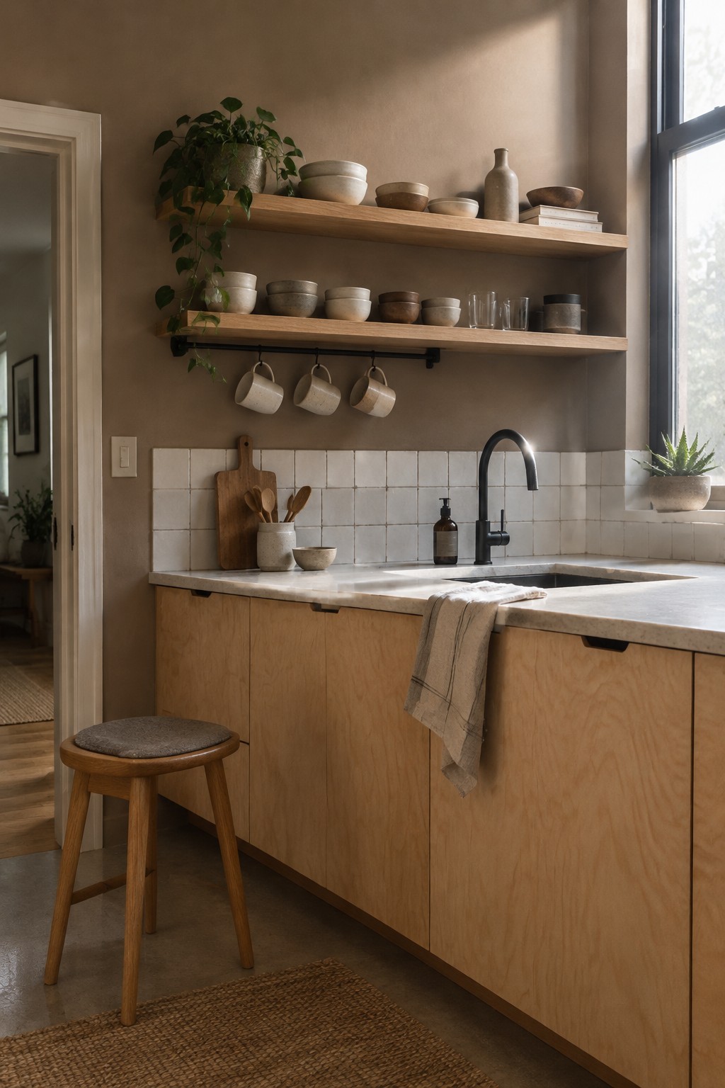
A warm taupe is the main paint idea here. It reads as a soft brownish neutral rather than a cool gray, and it gives a low-light room a little warmth without going very dark. Similar shades include Benjamin Moore Pashmina, Sherwin-Williams Tony Taupe, or Farrow & Ball Jitney.
The taupe works well beside the white backsplash and pale wood cabinets, which keep the overall look from feeling too heavy. In a dimmer kitchen, test a sample first, since taupe can turn noticeably browner when the light is limited.
Muted Olive Walls With a Woven Cane Headboard
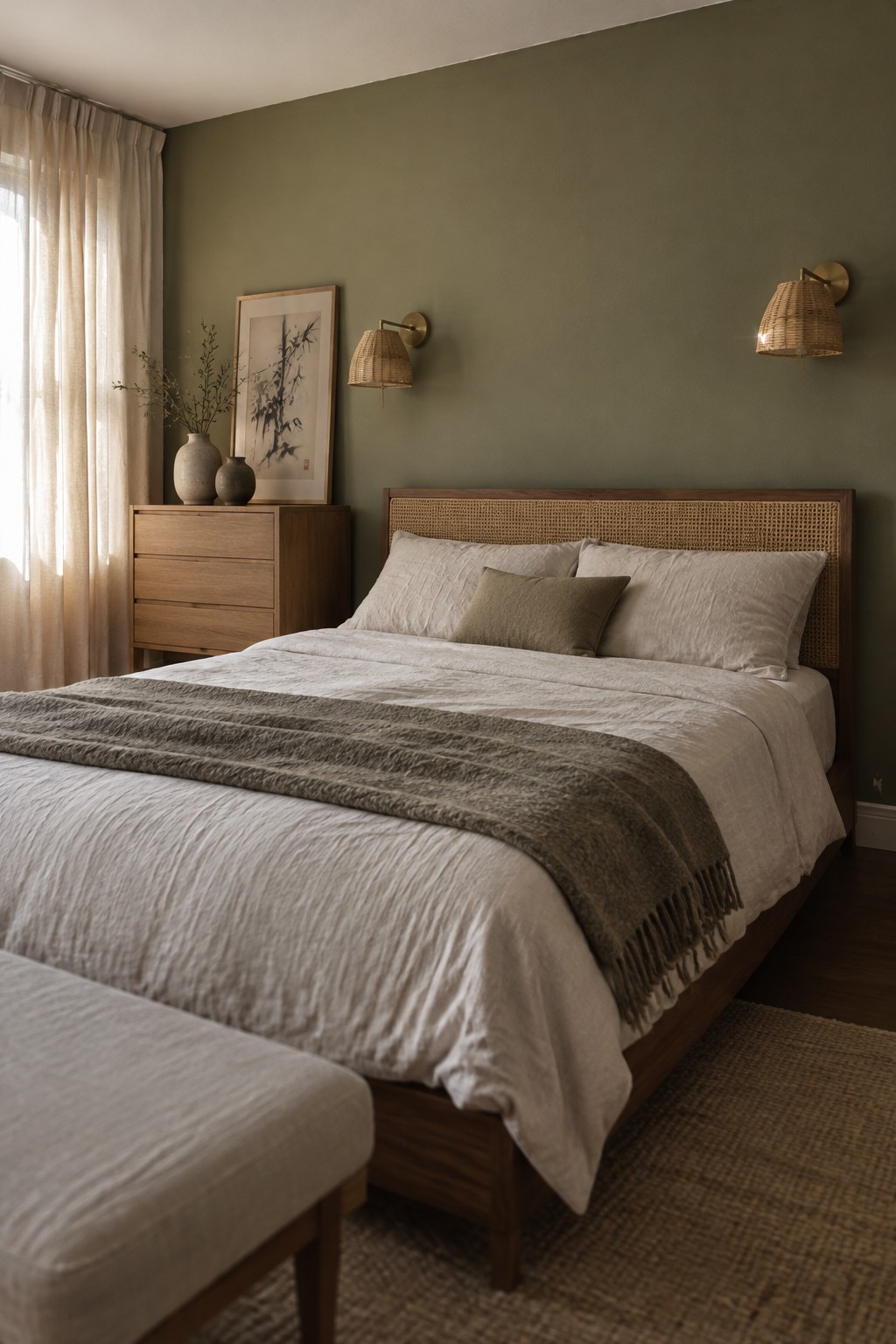
This wall color looks like a muted olive green, a grounded choice for a bedroom that gets limited daylight. Close matches might include Benjamin Moore October Mist, Sherwin-Williams Evergreen Fog, or Farrow & Ball Green Smoke, though the exact shade is hard to pin down from a photo.
The green has a soft, earthy cast that works well beside the warm wood and cane headboard. In a low-light room, it may read deeper and a little grayer, so test a sample on the wall before painting the whole room.
Warm Greige Walls Beside Rustic Wood
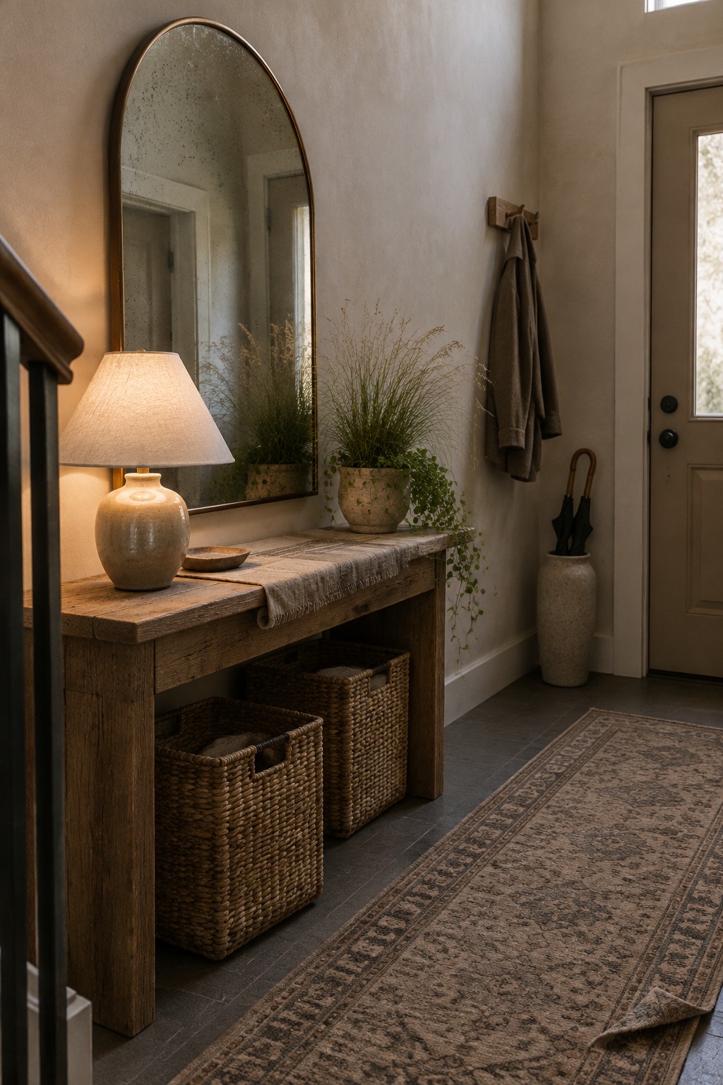
A warm greige or light taupe seems closest here, with likely matches such as Benjamin Moore Edgecomb Gray or Sherwin-Williams Accessible Beige. It’s a soft neutral that suits a dim entryway without making the walls feel stark.
The shade’s slight warmth works well beside the console’s aged wood. In a low-light room, test a sample first, since greige can read darker or more brown once the daylight fades.
Warm Greige in a Low-Light Bathroom
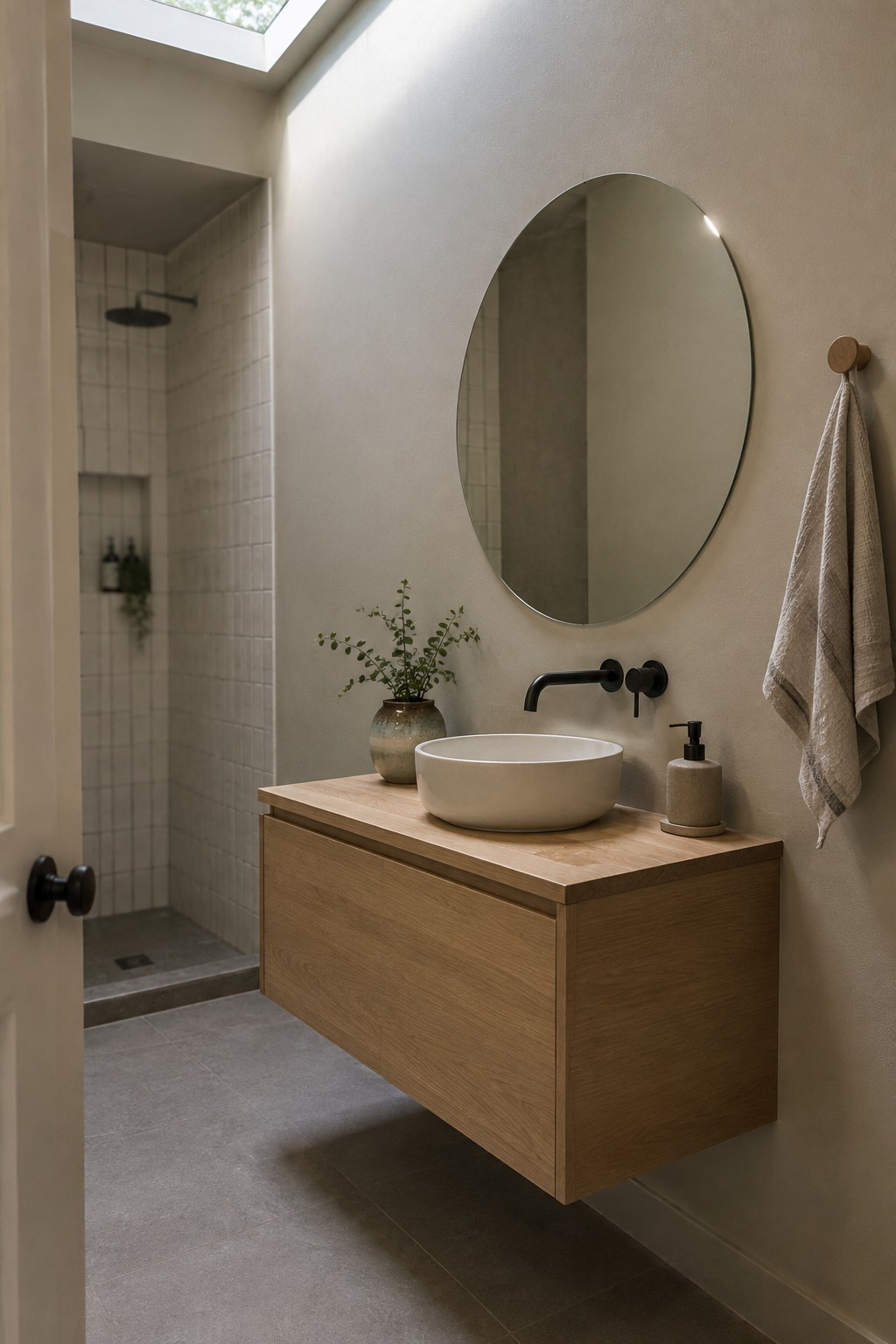
A warm greige, somewhere between beige and soft gray, seems closest here. For similar shades, look at Benjamin Moore Pale Oak, Sherwin-Williams Agreeable Gray, or Behr Wheat Bread. It’s a useful choice for a small bathroom because it feels gentle rather than stark, while still keeping the walls light.
The warm undertone works well with the oak vanity, and a little natural light from above helps the color stay from reading too dull. Try a sample on the wall first, since greige can shift noticeably in a room with limited daylight.
Muted Olive Walls With a Built-In Desk
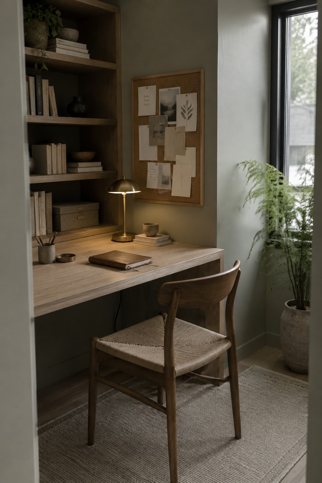
This wall color reads as a muted olive green, close to Benjamin Moore October Mist or Sherwin-Williams Evergreen Fog. It is a soft, earthy green rather than a bright sage, and it gives a small work area a settled feel without making the walls look too dark.
The color works well with the built-in’s warm wood, which brings out its warmer side. In a low-light room, test a sample first since olive can look browner when daylight is limited. Creamy white trim and natural-fiber textures are easy pairings.
Warm Taupe Walls in Cool Window Light
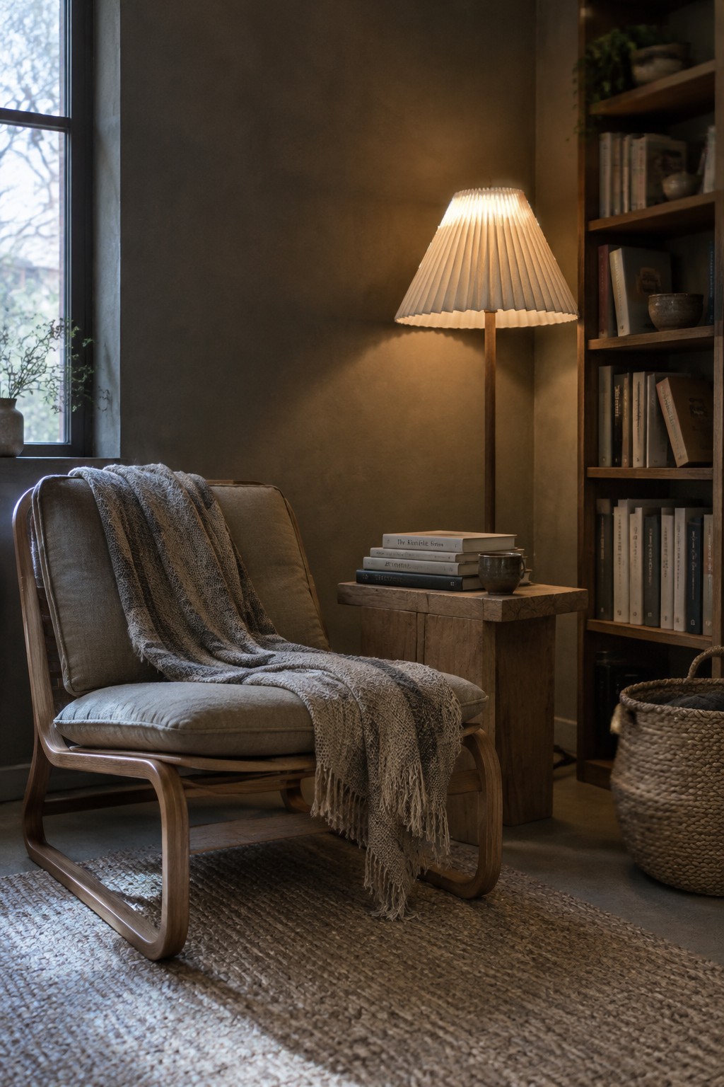
This looks like a warm taupe, a muted brown-gray that feels softer than a plain gray. Close matches might include Sherwin-Williams Balanced Beige, Benjamin Moore Pashmina, or Farrow & Ball Mouse’s Back. It suits a Japandi room where you want a low-key color with a little more warmth than greige.
In a low-light room, taupe can turn quite deep, while cooler window light may make its gray side more noticeable. Try it with warm wood and cream textiles, and test a sample on the wall first so it doesn’t read too muddy.
Warm Greige Walls Around a Compact Laundry Counter
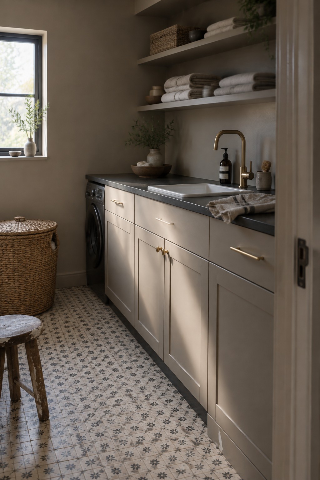
In this laundry room, the walls read as a warm greige, close to Benjamin Moore Pale Oak, Sherwin-Williams Accessible Beige, or Behr Wheat Bread. It’s a quiet neutral that feels softer than gray without turning strongly beige. That makes it a useful choice for a small utility room where you want a little warmth without a dark, heavy look.
The color appears slightly deeper away from the window, so test a sample in both the brighter and dimmer parts of the room. It pairs easily with the pale cabinetry and dark counter here. If your room gets very little daylight, choose a lighter sample so the walls don’t look muddy.
Dusty Rose Walls Beside Natural Wood

Dusty rose is the main wall color here, a muted warm pink that looks closest to Benjamin Moore First Light, Farrow & Ball Setting Plaster, or Sherwin-Williams Intimate White. It gives a bedroom a little color without feeling bright or sugary, which can be helpful when the room gets limited daylight.
The shade has a soft, earthy undertone that works well with the natural wood bed frame and pale neutral textiles. In a dim room it may read deeper and browner, so test a sample on more than one wall before committing.
Muted Olive Across the Reading Nook
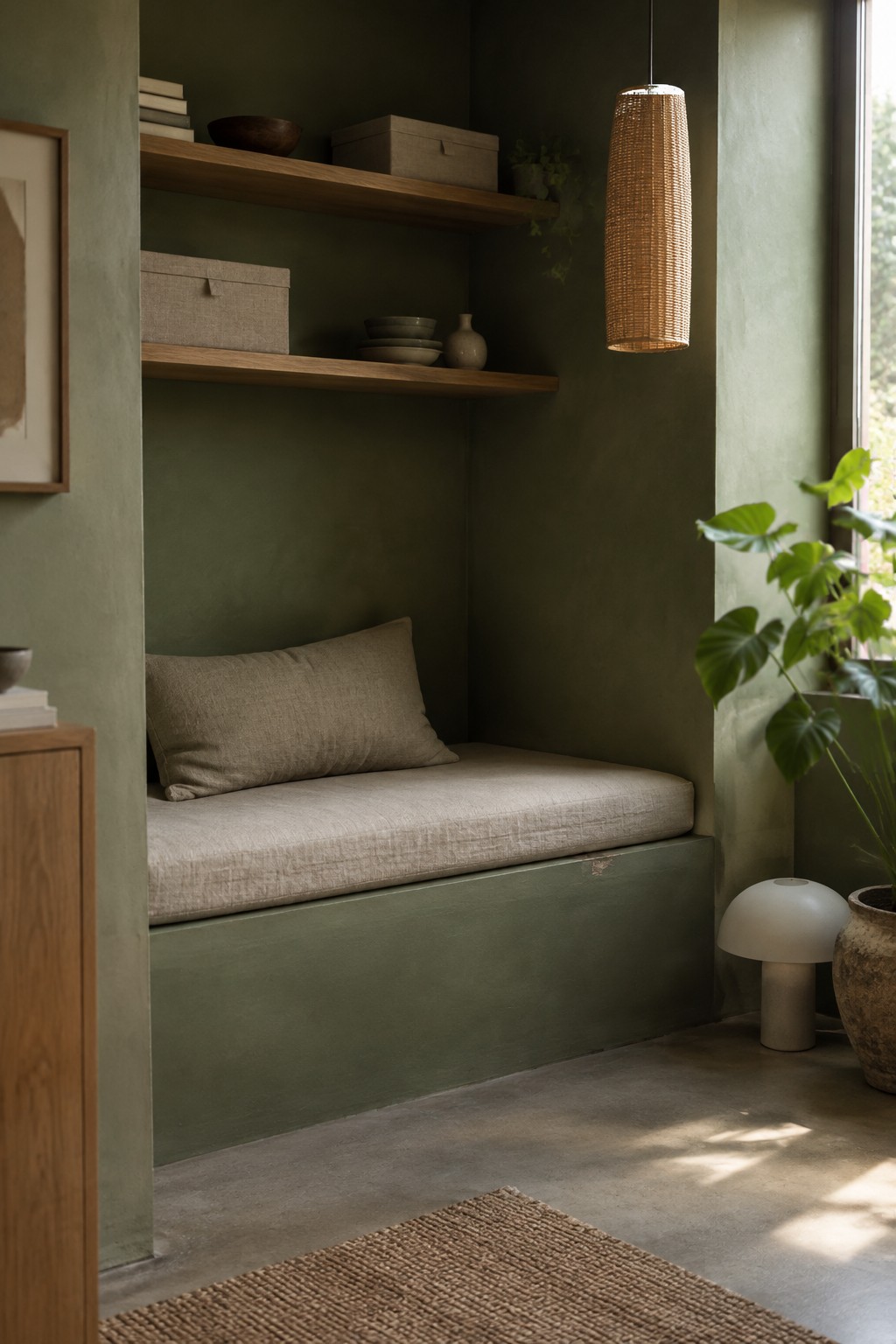
This looks like a muted olive green, with a slightly earthy, gray cast. For a close match, I’d look at Benjamin Moore’s Tate Olive, Sherwin-Williams’ Evergreen Fog, or Farrow & Ball’s Treron. Painting the nook walls and built-in bench the same color makes this a useful choice for a small spot that feels a little separate from the rest of the room.
The color stays fairly deep in the shaded nook, while natural light from the nearby window keeps it from reading too dark. Warm wood shelves and pale linen work well beside it. In a room with less daylight, test a sample first, since olive greens can look browner when the light is limited.
Frequently Asked Questions
Q: Will a warm white wall still look warm in a room with very little sunlight?
A: It can, but test a sample on the wall before painting the whole room. Some whites turn gray in cool, dim light, so check the color in the morning and evening too.
Q: Can I use a dark Japandi color in a low-light room?
A: Yes, especially on one wall or in a small nook. Pair it with pale wood and light fabrics so the space still feels balanced.
Q: What finish works best for low-light walls?
A: A matte or eggshell finish keeps the look soft and relaxed. If the room feels especially dim, eggshell can bounce a little more light without looking shiny.
Q: Should my trim match the wall color?
A: Matching them can make a small room feel calmer and less choppy. If you prefer contrast, choose a soft, muted trim color rather than a bright white.
