


Open-plan living and dining rooms need color that connects the spaces without making them feel flat or overly matched.
I find Japandi palettes work best when warm wood, flooring, and trim have room to shape how each paint color reads.
Soft whites can turn creamy in afternoon light, while muted greens and taupes may shift cooler beside gray stone or pale upholstery.
The balance matters.
I would test a few shades on different walls and look at them through the day, since a color that feels calm near the dining table may seem much stronger by the living room windows.
Muted Greige Walls With Warm Oak

The walls look like a muted greige, a warm gray-beige that keeps this open-plan living and dining area from feeling stark. A close match might be Benjamin Moore Pale Oak, Sherwin-Williams Accessible Beige, or Behr Wheat Bread; the exact shade is hard to tell from a photo.
This kind of neutral works well when the same wall color carries through connected rooms. Here, it sits comfortably beside the oak floor and dining table. Test a sample in both daylight and evening light, since greige can shift noticeably depending on the room.
Muted Olive Walls With Warm Walnut
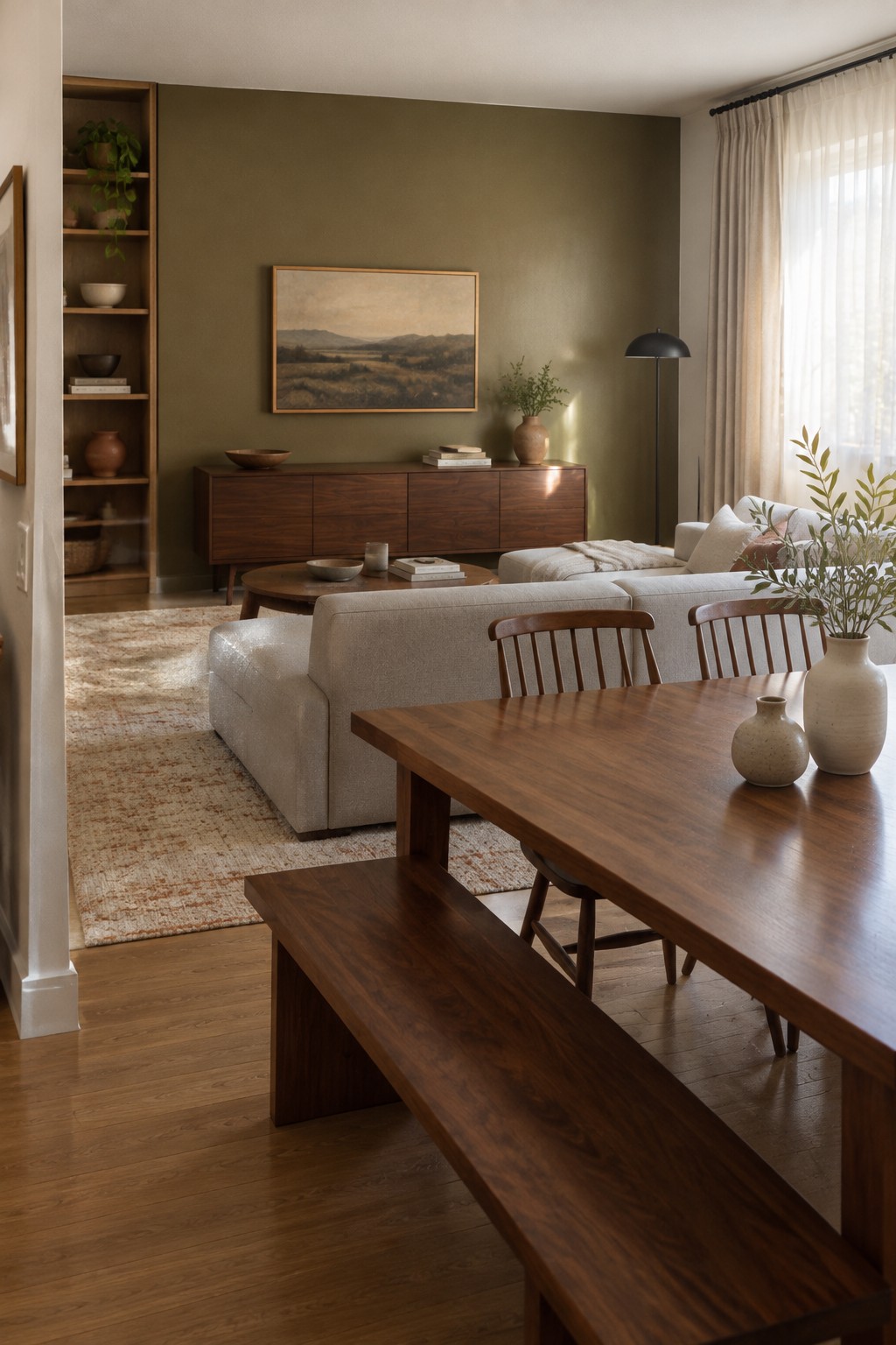
The wall color reads as a muted olive green, with a soft, earthy quality rather than a bright or grassy look. For an unbranded match, I’d look at Benjamin Moore Vintage Vogue, Sherwin-Williams Evergreen Fog, or Farrow & Ball French Gray. In an open living and dining area, this mid-tone green gives the connected rooms a clear color story without feeling too bold.
The warm walnut furniture brings out the green’s softer, slightly brown side. This kind of shade can work well in a room with good natural light, though it may look darker in a dim space. Pair it with creamy neutrals and warm wood for an easy Japandi palette.
Warm Greige Walls With Natural Oak Flooring
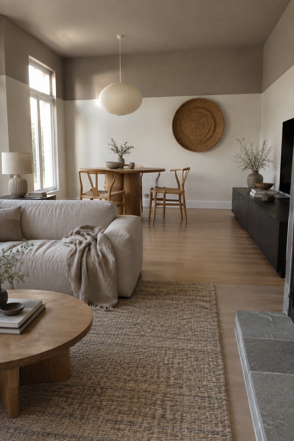
The walls look like a warm greige, a soft mix of beige and gray that keeps this open-plan room from feeling stark. Close matches might include Sherwin-Williams Accessible Beige, Benjamin Moore Edgecomb Gray, or Behr Wheat Bread. The color works well across connected living and dining areas because it gives both zones a quiet, consistent backdrop.
In changing daylight, greige can lean more beige or more gray, so test a sample on more than one wall before painting. Here, the natural oak flooring and furniture suit its warmer side. Choose a shade that still looks comfortable beside your wood tones, rather than one that turns too cool or muddy.
Muted Sage Walls Beside Warm Oak

This muted sage green looks closest to colors like Benjamin Moore October Mist, Sherwin-Williams Evergreen Fog, or Farrow & Ball Mizzle. It is a soft, slightly gray green that gives an open living and dining area more color than a neutral wall, without making the connected rooms feel separate.
The shade works well with warm oak flooring and pale wood shelving. In a room with less daylight, test a sample first, since the gray undertone may read cooler than expected.
Warm Greige Walls With Wood Cabinetry and Ceiling Beams

This looks like a warm greige, close to Benjamin Moore Edgecomb Gray, Sherwin-Williams Accessible Beige, or Farrow & Ball Skimming Stone. It is a soft neutral that keeps an open living and dining area feeling connected without making the walls stark white. The wood cabinetry and ceiling beam suit its gentle warmth.
In changing daylight, greige can lean more beige or more gray, so it is worth testing a sample on more than one wall. Pair it with natural wood and warm white trim; very cool whites may make it look dull.
Warm White Walls Across a Japandi Living and Dining Room
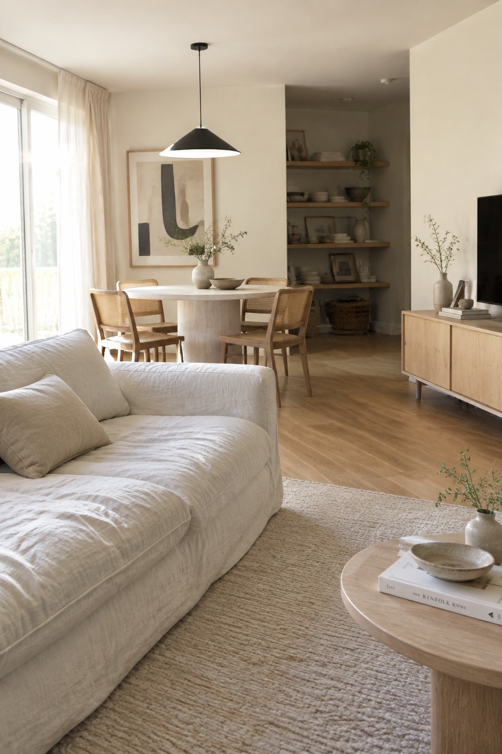
The walls look closest to a warm, soft white, with a slight creamy cast rather than a crisp, cool tone. A similar color might be Benjamin Moore White Dove, Sherwin-Williams Alabaster, or Farrow & Ball School House White. It suits an open living and dining area because it keeps the connected rooms feeling light without making the natural wood look stark.
In changing daylight, this kind of white can read warmer, so test a sample beside your wood flooring before painting the whole space. It works well with pale oak and linen, but a cooler white could feel out of place next to those warm materials.
Charcoal Walls Beside Warm Wood
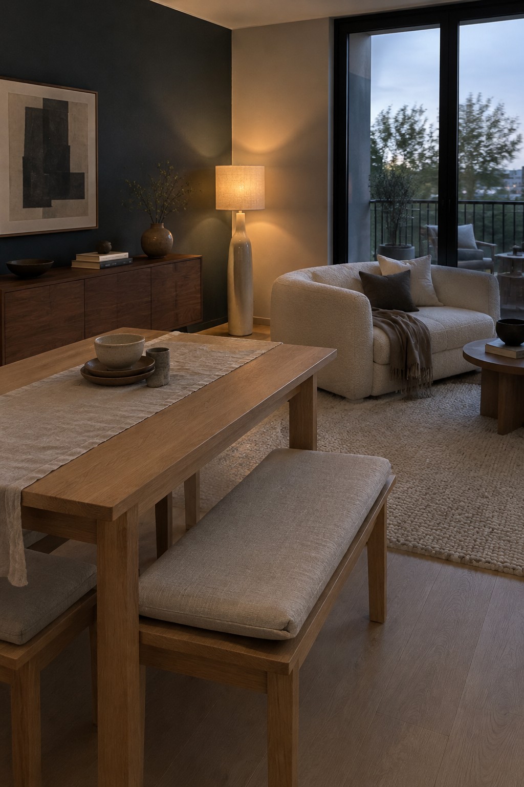
The walls look like a soft charcoal gray with a slight warm cast, rather than a stark black. For a close match, I’d compare it with Benjamin Moore Kendall Charcoal, Sherwin-Williams Urbane Bronze, or Behr Cracked Pepper. This deeper color gives a connected living and dining area a clear sense of separation without needing a wall or a change in flooring.
Warm wood keeps the charcoal from reading too cold, while the large windows bring in cooler natural light that may make it look grayer. Try a sample on more than one wall before committing, especially if the room gets limited daylight.
Warm Greige Paneling With Oak

The painted paneling reads as a warm greige, a soft gray-brown that feels more settled than plain beige. Close matches might include Sherwin-Williams Accessible Beige, Benjamin Moore Pashmina, or Farrow & Ball Elephant’s Breath. This kind of muted color works well across a dining area because it gives the walls some definition without competing with the natural oak nearby.
In changing daylight, greige can lean a little more gray or brown, so test a sample beside the wood before painting the whole area. It suits open-plan rooms where a quiet wall color helps the dining and living spaces feel connected.
Blue-Gray Charcoal Walls With a Warm Wood Dining Table
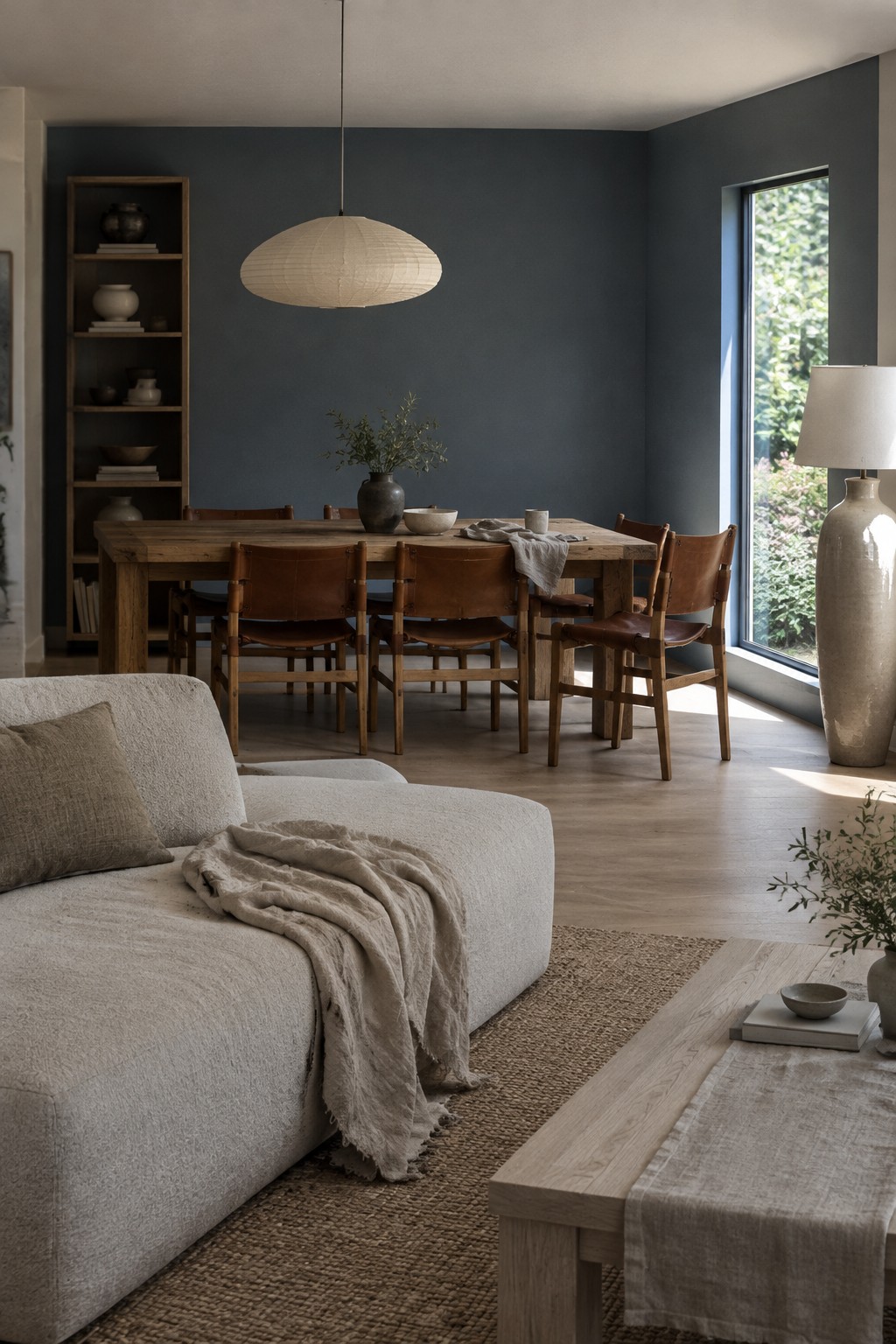
A muted charcoal blue-gray is the main paint idea here. It reads close to Benjamin Moore Kendall Charcoal, Sherwin-Williams Grays Harbor, or Farrow & Ball Down Pipe, though the photo can’t confirm an exact match. The deep, cool wall color gives an open living and dining area a clear backdrop without needing a dividing wall.
Warm wood helps keep the charcoal from feeling too cold. In a connected space like this, use the color on the dining-area walls and carry lighter neutrals into the living area; test a sample in both spots, since it may look bluer in daylight.
Warm Taupe Walls Beside Rustic Wood

The walls read as a warm taupe, with a brown undertone that feels softer than a standard beige. A close match might be Benjamin Moore Pashmina, Sherwin-Williams Balanced Beige, or Farrow & Ball Jitney. In an open living and dining area, this kind of muted neutral helps the connected rooms feel settled without making them seem dark.
It works especially well beside the exposed wood beams and floorboards, which bring out the color’s earthy side. Check a sample in both daylight and evening light, since a warm taupe can look quite brown in a dim corner.
Warm Greige Walls With Rustic Oak Flooring and Furniture

This open living and dining area looks closest to a muted warm greige, a soft neutral that sits between beige and gray. It keeps the connected rooms feeling easy and calm without making the walls look stark.
The color reads a little warmer beside the oak flooring and wood furniture. Similar shades include Benjamin Moore Pale Oak, Sherwin-Williams Agreeable Gray, or Farrow & Ball Skimming Stone. Sample a few on the wall first, since daylight can bring out more beige or gray.
Warm Terracotta Walls With Cane and Oak Accents

A muted terracotta, or warm clay, is the main paint idea here. It looks closest to earthy shades like Benjamin Moore Potters Clay, Sherwin-Williams Cavern Clay, or Farrow & Ball Red Earth, though the exact match is hard to tell from a photo. This rusty color gives one side of an open living and dining area a clear boundary without making the connected rooms feel closed off.
The warm red-orange undertone works naturally with oak and woven cane. In a room with less daylight, terracotta may read darker, so test a sample on the wall first. It suits a single accent wall or dividing wall especially well, with quieter warm neutrals nearby.
Warm Greige Walls With a Dark Wood Dining Table
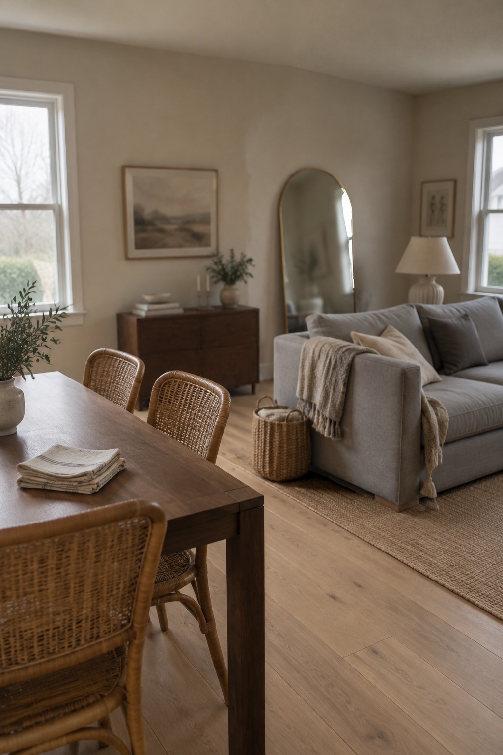
For this open-plan room, the walls look closest to a warm greige, a soft neutral between beige and gray. It keeps the dining and living areas feeling connected without making the room too stark. The dark wood dining table gives the pale walls a useful bit of contrast.
The color appears slightly beige in the natural light, so it should pair easily with light oak floors and cream or gray furnishings. Look at samples in both parts of the room before choosing, since the shade may read grayer away from the windows.
Warm Greige Walls With Dark Wood Shelving

The walls read as a warm greige, a quiet mix of beige and gray. A close match might be Benjamin Moore Pale Oak, Sherwin-Williams Accessible Beige, or Farrow & Ball Skimming Stone. This kind of neutral works well in an open living and dining area because it lets the rooms feel connected without making the walls look stark.
The color appears warmer beside the dark wood shelving and dining furniture, while its gray side keeps it from leaning too yellow. It suits homes with natural materials and soft, warm lighting. Test a sample on more than one wall, since it may look grayer in a dim hallway.
Golden Ochre Walls With Honey-Toned Wood

A warm ochre yellow, close to muted golden beige, gives this open living and dining area a sunny feel without reading as bright yellow. For similar paint colors, look at Benjamin Moore Hawthorne Yellow, Sherwin-Williams Blonde, or Farrow & Ball Hay.
The color can shift more golden in direct daylight, so test a sample on the wall before painting the whole space. It pairs naturally with wood floors and oak furniture, and a soft cream trim can keep the overall look from becoming too strong.
Muted Blue-Green Walls With Pale Oak

A muted blue-green is the main paint idea here, likely close to Benjamin Moore Quiet Moments, Sherwin-Williams Comfort Gray, or Farrow & Ball Pigeon. It sits between soft blue and green, with a gentle gray cast that keeps the color easy to live with across connected living and dining areas.
Pale oak flooring and furniture suit this cooler wall color, while cream and natural-texture accents help the open space feel connected. In strong window light, the blue-green may read lighter and bluer, so test a sample on more than one wall before committing.
Deep Charcoal Walls With a Pale Stone Coffee Table
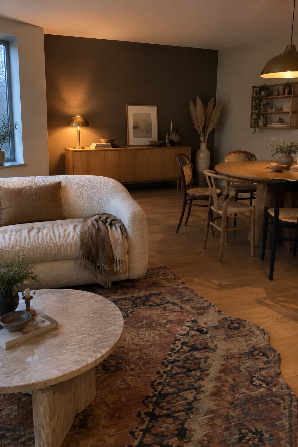
A deep, warm charcoal wall color suits an open living and dining area when you want the rooms to feel connected but not stark. It looks closest to a brown-leaning charcoal, rather than a cool blue-gray, and pairs naturally with the honey-toned wood nearby.
In softer light, this shade can read quite dark, so it works best where there is enough daylight or warm lamp light to keep the room comfortable. Try it with light upholstery and pale stone, and test a sample on the wall first since charcoal can shift noticeably from one corner to another.
Soft Taupe Walls With Light Oak Furniture
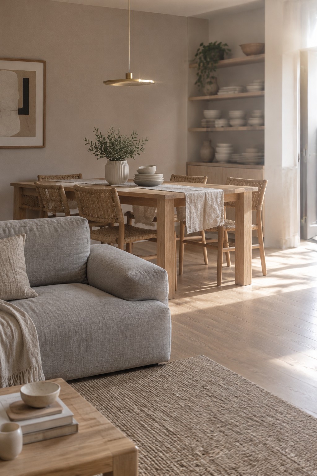
This open living and dining area looks closest to a warm taupe or soft greige, a quiet neutral that works well across connected rooms. Similar shades include Benjamin Moore Edgecomb Gray, Sherwin-Williams Accessible Beige, and Farrow & Ball Skimming Stone. The color feels warmer than a plain gray, but still subtle enough to let the dining area and living room feel connected.
In strong window light, the walls may read lighter and more beige, while shaded areas can look a little grayer. Pale oak flooring and furniture suit this color well; use a sample on more than one wall before painting, since the undertone can shift with the light.
Clay-Toned Walls Defining the Living and Dining Areas
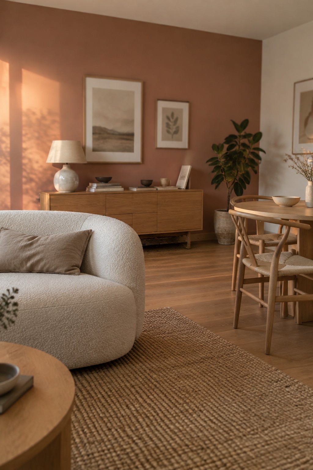
A muted terracotta or clay-pink paint seems closest here, with a warm, earthy quality rather than a strong orange cast. It gives the open living and dining area a clear change in color while still feeling comfortable beside the oak furniture.
Warm wood and cream upholstery suit this shade, and the natural daylight helps it read softly. In a dimmer room, test a sample first, since terracotta can look deeper and more orange without much daylight.
Muted Olive Built-Ins Beside Warm Oak
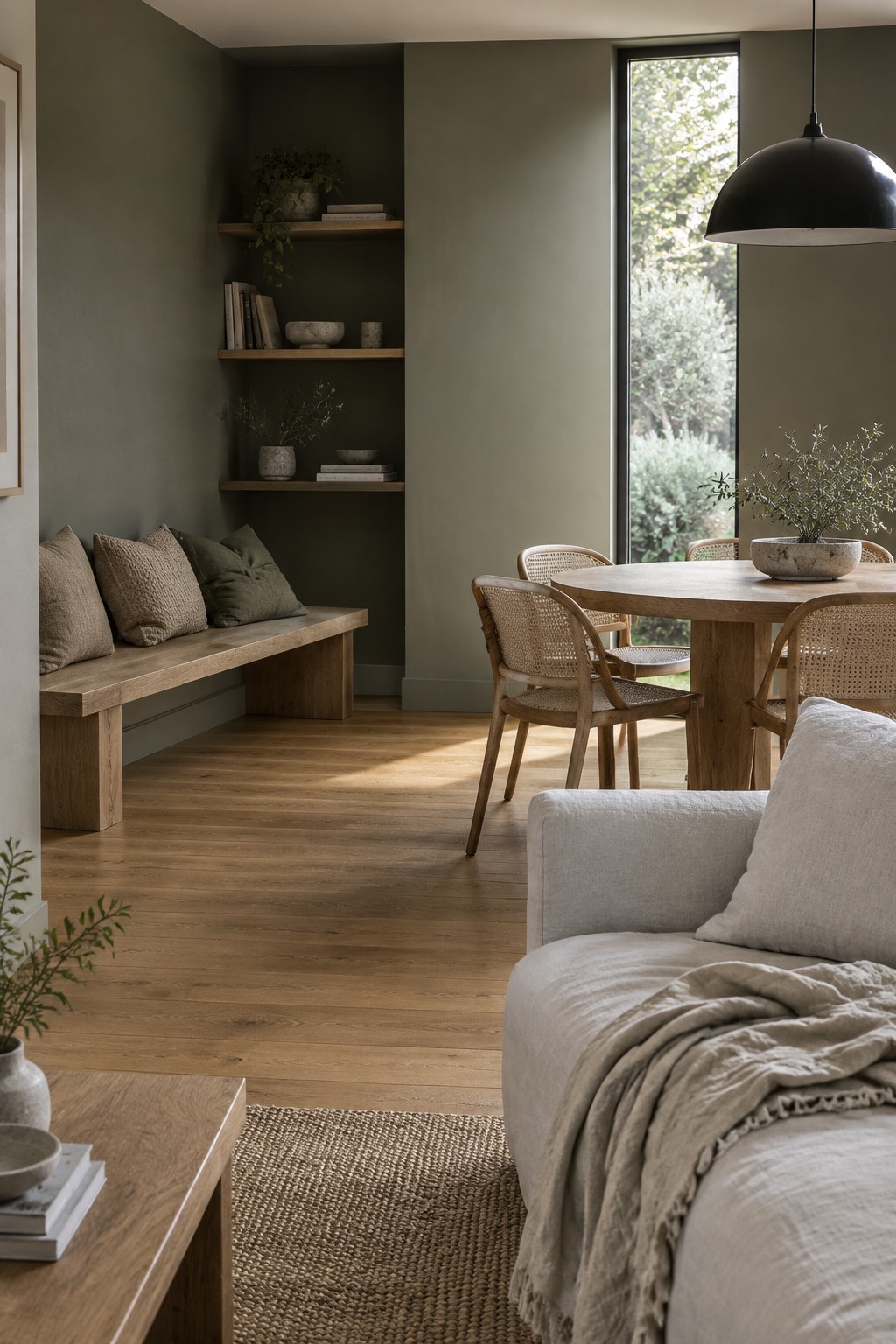
A muted olive green is a good fit for the built-in nook in this open living and dining area. It looks closest to a soft, gray-leaning olive, though the exact shade is hard to pin down from a photo. The darker paint gives the shelves and bench a little definition without making the connected rooms feel too stark.
Warm oak flooring and furniture suit this kind of green, since the wood keeps the color from reading too cool. In an open-plan room, using olive on one built-in area rather than every wall is an easy way to mark out a nook while keeping the rest of the space light.
Warm Taupe Walls With Pale Textured Upholstery

The walls look closest to a warm taupe, a soft neutral with a slight gray-brown cast. It suits a Japandi open-plan room because it gives the living and dining areas a connected backdrop without feeling stark, and it pairs easily with natural wood.
In changing daylight, taupe can look a little grayer or browner, so test a sample on more than one wall before painting the whole space. Pale, textured upholstery keeps the color from feeling too heavy, while the oak tones help maintain a relaxed, natural look.
Deep Blue-Gray Walls Across the Dining Nook
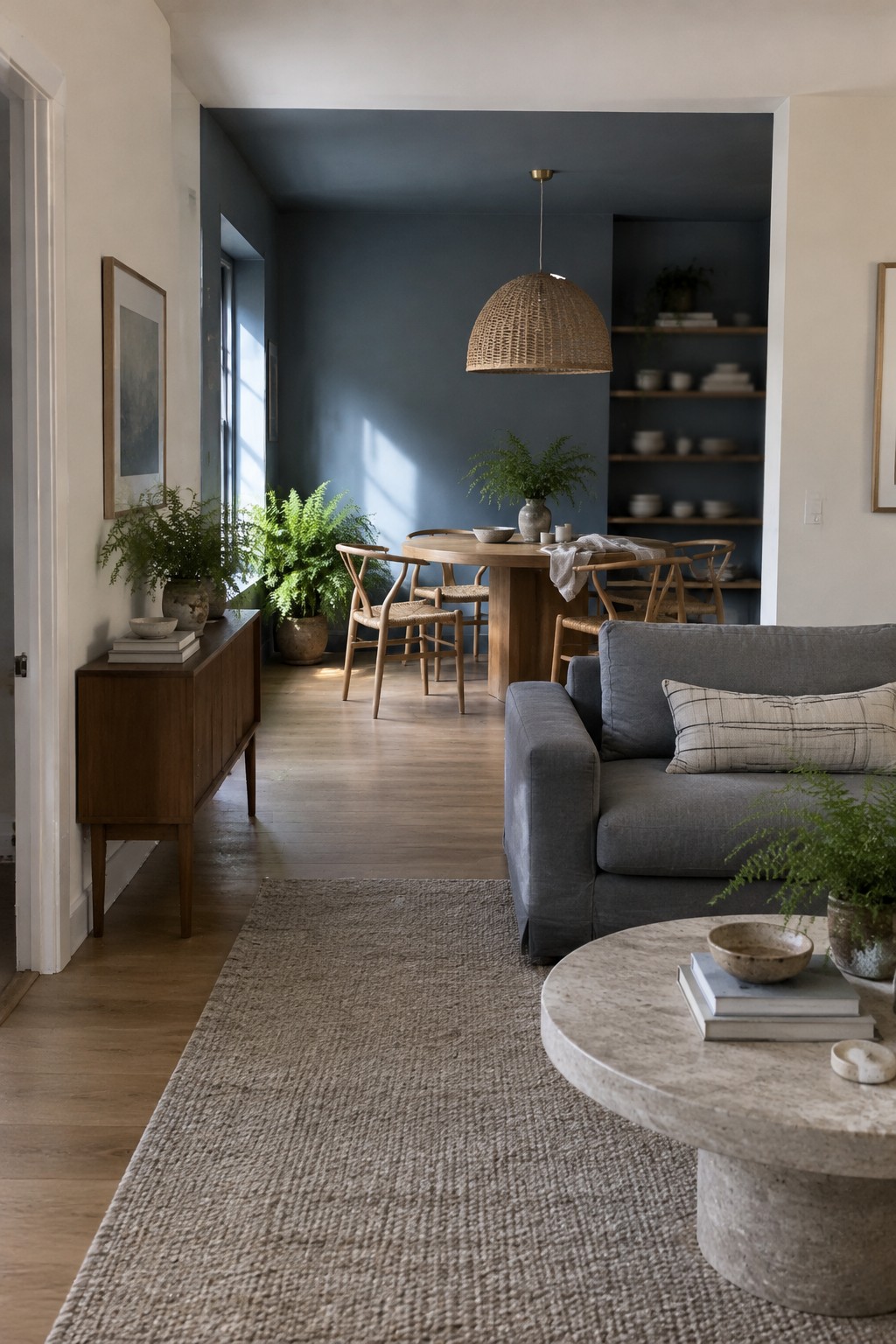
The walls read as a deep blue-gray, close to Benjamin Moore Boothbay Gray or Sherwin-Williams Smoky Blue, though the exact shade is hard to pin down from a photo. It gives the dining end of this open room a little more definition without separating it from the living area.
This color can look cooler in shaded rooms, so test a sample through the day before painting. Pale wood flooring and the round oak table suit its muted tone; warm white on the surrounding walls helps keep the open plan from feeling too dark.
Warm Greige Walls Framing a Central Fireplace

A warm greige, a soft beige-gray, looks closest to Sherwin-Williams Accessible Beige or Benjamin Moore Edgecomb Gray. It keeps an open living and dining area feeling connected without making the walls look stark. The color continues around the fireplace, so the main wall feels simple rather than broken into separate sections.
In changing window light, greige can lean more beige or more gray, so test a sample before painting the whole room. It works well with the oak floor and natural wood furniture here; choose a shade that stays warm if your room gets cooler, indirect light.
Frequently Asked Questions
Q: How do I keep the living and dining areas connected without making them feel like one big room?
A: Use the same main wall color and repeat a few finishes, such as light oak or black accents. Then give each area its own rug or lighting so it feels distinct while still belonging to the same space.
Q: Will Japandi colors make my open-plan room feel too pale?
A: Not if you add contrast through wood tones, soft black details, or a deeper accent like olive green. Keep the larger surfaces calm, then bring in those darker shades through a dining chair, cushion, or pendant light.
Q: What color should I use if my open-plan room gets very little natural light?
A: Try a warm off-white or pale beige rather than a cool gray, which can feel flat in dim light. Add warm wood and a few layered lamps to keep the room inviting after sunset.
Q: Can I use different colors in the living and dining areas?
A: Yes, as long as the colors share a similar warmth or muted quality. A soft clay dining nook can sit comfortably beside a sandy living area, especially if you repeat one shade in a cushion or piece of art.
