

Japandi rooms often feel calm because their colors sit gently beside wood, stone, and woven textures rather than competing with them.
Jotun’s muted shades can look warm and earthy in one room, then turn cooler or more gray as daylight shifts, so I’d pay close attention to undertones before choosing.
A soft neutral can also change beside bright trim, dark flooring, or natural furniture, which is why a small sample on the wall tells me more than a paint chip.
The quieter shades usually hold their appeal best when they work with the room’s existing materials instead of trying to match everything exactly.
I’d test a few options in morning and evening light before settling on the one that feels right.
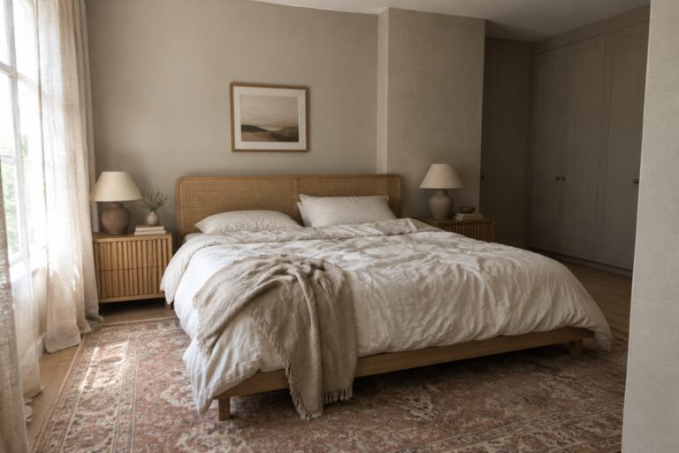
Warm Greige Walls With Cane and Oak

The walls look like a warm greige, a muted beige-gray that feels soft rather than stark. For a Jotun match, I’d look at Jotun 10679 Washed Linen, though the photo’s lighting makes an exact match hard to confirm. It’s a useful bedroom color when you want a neutral backdrop that still feels warm.
The shade sits comfortably beside the cane headboard and pale wood, but test a sample in your own room first. In cooler light, greige can look more gray, so check it at different times of day before painting all the walls.
Warm Greige Around a Stone Fireplace

This living room’s wall color looks like a warm greige, a muted mix of beige and gray. For Jotun, Kalk 10341 seems like a plausible match, though the photo can’t confirm the exact shade. It’s a useful choice when plain beige feels too yellow but a cool gray would feel out of place.
The color sits comfortably beside the pale stone fireplace and warm wood floor. In a room with less daylight, test a sample first, since greige can look darker or more gray as the light changes.
Muted Olive Cabinets With Warm Wood Shelves
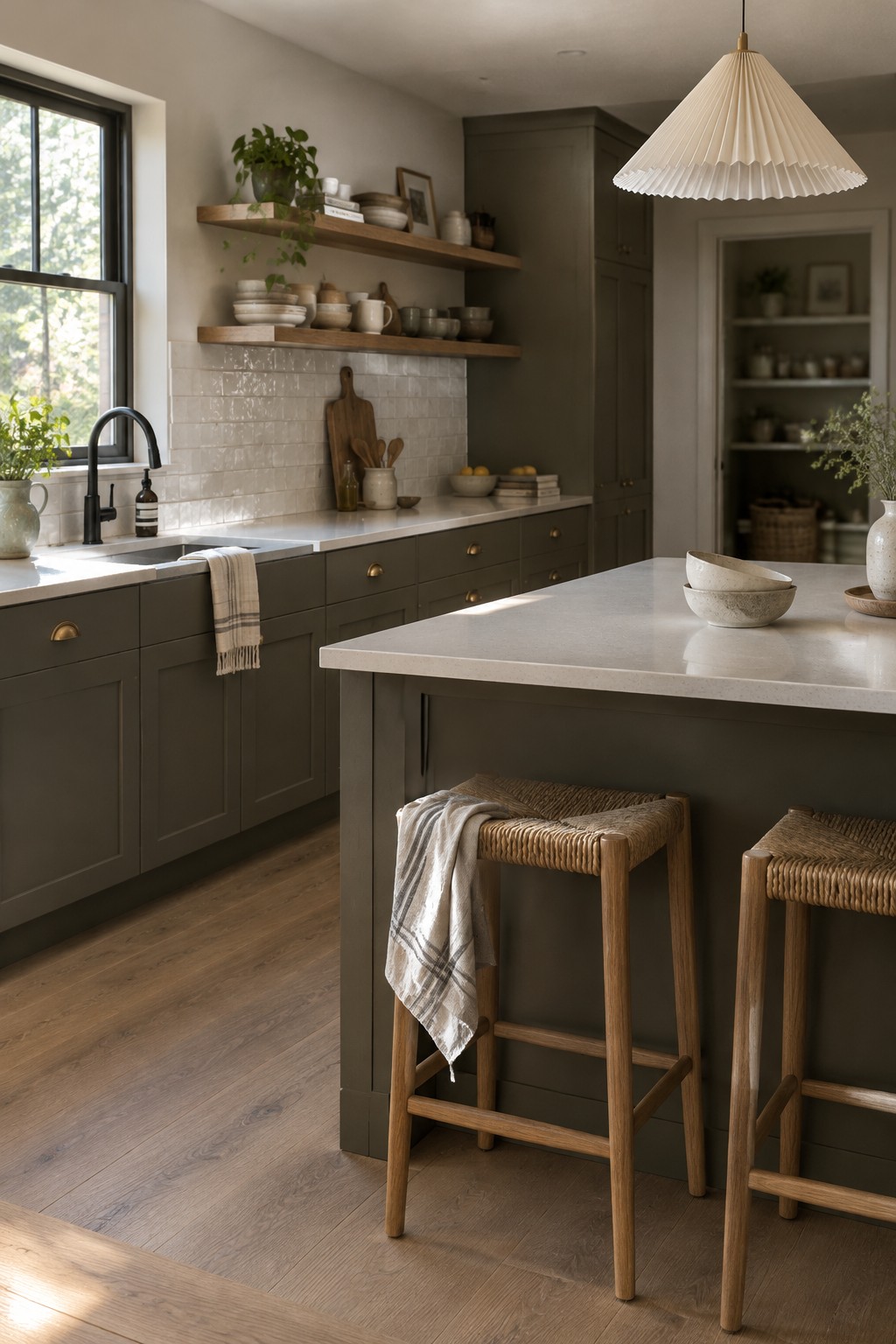
This kitchen’s cabinets look closest to a muted olive green, a grounded shade that sits between green and brown. For Jotun, I’d place it near Jotun 8422 Green Marble, though the match is only an estimate. It’s a useful choice for a kitchen because it gives the cabinetry color without making the room feel too bright or too dark.
The warm wood shelves bring out the olive undertone, while the white tile and counters keep the palette from feeling heavy. This kind of green suits kitchens with natural wood and simple finishes. Check a sample in your own light, since olive shades can read browner in a dim room.
Muted Green Walls With Warm Wood
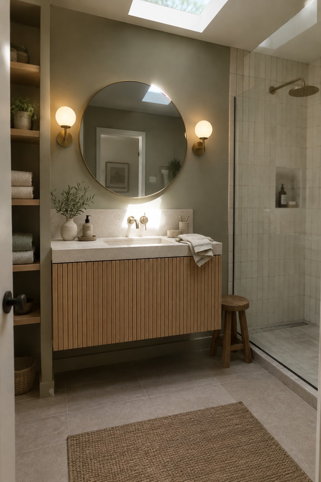
The wall color reads as a muted, gray-leaning green, close to Jotun’s Lady Pure Color 8252 Green Harmony or 8302 Laurbær. It gives this bathroom a soft, earthy feel without making the room look dark, and it pairs naturally with the warm wood vanity.
This kind of green works well in bathrooms with natural wood or pale stone. Check a sample in your own lighting first, since some muted greens can look more gray in a dim room.
Blue-Gray Walls Above White Wainscoting
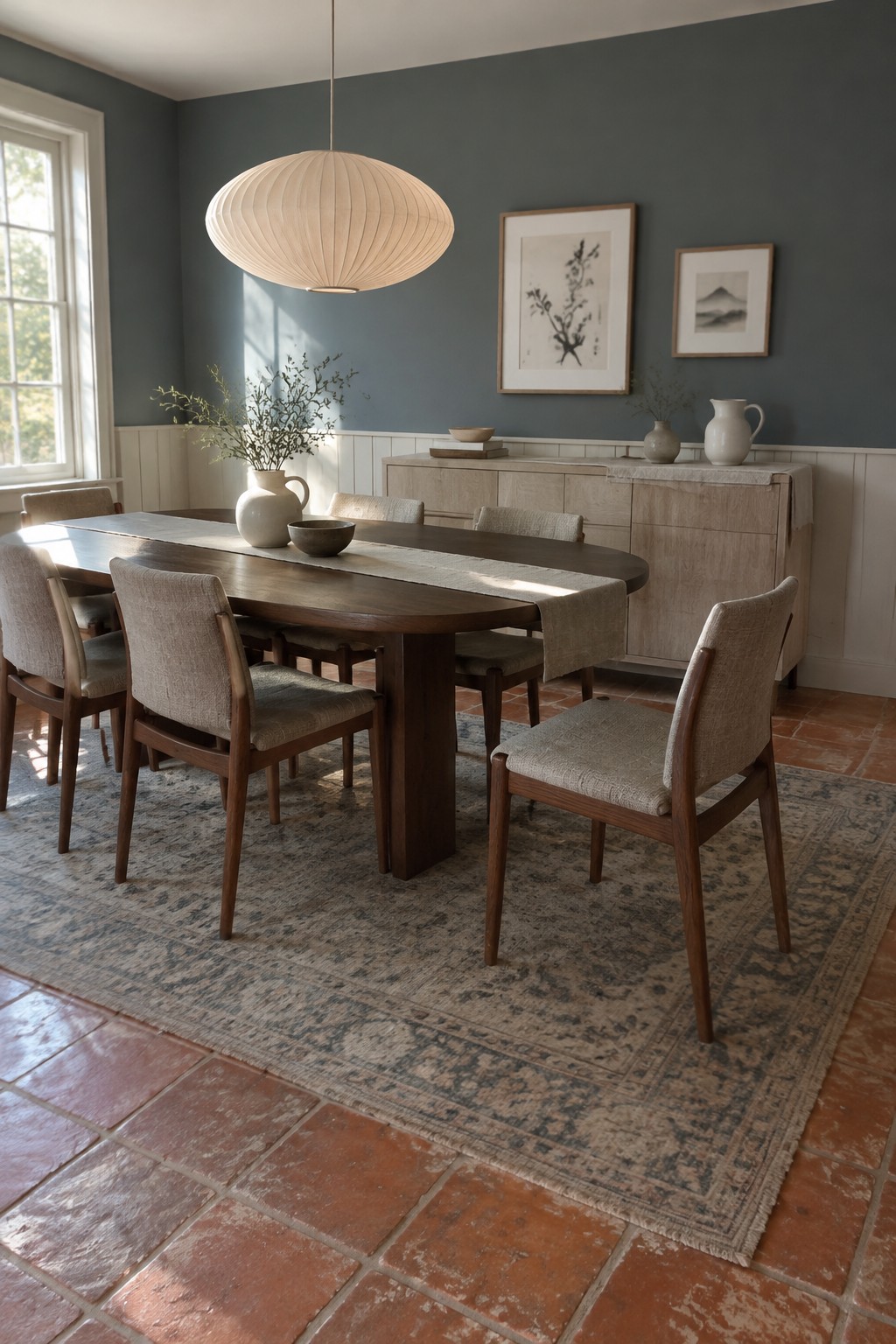
This muted blue-gray looks closest to Jotun 5452 Nordic Breeze, though the photo alone can’t confirm the exact shade. It is a calm, mid-tone color that feels a little softer than a plain gray and gives the upper walls more definition without making the room feel dark.
The white wainscoting keeps the color from taking over, while terracotta tile adds a warmer note underfoot. This pairing can work well in a dining room with good natural light. In a dimmer room, test a sample first, since blue-gray paint may read cooler.
Soft Greige Walls Along a Narrow Hallway
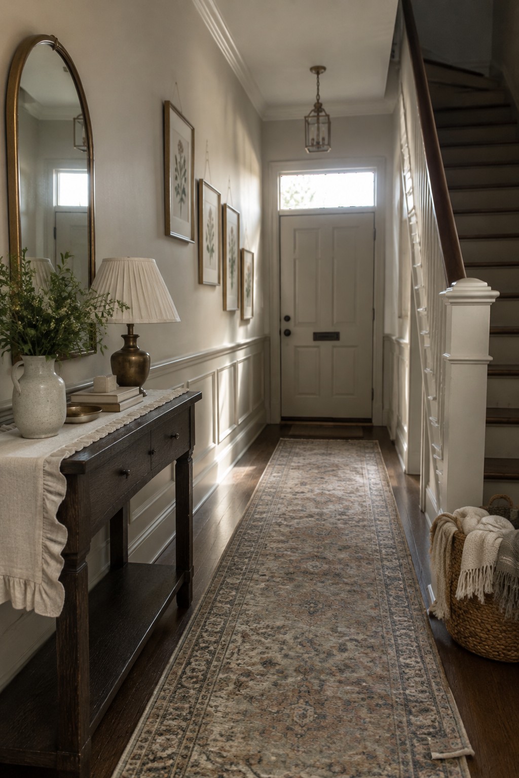
This warm greige looks closest to Jotun 10679 Washed Linen, though the photo can’t confirm the exact shade. It’s a muted neutral that feels softer than plain white, a useful choice for a long hallway where you want the walls to stay light without looking stark.
The shade leans warm beside the dark wood floor, while the white trim gives it a clean edge. In a dimmer hall, test a sample first, since warm greige can look more beige when there’s less daylight.
Deep Forest Green Across Built-Ins and Cabinetry
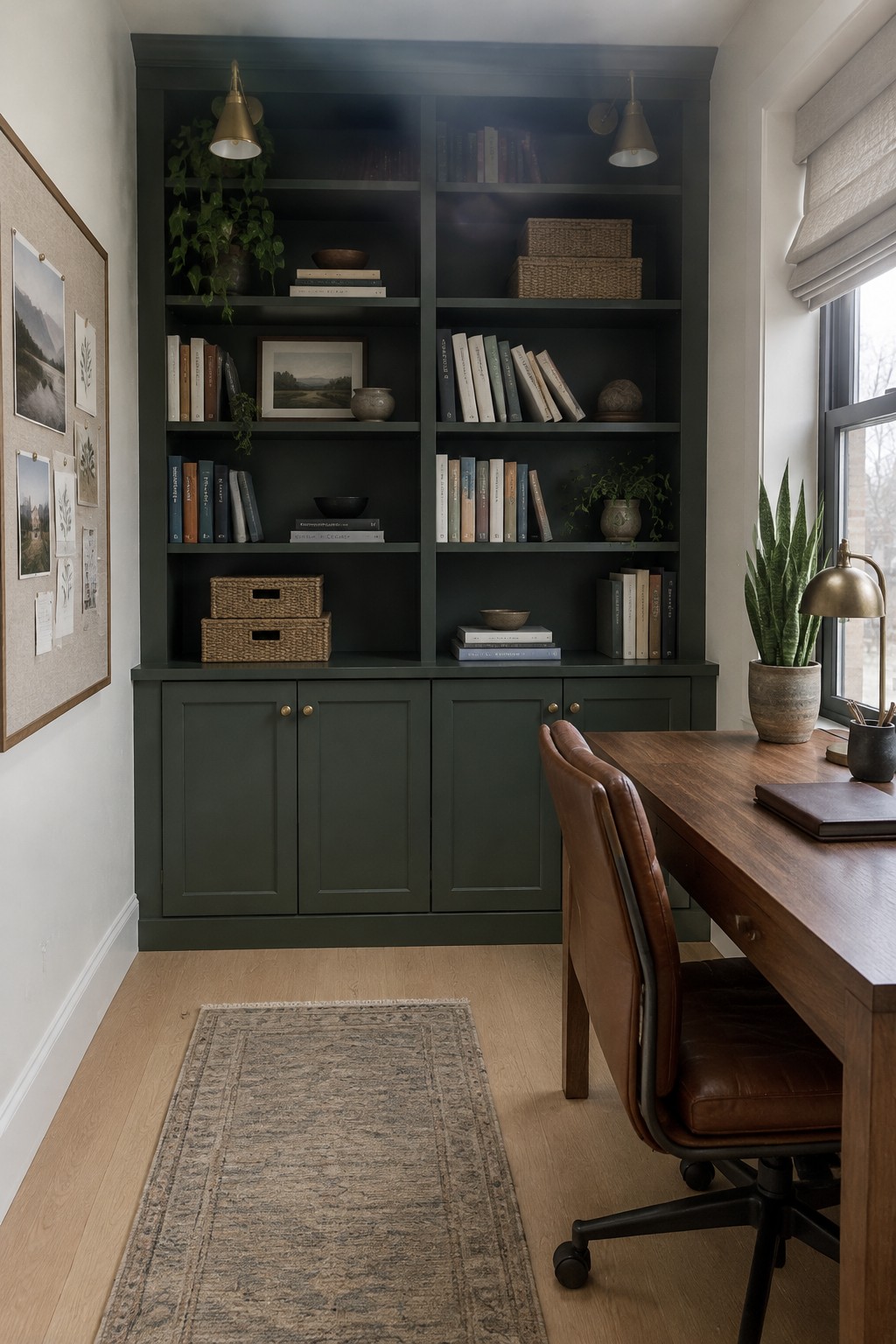
This deep forest green looks close to Jotun’s Green Marble, though the exact shade is hard to confirm from a photo. It is a muted, nearly black green, and using it across both the shelves and lower cabinets gives the built-in a calm, continuous look.
The color can read darker in a room with limited natural light, so it suits a study or office with a good window. Pale wood flooring helps keep the room from feeling too dark, while brass details work well with the green.
Muted Greige Walls Beside Light Oak

This nursery’s walls look like a muted greige, a warm neutral that sits between beige and soft gray. A close match might be Sherwin-Williams Accessible Beige, Benjamin Moore Pale Oak, or Jotun’s own muted beige-gray range. It’s a gentle choice for a room where you want color without making the walls feel busy.
The light oak crib helps the greige read warm, while daylight may make it look a little grayer. Try samples on more than one wall before choosing, since the balance can shift with the room’s light.
Warm Greige Across the Mudroom Built-Ins

A warm greige, or soft taupe-gray, looks like the closest color family here. For Jotun, shades such as Washed Linen or Space may be worth sampling, though the photo can’t confirm an exact match. This muted neutral works well across cabinets and the wall behind the bench, so the whole built-in area feels calm rather than chopped into separate pieces.
The color has a gentle beige undertone that suits the natural wood bench. It should work in an entry or mudroom, especially with warm wood and simple woven textures; check a sample in your own light first, since greige can lean grayer in a dim room.
Muted Blue-Green Tile Beside Light Oak
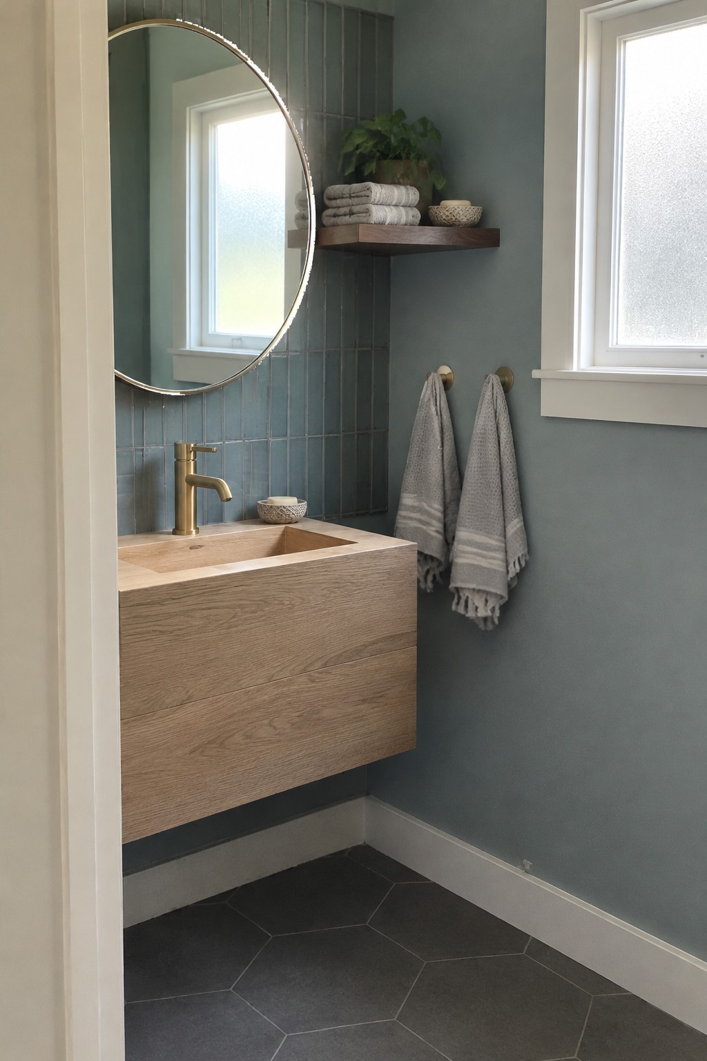
This muted blue-green paint color looks closest to a soft, grayed teal, though the exact shade is hard to pin down from a photo. It has a calm, cool quality that works well in a small bathroom, especially when the color continues across the walls and tile.
The cooler tone pairs nicely with the light oak vanity, which keeps the room from feeling too chilly. Try it with warm white trim and brass details, and test a sample in your own bathroom since window light can shift blue-green paint noticeably.
Muted Terracotta Wainscoting With Warm Wood
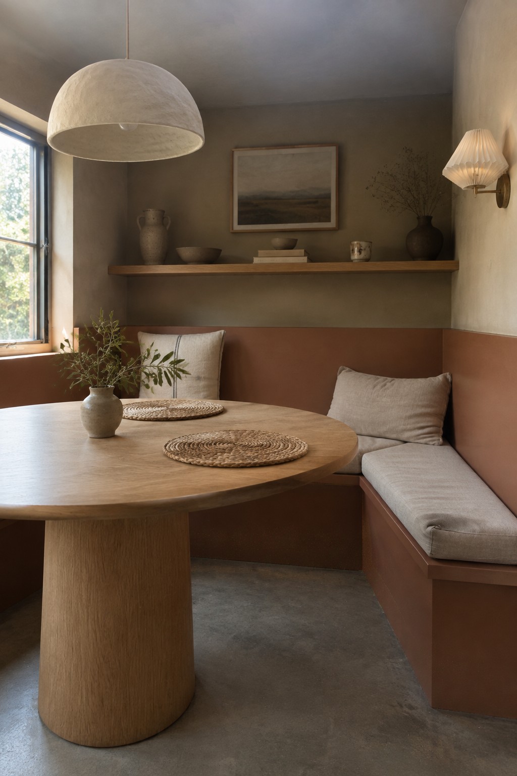
The painted lower walls read as a muted terracotta, a warm, earthy color that is softened rather than bright. Since the article names Jotun, Jotun Masala seems like a possible close match, though the exact shade is hard to confirm from a photo. This kind of color gives a dining nook a cozy feel without needing to cover every wall.
It works well with the oak table and other natural finishes, while the pale upper walls keep the room from feeling too dark. In a room with less daylight, I’d test a sample first, since terracotta can look browner and deeper in shade.
Muted Greige Walls With Dark Wood Trim

For a Japandi interior, this wall color reads as a warm, muted greige, somewhere between soft taupe and gray. A close match might be Benjamin Moore Pale Oak, Sherwin-Williams Accessible Beige, or Jotun 10679 Washed Linen. It keeps the room quiet without looking stark, and pairs naturally with the dark painted woodwork.
In changing window light, the greige may look more brown or more gray, so test a sample on the wall before choosing it for a whole room. It suits bedrooms and reading corners especially well, where warm wood and simple linen fabrics feel at home.
Warm Greige Across Cabinets and Marble

This kitchen’s cabinetry looks closest to a warm greige, a soft neutral between beige and gray. For Jotun, I’d look at 10341 Kalk, though the exact shade is hard to confirm from a photo. It’s a useful choice for a kitchen when you want something gentler than white but still light enough to keep the cabinets from feeling heavy.
The marble counters and warm wood shelves suit this color well. In a dimmer kitchen, greige can look more beige, so test a sample beside your counters before painting all the cabinets.
Pale Gray-Greige Walls With Warm Oak

A pale gray-greige is a good fit for a quiet work nook like this. It reads mostly soft and neutral, with a slight cool cast, and looks closest to Benjamin Moore Balboa Mist, Sherwin-Williams Drift of Mist, or Farrow & Ball Ammonite. The muted color keeps a small room from feeling stark while letting the oak desk remain the warmer note.
In a room with limited direct light, this shade may look grayer, so test a sample on more than one wall before committing. Warm wood and off-white trim are easy pairings, and a matte finish can keep the walls looking calm rather than shiny.
Pale Sage Above a Stone Floor

A muted sage green is the main paint idea here. It looks like a soft, slightly gray green, and a close match might be Benjamin Moore October Mist, Sherwin-Williams Evergreen Fog, or Jotun Green Leaf. This kind of color is gentle enough for an entry but has more character than a plain off-white.
The pale green works well beside the natural stone floor, which keeps the overall look earthy rather than cool. Try it in a hallway or mudroom with simple wood furniture, and test a sample in both daylight and evening light before painting.
Warm Taupe Walls With a Fluted Oak Vanity

A warm taupe, close to a muted brownish greige, gives this bathroom a soft, earthy look. For Jotun, Sober seems like a reasonable match, though the photo’s warm lighting makes an exact shade hard to pin down. The color feels especially suited to a small bathroom, where it can make the walls and built-in features feel connected.
It leans brown rather than pink, so it pairs naturally with the oak vanity and dark stone floor. Try a sample on more than one wall before committing, since taupe can look darker in a room with limited daylight.
Terracotta Walls Beside Warm Oak
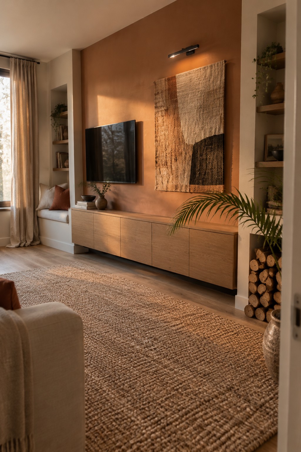
This kind of terracotta works well on a main wall in a living room, especially with light wood flooring and cream textiles. Check a sample in both daylight and evening light, since the orange undertone can look stronger when the room is dim.
Frequently Asked Questions
Q: How do I keep a muted Japandi paint color from looking too gray?
A: Check a sample on the wall at different times of day, since cool daylight can make soft beige or greige look grayer than expected. Pair it with warm wood and natural fabrics to bring out its softer tones.
Q: Should I use the same Jotun color in every room?
A: You can, especially if you want the rooms to feel connected, but the light may change how the color reads. Try it in each space first, and use a lighter or warmer shade where a room feels dim.
Q: What finish works well for a Japandi interior?
A: A matte or low-sheen finish suits the calm, natural feel and helps keep walls from looking glossy. In busy areas, choose a washable finish so you can clean marks without giving up that understated look.
Q: How can I test a paint color before committing?
A: Paint a large sample on a movable board, then check it beside your flooring and furniture. Small swatches rarely show how a color will feel across a whole wall.
