

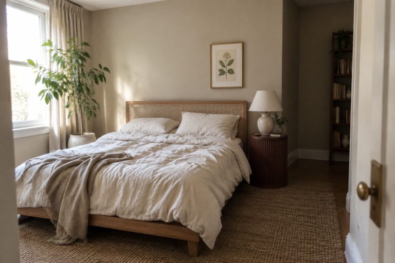
Japandi interiors feel calm when their colors bring warmth without making the room feel flat or overly beige.
I look for shades with subtle, balanced undertones, since soft whites, muted greens, and earthy neutrals can shift noticeably as daylight moves across walls and floors.
Wood furniture, textured fabrics, and trim also affect how a paint color reads, so a shade that looks gentle on a sample card may feel cooler or heavier once it fills a room.
A few colors may be worth testing first in the spaces where you plan to use them.
I’d check each sample beside the room’s finishes and at different times of day before settling on a palette.
Warm Taupe Walls Beside Cane and Oak
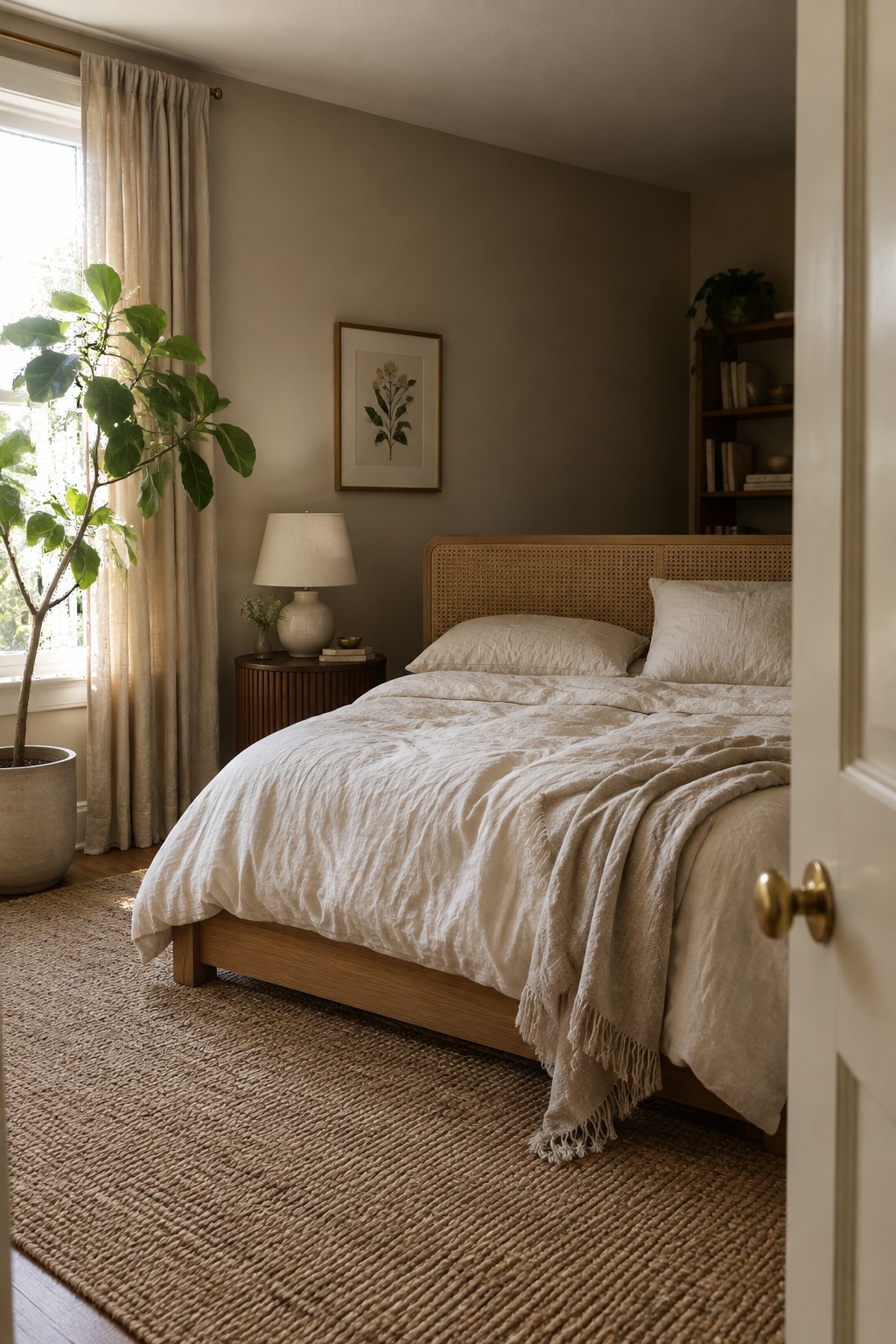
The bedroom walls look closest to a warm taupe or muted mushroom shade. It is a soft, earthy neutral that feels less stark than white, while still keeping the room easy to change with different bedding or wood tones. For a Sherwin-Williams match, I’d consider Balanced Beige.
This kind of shade can look browner in dimmer areas and more softly beige near a window, so test a sample on more than one wall before committing. It pairs naturally with the oak bed frame and woven cane headboard, and works well in a bedroom where you want color without a strong contrast.
Warm Taupe Around a Concrete Fireplace

The painted fireplace surround reads as a warm taupe, close to Sherwin-Williams Perfect Greige. It is a muted neutral with a little brown in it, so it feels softer than a cool gray but still suits a simple Japandi palette.
The shade works well across a large fireplace wall, especially beside dark wood shelving and floors. Test it in your own room first, since warm taupe can look more gray in cooler light.
Muted Sage Cabinets Beside Warm Wood
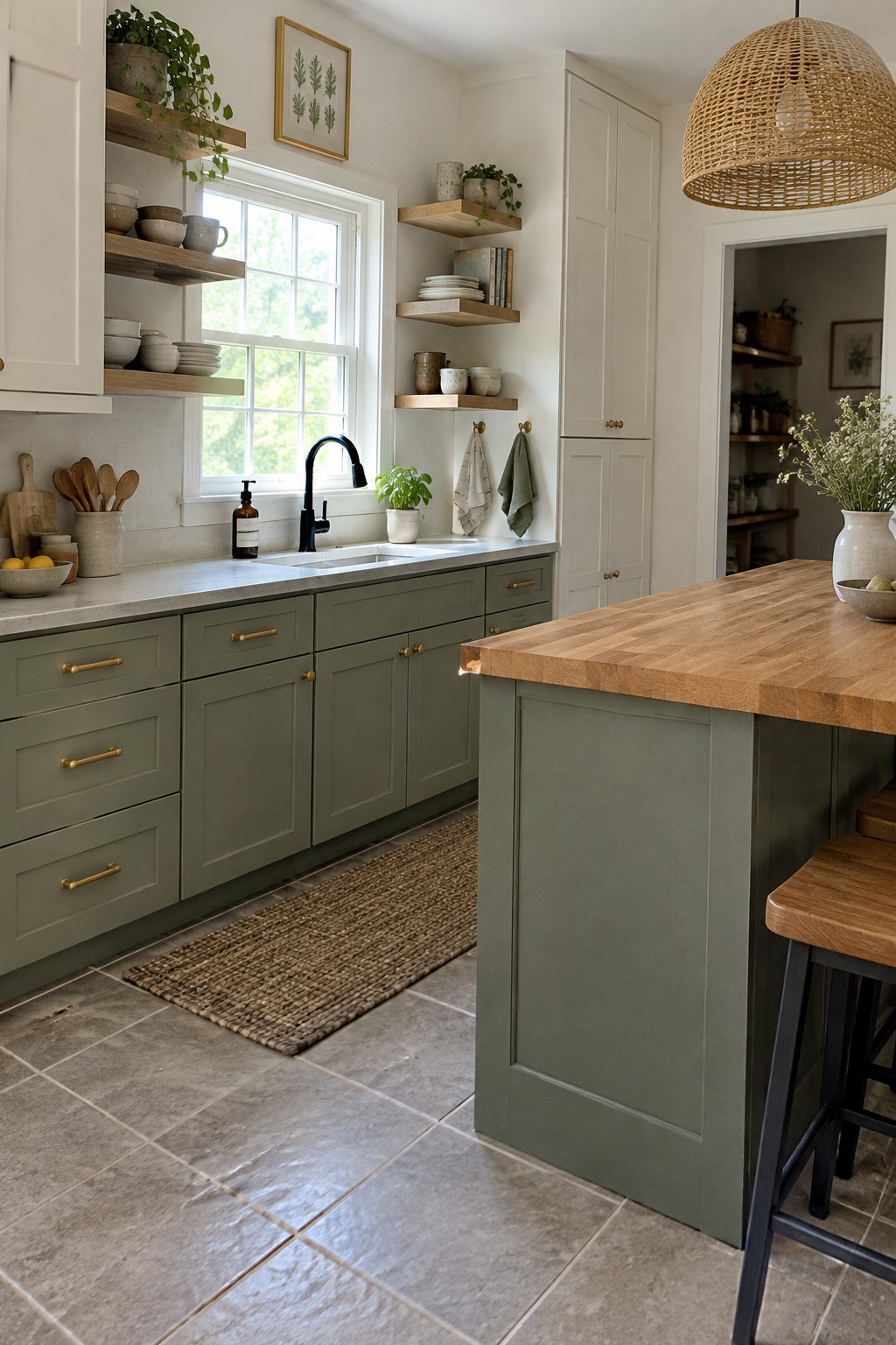
The cabinet color looks closest to Sherwin-Williams Clary Sage, a muted green with a slightly gray cast. It feels softer than a deep olive, so it works well across a kitchen’s lower cabinets without making the room feel too dark. The butcher-block island gives the green a warm contrast.
In a bright kitchen, this kind of sage can read a little lighter, while shaded areas may bring out its gray undertone. Pair it with warm wood and simple cream or white finishes; test a sample first, since some sage paints can lean cooler than expected.
A Cool Gray-Green Beside Warm Oak

This bathroom wall color looks closest to Sherwin-Williams Misty, a muted gray with a subtle blue-green cast. It feels cool and quiet without reading as plain gray, and it gives the warm oak vanity a clear contrast.
In a window-lit bathroom, this kind of shade can look cooler than it does on a paint chip. Pair it with warm wood and pale stone or tile, and test a sample on the wall before painting the whole room.
Warm Gray-Brown Walls With Dark Wood
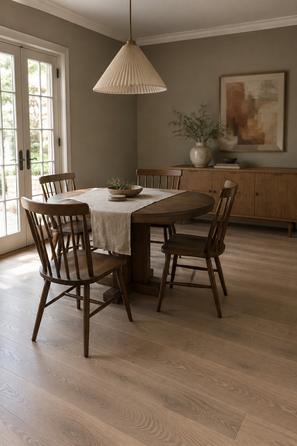
The walls look closest to a warm gray-brown, a quiet neutral that works well in a dining room without feeling stark. The color has enough warmth to suit the dark wood table and chairs, while still reading softer than a deep brown.
This shade may look grayer in less natural light, so it’s worth testing on the wall before painting the whole room. It suits homes with wood floors and simple cream or white trim.
Muted Terracotta Walls Above Painted Wainscoting
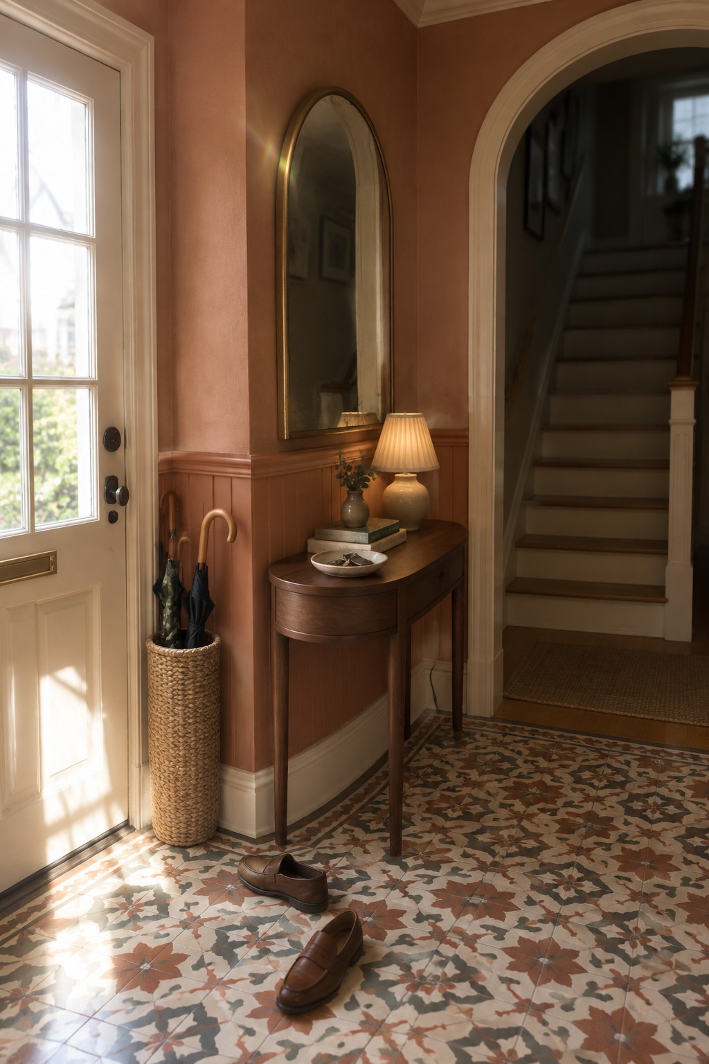
The walls look closest to a muted terracotta, a warm, earthy color with a soft brown undertone. It gives this traditional entry more character than a beige, but it is still subdued enough for a small hallway.
The color works well above the dusty rose wainscoting and cream trim. In a dimmer room, terracotta can read deeper and browner, so test a sample on the wall before painting the whole space.
Deep Olive Built-Ins Beside Warm Wood
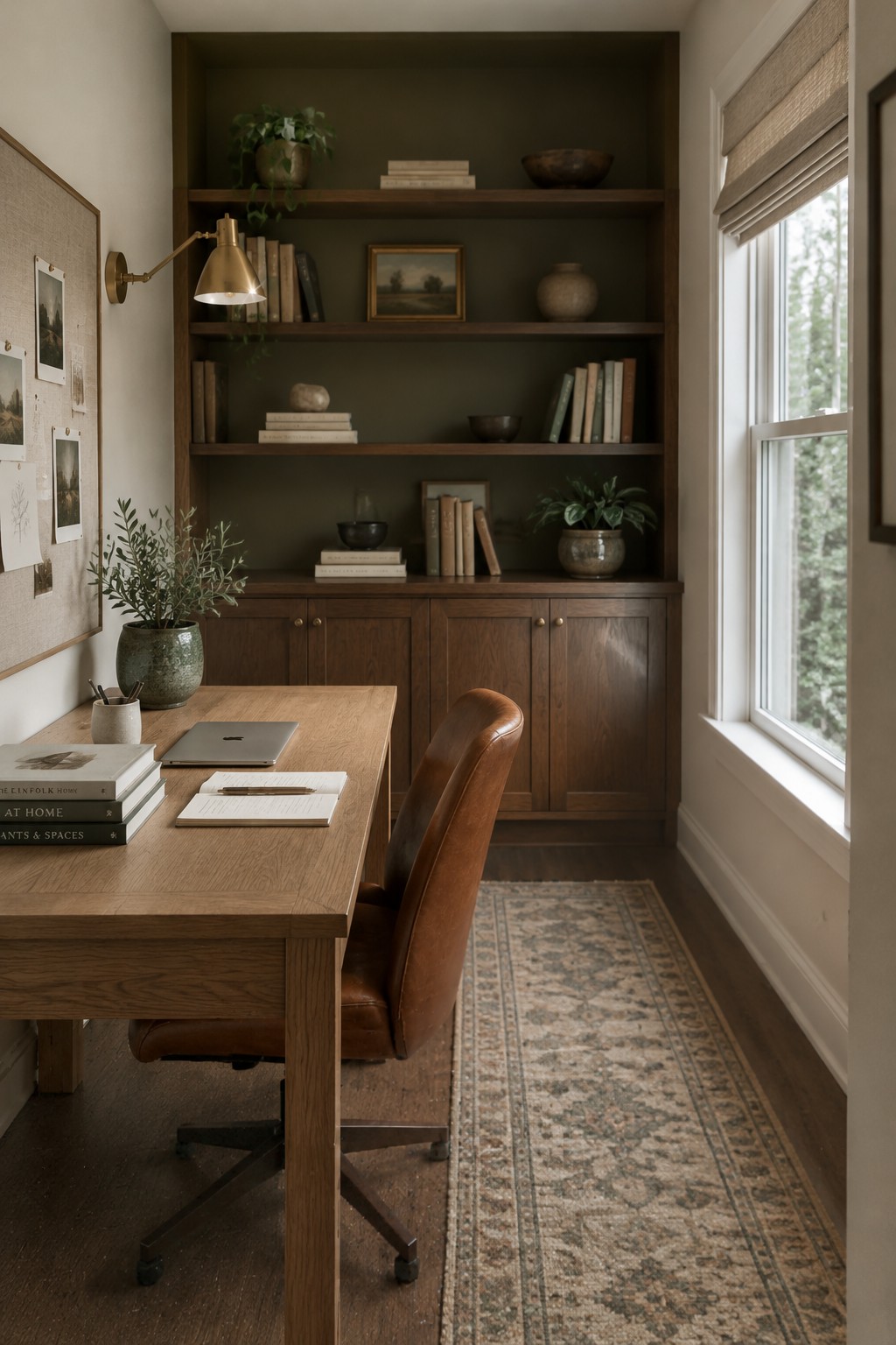
The built-in shelves look closest to a deep olive green, a muted, earthy shade that feels cozy without reading as black. Sherwin-Williams Rosemary seems like a reasonable match, though the photo alone can’t confirm the exact paint. Using the color across the shelves and lower cabinets gives the woodwork a consistent look.
Warm wood next to olive keeps the green from feeling too cool or stark. This shade suits a study or library, especially with natural light from a nearby window. Test a sample in your room first, since the deeper color may look quite dark in a space with little daylight.
Soft Blush Walls With Warm Wood

For this nursery, the wall color looks closest to a soft, warm blush beige. It is a muted neutral rather than a strong pink, so it can give a room a little color without making the walls feel busy. A shade in this range works well when you want a gentle backdrop for everyday use.
The color reads warmer beside the oak crib and floor. I’d sample a few similar paints on the wall first, since daylight can make blush tones look pinker than expected. Creamy whites and natural wood are easy pairings.
Cool Gray Walls Above Dark Tile
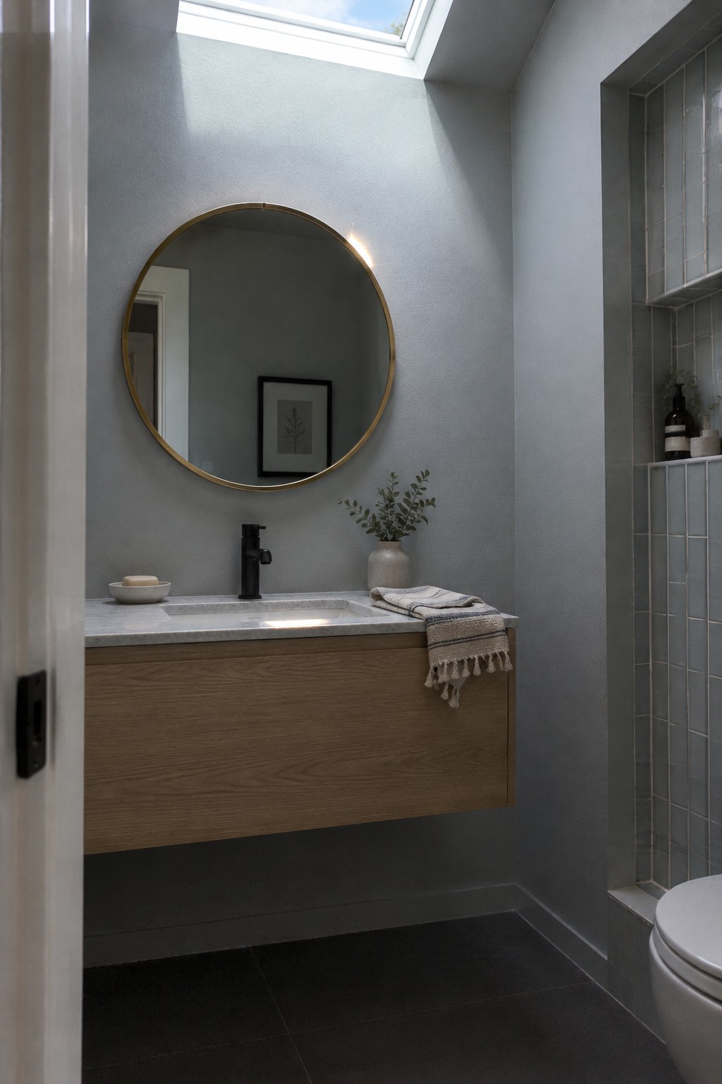
For this bathroom, Sherwin-Williams Silver Strand seems like a close match for the cool gray paint. It is a soft gray with a subtle green-blue cast, a useful choice when plain white feels too stark but a darker color would weigh down the room.
The skylight may make the paint read lighter, while the dark floor gives it contrast. Try it with warm oak and white stone, as shown here, and test a sample in your own bathroom since cooler light can bring out more of its blue-green undertone.
Warm Taupe Cabinets With Open Oak Shelving
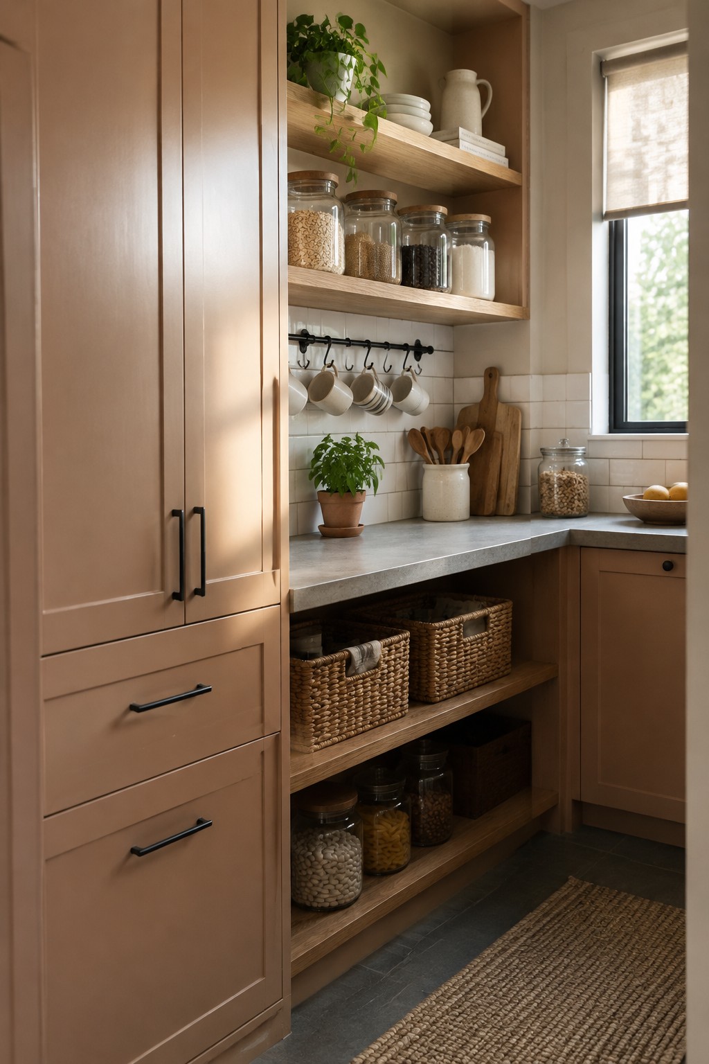
This cabinet color looks closest to Sherwin-Williams Moth Wing, a warm taupe with a soft brown undertone. It gives the kitchen a quiet, earthy feel without going as dark as many brown paints, and it works well across a larger run of cabinetry.
The natural oak shelves make the taupe read warmer, while the pale tile keeps the combination from feeling too heavy. Try a sample on the cabinets first, since this kind of neutral can look more brown in dimmer light.
Blue-Gray Walls Across a Reading Nook
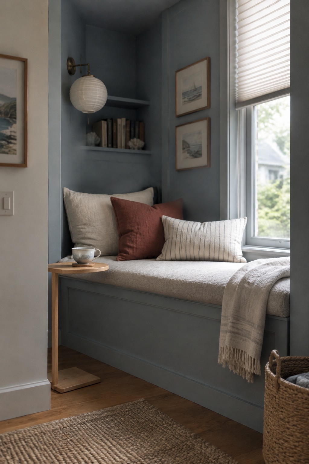
This muted blue-gray looks closest to Sherwin-Williams Smoky Blue, though the exact match is hard to confirm from a photo. It is a cool, subdued color that gives the built-in nook a tucked-away feel without making it too dark.
The shade reads softer in the window light and pairs well with the warm wood floor and pale upholstery. It could work nicely in a small reading corner or bedroom alcove, especially with warm-toned wood nearby.
Near-Black Wardrobes Against Warm Wood

A charcoal-black paint, close to Sherwin-Williams Tricorn Black, gives these built-in wardrobes a simple, nearly seamless look. It is a useful choice when you want storage to recede rather than stand out, especially in a bedroom with warm wood flooring.
The shade reads almost black, with a slight softness that keeps it from looking stark. Try it with warm wood and light neutral walls, and test a sample in the room first since dark paint can look quite different in low light.
Warm Greige Built-Ins With Woven Baskets
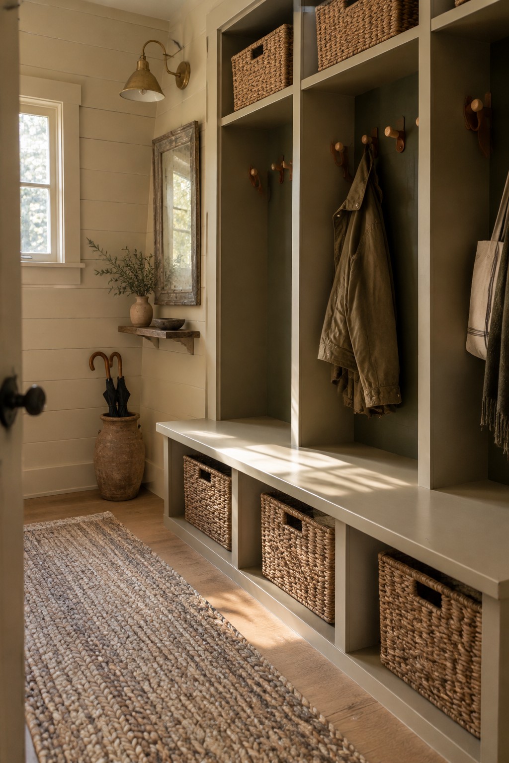
For this mudroom, the built-ins look closest to a warm greige, a soft gray-beige that feels more grounded than plain white. Sherwin-Williams Agreeable Gray is a likely match, though the exact paint color is hard to confirm. It’s a practical choice for tall cubbies and a long bench because it keeps the cabinetry calm without making the narrow space feel too stark.
The shade leans warm beside the wood floor and woven baskets. In a room with less daylight, test a sample first, since greige can look darker or more beige in shade. Creamy white walls make an easy pairing.
Warm Greige Cabinetry With a Butcher-Block Counter

For the painted cabinetry, Sherwin-Williams Agreeable Gray seems like a close match. It is a warm greige, though the exact shade is hard to confirm from a photo. This kind of muted neutral suits a laundry room because it feels softer than stark white without making the cabinets feel dark.
The wood counter brings out the warmer side of the paint, while the patterned floor adds contrast. In a room with less daylight, test a sample first, since warm gray can look more beige or more gray depending on the light.
Blue-Gray Cabinets Beneath a Bright Window
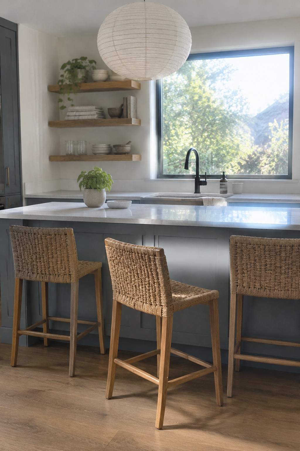
The painted cabinets look closest to a muted blue-gray, a cool shade that still feels soft enough for a Japandi kitchen. For this Sherwin-Williams palette, I’d place it near North Star. It gives the cabinetry a little color without competing with the pale countertop.
The warm wood floor helps keep the cool paint from feeling stark, while daylight may make the cabinets read a touch bluer. This kind of gray-blue works well in a bright kitchen, especially with simple white or stone surfaces. Check a sample at different times of day before committing.
Warm Greige Above White Hallway Paneling
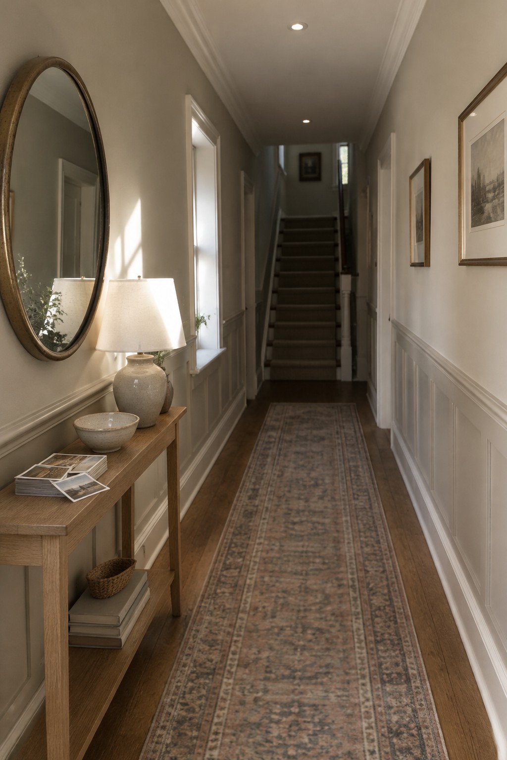
A warm greige seems closest here, with Sherwin-Williams Accessible Beige as one likely match. It is a quiet neutral that suits a narrow hallway, where a soft wall color can keep the long passage from feeling stark.
The warm undertone works naturally with the wood floor, while the white paneling gives the lower walls a clear break. Test a sample in the hall first, since a greige can look darker in a space with limited natural light.
Muted Olive Cabinets With Marble Counters
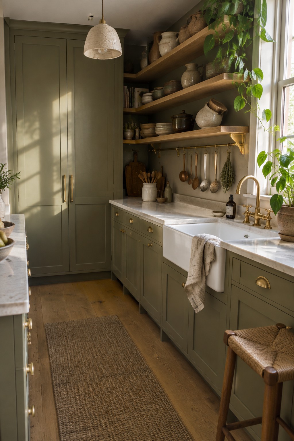
This kitchen’s muted olive paint looks closest to Sherwin-Williams Pewter Green, though the exact match is hard to confirm from a photo. It’s a deep, earthy green that gives the cabinets a softer feel than a very dark forest shade.
The color has a slightly gray cast, which suits the pale marble counters and warm wood floor. It works well in a kitchen with some natural light; in a darker room, sample it first, since olive can look quite deep.
Deep Blue-Green Built-Ins Beside Warm Wood
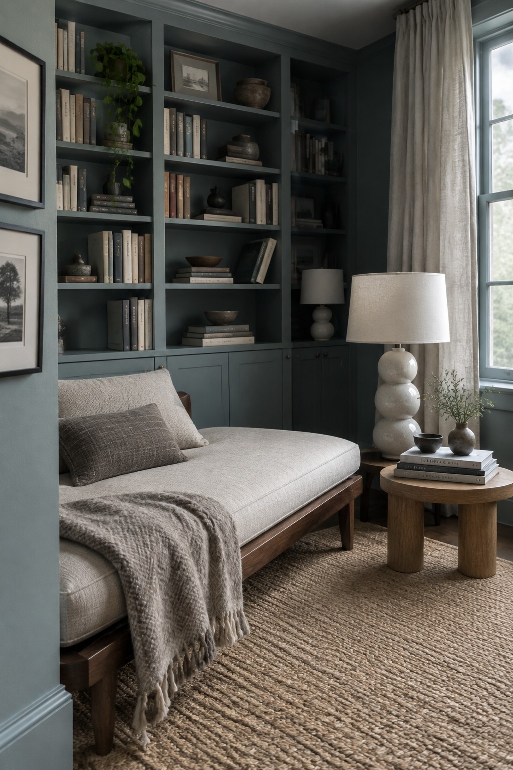
Sherwin-Williams Riverway looks like a close match for these deep blue-green built-ins. It is a muted, slightly cool color, but the dark wood daybed keeps the room from feeling too cold. Painting the shelves and lower cabinets the same shade makes the built-ins feel like one continuous feature.
In daylight, the color may read a little grayer, while the shadowed shelves can look nearly charcoal. It suits a reading nook or study, especially with warm wood and simple cream fabrics. Test a sample on both a bright and a shaded section before committing.
Warm Greige Above the Breakfast Bench
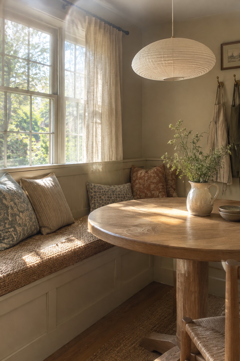
The wall color looks closest to a warm greige, a soft beige-gray that suits a Japandi palette without feeling stark. A close Sherwin-Williams match is Accessible Beige, though the exact shade is hard to confirm from a photo. It’s a useful choice for a breakfast nook where you want a neutral backdrop that still feels gentle.
Daylight can bring out the beige side, while less direct light may make it read grayer. It pairs well with the natural wood table and cream trim here; test a sample on the wall first, since warm neutrals can shift quite a bit from room to room.
Warm Greige Walls Beside Woven Cane and Oak

The walls read as a soft warm greige, and Sherwin-Williams Accessible Beige seems like a close match. It sits between beige and gray, so it feels calm without looking stark. Beside the oak bed and woven cane headboard, the color keeps the room feeling natural and easy to live with.
In a bedroom with good window light, this kind of neutral can stay soft rather than turn muddy. Try a sample on more than one wall first, since the gray-beige balance can shift as the light changes.
Muted Sage in a Narrow, Wood-Floored Entry

For this entry, a muted sage green seems closest to Sherwin-Williams Evergreen Fog. It’s a soft gray-green that feels more settled than a pale mint, and it suits a small transitional space without making the walls feel too dark.
The color shifts a little in changing daylight, so sample it near the doorway before painting the whole entry. Warm wood and woven textures are easy companions, while a very cool white trim could make the green look grayer.
Frequently Asked Questions
Q: How do I keep a Japandi room from feeling too beige?
A: Add contrast with a deep charcoal, muted green, or warm wood tone. Even a few darker details, like a lamp or dining chair, can give soft neutrals more definition.
Q: Should I use the same paint color in every room?
A: You can, especially if you want the home to feel calm and connected. For a little variety, keep the same warm undertone and shift to a lighter or deeper shade in nearby rooms.
Q: How can I tell if a paint color will look too cool in my space?
A: Test a large sample on the wall and check it in morning and evening light. If it looks blue or gray beside your wood and furnishings, try a warmer shade.
Q: Do Japandi colors work in a small room?
A: Yes. Light, warm neutrals can make a small room feel open, while natural textures add depth without making the palette feel busy.
