

I remember painting my front door what seemed like a crisp navy in the store, but it softened to almost black under evening shadows.
Real light outside pulls the truth from paint colors in ways no chip can predict.
Shades with subtle depth usually adapt well to shifting sun and hold their charm year-round.
The troublemakers often lean too yellow or pink when the weather turns, disappointing after all that effort.
Test a couple on your siding first.
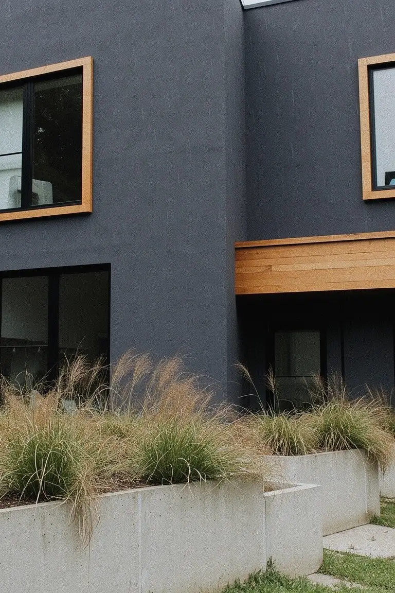
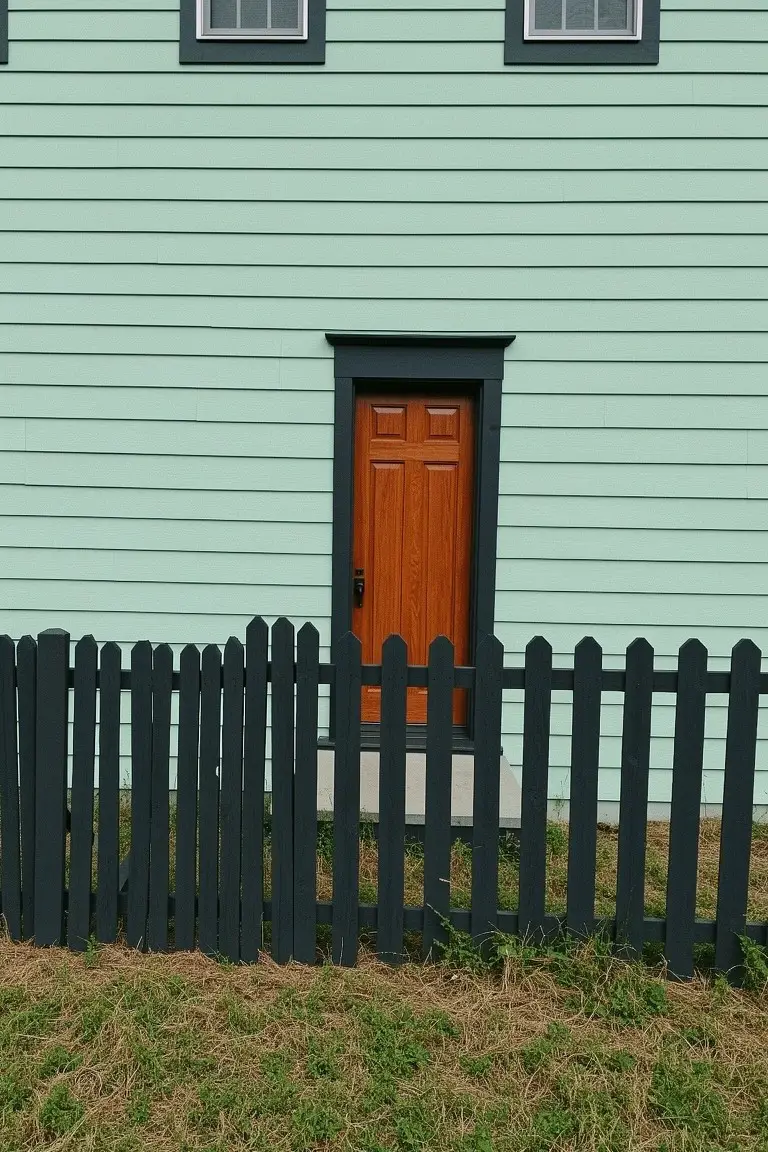
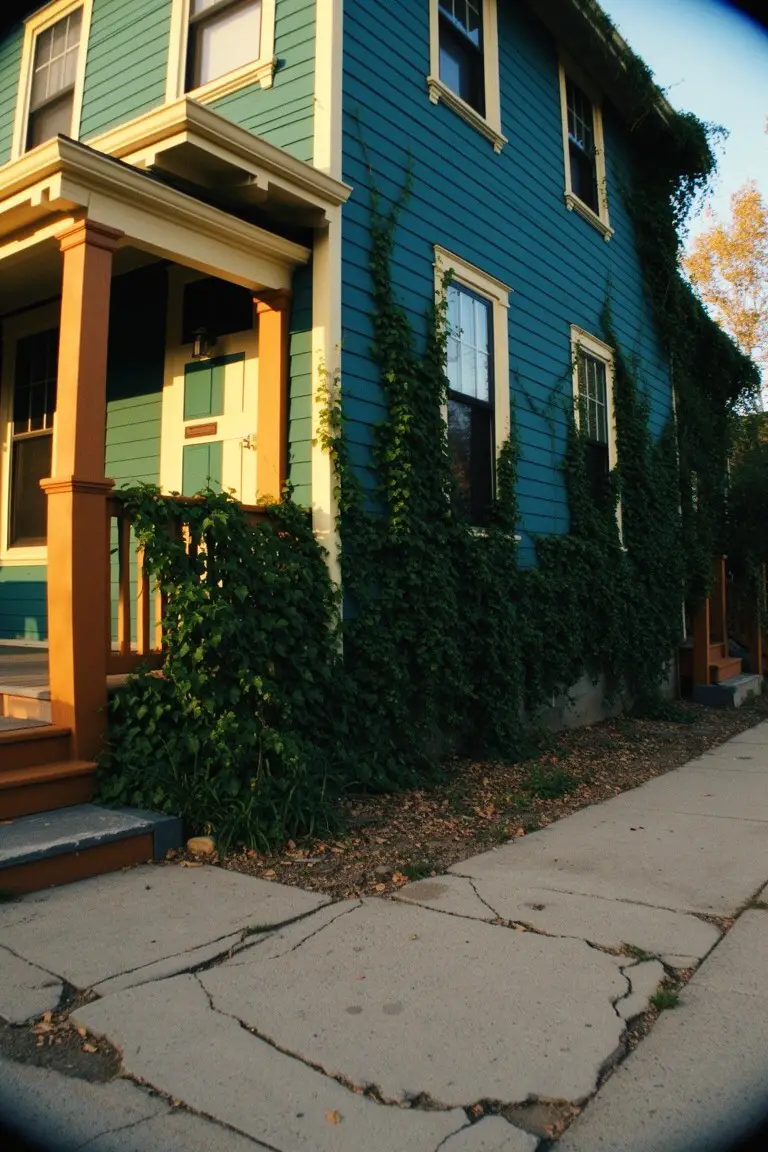
Soft Sage Green Siding
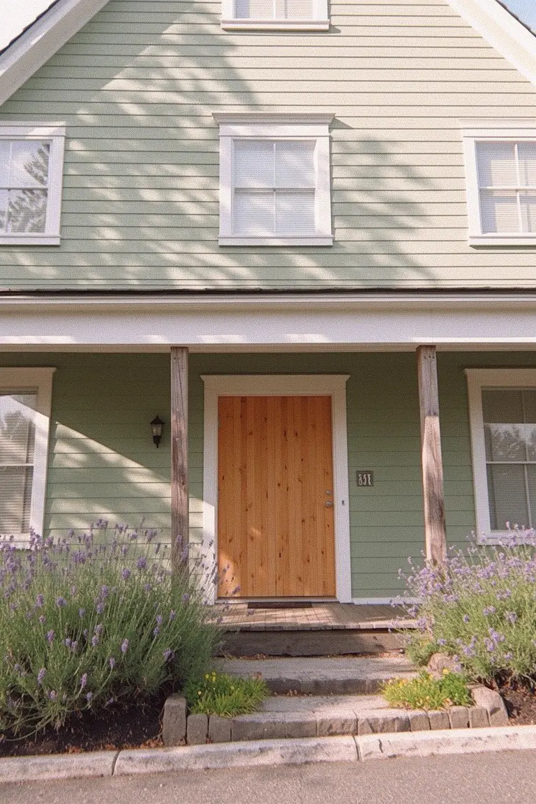
This soft sage green makes for easy exterior siding. It looks closest to Sherwin-Williams Evergreen Fog, Benjamin Moore Saybrook Sage, or Behr Silver Sage. It’s appealing because it’s calm and fresh. Not too bright. And the wood door pops right against it.
That cool gray undertone helps in different lights. Won’t turn muddy. The lavender plants nearby show how it works with soft purples. Good for cottage-style homes. Just watch for pairing with warm bricks.
Deep Navy Siding
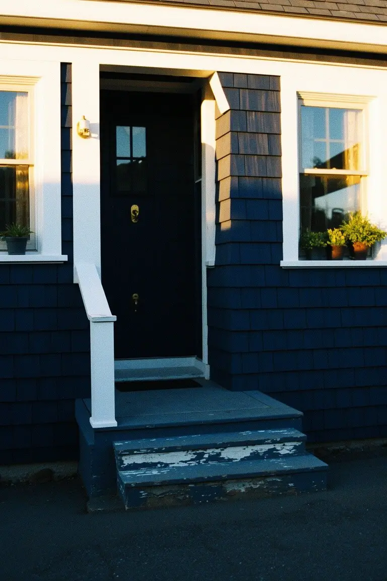
This deep navy blue on the shingle siding reads very close to Sherwin-Williams Naval or Benjamin Moore’s Hale Navy. Sometimes Behr’s Abyss hits the same note. It’s a solid, classic blue in that cool-toned family. People go for it because it gives a house real presence. Not screaming for attention. Just strong and steady next to white trim.
The undertone stays cool without going gray. It shines in good light, like afternoon sun on these steps. Works best on bigger homes or with black doors like this one. Pair it with greenery in the windows. Skip it if your spot gets mostly shade. Might turn too heavy there.
Warm Terracotta Walls
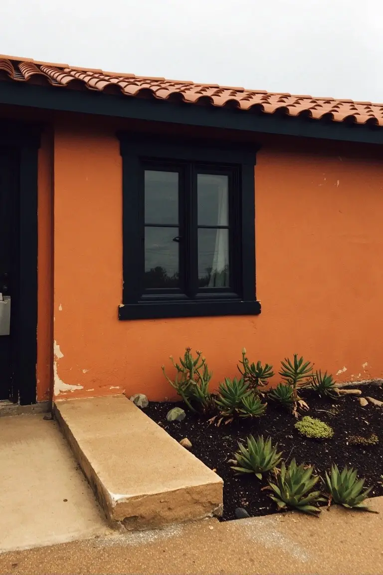
This terracotta orange catches your eye right away. It looks closest to Sherwin-Williams Spiced Cider or Benjamin Moore Potter’s Clay, maybe Behr’s Terracotta too. A solid warm earth tone that feels right at home in sunny spots. People go for it because it brings that cozy Southwest feel, bold but not over the top.
The red undertones keep it lively, especially next to black trim and a red tile roof like this one. Works best on stucco houses in dry areas. Pair it with desert plants at the base. Just keep an eye on fading if your sun’s real harsh.
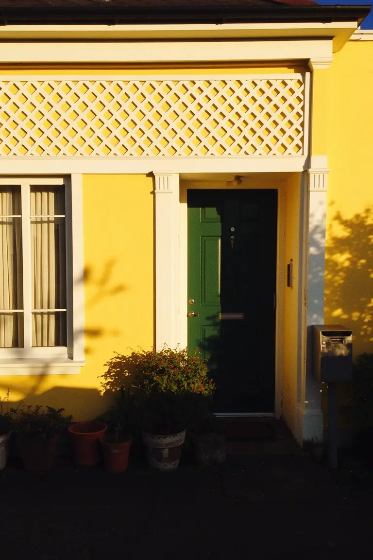
Pale Yellow Walls
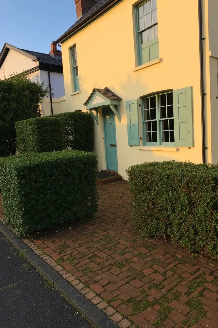
This pale yellow on the walls looks closest to Sherwin-Williams Corn Silk or Benjamin Moore’s Lemon Sorbet. Behr’s Lemon Glow has that same soft buttery feel too. It’s the kind of yellow that’s gentle, not screaming for attention. Folks like it because it brightens up a plain house without going overboard.
Warm undertones keep it from looking washed out in shade. Notice how it sits easy next to the blue door and those hedges. Try it on a cottage-style home, especially where you want something cheerful that lasts through the seasons. Just test samples in your light first.
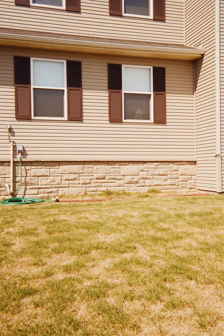
Deep Gray Exterior Walls
This deep gray paint has a cool undertone that reads very close to Sherwin-Williams Iron Ore or Benjamin Moore Kendall Charcoal. It’s the kind of solid dark gray that gives a house a clean, modern edge. Folks like it because it lets warm wood details stand out without stealing the show.
The cool base keeps things from looking too heavy, especially next to those wood frames and planters. It works best on stucco or siding in sunny spots. Pair it with light stone or greenery to keep the look balanced. North-facing walls might need a test patch first.
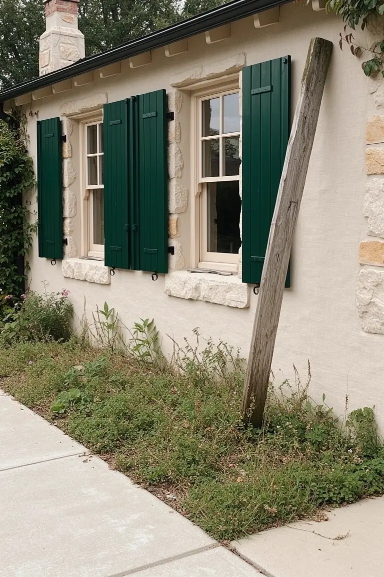
Deep Teal Siding
This deep teal on the house siding looks closest to Sherwin-Williams Sag Harbor or Benjamin Moore Wythe Blue. It’s a muted blue-green that’s rich enough for an older home like this one. People go for it because it stands up to trim and wood details without overpowering them.
That cool undertone with green keeps it from going too blue in the shade. Works great on porches or north-facing sides. Stick to cream or soft white for the accents, and let the wood rails stay natural.
Muted Sage Green Siding
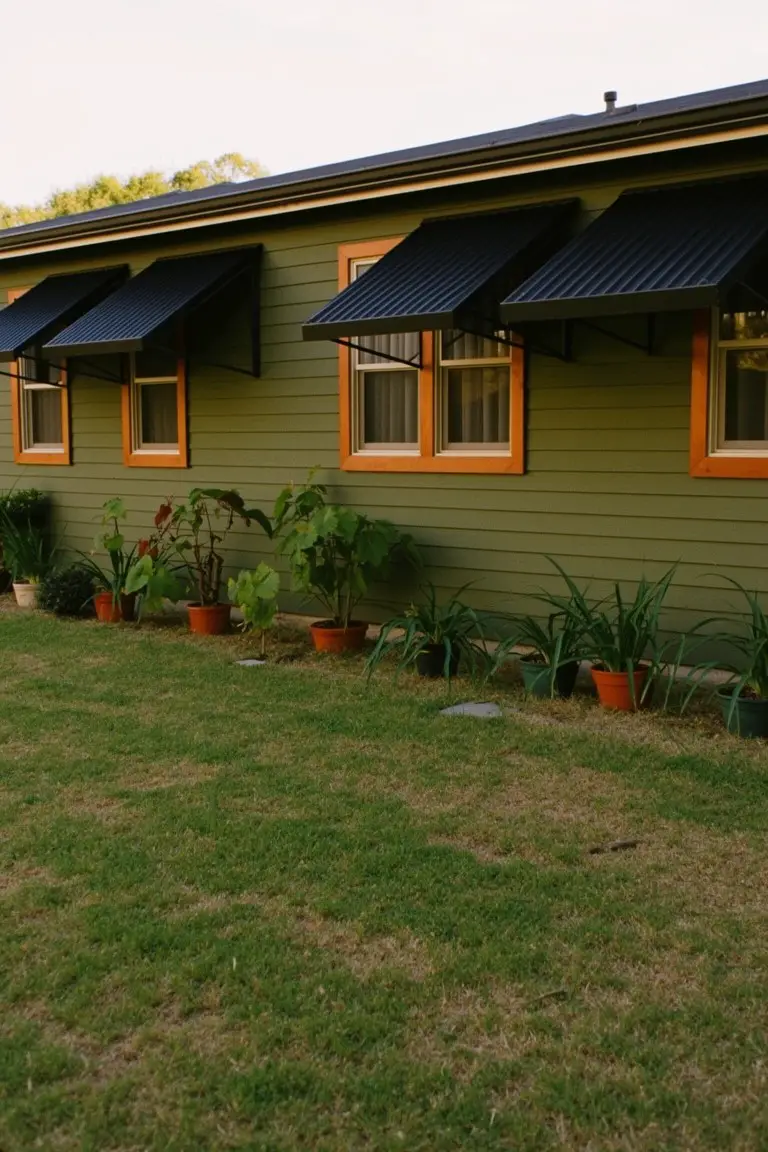
The siding here picks up a muted sage green that’s easy on the eyes. It sits in that earthy green family and seems closest to Sherwin-Williams Pewter Green or Benjamin Moore Saybrook Sage, maybe Behr’s Silver Sage too. Folks go for this kind of color because it feels at home next to plants and grass without shouting.
Warm gray undertones make it read softer in yard light. Those orange window frames give it a lift, and it pairs fine with natural wood trim or stone paths. Watch for too much shade though. It can pull cooler there.
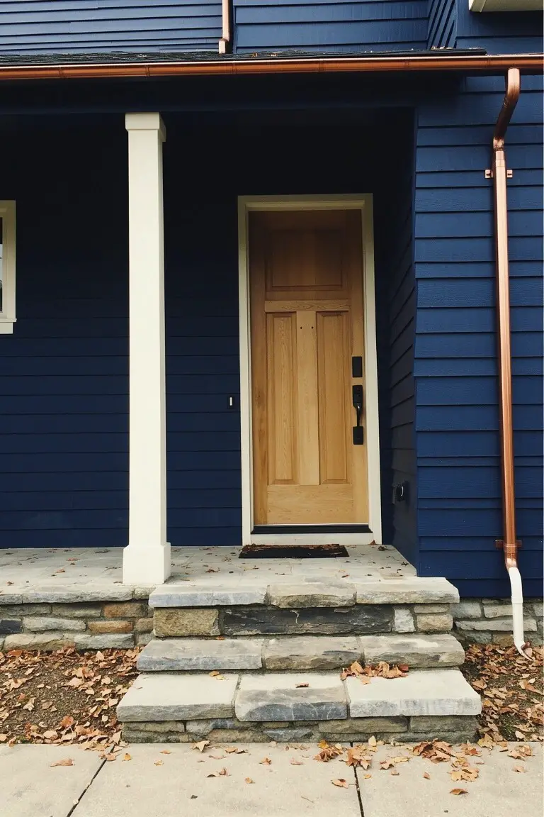
Navy Blue Front Door
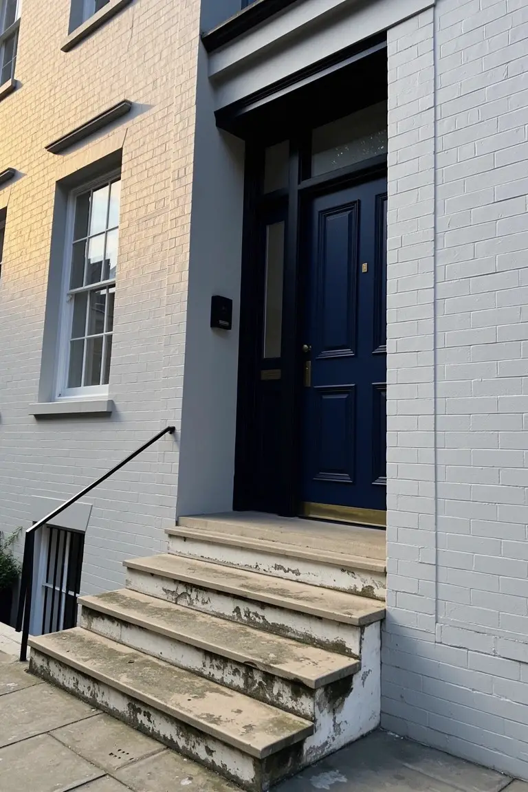
That deep navy blue on this door reads very close to Sherwin Williams Naval or Benjamin Moore Hale Navy. Maybe even Farrow & Ball’s Hague Blue. It’s the kind of rich blue that stands out without trying too hard. Pairs nicely with plain white brick like you see here, giving the entry a clean, sharp look.
The undertone leans a bit gray, which keeps it from going too bright in full sun. Works best on a north-facing door or in shady spots. Stick to brass hardware and light stone steps to let it pop. Just test a sample first, since navies can shift with the light.
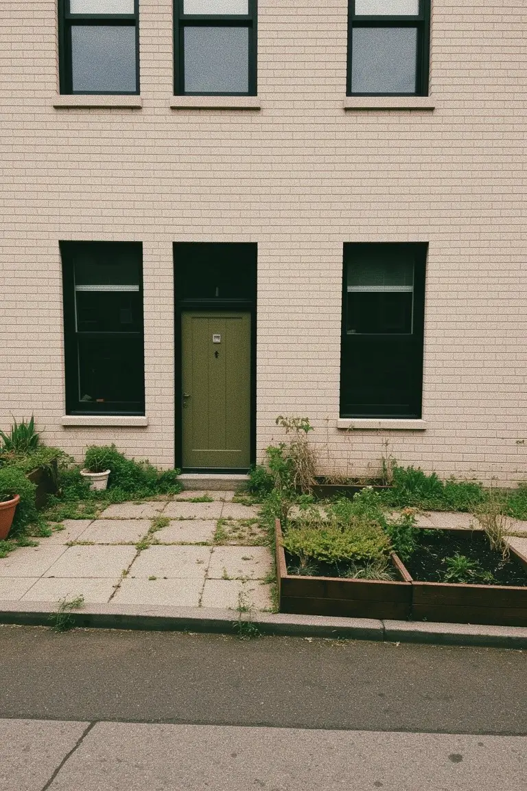
Sunny Yellow Exterior
This sunny yellow on the house body looks closest to Sherwin-Williams Lemon Slice, Benjamin Moore Lemon Sorbet, or Behr Dynamic Yellow. It’s a warm yellow that brightens the whole front without overwhelming things. People go for it when they want that cheerful pop right at the entry.
Warm undertones make it read softer in sunlight. White trim sets it off nicely, and a green door like this adds some contrast. Try it on a cottage-style home or anywhere with good exposure.
Deep Green Wood Trim
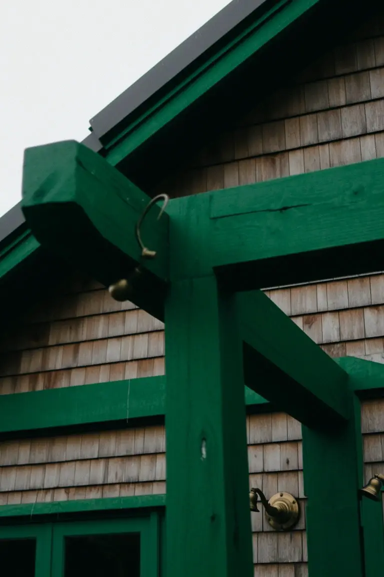
This rich green paint on the heavy beams and door frame looks closest to Sherwin-Williams Pewter Green. It has that same feel as Benjamin Moore Black Forest or Farrow & Ball Studio Green. It’s a deep, grounded green that sits right with natural wood siding. Folks go for it because it adds some punch to a house without overwhelming the look.
That neutral undertone keeps it from going too blue or yellow. It holds up well in shaded spots like this one. Try it framing entryways or porch posts, especially alongside cedar shakes or light stone.
Soft Pink House Walls
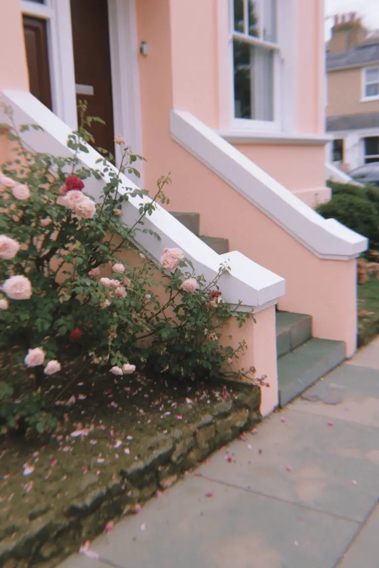
This soft pink on the exterior walls pulls from the blush family, that gentle rose shade with a bit of warmth. It reads closest to Farrow & Ball Calamine, or maybe Sherwin-Williams Amoret and Benjamin Moore First Light. Folks go for it because it softens up an older house front without going overboard. Those climbing roses next to it just fit right in.
The undertone stays warm, so it holds up in morning light better than cooler pinks might. White trim on the steps and railings keeps things crisp. I’d use it on stucco or brick homes, east-facing if you can. Steer clear of shady spots where it might read flat.
Deep Navy Walls
Those deep navy walls stand out in a good way here. It’s solidly in the cool navy family, and the best matches would be Sherwin-Williams Naval or Benjamin Moore Hale Navy. Behr’s Abyss reads close too. What I like is how it gives a modern edge without going full black. The color holds up next to that warm wood door.
The gray undertones keep it from turning too blue in sunlight. It works best on bigger homes or clean-lined ones like this. Pair it with natural wood accents or crisp white trim. Just test it on your side first, since it can read darker in shade.
Warm Beige Exterior
This warm beige on the house siding seems closest to Sherwin-Williams Accessible Beige or Benjamin Moore Edgecomb Gray. Maybe Behr Toasted Cashew too. It’s a solid neutral tan that feels right at home outdoors. Folks go for it since it takes the sun all day without looking too bold.
Warm golden undertones make it read richer in morning light. It pairs easy with stone at the base like this or brick accents. Stick to suburban spots where you want low upkeep… avoids showing every dirt mark.
Classic Barn Red
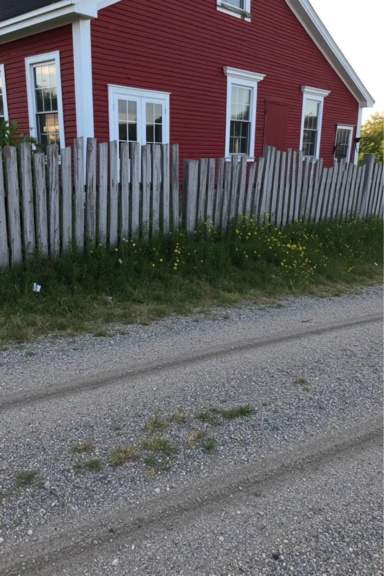
This siding pulls off a classic barn red that’s hard to miss. It looks closest to Sherwin-Williams Real Red, Benjamin Moore Caliente, or Behr Barn Red. That warm shade gives an old-school charm without trying too hard. Folks like it on farmhouses or coastal homes where it stands up to the elements.
The warm undertones keep it from going too orange in the sun. Here it pairs nice with white trim around the windows and some weathered wood fencing nearby. Use it on full exteriors but test a sample first. It holds color well if you keep up with touch-ups.
Pale Mint Green Siding
This house siding shows off a pale mint green that reads close to Sherwin-Williams Sea Salt or Benjamin Moore Saybrook Sage, maybe Behr’s Silver Drop too. It’s from that soft cool green family, the kind that keeps things fresh without trying too hard. Folks go for it on exteriors because it brightens up the whole place nicely, especially next to grass and simple landscaping.
Cool blue undertones make this green shift a bit in sunlight. That orange wood door and black trim here really pop against it. Use it on garden homes or anywhere with natural light. Just check how it looks in shade, might lean grayer there.
Soft Seafoam Green Siding
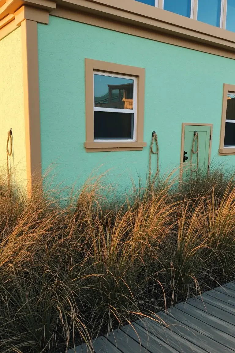
This light seafoam green on the exterior walls seems closest to Sherwin-Williams Sea Salt or Benjamin Moore Palladian Blue. Behr’s Jade Whisper runs right along with it too. It’s a pastel green in the cool family. People go for it because it feels fresh and beachy. Not overpowering at all.
That blue undertone shows up nice in the sun. See it here by the beige trim. Good for coastal spots or simple cottages. Pair with natural wood or light tans. Test a sample though. Shade can shift it cooler.
Deep Navy Siding
This exterior pulls off a deep navy blue on the siding. It looks closest to Sherwin-Williams Naval or Benjamin Moore Hale Navy, maybe Behr Abyss too. That’s the kind of rich blue folks turn to for a strong look without going overboard. The warm oak door and stone steps make it feel right at home.
Cool undertones keep the navy crisp, even on overcast days. It pairs easy with white trim or copper details like those gutters. Try it on craftsman or colonial styles where you want the house to hold its own.
Sage Green Front Door
This front door uses a deep sage green that pulls the whole entry together. It has that soft, earthy feel close to Sherwin-Williams Pewter Green or Benjamin Moore Saybrook Sage, and Behr’s Back to Nature comes pretty near too. What makes it work so well is how it sits quietly against brick without shouting.
Gray-green undertones keep it from going too yellow in the sun. Pair it with black window frames like here, or simple pots out front. Best on smaller homes where you want color that lasts through seasons.
Warm Brown Wood Siding
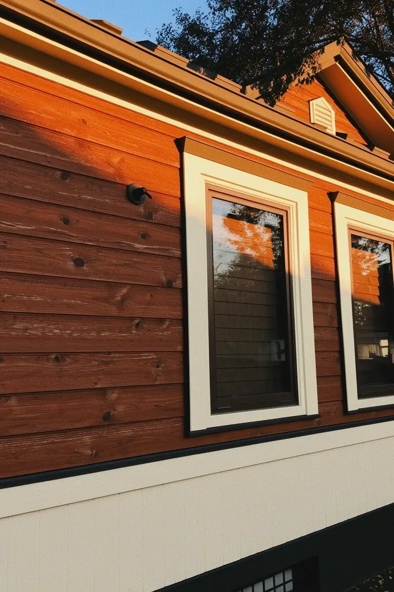
This exterior pulls off a rich warm brown on the siding that just works. You can see the wood grain pop through it. I’d say it comes closest to Sherwin Williams Potters Clay, or Benjamin Moore Burnt Almond, Behr Spiced Brandy too.
That subtle red undertone gives it life without going overboard. It sits nice against white trim and a black base, like in this setup. Best for cozy homes or cabins where you want some natural feel. Watch the lighting though. It shifts a bit in full sun.
Charcoal Gray Shingles
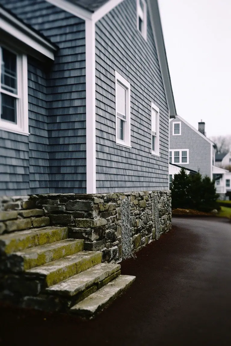
This deep charcoal gray on the shingle siding seems closest to Sherwin-Williams Iron Ore or Benjamin Moore Kendall Charcoal. Or maybe Behr’s Cracked Pepper. It’s a solid, cool-toned gray that gives a house that classic New England feel. Folks go for it because it stands up to weather and doesn’t show every little smudge.
The blue undertones come out more on cloudy days, like in this shot. It works best on homes with stone bases or white trim to keep things crisp. Pair it with black shutters if you want more punch, but watch that it doesn’t feel too heavy in full sun.
Deep Green Shutters
Those green shutters catch your eye right away. It’s a deep, true green that reads close to Sherwin-Williams Jasper or Benjamin Moore’s Essex Green. Behr’s Cactus Shadow has that same rich feel too. What makes it work is how it stands up next to stone without overwhelming things. Solid color for accents.
On a house like this with light stone walls, the green pulls a bit cool in the shade. It pairs easy with beiges or off-whites on the body. Good for older homes or anywhere you want trim that lasts through seasons. Just test it in your light first… greens can shift.
Warm Coral Siding
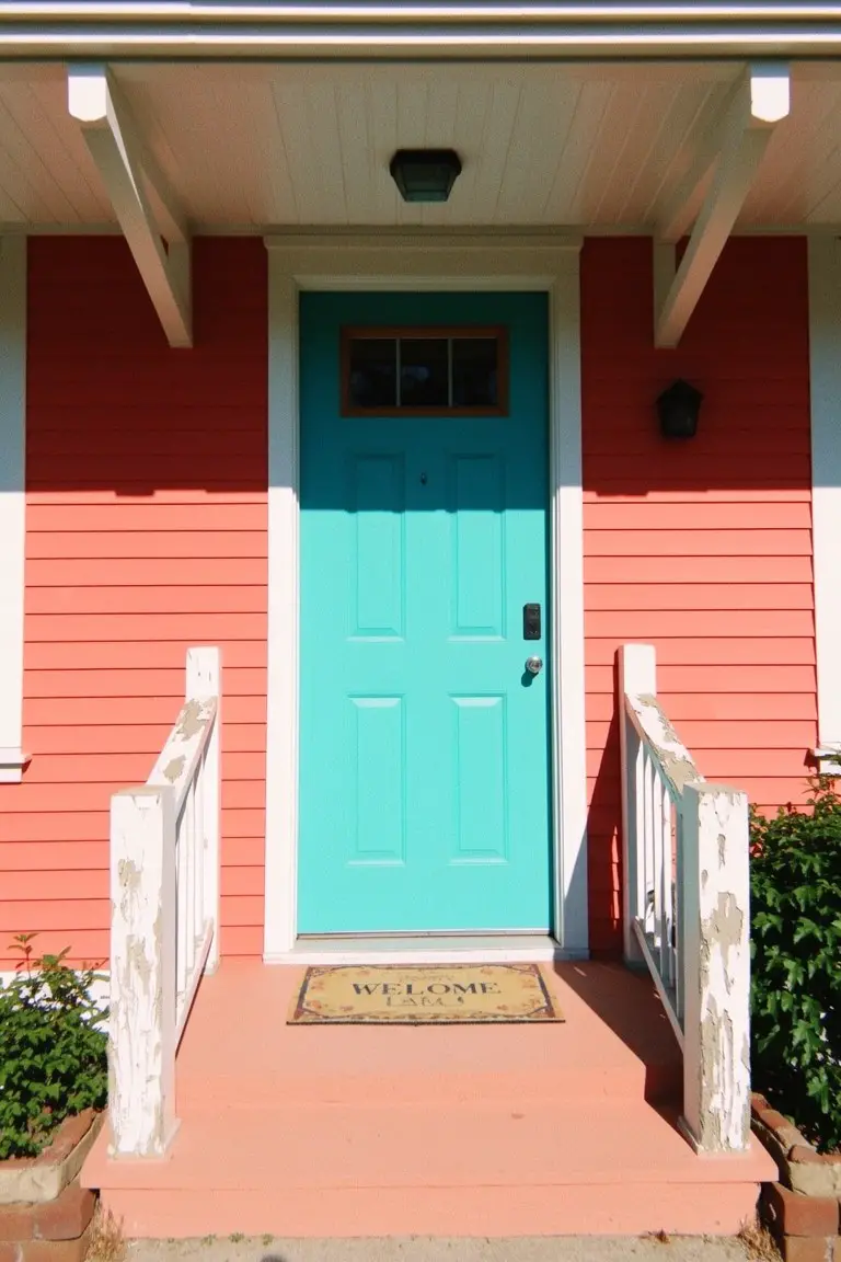
That coral pink on the house siding reads close to Sherwin-Williams Coral Reef or Benjamin Moore’s Calypso. It’s a lively warm pink with just enough peach to feel friendly, not garish. Folks like it because it perks up a plain front porch without overwhelming the yard.
The peachy undertones glow in sunlight. It pairs well with white trim and a turquoise door like this one shows. Stick to bright accents so the coral stays punchy. North-facing spots might need testing first.
Soft Light Gray Walls
This exterior pulls off a soft light gray that’s cool and neutral. It reads very close to Sherwin-Williams Repose Gray or Benjamin Moore Gray Owl, maybe Behr Silver Drop too. What stands out is how it keeps things fresh and understated, letting the wood door add some warmth without overpowering.
That cool undertone holds up well in overcast light. Pair it with black metal rails or stone steps like here. It suits urban row houses best, but test a sample first if your spot gets heavy shade.
Deep Teal Siding
This siding pulls off a rich teal that’s got that cool blue-green vibe. It looks closest to Sherwin-Williams Retreat, Benjamin Moore St. Lucia Teal, or Behr Gale Force. What stands out is how the color hugs an older house just right, giving it personality next to plain wood trim.
That green undertone keeps it from going too blue in different lights. It shines on homes with porches or vines, especially where you want contrast against warm oranges or plants. Watch for north-facing spots though. It can read a touch moodier there.
Frequently Asked Questions
Q: How do I test one of these colors on my house before going all in?
A: Pick up a couple quarts of sample paint. Paint big swatches on different sides of your home. Walk around at different times of day to catch how sunlight changes it.
Q: Will a bold color like deep navy hide dirt better than a light one?
A: Dark shades such as navy or charcoal grab grime less obviously than soft whites or beiges. You still wipe down annually to keep that fresh look. They bounce back quicker from everyday weathering.
Q: What if my trim clashes with the new body color I love?
A: Swap the trim paint first to match. Try a crisp white or soft black for punchy contrast. It pulls the whole refresh together fast.
Q: How do I pick a color that fits my home’s style and neighborhood?
A: Drive around your area and snap pics of houses you like. Match one of our 25 shades to those vibes. Your ranch or colonial will pop without screaming for attention.