

I’ve spent time walking neighborhoods with well-kept Victorian houses, noticing how their paint choices capture that old-world charm while standing up to years of weather. Exterior colors behave differently than you might expect, warming up in morning light or cooling off dramatically by evening, which is why samples on your actual siding beat any fan deck. I learned that lesson the hard way with a burgundy trim I tested; it glowed beautifully at dusk but looked flat under harsh noon sun. The best combinations layer historic hues like soft ochres and slate blues in ways that highlight gingerbread details without overwhelming the facade. Try a few of these in your real light.
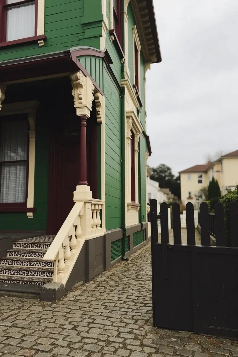
Dark Green Siding
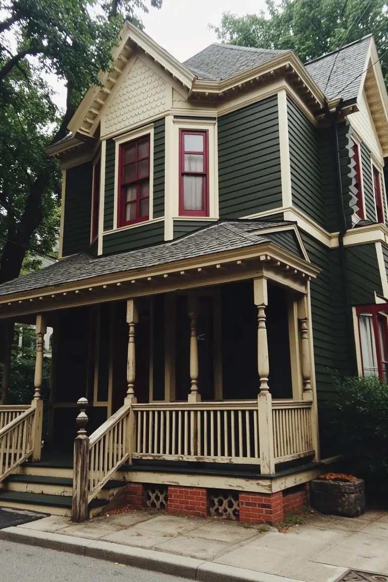
This Victorian exterior leans on a deep, rich green for the main siding, the kind that feels right at home on older houses. It looks closest to Sherwin-Williams Pewter Green or Benjamin Moore’s Black Forest Green, maybe Behr’s Cactus Shadow too – all in that muted dark green family. What stands out is how it holds its own next to the cream trim without stealing the show. Solid choice for historic curb appeal.
That green has a subtle gray undertone. Works best where there’s some tree shade, like here. Pair it with off-white trim and brick accents. In full sun it might read a touch brighter… just test a sample first.
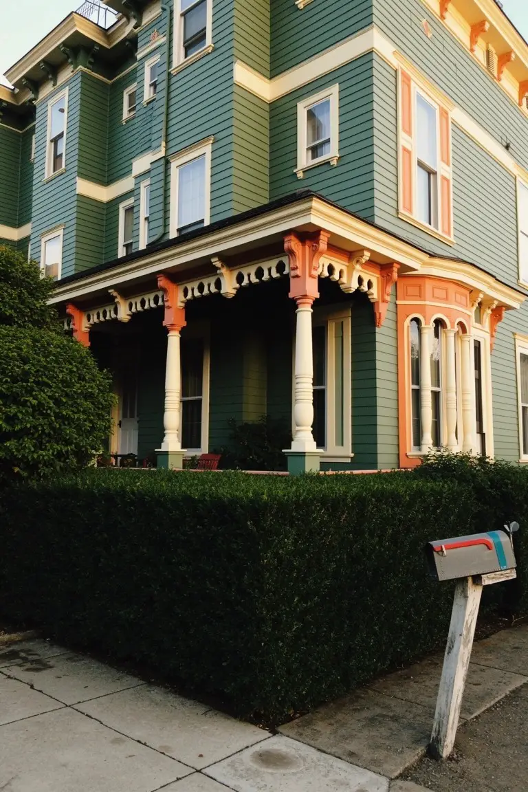
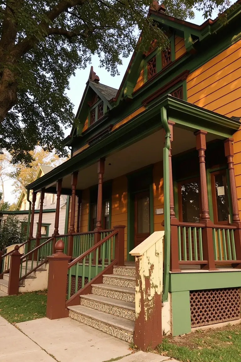
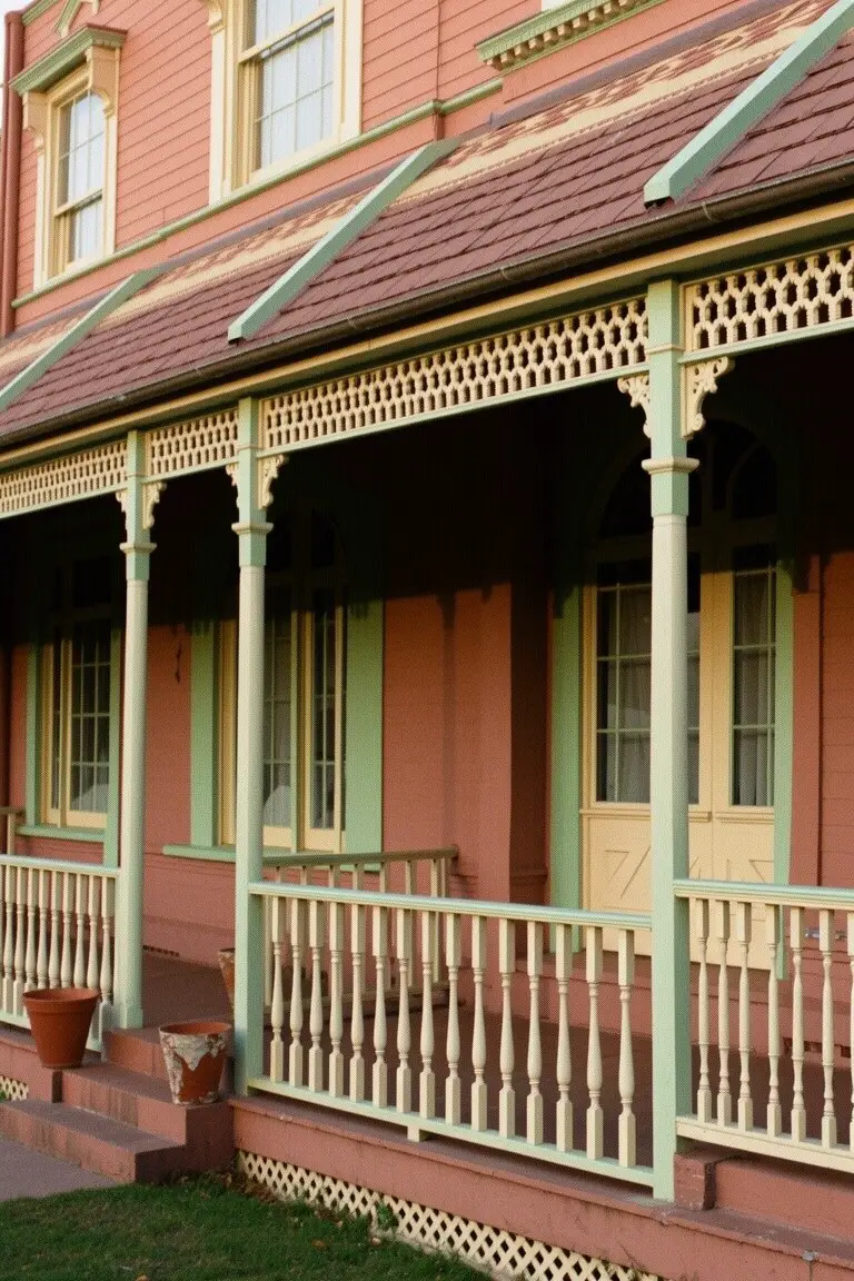
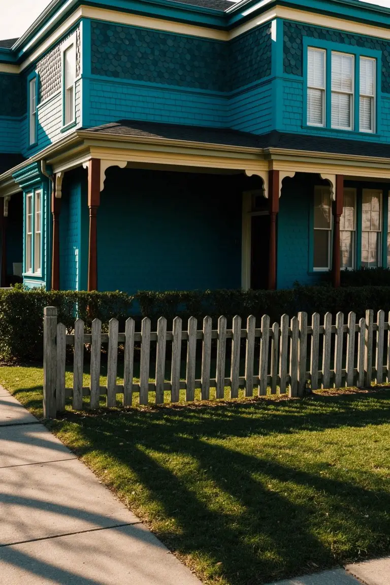
Muted Teal Siding
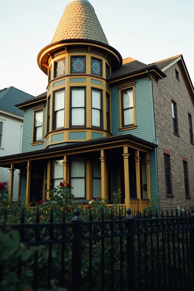
This Victorian exterior uses a muted teal on the body that has a nice historic feel. It looks closest to Sherwin-Williams Tidewater, or maybe Benjamin Moore Palladian Blue. Behr’s Back to Nature comes pretty close too. It’s not too bright. Just soft enough to let the architecture stand out.
The color picks up warm green undertones in most lights. Works great next to yellow trim like you see here on the porch columns and windows. Try it on homes with some brick nearby. Avoid pairing with cool grays though. It can look flat then.
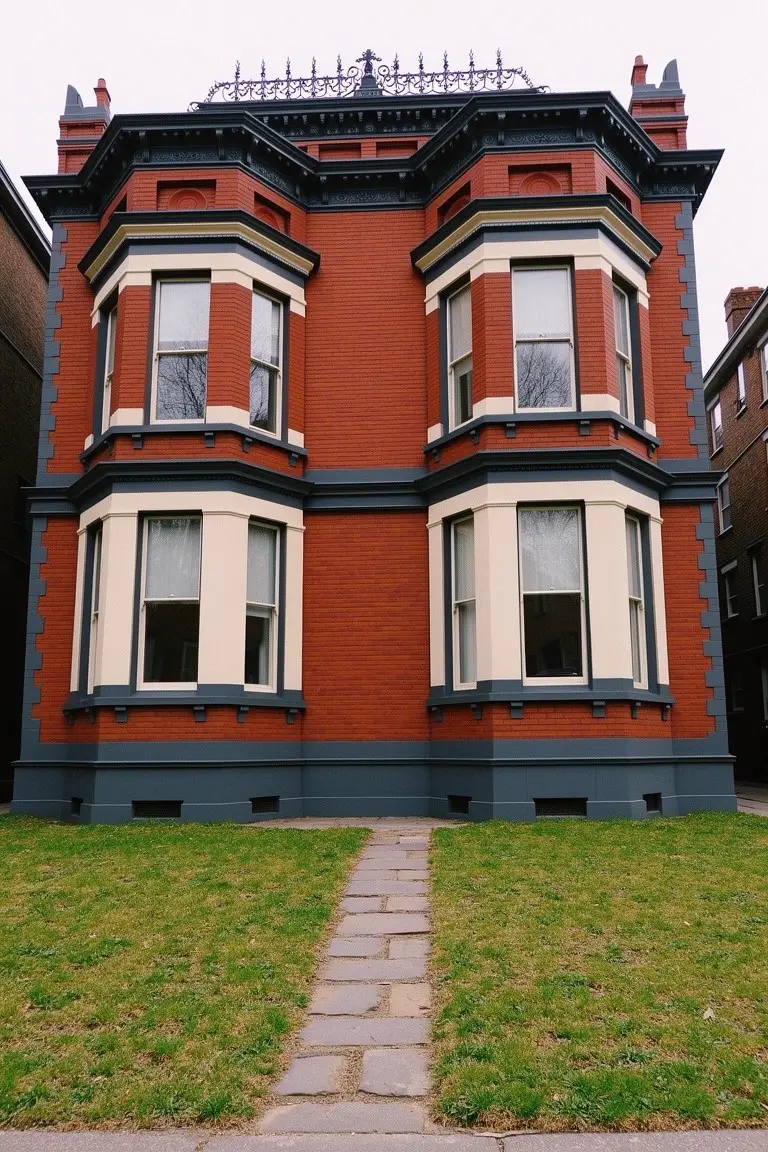
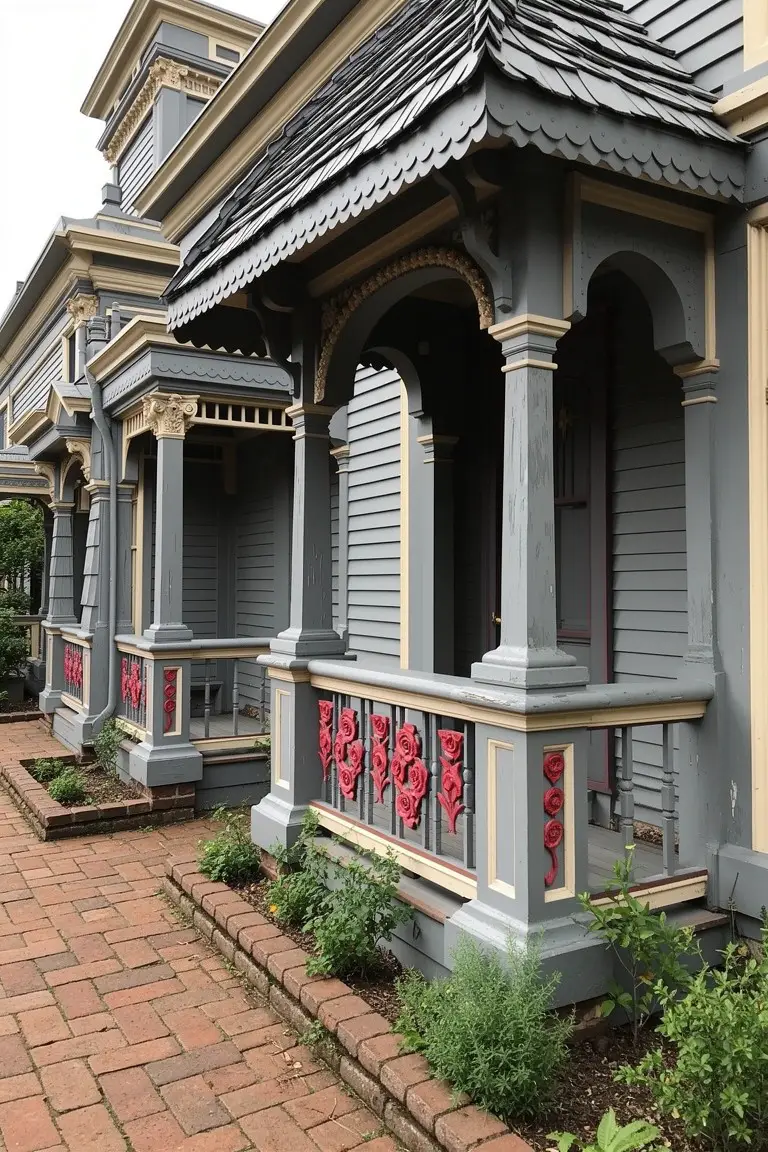
Charcoal Gray Trim
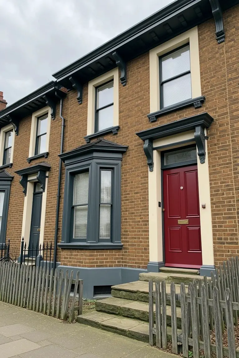
The trim on this Victorian house is a deep charcoal gray. It looks closest to Sherwin-Williams Iron Ore or Benjamin Moore Kendall Charcoal, maybe Farrow & Ball Railings too. That shade works so well because it’s got enough depth to stand up to warm brick without going full black.
Cool undertones make it feel current. It holds its own next to a red door like this. Best on north-facing spots or cloudy days. Just test it against your brick first.
Soft Blue-Gray Shingle Siding
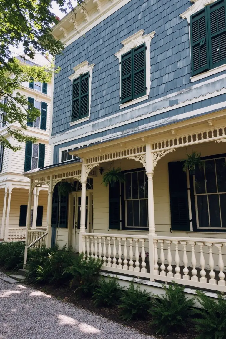
This soft blue-gray on the shingle siding reads close to Sherwin-Williams Sea Salt or Benjamin Moore Palladian Blue. It’s a cool tone in the gray family with just enough blue to feel historic without going too dark. Homeowners pick it for exteriors like this because it lets the trim and details stand out nice and clear.
The cool undertones keep it from looking too blue in most lights, especially under trees like here. It pairs well with cream porches and green shutters. Just test a sample first since it can shift a bit on shingles.
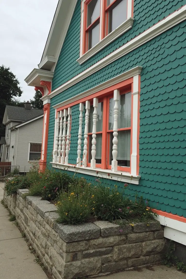
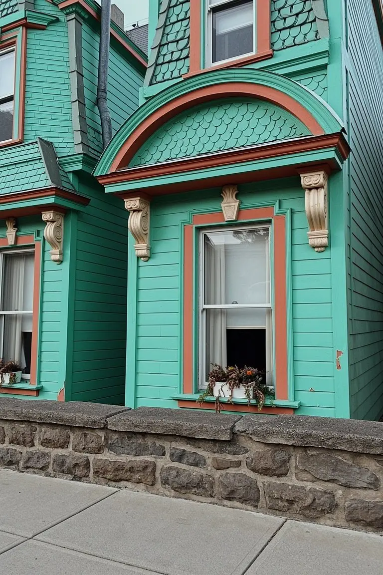
Muted Teal Green Siding
That muted teal green on the main siding stands out without trying too hard. It looks closest to Sherwin-Williams Rainwashed or Benjamin Moore Saybrook Sage, maybe Behr’s Silverado Sage too. It’s the kind of green with a blue undertone that feels right at home on a Victorian. People go for it because it nods to history while looking clean and lived-in.
The orange trim details lift it up, keeping things from going flat. Warm undertones in the accents make the green read richer in sunlight. It suits street-facing homes like this one, especially with hedges or plantings nearby. Stick to off-white on the porch posts, and it all settles in nice.
Deep Black Victorian Siding
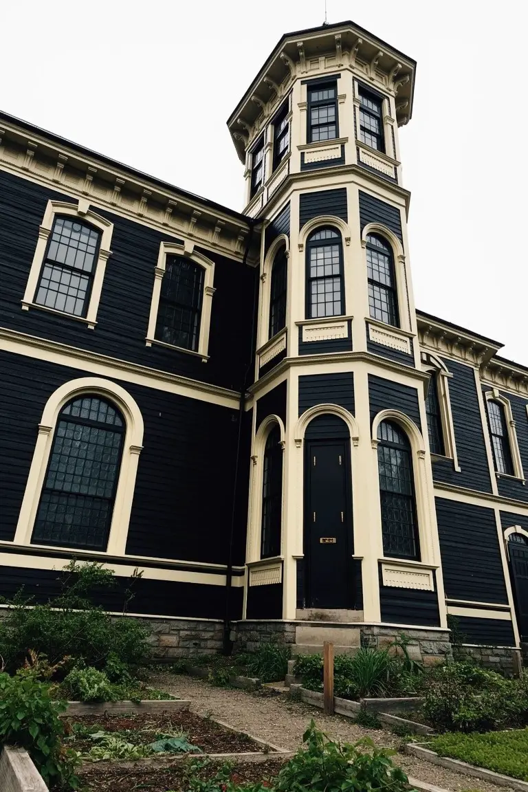
This Victorian exterior uses a deep black paint on the siding and main structure. It looks closest to Sherwin Williams Tricorn Black or Benjamin Moore Onyx, maybe Behr’s Black too. That kind of black brings out the home’s historic shape, especially around the tall corner tower. It’s bold but stays true to older styles.
The color sits neutral, not too blue or brown, so it holds up in shaded spots or cloudy weather. White trim on the windows and edges makes everything pop clean. Try it on larger homes with some plantings nearby to soften the base.
Rosy Pink Siding
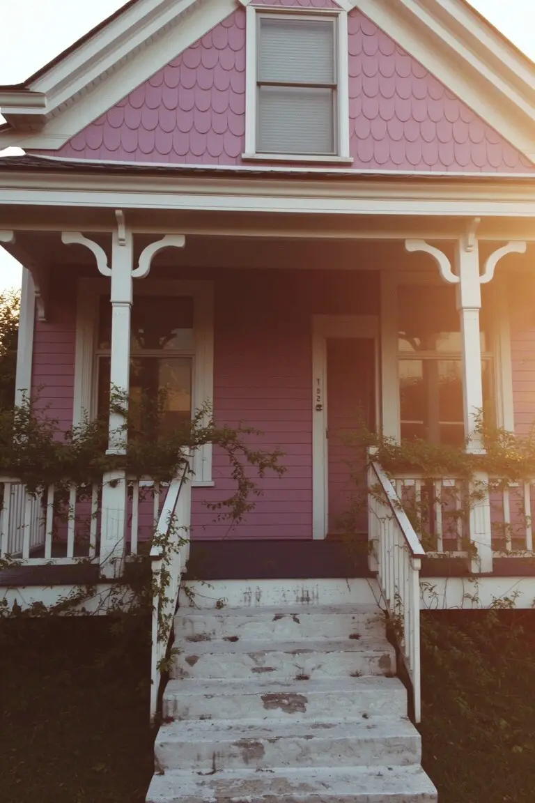
This rosy pink on the siding looks closest to Sherwin-Williams Blush or Benjamin Moore First Light. Behr’s Powder Blush reads very close too. It’s a dusty pink from the mauve family that fits right on older homes. What stands out is how it keeps that gentle historic vibe without going too bright or candy-like.
The color has a subtle purple undertone that shows up more in afternoon light. Pair it with crisp white trim like you see here, and maybe some greenery around the porch. It works best on houses with good trim details. Just test a sample first, since it can pull cooler on shady sides.
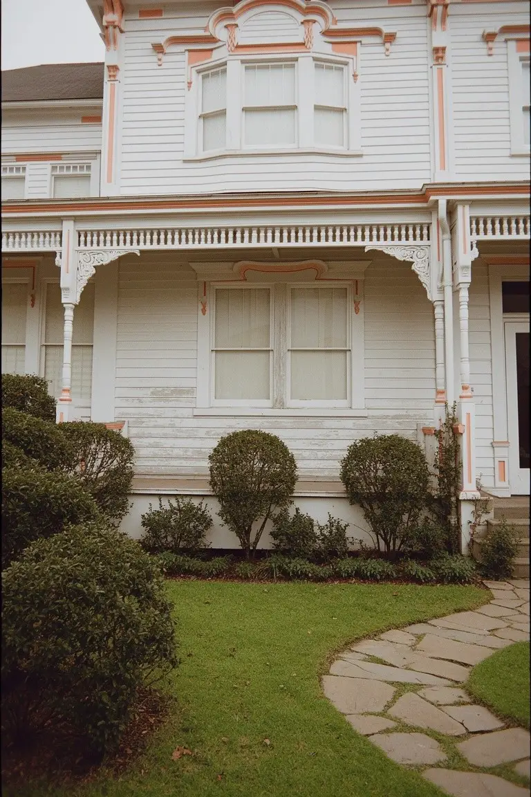
Warm Cream Trim on Brick
The main paint color here is a warm cream on the bay window surrounds and sashes. It looks closest to Sherwin Williams Alabaster or Benjamin Moore White Dove, maybe Behr Swiss Coffee too. This kind of soft off-white has a beige undertone that plays right off red brick without clashing. Folks like it because it keeps that historic feel alive, bright but not stark.
Pair it with dark gray or black on the edges and base, like they did here. The warmth holds up in overcast light. Works best on older homes where you want trim to pop gently against brick or stone. Just test samples, since brick can shift how it reads up close.
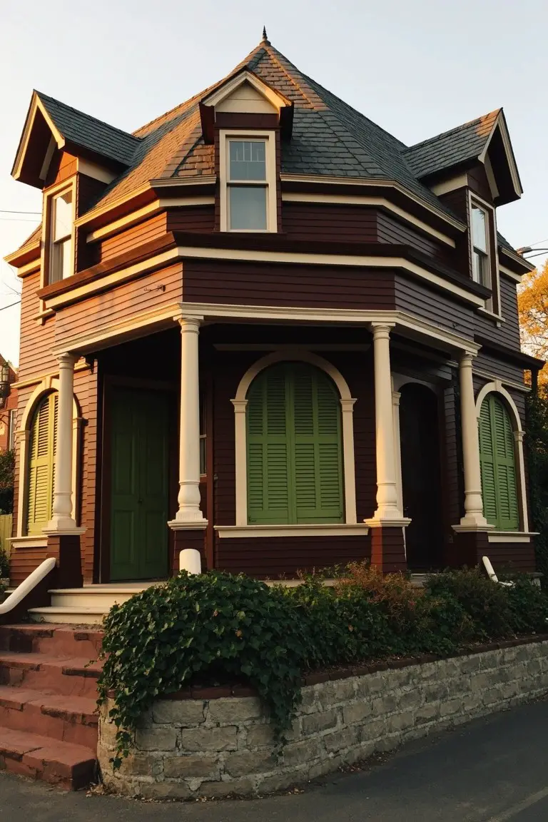
Warm Mustard Yellow Siding
This warm mustard yellow on the main siding reads very close to Sherwin Williams Goldenrod or Benjamin Moore Hale Gold. Behr Mustard Seed works too. It’s an earthy take on yellow that feels right at home on older houses. The color picks up nicely on the historic trim without overpowering it.
That golden undertone keeps it from going brassy in the sun. Pair it with olive green on the porch rails and darker wood doors like you see here. It suits shady spots under big trees best, where the warmth shows up without washing out. Just test a sample first, since it can shift a bit on different siding.
Rich Teal Siding
That deep teal covering the shingles on this Victorian house pulls off a historic vibe without trying too hard. It reads closest to Sherwin-Williams Rookwood Jadeite, or Benjamin Moore St. Lucia Teal, maybe even Behr Deep Teal. It’s a blue-green shade with real presence, the kind folks pick for older homes to nod to the past while keeping things fresh.
The cool undertone shines in softer light, pairing sharp with the orange window frames you see here. Stone at the base grounds it nicely. Stick to warm trim colors to keep the teal from going flat, and it’ll hold up on most any side of the house.
Deep Navy Blue Exteriors
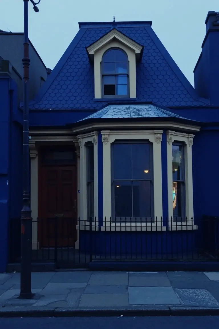
The body paint here is a deep navy blue, the kind that sits rich and strong on older homes. It reads close to Sherwin-Williams Naval or Benjamin Moore’s Hale Navy, with Farrow & Ball’s Hague Blue in the mix too. Folks like it because it honors that Victorian boldness without feeling too modern or flat.
This shade has a cool undertone that stays true even at dusk. It works best on full facades like this, paired with cream trim and a red door for contrast. Just watch it doesn’t overwhelm small trim details.
Slate Blue Door
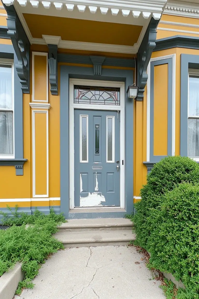
This front door pulls off a slate blue that’s muted and easy on the eyes. Looks closest to Sherwin-Williams Naval or Benjamin Moore Hale Navy, maybe Behr’s Night Flight too. Folks like it because it gives that historic nod without screaming for attention, especially next to warmer yellow walls.
The cool gray undertone helps it hold up in different light. Works best on shady porches or north sides. Pair it with ochre body paint and crisp white trim, but watch for pairing with reds… can fight a bit.
Warm Terracotta Pink Siding
This warm terracotta pink covers the main body of the house. It looks closest to Sherwin Williams Terracotta Tile or Benjamin Moore Potters Clay, maybe Behr Spiced Brandy too. It’s the kind of color that fits right into older neighborhoods. People pick it for that settled, historic look. Not too bright. Just right for a Victorian place.
The warm earthy undertone keeps it from going flat in shade. Sunlight warms it up nicely with a rosy hint. Use it on south-facing homes. Pair with soft green trim and off-white details. Watch for pairing with anything too cool though. It can clash.
Deep Mauve Body Color
This Victorian pulls off a deep mauve on the main body. It looks closest to Sherwin-Williams Amulet or Benjamin Moore Rich Mauve, maybe Behr Mystical Mauve too. That warm purple family has just enough gray to feel grounded, and it gives the house real historic charm next to the wood trim.
The rosy undertone comes out more in sunlight. It works great on bigger homes like this, paired with off-white trim and brick or stone details. Steer clear if your light stays dim… it can read flatter there.
Deep Green Siding
This Victorian exterior pulls off a deep green on the main siding. It reads very close to Sherwin-Williams Pewter Green or Benjamin Moore Essex Green. That’s the kind of green with real depth. Folks pick it for that old-house punch without going black.
The tone leans a touch blue on overcast days. It shines next to creamy trim like on these stairs and rails. Red doors pop against it too. Works best where you want bold color that holds up year-round. Keep accents light or it gets heavy.
Bright Teal Trim
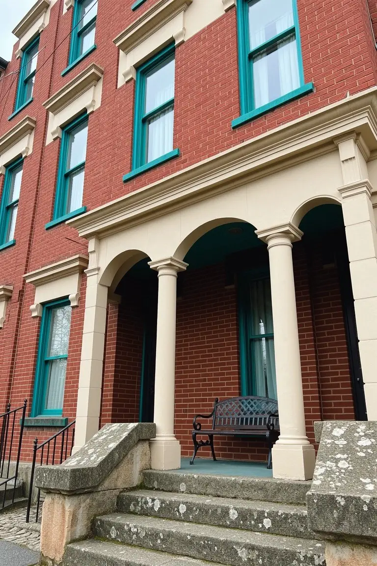
This Victorian exterior pulls off bright teal paint on the window frames and trim against solid red brick. It’s a lively turquoise shade in the blue-green family. Closest matches I’d peg are Sherwin-Williams Rainwashed or Benjamin Moore Wythe Blue, maybe Behr’s Oasis Blue too. That punch of color wakes up the brick without overwhelming it.
The cool undertones keep it crisp next to the warm brick, especially on cloudy days. Pair it with creamy stone steps like here, and black iron details. Just use a good exterior paint so it holds up over time.
Deep Turquoise Siding
This Victorian exterior shows off a deep turquoise on the main siding. It falls in the blue-green family and seems closest to Sherwin-Williams Rain or Benjamin Moore Wythe Blue. Maybe Behr’s Blue Dusk too. That kind of color gives an old-house vibe. It stands up well next to wood trim without overwhelming things.
With its cool undertone, the turquoise picks up nicely in sunlight. Notice how the cream window trim and red porch posts play off it here. It works great on clapboard homes like this. Just watch that it doesn’t look too intense in shade.
Neutral Gray Siding
This neutral gray on the house body reads very close to Sherwin-Williams Repose Gray or Benjamin Moore Edgecomb Gray, maybe Behr’s Silver Screen too. It’s that mid-tone gray folks turn to for older homes, soft enough to let the architecture stand out without overpowering it. On a Victorian like this, it gives a settled, lived-in feel right away.
Pair it with creamy trim like you see here, and the warmth comes through even on cloudy days. Watch the undertones though. It pulls a bit cool next to brick paths, so test samples in morning light. Red accents on the porch rail pop nicely against it, keeping things from going too muted.
Deep Reddish-Brown Siding
This siding paint reads as a deep reddish-brown, close to Sherwin Williams Marooned or Benjamin Moore Old Tavern Inn. Maybe Behr’s Deep Cordovan too. It’s that warm burgundy family with a bit of brick in it. Folks like it on older homes because it adds real depth without going full black. Pairs nice here with the green shutters and cream trim on the porch.
The warm red undertone keeps it from feeling cold, even on overcast days. It sits well against stone bases or brick walks. Stick to crisp whites or soft creams for trim, and greens for accents. Watch it doesn’t fade too fast in harsh sun.
Deep Navy House Body
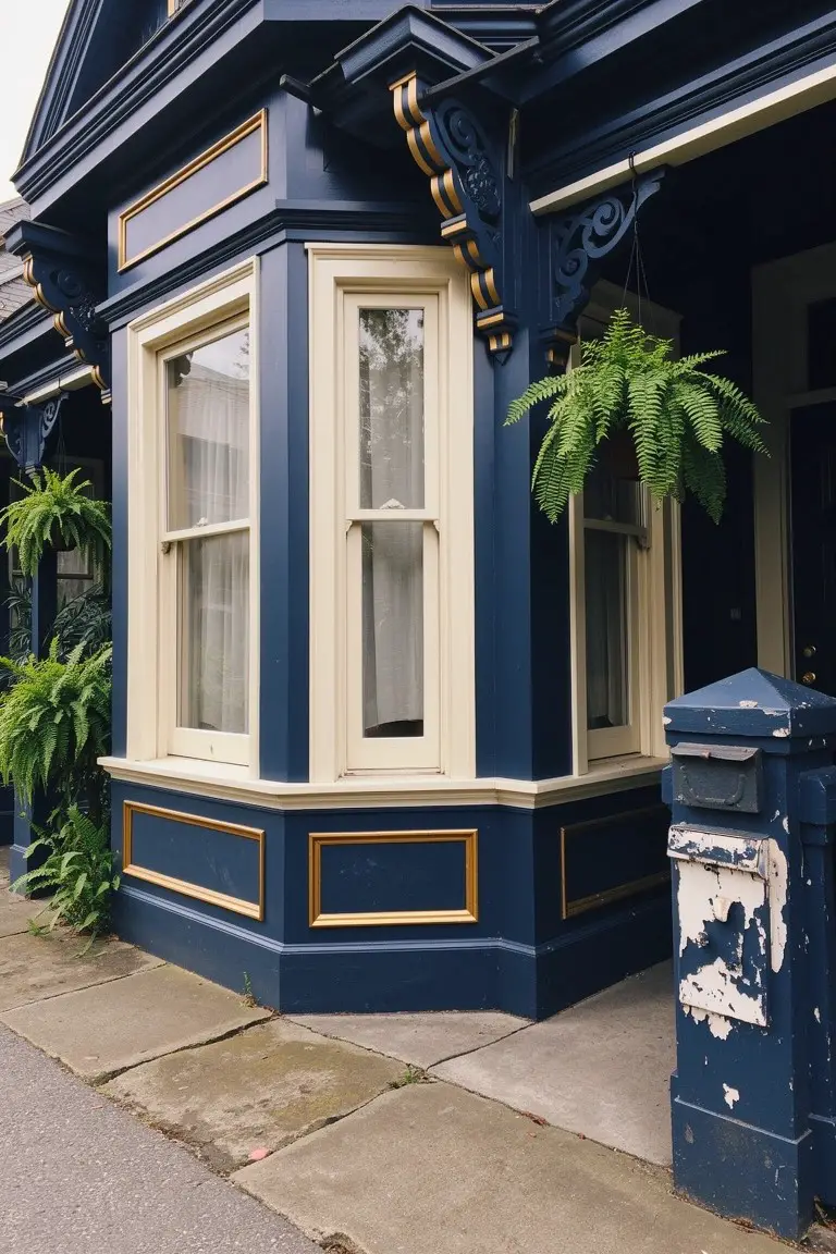
This Victorian exterior leans into a deep navy blue for the main body paint. Looks closest to Sherwin-Williams Naval or Benjamin Moore Hale Navy, maybe Farrow & Ball Hague Blue. It’s that rich, almost black blue that suits older homes so well. The gold-edged trim stands out crisp against it.
The color pulls a bit cooler in shade, warmer up close. Works best on homes with some detail like bay windows. Stick to cream or gold accents, and add plants for life. Avoid pairing with anything too bright.
Teal Green Siding
The body paint on this Victorian is a bright teal green. It looks closest to Sherwin-Williams Rain, Benjamin Moore Wythe Blue, or Behr Retro Teal. That kind of lively mid-tone color fits right into historic neighborhoods. It perks up the facade without overwhelming things.
Cool blue-green undertones keep it crisp next to stone bases and warmer red trim. Works best on houses with some sun exposure. Just watch it doesn’t wash out in heavy shade… pair with creamy window details for balance.
Pale Orange Trim
That pale orange on the trim gives this white Victorian its charm. It’s a warm peach tone in the terracotta family, reading close to Sherwin Williams Dorset Gold, Benjamin Moore Peach Parfait, or Behr Spiced Brandy. Homeowners pick it for how it livens up plain white siding. Not too bright. Just right for historic feel.
The warm red undertones show best next to crisp whites and green plants like these boxwoods. It works on porches or brackets in mild climates. Pair with pure white body paint. Avoid if your area gets harsh direct sun. Might fade over time.
Frequently Asked Questions
Q: How do I pick one combo from these 22 that matches my house’s trim and roof?
A: Stand back and note your current trim and roof colors first. Pick combos here that pull those shades into the body color or accents. That way your house looks pulled together right away.
Q: Can I try these Victorian colors on a house that’s not super historic?
A: Go for it. These combos add that charming flair to any older-style home without screaming “museum piece.” Just prime well over whatever paint’s already there.
Q: My house sits in shade most of the day. Which combos show up best?
A: Lean toward the warmer palettes with deeper golds or soft reds. They glow even without direct sun… unlike cooler grays that can wash out. Paint a test board and check it at different times.
Q: How do I test colors before committing to the whole exterior?
A: Grab sample quarts in the key shades and paint big plywood sheets. Prop them against your house for a week to see how light hits them. And tweak if needed before the pros roll up.