

I’ve learned that exterior paint colors reveal their true character only after spending days in your specific sunlight and shadows.
I remember choosing a warm taupe for our siding, convinced it was foolproof, until northern light brought out unexpected yellow tones that clashed with the oaks nearby.
The schemes that hold up best draw quiet strength from the home’s surroundings, letting architecture and nature guide the palette instead of overpowering it.
They resist the letdown of fading vibrancy or surprise undertones that indoor samples hide so well.
Test the neutrals with subtle blue leans in your yard light.
Crisp White Siding
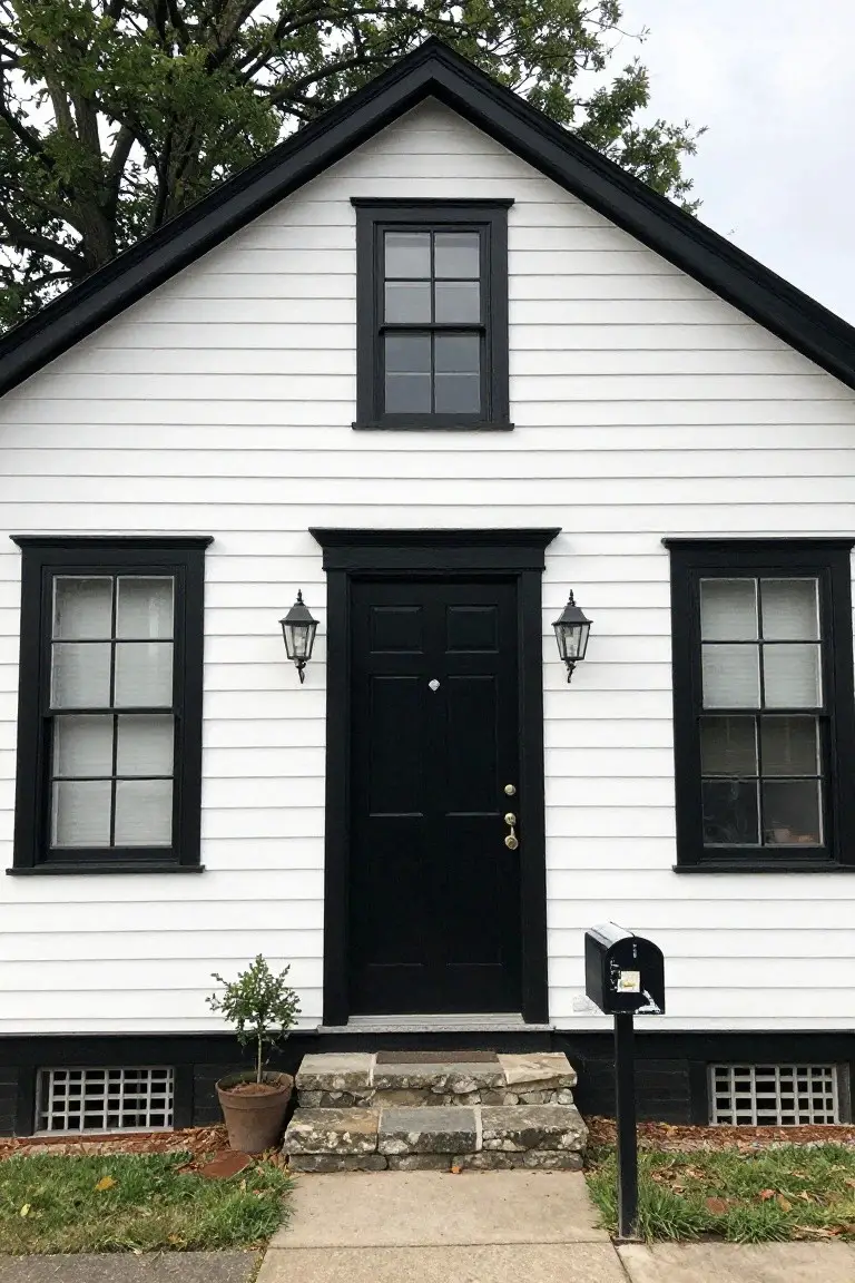
This crisp white on the house siding gives a clean, classic look. It seems closest to Sherwin Williams Extra White or Benjamin Moore Chantilly Lace, with Behr Ultra Pure White reading right in there too. Folks like it because it’s bright without being stark. Makes the black door and trim pop just right, for that polished feel on an older home.
The cool undertone keeps it fresh in most light. Pair it with black accents like this, and maybe some stone steps. Works best on traditional clapboard houses. Watch for dirt showing up more than on warmer whites.
Soft Greige Siding
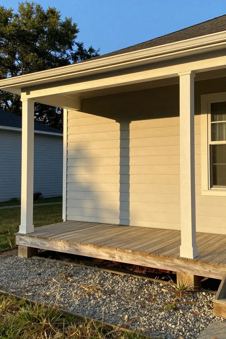
This exterior siding pulls off a soft greige that’s equal parts gray and beige. It looks closest to Sherwin Williams Agreeable Gray, Benjamin Moore Edgecomb Gray, or Behr Toasted Almond. That warm neutral feel makes it dead simple for houses with wood decks or white trim like this one. No fuss, just easy polish.
The beige undertone gives it life next to raw wood. It holds up well in mixed light, though shadows can make it read a touch cooler. Pair it with clean white columns and you’re set. Skip it if your spot gets constant harsh sun.
Soft Greige Exterior
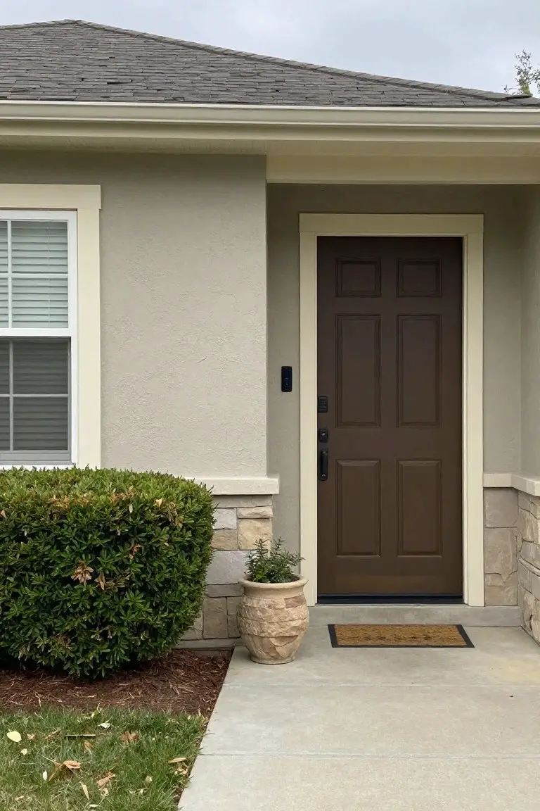
This house shows off a soft greige paint, the kind that lands close to Sherwin-Williams Accessible Beige or Benjamin Moore Edgecomb Gray, maybe Behr Silver City too. It’s a warm neutral, gray with just enough beige to feel cozy. People go for it on exteriors because it hides dirt well and stays looking fresh against all sorts of trim.
That beige undertone shows up best in natural light. Here it pairs easy with the dark wood door and stone base. Stick to warm woods or bricks around it. Cool tones nearby can make it read flat.
Soft Sage Green Exterior
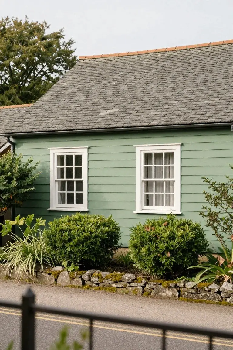
That pale sage green on the siding pulls from the sage family and seems closest to Sherwin-Williams Retreat or Benjamin Moore Saybrook Sage HC-114. Behr’s Sage Whisper runs right along those lines too. It’s a muted green with gray mixed in. What makes it nice is how it settles quietly against plants and stone. Timeless without trying too hard.
The gray undertone keeps it cool and steady in shaded spots or overcast light. White window frames pop clean against it, like here. Works best on older homes with slate roofs or rock walls. Steer clear if you want bold color. Otherwise, it just feels right.
Cool Gray Siding
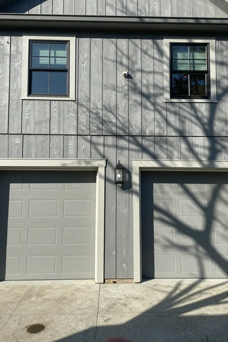
This exterior uses a light cool gray on the siding and garage doors. It looks closest to Sherwin-Williams Repose Gray, Benjamin Moore Gray Owl, or Behr Silver Drop. That sort of gray stays neutral and easygoing. Homeowners go for it since it pairs simply with white trim and keeps things looking clean year-round.
The cool undertone picks up nicely in overcast light. White windows and lanterns stand out against it just right. Try it on a straightforward house like this one… avoids feeling too cold if you add some warm wood details nearby.
Soft Pale Yellow Brick
This soft pale yellow brick exterior seems closest to Sherwin-Williams Creamy or Benjamin Moore Pale Yellow HC-3. Behr’s Toasted Marshmallow reads pretty similar too. It’s that easy warm shade older homes do so well. Not too buttery. Just enough glow to feel welcoming.
The warm yellow undertone picks up nicely next to red brick paths and dark wood shutters. White trim on the columns keeps everything crisp. Works best on east-facing homes where morning light brings out the subtle richness. Skip it if your lot has heavy tree shade. It can pull a bit flat there.
Pale Blue Siding
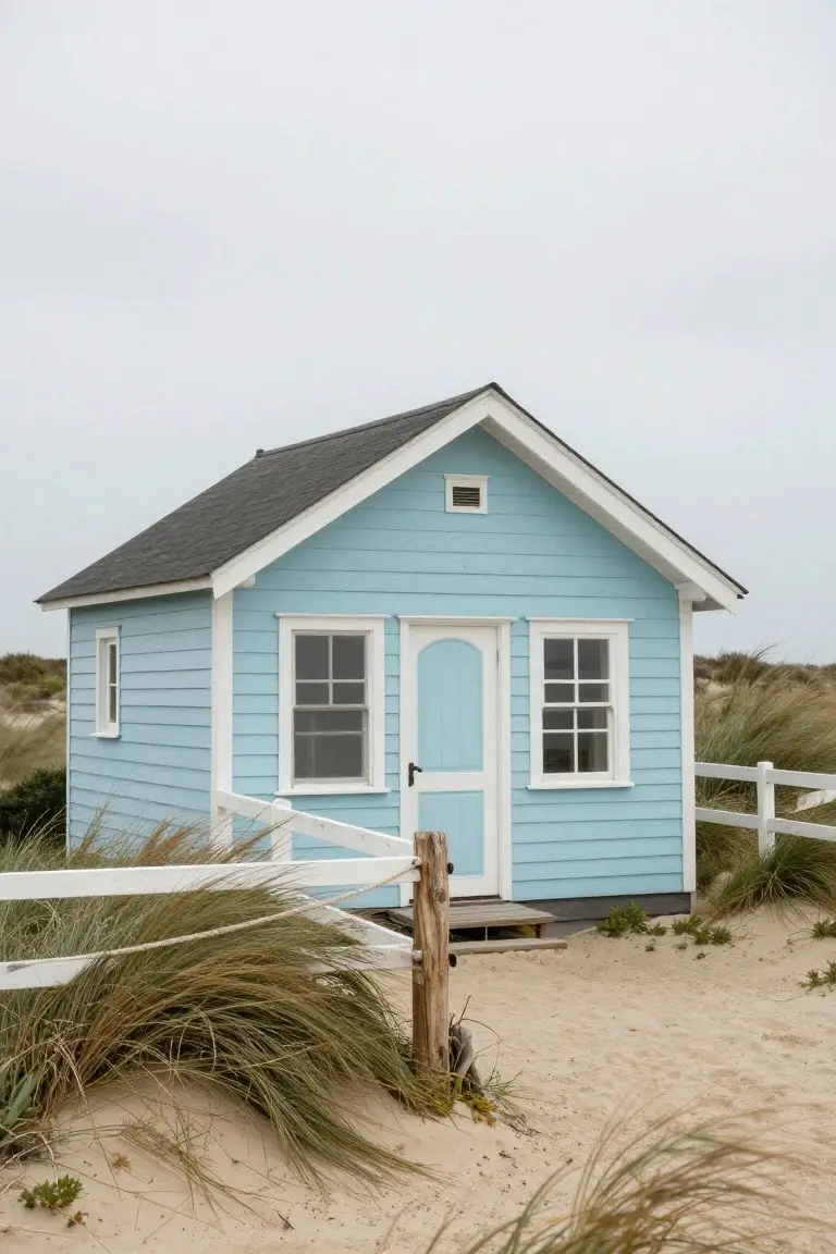
This little house uses a pale blue on the siding that looks closest to Sherwin-Williams Rain. Or Benjamin Moore Palladian Blue and Behr’s Blue Haven come pretty near too. It’s a soft cool blue, not too bold, that gives exteriors a clean fresh look without much fuss.
The color picks up a bit of gray in the undertone. Works best where there’s open sky or beach light to show it off. White trim keeps things crisp, and that dark roof adds some weight so it doesn’t float away.
Sage Green Exterior Siding
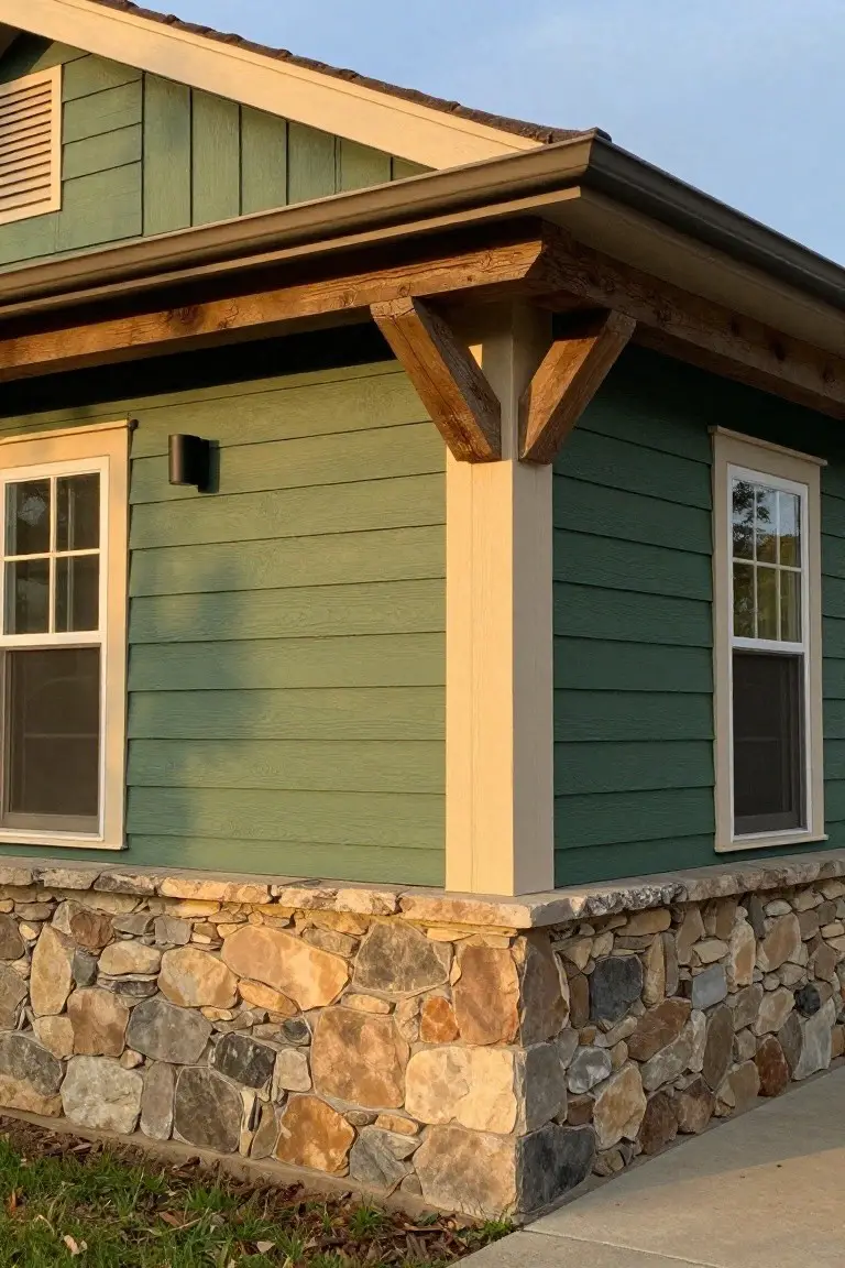
This soft sage green siding pulls from the earthy green family and seems closest to Sherwin-Williams Clary Sage or Benjamin Moore Saybrook Sage, maybe Behr’s Silver Sage too. It’s got that relaxed, muted vibe with warm gray undertones. Folks go for it on exteriors because it sits back easy, letting stone or wood details stand out without competing.
Pair it with tan stone bases like this one, or creamy trim. The warmth keeps it from going cold in shade. Best on craftsman-style homes… or anywhere you want low-key polish that ages well.
Classic Black Front Door
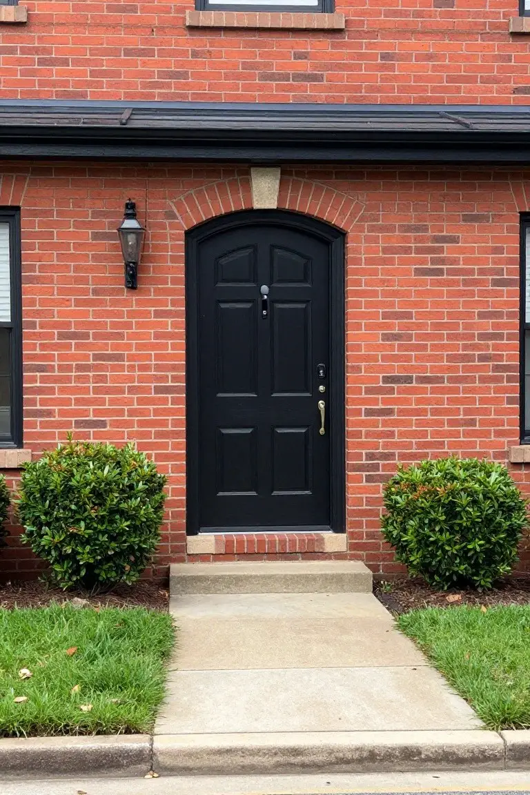
A deep black front door like this one reads very close to Sherwin-Williams Tricorn Black or Benjamin Moore Jet Black. Or try Behr’s Black for something similar. It’s a straightforward true black that adds real punch to brick without trying too hard.
No strong undertone here. Just clean black that holds up in most light. It suits traditional brick homes best. Brass hardware keeps it from feeling too stark… and wipe off dirt before it sticks.
Pale Yellow Exterior
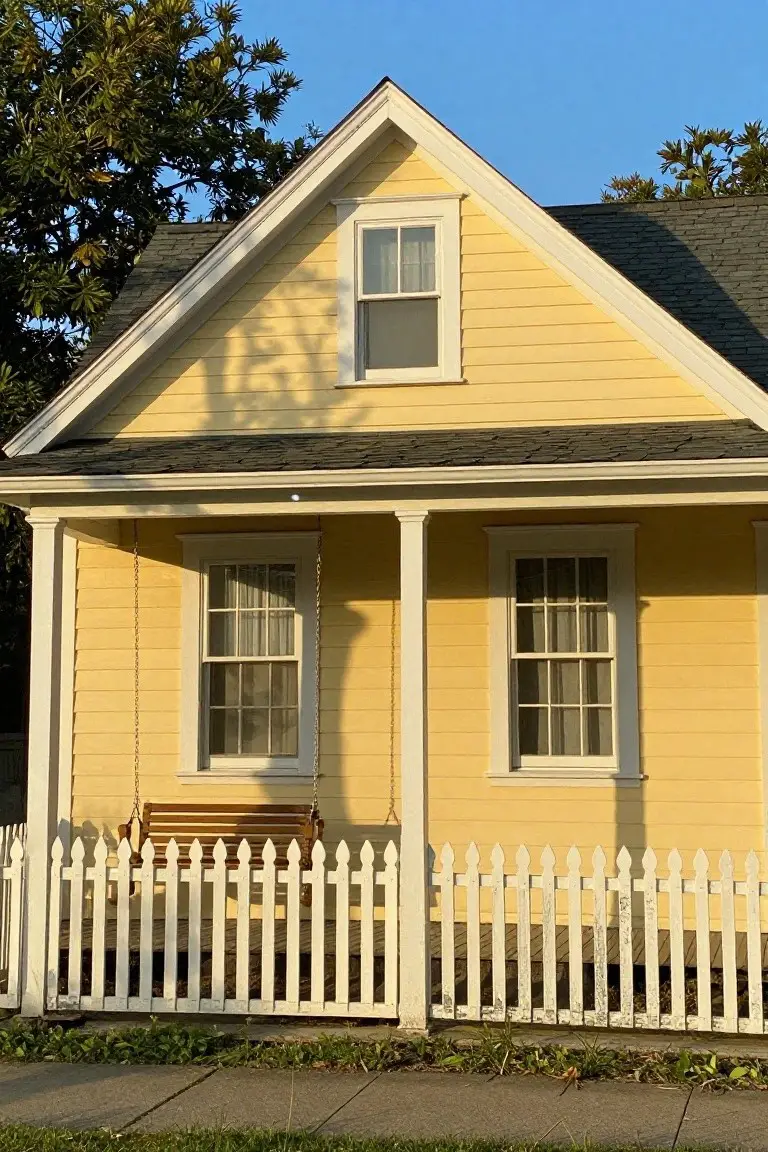
This pale yellow on the house siding pulls from the warm yellow family. It reads very close to Sherwin-Williams June Day, Benjamin Moore Pale Yellow, or Behr Butter Up. Folks go for it because it’s sunny and light but stays calm on a whole house front.
That gentle warmth shows up best next to white trim like on the porch columns here. It works well around green lawns or trees. Keep an eye on the undertone though. Too cool a white nearby can make it look flat.
Pale Gray Exterior Walls
The big walls on this house use a pale gray paint that’s clean and easygoing. It looks closest to Sherwin-Williams Repose Gray or Benjamin Moore Gray Owl, maybe Behr Silver Drop too. That light neutral family gives a fresh start without screaming for attention, and it holds up well outside year-round.
Cool undertones keep it from yellowing in sun, though it softens nicely next to the dark base trim here. Good for modern spots with plants or stone nearby. Just test samples in your light first… it can read whiter than you think.
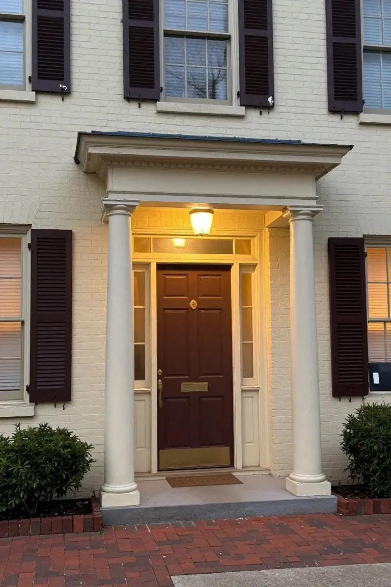
Warm Beige Brick Exterior
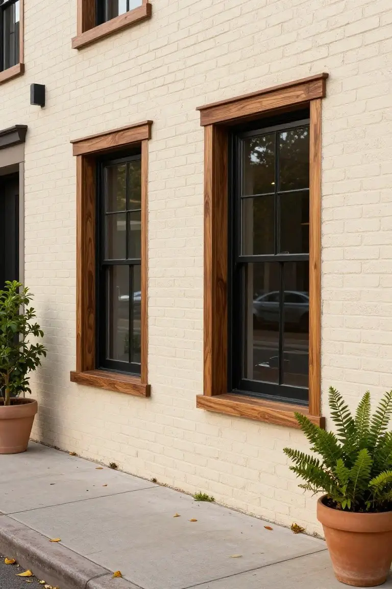
This warm beige on the brick walls feels like a classic choice for house exteriors. It looks closest to Sherwin-Williams Accessible Beige, or maybe Benjamin Moore Edgecomb Gray and Behr Swiss Coffee. What I like about it is how it stays soft and neutral without going too yellow or gray. The black windows pop right against it, and that wood trim adds some richness.
The warm undertones keep things cozy, especially next to natural wood. It works well on full facades in decent light, where it won’t look dingy. Pair it with dark trim like here, or stone accents. Just test a sample first, since brick can shift the read a bit.
Crisp White with Navy Shutters
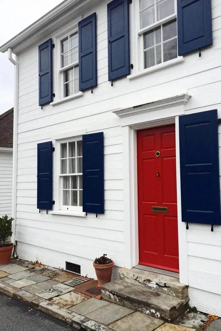
This siding paint is a crisp, bright white that keeps the whole house looking sharp and fresh. It comes across closest to Sherwin-Williams Extra White or Benjamin Moore Chantilly Lace. Folks pick these for exteriors because they hold their clean look year after year. Navy shutters like these add that strong contrast without overpowering things.
That white pulls a bit cool in everyday light, which works right next to deep navy. The red door gives it extra life too. Try this setup on a clapboard colonial. It shines with stone or brick details nearby. Just watch for dirt showing up more on the white.
Warm Black Wood Siding
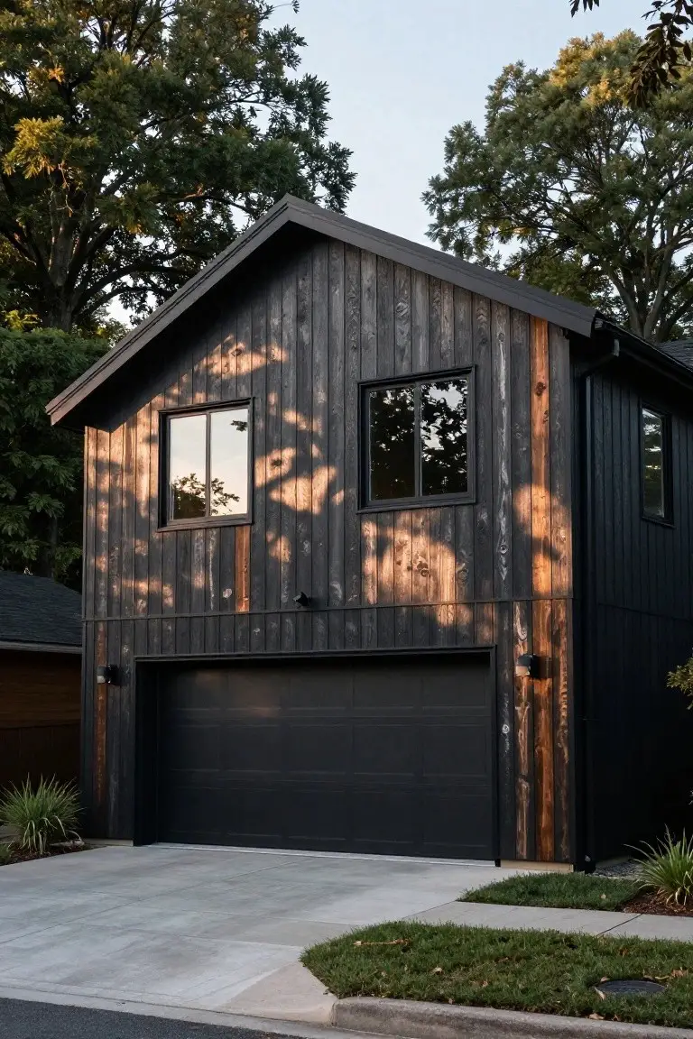
This exterior pulls off a deep warm black on the siding that looks closest to Sherwin-Williams Iron Ore or Benjamin Moore Wrought Iron. Or maybe Behr’s Black. It’s the kind of black with brown undertones from the wood grain peeking through. Folks pick it for that modern yet rustic feel that lasts.
The warmth keeps it from going flat in shade. It sits right next to raw wood accents and stone paths. Best on homes with some trees around for contrast. Just test a sample in your light first.
Creamy White Stucco Walls
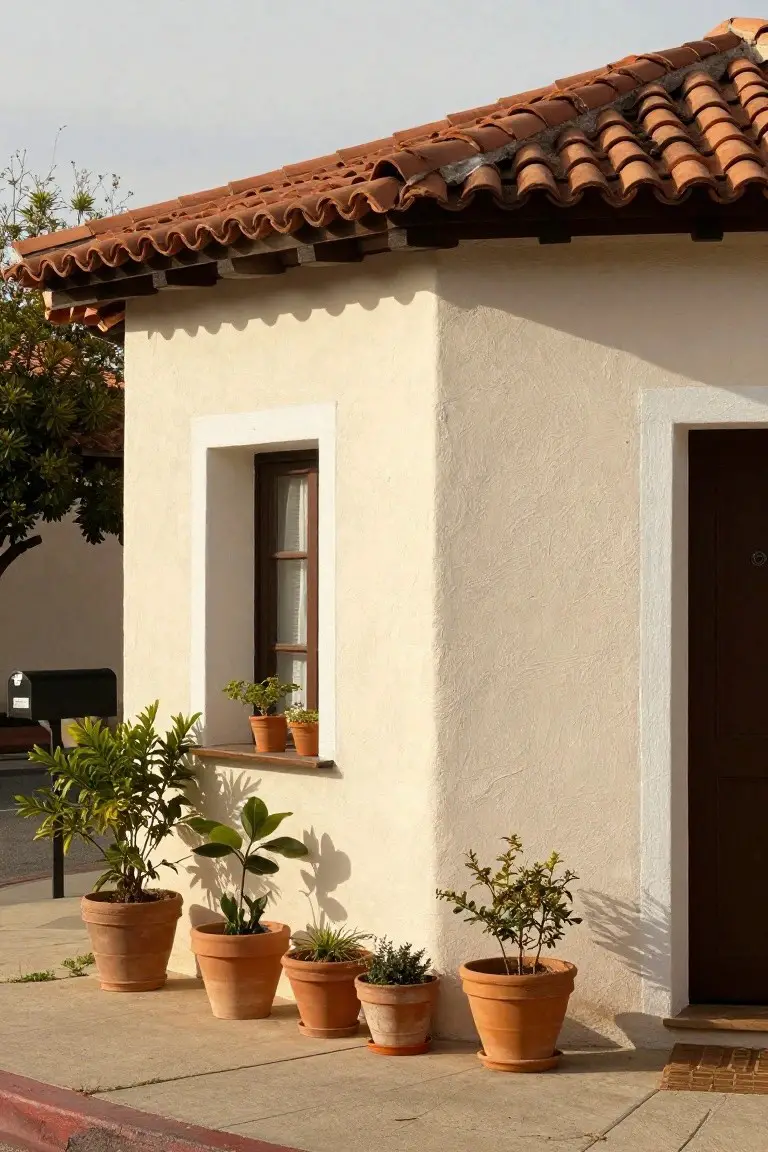
This exterior uses a creamy white stucco that reads very close to Sherwin Williams Alabaster or Benjamin Moore White Dove. Behr Swiss Coffee could work too. It’s a warm neutral folks turn to for that easy, lasting look on older homes. Keeps things bright without being stark.
The subtle beige undertone gives it life next to wood trim and terracotta pots like you see here. It shines in good light, holding color through the day. Best on sunny sides. Steer clear of pairing with cool grays, though. Stays too muddy.
Muted Blue-Gray Siding
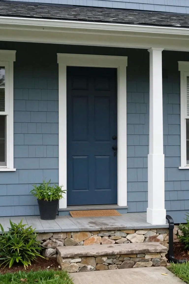
This house siding shows off a muted blue-gray paint that’s got a cool, coastal vibe. It looks closest to Sherwin-Williams Rainwashed, Benjamin Moore Stonington Gray, or Behr Blue Peppercorn. Folks like it for exteriors since it holds up well to weather and gives a calm, lived-in look without being too trendy.
The cool gray undertones make it read softer in morning light, especially next to white trim and that navy door. It pairs nicely with stone steps or foundations like you see here. Just watch if your area has strong yellow evening sun, it might pull a bit greener.
Warm Terracotta Walls
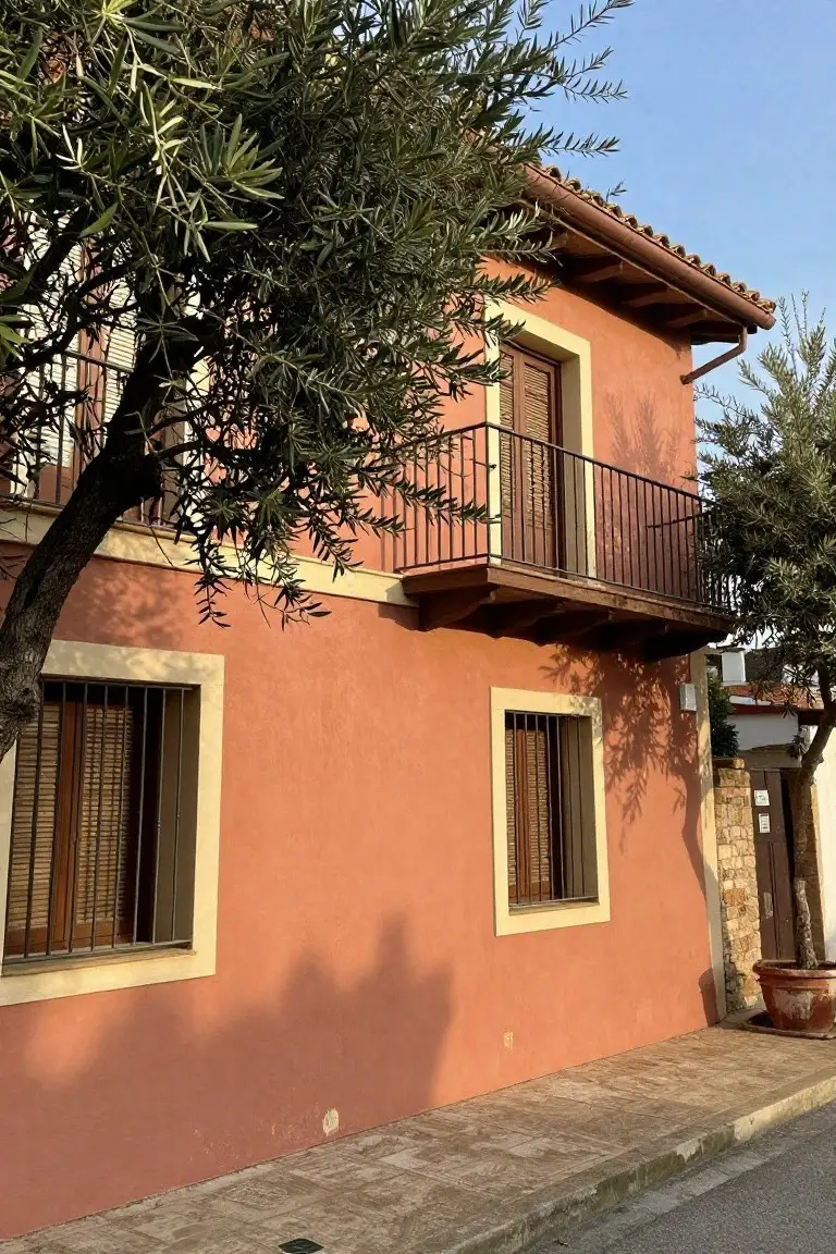
This exterior pulls off a classic warm terracotta, that soft earthy orange-red with a hint of clay. It reads very close to Sherwin-Williams Spiced Cider, Benjamin Moore Potter’s Clay, or Behr Terracotta Clay. Folks go for it because it sits so right with stone bases and wood trim, giving that lived-in Mediterranean feel without trying too hard.
The warm undertones keep it from going too pink or rusty in the light. It works best in sunny yards where olive trees or greenery frame it. Watch for pairing with crisp white trim to keep things sharp.
Soft Gray Siding
This siding paint pulls off a soft cool gray that seems closest to Sherwin-Williams Repose Gray or Benjamin Moore Gray Owl. Maybe Behr’s Silver Drop too. It’s the kind of light gray that stays neutral enough for most houses but has just enough coolness to feel crisp. People go for it because it lets wood elements like that front door stand out without competing.
The subtle blue undertone comes through in shade or overcast days. White trim keeps it sharp, and it suits craftsman or farmhouse styles best. Watch for pairing with warm brick, though. It can look a touch chilly there.
Pale Yellow Siding
This pale yellow siding has that same feel as Sherwin-Williams Decorous Yellow or Benjamin Moore Pale Yellow, maybe even Behr Rice Pudding. It’s a gentle warm yellow, not too bold, that keeps an older house looking fresh without overpowering the trim. You see it here with the deep green door popping right out.
The warm undertones make it forgiving in different lights, especially on a sunny day like this. It suits Craftsman-style homes best, paired with green shutters and simple plants. Watch for cooler north-facing spots though, where it might read a bit flat.
Warm Greige Siding
This exterior siding pulls off a warm greige that looks closest to Sherwin Williams Agreeable Gray or Benjamin Moore Edgecomb Gray, maybe even Behr’s Silver City. It’s a soft neutral blending beige and gray tones. Folks go for it because it stays quiet while making wood doors and stone details stand out nice.
That subtle warmth in the undertone plays well next to natural materials. It holds up under different lights without washing out. Stick to pairings like rich wood trim or muted black accents, and skip anything too bright.
Turquoise Siding
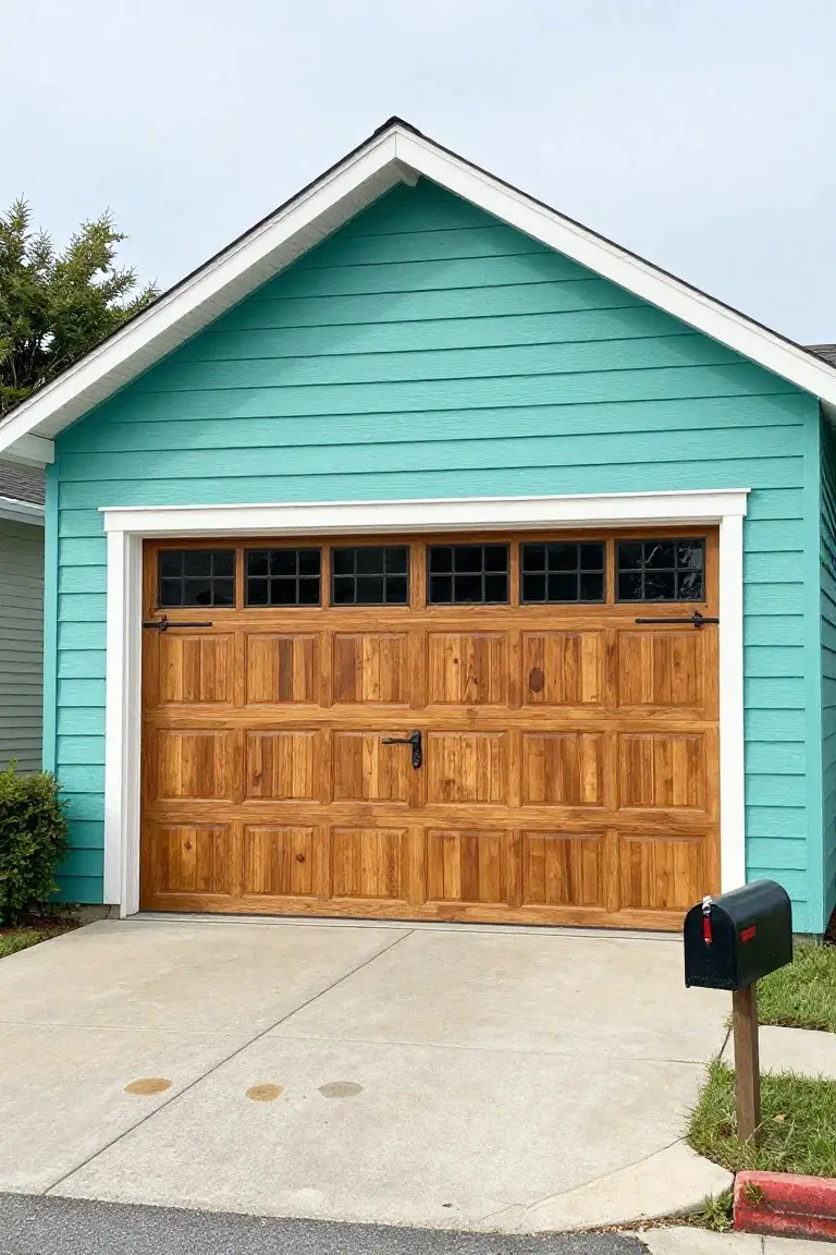
This garage siding in a bright turquoise pulls off that cool blue-green vibe nicely. It reads very close to Sherwin-Williams Rain, Benjamin Moore Wythe Blue, or Behr Tropical Splash. What stands out is how fresh it feels next to the warm wood garage door. It’s lively but not overwhelming, a color that gives exteriors some personality.
The undertone stays cool with blue leading and just enough green to keep it from looking flat. It shines in good light, especially coastal or sunny yards. Stick with white trim and natural wood tones to let it breathe… avoid pairing with heavy reds that might fight it.
Deep Black Siding
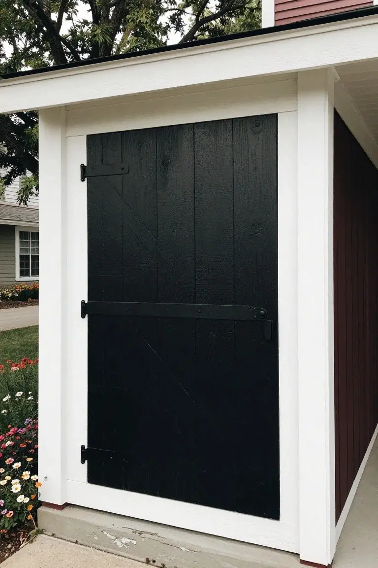
That black siding on the shed door catches your eye right away. It’s a true, deep black in the neutral family. Closest matches would be Sherwin-Williams Tricorn Black or Benjamin Moore Onyx, maybe Behr Black too. Folks like it because it gives exteriors a clean, strong look that lasts. The vertical boards take the paint well and show some wood grain underneath.
Neutral undertones mean it stays honest in most light. White trim sets it off nicely, like here, and it holds up against brick or red roofs. Try it on garages or backyard buildings. Just test a sample first. North-facing spots can pull a little cool.
Soft Gray Front Door
This front door in a soft gray reads very close to Sherwin Williams’ Repose Gray or Benjamin Moore’s Gray Owl. Or try Behr’s Silver Screen for something similar. It’s that easy cool gray with a hint of blue underneath. Folks like it because it adds a clean polish to brick houses without taking over.
The undertone stays cool in most light, so it pairs well with black window trim like you see here. Works best on traditional homes with warm brick. Just watch it doesn’t look too stark next to super yellow tones. Black railings keep everything grounded.
Black Trim on Warm Cedar Siding
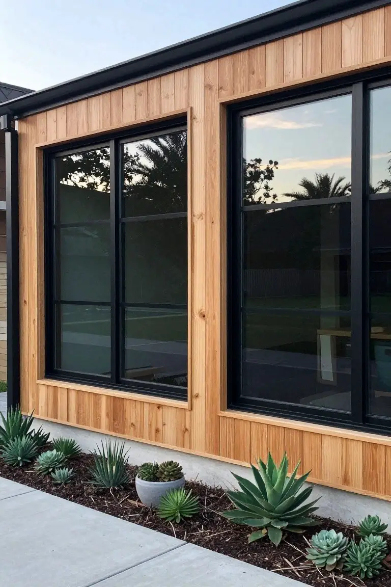
This exterior pulls off a deep black paint on the slim window frames that sits right next to the golden cedar siding. It comes across closest to Sherwin-Williams Tricorn Black or Benjamin Moore Onyx, maybe Behr’s Black. That black feels solid and straightforward. People go for it because it sharpens up the wood tones without stealing the show.
The neutral undertone holds steady in different lights, from morning sun to late afternoon. It works best on modern homes like this, paired with natural wood or stone. Just keep an eye on the cedar fading over time… it keeps the contrast fresh if you restain now and then.
Frequently Asked Questions
Q: How do I test these color schemes on my actual house? A: Snag big paint chips from the store and tape them to your siding in key spots. Step back at morning, noon, and evening to watch how light plays with them. You spot winners fast that way.
Q: What if my yard stays shady most of the day? A: Lean toward warmer tones like soft taupes or muted greens. They brighten without washing out in low light. Cool grays can turn dull there.
Q: How do I keep the look fresh without repainting every year? A: Pick paints built for exteriors with fade resistance. Clean the siding yearly with a gentle hose and mild soap. That polish hangs on longer.
Q: My roof is dark gray. Which schemes pair best? And: Pair it with creamy whites or warm beiges on the body and crisp black trim. The contrast pops clean and timeless.