

I’ve noticed how exterior paint colors come alive differently depending on the time of day and your home’s surroundings.
One summer I tested a sage green on my garage door and saw it warm up beautifully in the late sun but cool off too much at dawn. Combinations that work pull from the house’s natural backdrop like siding or plants instead of fighting it.
They avoid those stark contrasts that look bold on a fan deck but flatten out in real light. Grab some samples.
Deep Charcoal Gray Siding
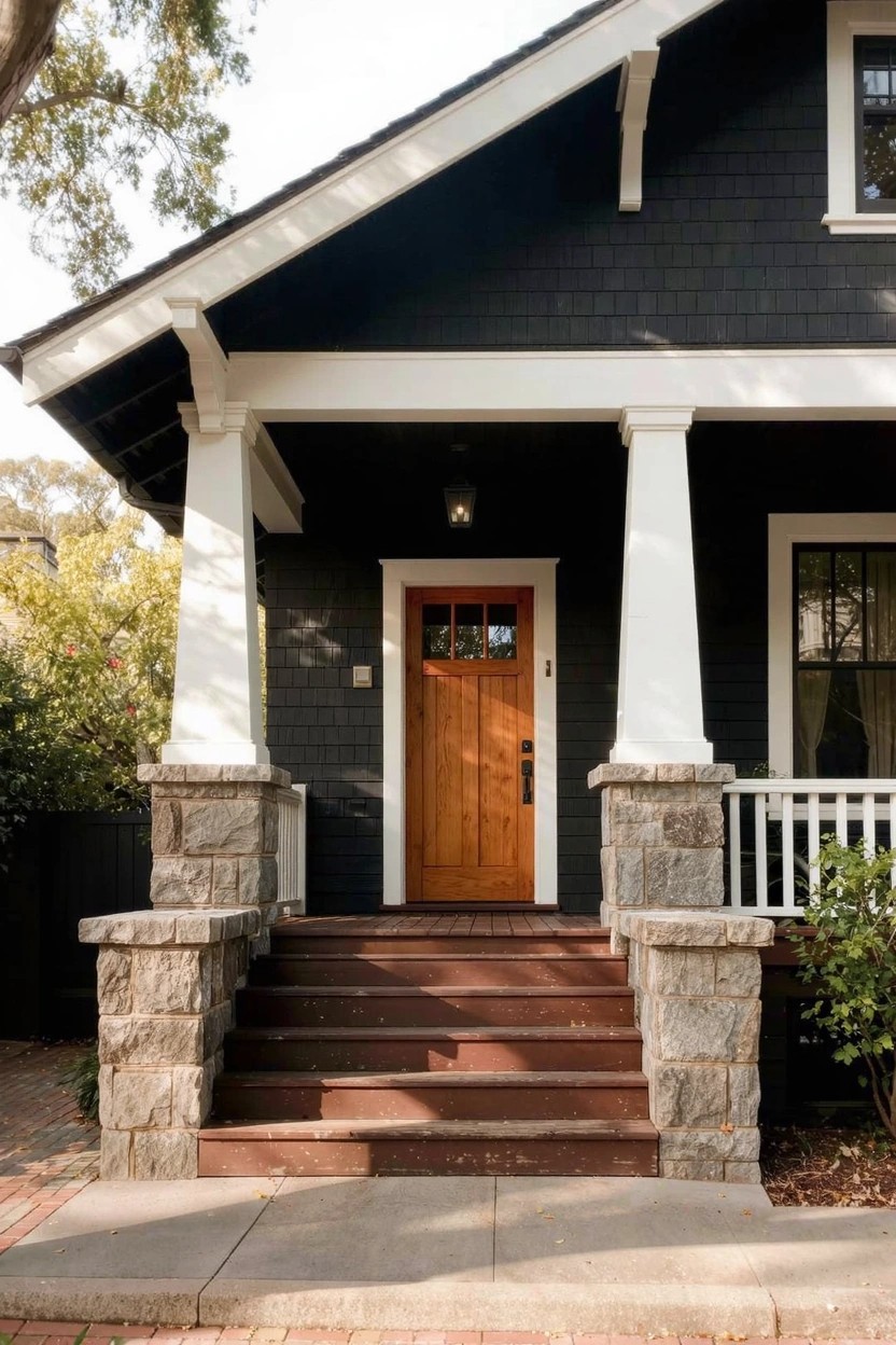
This deep charcoal gray on the house siding has that solid feel you get from shades like Sherwin-Williams Iron Ore or Benjamin Moore Kendall Charcoal. Maybe Behr’s Cracked Pepper too. It’s a cool dark gray that makes the whole front look put-together. People go for it when they want something stronger than light gray but not quite black.
The cool undertone sits right with stone pillars and wood steps. White trim keeps it crisp. Add a warm orange door for contrast. It works best on Craftsman homes… just check your light first to avoid it looking too heavy.
Deep Navy Exterior
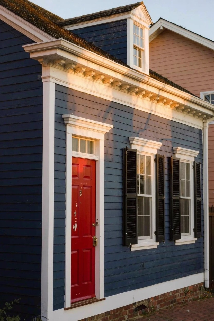
This deep navy blue on the house siding stands out as the main color here. It looks closest to Sherwin-Williams Naval or Benjamin Moore Hale Navy, maybe even Behr’s Abyss. That rich blue gives the whole place a solid, grounded feel. It’s not screaming for attention. Just steady and classic.
The cool undertone keeps it from going too dark in shadows. White trim sharpens it up nicely, and that red door adds a little kick without overdoing it. Works best on older homes like this. Pair it with brick or light stone for balance.
Warm Greige Siding
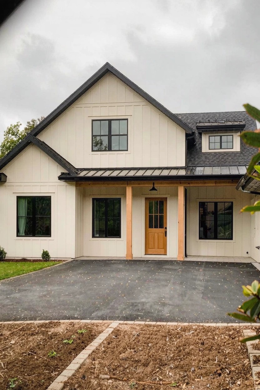
This siding paint pulls off a warm greige that’s soft and easy on the eyes. It looks closest to Sherwin-Williams Alabaster or Benjamin Moore Edgecomb Gray, maybe even Behr’s Wheat Bread. Folks like it because it keeps things neutral but feels cozy next to wood and black accents, not cold or too yellow.
The warm undertones make it hold up in shady spots or overcast days. Pair it with dark trim like here, and a wood door pops right out. Just test a sample first, since lighting can shift it a bit cooler.
Soft Sage Green Exterior
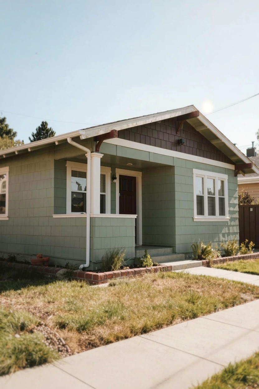
This bungalow pulls off a soft sage green on the siding that looks closest to Sherwin-Williams Retreat or Benjamin Moore Saybrook Sage. Behr’s Back to Nature reads pretty close too. It’s that muted green family, not too bright, just enough color to freshen up an older home without overwhelming things.
The gray undertones give it a cool feel that plays nice in dappled light. White trim pops against it, and those wood shakes add some warmth up top. Stick to crisp pairings like that, and watch it doesn’t look flat in full sun.
Soft Seafoam Green Siding

That pale seafoam green covering the house body looks closest to Sherwin-Williams Sea Salt or Benjamin Moore’s Palladian Blue. It’s a cool pastel in the green-blue family, light enough to brighten up a simple exterior. Folks like it for beachy homes because it picks up on the water and sky without overwhelming the view.
The subtle blue undertone keeps it from going too minty, especially in morning light. White trim like on the porch posts makes everything crisp, and a darker door anchors it. Try it on older wood siding, but test samples first since it can shift grayish in shade.
Cool Blue-Gray Siding
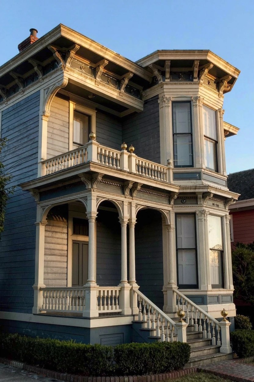
This cool blue-gray on the house body reads close to Benjamin Moore Stonington Gray or Sherwin-Williams Rainwashed. Or Behr’s Silver Drop if you’re matching that dusty feel. It’s the kind of color that settles right into older neighborhoods. Gives a home some quiet character without shouting.
That subtle blue undertone keeps it from going flat gray. Works best where there’s good light to show the trim pop. Pair it with plain white woodwork like here. Just make sure your house has enough detail. Otherwise it might feel plain.
Warm Terracotta Walls
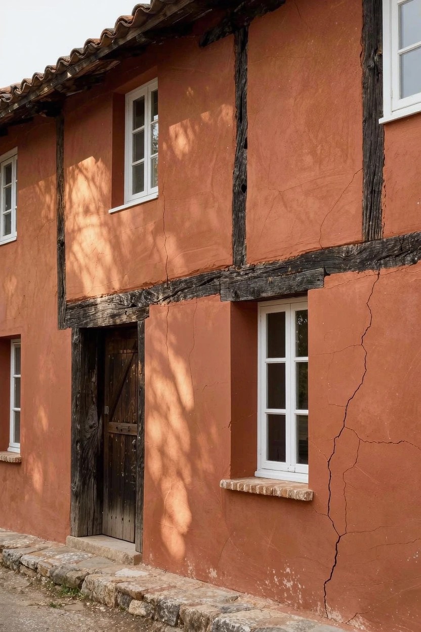
This terracotta shade covers the stucco walls and gives the house that old-world charm. It’s a warm earth tone in the red-orange family, and it looks closest to Sherwin-Williams Canyon Clay, Benjamin Moore Potter’s Clay, or Behr Terracotta Tile. Folks like it because it feels grounded and lively without being too bold, especially on traditional homes.
The warm undertones pick up the sun nicely and play well off dark wood beams or stone bases. It suits sunny southern exposures best. Just watch the trim, crisp white works to keep things sharp.
Creamy White Walls
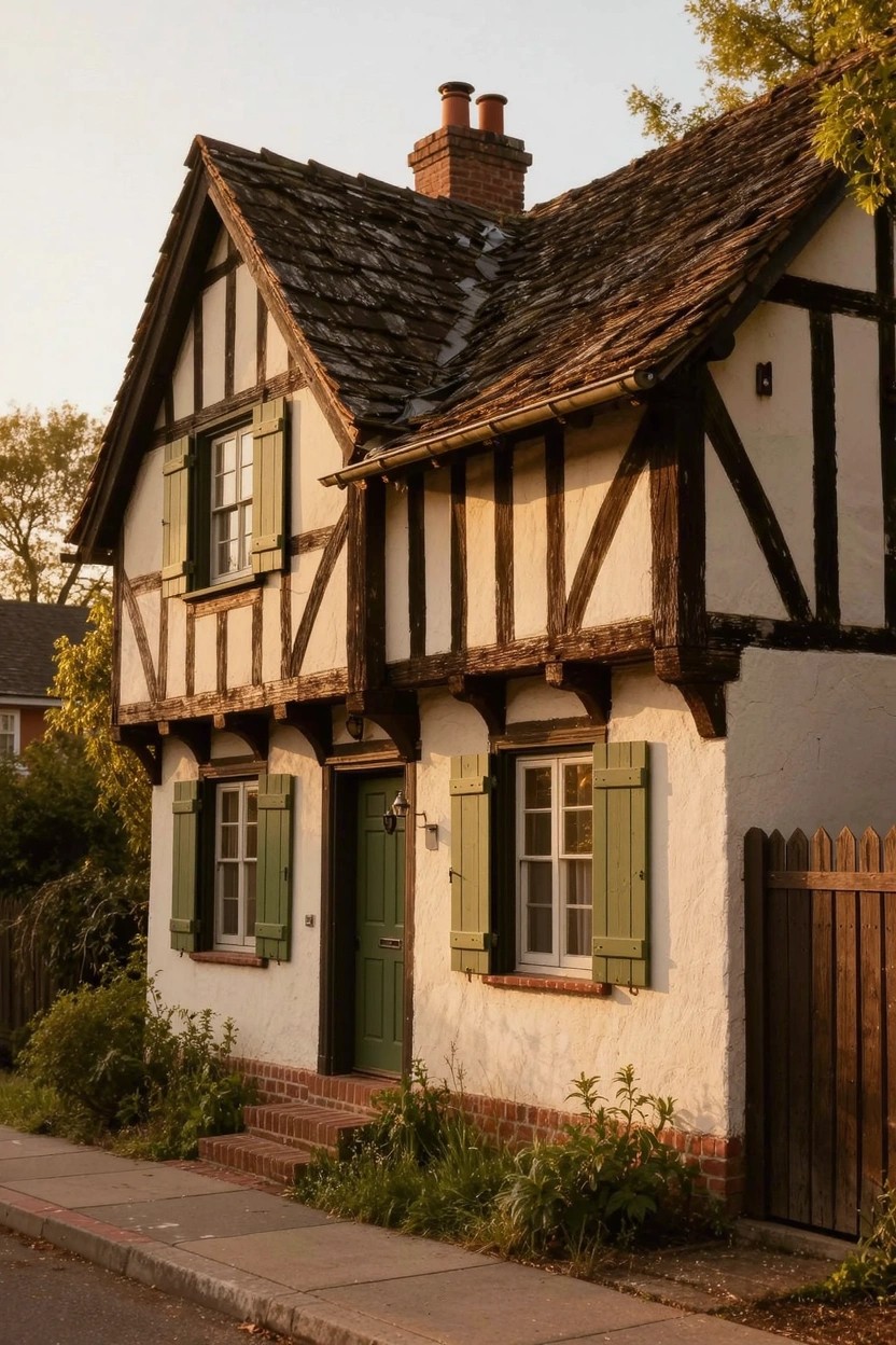
This creamy white on the house body reads very close to Sherwin-Williams Alabaster or Benjamin Moore White Dove. Maybe Behr Swiss Coffee too. It’s a warm white, not too bright, with just enough yellow undertone to feel cozy on an older-style home. What makes it stand out is how it highlights those dark timbers without overpowering them.
That subtle warmth shows up well in different lights and works great next to greens like the shutters and door here. Pair it with natural wood or brick for balance. One thing… it can pick up dirt over time, so a good power wash keeps it looking sharp.
Ochre Yellow Walls
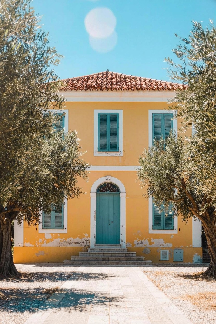
This ochre yellow on the exterior walls has that soft, sunbaked look. It seems closest to Farrow & Ball Babouche or Sherwin-Williams Goldenrod, with Benjamin Moore Saffron Thread reading pretty similar too. It’s a warm yellow folks turn to for older style homes, since it feels lived-in and cheerful all at once.
The golden undertone keeps it from going brassy in bright light. Works great with green shutters and doors like you see here, plus terracotta roofs. I’d stick to sunny spots or Mediterranean setups, though. It can pull a little green in cooler shade.
Soft Greige Exterior
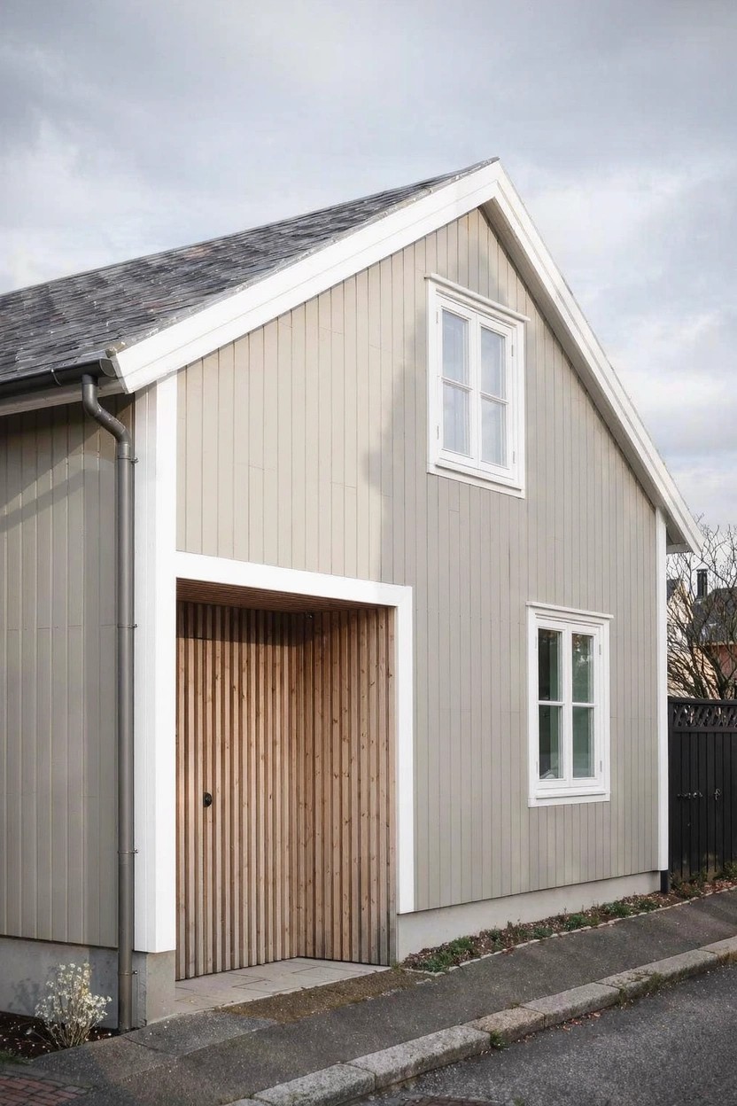
This soft greige paint on the siding reads very close to Sherwin Williams Agreeable Gray or Benjamin Moore Revere Pewter. It’s that in-between shade, warm enough to feel cozy but gray enough to stay neutral. Folks like it because it doesn’t show dirt as fast as white does, and it lets the wood door and trim stand out without competing.
The warm beige undertone keeps it from looking cold, especially on overcast days like this. Pair it with crisp white trim and natural wood accents for a clean Scandinavian vibe. It works best on homes with simple lines, north-facing or not. Just test a sample first, since lighting can shift it cooler.
Deep Green Exterior Walls
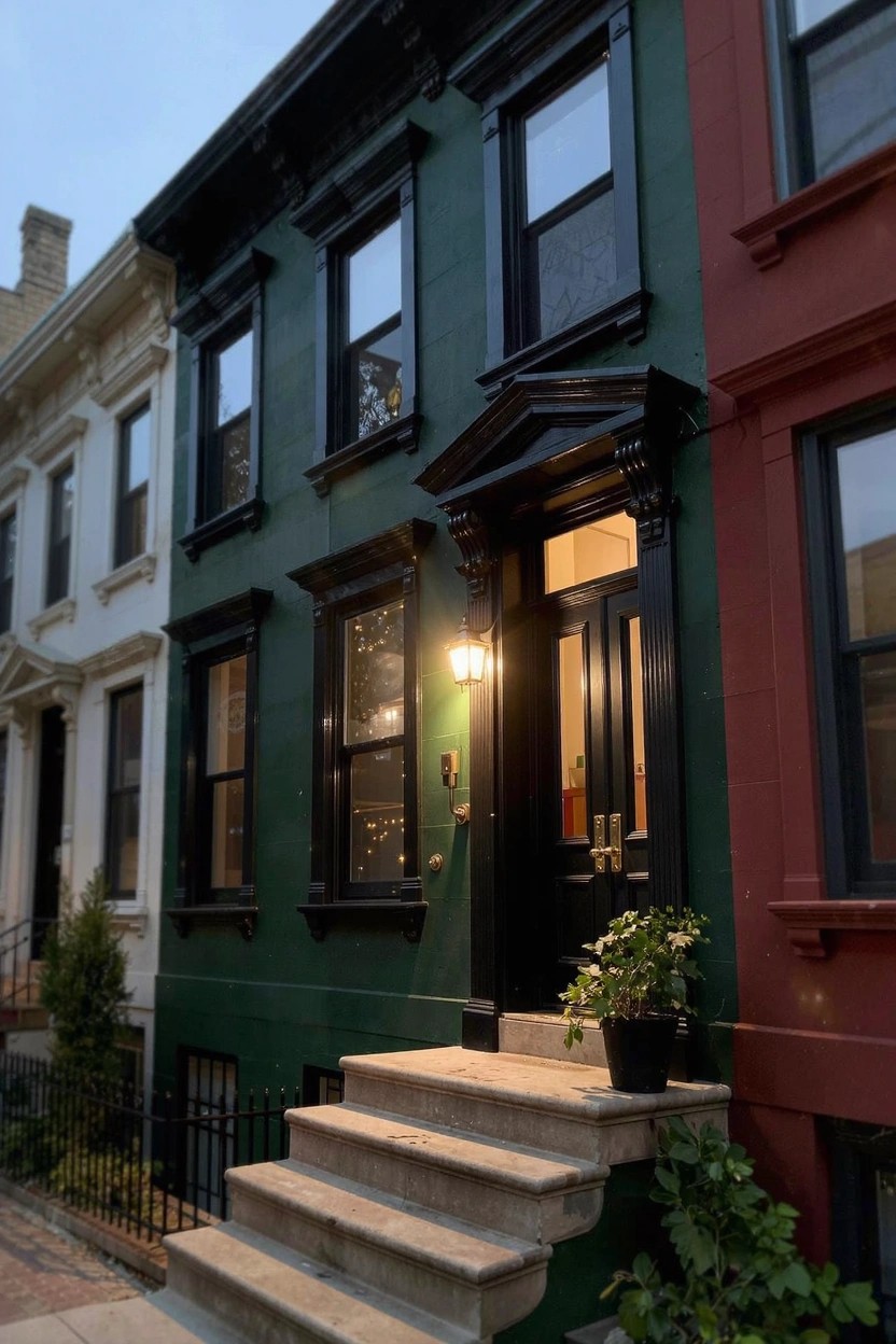
This deep green on the main house body looks closest to Sherwin-Williams Rookwood Dark Green or Benjamin Moore’s Essex Green. It’s that kind of rich, almost hunter green shade that gives older rowhouses a solid, grounded feel without going full black. People like it because it holds up next to brighter neighbors, like the red and white ones here, and still pops in low light.
The color has a cool undertone that keeps it from feeling too foresty. Pair it with black trim and doors, plus stone steps if you have them. It works best on urban streets or historic blocks, especially where brick is around. Just test it on your siding first, since it can shift a bit in shade.
Black and Beige Exteriors
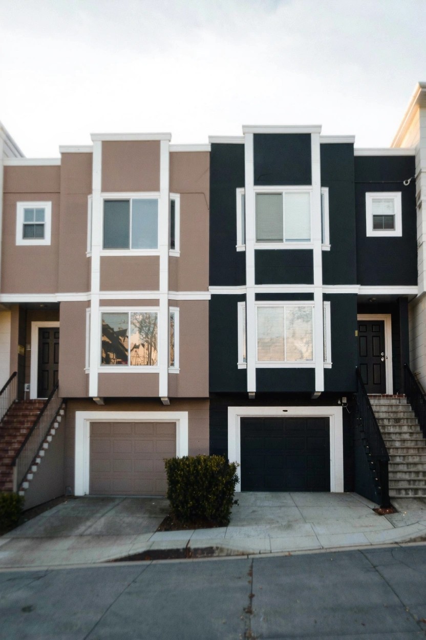
This combo splits a duplex with warm beige on one side and deep black on the other. It’s a neutral pairing where the beige pulls from sandy earth tones, reading close to Sherwin-Williams Balanced Beige or Benjamin Moore’s Manchester Tan. The black side hits that near-black depth, like Sherwin-Williams Tricorn Black or Behr’s Black. Folks like how it gives a fresh, modern look without much fuss.
The beige has a subtle warm undertone that plays nice in overcast light, while the black stays bold even on cloudy days. White trim and garage doors tie it together clean. It suits townhomes or row houses best, especially paired with simple landscaping. Just test samples, since black can show dirt over time.
Classic Barn Red Siding
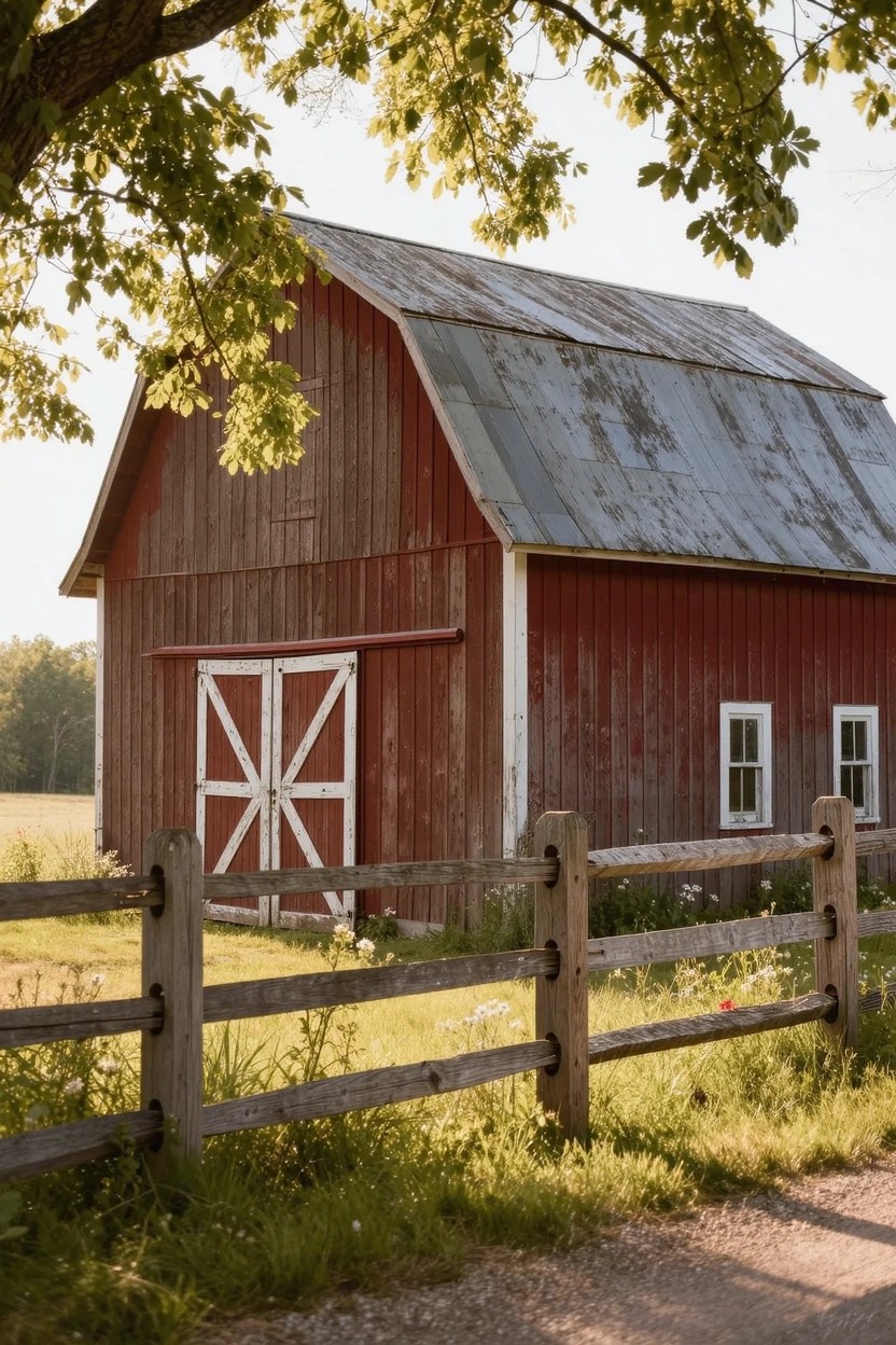
That barn red on the siding pulls from the classic warm red family. It reads close to Sherwin-Williams Red Barn, Benjamin Moore Barn Red, or Behr Barn Red. Folks go for this shade because it gives a sturdy, lived-in look that fits right into rural spots. It holds up well outside and doesn’t fade too fast.
The rusty undertones make it warmer than a straight red. Sunlight brings out the depth, especially next to white trim on the doors. Try it on farmhouses or cabins, paired with wood fences or green fields. Just watch it can overpower small houses.
Frequently Asked Questions
Q: How do I test these color combos before committing to the whole house? A: Paint large sample boards or swatches right on your siding in a few spots. Check them morning, noon, and evening to catch how sunlight shifts the shades. That way you live with the look a bit first.
Q: What if my house has brick—can I still pull off these combos? A: Paint the trim, doors, and shutters to tie into the brick’s warmth. Soft blues or sages play off red tones beautifully without overwhelming. Skip full-body paint unless you plan a limewash for subtle change.
Q: Do bold colors like deep navy work in a cookie-cutter neighborhood? A: They stand out just enough to turn heads without clashing. Pair with crisp white trim to keep it fresh and neighbor-friendly. And yeah, folks notice—in a good way.
Q: My roof is dark gray—how do I match paint to it? A: Lean into cool grays or soft charcoals on the body for harmony. Add a pop like mustard on accents to lift the whole scheme.