

I’ve noticed how brick houses often look flat until you add the right paint colors around them.
The key lies in balancing the brick’s earthy tones so paints enhance instead of competing, especially since shadows and sun shift everything throughout the day.
I tried a muted sage on a board against brick one summer, and it warmed up surprisingly well by midday, pulling the whole facade together.
Certain pairings create that clean contrast without feeling forced or dated.
Test a few in your light.
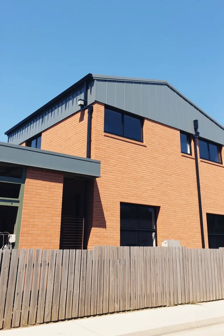
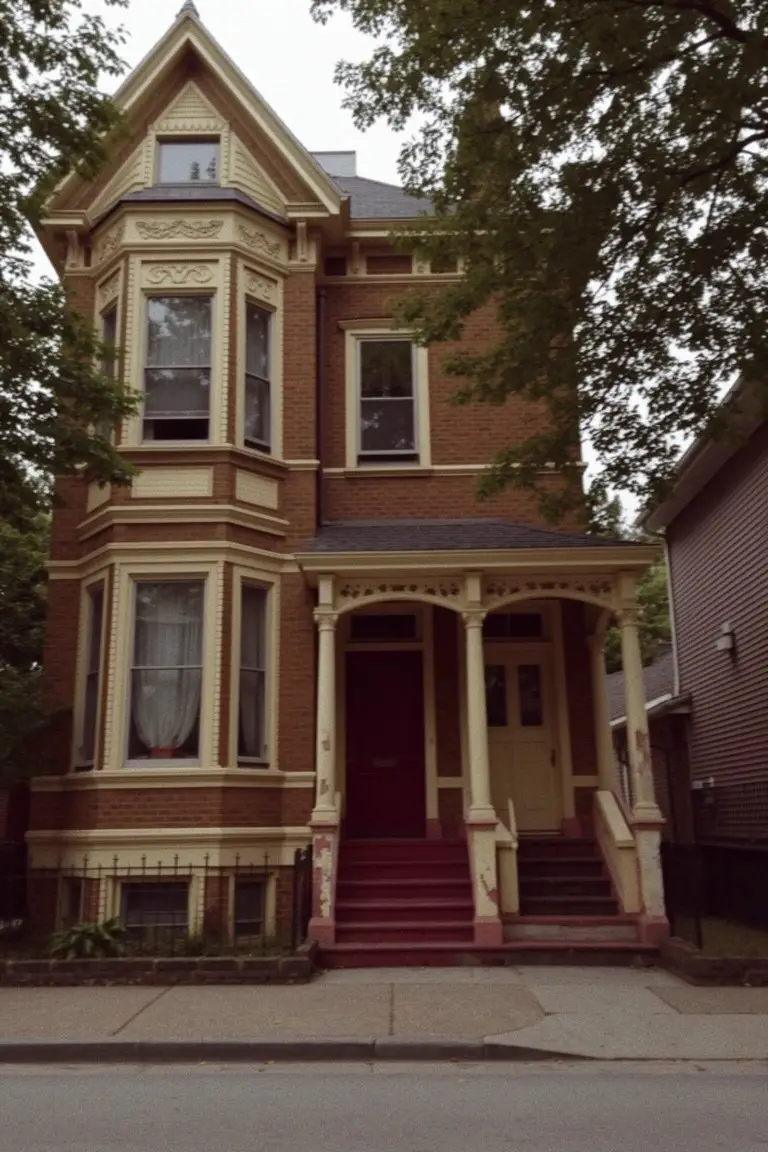
Charcoal Gray Trim
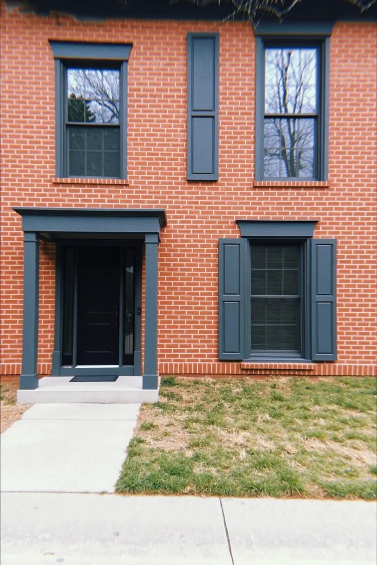
The trim, shutters, and door on this brick house use a deep charcoal gray. It reads close to Sherwin-Williams Iron Ore or Benjamin Moore Kendall Charcoal, maybe Behr Black Sapphire too. That dark shade pulls a strong contrast from the warm red brick without feeling too harsh. People go for it because it keeps things traditional and sharp.
Cool undertones in this gray play off the brick nicely, especially in natural light. It suits older homes best, like colonials or federals. Stick to the brick as your base and keep any other accents light, or it might close in. One thing to watch. Too much black nearby can muddy it up.
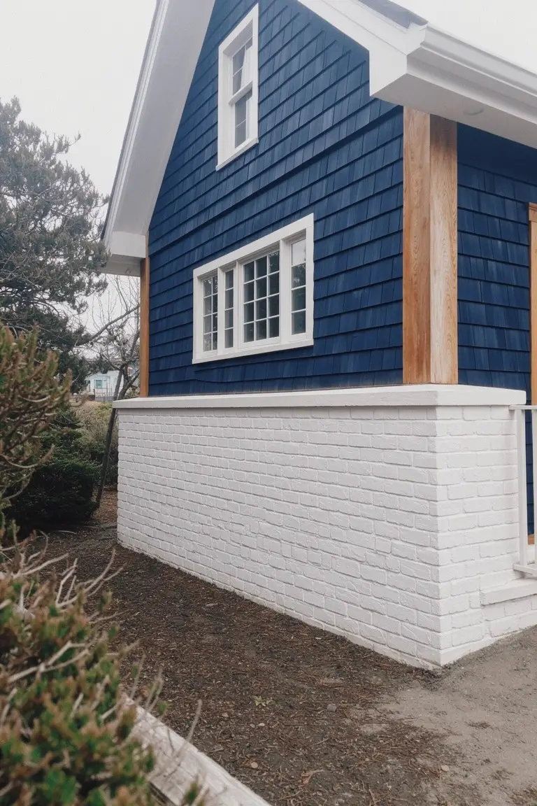
Deep Navy Siding
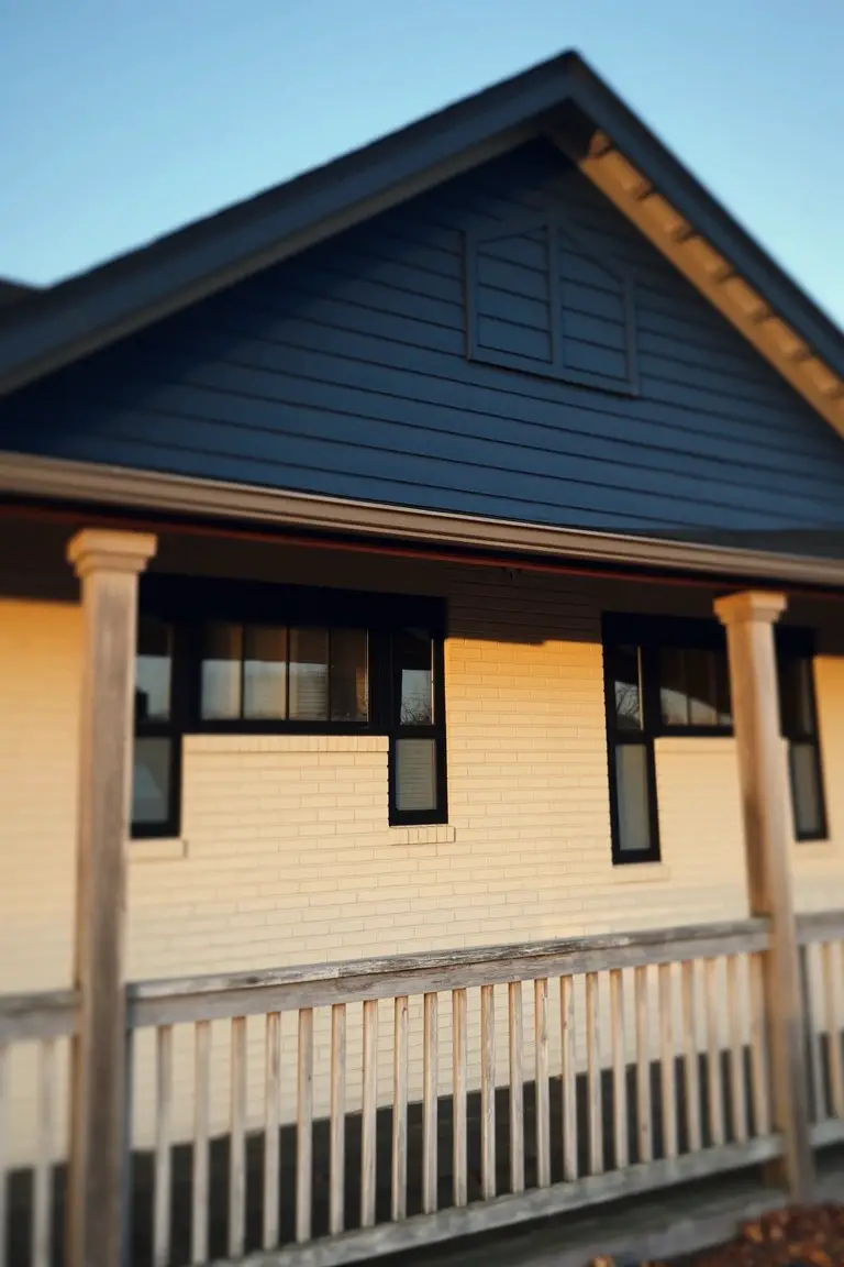
A deep navy blue covers the upper siding here. Looks closest to Sherwin-Williams Naval or Benjamin Moore Hale Navy, maybe Behr’s Abyss too. It’s that solid navy family with a cool edge. People go for it on exteriors because the contrast pops so nicely against beige brick.
Cool blue undertones keep it from going too black. White window frames and warm wood columns balance it out. Works best on homes with some south-facing light. Steer clear if your brick runs too yellow.
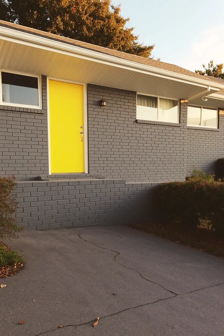
Warm Yellow Door
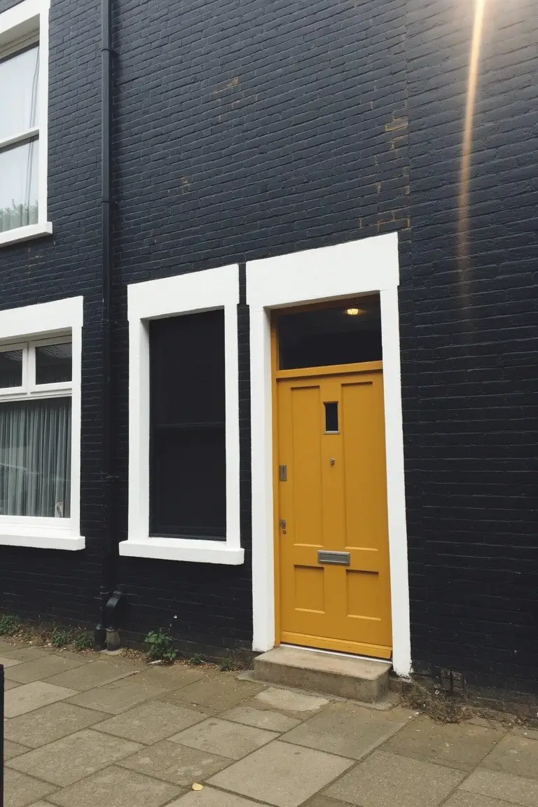
That bright yellow door pops right against the dark brick. It’s a warm mustard yellow that feels close to Farrow & Ball Babouche. You could get a similar look with Benjamin Moore Hawthorne Yellow HC-13 or Behr Mustard Seed. Folks like it because it brings some cheer to a moody exterior without going overboard.
The golden undertone plays nice in sunlight. It works best on front doors with white trim nearby. Pair it with black or charcoal brick for real contrast. Just keep an eye on fading if your spot gets a lot of direct sun.
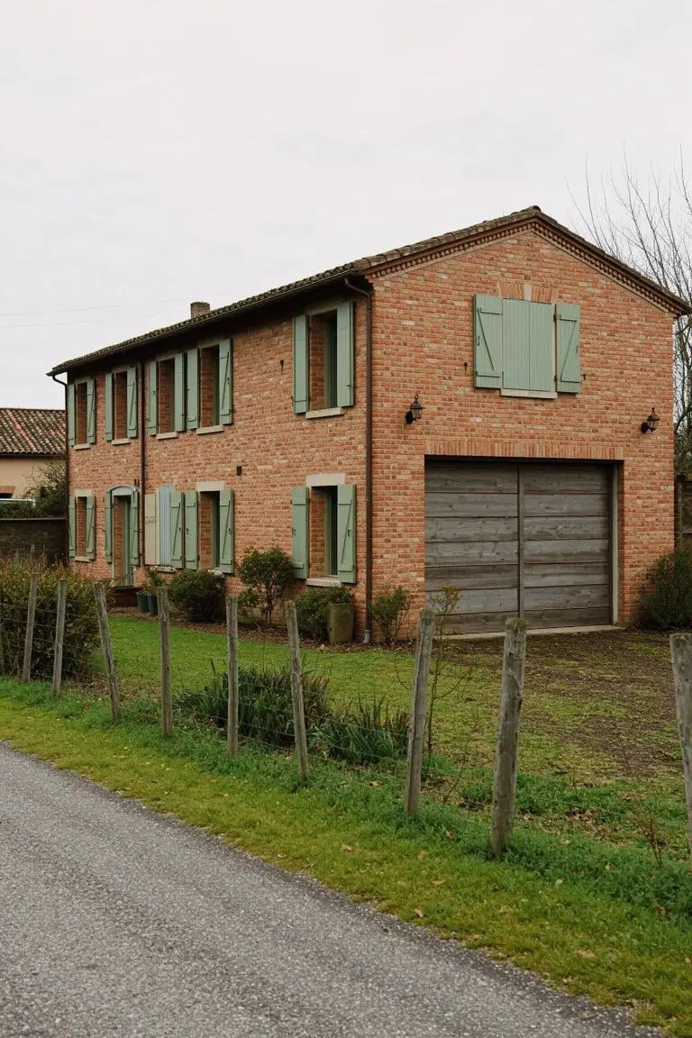
Deep Green Shutters
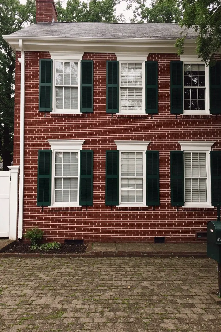
The shutters on this brick house pull off a deep green that reads very close to Sherwin-Williams Jasper or Benjamin Moore Hunter Green. It’s from that classic hunter green family, the kind with real depth that doesn’t fade into the brick. Folks like it because it adds some punch without overwhelming the warm reds underneath.
That green sits best on older style homes like this one, where the brick has some orange tones to balance any coolness in the paint. Stick to crisp white trim, and it works year round. Just test a sample in shady spots first, since it can look nearly black there.
Cool Gray Cladding
This brick exterior uses a cool medium gray on the metal roof and upper panels. It looks closest to Sherwin-Williams Dorian Gray or Benjamin Moore Stonington Gray. Those kinds of grays give the warm orange brick a clean modern lift. They don’t overpower. Just enough contrast to make the house stand out.
The cool undertone reads crisp next to the brick’s warmth. It works best in full sun where the gray stays balanced…not too blue or harsh. Pair it with simple wood fencing like here. Avoid pairing with too much black trim though. It can feel cold.
Crisp White Brick Base
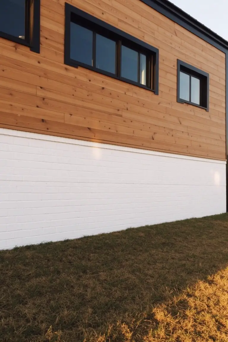
This home uses a bright, clean white on the lower brick section for real punch. It looks closest to Sherwin-Williams Pure White or Benjamin Moore Chantilly Lace, with Behr Ultra Pure White also in the mix. Folks like how that white stays sharp and lifts the warmer wood siding without muddling things.
The cool undertone in this white holds up well in sunlight. It pairs easy with natural cedar tones and black window frames like you see here. Good pick for a modern setup, just test it on your own brick to see the match.
Deep Navy Doors on Gray Brick
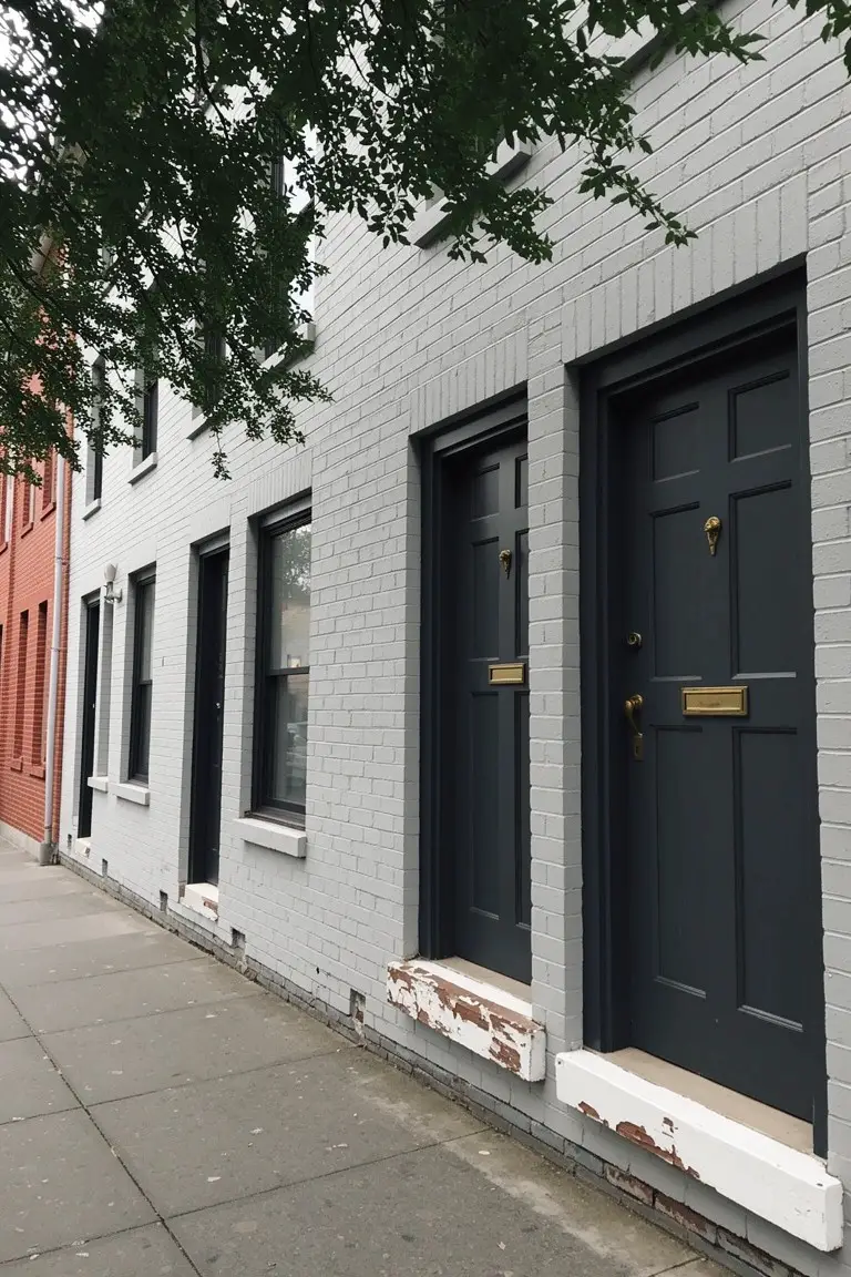
The doors here read as a deep navy blue. That kind of rich, almost black shade with a blue undertone. Closest matches would be Sherwin-Williams Naval, Benjamin Moore Hale Navy, or Behr’s Midnight Express. It’s a smart pick because it gives real punch next to the soft gray brick without overwhelming the whole front.
Cool undertones like this hold up well in shaded spots or under trees. Brass hardware pulls out the warmth just right. Stick to light neutrals on the brick or trim so the doors stay the star.
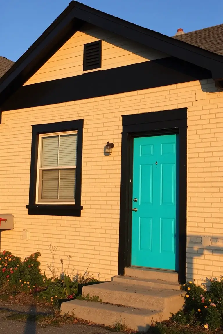
Bright Teal Door
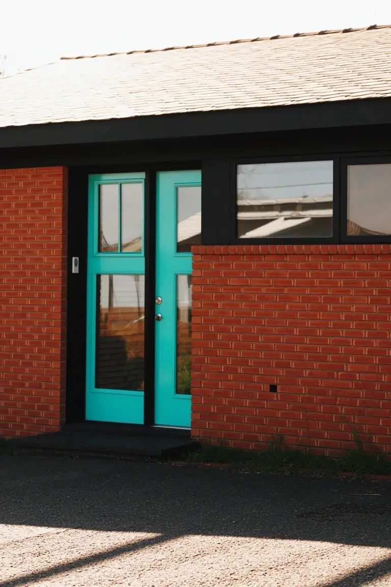
That front door pulls off a vibrant teal on brick without trying too hard. It’s a cool turquoise shade in the blue-green family, and it looks closest to Sherwin-Williams Lido Blue or Behr Cabana Coast. Benjamin Moore’s Wythe Blue has that same crisp feel. Folks go for it when they want a pop of color that stays cheerful year-round.
The blue undertones keep it fresh in bright light, and the black trim around it sharpens things up. It works best on warmer red bricks like this. Just watch the saturation if your facade faces north… might read a touch moodier.
Warm Cream Trim
The trim on this brick house pulls off a warm cream paint that looks closest to Sherwin Williams Alabaster or Benjamin Moore White Dove. Sometimes Behr Swiss Coffee fits right in too. It’s that soft, not-too-white shade that sits easy next to red brick without clashing. People go for it because it brightens the whole front but keeps things cozy, not stark.
Warm undertones make it read yellow in sunlight. Pair it with a bold red door like this one for punch. Works best on older homes with wood details. Just test a sample first, brick can shift how it looks.
Bold Orange Door
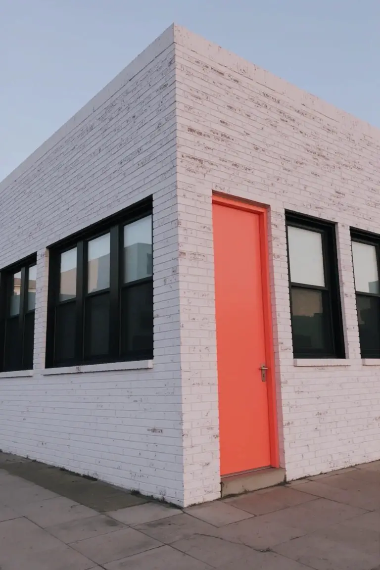
This bold orange on the door is the star here. It’s a warm, vibrant orange that jumps right out against plain white brick. Looks closest to Sherwin-Williams Piqued Peach or Benjamin Moore Caliente, maybe Behr Tangelo too. Folks like it because that punch of color makes the entry feel lively without overwhelming the whole house.
Warm undertones keep it from going too garish. It works best where you get good light, pairing easy with black window frames or neutral brick. Just test a sample first. Direct sun can shift it a bit over time.
Muted Sage Green Siding
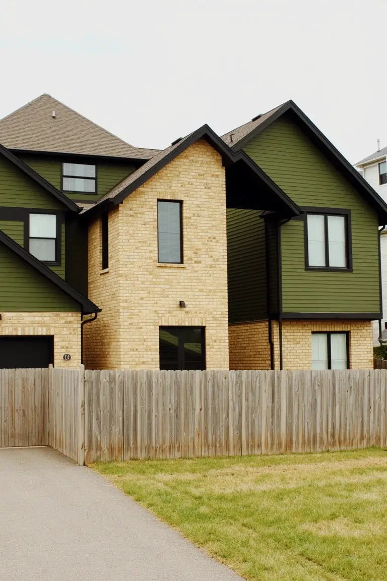
This muted sage green on the siding stands out against the beige brick. It looks closest to Sherwin-Williams Evergreen Fog or Benjamin Moore Saybrook Sage. Maybe even Behr’s Ivy Green. That soft green tone keeps things fresh but grounded. Folks like it because it adds contrast without going too bold on a house front.
The color pulls a bit warm in natural light. Works best on bigger surfaces like siding where it can settle in. Stick with black trim to sharpen it up. And that beige brick underneath? Perfect balance. Just test a sample first. Lighting can shift it cooler.
Deep Green Doors
Deep green doors like these stand out nice against the brick. The color here seems closest to Sherwin Williams Jasper or Benjamin Moore Essex Green, maybe Behr Cactus Shadow too. It’s a cool-toned deep green, not quite black. That makes it a good pick for houses wanting some punch without going overboard.
The undertone stays cool next to warm brick, so it doesn’t muddy up. Works best on city row houses or older homes with stone steps. Pair with black lanterns or keep trim simple. Just watch it in bright sun, might look greener than you think.
Sunny Yellow Door
Gray brick gets a real lift from this sunny yellow door. It’s a bright, cheerful yellow in the vivid family, the kind that catches your eye right away. Looks closest to Sherwin-Williams Lemon Twist or Benjamin Moore Lemon Sorbet, maybe Behr’s Lemon Drop too. People like it because that pop of color makes a simple brick house feel more welcoming without going overboard.
The warm undertone keeps it from looking too harsh in soft light. It works best on north-facing spots or overcast days where it still shines. White trim around the windows sets it off nicely, and those neutral brick tones ground it just right. Skip it if your brick has strong red hues though.
Deep Navy Siding
This siding shows off a deep navy blue paint. It looks closest to Sherwin-Williams Naval or Benjamin Moore Hale Navy, maybe Behr Abyss too. It’s a cool-toned blue that stands out nice against the white brick base. Homeowners pick it for that clean, crisp look without going too dark.
The navy has a subtle gray undertone that plays well in overcast light. Pair it with natural wood trim like on this house. It suits coastal spots or modern farmhouses best. Just test a sample first to see how it reads in your yard.
Soft Sage Green Shutters
The shutters on this brick house read as a soft sage green. It’s that easy cool green with gray undertones, closest to Sherwin Williams Pewter Green or Benjamin Moore Guilford Green, maybe Behr’s Silver Sage too. What stands out is how it pulls back just enough from the warm brick, giving a quiet contrast that feels right at home in the country.
That gray edge keeps it from going too minty in shady spots. Pair it with natural wood like that garage door, and it settles everything down. Works best on older homes where you want trim to blend a bit, not shout.
Muted Teal Siding
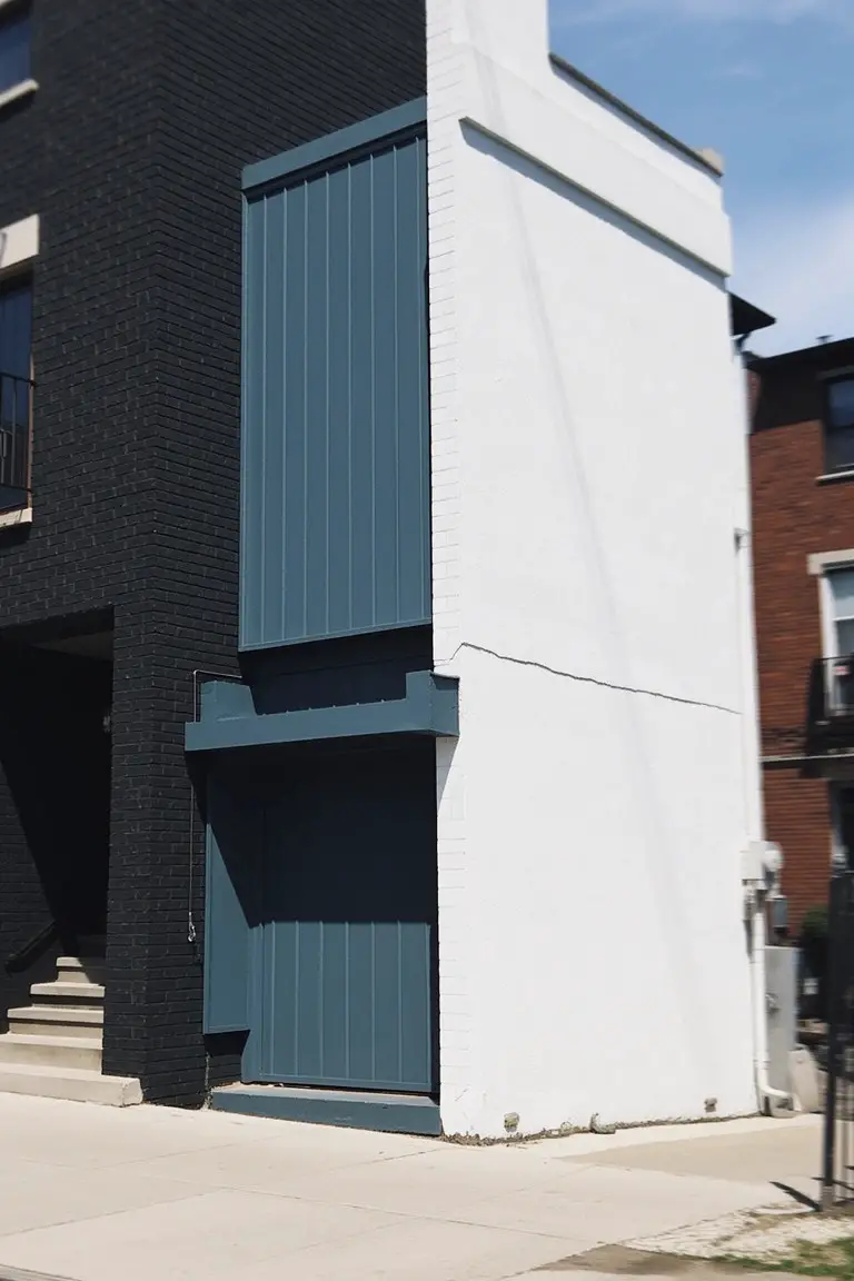
This muted teal on the siding and garage door pulls from the blue-green family. It reads close to Sherwin-Williams Rainwashed (SW 6212), Benjamin Moore Saybrook Sage (2122-40), or Behr’s Blueprint. What stands out is how it sits right between the black brick and white walls. Folks like it because that color adds a fresh pop without going too bright.
The undertone leans cool with a bit of gray in there. It shows up best on a modern addition like this one. Pair it with plain brick tones or crisp white trim, and skip anything too yellow. North-facing spots keep it from looking flat.
Turquoise Front Door
This setup uses a bright turquoise on the front door that really pops. It reads close to Sherwin-Williams Rain or Benjamin Moore Wythe Blue, maybe Behr Breeze too. That kind of vivid blue-green gives a fun lift to plain beige brick without overwhelming things. Folks like it because it draws the eye right to the entry, making the house feel welcoming from the street.
The color has a cool undertone that stays crisp next to black trim and warm brick. It works best in full sun where the vibrancy shines, or even under porch lights at night. Pair it with neutral siding and simple landscaping to keep the focus on the door. Just watch if your brick leans too yellow, it might clash a bit.
Deep Purple Exterior Panels
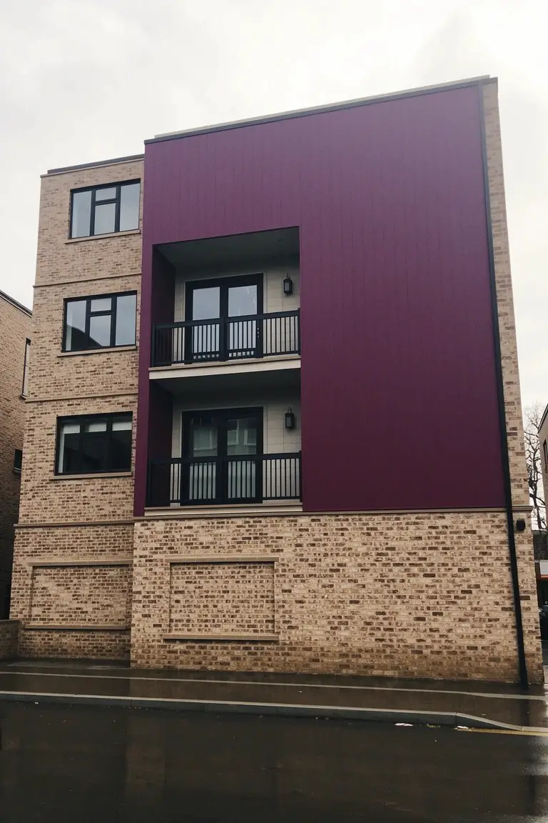
That tall purple panel running up the side of this brick building looks closest to a deep purple from the violet-magenta family. I’d place it near Sherwin-Williams Rookwood Purple or Benjamin Moore Deep Mulberry, maybe Behr Polished Plum too. It’s bold but grounded. People notice it because it stands out so sharp against plain brick. No mistaking the contrast.
The warm magenta undertone shines even on cloudy days like this. Stick it on accents next to warm brick or black trim. Full walls might feel heavy, so keep the scale right. Works in any light if you like a little drama.
Deep Blue Garage Door
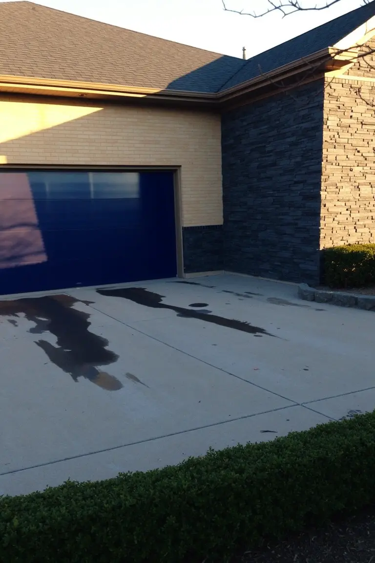
That garage door shows off a deep, true blue that contrasts sharp with the tan brick. It looks closest to Sherwin Williams Naval or Benjamin Moore Hale Navy, maybe Behr’s Night Flight too. It’s a go-to for adding some punch to plain brick without going overboard.
Cool undertones keep it crisp next to warmer stone and brick. Best in side-facing spots where light hits even. Stick to neutral siding around it, skip busy patterns.
Crisp White Walls
This exterior uses a bright white paint on the walls with a black door for punch. It seems closest to Sherwin-Williams Extra White or Benjamin Moore Chantilly Lace, maybe Behr Ultra Pure White too. Clean whites like this make brick pop without overpowering it.
That cool tone stays sharp in most light. Good for city homes or anywhere brick needs contrast. Stick with black hardware. Watch it can show dirt more than warmer off-whites.
Frequently Asked Questions
Q: My brick is a warm red. What siding color makes it stand out without clashing?
A: Pair it with a crisp white or pale gray siding.
That clean backdrop pulls out the brick’s rich tones and keeps things fresh.
Q: How do I test these color combos before committing to paint?
A: Grab sample quarts from the paint store and slap them on poster board.
Prop the boards against your house at different times of day.
You’ll see exactly how sunlight changes everything.
Q: Does roof color mess up these brick and siding pairings?
A: Match your roof to the siding for smooth flow, or go darker for grounding.
And pick up a brick tone in the shingles to tie it all together.
Q: Light trim on dark brick seems risky. Will it get dirty fast?
A: Wipe it down once a season with mild soap.
Dirt fades into brick anyway, so light trim stays sharp longer than you think.