

I’ve noticed over the years that exterior paint on small homes can either shrink them visually or stretch them out toward the horizon. Last spring I brushed a few light sage samples onto my fence posts and saw how the green picked up subtle yellows in midday sun but cooled right down by dusk. Shades leaning cool usually recede better than warm ones which hug the walls too close. They catch and scatter light in ways that open up tight spaces without much fuss. Test them in your light.
Crisp White Siding
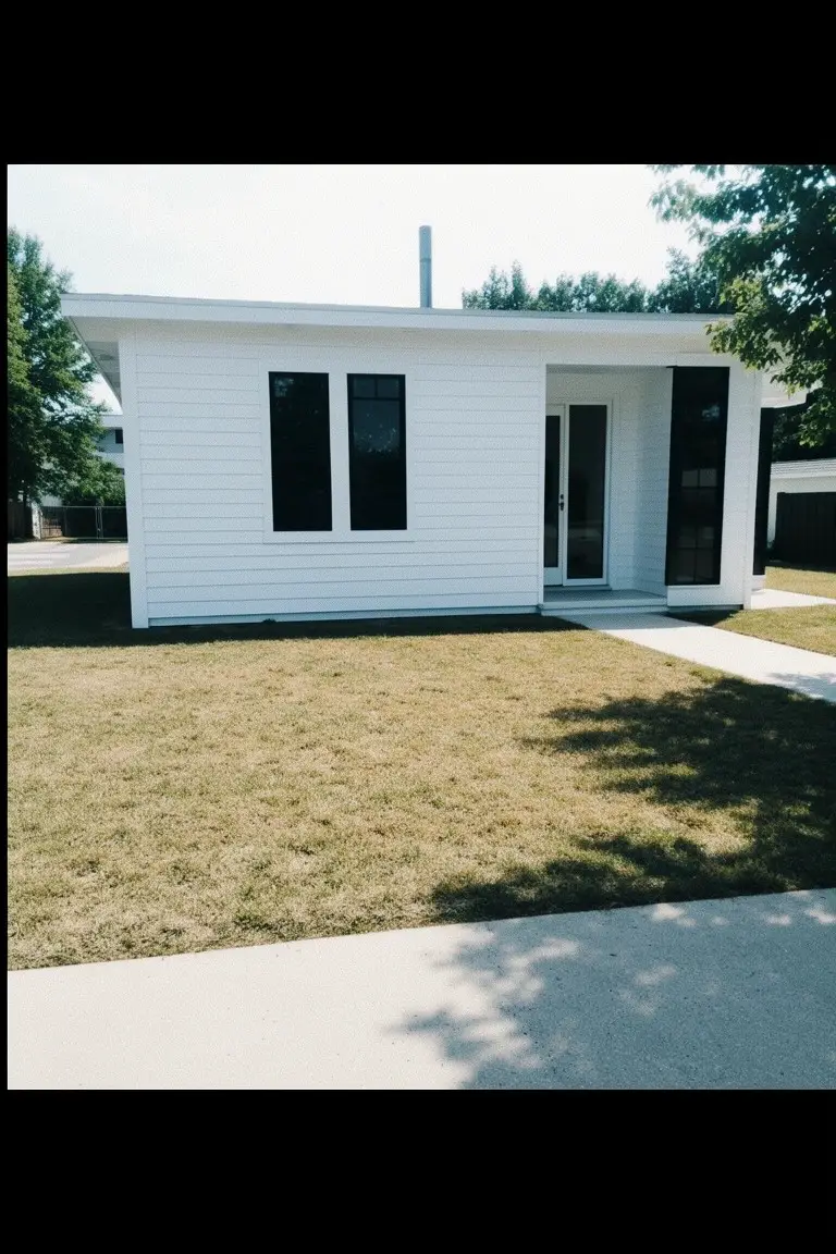
This crisp white siding reads very close to Sherwin-Williams Extra White or Benjamin Moore Chantilly Lace. Maybe Behr Ultra Pure White too. It’s the kind of bright white that picks up sunlight and opens up a small house. You get that bigger feel without much effort.
Cool undertones keep it looking sharp against black window frames and green grass. It works great on a sunny lot like this. Go with dark trim to make the white pop. One thing. Dirt shows more on white so plan to wash it now and then.
Soft Light Gray Siding
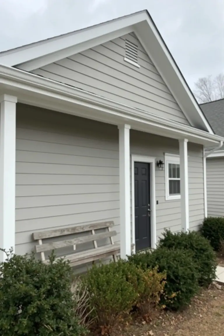
This siding shows a soft light gray that’s easy on the eyes. It looks closest to Sherwin-Williams Repose Gray or Benjamin Moore Gray Owl, maybe Behr’s Silver City too. Folks pick this kind of neutral gray because it bounces back light well. On a small home it helps things feel more spacious without going all white.
That gray sits right with white trim on the porch columns. A touch of warmth comes through on cloudy days like this. Pair it with a dark door for some punch. Just test samples outside first, since grays shift a lot.
Warm Beige Walls
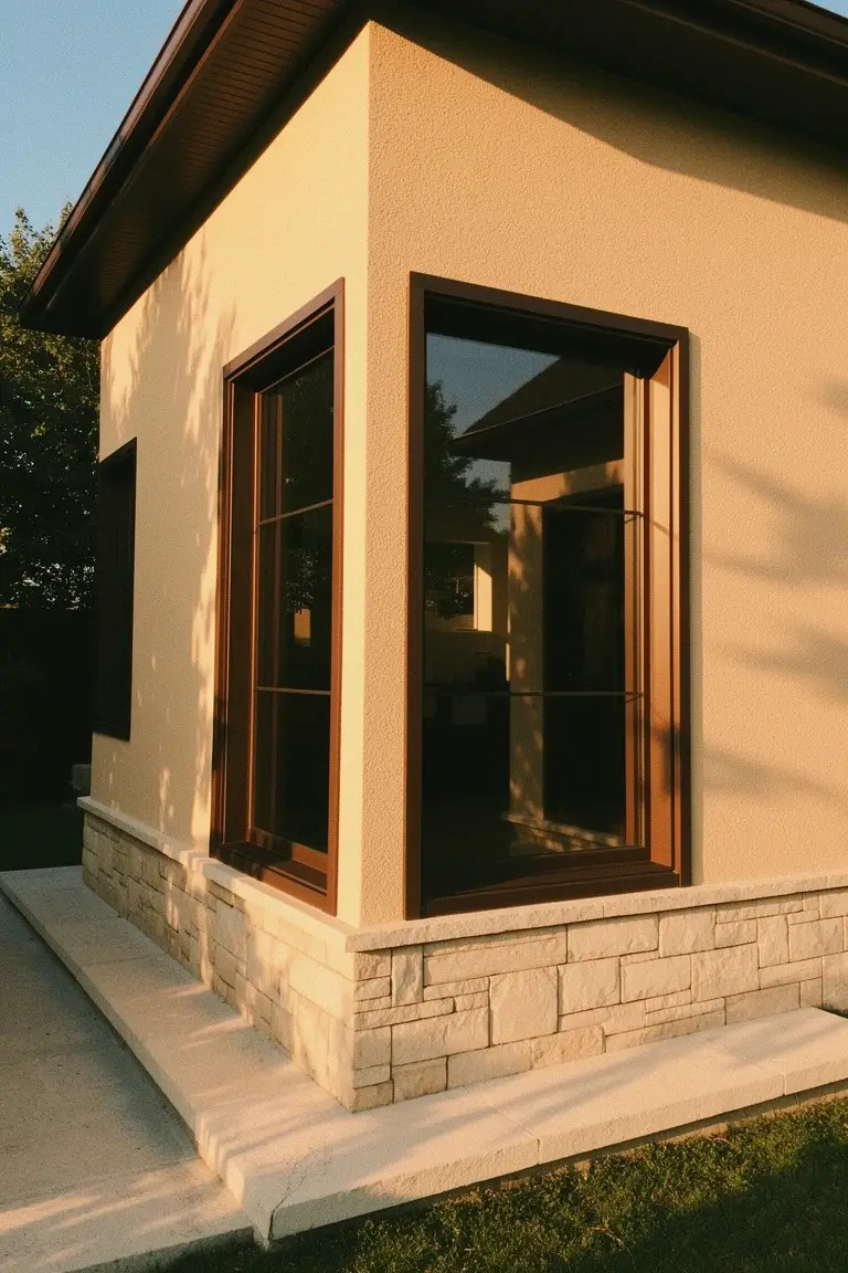
This warm beige paint reads very close to Sherwin-Williams Access Tain or Benjamin Moore Edgecomb Gray. Behr’s Balanced Beige works too. It’s a soft neutral that stays light without going stark white. Folks like it because it bounces back sunlight and makes tight corners on small homes open up a bit.
Warm yellow undertones give it life next to wood trim and stone. It holds up best where there’s good light. Pair it with medium brown frames like these to keep things grounded. Dirt shows some on beige. So hose it down yearly.
Soft Blue Siding
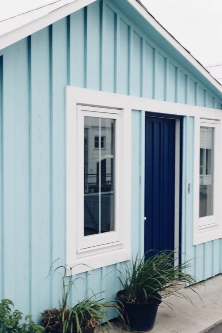
This siding paint pulls off a cool pastel blue that looks closest to Sherwin-Williams Rainwashed, Benjamin Moore Palladian Blue, or Behr Blue Whisper. It’s the kind of light shade that freshens up small homes without overwhelming them. Folks like how it keeps things airy and open.
The cool undertone plays nice in bright light, making spaces feel larger. White trim sets it off clean, like on these windows, and that navy door adds some punch. Best for coastal spots or sunny yards. Just pair it right so it doesn’t wash out.
Pale Sage Green Exterior
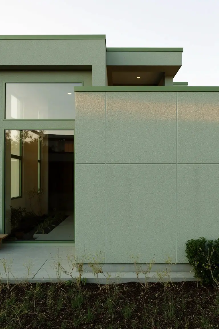
This side of the house shows a pale sage green paint that reads very close to Sherwin-Williams Clary Sage or Benjamin Moore Saybrook Sage. Behr’s Silver Sage sits right there too. It’s a muted green from the sage family, cool and easy on the eyes. For small homes, this color pulls back a bit. Makes the place feel larger by mixing with the plants and yard around it.
The gray undertone keeps it steady in different lights. Works best on modern boxes like this, next to wood frames on the windows. Pair with earthy trim or stone. Skip harsh contrasts though. They can make it look flat.
Warm Greige Walls
This warm greige on the exterior reads very close to Sherwin Williams Accessible Beige, or Benjamin Moore Edgecomb Gray. Behr’s Wheat Bread has that same easy feel too. It’s a go-to neutral for small homes. Keeps things looking bigger without much fuss. The color sits quiet against the wood trim.
Warm undertones make it work in full sun. Won’t go dingy over time. Pair it with crisp white doors and simple landscaping. Steer clear of dark roofs if you want it to stay light. Solid choice for everyday siding.
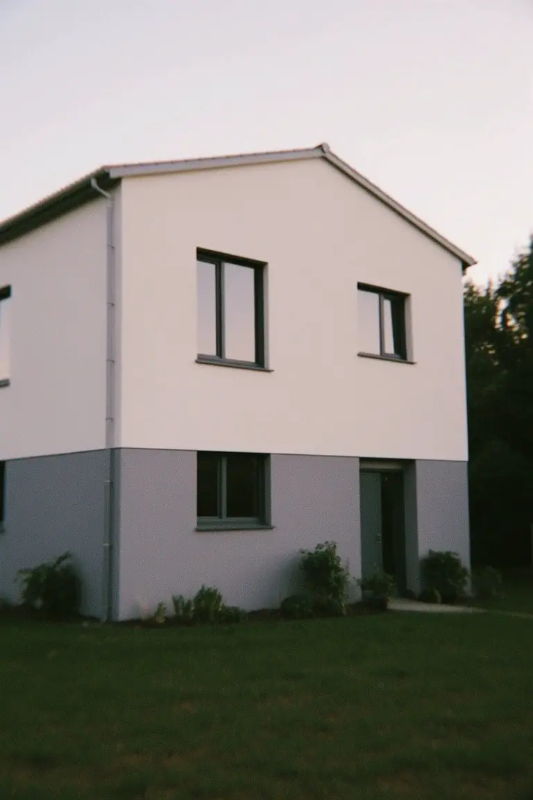
Crisp White Walls
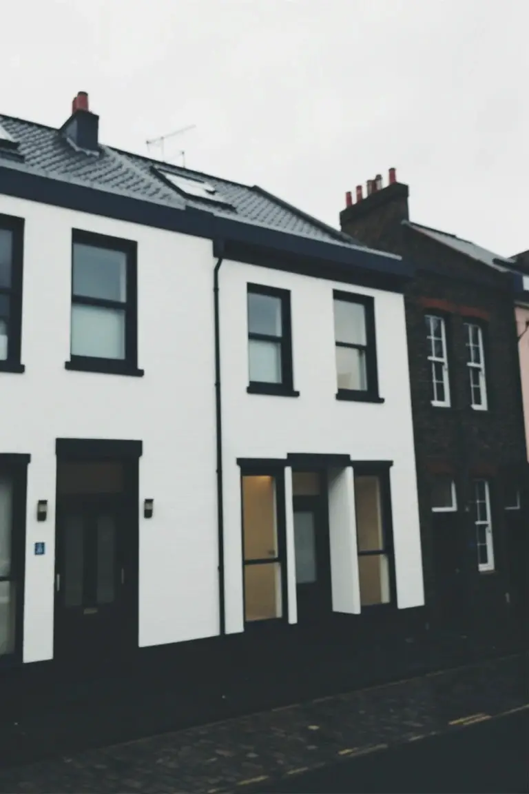
This crisp white paint on the house walls looks closest to Sherwin Williams Extra White or Benjamin Moore Chantilly Lace. Maybe Behr Ultra Pure White too. It’s a bright clean white with cool undertones that lightens up tight row houses like this one. The black window frames make it snap without overwhelming the space.
Cool whites like these hold up well in shady spots or overcast weather. They pair easy with black trim or brick neighbors. One thing. Dirt shows faster so plan for regular cleaning.
Soft Creamy White Siding
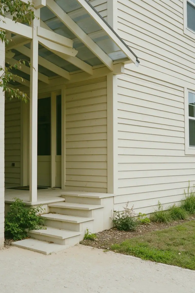
This soft creamy white on the siding reads very close to Sherwin-Williams Alabaster or Benjamin Moore White Dove. Behr’s Swiss Coffee has that same easy warmth too. It’s a warm neutral white that stays light without going stark. Folks like it because it brightens up small homes. Makes the space feel open and bigger right away.
The warm undertones keep it from looking cold in shady spots. It works best on exteriors with some wood trim or plants nearby. Pair it with natural wood tones on the porch. Just watch that it doesn’t yellow too much in full southern sun.
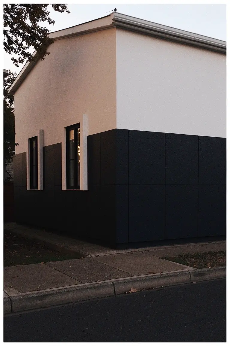
White Over Cool Gray Base
This exterior pulls off a straightforward two-tone paint job with bright white upper walls over a cool medium gray lower section. It comes across closest to Sherwin-Williams Extra White up top and something like Benjamin Moore’s Stonington Gray or Behr’s Cracked Pepper down below. That setup gives small homes a taller, cleaner look without much fuss.
The gray sits cool with a hint of blue undertone. It holds up nice in shady spots or overcast days. Stick to black window frames and keep plantings simple around it. Just watch it doesn’t pull too dark next to yellow brick.
Soft Pale Yellow Siding
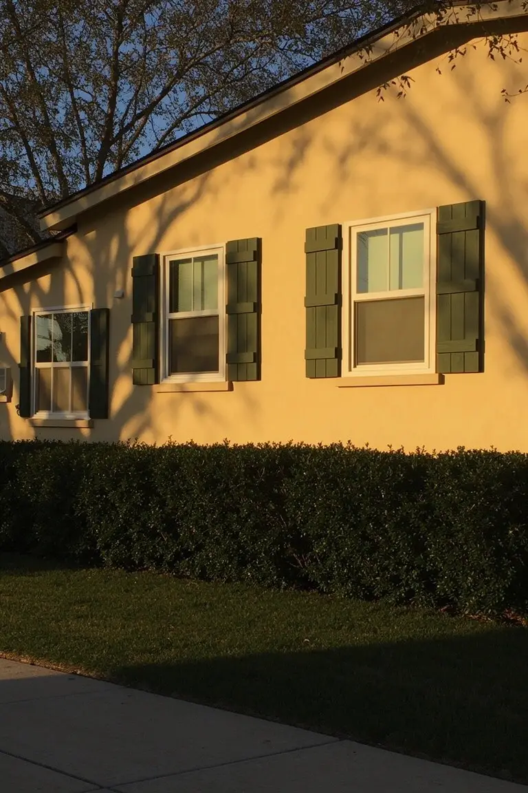
This exterior uses a soft pale yellow that seems closest to Sherwin-Williams Cornsilk or Benjamin Moore Pale Yellow. Behr Butter Up reads very close too. It’s the kind of light warm yellow that opens up a small house. Makes it feel airier without going too bright.
That subtle warmth in the undertone works well next to green shutters like these. Best on homes with good sun. White trim keeps it clean, but watch it next to red brick, might fight a bit.
Pale Blue-Green Exterior
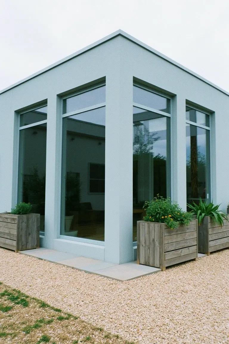
This pale blue-green paint on the corner walls reads very close to Sherwin-Williams Sea Salt or Benjamin Moore Palladian Blue. Maybe Behr’s Blue Whisper too. It’s a cool soft shade that keeps a small home feeling open and fresh. Those big windows help it look even airier.
The cool undertone picks up nicely in natural light. It sits well next to wood like the planters there. Try it on a modern boxy house. Just watch that it doesn’t turn too gray in heavy shade.
Crisp White Walls
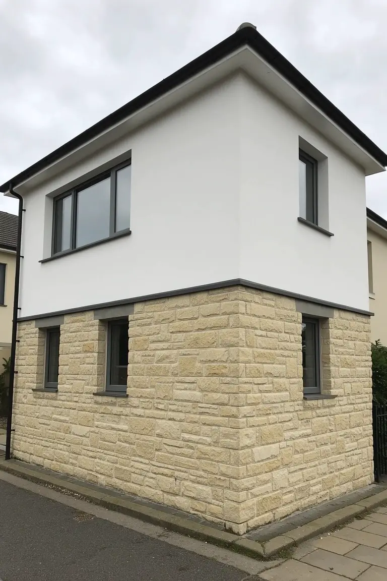
This crisp white on the upper walls looks closest to Sherwin-Williams Extra White or Benjamin Moore Chantilly Lace, maybe Behr Ultra Pure White too. It’s that bright, no-nonsense white folks use to make small homes feel taller and wider right away. You see it here against the beige stone, and it just lifts everything up without trying too hard.
The cool undertone keeps it from going yellow in most lights, though watch for north-facing spots where it might read a touch gray. It pairs easy with natural stone or wood accents below. Great for compact houses on a street like this.
Crisp White Siding
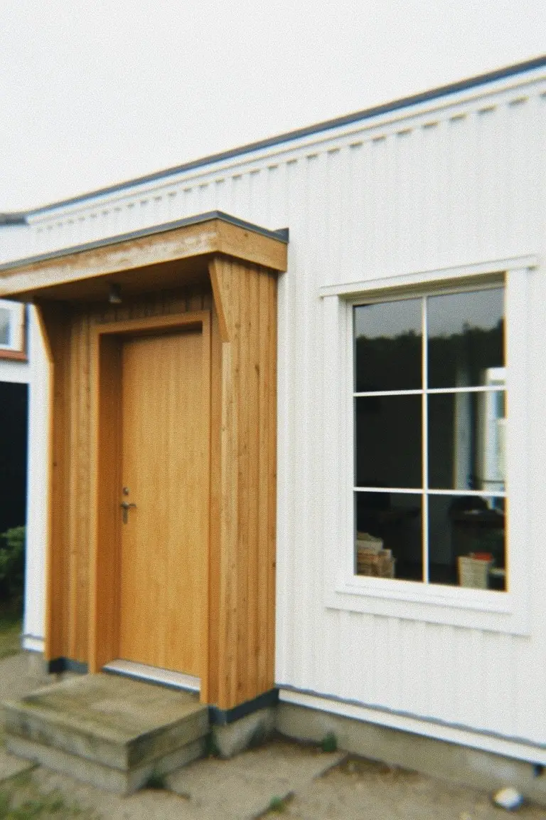
This siding shows a clean, crisp white that seems closest to Sherwin-Williams Extra White or Benjamin Moore Chantilly Lace. Behr’s Ultra Pure White reads close too. It’s the kind of white that brightens up a small home without overpowering things. Paired with the wood door here, it keeps everything looking fresh and open.
The cool undertone holds up well next to warm wood tones. It works best on north-facing spots or cloudy days. Go for it if you have stone accents or black trim. Just watch for dirt buildup in sunny areas.
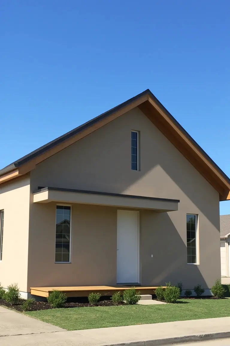
Warm Terracotta Walls
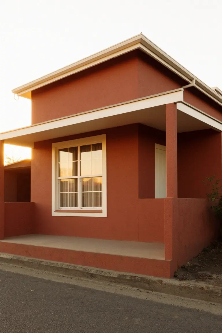
This small home shows off a warm terracotta paint on the main walls. It’s an earthy red-brown in the terracotta family, the kind that feels right at home outdoors. It reads close to Sherwin-Williams Spiced Cider, Behr Terracotta Flower, or Benjamin Moore Potters Clay. Folks like it because it gives a cozy, grounded look to little houses. Makes them stand out just enough.
That warm undertone brings out golden hints in sunlight. Works best with white trim around windows and doors, like you see here on the porch. Try it on south-facing spots where it stays lively. Just check your light first, since it can pull a bit muddier in shade.
Soft Pale Green
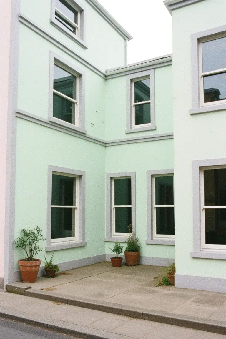
This soft pale green reads close to Sherwin Williams Sea Salt or Benjamin Moore October Mist, maybe even Farrow & Ball Pale Powder. It’s from the mint family but with enough gray to stay calm and easy on small homes. Folks like it because it lifts the whole look without overwhelming tight spaces.
The cool undertones play nice in shaded spots or overcast weather, like on this corner house. White trim keeps it crisp, and those pots at the bottom add life. Just pair carefully with warmer woods so it doesn’t go too chilly.
Pale Lavender Siding
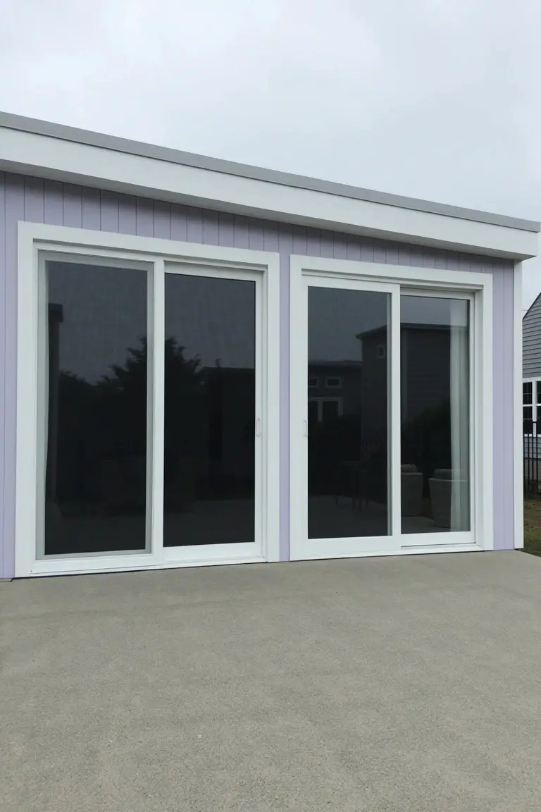
This siding shows a pale lavender paint that reads like a soft, cool purple in the lavender family. It looks closest to Sherwin-Williams Lullaby or Benjamin Moore Gray Wisp, with Behr Wisp reading very close too. What stands out is how light it is. On a small structure like this, it keeps things from feeling boxy.
The cool undertones give it a fresh feel without going too bold. It works best where you want subtle color that bounces light around, paired with crisp white trim like on these doors. Watch for north-facing spots though. It can pull a bit gray there.
Pale Beige Exterior
This small home shows off a pale beige paint on the upper walls. It’s a warm neutral that sits right between beige and greige. Looks closest to Sherwin-Williams Accessible Beige or Benjamin Moore Edgecomb Gray. Behr’s Silver Screen reads close too. That light tone opens up the front and makes the house feel taller than it is.
The warm undertone picks up nicely next to the dark black panels down low. White window frames keep everything sharp. It works well on homes with a bit of yard or street exposure. Just test a sample first. Shadows can pull it cooler.
Warm Greige Walls
This warm greige on the exterior walls looks closest to Sherwin Williams Accessible Beige or Benjamin Moore Edgecomb Gray, maybe even Behr’s Silver Drop. It’s that easy neutral where beige meets a touch of gray. People go for it on small homes because it stays light and open, blending right into the yard without shrinking the place visually.
Warm undertones keep it from feeling cold, especially with sun hitting it like this. Those big windows and a bit of stone at the bottom show how it pairs well with white trim and simple landscaping. Stick to south-facing spots or anywhere you want subtle depth. Just test samples in your light first.
Pale Warm Beige Walls
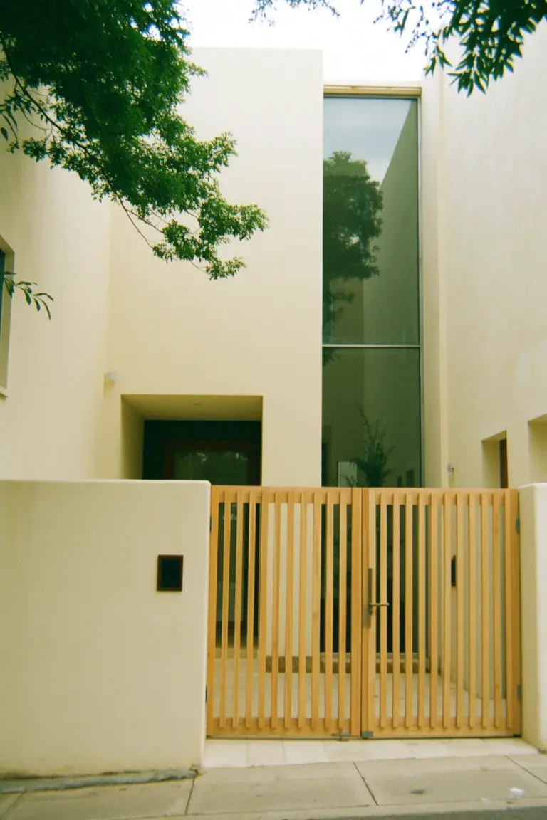
This pale warm beige on the walls looks closest to Sherwin-Williams Alabaster or Benjamin Moore White Dove. Maybe Behr’s Wheat Bread too. It’s that soft neutral with just enough yellow undertone to feel cozy but light enough for a small house exterior. Folks like it because it bounces back sunlight and makes tight spaces look a bit roomier.
Pair it with natural wood like that front gate here, and it keeps everything grounded. Watch for too much shade though. It can pull a little dingy if the spot doesn’t get morning light. Stick to south-facing yards or open lots for the best read.
Frequently Asked Questions
Q: Light colors sound great, but what if my small house sits under a bunch of trees with not much sun?
A:
Go for soft, warm neutrals like pale beige or light taupe. They bounce available light around and avoid looking dingy in shade. Darker shades just shrink the house more.
Q: How do I pick house colors that won’t clash with my dark asphalt roof?
A:
Stick to colors a few shades lighter than your roof. Try warm grays or soft blues, then paint your trim in a crisp white to tie it all together. That setup keeps everything harmonious without fighting the roof.
Q: Can I add a pop of color on the door without making my little home feel cluttered?
A:
Absolutely, pick one bold accent like a deep navy or sunny yellow on the door. It draws the eye outward and adds personality. Keep the rest of the exterior simple so the door shines.
Q: What’s the easiest way to test these colors on my actual house before painting?
A:
Grab sample pints and paint big swatches on different sides at different times of day. Walk back 20 feet and snap photos. You’ll spot how the color plays with your light right away.