

I’ve always found that exterior paint colors come alive differently once they’re out in the open air, catching sunlight at dawn or dusk. Some shades promise drama on the chip but settle into something muted against real brick or siding. I once brushed a taupe across our garage that pulled unexpected pink from the western light, teaching me to watch for those hidden undertones. The ones that truly transform a home flex with the weather and time of day without losing their edge. Test a few samples in your own yard before committing.
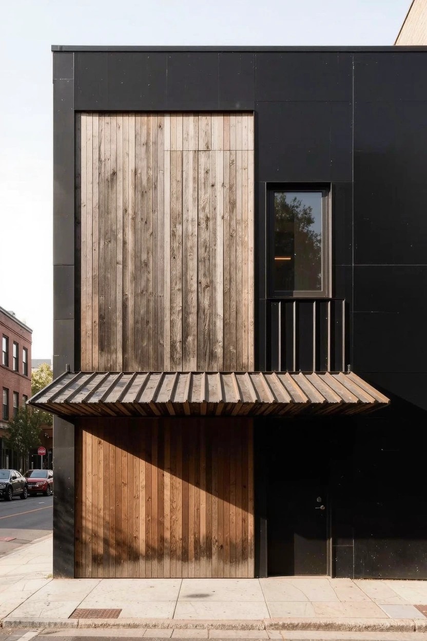
Deep Black Siding
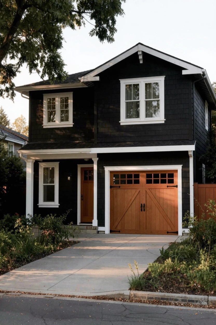
This deep black paint covers the house siding in the photo. It looks closest to Sherwin-Williams Tricorn Black or Benjamin Moore Onyx, maybe Behr’s Black as well. It’s a bold neutral that makes everything else pop. People go for it when they want a modern edge on their home exterior.
The undertone sits neutral, not too warm or cool. It holds up nice in evening light like this. White trim keeps it crisp. Add wood accents on the garage, and it feels right. Best for houses with simple shapes. Watch the dirt though… it shows if you skip regular cleaning.
Warm Greige Exterior
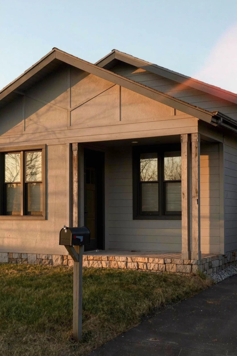
This siding paint pulls off a nice warm greige. It reads closest to Sherwin-Williams Agreeable Gray or Benjamin Moore Revere Pewter. Maybe even Behr’s Silver Drop. People go for it because it’s neutral enough for any style but has that subtle beige warmth so the house doesn’t look cold.
The undertone leans warm against the stone base and wood posts. It holds up well in natural light like this late afternoon shot. Pair it with black trim or a dark mailbox for contrast. Just test samples first, since greige can shift a bit on different sidings.
Neutral Light Gray Exterior
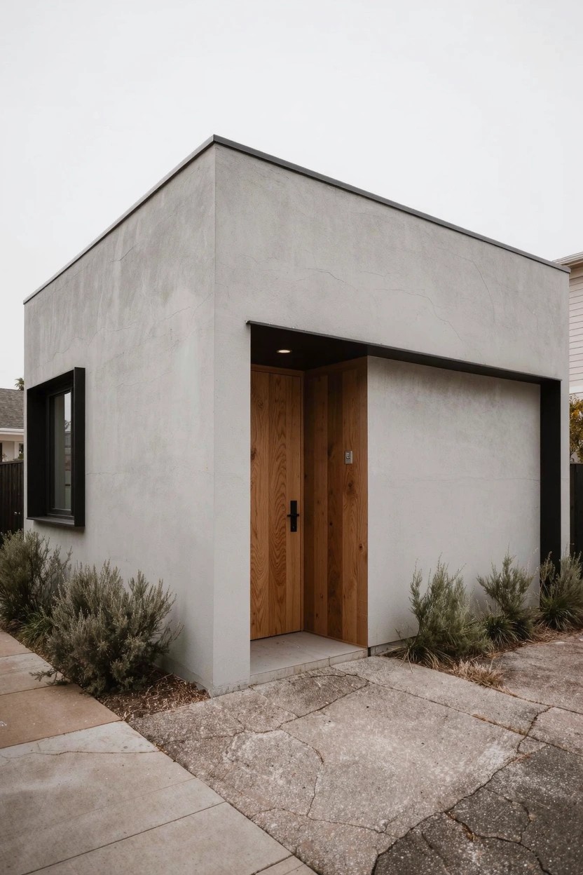
This neutral light gray covers the main walls here and gives that clean modern look so many folks are after these days. It seems closest to Sherwin-Williams Repose Gray or Benjamin Moore Gray Owl, maybe even Behr’s Silver Drop. People go for it because it’s soft enough to not show every bit of dirt, but still has enough presence next to wood tones.
The undertone leans just a touch warm, which keeps it from feeling stark in overcast light. It works best on boxy homes like this, paired with natural wood doors and simple black frames. Watch that it doesn’t wash out in bright sun, though… test a sample first.
Muted Sage Green Siding
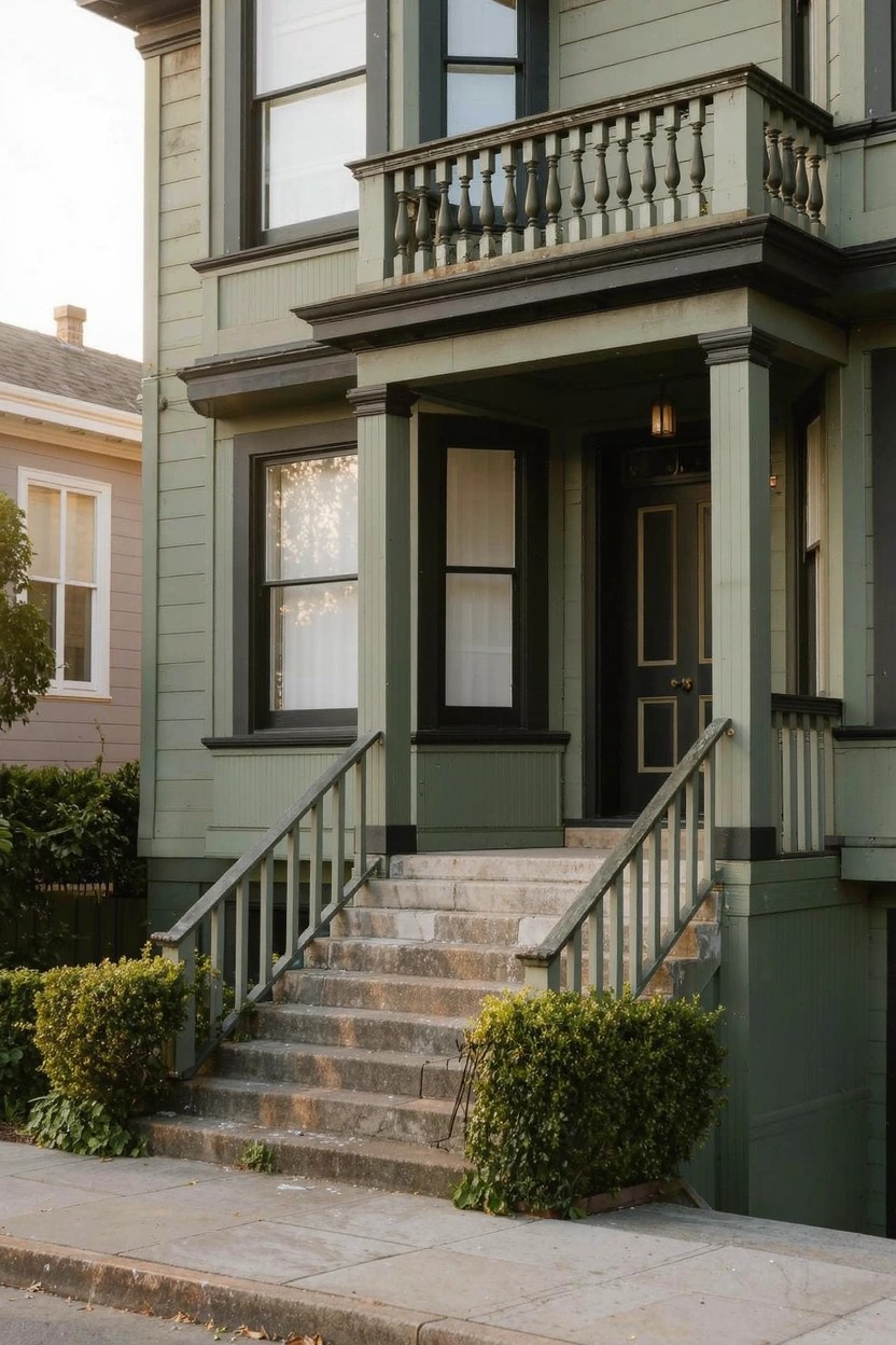
This muted sage green on the house siding reads very close to Sherwin-Williams Clary Sage or Benjamin Moore Saybrook Sage HC-114. Behr’s Silver Sage works too. It’s an earthy green with a bit of gray in it. Folks like it because it gives older homes a fresh, modern feel without going too bold. The color sits nice against stone steps and dark trim.
That gray undertone keeps it from looking too yellow in shady spots. It pairs well with black doors and white window frames. Try it on Victorians or craftsman styles in cooler climates where the green stays calm. Just test a sample first, light changes it a little.
Warm Off-White Siding
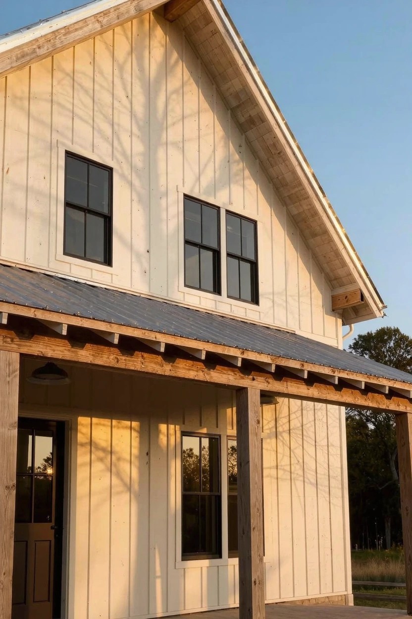
This siding uses a warm off-white that keeps things bright but not harsh. It looks closest to Sherwin-Williams Alabaster, Benjamin Moore White Dove, or Behr Swiss Coffee. People go for it because it plays well with wood accents and makes the whole place feel settled in.
That subtle yellow undertone shows up more in sunlight. It suits farmhouses or bigger homes like this. Stick to black windows or natural porch wood to keep it simple.
Deep Charcoal Gray Siding
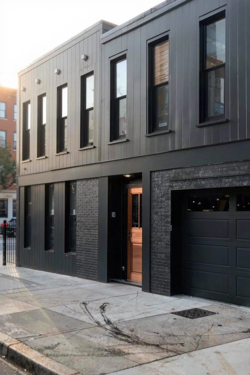
This deep charcoal gray covers most of the siding on this house. It looks closest to Sherwin-Williams Iron Ore or Benjamin Moore Kendall Charcoal, maybe Behr’s Cracked Pepper too. It’s a cool-toned dark gray that feels modern and solid. People go for it because it stands up next to brick and wood without overwhelming them.
The gray has a subtle cool undertone that works best in city spots with some sun. Pair it with warm accents like that copper door to keep things balanced. Avoid soft trim colors, though. They can get lost.
Soft Blue-Green Exterior
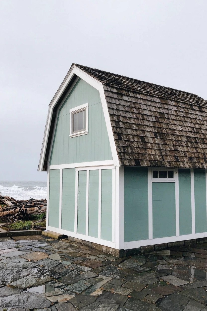
This soft blue-green paint on the siding looks closest to Sherwin-Williams Sea Salt or Benjamin Moore Palladian Blue. Behr’s Breezeway reads pretty similar too. It’s a muted coastal color with a cool undertone that keeps things fresh and easy on the eyes. Folks like it because it picks up on natural surroundings without overpowering them.
Pair it with crisp white trim like you see here, and it really pops against wood shingles or stone paths. It works best in overcast light or near water, where the grayish edge shines. Just test a sample first. North-facing spots can make it feel a touch chilly.
Warm Terracotta Siding
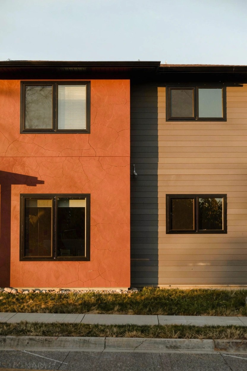
This terracotta paint on the stucco side stands out as the main color here. It’s a warm red earth tone that seems closest to Sherwin-Williams Moroccan Spice, Benjamin Moore Caliente, or Behr Spiced Brandy. Folks go for shades like this because they bring some life to plain modern boxes, especially when the rest stays neutral.
Warm undertones make it feel steady, not too fiery. It works best on textured surfaces where the color can catch light a little differently. Next to that gray siding and some wood accents, it keeps everything balanced. Just test it in your own sunlight first.
Deep Teal Siding
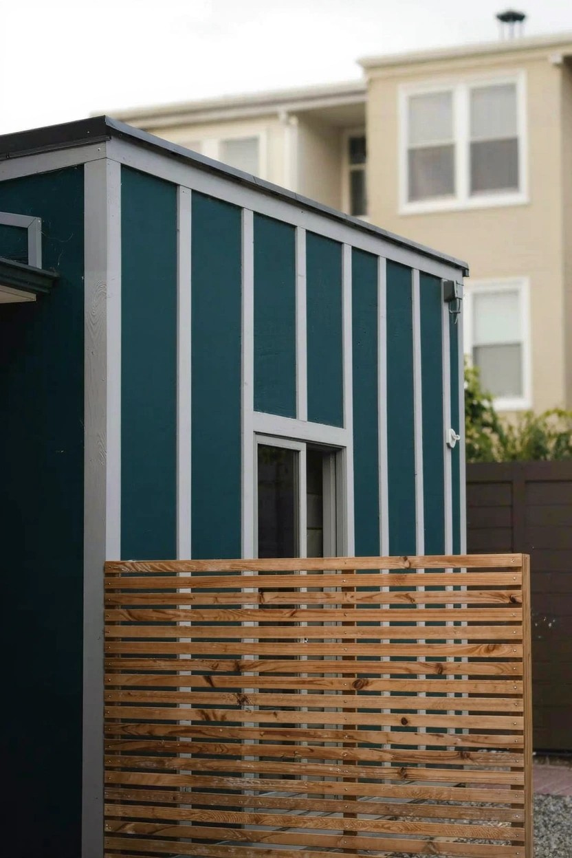
That deep teal on the siding stands out nice and clean. It seems closest to Sherwin-Williams Oceanside or Benjamin Moore Borrowed Blue, maybe Behr’s Deep Breath too. It’s a cool blue-green with some saturation that feels fresh for modern homes, especially on smaller structures like sheds.
The cool undertones keep it from going too dark in low light, and it sits well next to natural wood fences or gravel paths. Go with crisp white trim if you want contrast. Just test it on your house first, since it can shift a bit in full sun.
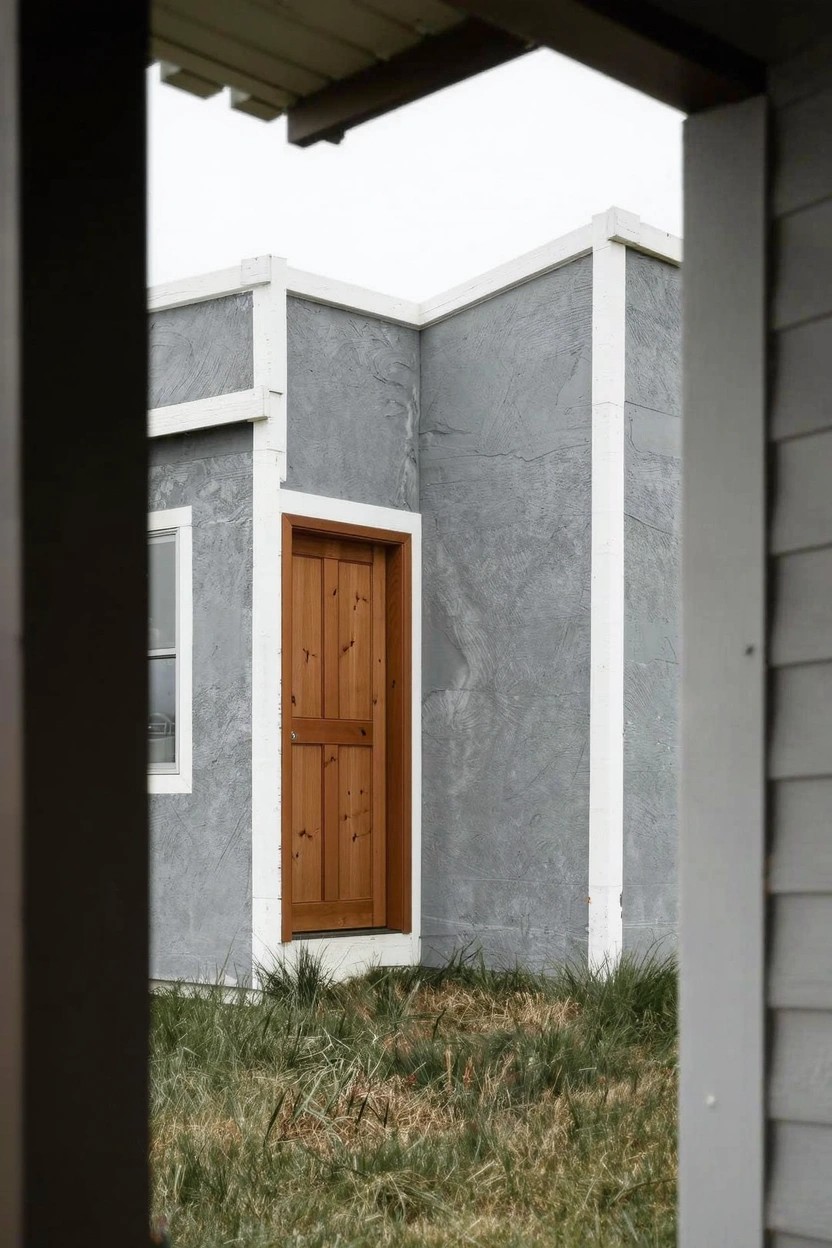
Warm Greige Walls
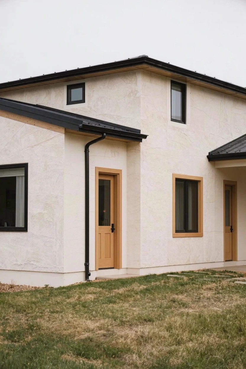
This light warm greige on the stucco exterior looks closest to Sherwin-Williams Alabaster (SW 7008), Benjamin Moore White Dove (OC-17), or Behr Polar Bear. It’s a soft neutral that sits just right between gray and beige, giving a clean modern look without going cold. People go for it on houses because it lets black trim and wood pop nicely.
Warm undertones show up best in overcast light like this, keeping things cozy on the outside. It works well with simple wood doors and dark frames. Test a sample though, since stucco can pull a bit more yellow in bright sun.
Warm Yellow Door
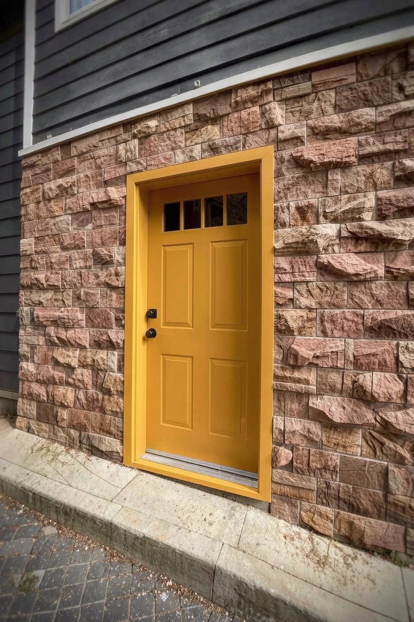
This front door uses a warm yellow paint that stands out nicely. It reads very close to Farrow & Ball Babouche, Sherwin-Williams Daffodil, or Benjamin Moore Hawthorne Yellow HC-8. It’s a cheerful pick for exteriors because it brings some life to the entry without overwhelming everything else.
That golden undertone sits right next to the brick stonework here. Gray siding up top keeps it balanced. Try it as a door color where you want a modern pop. It shows best in good daylight. Pair with earth tones so it doesn’t fight the rest.
Deep Blue Siding
This deep blue on the siding has that rich navy feel. It looks closest to Sherwin-Williams Naval or Benjamin Moore Hale Navy. Or Behr’s Abyss if you’re matching a slightly grayer tone. Folks go for it because it’s sturdy looking. Holds up on older houses without fading fast.
Cool undertones make it read darker in shade. But next to the white stucco base here, it stays balanced. Pairs well with black trim. Try it on homes with some wood details. Just test in your light first.
Matte Black Walls
This home rocks a deep matte black paint that reads very close to Sherwin-Williams Tricorn Black or Benjamin Moore Onyx, maybe Behr’s Black Sapphire too. It’s a cool, neutral black without any brown sneaking in. What draws people to it is how it frames wood siding nicely, keeping things modern and clean.
That black holds its depth even in partial shade. It works best on boxy new builds or urban spots, paired with raw timber or slim metal accents. Just clean it now and then. Dirt shows up quick.
Cool Gray Exterior Walls
This cool gray on the stucco walls looks closest to Sherwin-Williams Dorian or Benjamin Moore Gray Owl, maybe Behr’s Cracked Pepper too. It’s the kind of neutral gray that gives a house a clean, modern feel without going too dark. People go for it when they want something simple that highlights wood doors like the one here.
That cool undertone keeps it fresh next to white trim. It shows up best where there’s decent light, and warm wood tones help balance it out. Just check your own lighting first… it can read a bit flat in heavy shade.
Sage Green Exterior
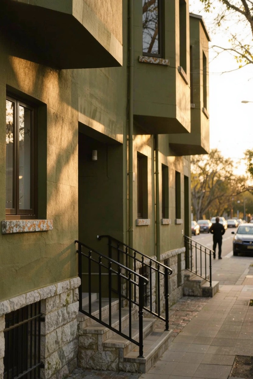
This muted sage green on the house walls reads very close to Sherwin-Williams Retreat or Benjamin Moore Saybrook Sage. It’s a soft green with warm undertones that feels grounded and easy on the eyes. Folks like it because it blends right into natural surroundings without shouting.
The color picks up golden hints in sunlight, which keeps it from looking too flat or cool. Pair it with black metal railings like these, or stone at the base. It works best on simple modern homes where you want something fresh but not trendy.
Warm White Exterior Walls
This warm white on the stucco walls looks closest to Sherwin-Williams Alabaster or Benjamin Moore White Dove, maybe Behr Swiss Coffee too. It’s a soft neutral in the off-white family that stays bright but picks up subtle warmth from the wood nearby. Homeowners pick colors like this for modern looks because they let natural accents stand out without competing.
The beige undertone keeps it from feeling too cool, especially in sunlight. It works great around entryways or on bigger facades, paired with wood slats or tile steps. Just test a sample first… shade can shift it a bit grayer.
Navy Blue Exterior Siding
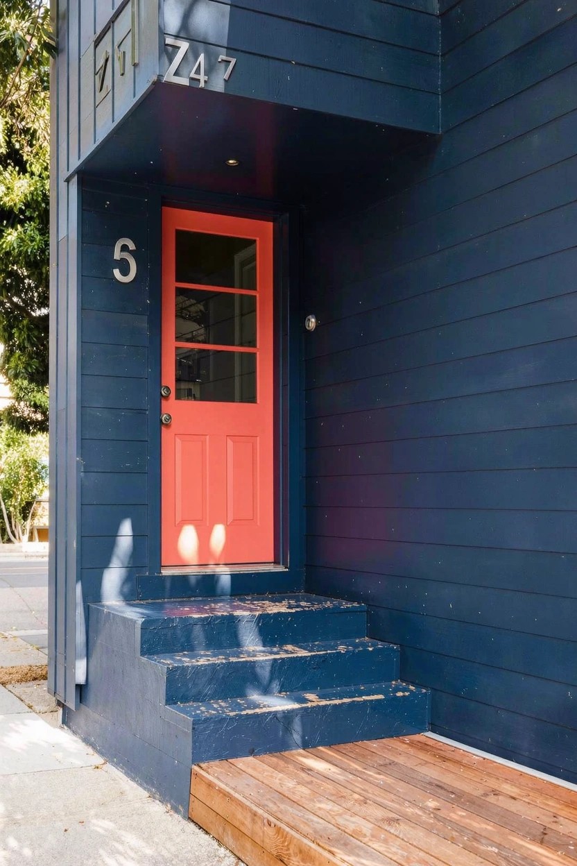
This navy blue on the siding looks closest to Sherwin-Williams Naval or Benjamin Moore Hale Navy, maybe Behr Abyss too. It’s a deep blue from the cool navy family that turns a simple house modern fast. The red door pulls focus without clashing.
Cool undertones make it read crisp in sunlight. Wood accents like the steps here keep it from going flat. Best on homes with some southern light, paired with white numbers or trim.
Frequently Asked Questions
Q: How do I test these colors on my actual house before committing to a full paint job?
A: Snag quart-sized samples of your top three picks and slap them on poster board or directly onto the siding in a few spots. Check them out morning, noon, and evening as the sun shifts. The real winner will pop right off the page.
Q: Will a bold color like charcoal gray overwhelm my small bungalow?
A: Not at all—it actually makes compact homes feel taller and more grounded. Balance it with lighter trim around windows and doors. Your place will look sleek, not swallowed up.
Q: What’s a safe modern pick if my neighborhood has strict HOA rules?
A: Stick with sophisticated neutrals like greige or soft sage. They nod to trends without screaming for attention. Neighbors won’t bat an eye, but you’ll love the fresh upgrade.
Q: How soon can I paint after a rainy week?
A: Wait two dry days minimum so the surface grips the paint properly. Wipe down any lingering moisture or mildew first. Fresh color sticks better that way.