

I’ve noticed over the years that exterior paint really comes alive or falls flat based on how sunlight filters through it during different parts of the day.
A soft light color might seem airy on a sample board inside the store, but out on the house it can pick up warm glows from nearby brick or go cool and shadowy at dusk. I once painted a test swatch of a pale gray that promised lift, only to watch it blend too much into our overcast skies and lose all character.
What works best tends to have gentle undertones that adapt without disappearing, keeping that fresh open feel even as weather shifts. These deserve your own light test before committing.
Crisp White Siding
This siding shows a crisp white paint that looks closest to Sherwin Williams Extra White or Benjamin Moore Chantilly Lace. Maybe Behr Ultra Pure White too. It’s the kind of bright clean white that keeps things light and open. People go for it when they want the house to feel fresh, not heavy.
That neutral undertone holds up well next to black shutters and doors. It shines in sunny spots. Add plants out front for some color. Just test it first if your light is mostly shaded.
Pale Gray Siding

This pale gray on the house siding sits in the cool gray family and reads close to Sherwin Williams Repose Gray or Benjamin Moore Gray Owl. Maybe even Behr’s Silver Drop. It’s light but has enough body to frame the white trim without overpowering the yard. Folks pick it for that clean, breathable exterior vibe.
Cool undertones keep it from turning warm in shade. Pairs easy with white windows and a dark base like black. Best on stucco or textured walls. Watch it might lean blue-ish in bright sun.
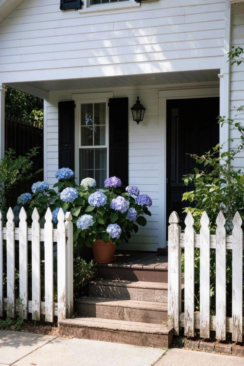
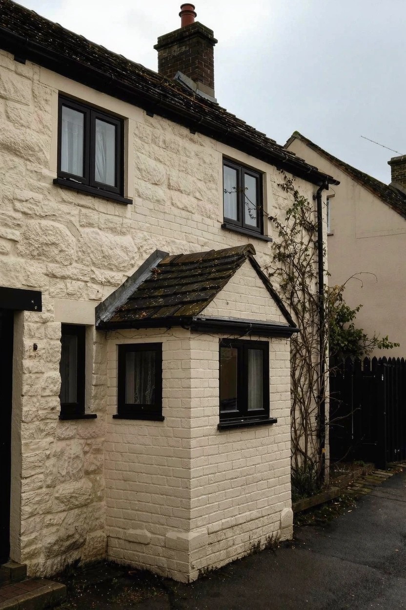
A Soft White Exterior
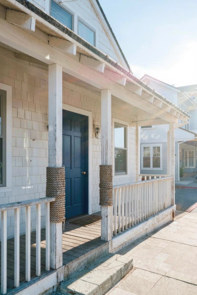
This soft white paint on the siding gives that airy, coastal feel without going too stark. It reads very close to Sherwin-Williams Alabaster or Benjamin Moore White Dove, maybe Behr’s Swiss Coffee too. Folks like it because it keeps things light and open, letting the architecture and any wood details stand out nice and easy.
The warm undertones keep it from looking cold in morning light, like you see here with the navy door popping against it. It works best on shaker-style homes or beach cottages, paired with darker accents on doors and shutters. Just test a sample, since whites shift with the sun.
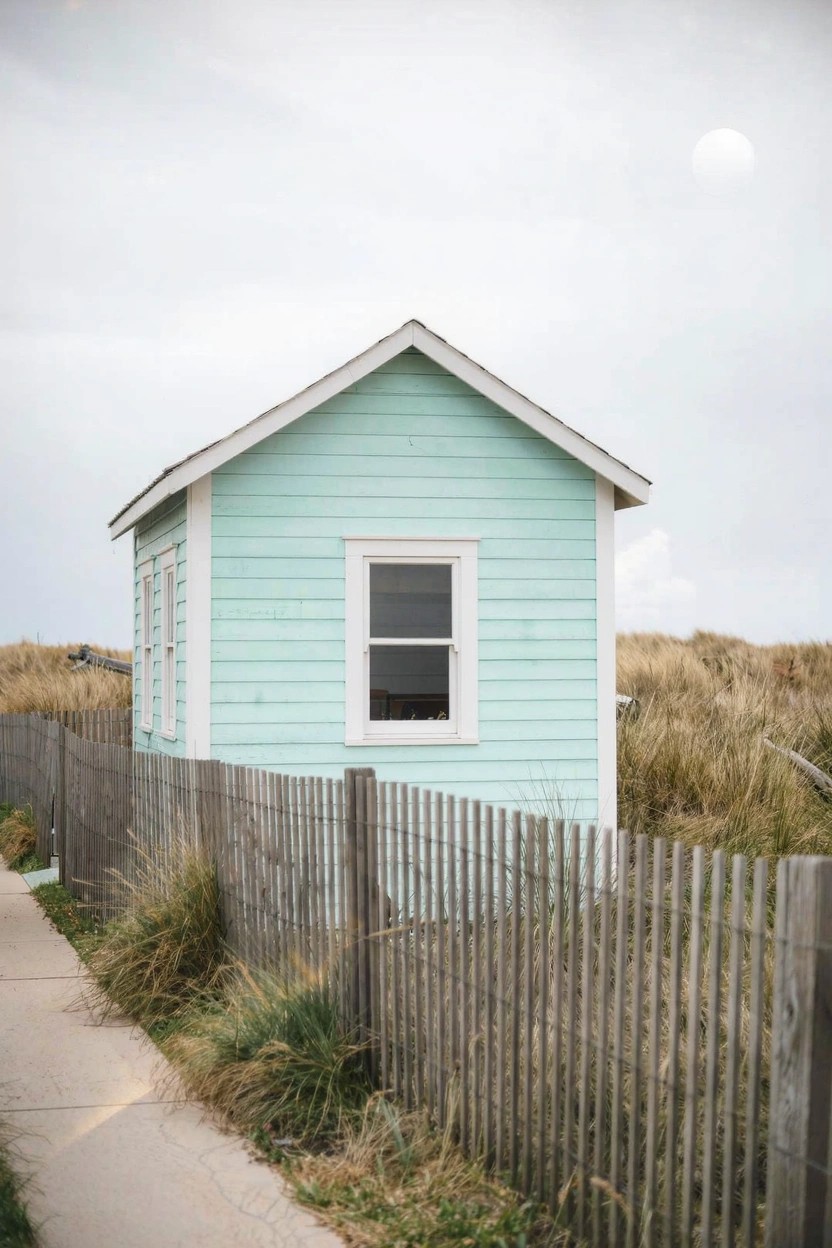
Pale Green Exterior Walls
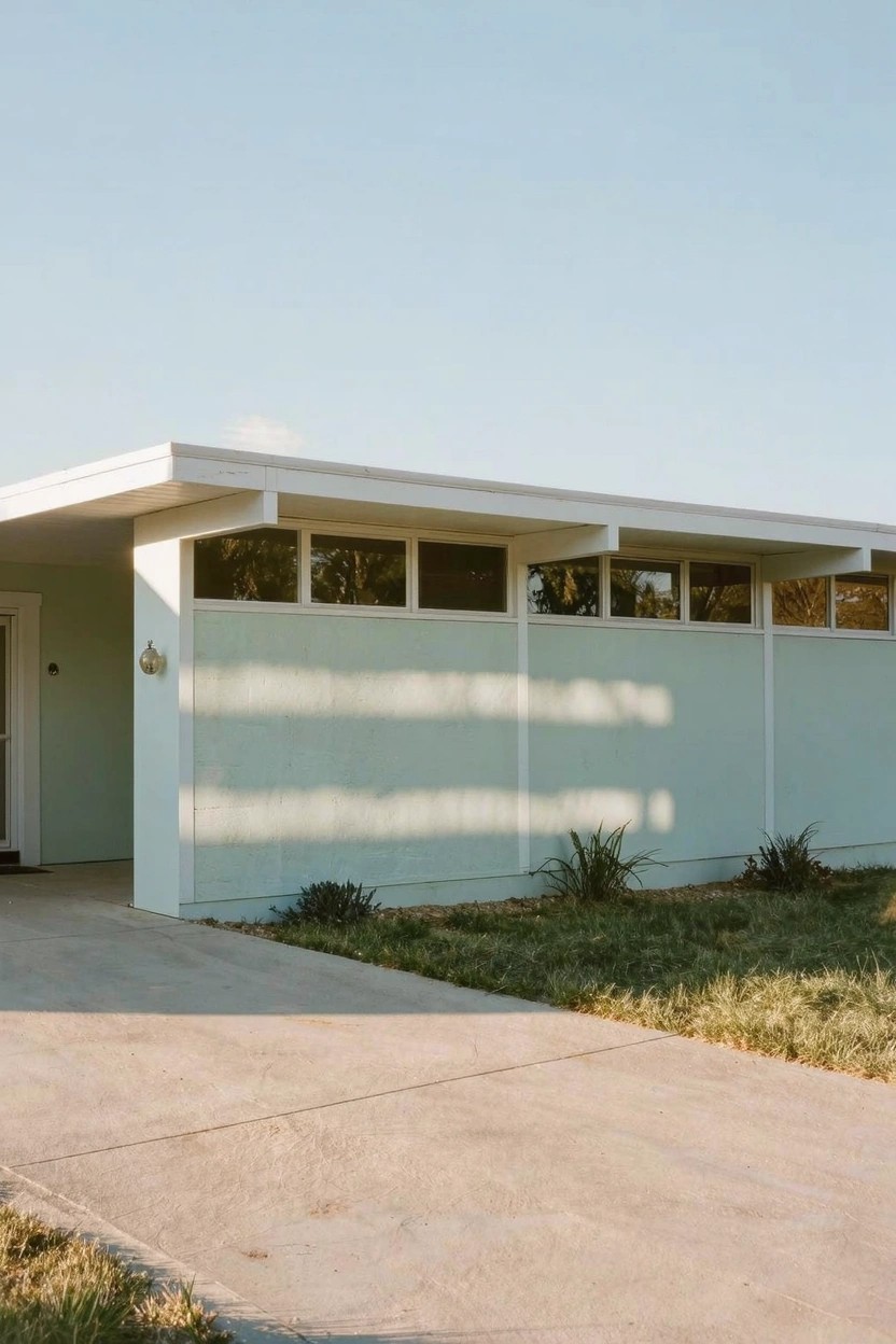
This pale green on the house reads very close to Sherwin-Williams Sea Salt SW 6204. Or something along the lines of Benjamin Moore’s Saybrook Sage HC-114 or Behr’s Whale Harbor 440D-3. It’s a soft, cool green in the mint family. That light tone keeps things feeling open and breezy, especially on a simple midcentury-style place like this.
The cool blue undertones show up nice in good light. It works best where you want that airy exterior without going too bold. Pair it with crisp white trim and some plants out front. Just test it on your own siding first, since shadows can shift how green it sits.
Pale Sage Green Siding
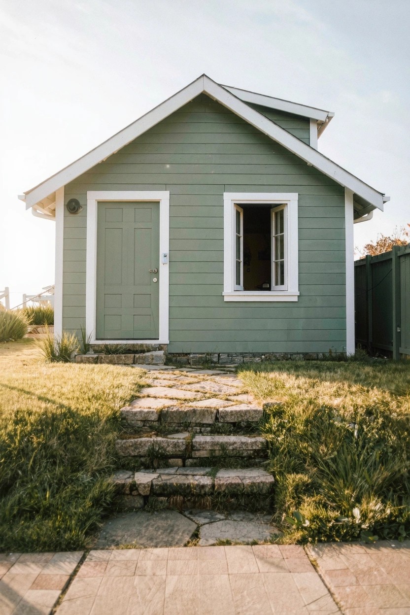
This pale sage green on the house body looks closest to Sherwin-Williams Evergreen Fog or Benjamin Moore October Mist. Maybe a touch of Behr’s Silver Sage too. It’s that soft green family color that stays light and easy on the eyes, perfect for an airy exterior without going too yellow or blue.
The gray undertone keeps it from feeling too bright. It sits nice next to white trim and those stone steps. Works best on smaller homes in good natural light. Pair it with simple landscaping to let the color breathe.
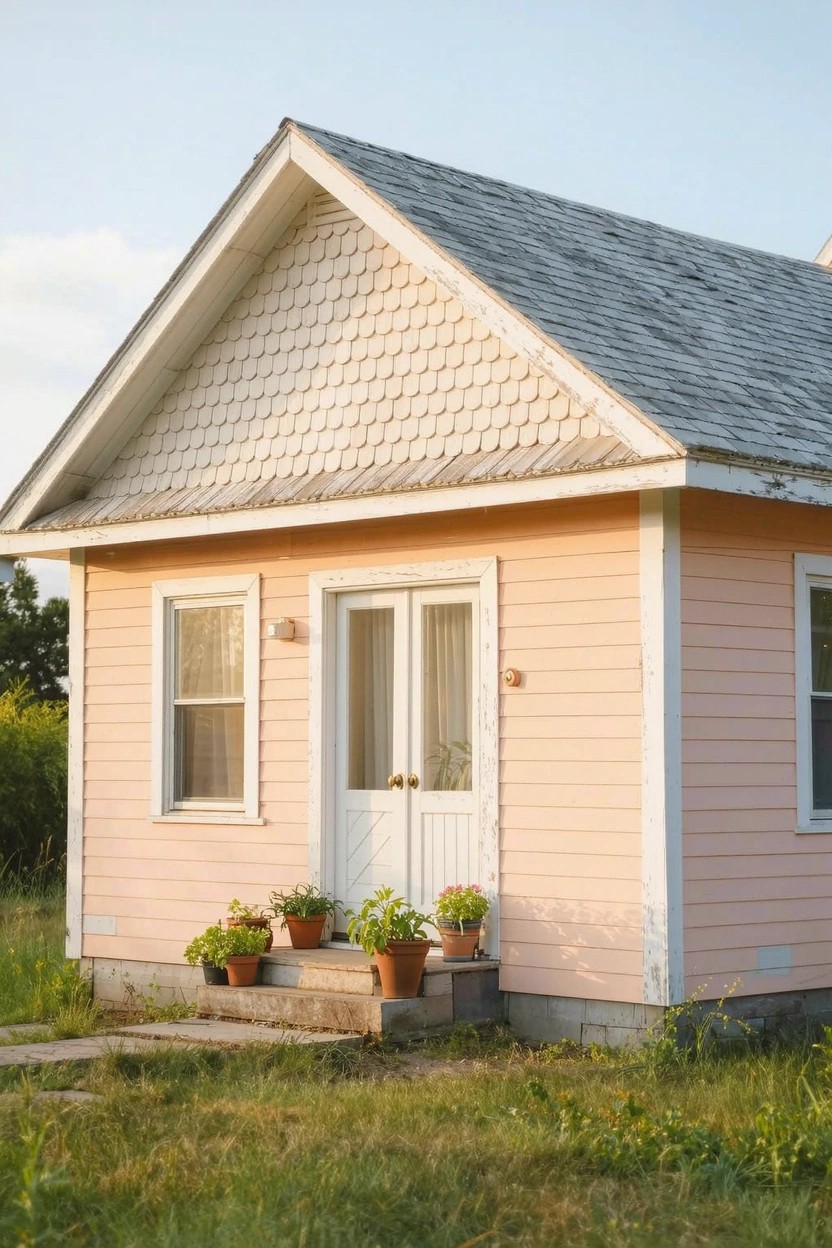
Pale Blush Siding
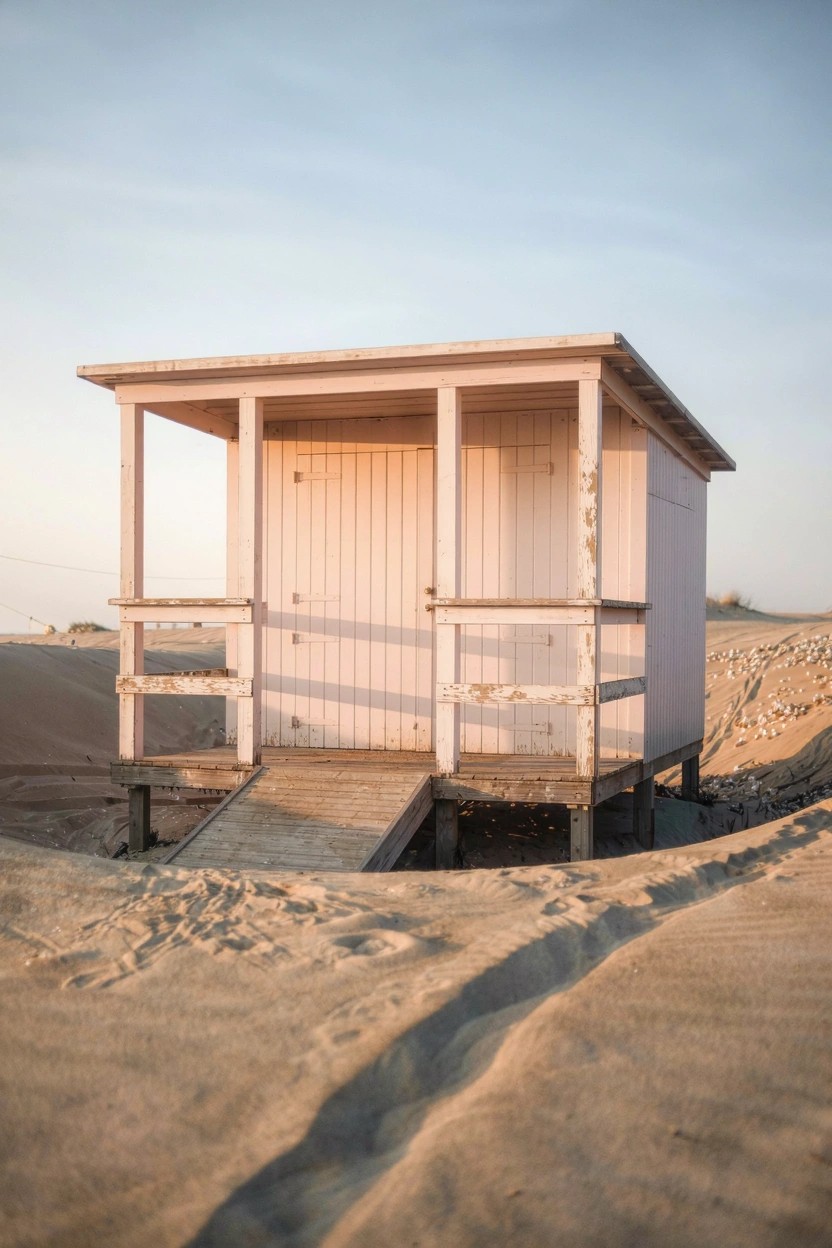
This siding in a pale blush pink reads very close to Sherwin-Williams Shoji White or Benjamin Moore White Dove, maybe even Farrow & Ball Calamine. It’s that soft light pink family, just barely there, which gives exteriors a gentle airy lift without going full white. Folks go for it on coastal spots because it sits so easy against sand and wood.
The warm pink undertone peeks out in good light, keeping things from looking cold. It works best on simple structures like sheds or cabins, paired with raw wood rails. One thing, it can weather a bit, but that’s part of the charm out there.
Light Warm Beige Walls
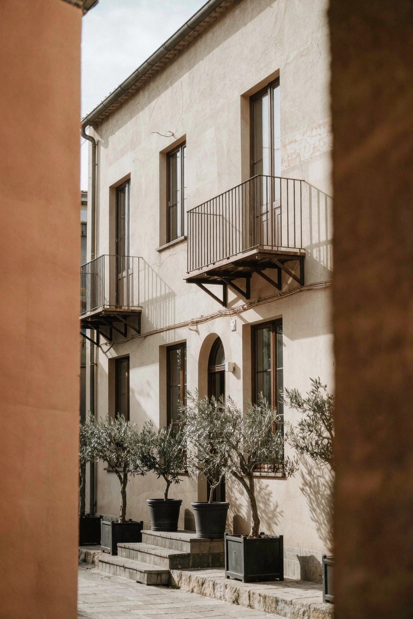
This warm beige on the stucco reads closest to Sherwin Williams Accessible Beige or Benjamin Moore Revere Pewter. It’s a soft neutral in the greige family, light enough for that airy exterior look but with enough warmth to feel homey. You notice how it sits nicely next to stone steps.
The undertone leans a touch peachy in sunlight, which keeps it from looking flat. It works best on older style homes, paired with olive trees or wrought iron. Watch for too much shade though. It can pull cooler.
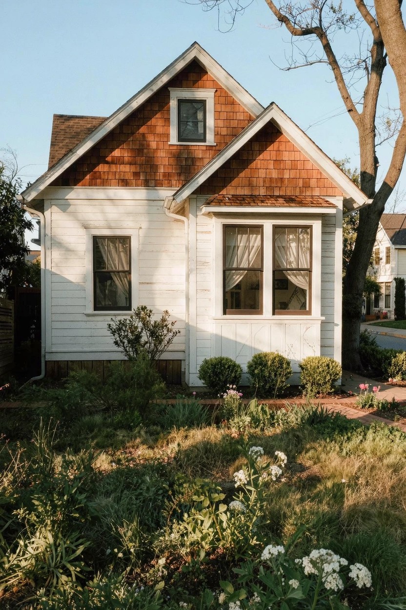
Creamy White Siding
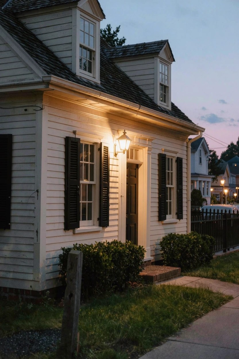
This soft creamy white on the clapboard siding pulls off that airy feel without looking stark. It seems closest to Sherwin-Williams Alabaster or Benjamin Moore White Dove, maybe Behr Swiss Coffee too. It’s the kind of light exterior paint that makes older homes feel bright and lived-in at the same time.
Warm undertones keep it from going cold, especially next to black shutters like these. It shows up best in mixed lighting. Pair with dark trim or natural wood details to let the white breathe.
Pale Lavender Exterior
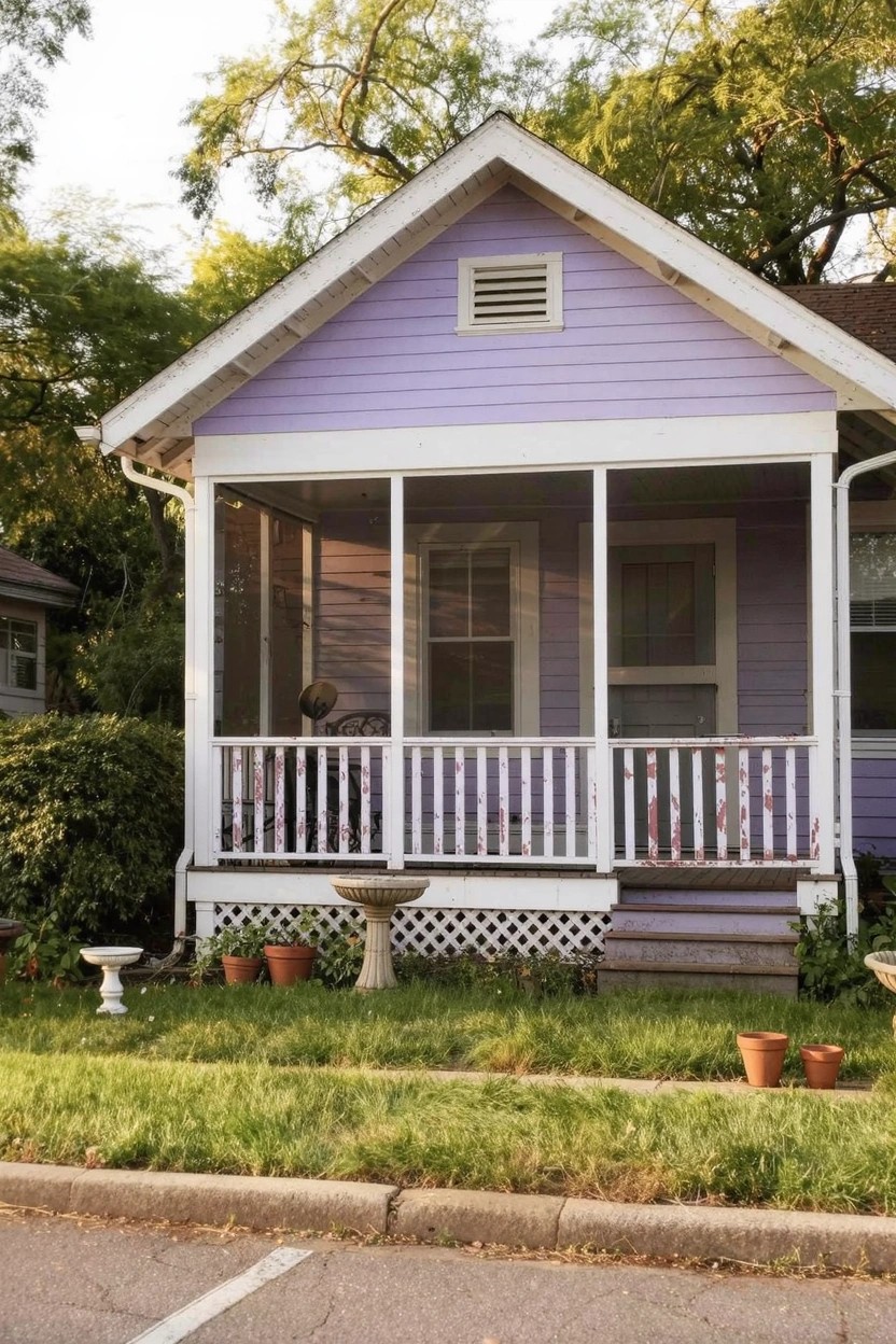
This soft lavender house paint seems closest to Sherwin-Williams Lullaby. Benjamin Moore’s Quiet Violet or Behr Lush Lilac read very close too. It’s a gentle purple in the light pastel family. Folks go for it when they want color that stays airy and doesn’t shout.
The undertone leans cool but softens in sunlight. White trim like on the screened porch keeps it crisp. It works well on bungalows with green yards around. Watch that it doesn’t look too gray on north-facing spots.
Light Creamy Walls
This cottage shows off a soft creamy paint that’s all about that airy feel on exteriors. It’s a warm off-white leaning into beige territory. Looks closest to Sherwin Williams Alabaster or Benjamin Moore White Dove, maybe Behr Swiss Coffee too. What stands out is how it lifts the old stone walls without feeling stark.
Warm undertones keep it from going cold in shady spots. Black trim pops right against it, and brick nearby stays rich. Try it on period homes… pairs well with evergreens or ivy for a settled look.
Soft Blush Pink Exterior
This little house shows off a pale pink paint that reads very close to Farrow & Ball Setting Plaster, or Benjamin Moore First Light, even Behr’s Dream Pop. It’s a light blush pink with peachy warmth, the kind that keeps things feeling open and easy on the eyes. You notice how it softens the whole place without overpowering the white trim or simple shingle roof.
That warm undertone comes through best in natural daylight, especially around plants or greenery like this yard has. Stick with clean white for doors and windows to keep it crisp. It suits cottages or farmhouses fine, just test it north-facing if your spot gets shady.
Soft Gray Exterior
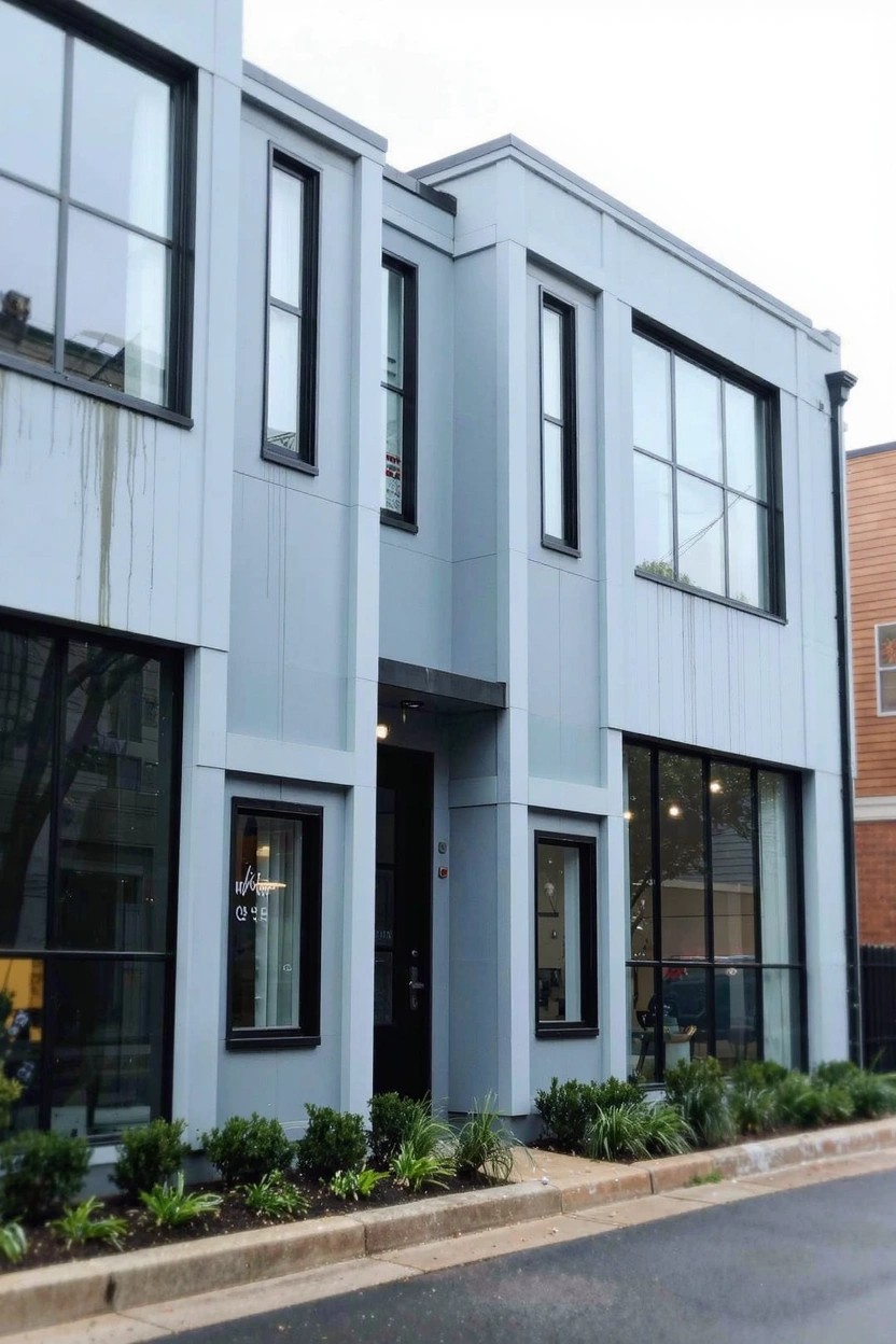
This home’s main siding shows off a light cool gray that seems closest to Sherwin-Williams Repose Gray or Benjamin Moore Gray Owl. Behr’s Silver Drop has that same feel too. It’s the kind of soft neutral that gives a modern airy look without going too dark or bold.
Cool undertones keep it from feeling heavy, especially next to those big glass windows. It works best on north-facing homes or with some plants in front like here. White trim sets it off nice, just watch it doesn’t pull too blue in overcast light.
Soft Greige Shingles
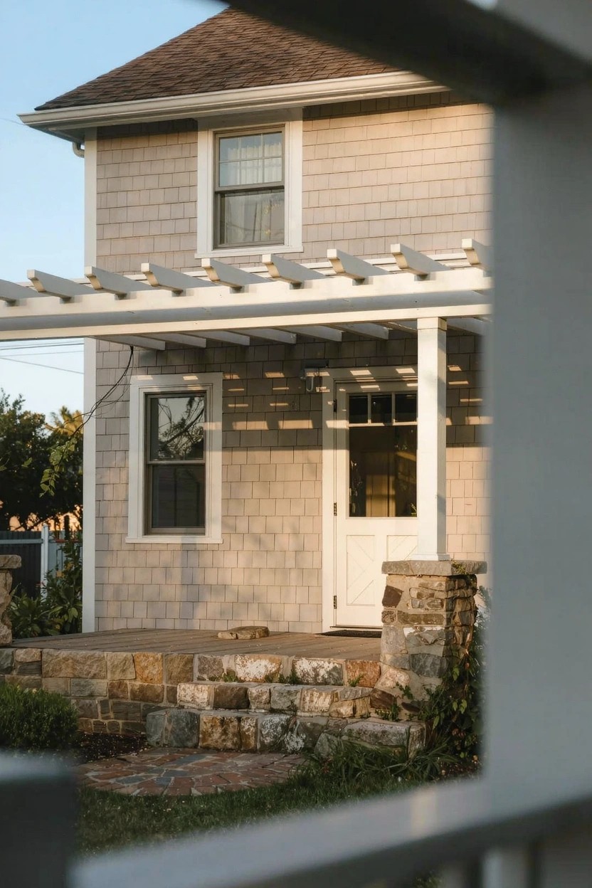
This siding shows off a soft greige that’s got a warm sandy feel. It looks closest to Sherwin-Williams Agreeable Gray or Benjamin Moore Edgecomb Gray, maybe Behr’s Silver City too. That in-between beige-gray tone keeps things light and easy on the eyes, perfect for an airy exterior without much fuss.
Warm undertones make it play well with stone like those steps and bright white trim. It shifts gently in sunlight, so it’s great for homes with some landscaping nearby. Just test it north-facing if your spot gets cooler light.
Soft Turquoise Siding
This light turquoise on the little house siding looks closest to Sherwin-Williams Sea Salt or Benjamin Moore Palladian Blue. It’s a gentle blue-green shade that keeps things feeling open and breezy, especially on smaller structures where you don’t want the color to overwhelm.
The cool undertones give it a fresh seaside pull that shows up nicely next to natural wood fences or trim. It works best in spots with good natural light, pairing easy with white window frames to stay crisp and airy. Just test it on your own siding first since it can shift a bit in shade.
Crisp White Siding
This siding paint is a crisp white that seems closest to Sherwin Williams Extra White or Benjamin Moore Chantilly Lace, maybe even Behr Ultra Pure White. It’s the kind of light white that stays bright and clean, giving that soft airy feel without going yellow or gray. Folks keep coming back to it for exteriors because it freshens up a house nicely, letting wood details and plants stand out.
Neutral undertones help it shift a bit with light, warmer next to the red roof like here. It suits older homes in sunny yards best. Just pair with natural trim, and watch it doesn’t look stark on overcast days.
Frequently Asked Questions
Q: Will these light colors make my small house look bigger?
A: Light shades reflect sunlight and stretch the walls visually. They trick the eye into seeing more space, especially on compact homes.
Q: How do I test one of these colors before painting the whole house?
A: Buy sample pints and slap large patches on a few walls facing different directions. Step back 20 feet and eyeball it morning, noon, and evening. You’ll spot the airy vibe right away.
Q: What if my house gets blasted by afternoon sun?
A: Go for paints with good UV blockers, but light tones still hold up fine over time. And refresh every 5-7 years keeps that soft look crisp.
Q: Can I use the same light color on trim and doors?
A: Stick to one shade for body and trim if you crave total airiness. It flows seamlessly, but a touch deeper trim adds subtle pop without clashing.