

I’ve noticed how a fresh exterior paint color can shift a house’s whole personality, especially when sunlight moves across it all day.
What catches people off guard is how those shades pull in warmth from the morning glow or settle into cooler tones by dusk.
I tried a muted green once that seemed flat under store lights but came alive on our front porch once real shadows played across it.
The keepers usually lean into the light around them rather than trying to dominate it.
Test a couple in your own yard before committing.
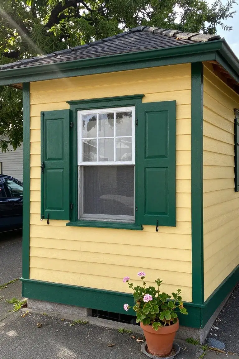
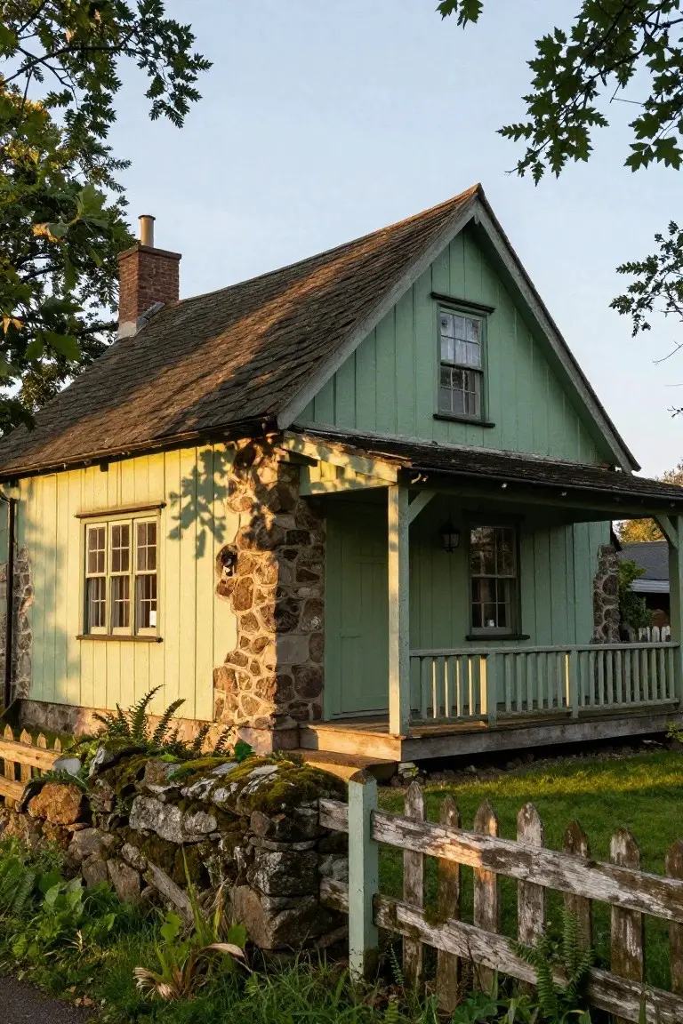
Soft Seafoam Green Siding
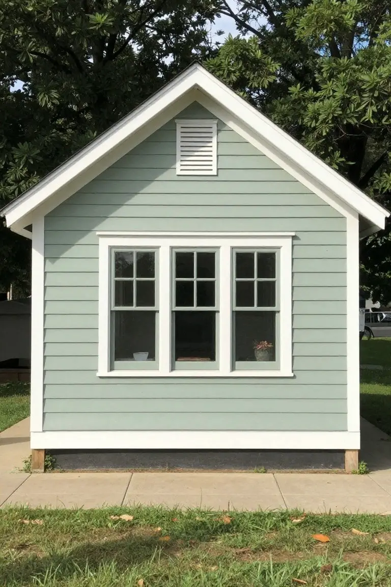
This pale seafoam green exterior looks closest to Sherwin-Williams Sea Salt or Benjamin Moore’s Saybrook Sage. It’s a cool green in the low-key family, not too bold but fresh enough to wake up a small house. The white trim sets it off clean, and you get that breezy feel right away.
The undertone leans blue-gray, which helps it sit well next to trees and grass without clashing. It works best on cottages or bungalows in partial shade, where the color stays lively. Pair it with crisp white or black accents, but test samples first. North light can pull it cooler.
Crisp White Exterior
This crisp white paint job seems closest to Sherwin-Williams Extra White or Benjamin Moore Chantilly Lace, right in that clean white family. It’s bright but not harsh, the sort folks pick for a fresh look on modern farmhouses. The black window frames pop against it nicely.
Neutral undertones keep it from going yellow in the sun. Works great with dark roofs or wood details nearby. Just test a sample first, since whites shift in different lights.
Soft Blue House Siding
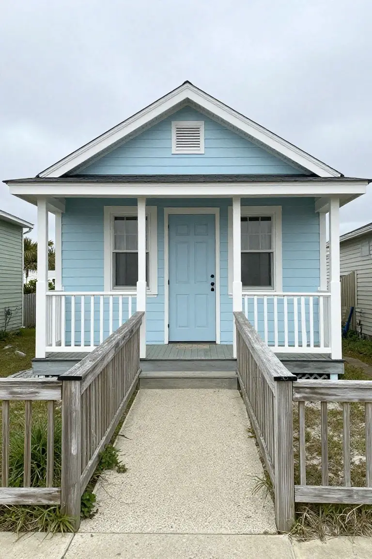
This soft blue on the house siding gives off a calm sky blue vibe, perfect for a fresh exterior look. It seems closest to Benjamin Moore’s Palladian Blue or Sherwin-Williams Rainwashed, with Behr’s Cabana Coast reading pretty similar too. What stands out is how it perks up the front without trying too hard, especially next to that white trim on the porch and door.
The cool undertone keeps it from going too bright. It shines in shady spots or coastal settings, where it pairs nice with weathered wood rails. In strong sun, though, test a sample first… might need a touch more depth.
Deep Navy Blue Siding
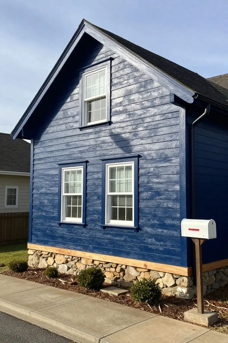
This siding pulls off a deep navy blue that’s bold but not flashy. It looks closest to Sherwin-Williams Naval, with Benjamin Moore Hale Navy right there too, or Behr Indigo. Folks like it because it gives a house real presence without screaming for attention.
That navy sits with a subtle cool undertone, especially next to the stone base and white window trim. It shines on craftsman-style homes like this, or anywhere with some wood accents. Just pair it carefully in shady yards, or it can turn almost black.
Warm Barn Red Siding
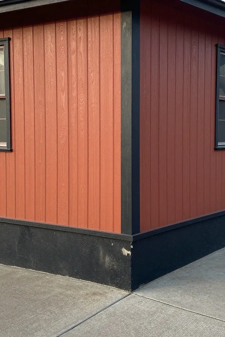
This siding shows off a warm barn red that’s rich and earthy. It looks closest to Sherwin-Williams Farmhouse Red or Benjamin Moore Hennings Red, with Behr Barn Red right in there too. It’s the kind of color that feels right at home on older houses, giving a sturdy, welcoming vibe that doesn’t shout.
Those orange undertones keep it from going too dark in shade. Black trim sets it off nicely, like on this corner, and it works well with stone foundations or wood accents. Just test a sample first, since it can shift a bit on different woods.
Charcoal Gray Exterior
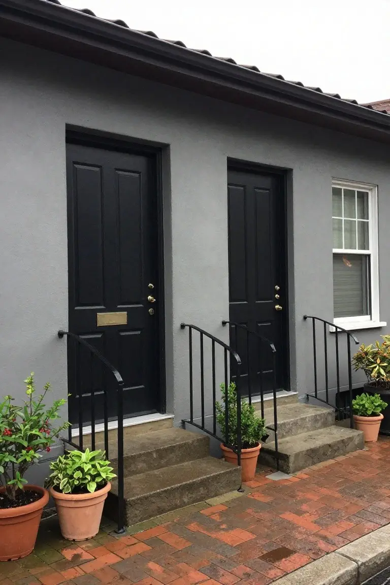
This deep charcoal gray on the house walls reads very close to Sherwin Williams Iron Ore or Benjamin Moore Kendall Charcoal. Behr’s Cracked Pepper sits right there too. It’s a solid neutral gray that gives a house a clean, modern edge without going all the way to black. Folks like it because it hides dirt well and makes plantings pop.
The undertone here leans neutral, maybe a touch cool in most lights. It works best on stucco or siding paired with black doors like these, or brick paths. White trim keeps things crisp. Just test it on your north side first, since it can pull darker there.
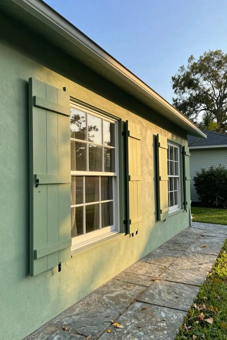
Deep Green Shutters
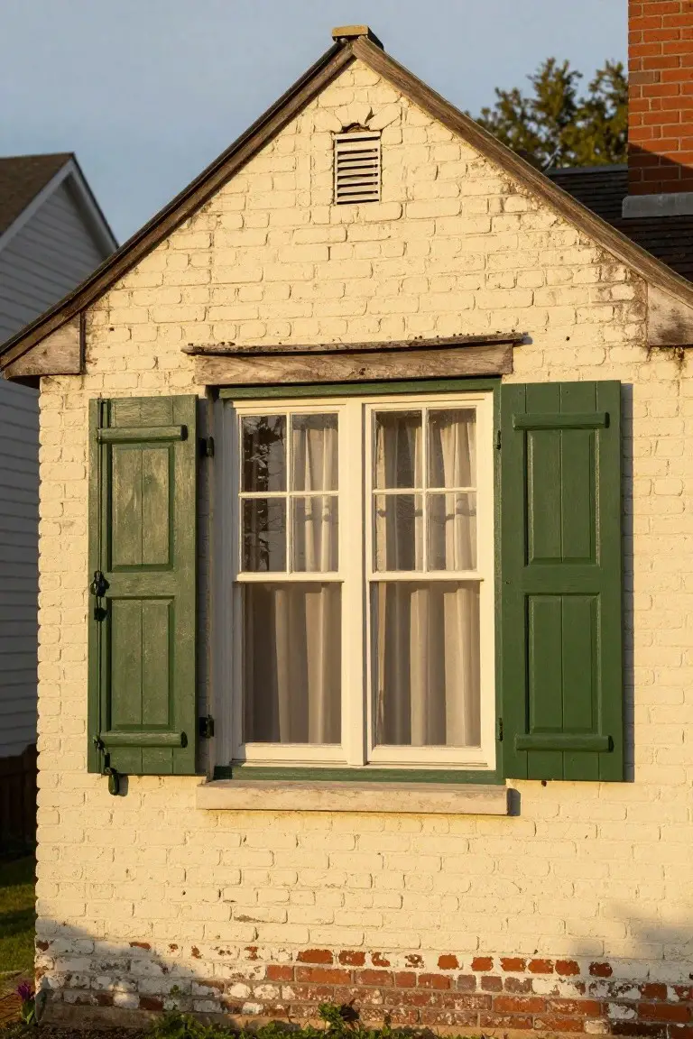
Those green shutters catch your eye right away on this cream brick house. It’s a deep, muted green that reads closest to Sherwin-Williams Pewter Green or Benjamin Moore Guilford Green. Folks pick shades like this for exteriors because they hold up well outside and give a traditional look without much fuss.
The color pulls a bit of warmth from the undertones, especially next to beige brick. It works best where you get good natural light. Pair it with white window frames and keep the brick neutral. Avoid pairing with super bright reds though.
Pastel Pink Siding
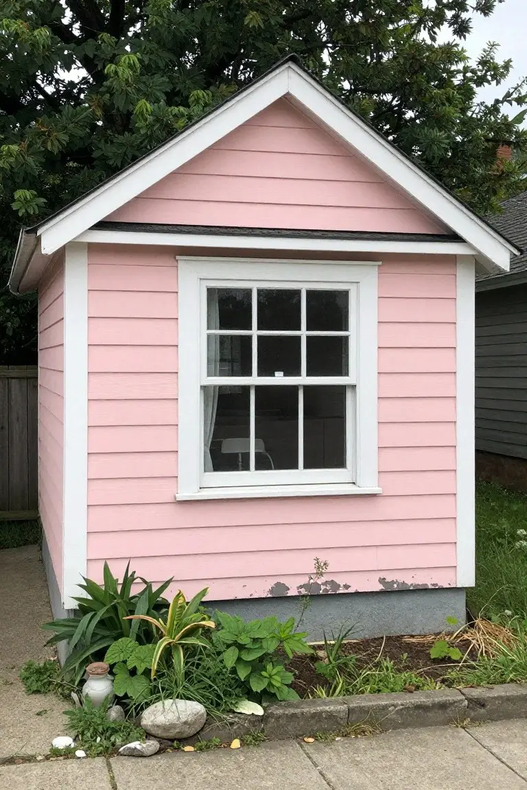
This little shed shows off a soft pastel pink that’s fresh and fun for smaller structures. It looks closest to Sherwin-Williams First Light, with Benjamin Moore Head Over Heels or Behr Dreamy Pink reading very similar. People like it because it adds a pop of color that feels happy and light, not overpowering, especially on siding like this.
The warm rosy undertone plays nice in natural light and keeps the white trim looking crisp. Try it on a garden shed or playhouse where it sits well with plants and gravel paths. Just test a sample first, since it can shift a bit in shade.
Dark Gray Siding
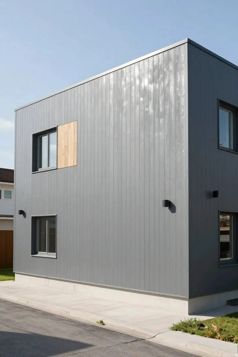
This siding shows off a deep neutral gray that’s popular for modern homes. It looks closest to Sherwin-Williams Iron Ore or Benjamin Moore Kendall Charcoal, maybe Behr’s Cracked Pepper too. What stands out is how it keeps things simple and bold at the same time. No fuss, just a solid color that makes the house pop.
The gray has a balanced undertone. Not too cool or warm. It sits right next to light wood accents without clashing. Try it on a boxy build like this, especially where you want low upkeep. White trim keeps it fresh. Skip it if your yard is super bright though… might feel heavy.
Classic Barn Red Siding
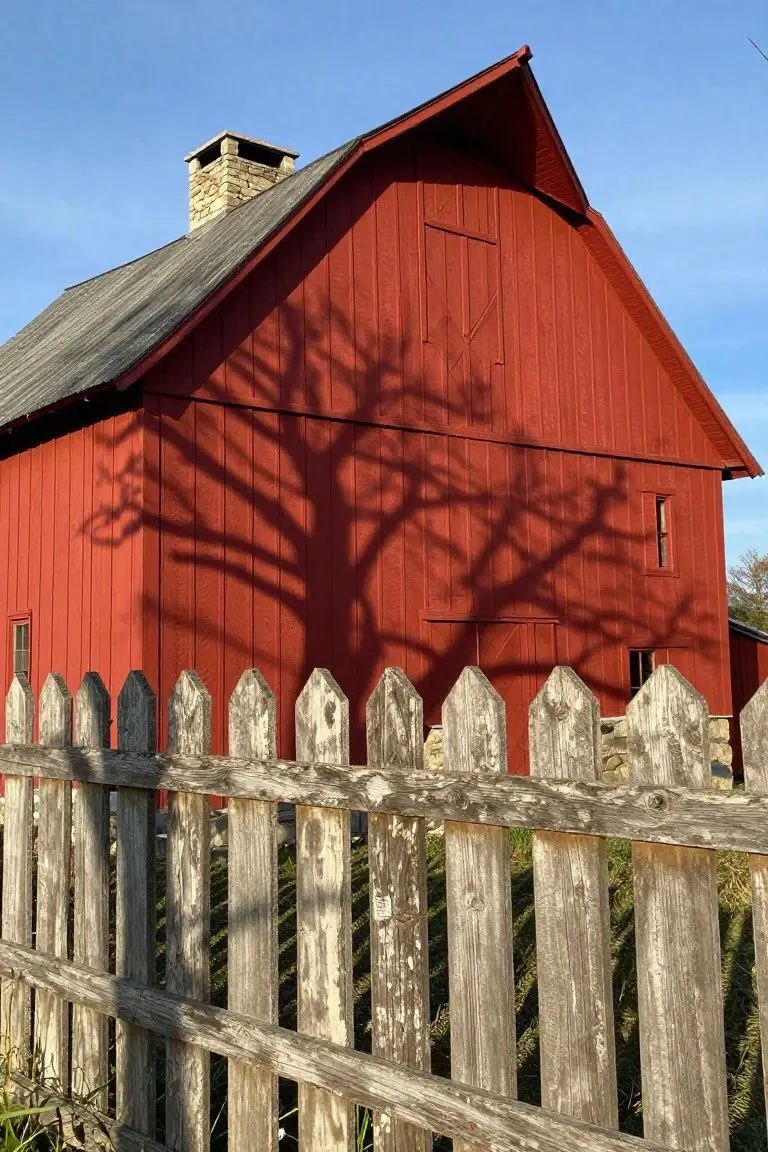
You can’t go wrong with a true barn red like this one on the old barn siding. It’s that warm, hearty red that looks closest to Sherwin-Williams Real Red, Benjamin Moore Barn Red, or Behr Barn Red. People pick it for exteriors because it pops against green fields or wooded areas without feeling too modern. Solid color. Stays looking good year after year.
The warm undertones keep it from going pink or orange in most lights. Pair it with white trim or aged wood fences like the one here, and it grounds everything nicely. Best on farmhouses or rural homes. Watch the sun though. It can deepen a bit by afternoon.
Cool Gray Siding
This cool light gray on the house siding makes for a fresh exterior that’s easy on the eyes. It reads very close to Sherwin-Williams Repose Gray, Benjamin Moore Gray Owl, or Behr Silver Screen. People go for shades like this because they brighten up the place without much fuss, especially with crisp white trim outlining everything.
Cool undertones keep it from going muddy in shade. It works best on homes with some tree cover or north-facing light. Pair it with dark roofs or stone bases… and it just settles right in.
Cool Gray Exterior Siding
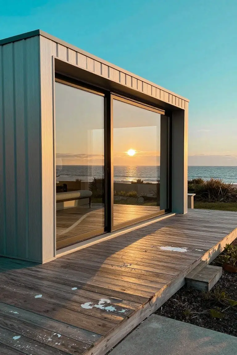
This cool gray on the siding looks closest to Sherwin Williams Repose Gray or Benjamin Moore Stonington Gray. It’s a medium tone that sits quietly against warmer wood like the deck here. Folks like it because it feels modern without being too stark, and it lets the sunset or ocean view take center stage.
The cool undertones keep it from going too blue in most lights, though it might read a touch greener on overcast days. Pair it with natural wood trim or black-framed windows for that clean look. It suits coastal spots or modern additions best, just test a sample outside first.
Pale Butter Yellow Siding
This small shed uses a pale butter yellow on the siding that feels just right for outdoors. It reads close to Sherwin-Williams Creamy (SW 7012), Benjamin Moore Pale Yellow (HC-5), or Behr Butter Up. That kind of soft yellow brings cheer without overwhelming the yard. It’s warm enough to look lived-in.
The golden undertone glows in sunlight, like here next to the green trim. It works best on smaller structures or accents where you want subtle pop. Pair it with deeper greens or browns to keep things grounded. Avoid north-facing spots, though. It can look a bit flat there.
Warm Greige Siding
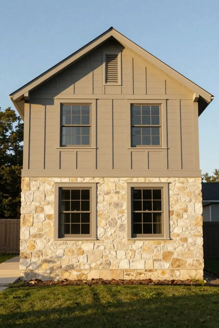
This warm greige on the siding reads very close to Sherwin-Williams Agreeable Gray, or maybe Benjamin Moore Revere Pewter and Behr Dry Dock. It’s that in-between neutral where beige meets gray, soft enough for a house exterior but with enough depth to hold up against stone. Folks like it because it doesn’t fight the natural materials around it.
The warm undertone keeps it from going too cold in shady spots, and it plays nice with tan stone bases or wood accents. Try it on a craftsman-style home where you want low upkeep that still looks put-together. Just test a sample in your light first.
White Exterior with Navy Trim
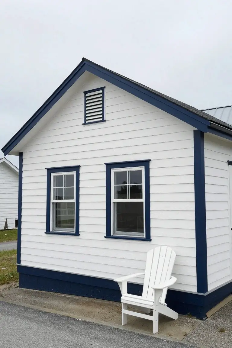
A clean white house like this one, trimmed out in deep navy blue, always looks sharp and pulled together. The body paint sits bright and crisp, reading closest to Sherwin Williams Extra White or Benjamin Moore Simply White. For the trim, it has that rich navy feel of Sherwin Williams Naval or Behr’s Midnight Blue. Folks like this combo because it stays fresh year round without much fuss.
The navy pulls a bit cool in most lights, which keeps the white from going yellow. It works best on smaller homes or cottages near water, where the contrast shows up nice. Stick to wood tones or black accents nearby, and skip busier colors that might fight it.
Navy Blue House Walls
This house uses a deep navy blue paint that seems closest to Benjamin Moore’s Hale Navy or Sherwin-Williams Naval. Sometimes Farrow & Ball’s Hague Blue fits too. It’s the kind of rich blue in the navy family that feels solid and timeless on older homes. People go for it because it hides dirt well and makes white trim pop.
That cool gray undertone keeps it from going too bright in sunlight. It suits shady streets or overcast areas best. Notice how the black railing and plants work right with it… simple pairings like that keep things looking sharp. White windowsills finish it off clean.
Soft Sage Green Siding
This exterior pulls off a soft sage green that reads very close to Sherwin Williams Retreat or Benjamin Moore Saybrook Sage. Behr’s Silver Sage sits right there too. It’s that gentle green with a bit of gray in it. Folks like how it feels calm and ties right into the yard without shouting.
The warm undertone keeps it from going too cool in shady spots. White trim pops clean against it, and those wood shutters in the same shade add some texture. Try it on a ranch-style house where you want low-key charm that ages well.
Warm Beige Walls
This warm beige on the stucco walls looks closest to Sherwin-Williams Accessible Beige or Benjamin Moore Edgecomb Gray, maybe Behr’s Toasted Wheat too. It’s a solid neutral that sits easy next to wood tones. People go for it because it freshens up the whole house without overpowering anything.
Warm undertones keep it from going flat in bright light. Best on sunny sides or milder spots. Darker trim on doors and simple plants nearby make it pop just right.
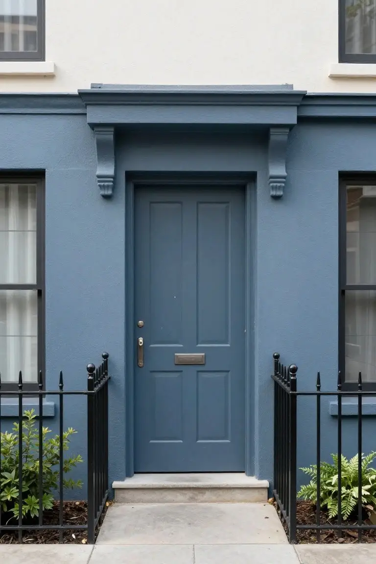
Soft Mauve Exterior
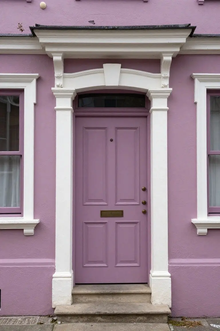
This soft mauve house paint reads very close to Sherwin-Williams Socialite, Benjamin Moore Wisteria, or Farrow & Ball Cinder Rose. It’s a muted purple with rosy warmth that freshens up older homes without going overboard. Folks like it for that subtle pop on brick streets or quiet neighborhoods.
The pink undertone shines in morning or late light, keeping it from feeling cold. It pairs easy with white trim and brass details, like on this door. Best on south-facing spots, though. North sides might need a test swatch first.
Soft Gray Siding
This soft gray covering the house body looks closest to Sherwin Williams Sea Salt or Benjamin Moore Gray Owl, maybe Behr Dolphin Fin too. It’s a light cool gray in the coastal family that stays neutral without going too blue. Homeowners pick it for that clean backdrop it gives plants and paths.
The subtle blue undertone keeps it from feeling stark, especially under overcast skies. White trim sets it off clean, and a bright orange door like this adds real pop. Try it on ranch styles or anywhere you want low-key modern.
Soft Sage Green Siding
This soft sage green paint on the clapboard siding looks closest to Sherwin-Williams Clary Sage. Benjamin Moore Saybrook Sage or Behr Silver Sage read very close too. It’s a muted green in the sage family, with gray undertones that tone it down nicely. Folks like it because it feels fresh but settled in, especially next to stone foundations like this one.
The gray keeps it from going too yellow in bright sun. It works best on cottages or farmhouses, paired with dark roofs and natural wood trim. Watch for north-facing spots where it might lean cooler. Simple update that lasts.
Frequently Asked Questions
Q: How do I test these colors on my house before painting the whole thing? A: Paint large sample patches right on the siding or use big foam boards propped up outside. Check them from the street and yard at different times of day. You’ll see quick which one flatters your home’s shape and light.
Q: What colors work best with brick or stone accents? A: Pick soft neutrals like warm beige or light gray to let the brick shine. They wrap around the texture nicely without clashing. Steer toward earth tones for that pulled-together feel.
Q: Do lighter colors really hide dirt better? A: Mid-light shades like creamy off-whites or soft taupes shrug off dust way better than pure white. Darker ones grab every speck of pollen. And they stay fresh looking longer on kid-filled homes.
Q: How do I pick a color that won’t date my house in five years? A: Lean into timeless picks from the list, like navy or sage, over super trendy neons. Test them against your roof and doors first. Your gut will guide you to the keeper.