

I’ve noticed how white trim on house exteriors can make or break that crisp look depending on the siding color you pair it with. Sunlight plays tricks outdoors, warming some whites in the afternoon while others stay cool and sharp from dawn till dusk.
I once tested a few siding samples on my own fence and saw one turn unexpectedly creamy against the trim, which killed the brightness I wanted.
Colors with subtle clean undertones tend to work best because they let the white trim lead without clashing in real weather. Some of these are worth sampling in your own yard.
Light Blue Siding
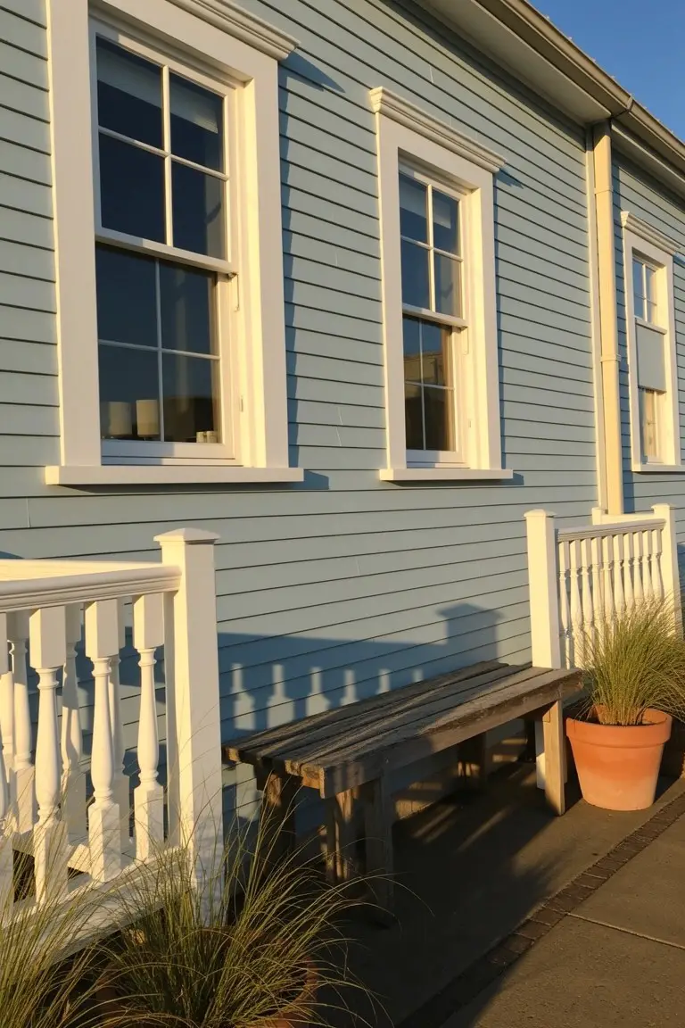
This light blue siding reads very close to Sherwin-Williams Rain or Benjamin Moore’s Gray Wisp. It’s a soft cool blue in the gray family that keeps things fresh without going too bold. Folks like it for exteriors because it pairs so clean with white trim around the windows. Makes the whole house feel brighter.
The gray undertone helps it settle nicely in different lights. Best on coastal style homes or anywhere with good sun. Stick to simple wood benches or potted grasses nearby. It can look flat in heavy shade though.
Warm Creamy Beige Siding
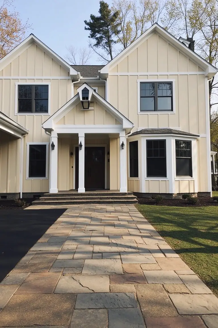
This warm creamy beige on the siding works so well with crisp white trim. It looks closest to Sherwin-Williams Alabaster, Benjamin Moore White Dove, or Behr Swiss Coffee. That kind of soft neutral feels easy on the eyes and gives the house a clean, lived-in look without going too yellow or gray.
The warm undertones keep it from washing out in shady spots. It pairs nicely with stone paths and dark driveways. Just test a sample on your own house first, since siding can shift a bit in different light.
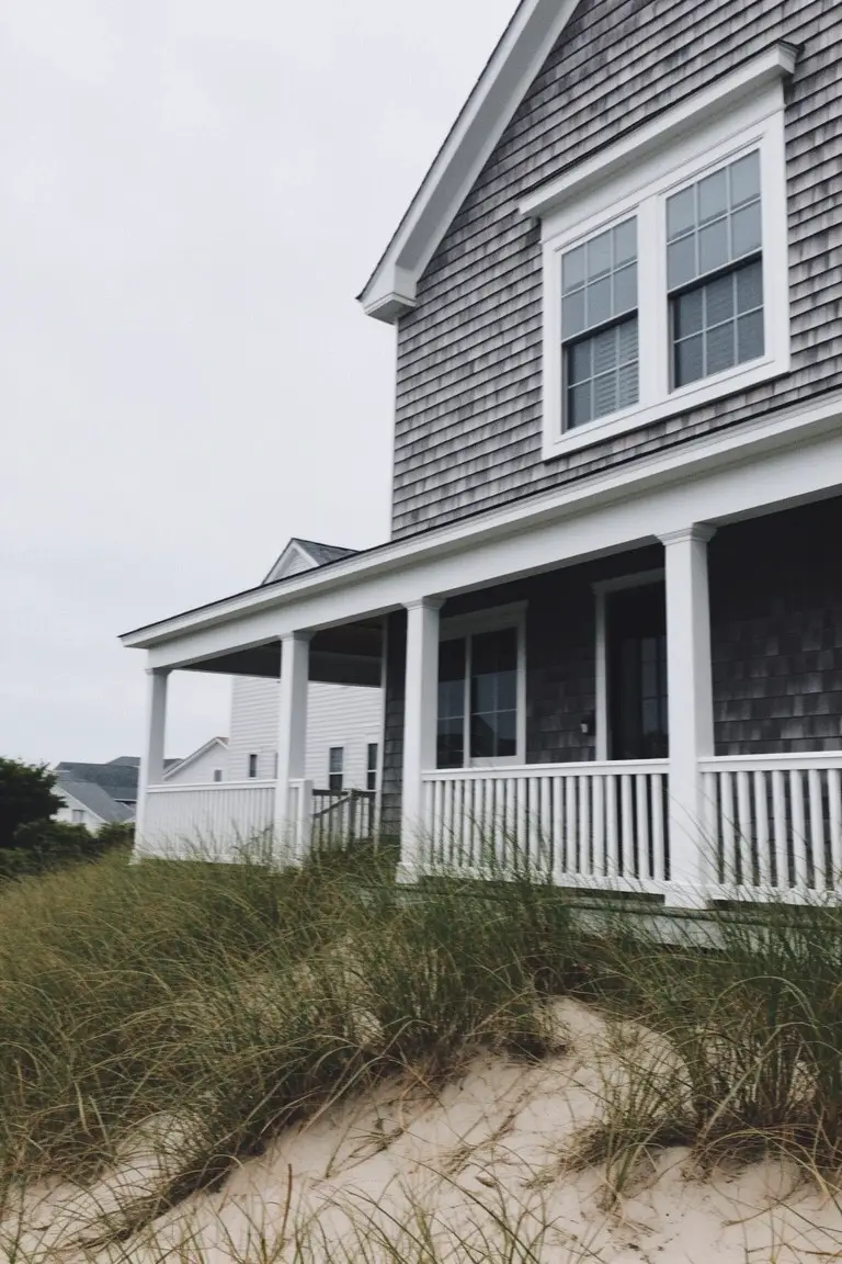
Deep Navy Siding
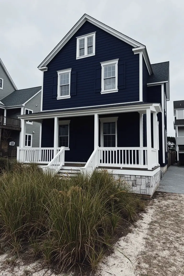
This deep navy blue on the clapboard siding reads very close to Sherwin-Williams Naval or Benjamin Moore Hale Navy. Maybe Behr’s Abyss too. It’s a strong blue that’s not quite black. People go for it because the white trim jumps out crisp and clean against it. Gives the house real presence without trying too hard.
Cool undertones make it hold up in bright light. Best on coastal homes or traditional styles like this one. Pair it with white rails and columns. Keep doors a warm wood tone if you can. Just test samples outside first… navy can shift a bit in shade.
Classic Barn Red Siding
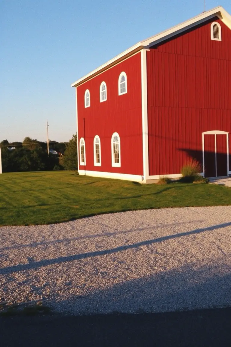
This barn-style exterior uses a bright barn red on the main siding. It has that same feel as Behr Barn Red or Sherwin-Williams Reddened Red, maybe Benjamin Moore Caliente too. Folks like it because the color pops without overwhelming, especially with those white-trimmed arched windows keeping things crisp and clean.
The warm red undertones read softer in afternoon light. It suits farmhouses or rural homes best, where it pairs naturally with green lawns and gravel paths. Just watch it doesn’t clash if your stonework pulls too gray. White trim makes the whole thing feel fresh.
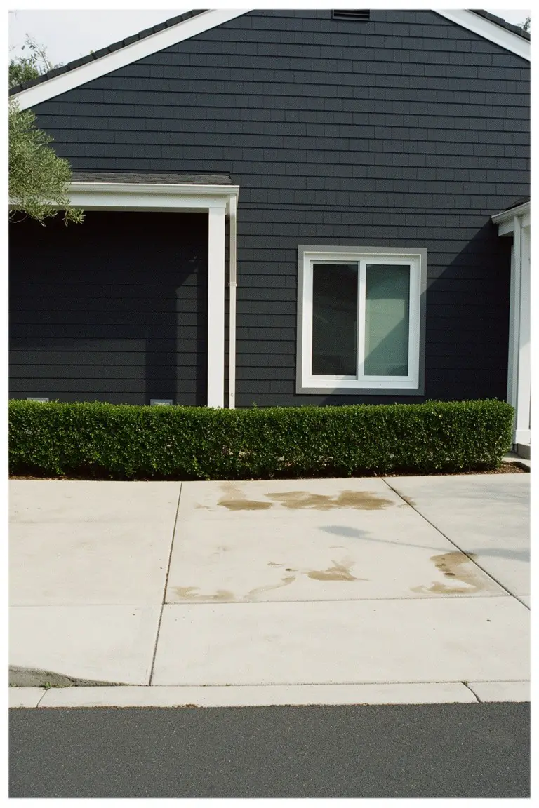
Charcoal Gray Siding
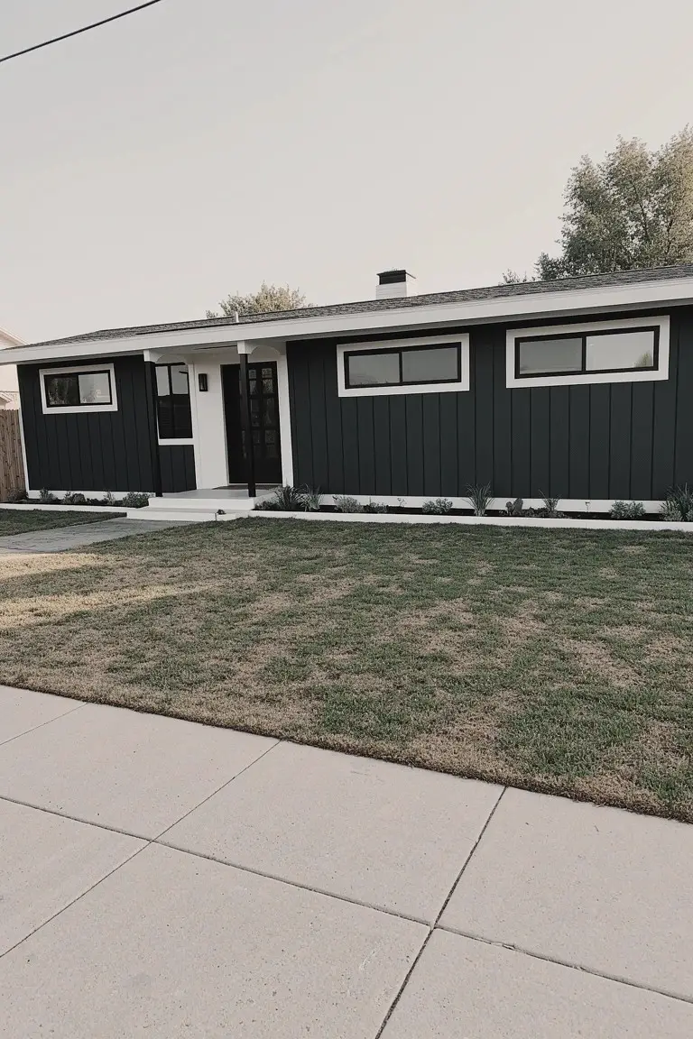
This deep charcoal gray on the siding looks closest to Sherwin-Williams Iron Ore or Benjamin Moore Kendall Charcoal. Sometimes it reads almost black in the shade. It’s a cool dark gray that works well for a clean, modern house front. The white trim stands out sharp against it.
Cool undertones make it hold up under different lights without shifting too much. It suits ranch homes or midcentury styles best. Pair it with white trim and simple landscaping. Just test a sample first, since it can look darker up close.
Pale Sage Green Siding
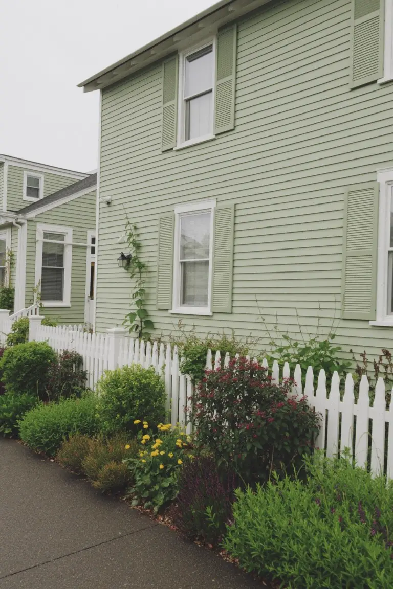
This pale sage green on the siding gives a fresh cottage look that pairs perfectly with white trim. It seems closest to Sherwin-Williams Clary Sage, Benjamin Moore Saybrook Sage, or Behr Silver Sage. Folks go for it because it’s calm and easy on the eyes. Not too bright. Just right for an older home feel.
That gray undertone keeps it grounded. Works best in shady spots or cooler climates where it won’t wash out. White shutters and fences pop against it. Plants in the yard blend right in too. Watch the north light though. It can read a bit cooler there.
Warm Taupe Siding
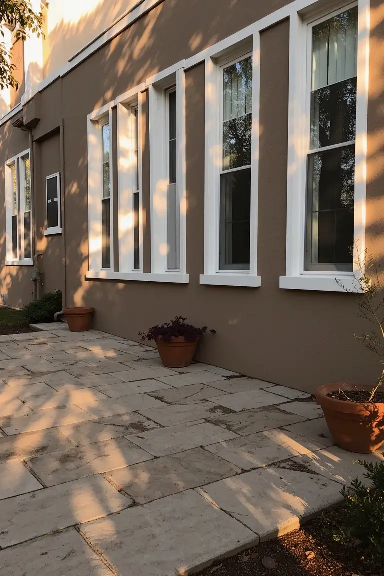
This exterior pulls off a warm taupe on the siding that reads very close to Sherwin-Williams Agreeable Gray or Benjamin Moore Revere Pewter. Maybe Behr’s Mushroom Buffet too. It’s a solid greige, that gray-beige mix folks keep coming back to. The white trim windows pop right against it, keeping things fresh and clean.
Warm undertones make the taupe feel cozy, not stark. It sits nice next to the stone pavers and those terracotta pots. Best on a house with some southern light. Pair it with greenery out front… avoids looking muddy.
Deep Navy House Body
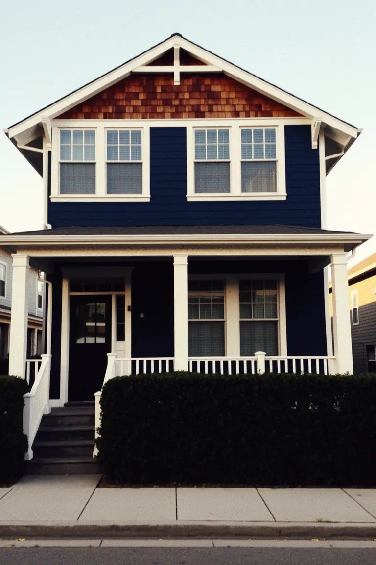
This exterior uses a deep navy blue on the main body that stands out nicely against the white trim. It looks closest to Sherwin Williams Naval or Benjamin Moore’s Hale Navy, maybe even Behr’s Indigo. That shade of navy feels solid and classic. It gives the house real presence without overwhelming the street view.
The cool gray undertones help it hold up in different lights. You see it here with cedar shakes up top, which warm things up a bit. Pair it with white trim like this for crisp lines, and it works on most any style home, just watch it doesn’t look too heavy on a small facade.
Soft Blush Pink Siding
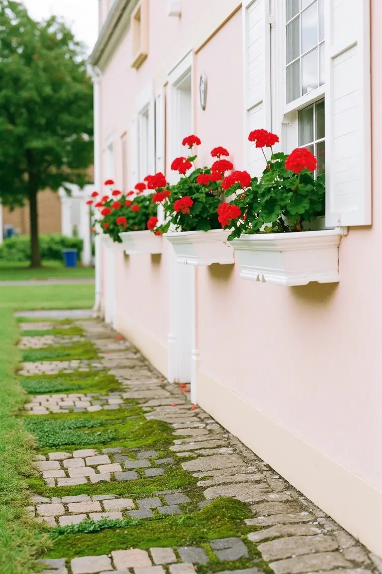
This soft blush pink on the house siding works great with white trim for that crisp look. It sits in the pale pink family, reading closest to Sherwin-Williams First Light or Benjamin Moore First Light. Behr’s Dream Pop comes pretty near too. Folks like it because it’s subtle. Not too bold. Just enough color to feel fresh on an older home.
The warm rosy undertone holds up in soft light. Pairs easy with greenery or those red geraniums in window boxes. Watch for north-facing spots though. It can pull cooler there. Stick to south or east sides for the best glow.
Deep Black Siding
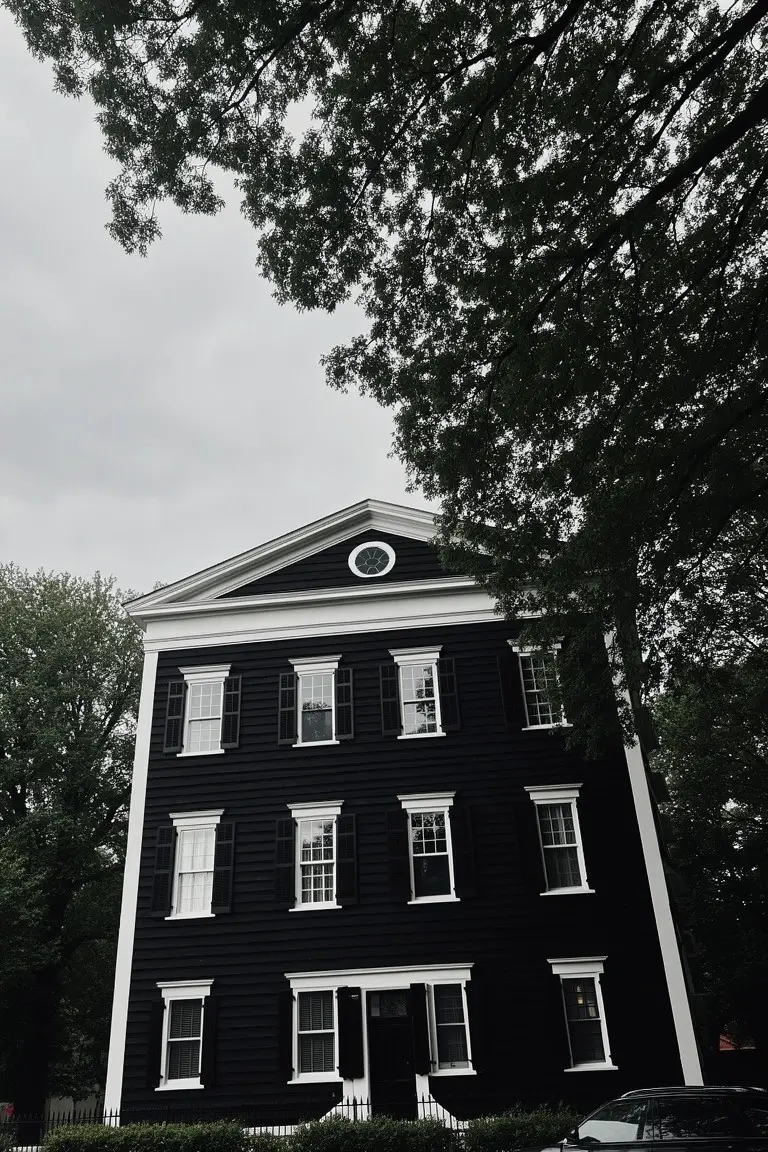
This siding paint is a deep, true black that looks closest to Sherwin-Williams Tricorn Black or Benjamin Moore Onyx. Or maybe Behr Black 3600-2 if you’re matching at a big box store. It’s the kind of black that feels solid and straightforward, not charcoal or navy pretending to be black. What stands out is how it makes the white trim really sharp and clean, like on this classic house with its tall windows.
The black sits neutral, no strong undertones pulling warm or cool. It works best on older style homes where you want that high contrast without fuss. Pair it with plain white trim and let green trees or brick paths add the life around it. Just test in your light first, blacks can shift a touch.
Muted Sage Green Siding
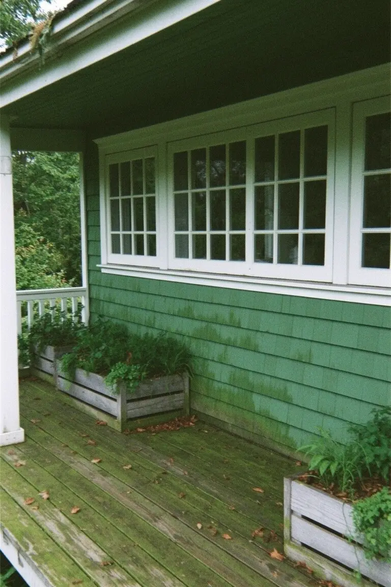
This muted sage green on the shingle siding looks closest to Sherwin-Williams Contented or Benjamin Moore Saybrook Sage, and it reads a lot like Behr’s Silver Sage too. It’s a soft green from the sage family, not too bright or bold. Folks go for it because it sits quietly against white trim and makes the house feel at home in a wooded spot.
That cool gray undertone keeps it from going too yellow in shady light. It works best on exteriors like this porch setup, paired with plain white windows and wood decking. Just test a sample first, since it can shift a bit on damp siding.
Cool Gray House Body
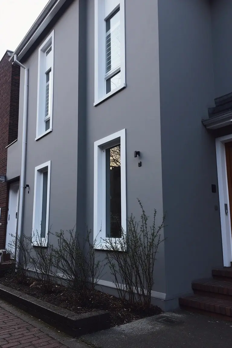
This house uses a cool medium gray for the siding that seems closest to Sherwin-Williams Repose Gray or Benjamin Moore Gray Owl. Behr’s Silver Screen reads pretty similar too. It’s the kind of straightforward gray that makes white trim stand out nice and clean. Folks like it because it feels modern without trying too hard.
The cool undertone keeps it fresh, especially next to brick or wood accents like that orange door. It shows up best on north-facing sides or cloudy days. Just pair it with warmer elements inside to balance things out.
Pale Yellow Siding
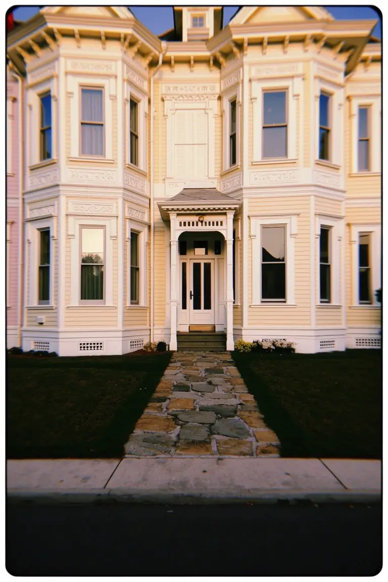
This siding shows a pale yellow paint that’s soft and warm. It seems closest to Sherwin-Williams Parchment or Benjamin Moore Cloud White, maybe Behr Rice Paddy too. That gentle yellow keeps things bright without going bold. The white trim stands out nice and clean against it, like on this older house.
The color has a bit of golden undertone. It looks good in morning or evening light… holds up well all day. Try it on Victorians or craftsman styles. White trim is perfect. Add stone or plants nearby to settle it in. Avoid pairing with too much gray, though.
Pale Mint Green Siding
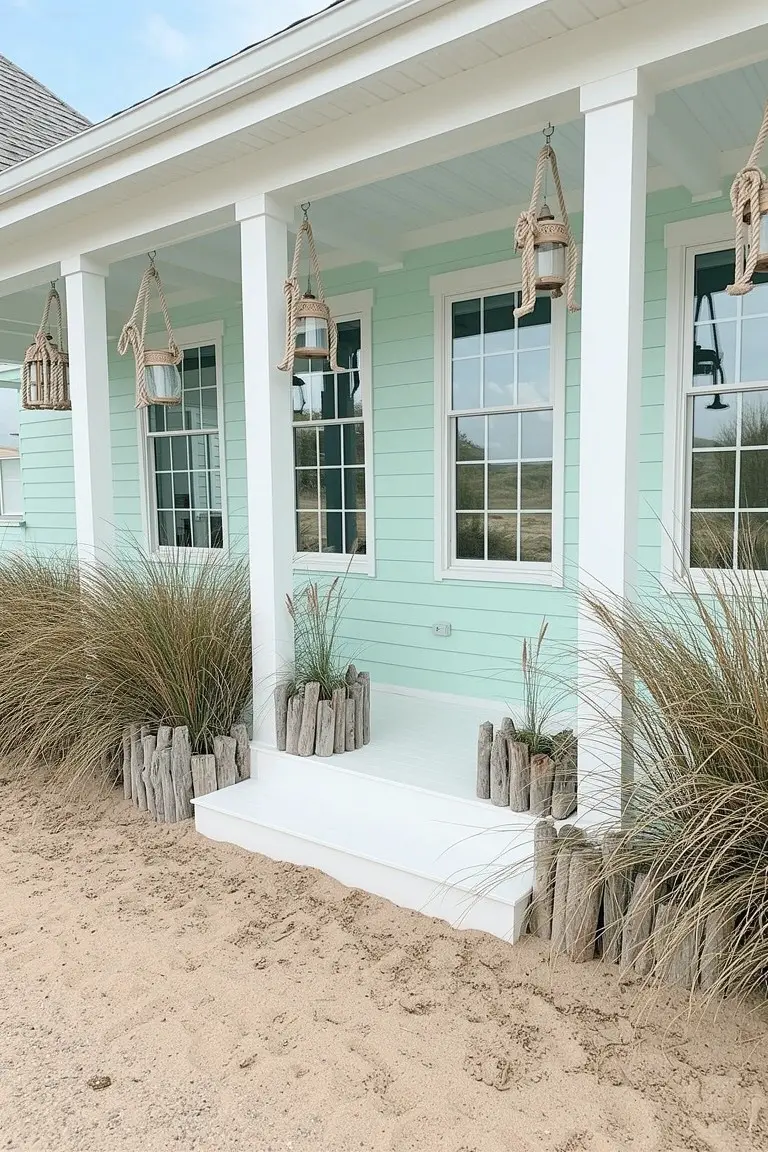
This pale mint green on the siding looks closest to Sherwin-Williams Sea Salt, Benjamin Moore Saybrook Sage, or Behr Whipped Mint. It’s a soft pastel in the cool green family, light enough to stay crisp next to white trim but with just enough color to nod to the beach. Folks like it because it feels clean and relaxed, not overpowering.
That cool blue undertone shines in sunny spots, picking up warmth from sand or driftwood accents. It pairs easy with white porch posts and natural plantings. Steer clear of heavy shade though. It can pull gray there.
Deep Green Exterior Siding
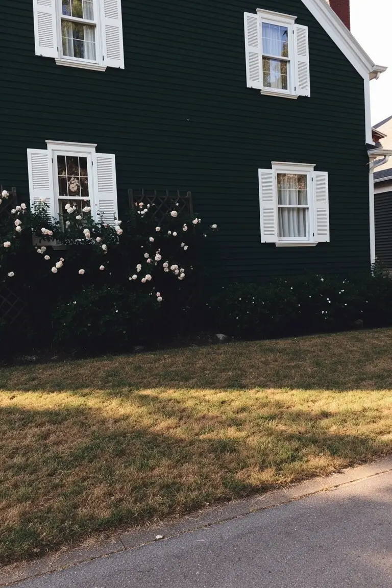
This siding paint pulls from the deep forest green family. It looks closest to Sherwin-Williams Pewter Green or Benjamin Moore Black Forest Green, maybe Behr’s Back to Nature too. That rich shade stands out against the white trim, giving the house a grounded, classic feel without going too bold.
The green has a warm earthy undertone. It sits nicely next to plants like those climbing roses. Try it on older clapboard homes in good sunlight. White trim keeps it crisp. Just test samples first, since it can shift a bit in shade.
Pale Yellow Siding with White Trim
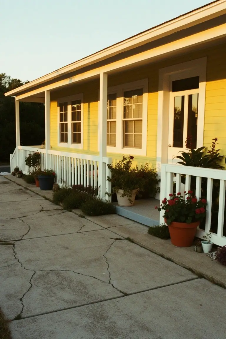
This pale yellow siding looks closest to Sherwin-Williams Honey Bee or Benjamin Moore Pale Yellow. It’s a soft warm yellow that stays light and crisp next to the bright white trim. Folks like it because it freshens up a simple house without overwhelming the yard or plants nearby.
The golden undertone picks up nicely in afternoon light. It works best on porches like this, where white railings keep everything sharp. Pair it with greenery in pots, but skip dark shutters, they might fight it a bit.
Soft Gray Shingle Siding
This soft gray on the shingle siding looks closest to Sherwin-Williams Repose Gray or Benjamin Moore Stonington Gray. It’s a cool neutral gray that sits just right with bright white trim. People like it because it keeps the house looking sharp and timeless, especially in beachy spots. The white pops clean against it.
That gray has a subtle blue undertone, which comes alive in overcast light. It works great on exteriors near dunes or water. Pair it with white railings like this, maybe some wood shutters. Watch the trim though. It needs to stay really crisp white or the look fades.
Deep Navy Siding
This exterior pulls off a deep navy blue on the siding that seems closest to Sherwin-Williams Naval or Benjamin Moore Hale Navy, maybe even Behr’s Abyss. It’s a cool-toned navy, not too bright but rich enough to make white trim pop crisp and clean. Folks like it for that sharp contrast without going overboard.
The gray undertone shows up more on cloudy days, keeping things balanced. Pairs nice with stone accents or simple plants like here. Best on bigger homes where it won’t overwhelm.
Warm Terracotta Walls
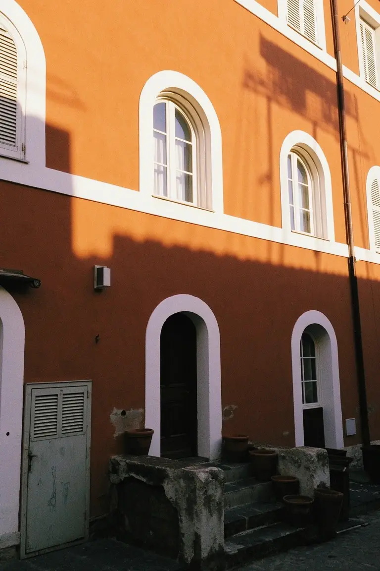
This terracotta body paint pulls a cozy orange-red warmth right off older European homes. It seems closest to Sherwin-Williams Reddened Earth or Benjamin Moore Potters Clay, with Behr Spiced Cider reading pretty similar too. Folks go for it on exteriors because it holds up against white trim without washing out, especially around those rounded window frames.
Warm red undertones make it glow in good light. It works best where you get some sun, paired with stone steps or simple pots. North sides can mute it a touch, so test a sample there first.
Soft Blue-Gray Siding
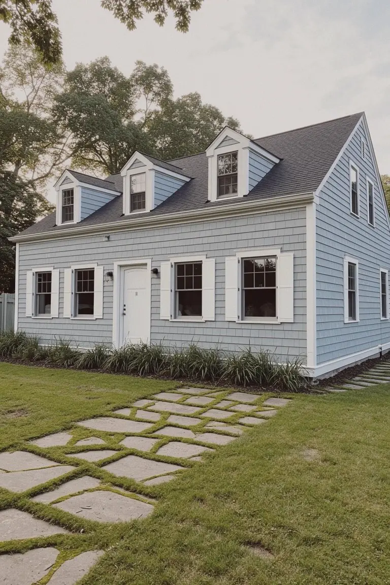
This soft blue-gray on the clapboard siding looks closest to Benjamin Moore’s Palladian Blue or Sherwin-Williams Rainwashed. Sometimes Behr’s Blue Whisper hits a similar note. It’s a cool gray with just enough blue to feel coastal but not beachy. Homeowners go for it because the white trim pops right against it. Keeps the whole look clean and not too stark.
That blue undertone comes out more on sunny days. North sides might read grayer, so test samples there. It suits older homes like this Cape style best. White trim is a must. Black roof or shutters add nice contrast without fuss.
Crisp White Trim on Stone
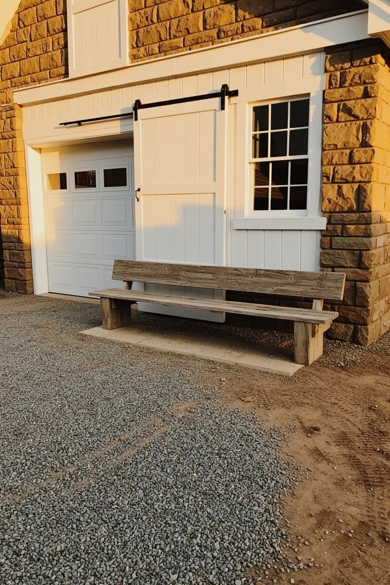
Crisp white trim like this keeps things looking sharp and clean. It reads very close to Sherwin Williams Extra White or Benjamin Moore Chantilly Lace, maybe Behr Ultra Pure White too. Folks like it because it brightens up the whole facade without overpowering the stone underneath.
That neutral white sits just right next to warmer stone and wood. It works best on garages or barns where you want light to bounce around. Pair it with gravel or natural benches… stays fresh year round.
Pale Pink Siding
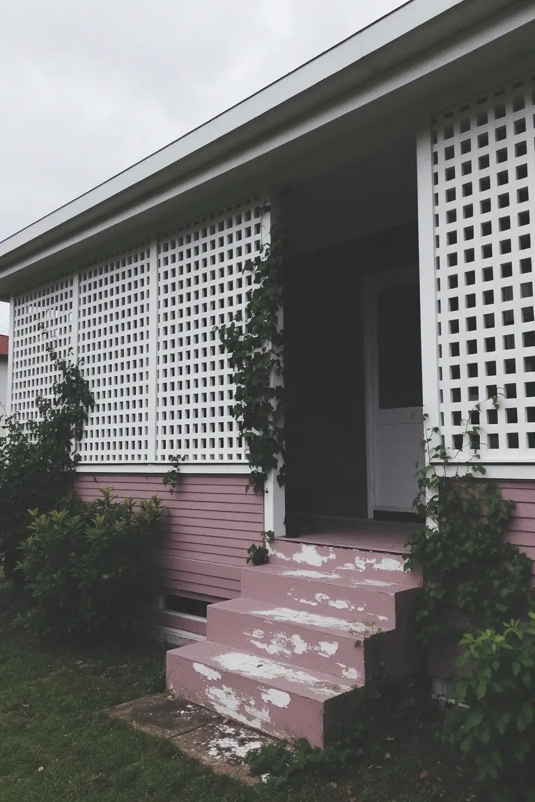
This pale pink on the house siding is a soft blush shade that feels just right for a cozy exterior. It reads very close to Sherwin-Williams First Light or Benjamin Moore Blush, with Behr’s Powder Blush in the same family too. Folks like it because it keeps things light and fresh next to all that white trim, without going too bold.
The color has a dusty warm undertone that holds up okay in softer light. Notice how it works with the climbing vines and white lattice here. It suits older cottages or bungalows best, paired with crisp white on doors and railings. Just watch for fading on steps like these.
Charcoal Gray Siding
This siding shows a deep charcoal gray that makes the white trim stand out sharp and clean. It looks closest to Sherwin-Williams Iron Ore or Benjamin Moore Kendall Charcoal, maybe Behr Cracked Pepper too. That kind of dark gray gives a house solid presence. Folks go for it since it handles weathering okay and lets lighter elements breathe.
You can spot a cool undertone here, especially next to the white frames. It suits straightforward exteriors like this one, best in areas with decent light so it doesn’t read too flat. Pair it with pure white trim, and skip busy landscaping right up against it.
Soft Green House Siding
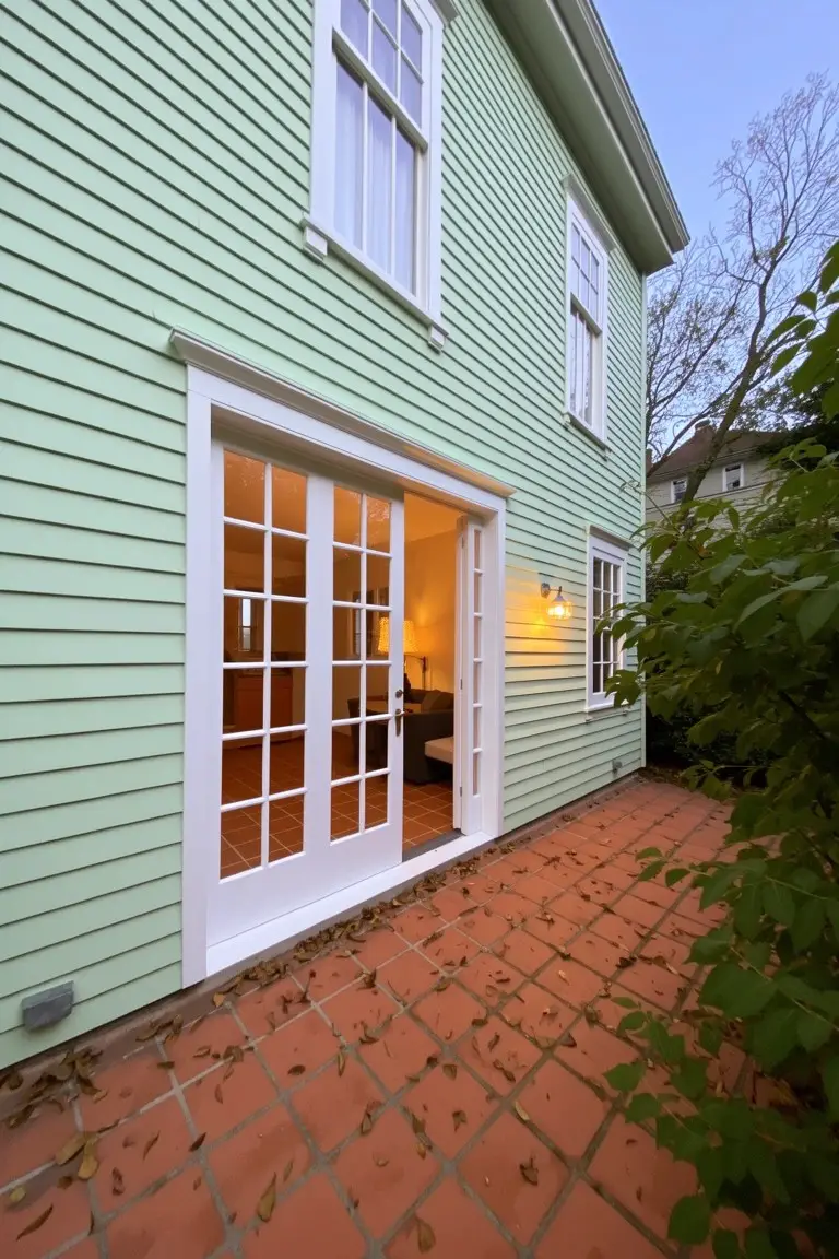
This soft green on the siding looks closest to Sherwin-Williams Sea Salt or Benjamin Moore Saybrook Sage, maybe even Behr’s Back to Nature. It’s a pale green with just enough mint to feel fresh and easy on the eyes, especially next to crisp white trim on the doors and windows. Folks like it because it brightens up older homes without going too trendy.
That subtle cool undertone shows up nicely in the later light here, opening right onto a patio. It works best on south or west sides where it stays lively. Pair with warm brick or plants to keep things grounded… just watch it doesn’t fade too much in full sun over time.
Pale Yellow Siding
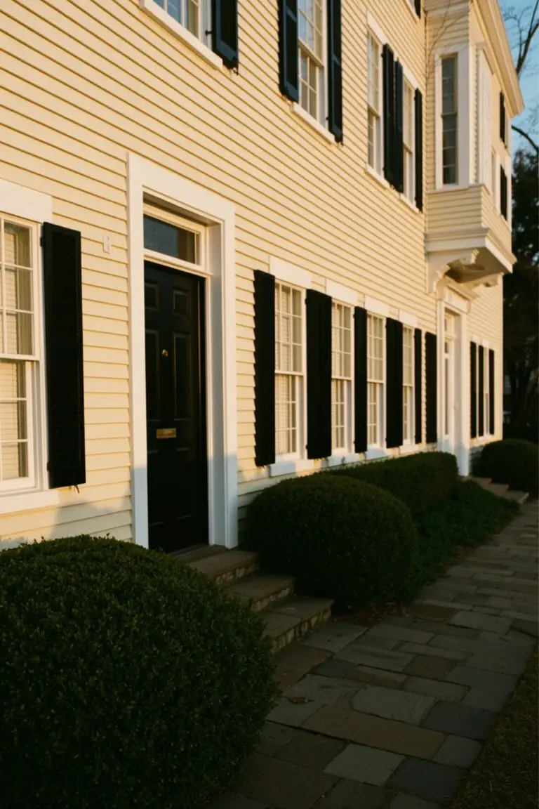
This siding paint pulls off a soft pale yellow that’s fresh and easy on classic homes. It sits in that warm yellow family and looks closest to Sherwin Williams Creamy (SW 7012), Benjamin Moore Cloud White (OC-130), or Behr Rice Porridge. Folks like it because it brightens things up without feeling cold or too bold, especially next to dark trim.
The golden undertone shows best in soft light, like on an older place with clapboard. It works well with black shutters or doors for punch, or white trim to stay crisp. Watch it on north-facing spots though… might read a touch greener there.
Frequently Asked Questions
Q: Does white trim go with a dark gray house?
A: White trim adds that crisp contrast dark gray craves. It makes the house pop without clashing. Pair it with black accents for extra punch.
Q: How do I stop white trim from yellowing in the sun?
A: Choose a high-quality exterior paint with UV protection. Prep the surface right by cleaning and priming well. Refresh every few years to keep it bright.
Q: Is bright white trim too stark for a cozy Craftsman home?
A: Bright white keeps the style fresh and clean. It highlights those classic lines nicely. Soften it with warm siding tones like beige.
Q: What’s quick to clean white trim after a storm?
A: Grab mild soap and a soft brush. Rinse with the hose. Dry spots fast to avoid streaks.