

I’ve noticed how a smart trim color can lift a house exterior from ordinary to noticeable, especially when it contrasts just right with the siding.
One time I tried a navy that looked crisp in the store, but it turned muddy in the late afternoon shade on my test board. Colors succeed outdoors when they borrow a hint of warmth or coolness from the main body paint, avoiding that flat, mismatched feel.
You’ll find trim shades here that handle shifting light well and add real pop to everything from craftsman bungalows to modern farmhouses. Test them large on your house first.
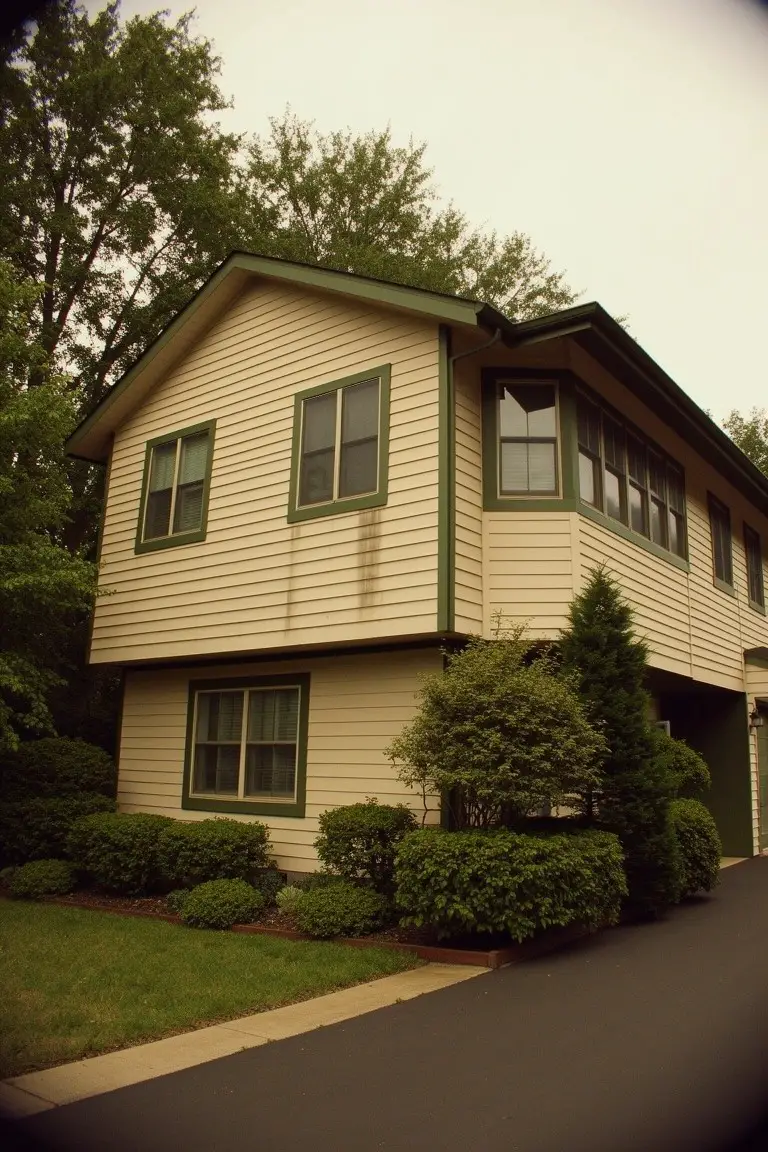
Charcoal Gray with White Trim
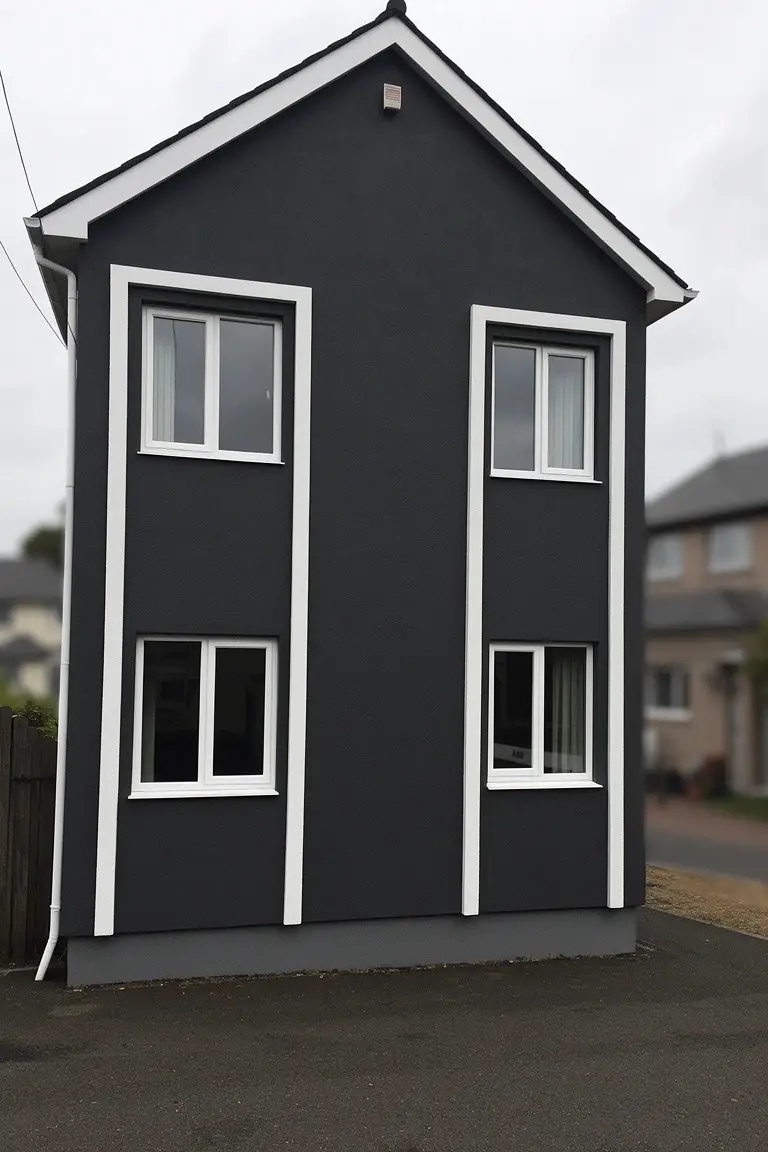
This charcoal gray siding reads very close to Sherwin-Williams Iron Ore or Benjamin Moore’s Kendall Charcoal. It’s a deep, cool gray that gives the house a sleek, modern feel without going all the way to black. What stands out is how it makes the white trim pop so nicely around those tall windows.
The cool undertone keeps it from feeling too heavy, especially on overcast days like this. It works best on simpler shapes like this narrow build, paired with bright white trim. Just watch it might show dirt more on the lower edges, so lighter grays could suit busier spots.
Crisp Black Trim
The trim on this house looks like a straightforward true black. I’d say it reads very close to Sherwin-Williams Tricorn Black or Benjamin Moore Onyx, maybe Behr’s Black too. That kind of black gives the windows, shutters, and door a clean sharp edge. It stands out nice against warmer house colors without feeling too heavy.
The neutral undertone keeps it from pulling brown or blue. It works best where you want contrast, like next to beige siding or brick. Pair it with soft landscaping. Just watch it in full shade, might look a touch softer there.
Turquoise Door Trim
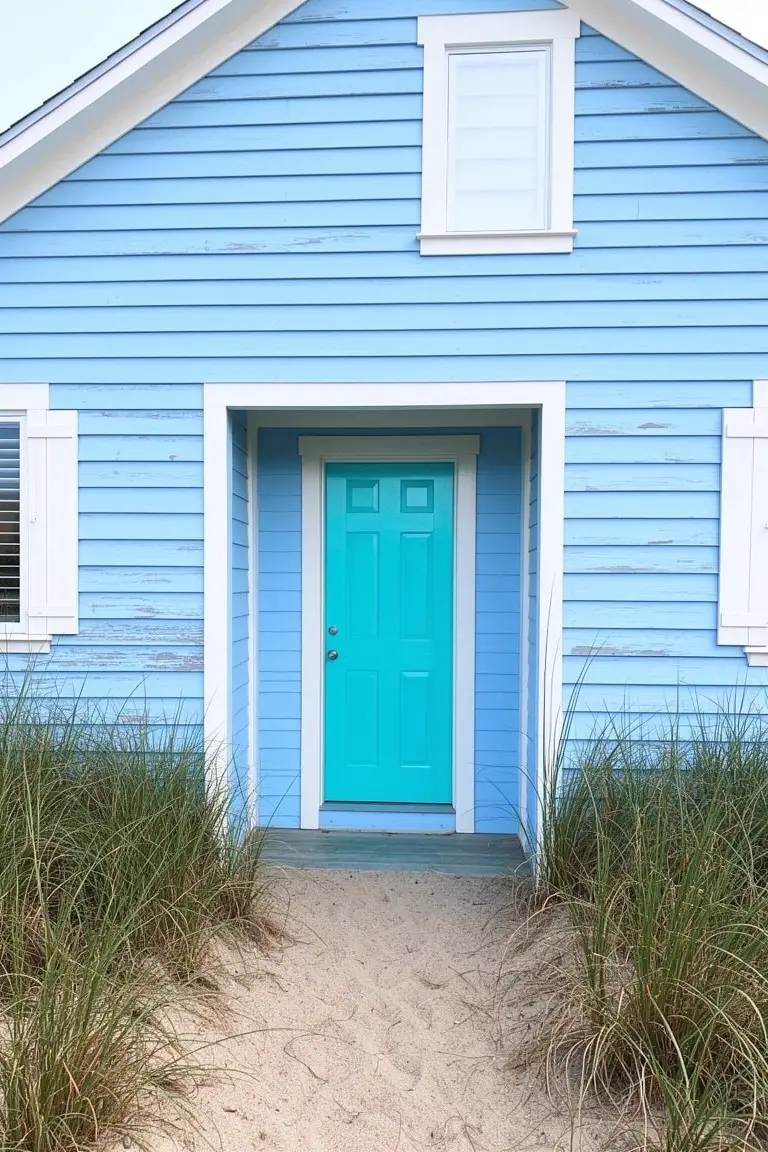
This front door shows off a bright turquoise paint that’s full of life. It’s that lively blue-green family, and it comes closest to Sherwin-Williams Overboard or Benjamin Moore Breton Blue. Behr’s Tropical Teal reads very similar too. Folks go for it because it jumps right out against pale house colors like the soft blue siding here, giving the whole exterior some easy energy.
The cool green undertone keeps it fresh, especially near the beach or in good sunlight. It works best with crisp white window trim and weathered wood details. Just pair it carefully with warmer grays, or it might feel a bit chilly on overcast days.
Deep Green Trim
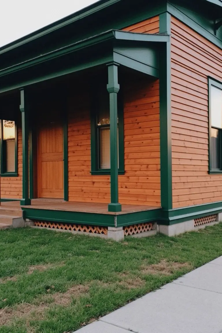
This trim paint is a deep, rich green that looks closest to Sherwin-Williams Rookwood Green or Benjamin Moore Essex Green. Behr’s Deep Emerald reads pretty similar too. It’s got warm undertones that play right off the orange wood siding, making the whole house look pulled together without trying too hard.
That warmth keeps it from feeling cold, even on overcast days. It suits older homes with wood exteriors best, like Craftsman styles. Stick to natural siding colors underneath and lighter doors to let the green really show.
Crisp Black Trim

The trim on this house pulls off a deep, true black that seems closest to Sherwin-Williams Tricorn Black, Benjamin Moore Onyx, or Behr Black. It’s the kind of straightforward black that frames the soft yellow walls nicely and gives the whole place a sharp look. Folks go for it when they want contrast without much fuss.
No real undertones to worry about here. It holds steady in bright light, like on this sunny side. Pairs best with pale yellows or off-whites on the body. Just make sure your prep is solid so it doesn’t peel over time.
Deep Red Trim on Light Gray
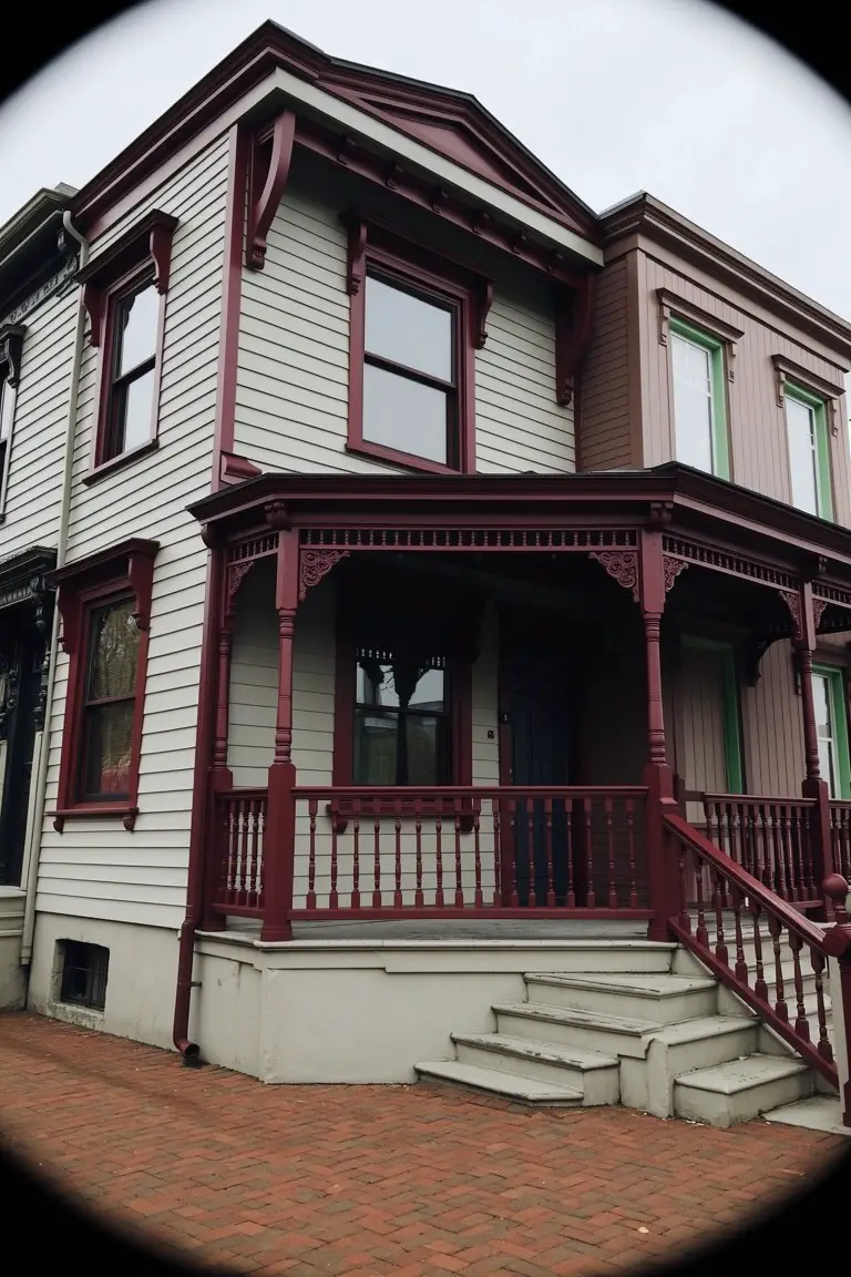
This deep red trim stands out nice and strong against the pale gray siding. It’s that warm burgundy red family, the kind that feels classic on older homes. Looks closest to Sherwin-Williams Rookwood Red or Benjamin Moore Black Forest, maybe Behr’s In the Reds too. People go for it because it pulls the eye right to the porch without overwhelming the whole place.
The warm undertones keep it from going too harsh in most light. Pair it with soft grays or beiges on the body, and it works great on Victorians or rowhouses. Just test a sample first. North-facing spots might read a touch darker.
Bold Black Trim
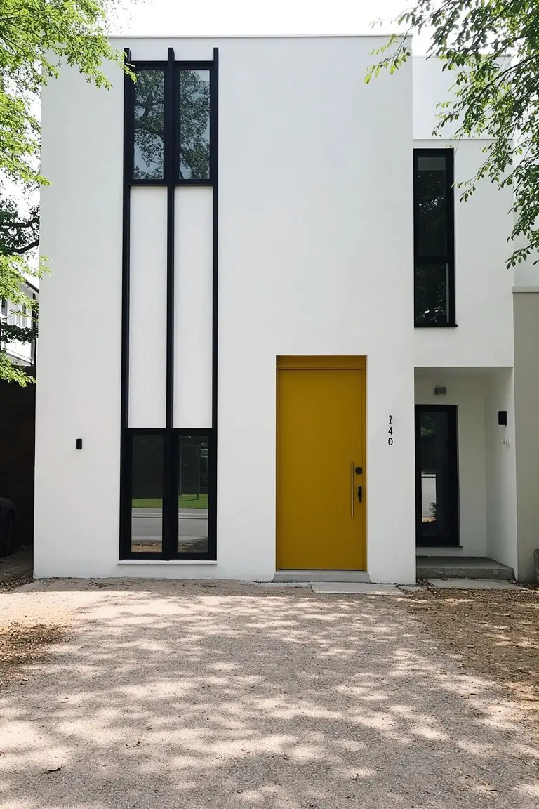
This trim pulls off a true black that stands out sharp against the white house body. It’s got that clean, modern edge people go for these days. Looks closest to Sherwin-Williams Tricorn Black or Benjamin Moore Onyx, maybe even Behr Black.
Those tall black lines next to the windows keep things simple and let the yellow door pop extra. Black like this works best in full sun where it stays crisp, not muddy. Pair it with plain white siding and skip busy stone or brick so it doesn’t fight the look.
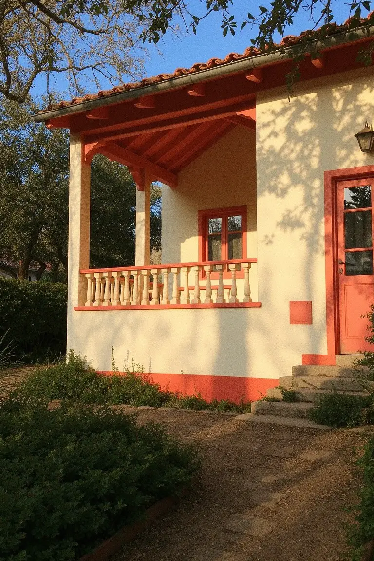
Warm Terracotta Trim
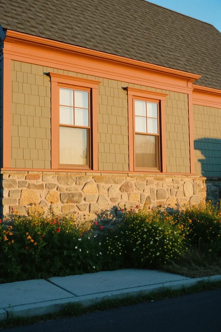
This trim pulls off a warm terracotta orange, right around Sherwin-Williams Spiced Cider or Behr’s Terracotta Flowerpot, maybe Benjamin Moore Potters Clay too. It’s that cozy red-orange family with real depth, the sort folks pick when they want something lively but settled. Stands out clean against the house siding here without stealing the show.
Warm undertones keep it from going brassy. Looks best next to stone or earthy plants like these. Go for it on craftsman or colonial styles, especially facing south for that sunset glow. Steer clear of stark whites, though, they can fight it.
Deep Navy Siding
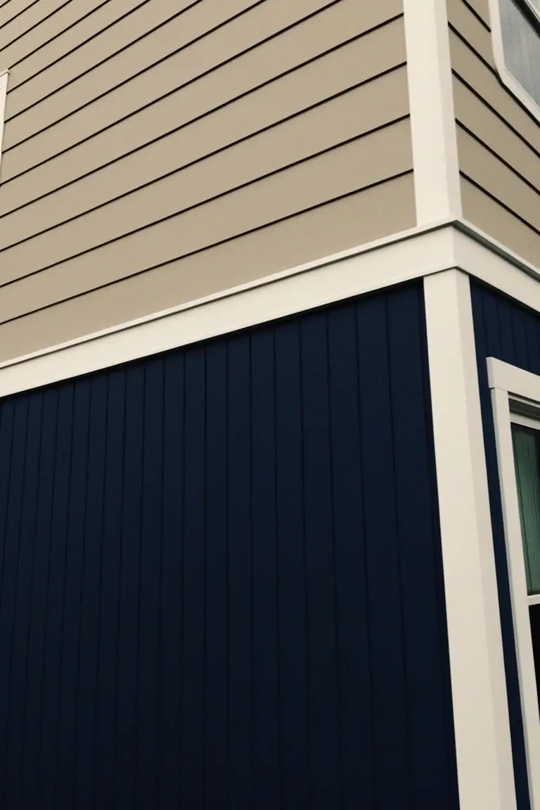
This deep navy blue on the lower siding seems closest to Sherwin-Williams Naval or Benjamin Moore Hale Navy, maybe Behr’s Polar Bear with a blue twist. It’s a solid, cool-toned navy that anchors the whole house without overpowering things. What stands out is how it lets the beige upper siding breathe and makes the white trim pop nice and clean.
The undertone stays true blue, not too purple or green, so it holds up in full sun or shade. Pair it with crisp whites on the trim and warm beiges up top, like they did here on the corner boards. It works best on bigger homes or two-stories where you want some weight down low. Just test a sample first, navies can shift a bit.
Pale Green Trim
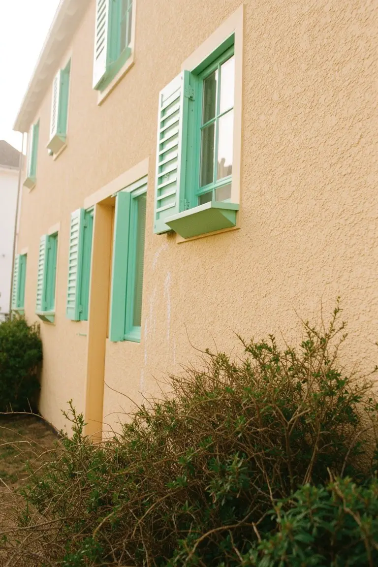
Pale mint green trim like the shutters here reads very close to Sherwin-Williams Sea Salt or Benjamin Moore Saybrook Sage, with Behr’s Soft Fern also in the mix. It’s a light cool green that stands out nicely on warmer house colors. People go for it when they want something fresh and lively, but not overpowering.
That blue-green undertone helps it stay crisp next to sandy beige siding. It works best in sunny spots or coastal areas, paired with stucco or brick. Watch it in shady yards though…might lean cooler than you think.
Black Trim on Wood Siding
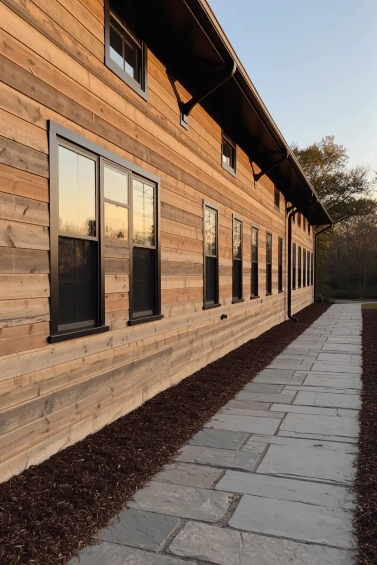
Black trim paints the window frames here, giving a sharp contrast to the warm wood siding. It’s a straightforward true black in the neutral family, something like Sherwin-Williams Tricorn Black or Benjamin Moore Onyx. Or maybe Behr’s Black. Folks like it because it keeps the wood feeling natural while adding that clean pop exteriors need.
No strong undertones to fight the light. It sits right next to stone paths and mulch without clashing. Best on houses with lots of wood or earthy tones… just test it in your own shadows first.
Rich Teal Front Door
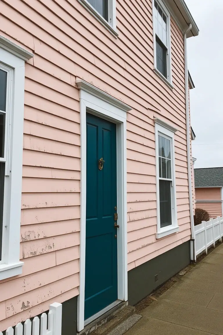
You can’t miss this rich teal door on a soft pink house. It reads very close to Sherwin-Williams Oceanside or Benjamin Moore’s Saybrook Sage, those deeper teals with a bit of green in them. Folks like it because it gives a pop without going overboard, especially against pale siding like this blush pink. Makes the entry feel fresh and a little unexpected.
The undertone here is cool blue-green, which plays well in overcast light or coastal spots. Pair it with white trim to keep things crisp, and it works best on houses with warm body colors like pinks or beiges. Just watch it doesn’t clash if your siding leans too cool… test a sample first.
Dark Charcoal Gray Trim

This house uses a deep charcoal gray for those tall vertical trim panels and roof accents. It reads very close to Sherwin-Williams Iron Ore or Benjamin Moore Kendall Charcoal. Behr’s Cracked Pepper would be another good match. What makes it work is how it pops against the light beige siding without overwhelming the whole look. It’s a strong neutral that gives modern townhomes some edge.
The gray here has a cool undertone. It holds up well in bright sun. Pair it with warm beiges or off-whites on the body, and keep windows crisp white. Avoid going too dark on small houses… might feel heavy. But on a row like this, it’s just right.
Warm Terracotta Trim
This trim paint pulls off a lively terracotta red-orange that looks closest to Sherwin-Williams Spiced Cider or Benjamin Moore’s Potters Clay. Behr’s Spiced Terracotta reads very close too. What stands out is how it jumps right off the soft cream walls. Homeowners go for it when they want trim with some punch but not overwhelming.
Warm undertones keep it friendly in bright light. It suits Southwestern-style homes or anywhere with stucco siding. Pair with pale beiges. Just test a sample first, since the orange can shift a bit on different roofs.
Soft Sage Green Trim
This trim pulls off a soft sage green that pops nicely against the pale beige house siding you see here. It reads closest to Sherwin-Williams Evergreen Fog, or maybe Benjamin Moore Saybrook Sage, Behr’s Back to Nature. What makes it work so well is how it adds that bit of nature without overwhelming the neutral body color. Homeowners go for shades like this when they want trim to stand out but still feel calm and easy.
The gray undertone helps it shift gently in different lights, staying muted instead of shouting. It pairs best with warm beiges or taupes on the main siding, and throw in some shrubs nearby to tie it together. Just watch it doesn’t clash if your house faces too much direct sun.
Crisp Black Trim
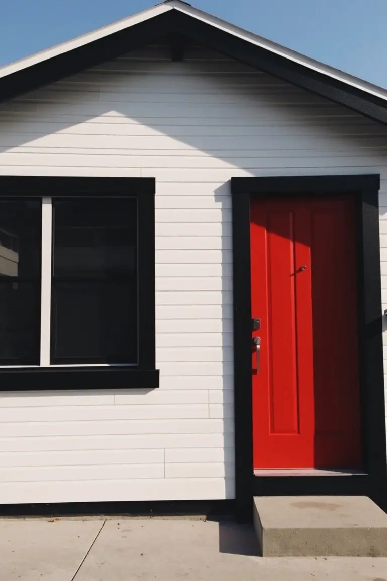
This trim is a true, no-nonsense black. It reads very close to Sherwin-Williams Tricorn Black or Benjamin Moore Onyx, maybe Behr’s Black too. On a white house like this, that deep black gives everything a sharp, modern edge without trying too hard. Folks like it because it makes the house look put-together right away.
Neutral undertones keep it from going muddy in different lights. Pair it with white siding and a punchy red door, and you’ve got contrast that lasts. Works best on cleaner styles, like a little farmhouse setup. Just test it on your trim first, shadows can shift things a bit.
Teal Trim on Brick Houses
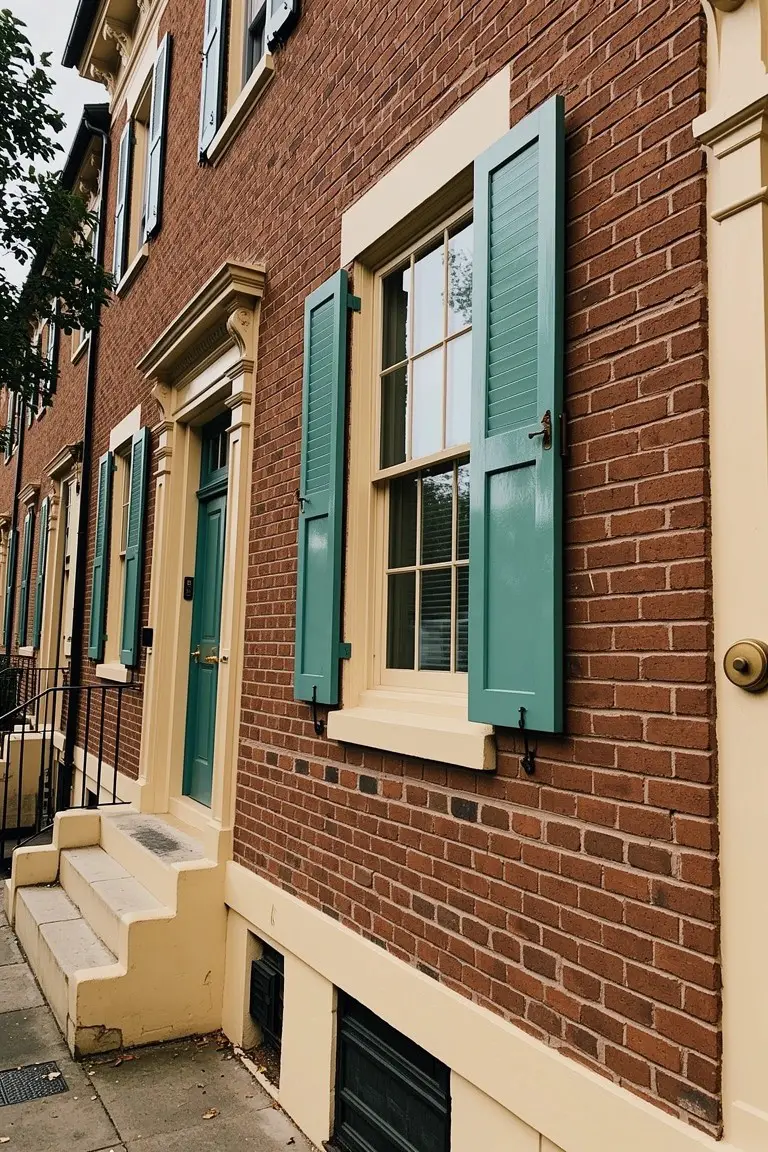
Those teal shutters you see here read very close to Sherwin-Williams Rain or Benjamin Moore Wythe Blue. It’s a solid blue-green in the mid-tone range. What makes it work so well is how it stands out crisp against red brick without overwhelming the whole look. Adds just enough color to notice.
The cool undertones keep it from going brassy in sunlight. Pairs easy with cream sills or yellow doors, like on these rowhouses. Try it on older brick homes where you want trim that pops but stays classic.
Frequently Asked Questions
Q: How do I test trim colors on my actual house before painting?
A: Paint big sample boards with your top picks and prop them near the corners or windows. Walk around at morning, noon, and evening light to catch how they shift. This quick step saves you from a full regret repaint.
Q: What if my siding is beige—any trim colors that always work?
A: Go for crisp white or soft black to make that beige siding shine without overwhelming it. Navy blue adds a fresh punch too, especially on sunny sides. Stick to one strong contrast for clean lines.
Q: Can bold trim colors like red work on a neutral house?
A: Bold reds pop hard on grays or whites, but paint just the accents like shutters or doors. Tone it down with a matte finish so it grabs eyes without screaming. Your house stays classy.
Q: Does my roof color clash with these trim ideas?
A: Match trim tones to your roof’s undertones—like warm grays with asphalt shingles. Skip cool blues if your roof runs reddish brown. Test side by side; harmony wins every time.