

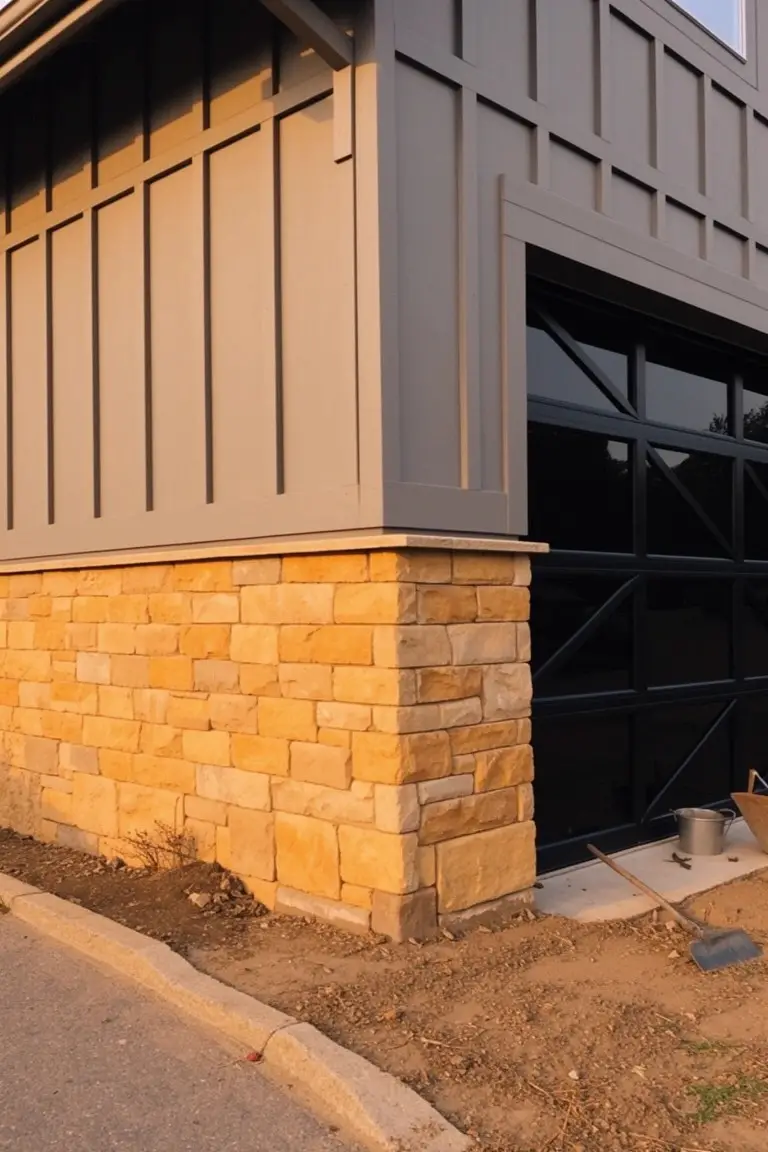
When stone accents your home’s exterior, the paint color you pick either amplifies that organic texture or drowns it in uniformity.
I once brushed a muted green onto a test board against local limestone, surprised at how it warmed up in afternoon shadows.
The best pairings draw subtle echoes from the stone’s own earthy tones, letting light play across both surfaces naturally.
They avoid the common pitfall of stark contrasts that look bold in the store but harsh outdoors over time.
A handful reward the effort of sampling them in your actual sunlight.
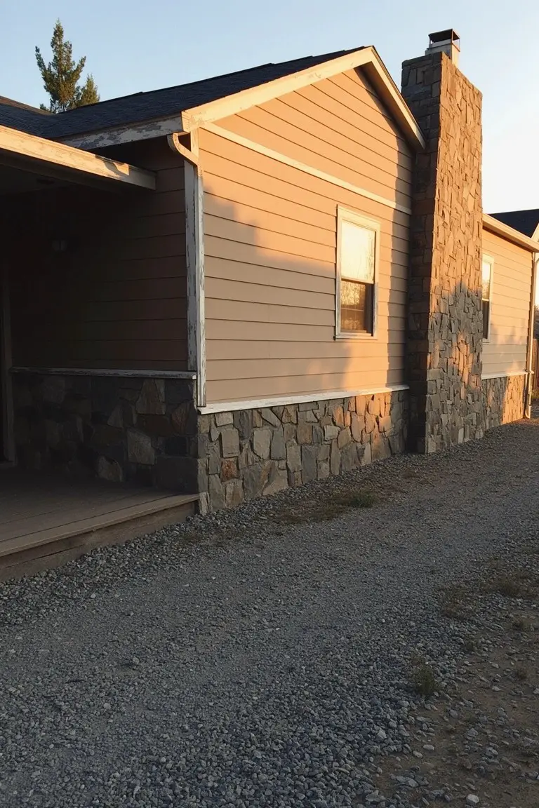
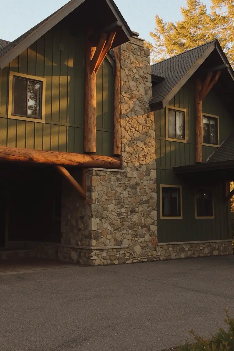
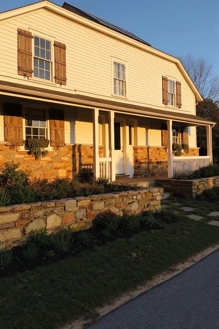
Deep Charcoal Gray Siding
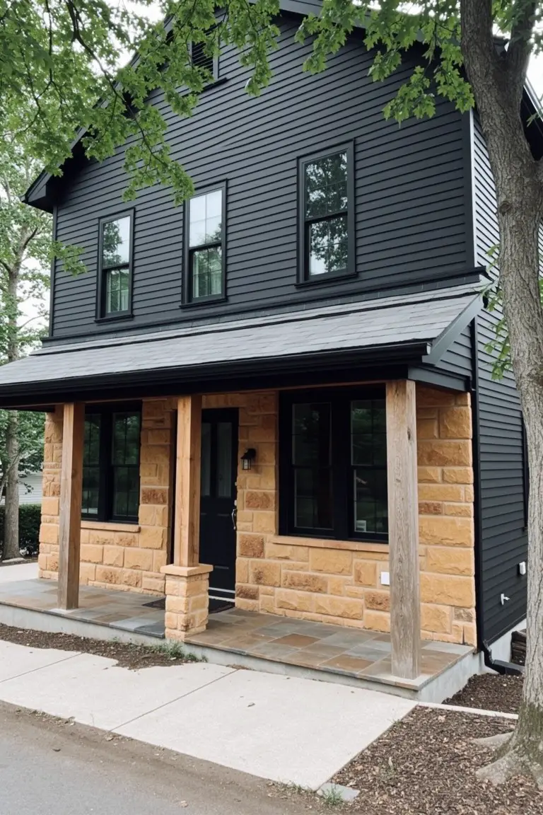
This house siding pulls off a deep charcoal gray that’s right on the edge of black. Looks closest to Sherwin-Williams Iron Ore or Benjamin Moore Kendall Charcoal, maybe even Behr’s Cracked Pepper. It’s a cool-toned neutral that makes the whole place feel pulled together and a bit moody.
The stone base in warm beige tones off the gray perfectly, like here on the porch pillars. It holds up well in shady spots or overcast days. Pair it with black windows and wood posts for that clean look, but test a sample first, it can shift a touch green in bright sun.
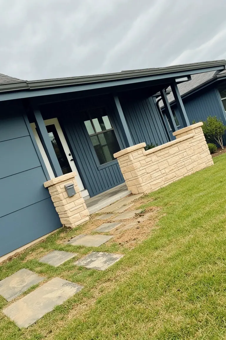
Pale Blue Siding
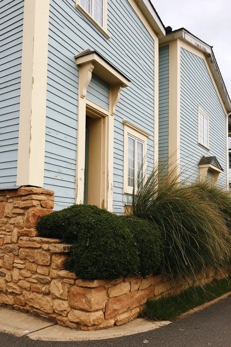
This siding shows off a pale blue paint that’s soft and easy on the eyes. It looks closest to Sherwin-Williams Rainwashed, or Benjamin Moore Palladian Blue, with Behr Breath of Fresh Air reading pretty similar too. A cool blue like this brightens up the house without overpowering the stone foundation below.
The gray undertone helps it sit well against warmer elements like that sandstone base. It works best on shady sides or in cooler climates where it won’t wash out. Pair it with crisp white trim to keep things clean, and avoid dark roofs that might clash.
Deep Navy Siding
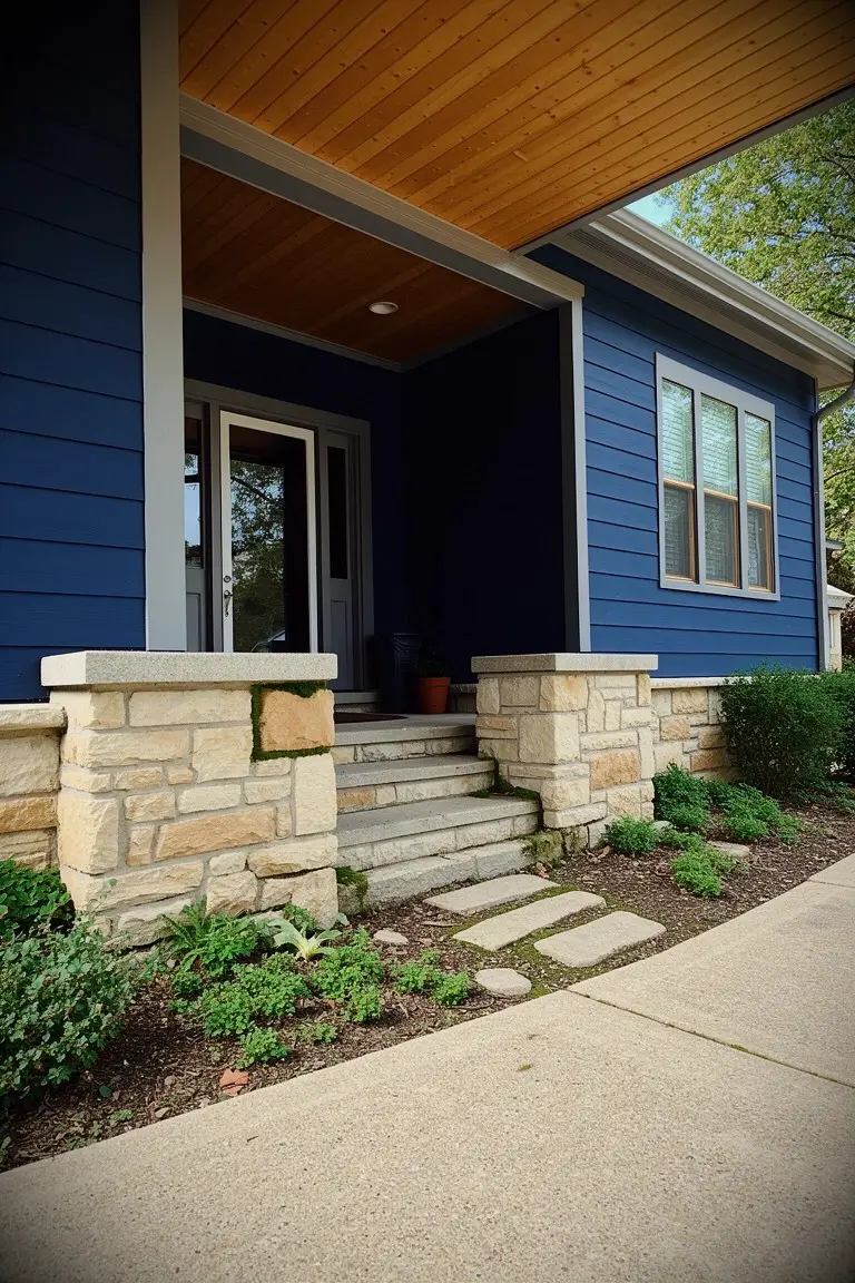
This siding shows a deep navy blue paint, the kind that reads very close to Sherwin-Williams Naval or Benjamin Moore Hale Navy, maybe Behr’s Indigo of the Sea too. It’s a solid cool blue with enough depth to hold up on a whole house. Folks go for it because it gives that crisp, grounded look next to natural stone without overwhelming the yard.
Cool undertones keep it from going too purple in most lights. It pairs easy with beige stone pillars like these and a bit of green planting. Best on homes that get decent sun. North sides can make it feel heavier, so test a sample there first.
Light Gray Exterior Walls
This setup uses a light cool gray paint on the main walls. It reads very close to Sherwin-Williams Repose Gray or Benjamin Moore Gray Owl. Behr’s Silver Drop seems like another good match. That kind of neutral keeps things clean and modern without going too stark.
The cool undertone plays nice against the beige stone base here. It works best in full sun where the gray stays crisp. Pair it with black trim like on the doors and garage. Just watch it doesn’t look flat in shady spots.
Warm Beige Siding
This siding shows a warm beige that reads very close to Sherwin Williams Accessible Beige or Benjamin Moore Edgecomb Gray. It’s a relaxed tan, not too pale or deep. Homeowners go for it because it sits easy next to stone without competing, and it feels at home in casual spots.
The warm undertones keep it from going flat in most light. Here by the stone chimney base, it picks up a bit of glow. Good for pairing with gray rock or wood trim. Just test it if your lot faces north, since it can lean cooler there.
Warm Terracotta Exterior
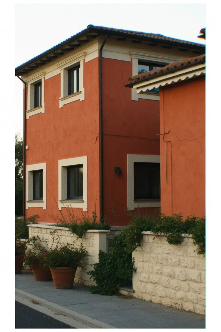
This terracotta paint on the house walls looks closest to Sherwin-Williams Moroccan Spice or Benjamin Moore Potters Clay. Maybe Behr Terracotta Sunset too. It’s a warm, earthy red-orange that sits just right against stone. Folks like it because it adds that lived-in, sunny feel without overpowering the yard or landscaping.
The undertones lean red and clay-like, so it picks up late afternoon light nicely. Pair it with pale stone bases and green plants like they did here. It works best on stucco homes in mild climates… watch it doesn’t fade too fast in harsh sun.
Medium Cool Gray Siding
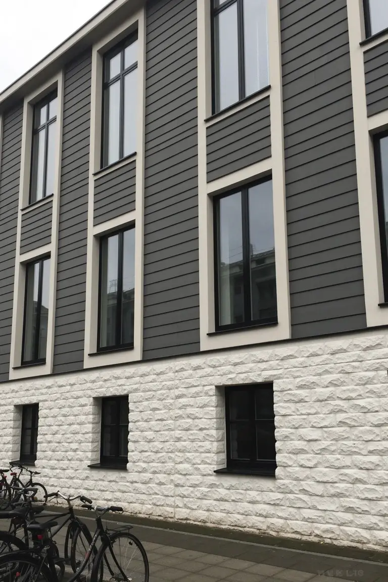
This siding shows a medium cool gray that looks closest to Sherwin-Williams Dorian Gray or Benjamin Moore Stonington Gray, maybe even Behr Winds Breath. It’s the kind of straightforward gray that sits neutral between light and dark. Homeowners go for it because it highlights stone accents nicely without stealing the show.
That cool undertone holds up under overcast skies too. Pair it with white trim or black windows for clean lines, especially on a base of textured stone like this. Just test a sample first, since grays can shift a bit by region.
Pale Sage Green Siding
This exterior paint job goes with a pale sage green that’s soft and easy on the eyes. It looks closest to Sherwin-Williams Clary Sage or Benjamin Moore Saybrook Sage, maybe Behr’s Willow Sage too. Folks pick shades like this for how they blend right into a yard setting, calm without being dull.
That gray undertone in the green helps it hold up in different lights. Stone pillars like these make it pop just enough. Pair it with wood trim or earthy bricks, and skip anything too bold next to it.
Pale Yellow Siding
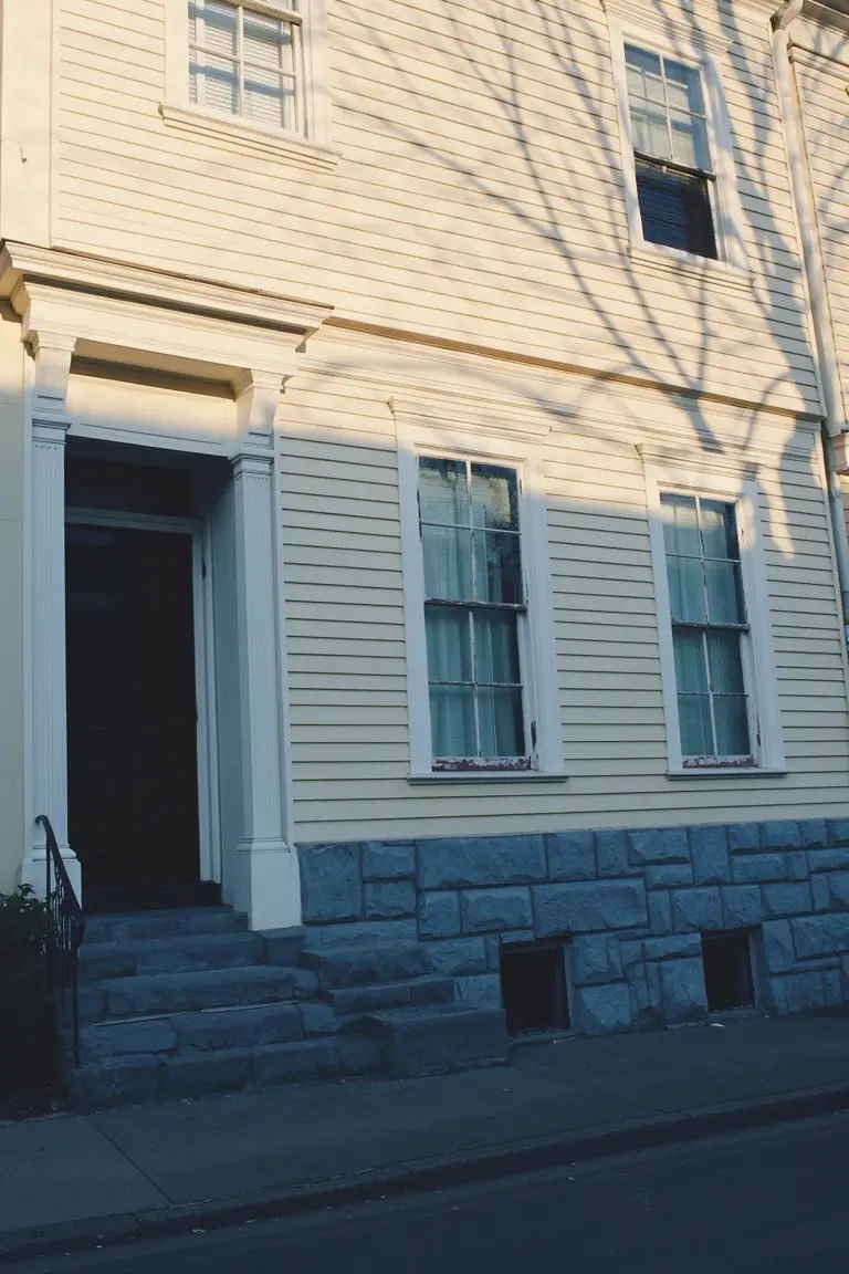
This pale yellow siding reads very close to Sherwin-Williams Greek Villa or Benjamin Moore Swiss Coffee. Sometimes Behr’s Silk comes pretty near too. It’s a soft yellow in the warm neutral family. Folks like it because it keeps an old house looking fresh without going bold. That stone base down below just sets it off nice.
The warm undertone picks up golden hints in sunlight. It works best on east or south-facing spots where light stays even. Pair it with crisp white trim and a dark door like you see here. Steer clear if your stone’s too cool. Might fight it a bit.
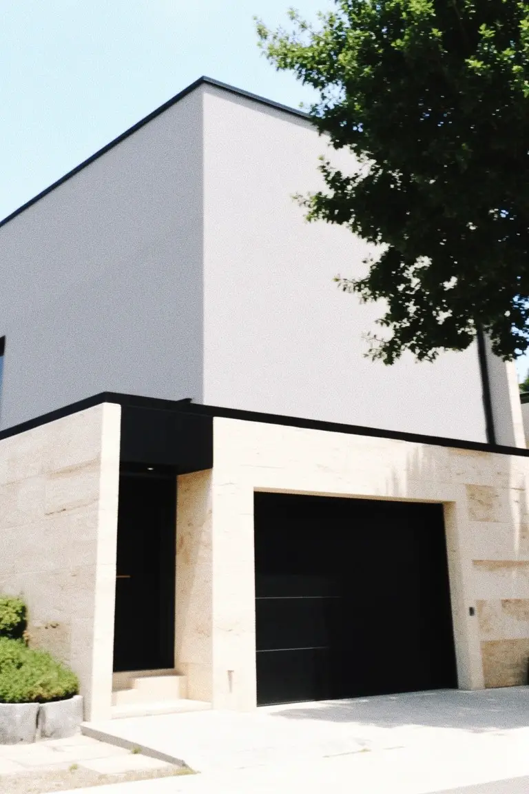
Deep Charcoal Siding
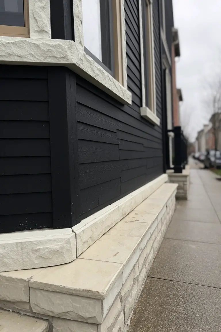
This siding pulls off a deep charcoal black that’s rich but not flat. It reads very close to Sherwin-Williams Iron Ore or Benjamin Moore Onyx, maybe even Behr Black. Folks like it for how it frames stone without stealing the show. Solid choice for a clean, updated look on the outside.
Cool undertones make it sit well next to pale stone trim like this. Works best on north-facing spots or cloudy days… stays moody but balanced. Pair it with warm wood windows to keep things from going too stark. Just test a sample first, since blacks shift in different lights.
Warm Tan Exterior Walls
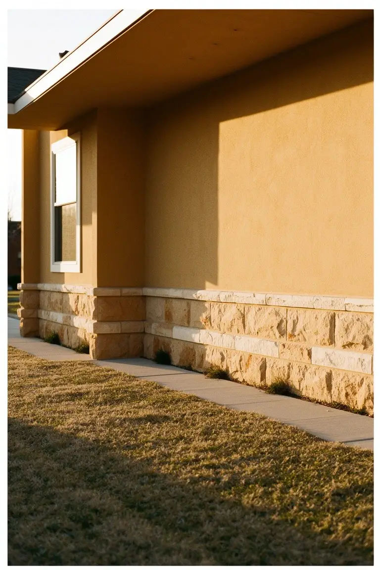
This warm tan on the stucco walls reads very close to Sherwin-Williams Nomadic Desert (SW 6058), or Benjamin Moore’s Rodeo Dust (1094), or Behr’s Toasted Wicker (MQ3-10). It’s a solid beige in the tan family that feels grounded and easy on the eyes. Folks like it because it lets the stone accents at the base stand out without competing.
The golden undertone keeps it from going flat in bright light, and it works best on homes with some sun exposure. Pair it with crisp white trim or dark wood doors to keep things simple. Just watch it doesn’t pull too yellow next to cool grays.
Crisp White Walls
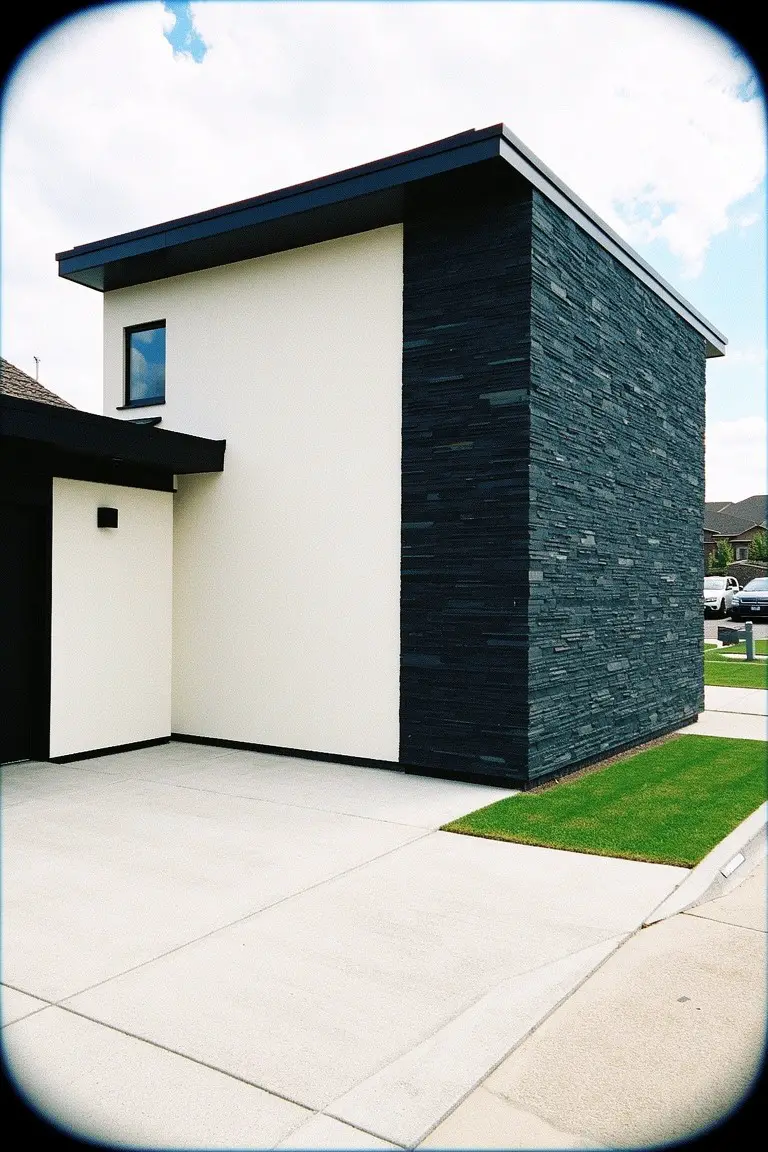
This crisp white paint covers most of the walls here and reads very close to Sherwin Williams Extra White or Benjamin Moore Chantilly Lace. It’s a straightforward, bright white in the cool family. Folks like it because it stays clean-looking next to darker stone without getting dingy.
That cool undertone shines in good light. Pair it with black trim or slate like this, and it keeps the house looking sharp. Avoid warmer stones though… they can pull it off balance.
Pale Blue Window Trim
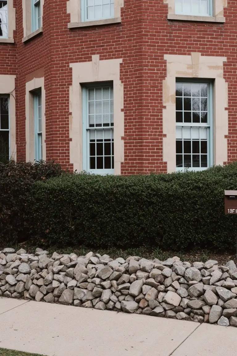
That pale blue on the window trim reads very close to Benjamin Moore Palladian Blue or Sherwin Williams Rain. Sometimes Behr’s Blue Whisper hits the same note. It’s a soft blue in the cool family. Not too bright. Just enough color to stand out against red brick without fighting it.
The cool undertones keep it fresh in sunlight. Pairs easy with stone borders or gravel paths like you see here. Works best on traditional homes. Skip it if your brick runs too orange… might clash a bit.
Warm Greige Siding
This warm greige paint on the siding reads very close to Sherwin Williams Agreeable Gray or Benjamin Moore Revere Pewter, maybe Behr’s Silver Drop too. It’s a solid neutral that sits right between gray and beige. Homeowners go for it because it lets stone details stand out without overpowering the look.
Warm taupe undertones keep it from going cold in the shade, and it picks up nicely on the beige stone base here. Works best on larger homes where you want subtle depth. Black garage doors add some punch, so watch the trim colors to keep things balanced.
Warm Beige Exterior Walls
The walls on this house use a warm beige paint that ties right into the sandy ground nearby. It looks closest to Sherwin Williams Accessible Beige or Benjamin Moore Edgecomb Gray, maybe Behr’s Parchment too. Folks like this shade because it feels grounded without overpowering the white stone wall next to it.
That warm undertone keeps it from going gray in different light. It works best on exteriors where you want stone details to stand out, like coastal spots. Just pair with clean trim, and watch it doesn’t pick up too much dust.
Soft Blush Pink Siding
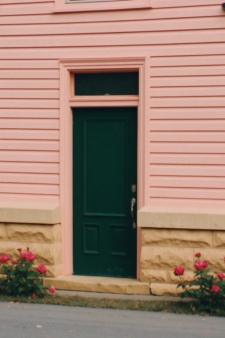
This blush pink siding looks closest to Sherwin-Williams Rosé or Benjamin Moore First Light, maybe Behr’s Powder Blush too. It’s a warm, muted pink that feels easygoing next to stone. What stands out is how it warms up the whole front without stealing the show from that beige stone base underneath.
Warm peachy undertones make it read softer in morning light. Stick with crisp green doors or black trim to keep things balanced. It suits older homes like this one best, especially where you want color that ages well over time.
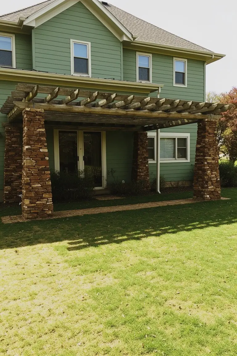
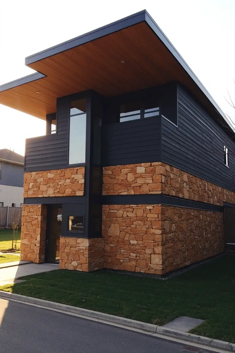
Muted Olive Green Siding
This exterior uses a muted olive green on the siding that sits just right with the stone and wood. It looks closest to Sherwin Williams Pewter Green or Benjamin Moore Caldwell Green, maybe Behr’s Back to Nature too. That kind of green pulls in some warmth from the yellow undertones. Folks like it because it blends into natural spots without overpowering them.
The color holds up well in dappled light like this. Warm olive tones make it forgiving next to raw stone or cedar beams. Try it on a cabin-style house where you want the siding to feel like part of the landscape. Just test samples in morning light first.
Deep Navy Siding
This siding pulls off a deep navy blue that seems closest to Sherwin Williams Naval, Benjamin Moore Hale Navy, or Behr Night Flight. It’s a cool-toned shade with some gray mixed in. People go for it because it gives the house real presence next to those beige stone pieces.
The gray undertone helps it read steady in flat light. It suits bigger homes or ones with good yard space. Stick to light trim around doors and windows so the stone pops right.
Dark Charcoal Gray Siding
This siding paint reads as a deep charcoal gray. It looks closest to Sherwin-Williams Iron Ore or Benjamin Moore Kendall Charcoal. Behr’s Black Suede comes pretty near too. That rich, near-black tone gives a modern edge without going full black. Folks like it because it lets warm stone accents stand out nice and clear.
The cool undertones keep it from clashing with the rusty stone or cedar wood up top. It works best on crisp, boxy homes like this one, especially in good light. Pair it with those earthy stones and some warm trim. Just test a sample first, since it can shift a bit in shade.
Soft Greige Siding
This soft greige on the siding seems closest to Sherwin-Williams Accessible Beige, Benjamin Moore Edgecomb Gray, or Behr’s Silky White. It’s that easy warm neutral, not too gray or beigey. Homeowners go for it since it plays well with stone and keeps things looking clean over time.
Warm undertones show up best in natural light. Pairs nicely with black trim or stone like the base here. Good for bigger walls, though test it first if your area’s shady.
Warm Beige Siding
This siding shows off a warm beige paint that’s got that soft, easy feel. It looks closest to Sherwin-Williams Alabaster or Benjamin Moore White Dove, maybe Behr Swiss Coffee too. People go for colors like this on older homes because they warm up stone without overpowering it. You get a natural look that fits right in.
The undertone leans a bit yellow, which shows up nice against the stone foundation here. It suits houses with porches or in areas with good sunlight. Stick to white doors and trim, and let wood shutters add contrast. Just test samples in morning light first.
Frequently Asked Questions
Q: How do I pick a combo that works with my house’s stone?
A: Squint at your stone to spot its main tones, like warm golds or cool grays. Match siding colors that pull from those tones for harmony. Test with big sample boards leaned against the wall.
Q: Will these combos look good on a ranch house?
A: Ranch homes shine with low-contrast combos, think soft taupes against beige stone. Layer in a pop of sage green on the door for subtle interest. It keeps things grounded and welcoming.
Q: What’s the fastest way to try stone texture?
A: Slap on manufactured stone veneer around your entry or garage. Pair it with siding in earthy browns. You’ll get that natural vibe without demo work.
Q: Do the colors fade fast outdoors?
A: Pick high-quality exterior paints with UV blockers. Stone actually protects nearby paint from direct sun. Refresh every five years or so.