

I’ve noticed that exterior paint colors shift a lot once they’re out there catching morning sun and afternoon shadows on a real house.
I tested a neutral taupe last summer that glowed warm in store lighting, only to cool into something flat and unremarkable by evening.
The shades that pull through usually carry enough depth to adapt without losing their quiet appeal.
They work best when you pair them thoughtfully with your home’s surroundings and the light it gets most.
Slap some samples up and watch them through a full day.
Soft Gray Siding
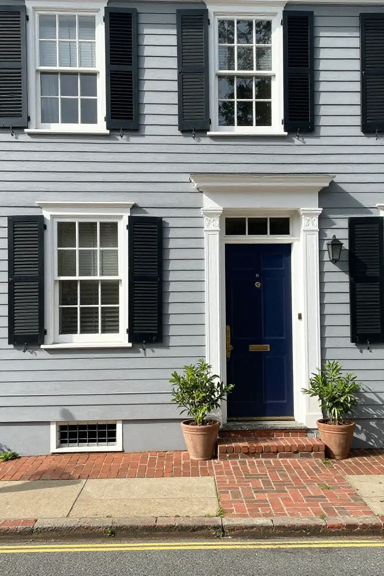
This soft gray paint on the house siding reads very close to Sherwin-Williams Repose Gray or Benjamin Moore Gray Owl. Sometimes it pulls toward Farrow & Ball Pavilion Gray too. It’s a cool light gray that feels calm and easy on older homes. People like it because it lets the white trim and blue door stand out without overpowering things.
The cool undertone works best in morning light or near the coast. Pair it with black shutters like here, or brick walks. It hides dirt okay but watch for too much shade, it can look flat. Good for clapboard styles.
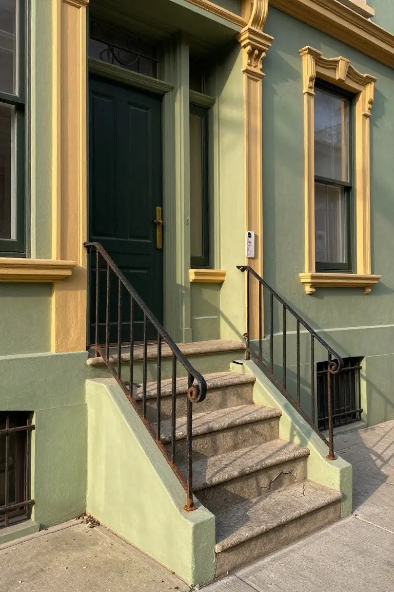
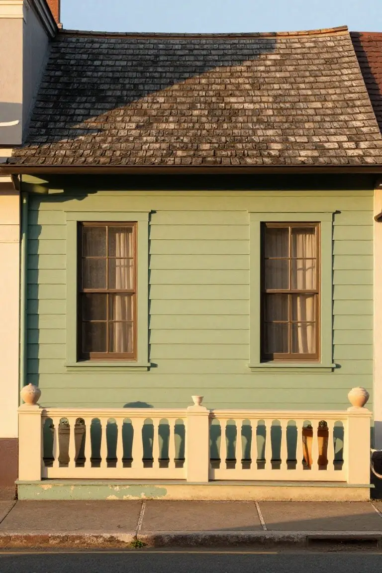
Pale Sage Green Siding
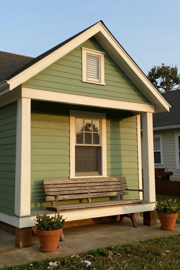
This pale sage green makes up the main body of the little house here. It’s a soft green from the sage family, and it reads very close to Sherwin-Williams Retreat or Benjamin Moore Saybrook Sage. Behr Silver Sage has that same easy feel too. Folks like it because it gives a cottage a quiet charm without shouting. That worn bench out front just sits right against it.
The gray undertone keeps it from going too yellow in most lights. It works best on smaller homes like this one, maybe in a yard with some trees nearby. Pair it with crisp white trim and those terra cotta pots for balance. Just test it north-facing if your spot gets shady… might pull cooler.
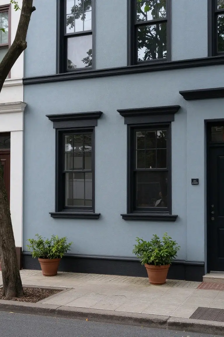
Deep Navy Blue Exterior
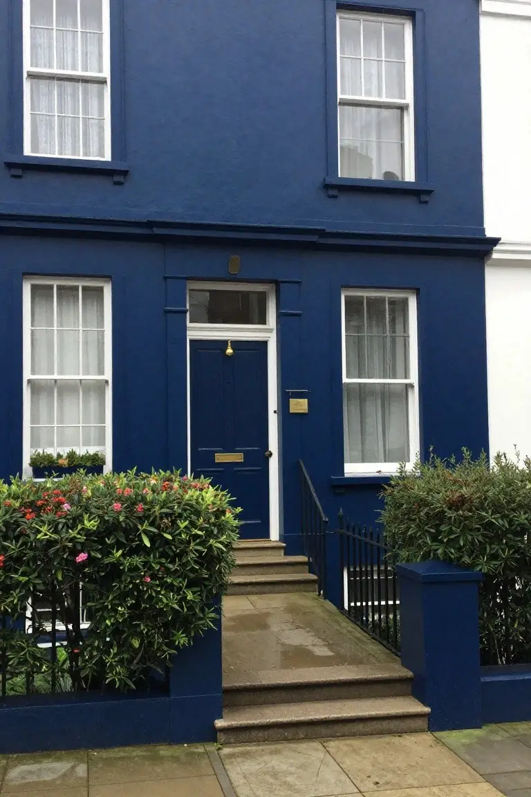
This deep navy blue on the house body looks closest to Benjamin Moore’s Hale Navy or Sherwin-Williams Naval, with Farrow & Ball’s Hague Blue not far off. It’s a rich, saturated blue in the cool family that wraps older homes in quiet elegance. People go for it because it holds up well against white trim and greenery, adding charm without shouting.
The cool undertone keeps it crisp next to the pale stone steps and black ironwork. It shines on period townhouses like this one, especially in softer light. Pair with white sashes and maybe some red flowers out front. Just check how it reads at dusk – it darkens fast.
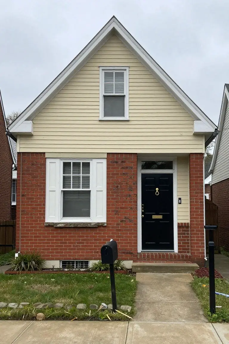
Pale Yellow Siding
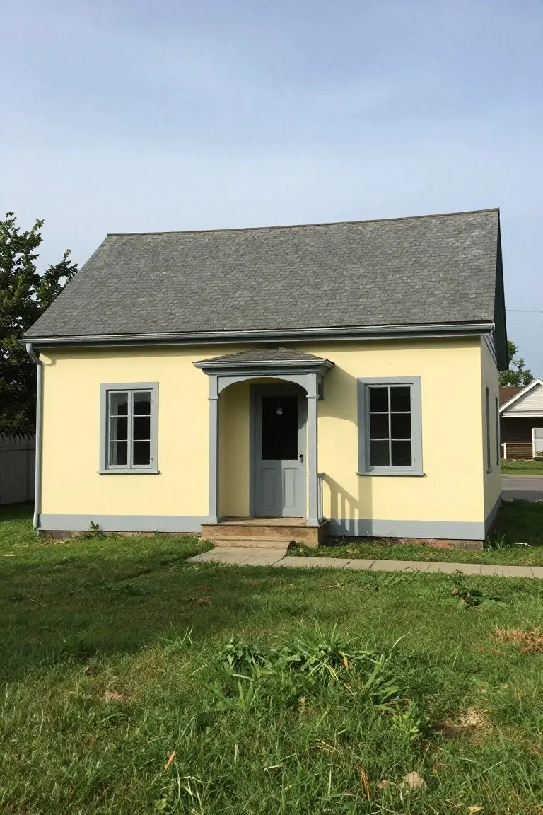
This pale yellow on the house siding catches the eye right away. It’s a soft yellow in the buttery family, warm but not overpowering. Looks closest to Benjamin Moore Pale Yellow (OC-20) or Sherwin-Williams Golden Fawn (SW 2865), maybe Behr Moonlight Silk too. Folks like it because it brightens up older homes without screaming for attention. Keeps things cheerful year round.
The warm undertones make it forgiving in different lights, especially next to the gray trim and door here. It suits cottages or farmhouses best, paired with grays or crisp whites. Just watch it might pick up pollen in spring… test a sample first if your yard is green heavy.
Muted Warm Gray
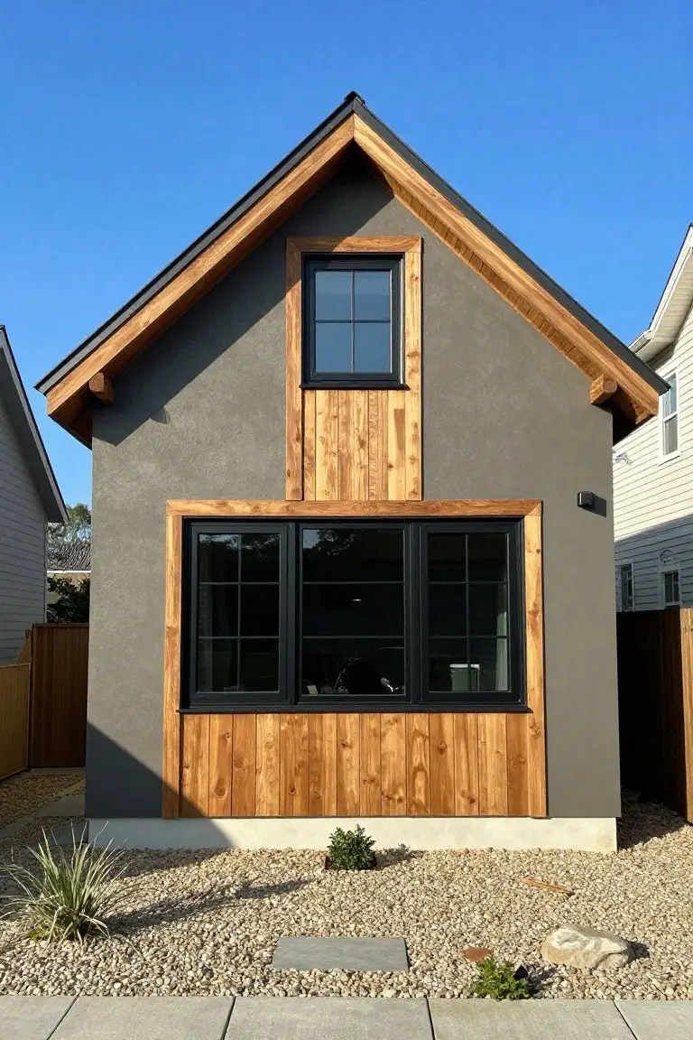
This exterior pulls off a muted warm gray that seems closest to Sherwin-Williams Repose Gray or Benjamin Moore Stonington Gray. Maybe Behr’s Silver Screen too. It’s the kind of gray with just enough brown undertone to keep things from feeling cold. Folks go for it when they want the siding to stay in the background and let wood accents shine.
That warmth shows up nice in sunlight. It pairs easy with black windows and cedar trim like you see here. Stick to simple gravel or plants around the base so nothing fights it.
Classic Red Front Door
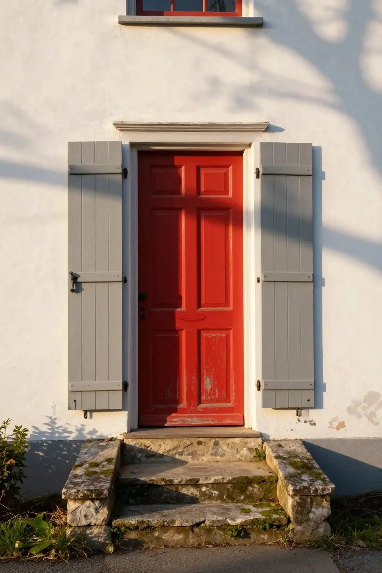
That red door stands out bold and bright against the plain white house. It’s a true fire-engine red in the warm red family, reading very close to Sherwin-Williams Real Red, Benjamin Moore Caliente, or Behr Hot Chili Pepper. Folks like it because it gives an old house instant pop without trying too hard.
The warm undertone keeps it friendly in full sun, not harsh. It works best on entry doors paired with neutral siding like this white and stone steps. Gray shutters tone it down a bit… just right.
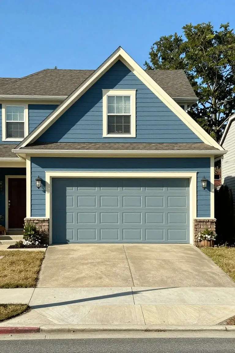
Soft Blue Siding
This light blue siding pulls off a cool coastal look that reads very close to Sherwin-Williams Rainwashed or Benjamin Moore Palladian Blue. Behr’s Breath of Fresh Air feels right in the mix too. It’s pale enough to stay easygoing but has just enough color to brighten up a simple house shape.
The cool undertone keeps it from going too gray on overcast days. Pair it with crisp white trim like you see here, and it pops nicely against sand or greenery. Stick to exteriors facing the water, or anywhere you want that relaxed beach vibe.
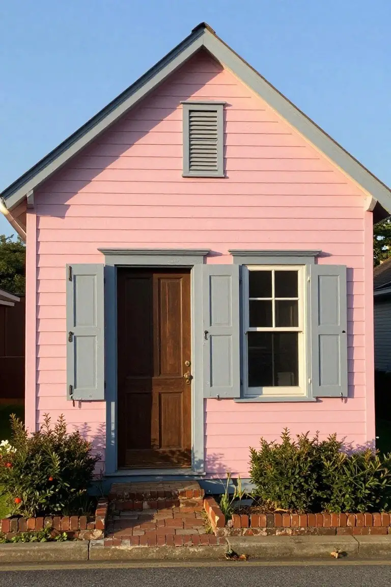
Warm Rosy Pink Walls
This warm rosy pink shows up nicely on older homes like this one. It reads very close to Sherwin Williams Rosé or Benjamin Moore Head Over Heels, with Behr’s Blushing Bride also in the mix. It’s a soft pink that’s not too bright. People go for it because it feels cheerful without being loud, especially next to yellow trim.
The undertone leans peachy and warm, so it picks up sunlight well on a brick walkway or driveway. Pair it with creamy yellow details to keep things balanced. Just watch it doesn’t look too orange in shady spots… test a sample first.
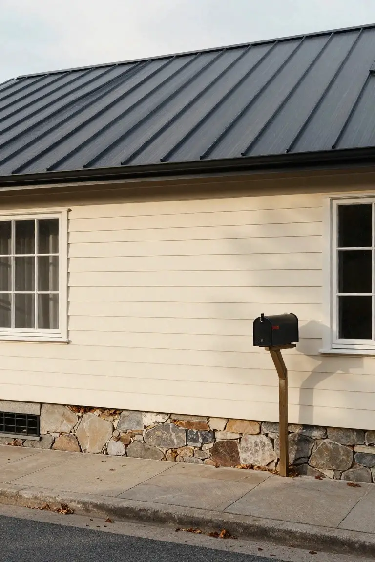
Soft Beige Walls
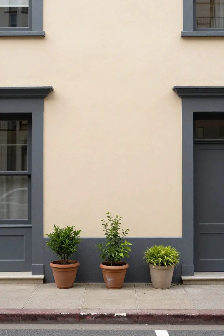
This soft beige on the exterior walls looks closest to Sherwin-Williams Accessible Beige or Benjamin Moore Edgecomb Gray. Behr’s Wheat Bread reads pretty similar too. It’s that easy warm neutral folks keep coming back to for houses. Gives a clean, settled feel right away. Not stark white. Just right.
Warm undertones make it work in good light, especially next to dark trim like those gray doors. Pairs well with plants or stone paths out front. Watch it in heavy shade though… might pull a touch cooler. Still holds up nice on most homes.
Warm Beige Exterior
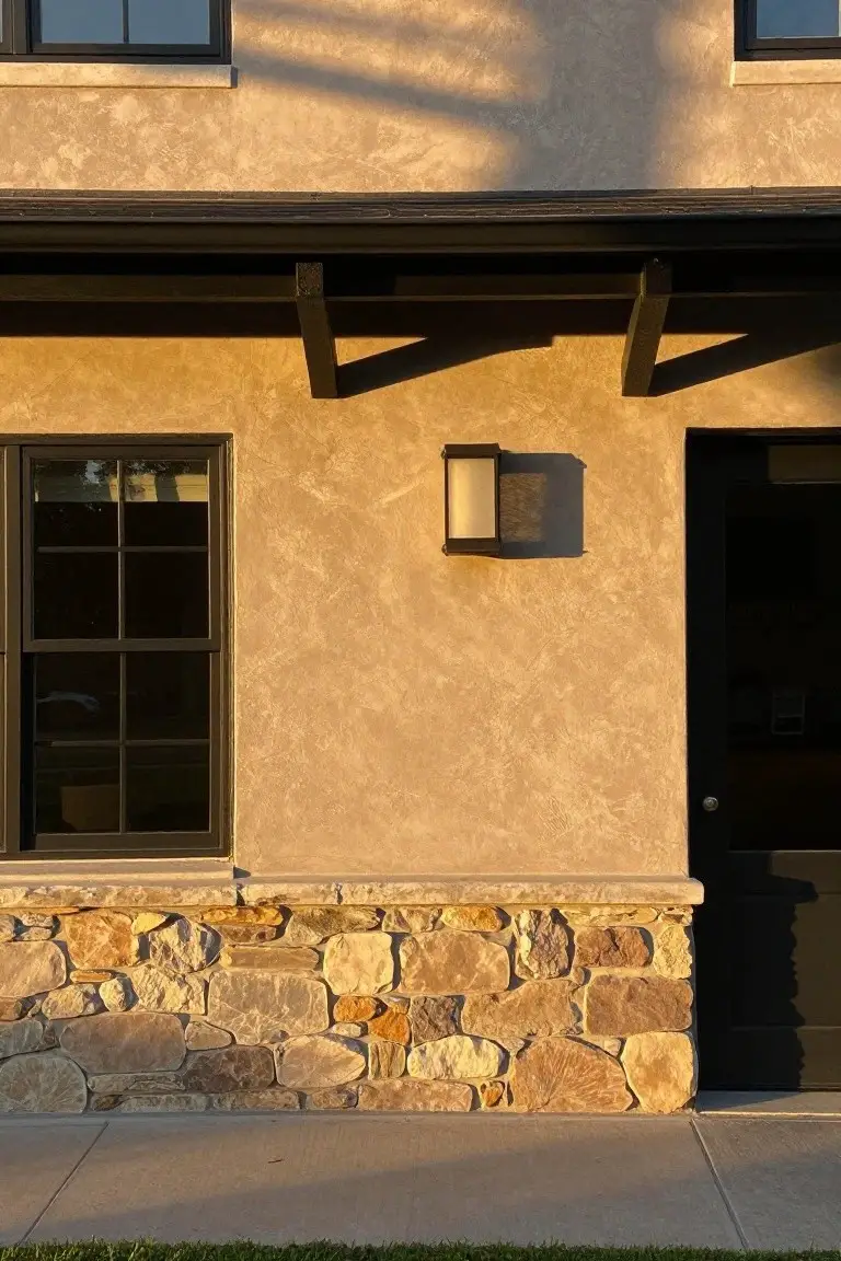
This home’s stucco walls show off a warm beige paint. It looks closest to Sherwin-Williams Accessible Beige, Benjamin Moore Edgecomb Gray, or Behr Toasted Almond. That kind of neutral pulls in earthy tones from the stone base. People go for it when they want something cozy that doesn’t shout.
Warm undertones give it life in the late light. Black trim on the door and windows sets it off clean. Try it on textured siding where south-facing sun hits. Stone or brick below keeps things from going flat.
Warm Beige Siding
This warm beige on the siding reads very close to Sherwin-Williams Accessible Beige or Benjamin Moore Edgecomb Gray. Maybe Behr’s Wheat Bread too. It’s that easy neutral that keeps a house looking fresh and settled in. Folks pick it for how it sits quiet next to brick without stealing the show.
Warm undertones keep it from going flat in cloudy light. Pairs right up with red brick bases like this one and white window trim. Stick to black doors or hardware to make it pop a bit. Good for bungalows or any older place wanting simple charm.
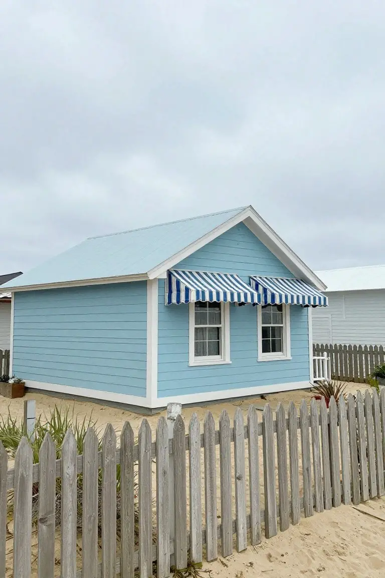
Crisp White House Exterior
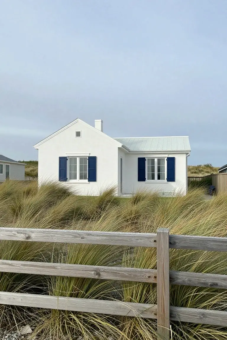
This beach house uses a bright, clean white paint that seems closest to Sherwin-Williams Extra White, Benjamin Moore Chantilly Lace, or Behr Ultra Pure White. It’s from that fresh white family folks keep coming back to for exteriors. What stands out is how it makes the simple siding pop without trying too hard.
The cool undertone here holds up well in open light, steering clear of any yellow warmth. It pairs easy with wood fences or navy shutters like these. Best on coastal homes or anywhere you need that airy, no-fuss look.
Soft Sage Green Siding
This soft sage green on the house body feels closest to Benjamin Moore’s October Mist or Sherwin Williams’ Clary Sage. Behr’s Silver Sage runs right along those lines too. It’s that easy green with gray mixed in. Folks like it because it freshens up an older place without shouting.
The yellow trim pops against it nicely. Warm undertones keep the green from going cold in shady spots. Try it on a row house facing the street. Just watch that it doesn’t fade too quick in full southern sun.
Light Blue-Gray Siding
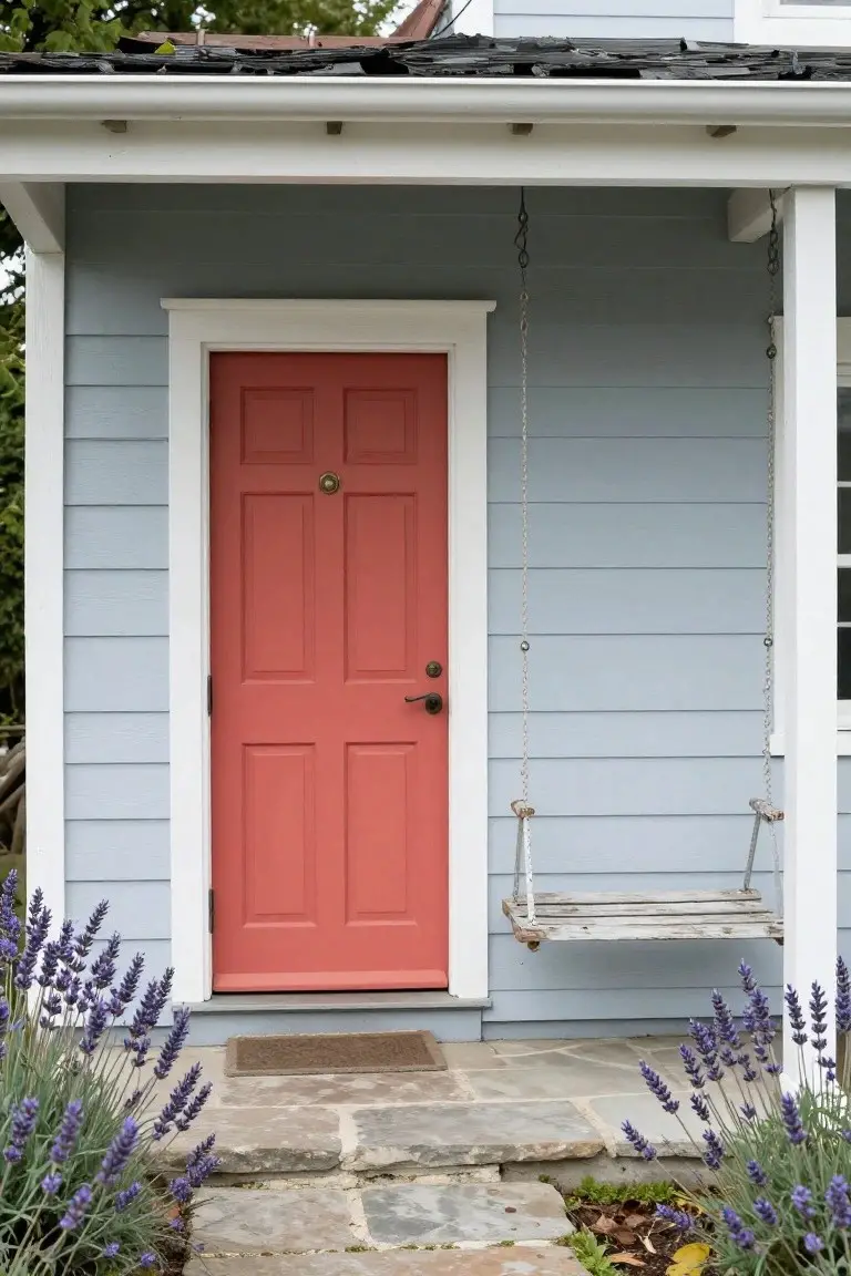
This siding paint pulls off a soft light blue-gray that’s easy on the eyes. It reads very close to Sherwin-Williams Palladian Blue or Benjamin Moore’s Breath of Fresh Air. Or you might try Behr’s Blue Pepper for something similar. People go for it because it feels fresh without being too bold. That red door pops right against it too.
The cool undertones keep things calm, especially next to white trim and wood like that porch swing. It works best on homes with some natural stone or plants nearby. Pair it with warm accents inside to balance the cool side. Just test in morning light first… it can shift a bit.
Soft Blue Siding
The siding on this house shows off a soft blue paint that looks closest to Sherwin-Williams Rainwashed. Benjamin Moore Palladian Blue or Behr Blue Dusk read very close too. It’s a relaxed blue from the cool side of the family. People go for it since it freshens up the exterior without shouting, and it plays nice next to plain lawns or trees.
That grayish undertone keeps it grounded in most light. White trim sets it off clean, like you see here, and a red door adds some kick if you want. Best on two-story homes where it won’t overwhelm smaller yards.
Deep Black Exterior Walls
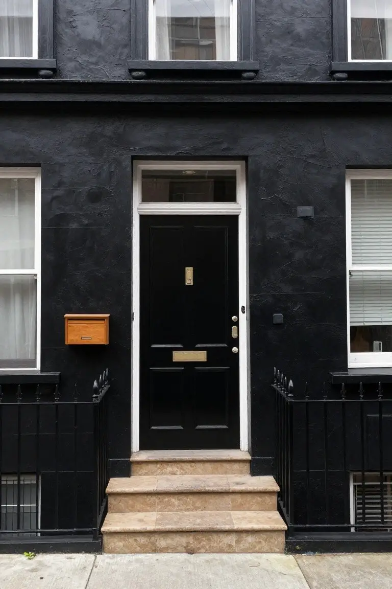
This setup uses a deep matte black paint on the whole facade. It looks closest to Sherwin Williams Tricorn Black or Benjamin Moore Onyx, maybe Farrow & Ball Off-Black too. What stands out is how it wraps the house in quiet elegance. That black door and walls make the white trim and windows feel fresh and sharp.
Neutral undertones keep it from shifting too much in light. It suits narrow townhouses best, especially with stone steps or brass accents. White sashes balance it nicely… just watch the matte finish doesn’t show dirt too quick.
Pale Sage Green Siding
This siding shows a soft sage green that seems closest to Sherwin Williams Clary Sage or Benjamin Moore Saybrook Sage HC-114. Behr Silver Sage 470D-4 has that same feel too. It’s a muted green with gray mixed in, easy on the eyes and just right for older houses. People go for it when they want charm that doesn’t shout.
The cool undertone holds up in different lights, pairing well with white railings like these and dark window frames. Try it on clapboard homes in town or by the water. North exposures can make it read a touch grayer, so test a sample there first.
Warm Beige Siding
This exterior uses a warm beige paint on the siding. It looks closest to Sherwin-Williams Accessible Beige or Benjamin Moore Edgecomb Gray, maybe Behr Toasted Cashew too. It’s a soft neutral with just enough warmth to feel homey. Folks go for it because it blends easy with stone bases and lets other parts of the house stand out.
Warm yellow undertones show up best in natural light. Works well on older homes or anywhere with mixed materials. White window trim keeps it crisp. Skip it if your accents run too cool… might fight a bit.
Warm Terracotta Exteriors
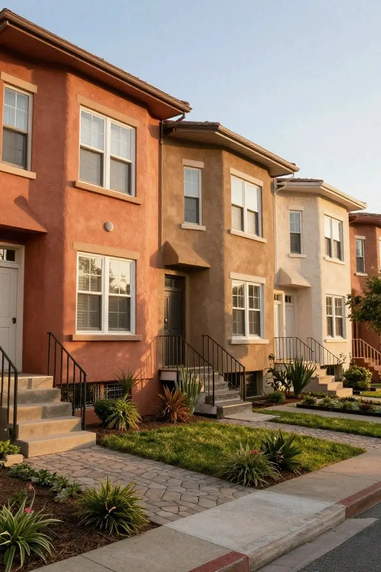
This warm terracotta on the house siding seems closest to Sherwin-Williams Rustic Red, or maybe Behr Terracotta Clay and Benjamin Moore Potters Clay. It’s an earthy red-orange family color that fits right into sunny neighborhoods. Folks pick it for that cozy, baked-in look on stucco walls.
Warm undertones keep it from going too orange in bright light. It works well next to beiges and creams, like these row houses show. Try it on Southwest-style homes with simple steps and plants out front… just watch it next to cool grays.
Soft Turquoise Siding
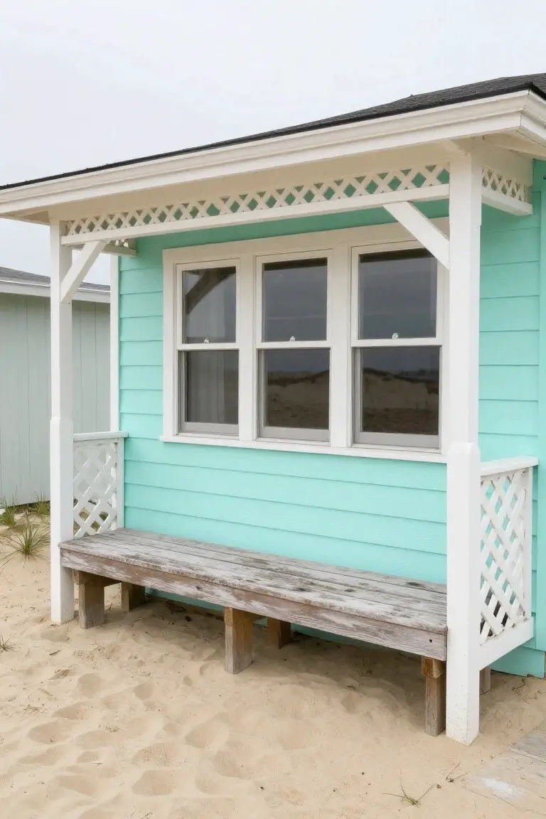
That soft turquoise on the siding looks closest to Sherwin-Williams Sea Salt, with Benjamin Moore Palladian Blue or Behr Blue Horizon reading very close too. It’s a cool pastel blue-green that’s easy on the eyes and gives off that relaxed beach feel right away. Folks like it because it perks up a plain exterior without overpowering things.
The subtle cool undertones shine in bright coastal light, especially next to crisp white trim and weathered wood like on that bench. Pair it with natural sandy tones or light grays. Just watch for algae buildup in damp spots.
Warm Gray Shingle Siding
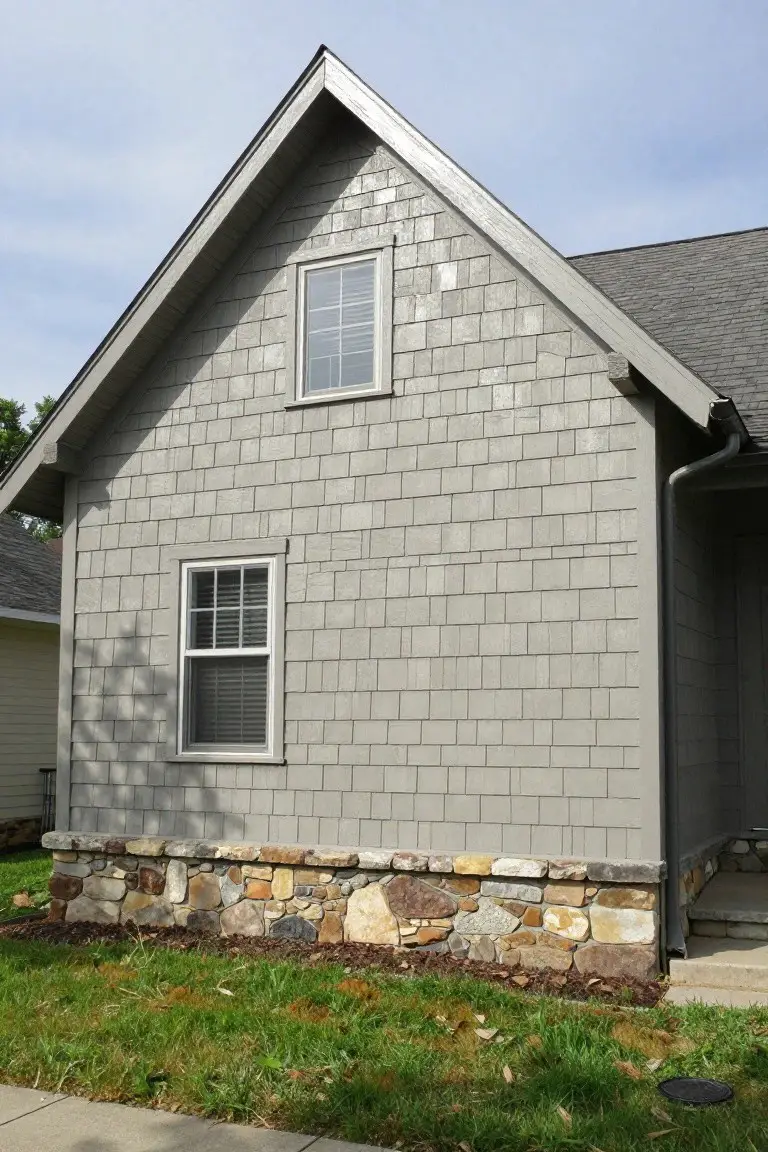
This siding shows off a warm gray that’s easy on the eyes and fits right in with natural surroundings. It reads very close to Sherwin-Williams Repose Gray, Benjamin Moore Gray Owl, or Behr Silver Drop. What stands out is how it keeps things neutral but not cold, making the house look settled and welcoming from the street.
Warm undertones in this gray play nice next to the stone base here. It holds up well in mixed light, from morning sun to overcast days. Pair it with crisp white trim and darker shakes on the roof, and you’ve got a look that doesn’t fight the landscape. Just watch it doesn’t pull too beige in bright sun.
Soft Blush Pink Siding
This soft blush pink on the house siding looks closest to Sherwin-Williams First Light or Benjamin Moore Head Over Heels. It’s a pale pink with just enough warmth to feel friendly, not candy-sweet. Folks go for it on cottages like this because it perks up the front without shouting.
The undertone leans peachy in sunlight, which is why it sits so well next to those gray shutters and the wood door. Pair it with brick steps or simple landscaping. Skip it on big houses, though… might wash out.
Soft Blue-Gray Exterior
This soft blue-gray paint covers the house body and reads closest to Sherwin-Williams Sea Salt or Benjamin Moore Gray Owl, maybe Behr’s Blue Whisper too. It’s a cool neutral in the gray-blue family, not too dark or bright. People go for it on row houses because it feels calm and fits right in with the neighborhood.
That gray undertone holds up next to black trim and keeps the look steady. Notice how it sits under the tree shade here. Works best on shady streets, paired with simple plants or brick nearby. Just check it doesn’t shift too blue in overcast light.
Frequently Asked Questions
Q: How do I test these paint colors on my actual house before painting the whole thing? A: Grab some sample pints from your local paint store and paint large swatches on different sides of your home. Step back and check them at different times of day over a couple days. That way you see how the light hits them for real.
Q: What if my neighborhood has rules about house colors? A: Pull up your HOA guidelines or chat with a neighbor who’s painted recently to spot any restrictions. Pick from neutrals or soft tones in the article that slide under most rules without a fuss.
Q: Do these colors work on brick or stone houses too? A: Yes, they pair great with textured surfaces like brick. Just paint the trim and accents to pull the elegance through. Your brick stays as the star.
Q: How soon can I paint over old peeling paint? A: Scrape off loose bits first, then power wash the whole surface. Prime any bare spots and go for it once everything dries. Fresh paint sticks better that way.