

I’ve noticed over the years that exterior paint colors look entirely different once sunlight hits them from every angle during the day. What seems like a crisp modern gray on the sample card often picks up warm undertones from brick or siding nearby, for better or worse. Pairings work best when they play off the house’s architecture and surroundings instead of fighting them. I always test a few combos with actual paint samples held up outside at different times, like one soft taupe with navy that surprised me by staying fresh even in overcast weather. A handful here are worth pulling outside for that kind of check.
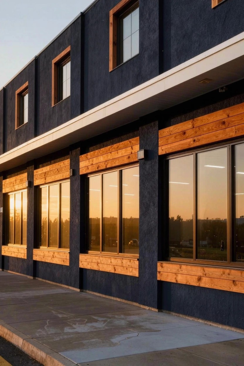
Deep Black Siding
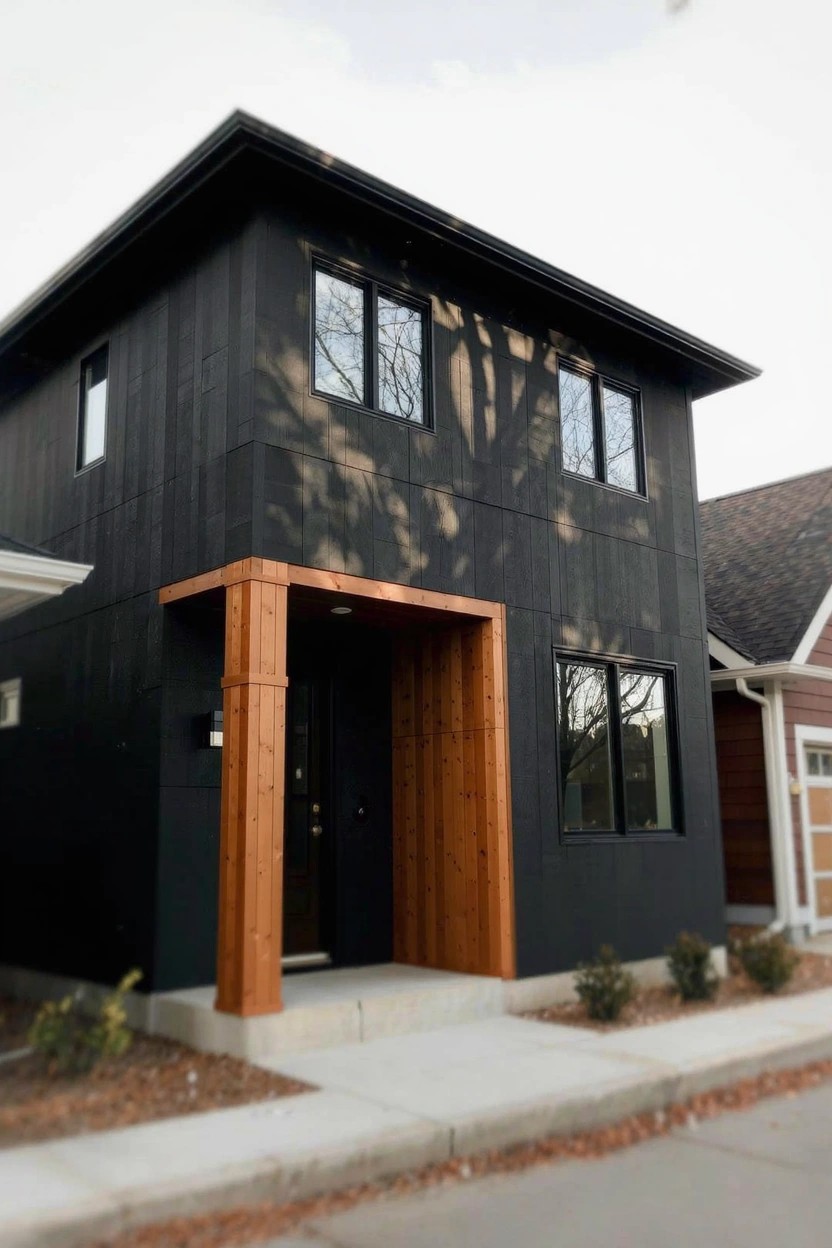
This siding paint is a deep black, almost like a true black with just a hint of charcoal underneath. It sits in that deep black family and comes closest to Sherwin-Williams Iron Ore, Benjamin Moore Onyx, or Behr Black. Folks go for it on modern homes because it looks sharp and pulls the eye right to the wood details around the door.
That cool undertone plays well against warm cedar trim. It holds up best in areas with steady light, not too much dirt kicking up. Stick to natural wood pairings and maybe some white on the trim to avoid it feeling too heavy.
Crisp White House Siding
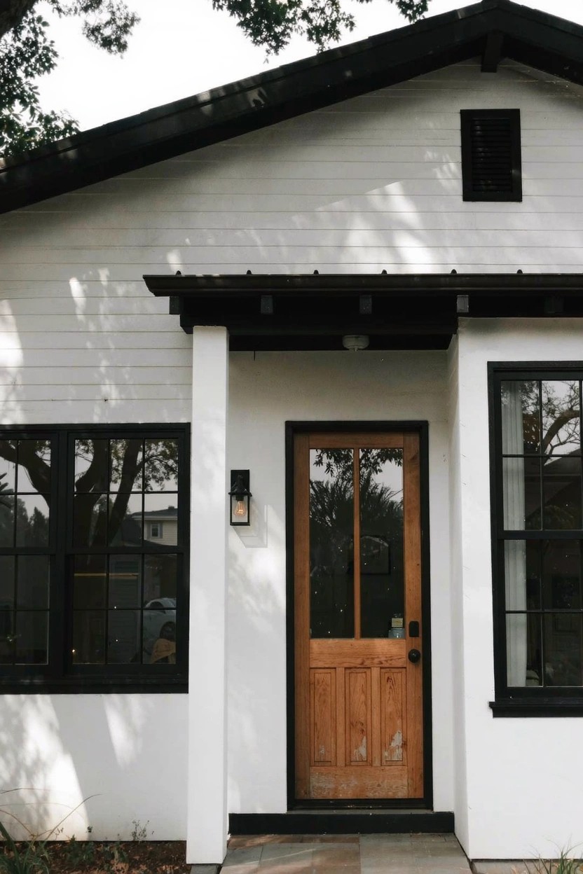
This crisp white on the house body looks closest to Sherwin Williams Extra White or Benjamin Moore Chantilly Lace. It’s a clean, bright white in the cool family that stays sharp all day. What makes it stand out is how it lets warmer wood tones on the door take center stage without competing.
That cool undertone reads best in good light, like on a south-facing wall. It pairs easy with black window frames or stone paths. Just watch it doesn’t pull too stark next to yellow brick.
Deep Navy Siding
This siding shows off a deep navy blue, the kind that looks closest to Sherwin-Williams Naval or Benjamin Moore Hale Navy, maybe Behr’s Midnight Blue too. It’s a solid cool blue with just enough gray to keep it from going too bright. Homeowners go for it because it gives the house real presence, especially next to white trim.
That navy holds its depth in most lighting, though it can pull a bit greener in bright sun. It pairs nicely with brick corners like you see here and simple greenery out front. Stick to white or cream trim so the blue stays the star.
Light Sage Green Siding
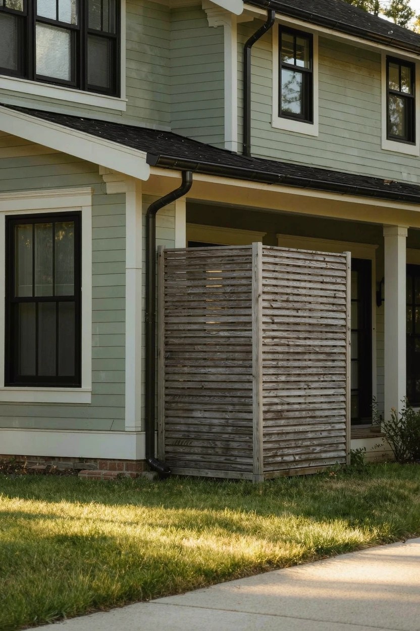
This siding paint pulls off a light sage green that seems closest to Sherwin-Williams Sea Salt. Benjamin Moore Saybrook Sage comes real close too, or Behr’s Back to Nature. It’s the kind of soft green-gray that’s easy on the eyes and gives a house that fresh, lived-in look without trying too hard.
That gray undertone keeps it from going too minty in the shade. It sits nice next to white trim and black-framed windows, like you see here with the wood screen nearby. Best on homes with some yard around, where daylight lets the green breathe.
Warm Terracotta Walls
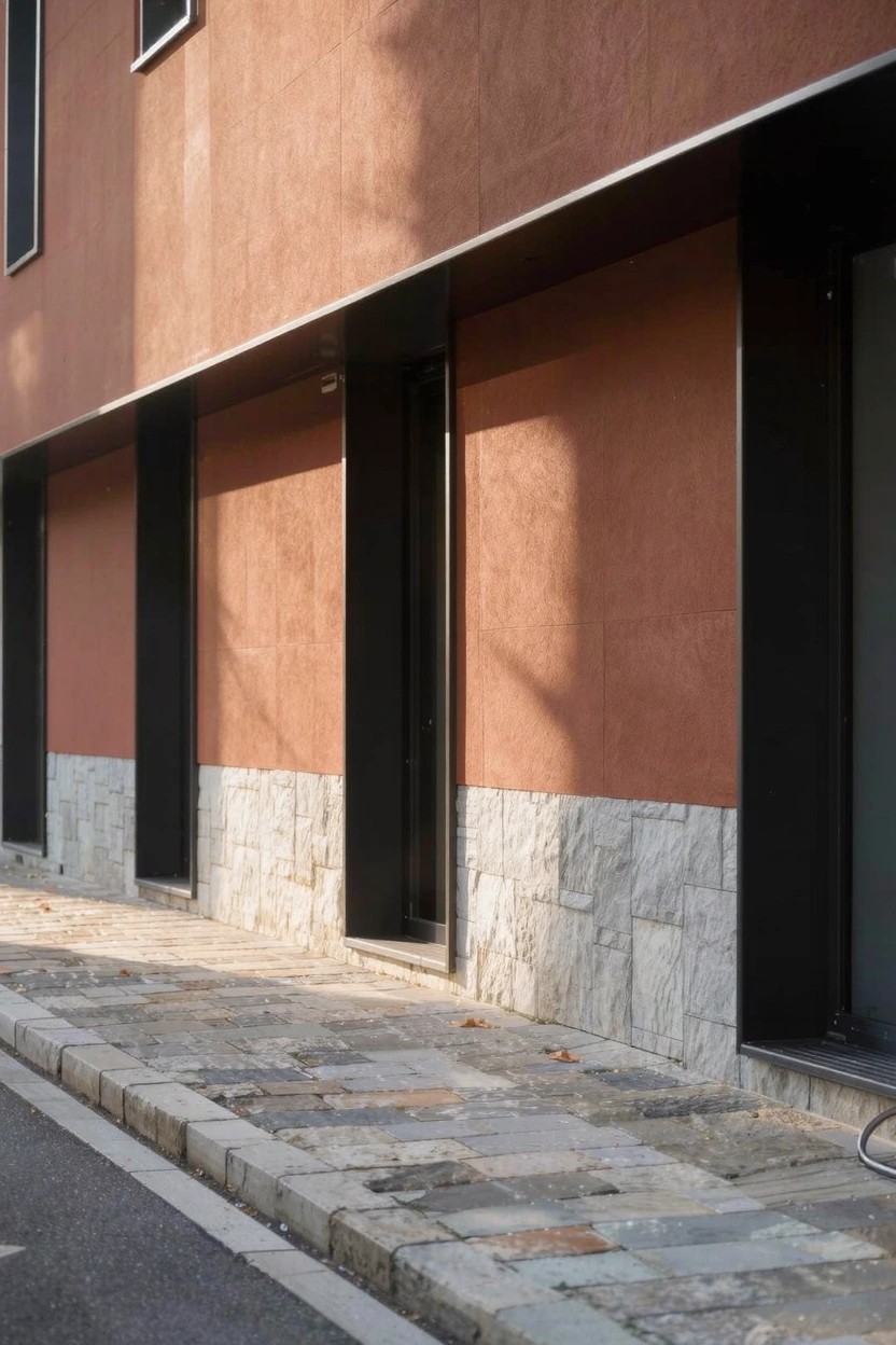
This setup shows off a warm terracotta on the main walls. It seems closest to Sherwin-Williams Spiced Cider, Benjamin Moore Potters Clay, or Behr Terracotta Flowerpot. That earthy red-brown shade feels grounded and fresh at the same time. It’s got enough warmth to keep things from looking stark.
Warm undertones bring out the best in good light. Black trim sets it off nicely, same with the light stone base down low. Try it on homes with some sun exposure. Just test samples first, since it can shift a bit.
Deep Black Siding
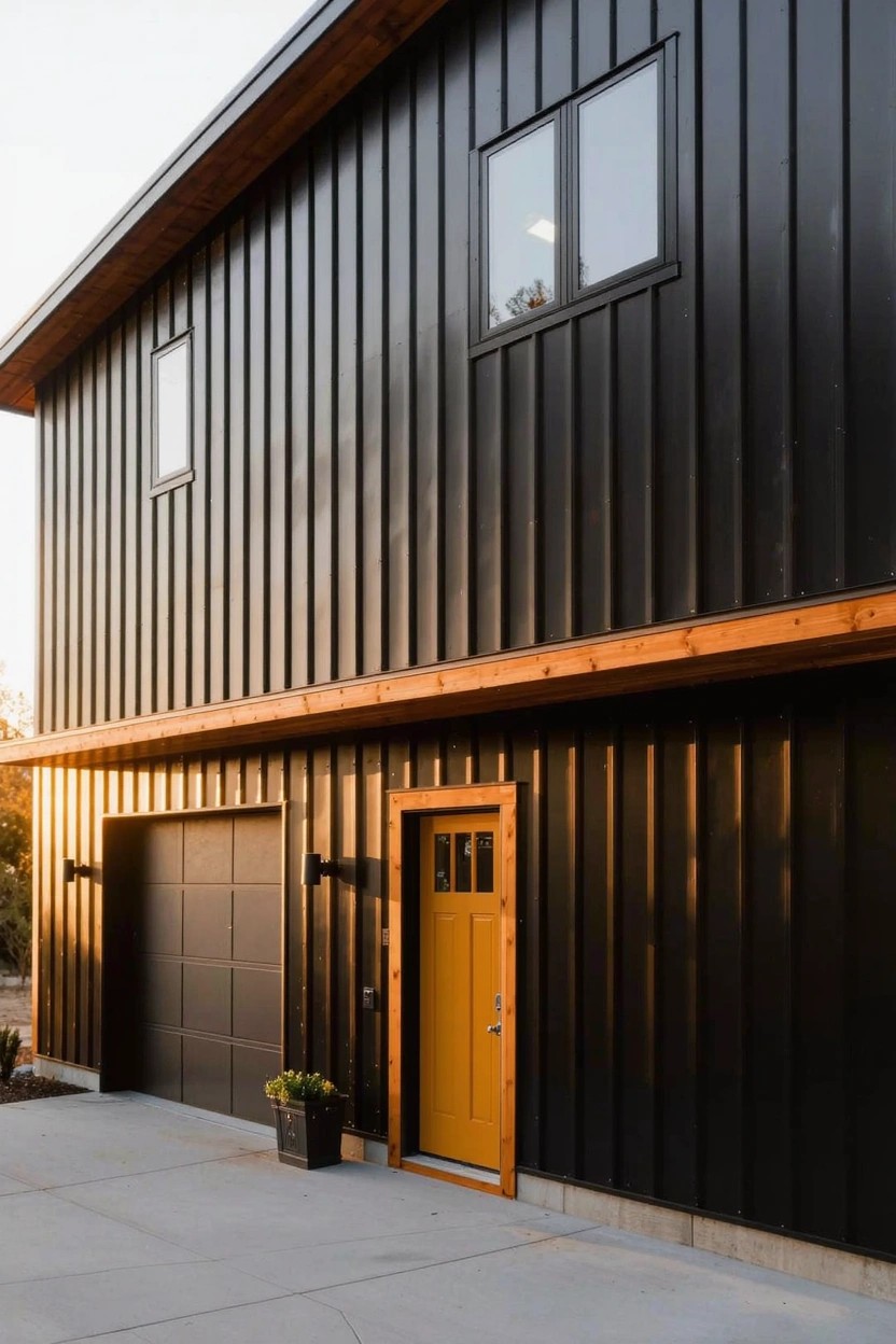
This exterior pulls off a deep black on the siding that feels like a true black. It reads close to Sherwin-Williams Tricorn Black or Benjamin Moore Onyx, maybe Behr’s Black. That kind of color gives a modern edge without trying too hard. The wood trim and yellow door stand out nice against it.
Black like this has a neutral undertone so it works with warm woods or pops of orange. It holds up well in good light, doesn’t fade to gray. Pair it on a garage or full facade if you want bold but simple. Just keep the surfaces clean, dirt shows more.
Pale Gray Brick Exterior
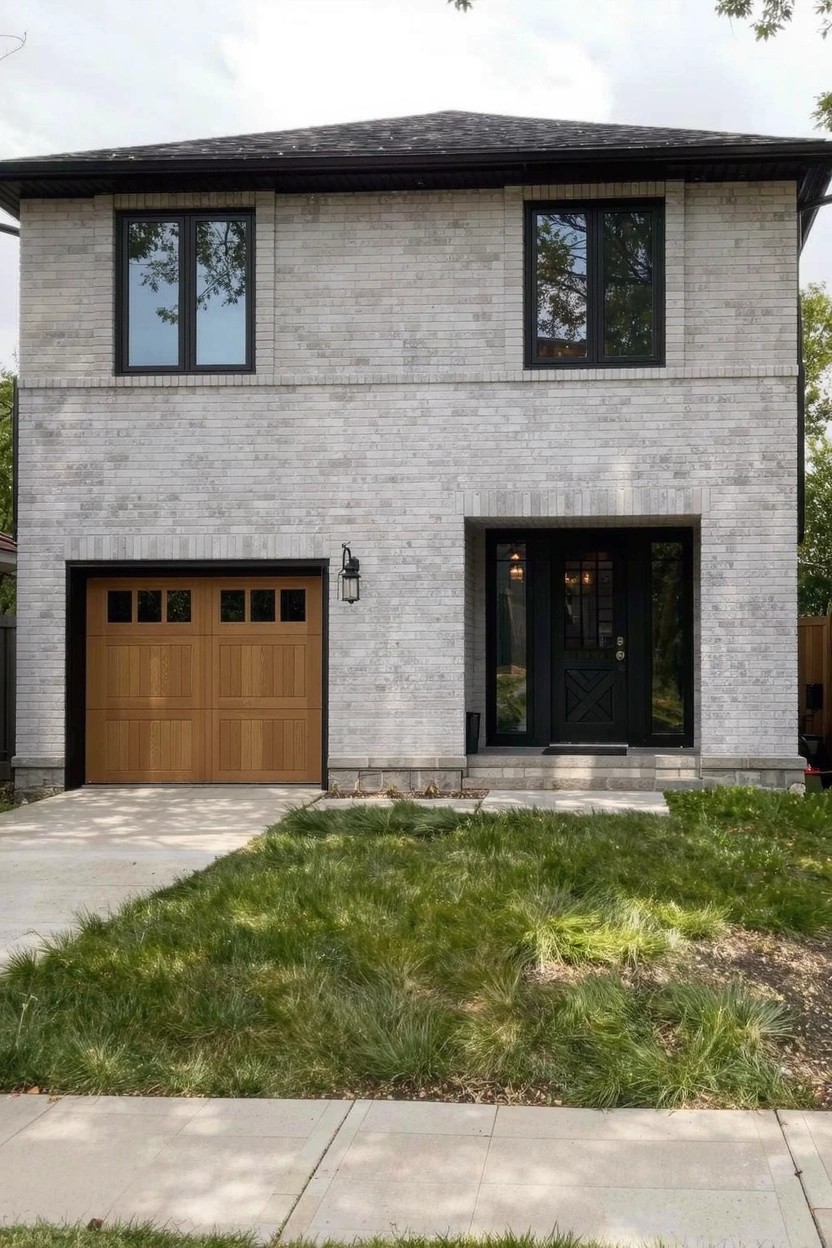
This house uses a pale gray brick that’s right in the light cool-gray family. It reads very close to Sherwin-Williams Repose Gray or Benjamin Moore Gray Owl, maybe even Behr’s Silver Drop. What stands out is how clean and modern it feels against the black windows and wood garage door. It’s a solid choice if you want something fresh without going too bold.
The cool undertone keeps it crisp, especially in good light. Pair it with dark trim like here, or warm wood accents to balance things out. Works best on straightforward modern homes. Just watch if your area has lots of direct sun, it might pull a bit cooler.
Deep Green Siding
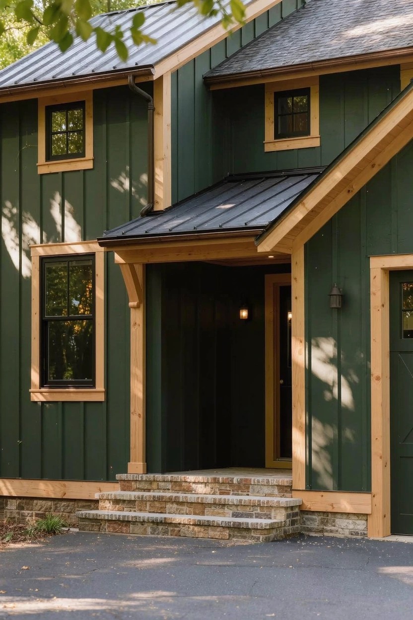
This exterior pulls off a deep green on the board-and-batten siding. It’s in the forest green family and reads close to Sherwin-Williams Pewter Green or Benjamin Moore Essex Green, maybe Behr’s Woodland Sage too. That kind of color sits quietly but strong, especially next to natural wood.
Warm earthy undertones give it depth without feeling heavy. It shines in partly shaded spots like this yard with trees overhead. The yellow wood trim and light stone steps keep everything balanced. Go easy on pairings though, stick to naturals so it doesn’t compete.
Warm Beige Stucco Walls
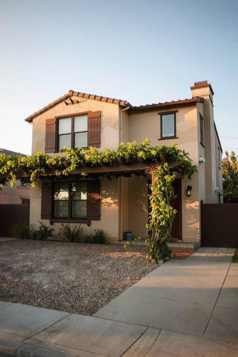
This exterior pulls off a warm beige on the stucco that sits just right. It looks closest to Sherwin-Williams Accessible Beige, or maybe Benjamin Moore Edgecomb Gray and Behr Wheat Bread. That kind of soft, easy beige keeps things feeling homey and not too stark. Folks go for it when they want color that blends with plants and wood without overpowering.
The warm undertones here pick up nicely on the brown shutters and vine-covered arbor. It works best in sunny yards where the light warms it up even more. Pair it with darker trim or stone accents, but skip cool grays nearby… they can fight it a bit.
Warm Beige Exterior Walls
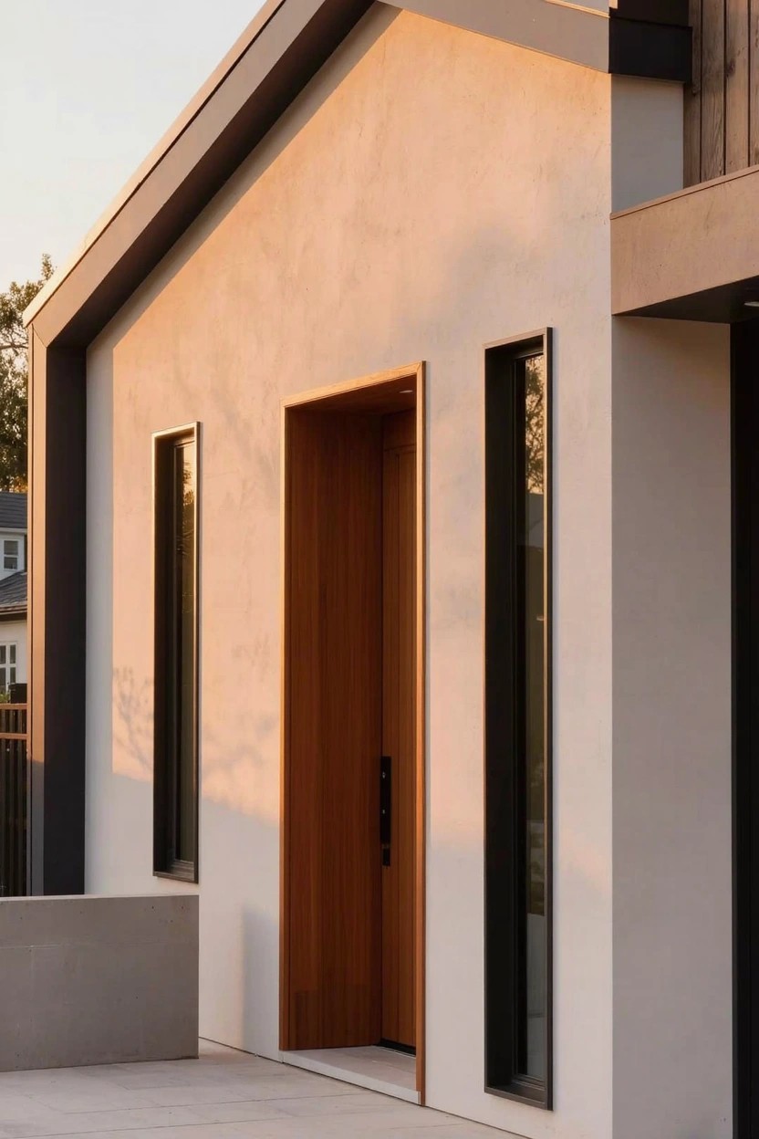
This warm beige on the stucco reads very close to Sherwin-Williams Accessible Beige. Benjamin Moore Edgecomb Gray has that same easy feel, and Behr Toasted Almond comes pretty near too. It’s a solid neutral that doesn’t go too yellow or gray. Folks like it for modern homes because it lets the wood and trim stand out without stealing the show.
The warm undertones keep it from looking flat next to natural wood like that door. It works best where you get good light, pairing nice with black window frames or stone bases. Just test a sample first, since it can shift a bit on different siding.
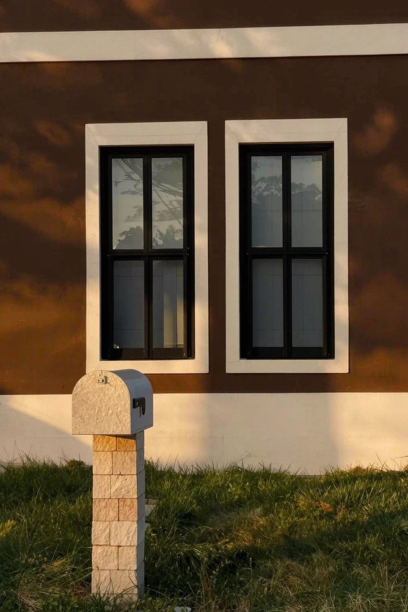
Vibrant Lime Green Accents
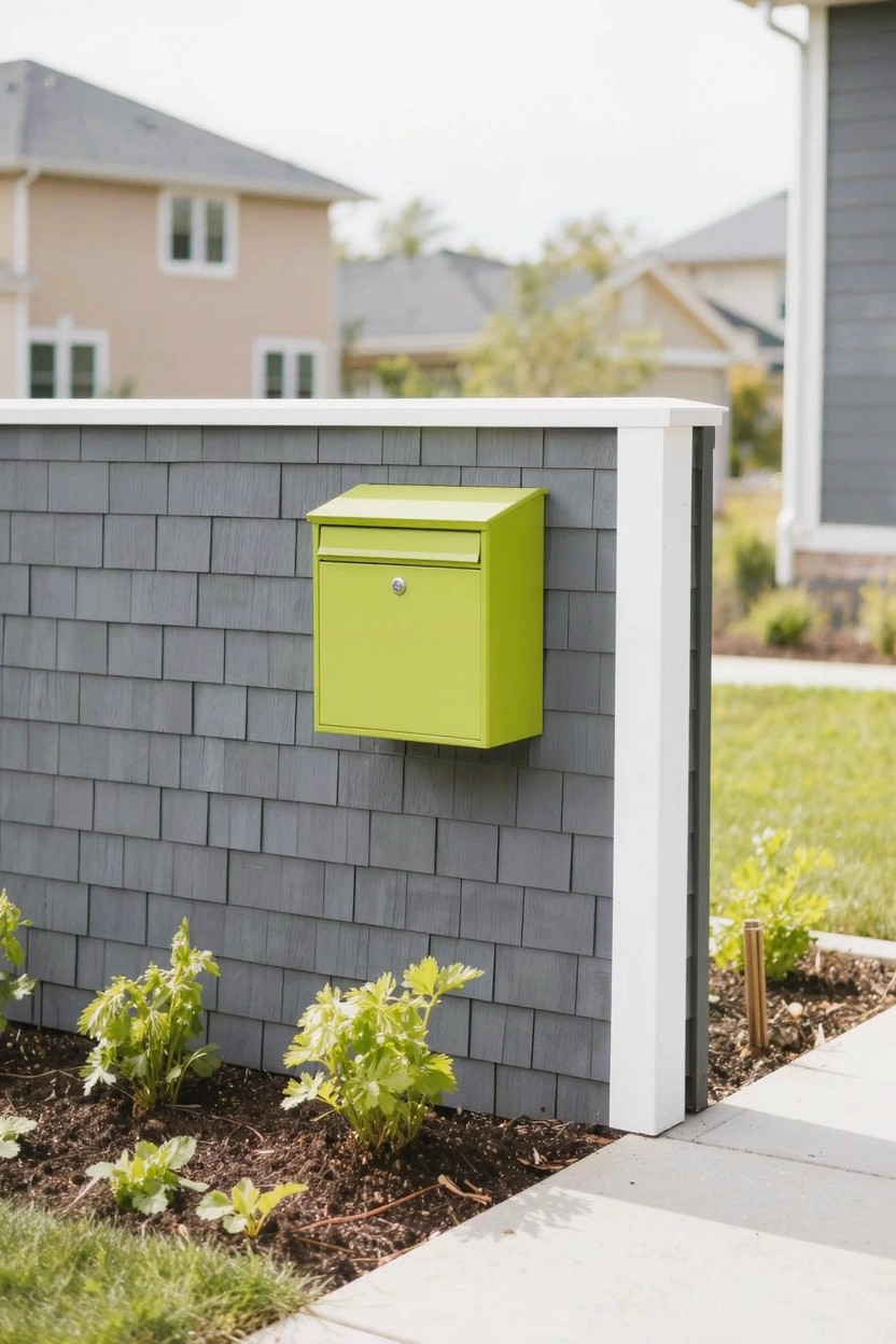
That lime green mailbox stands out strong in this setup. It’s a bright, punchy green in the lime family, and it reads very close to Sherwin-Williams Scandal or Behr In the Lime Light. Maybe even Benjamin Moore Key Lime. People go for it because it adds real zip to plain exteriors without taking over.
The color pulls a bit cool in daylight, which keeps things fresh next to grays like the shingle siding here. Use it on small spots, doors or trim maybe. Stick to neutrals around it. Full walls? Only if you’re feeling bold.
Crisp White Siding
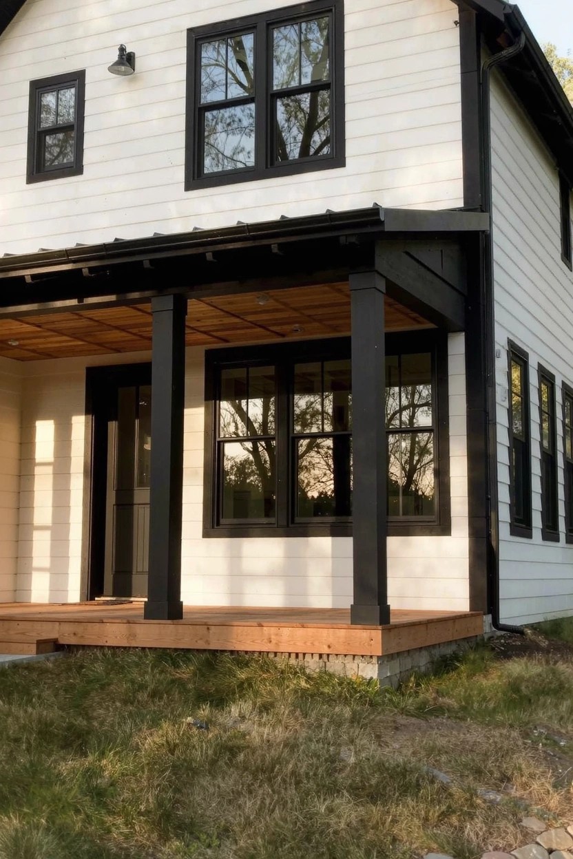
This siding shows off a bright clean white that seems closest to Sherwin-Williams Extra White or Benjamin Moore Chantilly Lace. Maybe Behr Ultra Pure White too. It’s a straightforward white. No fuss. People go for it because it lets black trim stand out sharp and keeps the whole look modern without trying too hard.
That neutral tone holds up in good daylight. Works best on a house like this with dark frames around the windows and some wood on the porch. Avoid pairing it with too many pastels. Stick to bold contrasts.
Deep Navy Walls
This exterior leans on a deep navy paint for the main walls. It has that same feel as Sherwin-Williams Naval, Benjamin Moore Hale Navy, or Behr Abyss. Folks like it because it’s bold but grounded, especially next to wood accents.
The blue undertone stays cool yet picks up warmth from the sunset light or nearby trim. It suits modern homes with clean lines and big glass. Just pair it with natural wood or crisp white to keep things balanced.
Pale Sage Green Walls
That soft pale sage green covering the house walls looks closest to Sherwin-Williams Sea Salt or Benjamin Moore Saybrook Sage. Behr’s Back to Nature reads pretty similar too. It’s a gentle green in the sage family. People go for it because it feels fresh and easy on the eyes. Keeps things modern without trying too hard.
The cool undertone sits well next to black trim. Notice how it works with those dark windows and door. Brightens up in sunlight. Try it on stucco or textured siding. Add some greenery nearby and it blends right in.
Cool Light Gray Exterior
This setup uses a cool light gray on the main walls that reads very close to Sherwin-Williams Repose Gray or Benjamin Moore Gray Owl. Behr’s Silver City has that same clean feel too. It’s the kind of neutral gray that gives a modern house a fresh, understated look without trying too hard.
That cool undertone keeps it from going warm or muddy in different lights. Pair it with black trim like you see here on the panels and canopy. It works best on contemporary homes with stone or concrete details nearby. Just test a sample outside first.
Warm Beige Siding
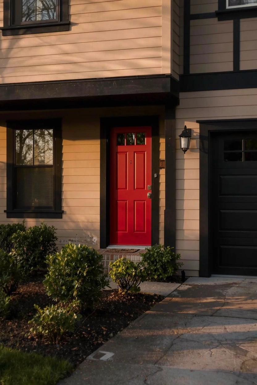
This warm beige covers the siding here and gives the house a solid, easy feel. It looks closest to Sherwin-Williams Accessible Beige or Benjamin Moore Edgecomb Gray, maybe Behr’s Toasted Almond too. Folks like it because it lets black trim pop and that red door really stands out. Keeps things fresh without trying too hard.
The warm undertones show up best in afternoon light like this. It suits modern homes with simple lines or a bit of wood detail. Watch the landscaping though, greens nearby make the beige read even richer. Avoid cool grays next to it, they can fight a little.
Creamy White Walls
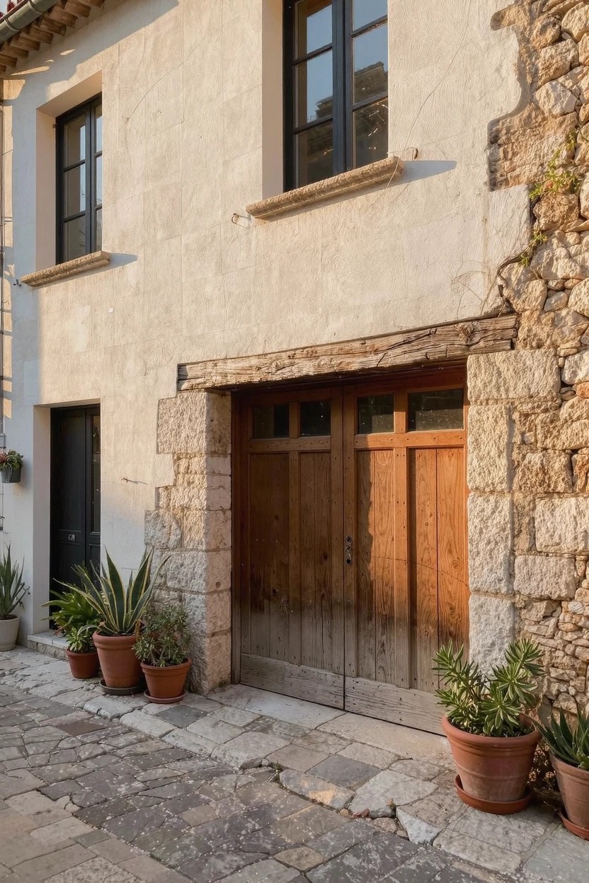
The walls here use a creamy white paint. It looks closest to Sherwin Williams Alabaster or Benjamin Moore White Dove, maybe Behr Swiss Coffee too. This warm white stays soft, not stark. It pulls the stone base and wood door together nicely for a fresh exterior.
That subtle warmth comes out best in good light. It suits older homes with stone or brick details. Try black trim on windows to keep it modern. Just test samples outside first.
Creamy White Walls
Alt text: Rustic exterior of a house featuring creamy white smooth plaster walls above a stone foundation, paired with dark wood garage doors and black-framed windows on a cobblestone path.
Navy Blue Clapboard Siding
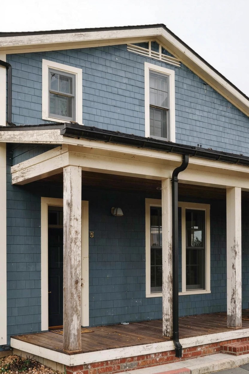
This siding paint reads as a deep navy blue with gray undertones. It looks closest to Sherwin-Williams Naval or Benjamin Moore’s Hale Navy, maybe even Behr’s Blue Peppercorn. That kind of color gives a house a solid, grounded look without going full black. It’s steady on the eyes, especially next to the natural wood porch posts here.
The gray in it keeps things from feeling too cold, even on overcast days. Pair it with unpainted wood trim or crisp white doors to let the navy stand out. Works best on homes with some age to them, like farmhouses or coastal spots. Just test a sample first, since lighting can shift the blue a bit greener.
Warm Brown Exterior Walls
This warm brown paint covers the main body of the house and gives off an earthy feel. It looks closest to Sherwin-Williams Roycroft Suede or Benjamin Moore Spice Box, maybe Behr Spiced Brandy too. Folks like it because it stands up well against stone details and keeps white trim crisp. Not too dark. Just right for a solid backdrop.
The warm undertones keep it from going muddy in different lights. Pair it with black or white accents, and it works on most homes. Watch for cooler grays nearby though. They can fight the warmth a bit. Good pick for fresh modern exteriors.
Warm Greige Siding
This siding shows a warm greige that seems closest to Sherwin-Williams Agreeable Gray or Benjamin Moore Edgecomb Gray, maybe Behr’s Silver Screen too. It’s a soft neutral blending beige and gray tones. People go for it on exteriors because it stays looking clean even with some dust around.
That beige undertone picks up nicely in sunny spots. Use white trim to keep things sharp, and add stone or gravel at the base. It suits modern homes in dry areas best. Just test a sample first, lighting changes it a touch.
Frequently Asked Questions
Q: How do I test these color combos on my actual house before painting?
A: Grab some large paint samples or poster boards in the shades you like. Tape them up at different times of day to see how light changes them. Pick the one that pops just right with your surroundings.
Q: What if my neighborhood has strict rules on house colors?
A: Chat with your HOA or check local guidelines early. Tweak a combo by toning down the boldest shade to match approved neutrals. You still get that fresh vibe without the hassle.
Q: Do these modern combos work well on older homes?
A: Yes, pair a crisp white base with one unexpected accent to bridge old and new. It refreshes without overwhelming the original charm… And your place stands out nicely.