

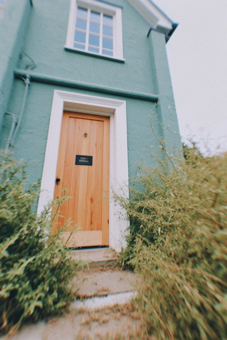
I’ve noticed how exterior paint colors come alive or fall flat depending on the way sunlight filters through trees or bounces off neighboring roofs.
You pick something refined in the store, but out on the house, it might pull too cool in shade or warm up unexpectedly at noon.
I once dismissed a muted sage because it looked dull on the fan deck, only to love it once I stuck a sample on our south-facing wall where it stayed balanced all season.
Classic shades like these usually succeed when they echo your home’s natural materials without overpowering them.
Test a couple in your real light.
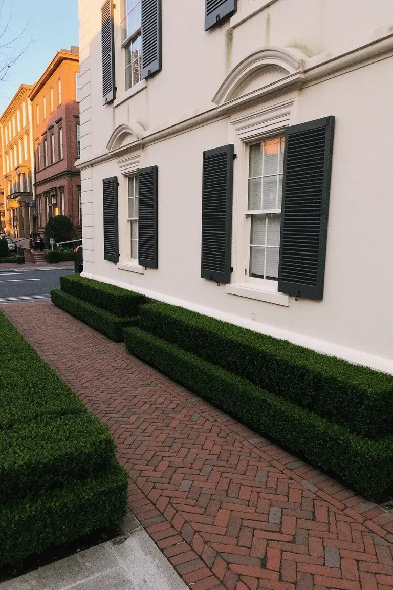
Crisp White Siding
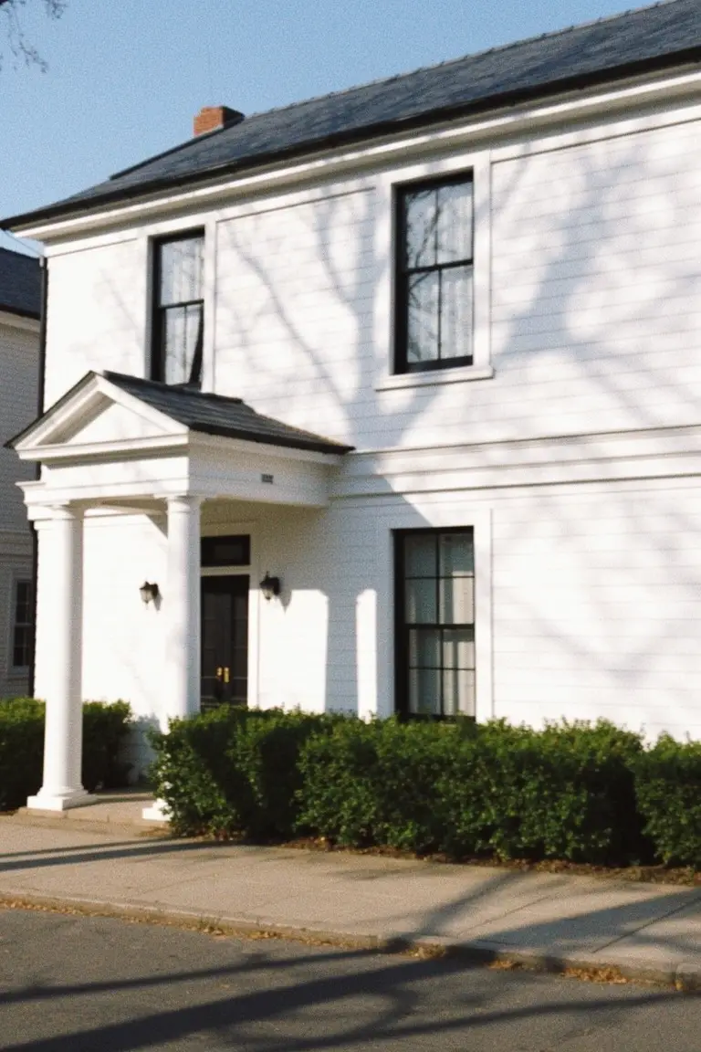
This bright white exterior looks closest to Sherwin Williams Extra White or Benjamin Moore Chantilly Lace. Sometimes Behr Ultra Pure White fits too. It’s the kind of clean white that freshens up a traditional house without much fuss. Folks go for it on places like this because it lets the architecture shine.
Cool undertones keep it from going yellow in the sun. Works best on clapboard siding with dark trim around the windows and doors. Add boxwoods out front. Just watch it can show dirt over time.
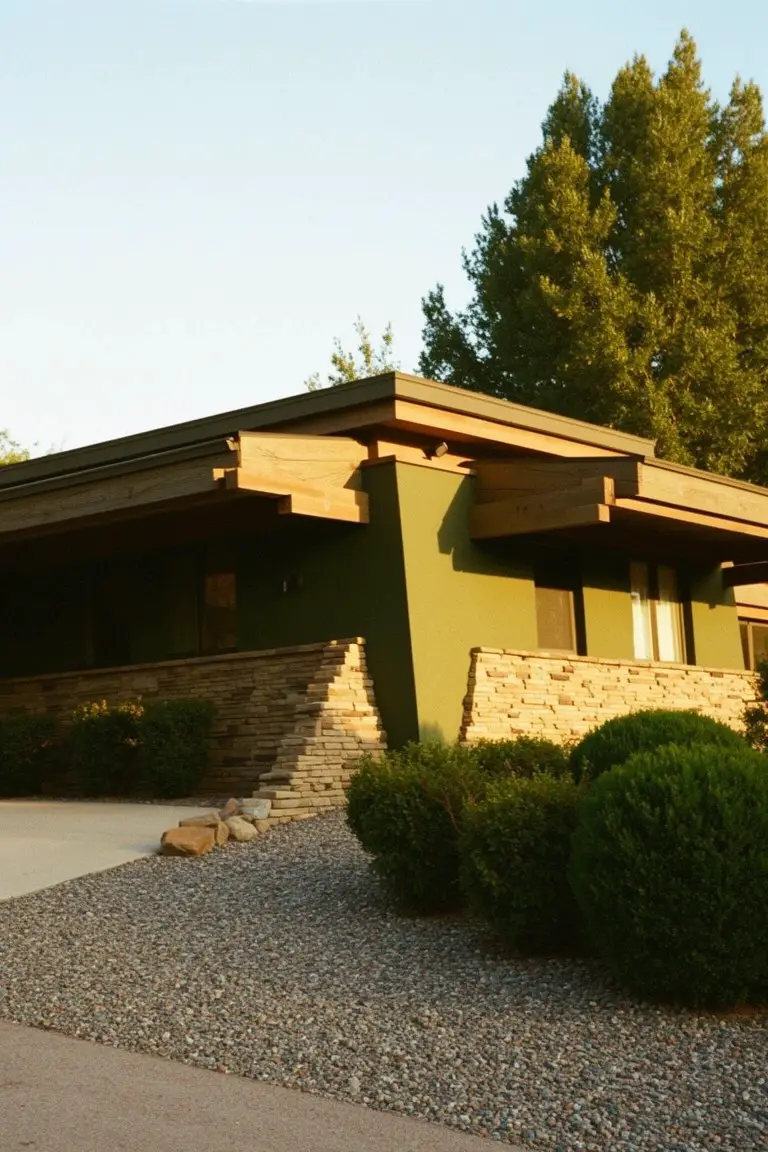
Soft Greige Exterior
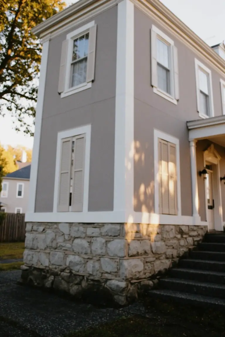
This exterior shows off a soft greige, that in-between gray and beige so many older homes pull off well. It reads closest to Sherwin Williams Agreeable Gray or Benjamin Moore Revere Pewter, maybe Behr’s Wheat Bread too. The color sits neutral but warm enough to keep stone bases and wood trim from looking stark.
Warm undertones make it hold up in changing light, especially around trees or on corners like this. Pair it with crisp white shutters and doors. It works best where you want low-key charm without going full gray. Just test a sample, since north-facing spots can pull cooler.
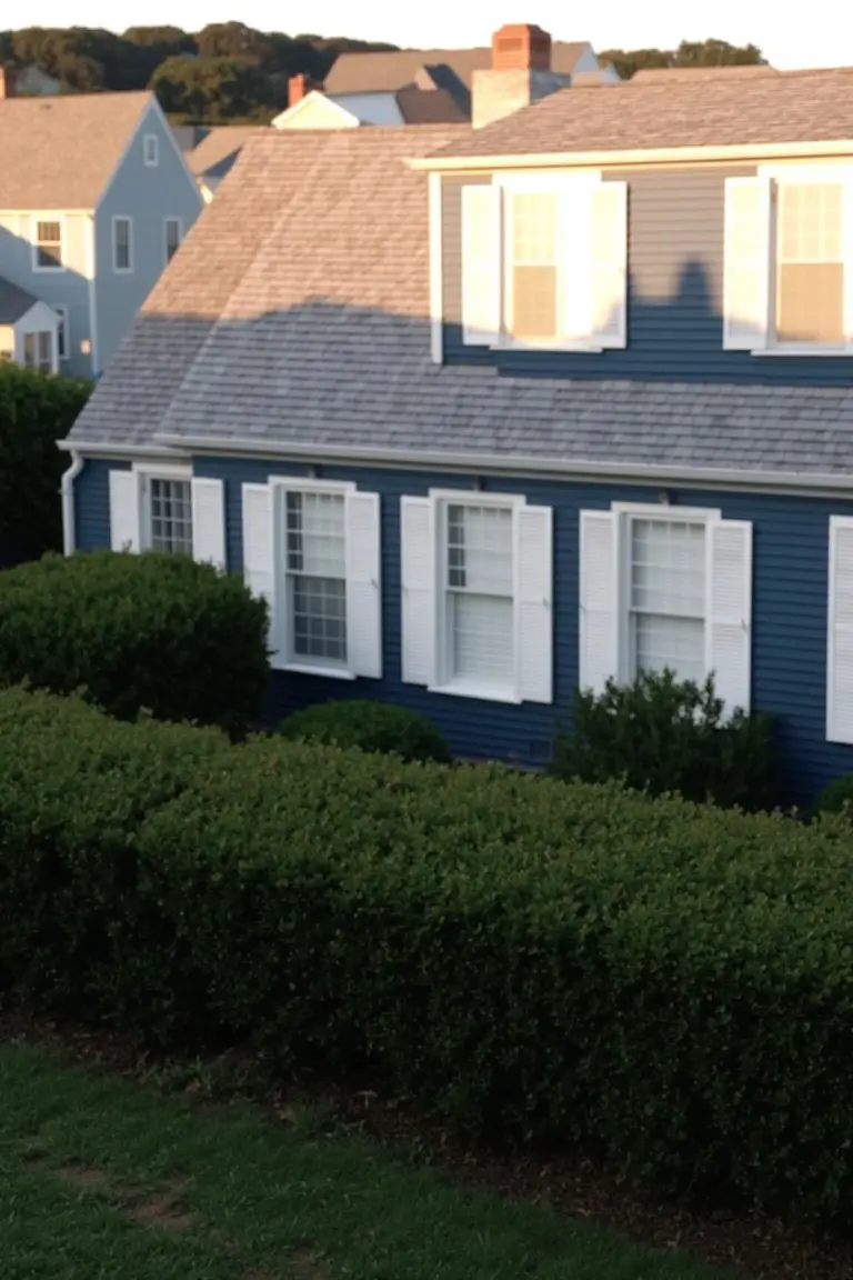
Deep Navy House Siding
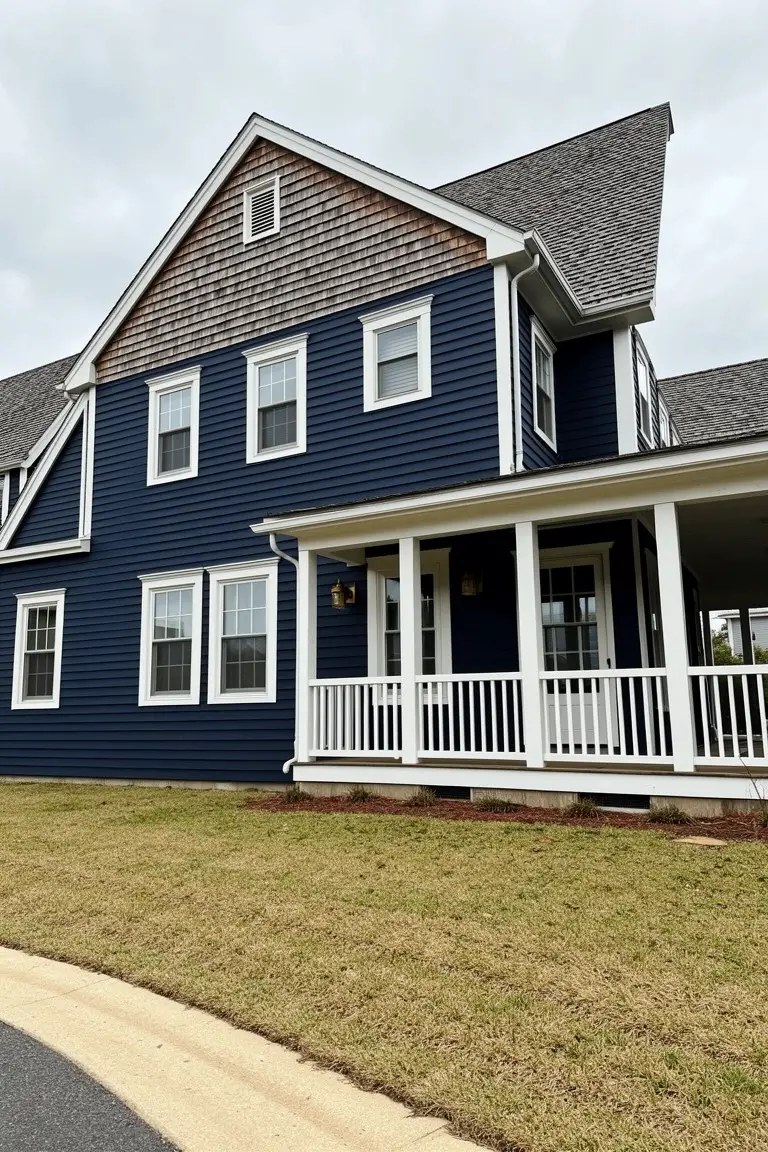
This deep navy blue on the house siding makes for a solid classic exterior choice. It looks closest to Sherwin-Williams Naval, Benjamin Moore Hale Navy, or Behr Deep Space. What stands out is how it holds its own next to white trim and wood shakes, giving that refined vibe without much fuss.
The cool undertone keeps it from going too dark in overcast light. It works best on traditional homes like this one, paired with clean white rails and natural roof shakes. Just watch it doesn’t clash with warm brick if you’re adding any.
Charcoal Gray Brick
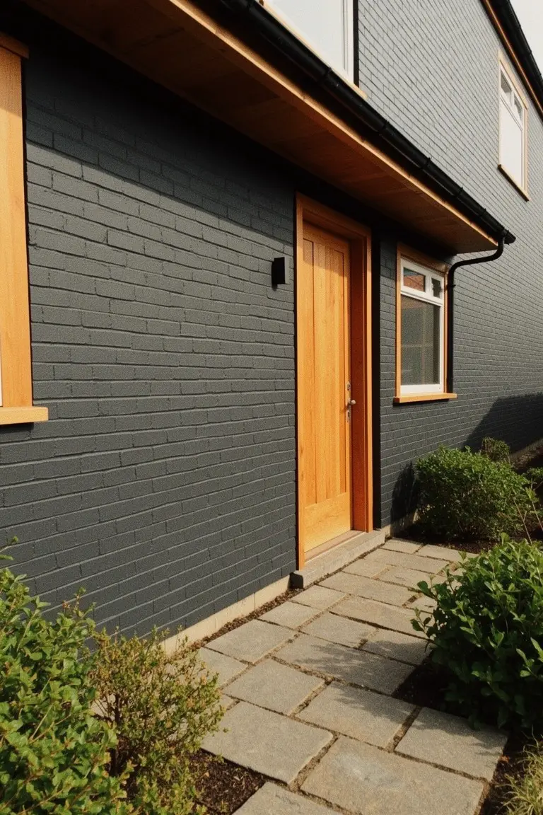
This charcoal gray on the brick reads very close to Sherwin Williams Iron Ore or Benjamin Moore Kendall Charcoal. It’s a deep, cool-toned neutral that gives exteriors a refined edge without going full black. Folks like it because it stands up to all kinds of weather and makes wood accents pop.
Pair it with warm wood doors like the orange one here, or crisp white trim. It works best on north-facing houses where it won’t look too stark. Just watch the undertones in different lights, it can pull a bit blue sometimes.
Soft Sage Green Exterior
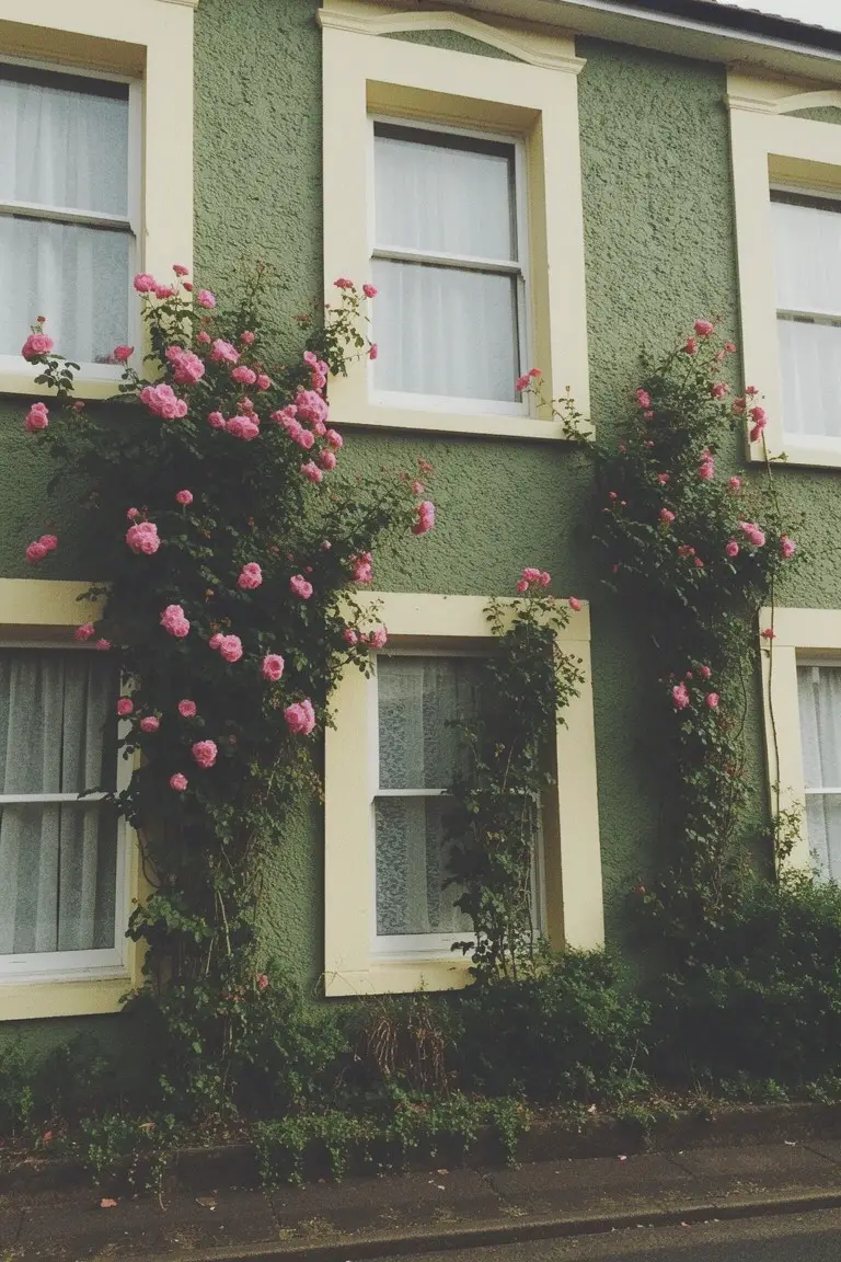
This muted sage green on the house walls reads very close to Benjamin Moore’s Saybrook Sage or Sherwin-Williams Clary Sage, with a nod to Behr’s Silver Sage too. It’s that soft green family, not too yellow or blue, just right for a settled, classic feel on older homes. Folks like it because it doesn’t shout. It sits quiet and lets the trim and plantings stand out.
The color has a gentle olive undertone that warms up in soft light. Pair it with cream or pale yellow window frames, like here, and climbing roses for some pink pop. It works best on north-facing spots or shaded sides, where bolder greens might turn dingy. Just test a sample first… greens shift outdoors.
Warm Beige Exterior
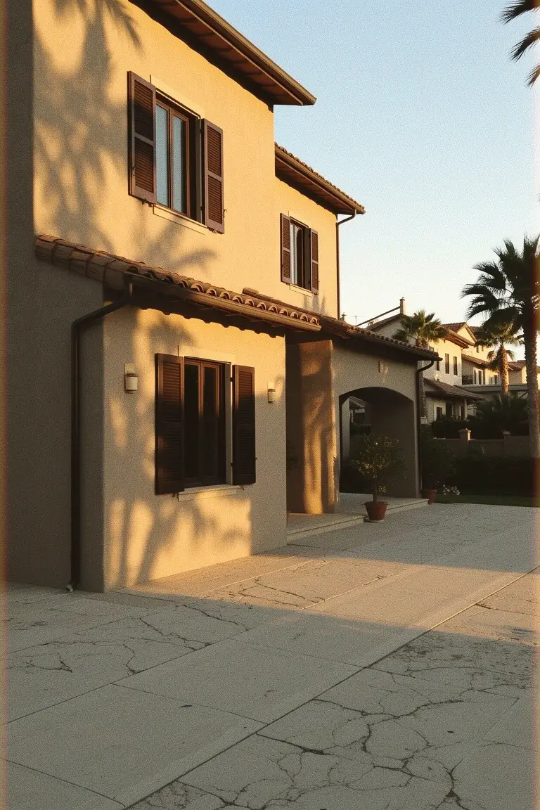
This warm beige on the stucco walls looks closest to Sherwin-Williams Accessible Beige or Benjamin Moore Edgecomb Gray. It’s that easy neutral tone that feels right at home in sunny spots. People go for it because it stays looking clean without being stark white, and it lets the wood shutters and tile pop nicely.
The warm undertone keeps it from going too gray, especially in good light. Pair it with dark trim or plants for contrast. Works best on bigger homes like this one, where it gives a settled, lived-in feel. Just test a sample first, since it can shift a bit on textured surfaces.
Soft Cream Exterior
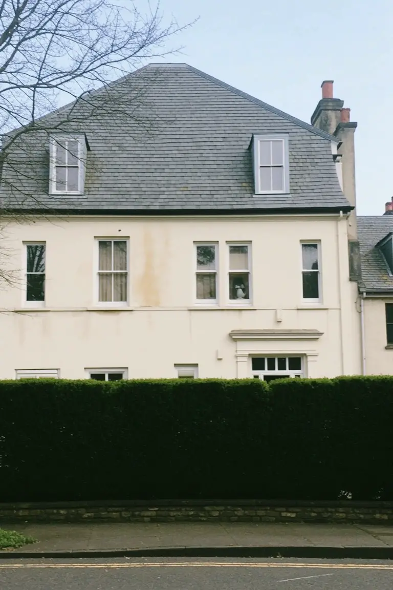
This soft cream paint is a classic warm white that shows up well on stucco or siding like this. It reads closest to Benjamin Moore White Dove or Sherwin-Williams Alabaster, maybe Farrow & Ball Pointing too. Folks like it because it feels settled and easy, not too yellow but enough glow to keep things from looking cold.
That subtle warm undertone helps it sit right with slate roofs and brick chimneys. White trim keeps it crisp. It works best on bigger homes facing the street, where hedges or lawns add some green. Just test in your light first…north-facing spots can pull cooler.
Muted Blue-Gray Siding
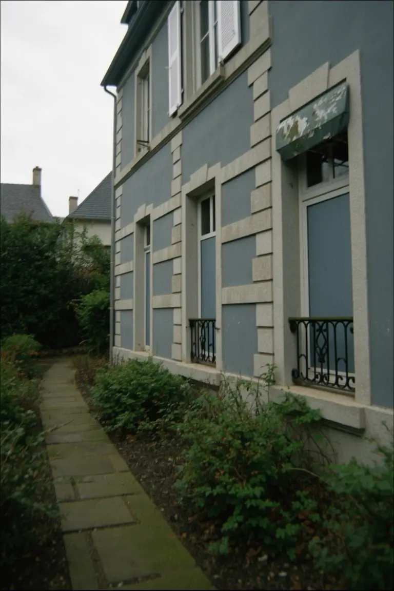
This muted blue-gray feels right at home on classic exteriors. It reads very close to Sherwin-Williams Sea Salt or Benjamin Moore Palladian Blue, maybe Behr Whale Harbor too. Cool-toned with just enough blue to keep it interesting. People go for it because it suits older houses without overpowering the stonework or trim.
The undertone stays blue in most lights, so it works well on shady sides. White window frames and black shutters stand out clean against it. Watch for pairing with warm woods though. Might need testing there.
Crisp Black Trim
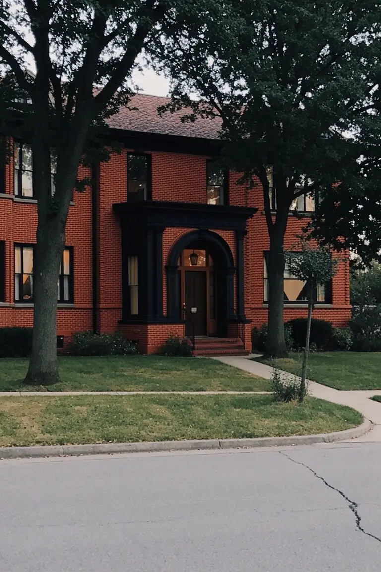
This brick house shows off a deep black paint on the trim, windows, and door arch. It’s that true black family, and it seems closest to Sherwin-Williams Tricorn Black or Benjamin Moore Onyx, maybe Behr Black Magic too. What stands out is how it frames the red brick so cleanly. Makes the whole front feel pulled together without trying too hard.
True blacks like this have no strong undertone. They hold up in shady spots or full sun. Best on traditional homes with brick or stone. Pair it with the house’s natural reds, keep lighter siding crisp white if you add any. Watch it doesn’t overwhelm small entries.
Warm Terracotta Walls
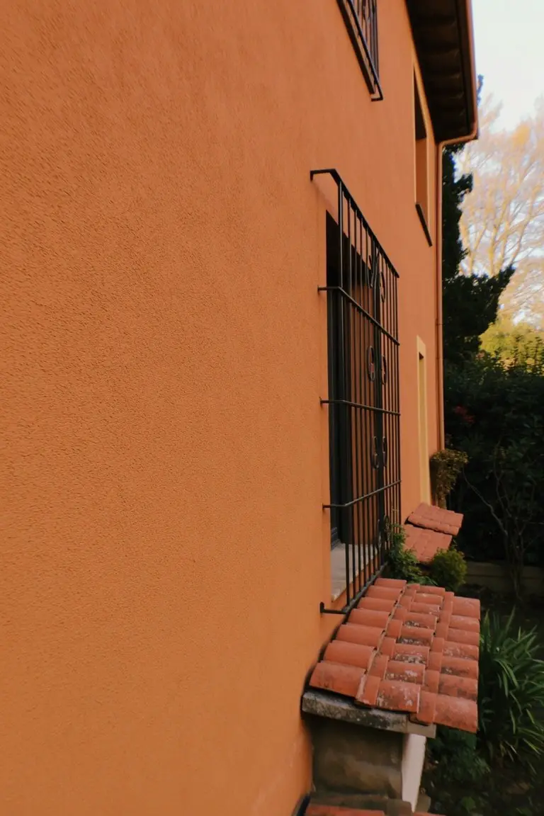
This terracotta paint on the stucco wall reads very close to Sherwin Williams Terracotta Tile or Benjamin Moore Potters Clay, with Behr’s Terracotta Sunset right in the mix too. It’s a warm, rusty orange in the earth tone family that settles into a home nicely. Folks go for it because it has that lived-in Mediterranean feel, cozy but not overpowering.
The red undertones warm up under sunlight, working best with black wrought iron like on this window or red clay roof tiles. Pair it with crisp white trim to keep things sharp. Skip it on north-facing sides unless you want a cooler read.
Pale Yellow Siding
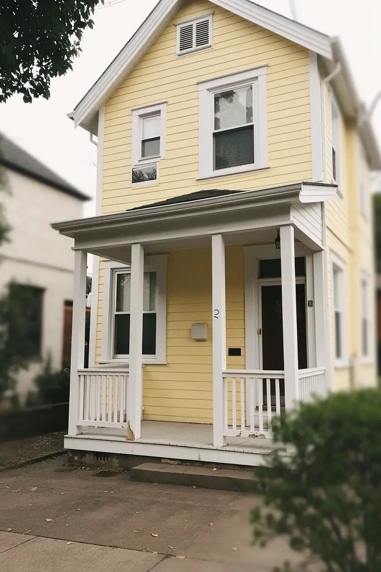
This pale yellow on the house siding looks closest to Sherwin-Williams Greek Villa or Benjamin Moore Pale Yellow, maybe Behr Butter Up too. It’s a soft buttery shade in the yellow family, the kind that’s classic for older homes. Gives a fresh, sunny feel without going overboard.
Warm golden undertones keep it from looking washed out in overcast light, like you see here. White trim on the porch columns pops right against it. Try this on Victorian or Craftsman styles, with a wood door for contrast. Just test samples first, yellow can shift funny in shade.
Soft Greige Siding
This exterior pulls off a classic soft greige on the main walls. It’s that in-between neutral where gray meets beige, and it reads closest to Sherwin-Williams Agreeable Gray or Benjamin Moore Revere Pewter. Behr’s Silver City has a similar vibe too. Folks like it because it stays put in any light without looking too stark or muddy. Pairs nicely with the wood door here.
The warm undertone keeps it from going cold, especially next to black window frames. It works best on bigger homes like this where you want something refined but not fussy. Stick to natural wood accents or stone details, and watch for north-facing spots where it might lean more gray. Solid choice for a low-key update.
Soft Sage Green Exterior
This soft sage green paint on the house body looks closest to Sherwin Williams Retreat or Benjamin Moore Saybrook Sage, maybe Behr’s Silver Sage too. It’s an earthy green with a muted tone that feels calm and grounded right away. Folks like it because it blends so well with nature without shouting.
The warm gray undertones keep it from going too yellow in sunlight. It pairs easy with stone bases and wood trim like here. Best on homes with some landscaping, watch it on super shady spots though… might read cooler.
Muted Teal Exterior
This muted teal on the house body pulls from the cool blue-green family. It looks closest to Sherwin-Williams Sea Salt or Benjamin Moore Palladian Blue. Farrow & Ball Borrowed Light has that same soft feel too. Folks like it for giving a house some color without going overboard. It’s refined in a quiet way.
The cool blue undertone reads clean next to white trim and wood doors. It works best on north-facing sides or cloudy days. Just pair it with warm wood tones to keep things balanced. Avoid too much bright sun if you want that steady look.
Deep Navy Siding
This house uses a deep navy blue on the siding that gives off a classic, pulled-together feel. It looks closest to Sherwin-Williams Naval or Benjamin Moore Hale Navy, maybe Behr’s Abyss too. Folks pick shades like this for exteriors because they stand up to weather and keep things looking sharp year-round.
The white trim on the windows and shutters makes the navy read even richer. It has a subtle warm undertone that works best on older-style homes, especially with green hedges nearby or light shingle roofs. Just test it in your light first… navies can shift cooler in shade.
Deep Green Siding
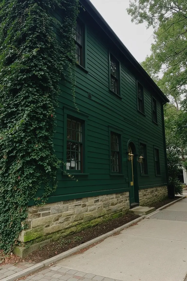
This deep green on the clapboard siding reads very close to Sherwin-Williams Pewter Green or Benjamin Moore Black Forest Green, maybe Behr Hunter Green too. It’s the kind of rich green that suits older homes right away. That steady color pulls together stone bases and wood details without much fuss.
With its warm undertone, it holds up in shaded spots or under trees. Brass hardware on the door pops nicely against it. Just watch if your light is too cool, or it might lean a touch darker.
Crisp White Exterior
This clean white on the house siding seems closest to Sherwin Williams Extra White or Benjamin Moore Chantilly Lace, maybe Behr Ultra Pure White too. It’s that straightforward bright white folks go for on older homes. Keeps the look crisp without any yellow creep.
The neutral undertone holds up in full sun, playing nice off black shutters and brick nearby. Boxwoods like these soften the edges a bit. Watch it on north-facing spots though… might read cooler there.
Deep Black Trim
This home goes with a deep black on the window frames and front door. It’s the kind of true black that feels classic and sharp next to wood. Folks pick it for exteriors because it sets off natural siding without stealing the show.
That neutral black holds up well in overcast light or full sun. Pair it with cedar shakes or stone like here, and it stays balanced. Looks closest to Sherwin-Williams Tricorn Black, Benjamin Moore Onyx, or Behr Black.
Frequently Asked Questions
Q: How do I test these classic colors on my house before painting the whole thing?
A: Grab sample pints from your local paint store and brush them onto poster board or scrap plywood. Prop the boards against your siding in different lights—morning sun, afternoon shade, evening glow. That quick check shows how the color plays with your home’s architecture and surroundings.
Q: What trim colors go best with these refined exteriors?
A: Stick to crisp whites or soft creams for most setups. They let the main body color shine without stealing the show. Pair deeper shades like charcoal or forest green with a lighter trim to add subtle contrast.
Q: Do these classic colors hold up well to weather and dirt?
A: Pick high-quality exterior paints with UV protection, and they stay vibrant for years. Darker tones like navy or slate hide dust better than pale ones. Clean them once a year with a hose and mild soap to keep that fresh look.
Q: Which color hides flaws on an older house?
A: Go for muted grays or warm taupes. They smooth over uneven siding or peeling spots without drawing eyes to the rough patches.