

I’ve spent years watching how exterior paints shift from morning fog to midday sun, especially when they butt up against a contrasting roof. Bold wall colors pull off that eye-catching vibe best when the roof anchors them, but they flop if the undertones clash under real sky conditions.
I remember eyeing a rusty red siding sample that seemed too intense next to black shingles until evening light softened it into something welcoming.
Those moments remind me why pairing matters so much outside, where shadows and glare reveal what showroom swatches hide. Try a few of these in your own daylight.
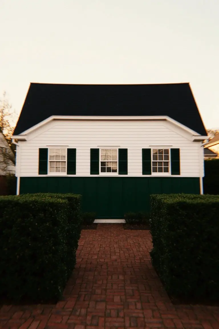
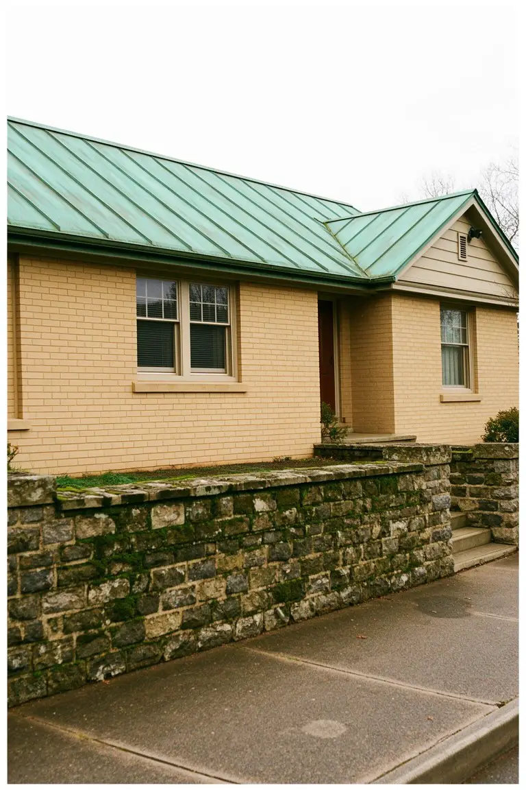
Crisp White Siding
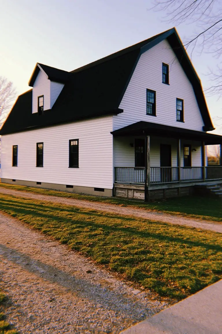
This crisp white on the house siding looks closest to Sherwin Williams Extra White or Benjamin Moore Chantilly Lace. It’s a bright, clean shade that stands out sharp against the black roof. Folks like it because it keeps things simple and lets the contrast do the talking.
Neutral undertones mean it holds up in morning light or late afternoon. Works best on farmhouses or older homes with dark trim. Just pair it carefully with wood tones so they don’t yellow next to it.
Deep Navy Walls
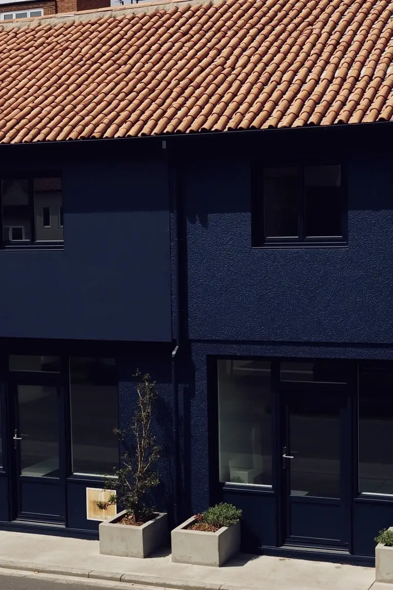
This deep navy blue on the walls seems closest to Sherwin-Williams Naval, Benjamin Moore Hale Navy, or Behr Midnight Ride. It’s a strong cool blue that hugs the building tight. What stands out is how it plays right off that warm terracotta roof. Makes the whole thing feel fresh and pulled together.
A gray undertone keeps the navy from going too blue-black in shade. It suits bigger homes or spots with good sun. Stick to white trim around doors and windows. And yeah, warm roofs like these are perfect to balance it.
Deep Black Walls
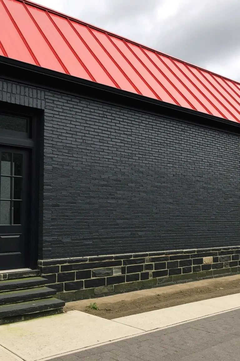
This deep black on the exterior walls gives a strong, modern base that makes the red roof pop right away. It sits in that true black family, close to Sherwin-Williams Tricorn Black or Benjamin Moore Onyx, maybe Behr’s Black too. Folks like it because it’s bold without being fussy, and it handles contrast well.
The color pulls a little warmth from being next to brick, so it won’t go icy cold. It works best on bigger homes where you want that grounded feel, especially with metal roofs in red or rust tones. Just watch it doesn’t fade too fast in harsh sun, and stick to matte finishes outside.
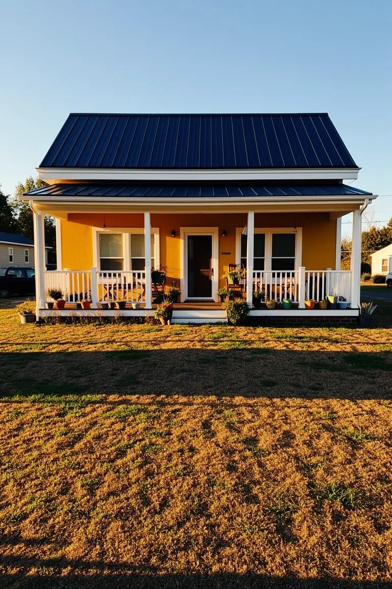
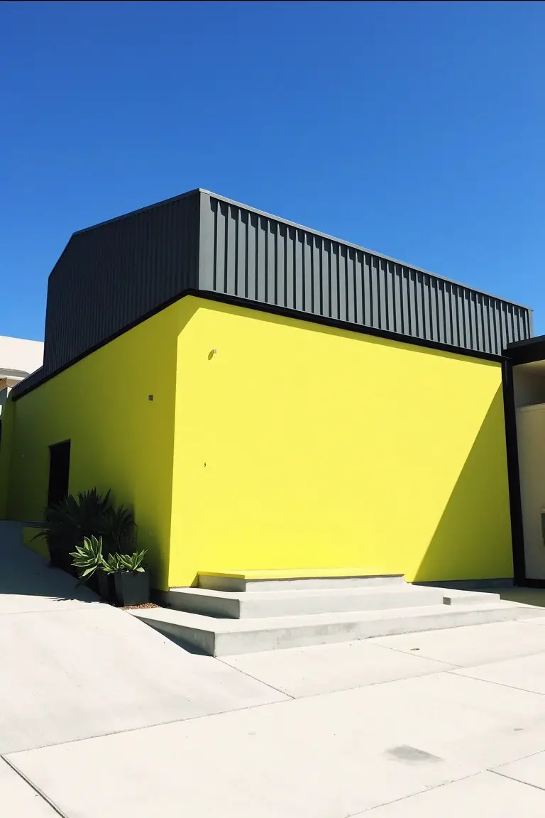
Sunny Yellow Siding
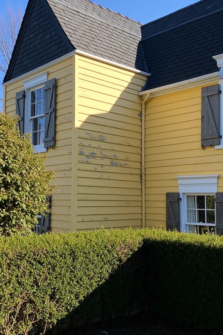
That sunny yellow on the siding pulls from the warm yellow family and looks closest to Sherwin-Williams June Day or Benjamin Moore Hawthorne Yellow. It gives the house a bright, happy lift that works well for standing out. The dark roof overhead makes the color pop even more.
Warm golden undertones keep it from going brassy in sunlight. It pairs nicely with white trim details and dark shutters like you see here. Good for homes with green landscaping nearby, but test a sample first on worn spots.
Earthy Green Walls
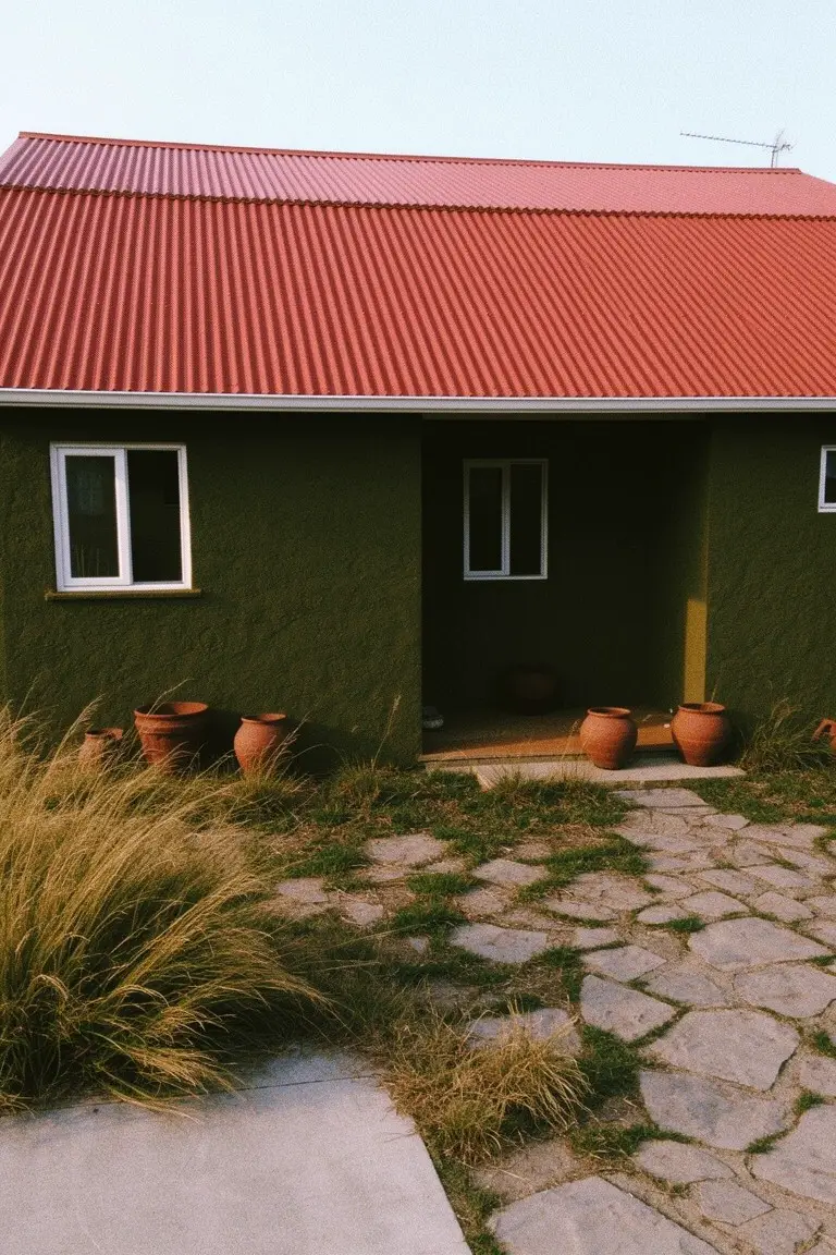
This muted earthy green on the house body seems closest to Sherwin Williams Olive Branch or Benjamin Moore Caldwell Green, maybe Behr Cactus Shadow too. It’s that warm green family with a bit of yellow undertone. Folks go for it on exteriors because it hugs the ground nicely but pops against a red roof like this one.
Warm light brings out the cozy side best. Stone paths and clay pots fit right in, keep things simple. Watch it can read darker in shade though.
Deep Black Walls
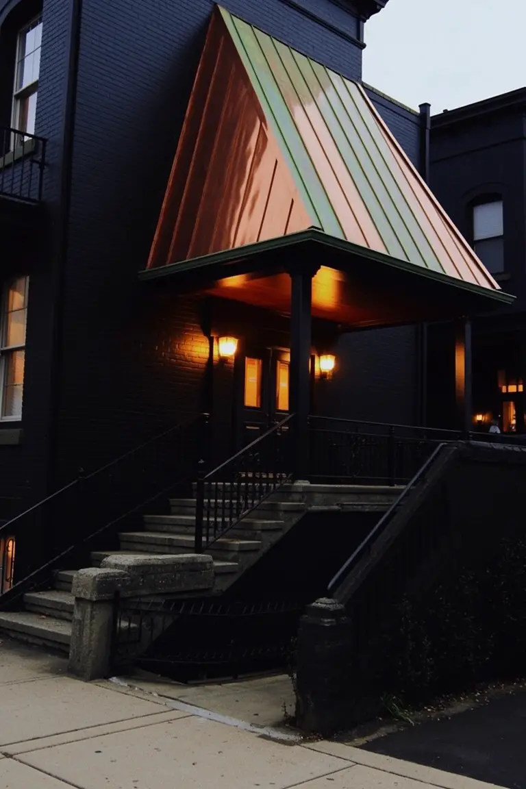
This deep black exterior on the house pulls close to Sherwin Williams Tricorn Black, Benjamin Moore Onyx, or Behr Black. It’s a straightforward neutral black that stands strong against brighter roofs. People go for it when they want something bold but not flashy, especially on brick like this.
Warm lights make the color read richer at night. It has no strong undertones to fight, so it pairs easy with copper patina or stone steps. Best on larger homes where the drama fits right.
Blush Pink Exterior Walls
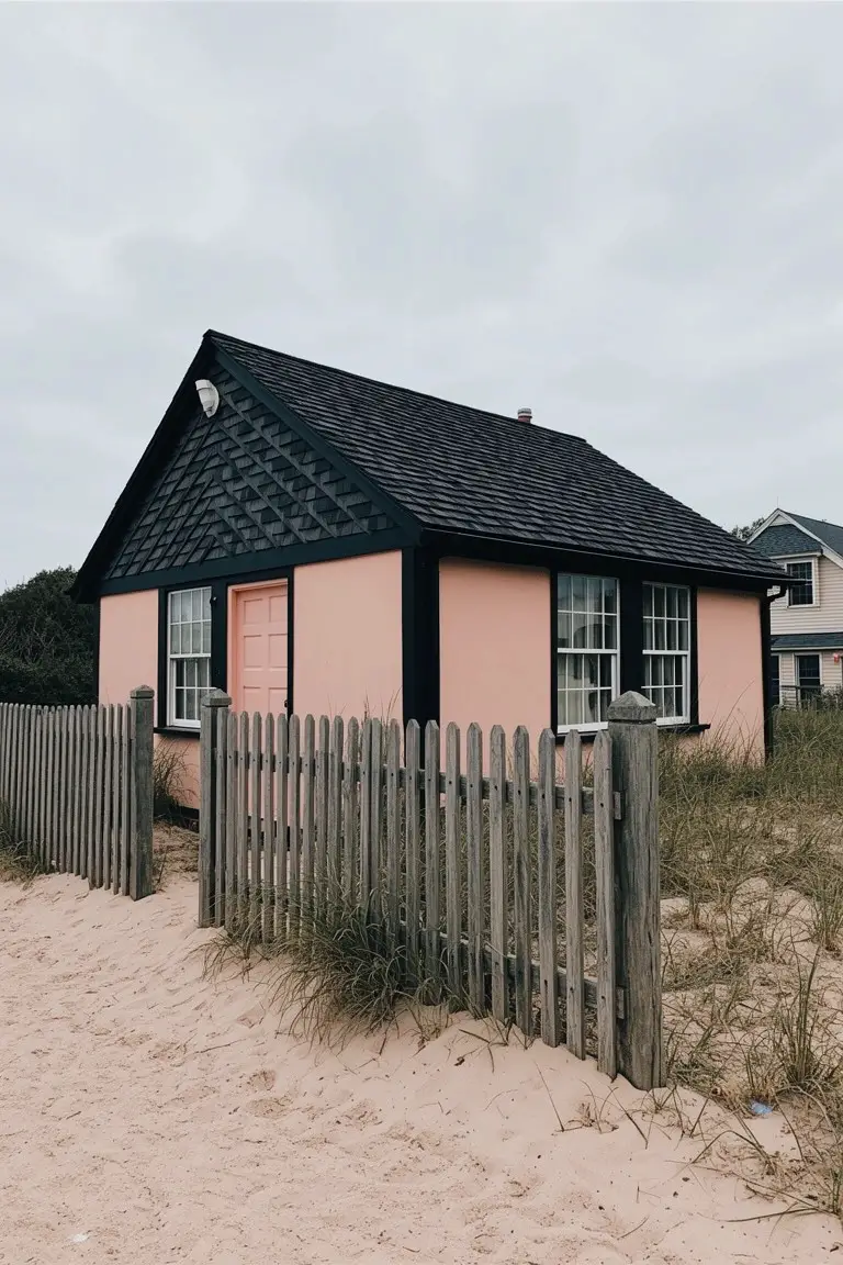
This soft blush pink on the house body looks closest to Farrow & Ball Pink Ground. You’ll also find close matches in Benjamin Moore First Light or Sherwin-Williams Pussy Willow, and Behr’s Bashful Blush runs right along the same lines. It’s a muted pink with just enough warmth to stand out against a dark roof without feeling too sweet. Folks like it for exteriors because it picks up light nicely and gives that unexpected pop.
The warm rosy undertone keeps it from going flat in overcast weather. It works best on cottages or beach houses, paired with black trim and simple wood fences like you see here. Stick to crisp whites inside if you’re matching doors, but watch it next to super yellow woods, it can pull a bit peachy.
Warm Ochre Yellow Siding
This ochre yellow siding catches the eye right away. It’s that rich mustard tone in the warm yellow family, reading close to Farrow & Ball’s Babouche or Sherwin Williams Goldenrod (SW 2846). Behr’s Mustard Seed would work too. Folks like it for how it pops against a dark roof like the blue metal one here, making a simple house stand out without trying too hard.
The warm golden undertone keeps it cozy, not brassy. It suits older farmhouses or cottages best, especially with white trim on the porch rails. Pair it with plants around the steps for extra life. Just watch it in full shade. It can pull a bit flat there.
Forest Green Siding
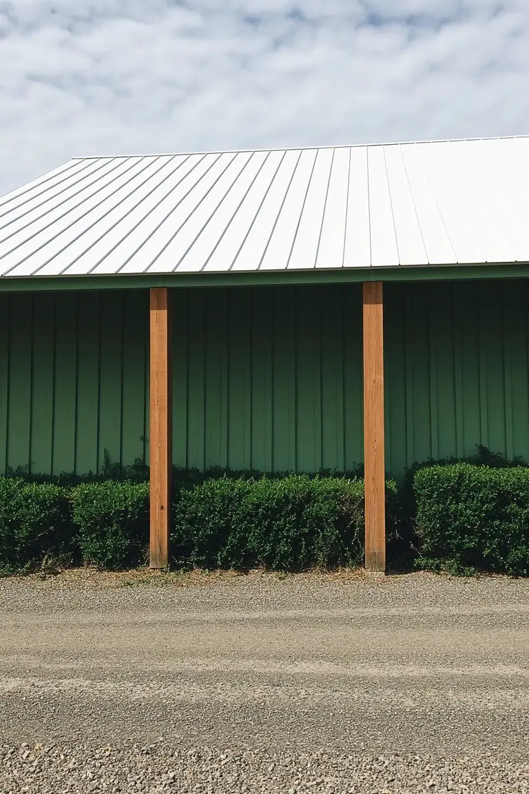
This forest green on the siding reads very close to Sherwin-Williams Pewter Green or Benjamin Moore Guilford Green. Or Behr’s Cactus Green if you’re shopping there. It’s a solid, mid-depth green that feels bold without going too dark. Folks like it because it stands up to a white metal roof for real contrast. And those wood posts? They pop right out.
The color has a touch of warmth from sitting next to the natural orange tones in the wood. It works best on garages or sheds where you want some country charm. Pair it with crisp white trim and keep plants low around the base. Skip it if your spot gets too much harsh sun. Might look a bit flat then.
Bright Turquoise Siding
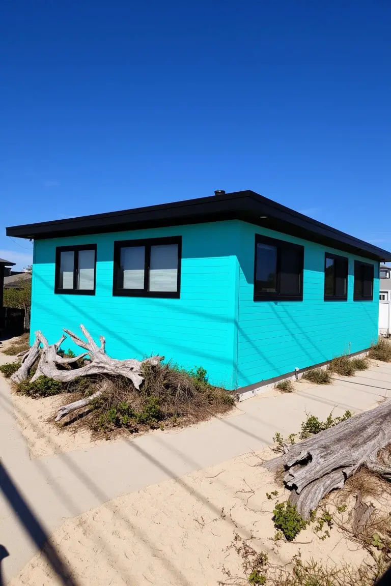
Bright turquoise siding like this grabs attention without trying too hard. The color looks closest to Behr’s “Laguna Splash” or Sherwin-Williams “Buoyant Blue,” maybe Benjamin Moore’s “Breton Blue” too. It’s a cool cyan shade that feels lively and beach-ready.
Cool undertones keep it crisp next to a black roof and white trim. It shines in sunny spots, especially coastal yards. Pair with simple landscaping to let the paint stand out.
Crisp White Columns
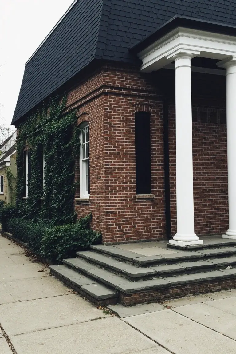
A crisp white on those columns looks closest to Sherwin-Williams Extra White or Benjamin Moore Chantilly Lace, maybe Behr Ultra Pure White too. It’s the kind of bright clean white that gives classic structure without overpowering the brick walls. Folks like how it sharpens up the entry without feeling stark.
That neutral tone holds up in shady spots or cloudy days, not turning yellow next to warm brick. It works best on trim like this, paired with a dark roof for that pop. Just keep it freshly painted since white shows dirt over time.
Crisp White Siding
This siding pulls off a crisp white that seems closest to Sherwin-Williams Extra White. Benjamin Moore Chantilly Lace or Behr Ultra Pure White read pretty much the same too. It’s a straightforward neutral white. Bright but not harsh. Folks like it because it lets other parts of the house stand out.
That black roof up top gives it nice punch. And the beige stone down low adds a warm undertone to the white. Works best in full sun. Pair with dark trim or natural materials. Just watch it doesn’t look too cool on shady sides.
Deep Green Lower Siding
That deep green on the lower siding and shutters stands out right away. It’s in the hunter green family, closest to Benjamin Moore’s Hunter Green HC-113 or Sherwin-Williams Jasper. Or check Behr’s Deep Emerald for something similar. This shade grounds the white clapboard up top. Makes the whole front feel steady and a bit traditional.
It picks up a cool undertone in shaded light. Pairs well with black roofs like this one. Try it on older homes with brick walks. Just watch it doesn’t fade too fast in full southern sun.
Warm Terracotta Exterior
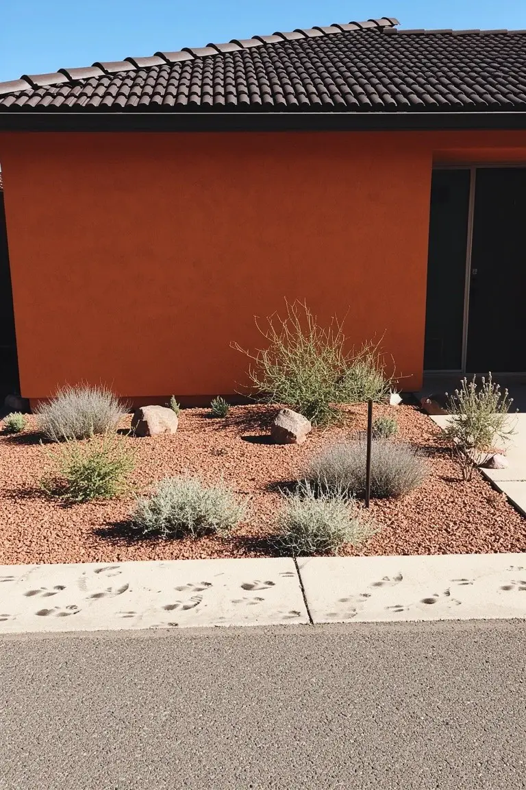
This bold terracotta orange on the house walls reads very close to Sherwin-Williams Spiced Cider or Benjamin Moore Moroccan Spice, maybe Behr Canyon Sunset too. It’s a warm earth tone with real punch, perfect for homes in sunny spots where it picks up the light just right. Folks like it because it feels grounded but lively at the same time.
That reddish undertone keeps it from going too muddy, especially next to the dark roof tiles here. It works best with simple stone accents or desert plants, nothing too fussy. Pair it with crisp white trim if you want, but watch it doesn’t overwhelm smaller houses.
Crisp White Walls
This setup shows off a bright white paint on the walls that looks closest to Sherwin Williams Extra White or Benjamin Moore Chantilly Lace. Maybe Behr Ultra Pure White too. It’s a straightforward white that holds up clean and sharp outdoors. What stands out is how it lets that reddish roof take center stage without competing.
Daylight brings out a neutral edge in this white. No strong undertones to fight the warm roof tiles or wood details. It suits simple homes like this one, on stucco or flat siding. Just watch it doesn’t look too flat next to cooler grays.
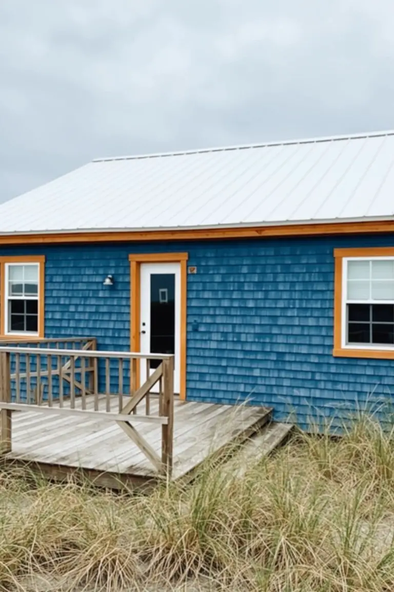
Deep Navy Siding
This siding shows off a deep navy blue, the kind that feels strong and steady. It looks closest to Sherwin Williams Naval or Benjamin Moore Hale Navy, maybe even Behr’s Midnight Show. Folks like it because it stands up to a bold roof color without fading into the background.
The cool undertones keep it crisp next to that rusty orange metal roof. It suits simple outbuildings or house sides in cooler climates best. Just pair it with light trim to avoid going too heavy.
Bright Turquoise Door
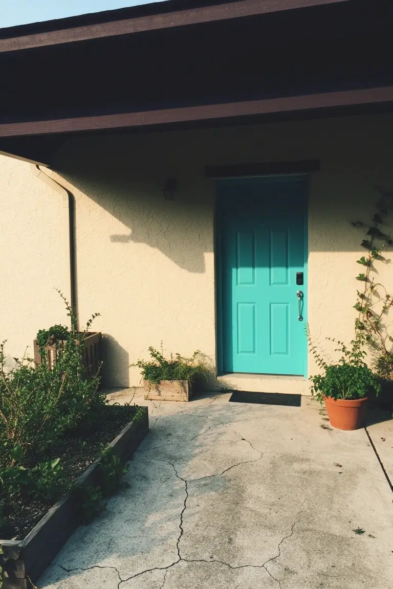
That front door shows off a bright turquoise paint that’s full of life. It’s in the turquoise family, cool and vibrant without going too dark. I’d say it reads very close to Sherwin-Williams Rain or Benjamin Moore Wythe Blue, maybe Behr’s Coastal Cabana too.
The cool undertones play nice with the warm beige stucco walls around it. Greenery and those potted plants nearby just soften things a bit. Try it on a sunny exterior where it can catch the light, but pair with neutrals so it doesn’t overwhelm.
Pale Mint Green Siding
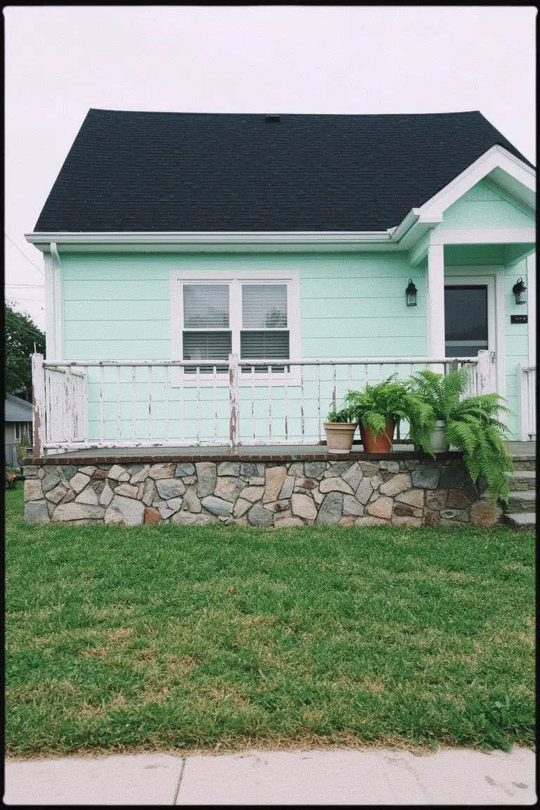
This siding shows off a pale mint green that looks closest to Sherwin-Williams Sea Salt or Benjamin Moore Saybrook Sage. Behr’s Silver Sage reads pretty close too. It’s a soft pastel in the mint family. Cool and easy on the eyes. That dark roof pulls it together and the stone base keeps things grounded.
The color has a slight blue-green undertone. Brightens up nice in the sun. Works best on cozy homes like this one. Go with white trim around doors and windows. Plants nearby just make it feel right… nothing too fussy.
Soft Shingle Gray Siding
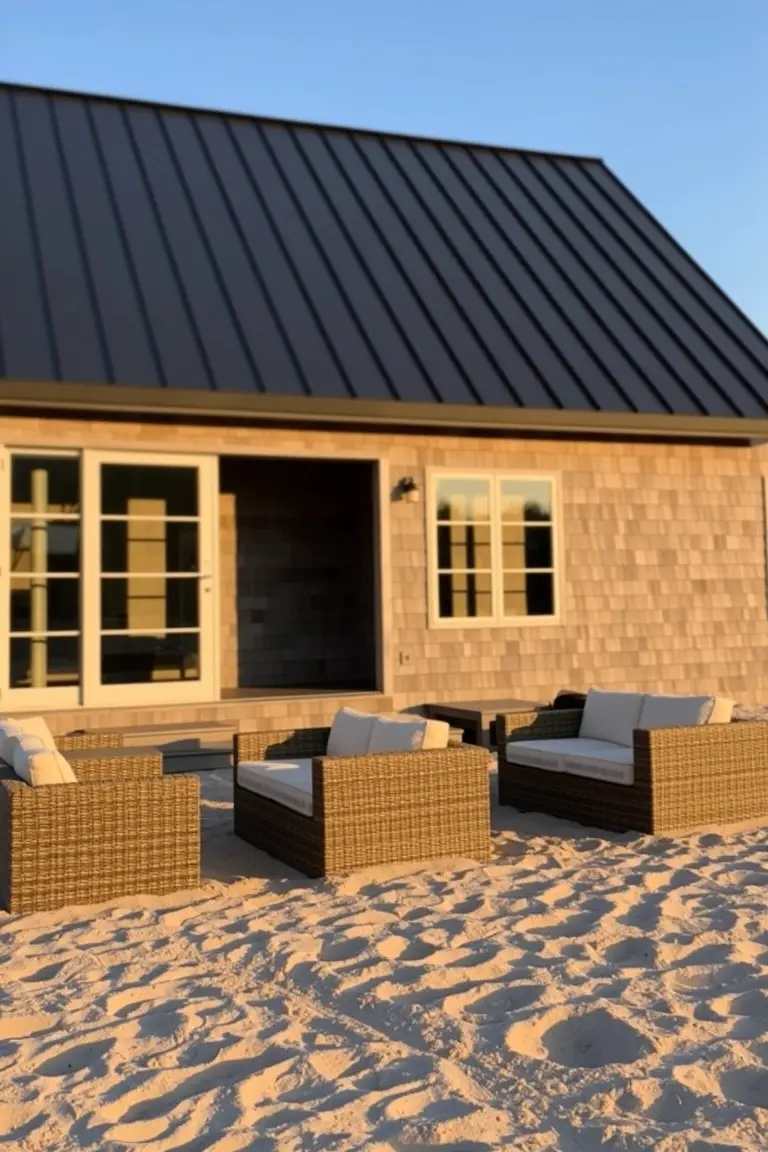
This siding pulls off a soft shingle gray that’s warm and neutral. It reads very close to Sherwin Williams Shale or Benjamin Moore Edgecomb Gray, maybe even Behr’s Silver Drop. Folks like it because it stays low-key next to a dark roof like that black metal one here, letting the contrast pop without overwhelming the place.
The warm gray-brown undertones make it hold up well in bright coastal light. Pair it with crisp white trim around doors and windows, and it keeps everything looking clean on sandy spots like this. Just test a sample first, since it can shift a bit toward beige in full sun.
Crisp White Walls
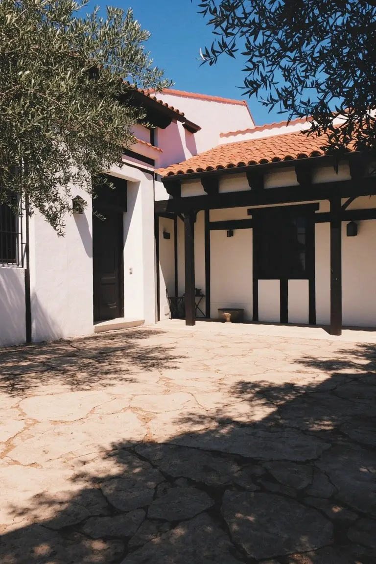
Those stucco walls show a crisp white paint that’s got a subtle warm undertone. It seems closest to Sherwin-Williams Alabaster or Benjamin Moore White Dove, maybe Behr Polar Bear too. This white keeps things fresh and clean. Makes the red roof tiles really stand out without overpowering them.
In good light it picks up a soft glow. Black wood trim like this sets it off nicely, same with stone paths. Best for sunny yards or courtyards. Just watch it doesn’t pull too cool in shade.
Warm Beige Brick Exterior
This warm beige on the brick house looks closest to Sherwin-Williams Balanced Beige or Benjamin Moore’s Manchester Tan. It’s a solid tan with just enough yellow undertone to feel cozy without going too golden. Folks like it because it lets the green metal roof pop while keeping the whole look grounded and easy on the eyes.
That yellow warmth shows up best in overcast light like this, where it doesn’t wash out. Pair it with stone accents or a red door for some kick. Steer clear of cool grays nearby, though. They can make the beige read flat.
Sunny Yellow Walls
This sunny yellow paint covers the main walls and gives off a bold, cheerful vibe. It reads very close to Sherwin-Williams Lemon Slice or Benjamin Moore’s Golden Straw, with Behr’s Solar as another good match. Folks like it because it wakes up a plain facade fast, especially against a darker roof like the gray metal one here.
Warm undertones keep it from looking cold, even in bright light. It suits modern or simple homes best. Go with black doors or concrete steps nearby, but skip busy landscaping that fights it.
Deep Green Barn Siding
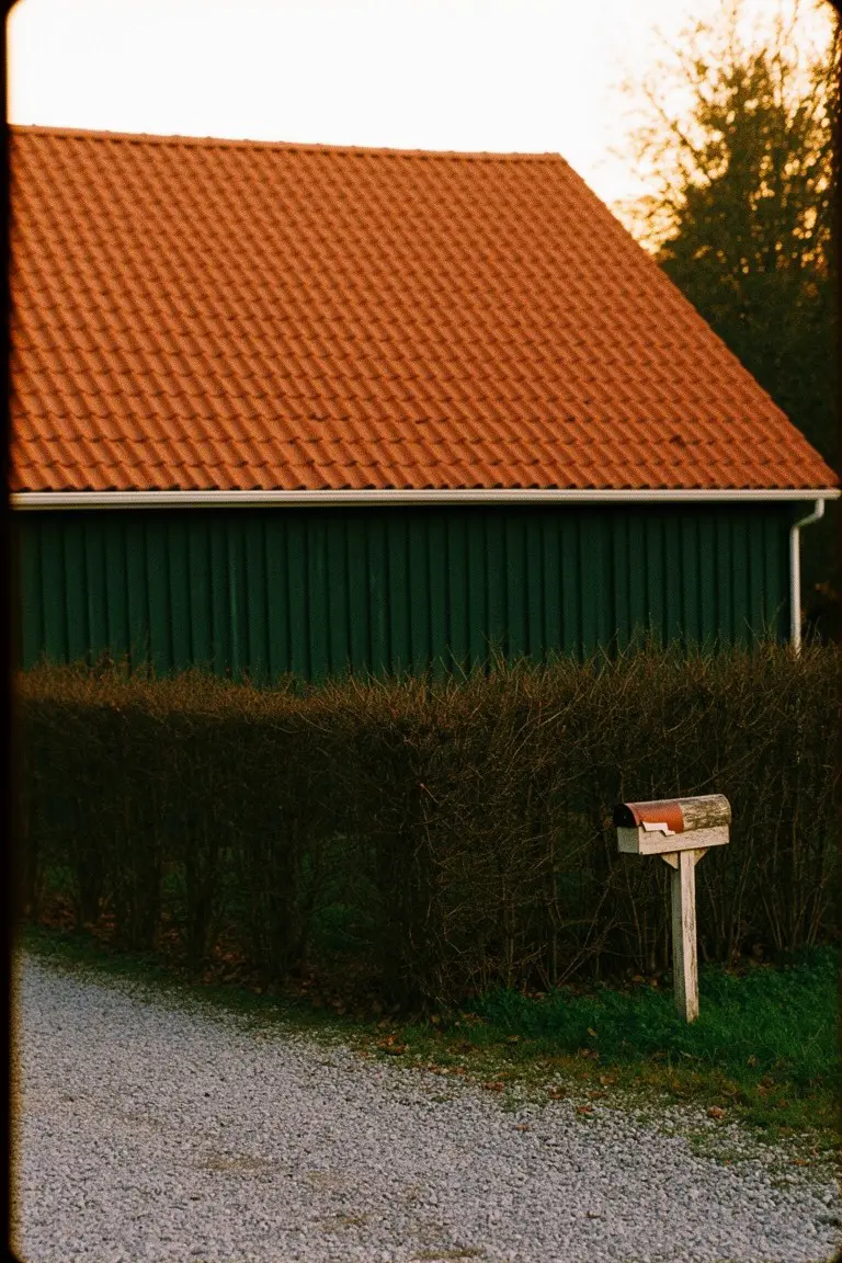
This siding paint pulls a deep forest green that seems closest to Sherwin-Williams Pewter Green or Benjamin Moore Black Forest Green. Behr’s Cactus Shadow sits right there too. It’s the kind of rich green that holds its own next to a bold red roof without shouting.
Warm undertones keep it from going too dark or chilly. You’ll see it pop best on bigger outbuildings or farmhouses, out in the country where it blends with trees. White mailbox or trim keeps things crisp… just right.
Rich Navy Siding
That deep navy blue on the clapboard siding reads very close to Sherwin Williams Naval or Benjamin Moore Hale Navy, maybe Behr’s Indigo too. It’s the kind of bold blue that gives a house real presence, especially when you pair it with a bright white roof like this one. Folks go for it when they want something coastal without being too flashy.
This shade picks up a touch of gray undertone, so it settles nicely in overcast light or near the shore. Stick to white trim around the windows and door, and a warm orange accent pulls it together without clashing. Just watch it doesn’t fade too fast in harsh sun.
Frequently Asked Questions
Q: How do I test a bold color combo on my actual house?
A: Paint big sample boards with your top picks. Stick them up where the house meets the roof and walk the curb at morning, noon, and dusk. Light shifts everything, so chase that real-world vibe.
Q: What if my roof is a weird color like greenish black?
A: Hunt for body paints that lean warm or cool to echo it. Deep terracotta warms it up, while slate blue cools the edge. Snap photos to compare options side by side.
Q: Do bold colors really hold up over time?
A: Choose paints loaded with fade-resistant pigments. Prep by power washing and priming first. They stay punchy years longer that way.
Q: How much bold is too bold for resale?
A: And dial it back with neutral trim if selling soon. Buyers warm to contrast that feels fresh, not wild. It boosts curb appeal without scaring folks off.